» Blue » Sea wave color and combination with it
The color of the sea wave is also called blue-green. Of course, the name of the shade comes from the impression of depth, sophistication, and the power of sea water, penetrated by the sun, in calmness or “anger.” Many artists have painted this uncontrollable, but amazingly beautiful element, not amenable to taming, but full of surprises and bounties. These paintings intertwine a hundred tones of blue and green, from the lightest to almost black, but the aqua color itself is average and does not have a very wide range. Blue, as the color of the high, intellectual, ideal, but detached, is mixed with green - the color of growth, prosperity, worldly wisdom, combined into authority, perspective, and determination. Everyone who wants to achieve something in this life loves this color. It characterizes scientists, various developers, entrepreneurs, etc. The color of the sea wave can be not only deep, high waves, but also precious stones, gems, which also support the play of shades.
Characteristics of sea green color
The combination of shades requires an understanding of what color you are dealing with. According to the science of color, all colors are divided into cold and warm. Those with a hint of blue are considered cool, and those with a hint of yellow are considered warm. Blue-green color or sea wave belongs to the group of cold ones. Since it is obtained by mixing blue and green with a predominance of the latter. Colors are also divided by degree of complexity. There are basic colors that cannot be obtained when mixed: red, yellow and blue. And from them you can create second-level colors, they combine two primary colors, for example green, orange. And then there are third-order colors, which are created by mixing several colors. These include the color of sea wave. This is a complex color scheme that varies greatly depending on which tone predominates. This is why people are so often confused about the name of this color.
Lighting
What kind of light will be in the kitchen depends on the intended design. For a “ship cabin” it is better to use selective lighting with lamps with warm light. A “sea house” or “outdoor deck” needs more natural light, and lamps should have diffused white light.
The design of lamps for the “ship” style is characterized by metal shades or chandeliers made of steel or polished to a shine, and in some versions, darkened brass.
Chandeliers often use light bulbs that imitate candles. All this reminds us of those times when there was no electricity on ships, and only natural light from fire was used.
For lighter and lighter marine designs, it is permissible to use modern spotlights, various thematic or neutral chandeliers.
If the size of the kitchen and funds allow, you can “break away” and build an entire suspended structure in the shape of a boat with lighting above your head.
Or you can be more original and, using rope ropes, hang unusual Edison light bulbs on them, and at the same time flower pots to continue the theme.
Names and shades
Since colors are perceived by people slightly differently, there are various synonymous names that try to convey the nuances of shades. Such duplicate names exist in all groups of colors, and sea green is no exception. Color combinations need to be drawn up, focusing specifically on the nuances. Therefore, it is so important to accurately indicate the chosen shade. For example, you tell an interior designer that you want to decorate a room using milk chocolate and faded rose flowers. But it turns out that you had different shades in mind, because you incorrectly correlated the color and its name, and the result was not the interior you expected. The following terms are also used to name the color of the sea wave: cyan, blue-green, petrol, teal, dark teal, aquamarine, turquoise and even marengo and the color of thrush eggs. All these are really shades of blue-green, in which there is more or less green and blue, and they also differ in lightness and darkness. For example, turquoise is a light tone that fades into blue, and marengo is a very dark blue-green color with a gray tint.
Furniture and household appliances
Wood, wood and more wood - this is the motto of the nautical style regarding furniture. Furniture of simple, sometimes even rough shapes made of solid wood perfectly creates the atmosphere of a sea vessel, cabin or coastal house. Natural wood color, painted wood or wicker furniture - all of this will demonstrate the marine theme, both individually and in combination with each other.
Both aged wood and brand new facades in white and blue tones look harmonious.
An interesting and unusual design move would be to create an island kitchen in the shape of a boat.
Owners of a kitchen-living room can and even need to decorate two spaces in the same style. In this case, a chest table with metal fittings made of the same material as the kitchen set will perfectly continue the marine design with a touch of a pirate theme in the living room.
Bar counter in a nautical style? Why not. The shape of the bow of a ship, white or natural wood, paneled portholes and you are the owner of a marine bar.
You can also set a marine theme using furniture facades with photo printing. As with poured floors or suspended ceilings, all that remains is to choose a picture to your liking.
Fabrics in the upholstery of upholstered furniture, like everything else, should be stylistically consistent in marine monochromatic or striped tones. Drawings with the inhabitants of the deep sea or with other marine symbols, for example, with anchors, a lighthouse or a lifebuoy, will look great.
As for household appliances, either hide them behind the facades of the kitchen unit, or let them match the style, which means they will be made of chromed steel, brass, or, in extreme cases, have a white or blue coating.
A hood designed in the shape of the side of a ship with a porthole may look original.
Symbolism of color
Cyan in many cultures is associated with coldness, ice, and depth. Dark shades of sea green symbolize self-immersion, reflection, and focus on higher goals. This is a strict color scheme, and therefore the combination of sea green (photo attached) with any shades makes them more conservative and restrained. Even bright orange in tandem with sea wave becomes less catchy and expressive.
Manicure
Cyan is a noble, colorful, luxurious and bold color. Any image will be hopelessly ruined if a woman has an ugly manicure or one that doesn’t fit into the color scheme. You should also take into account the occasion for which you wore a sea green dress.
A party is a bright and fun event. Therefore, the manicure should be just as sparkling and bold. Do not apply nail polish of the same shade as the dress; it is better to be 1-2 shades darker. Red, burgundy, pink and raspberry polishes go well with a short, playful cocktail dress. But it is completely unacceptable for a long evening dress.
The perfect and versatile French manicure. It can be decorated with rhinestones. The tips of your nails don't have to be white. They may be a different color, but they must be in harmony with the dress.
Impact on humans
Any color has an impact on the psyche of people. Despite the fact that there are personal preferences and tastes, there are also general patterns in the effect of a particular color on a person. Thus, the color aqua with a predominance of blue in an ensemble with other colors or in its pure form usually has a calming effect on people. But intense cyan is the color of psychological stress. If a person chooses this tone as his preferred tone, it may mean that he has problems with relaxation, that he is overstressed.
But the color itself has a very beneficial effect on people; it helps them focus on achieving their goals and get into a serious mood. It is no coincidence that, for example, offices in the English tradition are often decorated in precisely these colors. Psychologists recommend looking at this color for those people who have problems with self-control and concentration.
Turquoise color in nature, its meaning
Turquoise is one of the most beautiful shades; it is widespread in the world around us. This tone can be seen on the sea near resort shores; the water in the area of sea lagoons, various oases and water quarries is colored turquoise. Different shades of turquoise are seen in the sky in the early hours of the morning. This color is not present in the main palette; it must be obtained by combining paints.
Psychologists call turquoise cold and mysterious, although people associate it with intimate conversations with friends. In the countries of the East, the color symbolizes faith, healing, compassion, and in Europe it was previously considered a talisman that bestows good luck.
Alternative medicine uses turquoise in color therapy: this shade is good for the eyes, can strengthen the immune system, and reduces the risk of overload, depression and stress. It is believed that this tone is very harmonious, designed to add calmness and balance to a person, and helps control emotions.
Harmonious combinations
In ordinary life, people rarely think about how to create ideal color ensembles. Girls think about this problem when putting together outfits. But many have difficulties and therefore try to stick to traditional color schemes. And people try to leave questions about what colors to decorate their apartments to professionals. But it won’t hurt to expand your ideas about how to put together a harmonious combination of colors. The aqua color can be complemented with both warm and cold color partners. Pairs of cyan and white, black and beige will be unmistakable. Of course, they are not very impressive and expressive, but they are beautiful, and it is difficult to mistake them. In other cases, you need to carefully select your companions based on tone, warmth and intensity.
Length
Short
A sea green mini-dress made of knitwear may not be plain, but with a print (geometric or floral). Choose shoes in brown shades, depending on the time of year. In autumn and winter - these are ankle boots or boots, in spring and summer - shoes or sandals.
Long sleeves and a bustier bodice add beauty and elegance to the lace dress. This outfit can be used both for everyday life and for special occasions. Just complement it with matching accessories. The look looks incredibly impressive with red classic stilettos and matching jewelry.
A medium-length knitted dress in a dark shade is ideal for an everyday look. It radiates femininity and nobility. You can safely wear it to the office and for a walk.
Long to the floor
Empire style nautical dresses are incredibly beautiful. A high waist visually lengthens the figure and makes it slimmer.
Long sea green dresses are a stunningly chic evening option. They can be either with or without straps. Elegant floral decoration with rhinestones complements the outfit, and it does not need accessories. Folds and drapes add sophistication.
Classic combinations
Over the many centuries of the existence of flowers, certain traditions of their arrangement have developed. Classic techniques have been developed that are considered neutral and optimal. These are a kind of ready-made template solutions that can be used in any situation. This is also true for the aqua color combination. The combination of colors for any occasion is based on basic neutral colors - white, black and gray. But for blue-green, these companions are not always advantageous. Classic combinations with it are shades of ocher, beige, and white. In such pairs, blue-green looks noble and restrained.
Decorating a living room with cyan
The basis of a cheerful interior in the Greek style is white walls, columns, wooden beams and furniture, as well as green plants in tubs and pots. The sea green color suits all this perfectly.
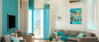
If you decide to paint the walls cyan, it is better to enlarge the windows in the living room so that they let in more light and the room does not seem gloomy. The sea wave looks great in accessories: paintings and wall panels, decor, sofa cushions, curtains or carpets.
Contrasting combinations
To create color pairs, the color wheel, which was invented by I. Itten, is often used. This tool helps you find the opposite shade and think through color combinations. The color red is in direct opposition to the color aqua. This is the brightest combination with blue-green. But straightforward contrasting combinations are sometimes too expressive to be used when creating color solutions for a suit or interior. Therefore, adjacent shades are usually selected from the color wheel using a triangle overlay. And in relation to the color of the sea wave, pairs with yellow and orange are contrasting. Such combinations are more complex and interesting than combinations with red. The ideal contrast for blue-green is cool white. This combination looks very formal and expressive, but at the same time very elegant.
Room design
Sea wave will be an excellent solution for decorating any room if you choose the right accompanying colors and their proportions.
Living room
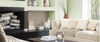
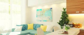
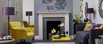
A family room usually has the most natural light, which will help avoid creating a gloomy interior. The cyan shade is perfect for decorating walls, accessories and furniture. A room design with blue-green wallpaper with beige accents and a chocolate pattern will add originality and style. White or beige walls combined with turquoise furniture will add freshness and naturalness, as will the use of natural wood.
As for deep sea shades in the living room, they are more suitable for textiles and various decor. Carpets, pillows, rugs with an ultramarine pattern look calm and positive. This range is perfect for zoning space using color transitions. Orange, light green, and lemon colors are used for accents.
Bedroom
Here the blue-green palette would be appropriate in textiles. This could be a bedspread, bed linen or light curtains. If you want to use sea wave for decoration, then it can only be part of the wall at the head of the bed, or a niche for a TV or things. Ultramarine is often used to create multi-level ceiling structures in combination with LED lighting. In this case, the color will become the center, visually increasing the height of the room.
Kitchen
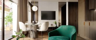
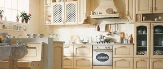
To prevent the kitchen interior from becoming too cold, you need to add elements made of natural wood or its imitation. These could be ceiling beams, floors, doors, window openings, kitchen units. If you give preference to dark shades of sea green, you need to correctly use contrasting combinations, which is typical for modern solutions. For example, a malachite or turquoise facade will look interesting against the background of white walls.
Turquoise can also be used in tiles, but paired with a lighter checkerboard pattern. To compensate for color absorption, glass, glossy surfaces, light curtains on the windows, and fresh flowers are used. Handmade accessories will add warmth. It is also worth considering that dark colors negatively affect appetite (if meals are taken in the kitchen-dining room).
Bathroom
Water colors are a traditional solution for bathroom design. It not only adds the effect of cleanliness and freshness, but also looks great in combination with the chrome surface of sanitary ware and white earthenware. To solve the problem with light, LED lamps and mirrors are used. To add liveliness, you can use azure-colored tile decor, rugs, and bath accessories.
If you use sea wave only for accents, then you should follow the rules of proportion and symmetry. For example, you can decorate only the bathroom, or the area around the sink or toilet. When using oriental stylistic trends, it is appropriate to use tiled mosaics with several splashes of color.
Children's
In a girl’s room, such a palette is rarely used. No dark or harsh tones, only diluted, soft shades. It is recommended to use them in textiles or furniture, photo frames, and decorative items. As for the boys' room, here the sea wave can take a dominant position. This includes a marine theme, American style, and blue-green combinations with terracotta, green, yellow and chocolate.
Hallway
When using the palette in the corridor, consider the following:
- the hallway should be large so as not to “lose” even more space;
- aqua color should only be used in a well-lit room with mirrors;
- the saturation of shades and their quantity directly depends on the total amount of light.
In general, the palette for apartment corridors is rarely used, but in a house with a spacious entrance area there is more space for implementing ideas.
Avant-garde combinations
Every season, fashion chooses its favorite color pairs, and they delight everyone. When planning your wardrobe for the coming season, it's worth taking a closer look at unexpected and trendy color combinations. Sea wave and pink or purple are solutions for the most daring and fashionable. Nuanced combinations based on a play of shades are also in fashion. For example, whitened turquoise and rich blue-green look very subtle and aristocratic. The combination of a soft shade of sea wave with camel color is also at the peak of fashion. The combination turns out to be very tender and romantic. When trying to find an unexpected and interesting combination of blue-green with other colors, you need to carefully look at their balance in intensity and tonality. The aqua color can be bright and dominant, or it can be inferior to the first party and be an excellent background for a bright partner. It is this kind of color game that is extremely relevant today.
Wardrobe selection rules
The color and various shades of aqua in the right combination with other colors in clothing (the photos show this well) can create bright and colorful images for any occasion. This trendy color is popular for any season.
It can safely be called universal, as it visually makes any figure slimmer and is well suited for different color types of appearance. Shades of sea green look most advantageous on women of the “winter” and “autumn” type.
The color of the sea wave looks impressive in business, office-style clothes, and is beautiful in evening dresses. Its delicate shades look harmonious in romantic and casual clothing styles.
Business attire
Business or office style implies restraint in color, various details of clothing, accessories and their quantity.
When choosing an outfit for a formal atmosphere, you should remember that the correct set should contain no more than 2-3 shades:
- a set of a skirt and jacket in a deep rich sea green color can be complemented with a white blouse or a black top and pumps of the same color;
- a business trouser set in petrol or deep Atlantic shades will be perfectly complemented by a gray or black blouse and matching shoes;
- a strict sea-green office dress will be perfectly complemented by contrasting accessories: a thin black belt and low-cut shoes of the same color or classic pumps with a comfortable, stable heel;
- A plain sea green dress and a checkered or striped jacket in contrasting shades: black or gray can look harmonious and businesslike.
It is better to choose shoes for laconic business and office styles in neutral colors: black or dark gray. Shoes in beige tones may be appropriate if the clothing set contains details of these shades.
Casual
Casual style involves convenience and comfort in clothes, shoes and accessories.
- For this, sets of skirts or trousers in blue-green tones with blouses, tops or jumpers in calm chromatic shades are good; they can be plain or complemented with fashionable classic prints: checks, stripes or polka dots in matching, matching shades.
- Sea green jeans go well with a checkered shirt in various calm shades from achromatic white to mustard and burgundy.
When choosing accessories for everyday style, the best solution would be to give preference to tone-on-tone colors with some detail of the outfit, or to play on the contrast of shades. This will bring some color and freshness to everyday life.
Evening
Evening style is, first of all, solemnity, sophistication and elegance.
The aqua color (photos show various looks) looks great in clothes for formal and festive events:
- A dark turquoise dress with a draped bodice on thin straps with a skirt decorated with ornate fluffy ruffles, complemented by a thin black strap and matching bows on the straps, is suitable for a party or a romantic dinner in a restaurant.
- A floor-length dress in the color of sea depth in combination with a clutch or handbag in black or a noble wine shade may be appropriate when attending a social event or going to the theater. To complement the outfit, you can use a light fur cape and jewelry made of noble and precious metals, as well as classic elegant pumps that match the color of the dress.
- For an evening look, classic or flowing wide trousers in blue-green deep shades can be used in tandem with a long jacket of the same color and a top or blouse in calm warm shades (burgundy, marsala, aged gold, dark chocolate). Shoes for this look can be worn to match them.
Romantic
Romantic style implies airiness and lightness in clothing.
When choosing an outfit and accessories to create a delicate look, it is better to give preference to light and pastel shades of sea green:
- A lake blue dress (or a very light blue-green) can be complemented with a light jacket in a calm beige or pink color, elegant shoes, light sneakers or slip-ons in neutral shades. The jacket and dress can have a floral or polka dot print.
- A light, aqua-colored, fluffy skirt combined with an airy blouse or a light top in a soft pink or pastel coral shade is an excellent example of a romantic look. It can be complemented with ballet flats or light sandals in the color of one of the clothing details.
- Flowing light trousers in blue-green or Atlantic shades will look harmonious in combination with a soft coral or pink blouse.
Elegant and light accessories will perfectly complement the romantic style.
Sports
Sports style does not include sportswear itself, but the presence of sports elements in classic clothing:
- wide-cut trousers, any shades of aqua blue, will perfectly complement sweatshirts, sweatshirts, T-shirts and T-shirts of matching colors;
- a sporty look looks great in combination with sneakers, sneakers, baseball caps, backpacks of all shades from a rich palette combined with sea green; any item of clothing can be printed in these colors.
By combining wardrobe items in different ways, you can change the looks and styles of clothing. Any of the details can be sea green.
Skirts
Skirts can be monochrome, in any shade of sea green. Otherwise, they may have a trendy striped, checkered or polka dot print. Any style and length: from mini to maxi, from a strict pencil skirt to a fluffy, flowing romantic one.
Dresses
A dress is a must-have item in every woman's wardrobe. It can have any of the shades of sea green, different styles and belong to any of the styles. Various combinations of colors, shades and prints can make a sea green dress sporty, romantic, business or evening.
Trousers
Trousers in shades of sea green can be of different cuts. These could be skinny jeans; trousers or culottes; timeless, straight-leg classic trousers; mom jeans or shorts.
Properly matched to trousers of any style, blouses, tops, jackets, jumpers and shoes can make them an item of any style that will be appropriate at a business meeting or a picnic, on a walk or at a romantic dinner.
Blouses and tops
Tops and blouses in sea green and all its shades are a wardrobe detail in any style. They can be plain and complement sets of jacket and skirt, or jacket and trousers in noble gray, taupe, mustard, blue, burgundy, black.
Also, blouses and tops in blue-green shades will perfectly complement skirts and trousers in checkered, striped or polka dots. Fashionable monochrome looks will also look great in sea green.
Bags and accessories
Bags, like any accessory, are designed to complement any look, to be in harmony with it, without distracting attention to themselves. Sea green bags can be of any size and shape, according to fashion trends or personal preferences.
A small handbag or clutch can decorate an evening or romantic outfit. Oversize bags will look good in casual and sporty looks. The briefcase bag will perfectly complement your business and office style. The bag can match the color of one of the items of clothing in the outfit or be completely different. The main thing is that the image is not overloaded with an abundance of colors and shades.
The classic combination is 2-3 colors (if it is not monochrome).
The photo shows examples of fashionable bags in sea green color.
Accessories: scarves, hats, hats, scarves, gloves and jewelry should also harmoniously complement the chosen image. Their color should match the tone of one or more wardrobe items.
Complex combinations
It is known that there are harmonious and disharmonious color solutions. Of course, there are colors that are difficult to pair, and it is better not to do so. There are also completely undesirable color combinations. The aqua color can hardly stand being next to gray or dull brown and has a difficult relationship with black. Such color pairs must be assembled in such a way that the colors do not “kill” each other. One of them should be dominant, and the second should only be accentuated; there are no parity combinations in such unions.
Using the palette in different styles
The aqua color is universal and multifunctional. Thanks to its beauty, sophistication and elegance, it is used in any classic and modern interiors. It is not necessary to use it for finishing walls and floors. It is enough to use textiles, decor, and place the right accents. Furniture of this shade will add freshness to the style.
Scandinavian and eco style can be added to the effectiveness of solutions, art deco can be made even more noble, and traditional designs with sea blue will become distinctive and original. As for minimalism and hi-tech, sea wave perfectly emphasizes metallic shine and glossy surfaces. In oriental interiors, sea wave is widely applicable to all elements.
Who will it suit?
It’s not easy to wear combinations of sea green with other colors, although it suits almost everyone, you need to carefully select your shade. Most of all, blue-green suits red-haired girls. It perfectly highlights the hair shade, making it even brighter. Ladies with a typical Russian color type - fair-haired with blue and gray eyes - should pay attention to the restrained, deep tones of blue-green, which will give their appearance the necessary expressiveness. Blondes with blue eyes look best in shades with a predominance of turquoise. Dark brunettes will benefit most from the bright blue-green and light shade of a thrush egg. The good thing about the sea green color is that in its palette a girl of any appearance can find her own shade, the main thing is to choose it carefully.
What to combine with
The aqua color goes well with other neutral colors. As a recommendation, designers advise paying attention to a number of combinations:
- Sea wave and orange. A bright combination that evokes summer associations.
This combination is most suitable for spacious rooms;
- Sea wave and coral. Another accent combination option, inspired by a marine theme. This solution is also more suitable for large spaces.
Sea wave in clothes
Blue-green color has not lost its relevance for many years, but the principles of its use are changing. Today there are three main approaches to wearing it. You can wear the so-called total look, when the entire look is built on the nuances of one color, in our case it is the color of the sea green. Combinations in clothing can be based on the principle of contrast, then ocher, orange, salmon, lemon, red or pink will be successful pairs for blue-green. The most difficult way is to select pairs using a triangle superimposed on the color wheel. In this case, very interesting combinations will be obtained with deep chocolate, plum or pomegranate and with adjacent colors: blue and green.
For an everyday look, you can also resort to combinations based on traditional black and gray colors. In such sets, blue-green can act either as accents - a handbag, blouse, scarf, or, conversely, should be chosen as the main one, and only the details can be black or gray.
Sea wave in the interior
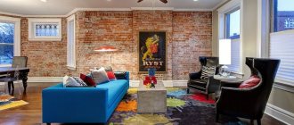
Interior designers today strive to use natural materials and natural shades. And cyan, which embodies the water element, becomes very relevant. The combination of sea green color in the interior with natural stone, brick, even concrete looks fresh and impressive. This color works best as color accents. In such cases, this color can be used in any room. A discreet, deep shade of blue-green is usually chosen as the main color. It is suitable for offices, halls, bathrooms. In order not to overload the eyes and not tire a person, it is better to choose restrained, light shades of cyan or dark, deep ones for interior decoration. Bright blue-green is recommended to be used only as color accents.
How lighting affects color
Cyan has the property of absorbing light. With its use, a room located on the north side can be even more darkened, and a room that is too sunny, on the contrary, can be diluted with freshness and coolness.
The marine shade can distort artificial lighting. So this color is better to choose for well-traveled rooms with large windows. Moreover, using thick curtains and blinds in such a room will be superfluous, replacing them with transparent tulle, which will help fill the room with air.
