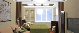
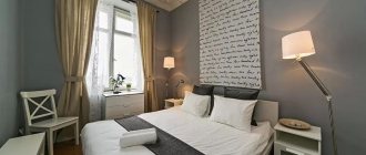
Proper arrangement of space in a small living space can be called a real art, especially if you need to combine the functionality of the rooms. A thoughtful interior design of a room of 18 m2 for the living room and bedroom will make it original, comfortable and cozy. The main thing is to correctly divide the space into zones.
You can do this in several ways:
- Using different materials to create an additional wall. The advantage is drywall. Convenient to use, easy to create partitions and fences.
- Formation of walls of different shades and textures. It allows you to visually divide the space into several zones using wallpaper, paint, plasters and other finishing materials.
- Zoning a room with furniture.
In our article you will see real examples in the photo, where a room of 18 square meters is divided into 2 zones: a bedroom and a living room.
Partitions
Dividing a room into several zones will allow you to create partitions that will change the perception of space.
There are two types of partitions:
- Mobile. They are easy to remove and move.
- Static. Always in the same place.
Movable partitions are also called movable partitions and are often made from bamboo panels or wooden frames that are covered with fabric. Any pattern corresponding to the interior design is applied to the fabric.
Static partitions are often made from materials:
- Plastic;
- Drywall;
- Tree;
- Lejomat;
- Metal;
- the frame is covered with fabric;
- Decoracrylic.
Partition walls emphasize the elegance of the room. Metal models will demonstrate luxury. Plastic partitions are cheap but practical, while wooden partitions will suit any style. Dividing a room into zones with a plasterboard partition will allow you to realize various creative ideas, apply any image to them or design any shape.
These are lightweight structures of a rectilinear or arched shape that do not occupy floor space.
Arches are popular for dividing space into zones. Designers recommend combining arches with partitions. This method allows you to divide the bedroom and living room into several functional areas. They look luxurious, give the room coziness, and regularly occupy a priority place in the spatial layout.
Square room layout
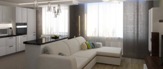
The square shape makes it possible to choose ergonomic furniture that will fit well along the walls, which will allow you to save free space in the middle of the room. Living room design 18 sq. m. in the shape of a square allows you to practically arrange the room, while showing a creative approach. When placing furniture, you can use one tricky trick. If possible, upholstered furniture is installed along the wall opposite the window. In this case, the person in the room perceives it as more illuminated by natural light.
Corner sofas or upholstered furniture with the possibility of transformation will help to practically use the space of the room. Classic sofas and armchairs, unfortunately, will take up too much space.
Another technique for properly arranging a room of this type involves the use of wardrobes, as well as sliding doors at the entrance to the living room.
The best solution for decorating a small room is a light color palette. This rule applies not only to walls, it applies to textile elements and furniture. Milky, vanilla, white, cream, beige, sand colors will add comfort to the room. In addition, a bright living room will seem more spacious.
When choosing types of lighting, it is important to pay special attention to the central lamp. There should be enough light from it to cover the entire room. The modern living room has 18 sq. m. should be provided with central (top), zonal lighting, as well as effective decorative lighting.
Screen
A sliding screen is a decorative design. Installed where there is no need for a static partition. The screen can be removed or removed at any time.
The design is based on several frames. Made from wood and other popular materials:
- Rattan;
- Bamboo;
- Rice paper;
- Grace.
Quite often, interior screens are used for oriental-style rooms. The design is easy to move from place to place; this is a common option for dividing a room into zones.
In order for the charm to transmit light, transparent materials are used in which light shades are used. The disadvantage of the design is the lack of sound insulation between rooms. The screen should fit harmoniously into the interior.
Children's room and living room in one room: creating a comfortable interior
In the process of arranging a children's area in the living room, you can use almost all of the above techniques. Partitions, screens, multi-level floors and ceilings, curtains - everything is acceptable. The age of the child matters. For a preschooler, 5-6 m² is enough; over the years, the number of meters needed will increase. This point must be taken into account when planning.
It is worth highlighting several conditions that should be observed when creating a children's area in the living room:
- the partition, in addition to its direct purpose, must protect the child from intense light penetrating from the guest area;
- the presence of a window in the part of the room where the space for children is equipped is mandatory;
- the difference in floor levels in the children's and guest areas should not create problems when moving;
- When designing an area for a child, you should use practical, easy-to-clean materials.
Many interior design ideas for living rooms and bedrooms may well become the basis for creating your own design project. There are many options on the Internet for living rooms combined with children’s rooms, the design of which does not require changes: with small isolated corners for infants, with loft beds for schoolchildren, with fairly large areas for teenagers, including all the necessary furniture.
Rack
A wardrobe or bookcase, which will serve as a limiter, perfectly divides the space into zones. It is recommended to choose a wardrobe in light shades.
Shelving that is used to mark out space has many advantages:
- versatility;
- the ability to combine several materials;
- simple assembly of the structure;
- mobility;
- decorative element.
Installing shelving to divide the living room and bedroom into zones makes it possible to make the room functional. Various trinkets can be placed on the structure. Shelves can be regularly updated to transform and diversify the interior.
Sliding doors
This design has an advantage over conventional doors. The product range allows the buyer to choose not only the material from which the sliding door will be made, but also the design of the door.
Frames are mainly made of chipboard, PVC, and wood. The canvases are mainly plastic, glass, and wooden boards.
Options with different patterns and designs, as well as material combinations, are also available. The sliding design most often has a standard linear shape, but corner or semicircular doors can also be produced upon request.
Recommendations for arrangement
The area for receiving guests requires the installation of a sofa. Both straight and angular designs are suitable. The sofa is generally positioned with its back facing the bed. It is better to equip a small room with a folding sofa, a compact modular wall or a wardrobe with a mirrored front.
The living room can occupy space near the window opening. In this case, it is furnished with a pair of armchairs, a coffee table, a pouf, a console and a wall-mounted TV.
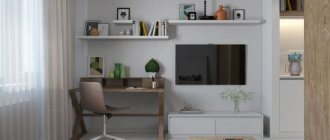
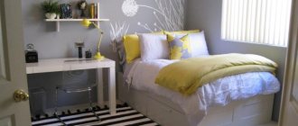
The sleeping area contains a bed with one or two bedside tables, a small chest of drawers or hanging shelves. If there is enough space, it is appropriate to add a dressing table or desk to the bedroom.
Podium
This is the most interesting way to divide a room. A podium in the interior will not only be a decoration, but also an excellent place to store things that can be hidden behind the stairs. You can buy a podium or make it yourself.
To do this you will need:
- Make a project.
- Select a material.
- Create a frame and cover it.
Decorative finishing.
Decorative zoning
The weight of the load must be taken into account. It is recommended to make the frame from metal. Lighting fixtures will become an original addition to the podium.
To effectively divide a room into a living room and a bedroom, various finishing materials are used.
- You can zone the space:
- decorative plaster.
- side panels.
- Painting.
- combining wallpaper by color, texture, pattern.
Curtains, curtains.
The division of space is simple. The main thing is to show imagination and creativity.
Using wallpaper to separate zones will allow you to visually expand. Wallpaper allows you to define the living room and bedroom.
Curtain
Zonal photo wallpaper will create the necessary mood and relaxing atmosphere in the room. Wall cladding should be combined with the chosen style in the interior.
Textiles are considered the most economical solution for zoning the bedroom and living room.
This is an ideal option for budget renovations. Cornices should be installed on one of the lines connecting opposite walls.
Glass zoning
During the day, you can close the curtains and, if necessary, create a partition. It is recommended to choose the shade of curtains to match the finish of the walls or curtains.
This is a high-quality natural material with aesthetic properties. Glass structures save usable space and make the room open and spacious. The disadvantages of the partition include the need for regular surface care.
Design ideas
Glass is used for stationary partitions and used as a movable screen. Light can easily pass through such a screen. The design is resistant to temperature and humidity fluctuations and has a long service life.
Nowadays zoning of space is popular. The bedroom and living room are separated by partitions so as not to endanger the recreation area.
- To properly divide a room into zones, you should consider several rules:
- Contrast allows you to hide the sleep area from prying eyes.
- Shades of light make the room appear larger.
- There is no need to put a lot of furniture in the room so as not to clutter the space.
Dark colors should only be used in accessories, and light shades should be used for interior items.
- Various ideas are used to give the room originality. For decoration use:
- original texture, floor coverings;
- stucco;
- relief drawings on drywall or walls;
Options for design projects for bedrooms and living rooms of 18 square meters with photographs
In order to competently arrange a living room-bedroom of 18 square meters as in the photo, you need to fully take into account all the subtleties of arrangement for such interiors.
It is necessary to follow the rule: an abundance of little things overloads the space of the room.
Basic list of recommendations.
- To give greater effect to the interior of the bedroom-living room, a pastel palette is used to decorate the space in combination with bright shades to visually enlarge the space.
- To increase the amount of light that enters the room, you can install panoramic windows.
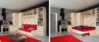
- To increase the functionality of the room, furniture transformers are used.
- To visually raise the ceiling, you can install a small chandelier instead of a large and bulky one.
- Using shelves instead of cabinets can give your interior a more miniature look.
- You can use a spectacular contrasting wall as a division.
This, in combination with the shades of the bedroom or living room, will allow you to highlight this or that area against the background of the entire room.
Furnishing features
a combination of materials with different textures.
Before you start renovating a room, you need to carefully consider all the nuances. Don't clutter the room with unnecessary furniture that isn't needed. This includes poufs and chairs, chairs, wardrobes.
- A number of rules can make a room more spacious:
- Give preference to functional interior elements.
- Use open shelves to store various items along the walls.
- Ditch the TV stand.
- The sofa can act as a bed.
Things shouldn't be confusing and cumbersome.
It is also not recommended to place objects on communication lines indoors. It’s a great idea to purchase transformable furniture, it could be a sofa, folding chairs or tables. Avoid blocking the bedroom and living room by using niches and bay windows for storage.
Arrangement methods
The symmetrical option is one of the most common. There is no need to invent anything - just paired things are installed on the sides of a certain object or relative to an imaginary axis. Alternatively, armchairs near a coffee table or fireplace. In the case of diagonal symmetry, objects are located in opposite corners of the room. Moreover, it is not necessary to use the same elements. Chairs of different colors look original and unusual. It is in rooms of regular shape that it is most interesting to use this method of arranging objects.
The asymmetrical option involves placing elements near a specific focal center (window, door, fireplace). To create balance, the size of objects and their “weight” in the interior are taken into account. Therefore, the large item is placed closer to the center, and the small item further away. An asymmetrical setting can also visually correct the proportions of the room. And you definitely need to imagine how the composition will look from different angles. After all, if you slightly unfold a large sofa, you will be able to visually reduce its length and “weight”.
With the circular principle, things are installed at the same distance from a certain center. If there is a round carpet in the middle of the room, then it can be “outlined” with pieces of furniture (chairs, tables, sofas). The most popular centers are tables and lamps/chandeliers. Typically, rooms combine different types of arrangement of objects. For example, circular and asymmetrical or circular and symmetrical.
