We are doing redevelopment
It’s good if the layout of your home fully meets your requirements and you don’t have to change anything, but there are times when redevelopment is necessary. First of all, this applies to families with children (turn a 2-room apartment from a one-room apartment) who need a separate room, or when the apartment’s rooms are small in size.
There are several options for remodeling the premises:
- partial demolition of walls, thereby increasing the living space. For example, by removing the partition between the kitchen and living room, you will achieve a visual expansion of both rooms. The same effect can be achieved by combining the hall and hallway. However, it is worth remembering that only non-load-bearing walls can be demolished, otherwise the consequences may be negative;
- construction of additional interior partitions. Such redevelopment will allow you to increase the number of rooms in the apartment, turning a two-room apartment into a full-fledged three-room apartment;
- increasing the area due to a loggia or balcony. If the first two options do not suit you, pay attention to the balcony or loggia. By insulating them and combining them with the bedroom, you get a workplace or a corner for relaxation. When a hall and a loggia (balcony) are connected, a large room is obtained, which can be easily divided into zones (working area, relaxation area, play area).
Please note that all changes in the apartment that relate to the demolition or construction of new walls must be registered with the Technical Inventory Bureau (BTI)!
Three-room apartment format
Increasing partitions or dividing the common space into more rooms affects the loss of comfort, but allows more people to live in one space. For many, this is a necessary measure, and standard layouts stipulate that 60 square meters is the norm for three-room apartments. You always want more, but the reality is that you have to get along in such territory.
However, there is always a way out - redevelopment. This can be a banal combination of rooms, if there are no load-bearing walls between them, as well as a different arrangement of partitions, which allows you to change the standard layout. Is there a loggia or balcony? They can also be attached to your living space by adding a few useful squares. This is a way to expand space, but it can also be wisely saved. Let's say that many people underestimate the inter-ceiling space, which is perfect for storing things if you equip hanging shelves, cabinets or mezzanines.
Often in three-room apartments the volume of the kitchen suffers. Some people solve this by simply connecting the kitchen to a nearby room, but this option is not suitable for a large family. Then you need to use design tricks that work great for small kitchens. We have a separate article on this topic on our website, which we recommend reading at this link.
We are furnishing a two-room apartment
Design of a two-room apartment of 60 sq. should be developed based on several factors:
- how many people will live;
- allocated budget.
If a family with one child (several children) will live in the apartment, it would be more rational to designate one room as a nursery, and the second will be a combined bedroom for the parents and a living room. It is better to decorate the interior of the rooms in different colors, adding similar elements: chandeliers or lamps, the same fabrics for textiles, frames for pictures (wall drawings), the same flooring for both rooms. This approach will make the apartment design complete. Combining the kitchen with one of the rooms will create a single space. If you are confused by the fact that the bed will be visible to guests, simply separate it with a sliding partition or partition-shelf, and the problem will be solved.
If parents do not agree to use their bedroom as a common room, a combined balcony and kitchen will be the solution. This way you will increase the area of the latter and be able to create a full-fledged corner for receiving guests.
For a married couple without children or one tenant, one room is allocated for a bedroom, the second for receiving guests.
Photos of apartments in various styles
Modern style is one of the most popular today because it combines beauty and functionality. It does not exclude the use of elements from other styles, as well as bright, saturated colors, but convenience and practicality come first here.
In contrast to the previous style, Provence in an apartment of 60 sq. m. meters brings decor to the fore, not functionality. The design actively uses antique carved furniture, pastel colors and floral patterns.
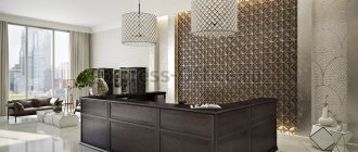
Classic style is something that never goes out of date. Following the established canons, you should choose elegant furniture and expensive textiles, and the decoration should be in pearl and cream tones.
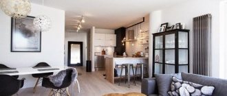
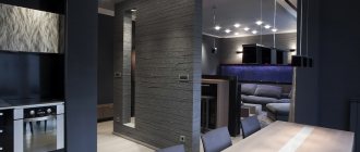
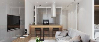
The photo shows a living room in a modern style with a bar counter and a pattern on a brick wall.
Scandinavian interior in an apartment of 60 sq. meters is suitable for lovers of comfort and light walls. It is worth diluting the laconic finishing with soft blankets, house plants, and wooden elements.
Minimalism is characterized by simplicity of form and the absence of any excesses in furniture and decor. In such a room we will not see clutter. Textiles, indoor flowers and paintings are used little, which is important in small rooms.
Neoclassicism, or modern classics, is characterized by noble textures and natural colors. At the same time, one cannot refuse either elements of classicism (for example, expensive textiles, elegant furniture, stucco), or innovations in the form of household and electronic appliances.
Loved by creative people, the loft combines rough finishes in the form of concrete and brick, as well as many wooden and metal elements. When recreating it, it is important to maintain balance, so it is recommended to add glossy surfaces, light textiles and light furniture to the decor to dilute the brutality of the industrial style.
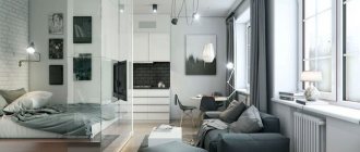
The photo shows a loft-style living room with an additional seating area, which can be isolated with curtains if desired.
If you have 3 rooms
The design of an apartment consisting of 3 rooms is difficult and difficult to create at the same time, since the area of the room is quite large, so it is possible to implement any projects, but connecting all the rooms into one whole composition is problematic.
The main thing that should be taken into account when developing a design project is that each room can have its own style, which should overlap with each other. There must be a clear distribution of zones: rest, work, play. Try not to overload the space, use modern multifunctional furniture.
Since there are many rooms, you can allocate separate ones for the parents’ bedroom and the children’s bedroom, taking into account the wishes of the owners, but decorate the common room together. Due to the large area, the balcony (loggia) can remain a separate room, but have its own individual character.
Apartment design ideas for a young family
For young people, property inherited or acquired with a mortgage should serve as an energetic stronghold. The slightest hint of the Soviet avant-garde ruins the modern style.
Despite living together, do not underestimate the importance of zoning during a period of strained relationships. At the same time, a divided area helps to better concentrate on work and also prevent quarrels.
From here the following project emerges:
- General design – neoclassical, Scandinavian style, loft;
- The location of the zones is welcome inside the bedroom, if there is only one;
- The relevance of additional zones - a dressing room is quite suitable for a large living room or bedroom, a study - is located inside the second or third room;
- Designing a bathroom - it is recommended to use a separate option (in this case, it is important to install a shower and a bathtub inside the bathroom at the same time);
- Kitchen arrangement – includes a set with a separate “island”;
- The hanging structure (balcony, loggia) must be glazed and heated for winter leisure and privacy, respectively.
Among the furnishing items, a young couple may like a bidet, interior sliding doors, wardrobe niches, folding furniture and a kitchen “island”.
Choosing a style and color palette
If everything is clear with the general vision of the apartment and possible redevelopments, then the choice of style and color schemes sometimes confuses the owners.
Among the many stylistic trends, for apartments of 60 sq. m. the following are distinguished:
- modern. The main highlight of such interiors is simplicity and minimalism. They belong to modern styles: eco-design, hi-tech, minimalism, Scandinavian and European. Monochrome shades with rich color accents, straight, strict lines of furniture sets, maximum space in the room - these are the main nuances of modern styles;
- ethnic. A characteristic feature of ethno-design are accessories related to certain peoples and cultures. For example, a room in an African style requires the presence of all kinds of masks, skins of exotic animals, animal prints, while in Chinese there is a predominance of red shades, gold elements, wall painting with hieroglyphs, and specific traditional figures;
- classic or traditional. Luxury and elegance inherent in the castles of aristocrats and kings are the main characteristics of the classical style. It includes: Venetian style, classicism, baroque and empire style. A room in one of the styles will always stand out from the rest with rich accessories, furniture, textiles, but without pretentiousness. As for the color scheme, warm pastel colors predominate here, while using rich shades of textiles to create a complete composition.
Style selection
The design of a small apartment requires an individual approach. The main point is the selection of style.
This is because some styles are not suitable for a small apartment area.
Those that:
- Need a lot of decorations.
- Need big furniture.
- Lots of fabrics.
- Lots of large and luxurious interior items.
All this is not appropriate in a small apartment, and therefore the necessary style will not be achieved.
For small apartments, the style of minimalism, high-tech and others is better suited.
This is because these styles do not require a large number of items and they are convenient and functional to the maximum.
Look also here:
- Electrically operated fabric roller blinds
- Advantages and disadvantages of plaster
Interior design - which one to choose?
Living room or reception room
The room with the largest area is often chosen for the living room, since this is where the whole family will gather in the evenings and receive friends and relatives.
Let us note that the design of the living room, first of all, depends on what function it will perform, whether it will also be a sleeping place for one of the family members.
Let's consider the case when you have a two-in-one living room - living room - bedroom. If the dimensions of the room allow, the sleeping area can be separated from the total area. To do this, they often install a sliding partition, or build a plasterboard wall with mirror inserts or one large mirror. A wooden shelf under the ceiling with a variety of small items, books, and fresh flowers will also look beautiful.
Your main task is not to overload the space, while placing in the room all the necessary furniture (sofa, easy chairs, ottomans), household appliances, and, if necessary, a dining table. If possible, place furniture along the walls, leaving the center free.
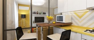
If you plan to combine the living room with the kitchen, install a bar counter at the border between them. It will visually separate the rooms without overloading them.
If the hall is combined with a hallway, a decorative partition that acts as a wall, as well as different floor coverings, will look beautiful.
Choose everything regarding the shades of the walls and floors based on the chosen style.
Living room interior design project
The entire space of the entrance area smoothly flows into the living room and kitchen. The interior design of the living room is made with the main beige shade in the palette. To create contrast, complementary colors are blue and lemon. To emphasize that the interior belongs to a modern style, in addition to the flat facade set in the kitchen apron area, a photo print depicting an industrial city was chosen.
The walls of the walk-through living area are decorated with decorative white bricks and paintable wallpaper. For the flooring, it was decided to use teak boards and atlas concorde time bronze lap porcelain tiles. both in the kitchen area and in the hallway.
The entire small kitchen space has been ergonomically used for storage: the cabinets go to the ceiling, providing greater capacity and ease of use.
Kitchen Design
The kitchen is the most visited place in the apartment, so its design should be approached responsibly, achieving harmony between the decoration of the walls and flooring with kitchen furniture and household appliances. Designers advise:
- do not use more than three colors;
- the floor and ceiling should not be the same tone;
- play with contrast. If the kitchen wall is light, add color to the upholstery, curtains, and paint the walls a bright color. The same principle applies in reverse. If the cuisine is rich, then everything else is discreet.
The main factor in choosing a design for a kitchen is the number of people in the family, since it is this who will determine the area allocated for the dining table. If the family is large, it is advisable to place the kitchen set along the walls and leave the center for the table. If the family is small, the best choice is a kitchen corner, leaving the center free. If possible, use the space under the window; a work surface placed in this place will make it possible to place more kitchen furniture around the perimeter of the kitchen.
Choose a color scheme based on the size of the kitchen. Remember that dark shades visually make the room smaller, while light shades do the opposite. If you want to add height, draw vertical stripes; if you want to expand the space, add a horizontal pattern on the walls. The best combinations are: white with blue, black and red; basic gray with dark pink, purple, red; yellow with purple, blue, black, gray. Black is an elegant and versatile color that goes with all shades.
Bedroom design
Note that a room is allocated for the bedroom, which is located as far as possible from the front door, this will ensure maximum comfort during rest.
For wall decoration, choose warm, muted shades that allow you to relax and your bedroom will seem not only larger, but also more comfortable. Bright accents are acceptable, but it is better to place them on the wall behind the head of the bed.
The amount of furniture is minimal: a bed, bedside tables, a wardrobe, a dressing table with a dressing table. If you don’t want standard (wooden) bedside tables, place small glass tables near the bed. A wardrobe with mirrored doors will add volume and light.
As far as textiles are concerned, it is more rational to cover the window with transparent curtains in combination with thick curtains. This way you can regulate the lighting in the bedroom. Bright decorative pillows will dilute the pastel walls, choose a carpet to match them and get a complete set.
An original ceiling structure made of plasterboard, or a similar one on one of the walls, will add zest to the design of the room.
Setting up a nursery
The design of a children's room should be selected exclusively according to the wishes and gender of the child who will live in it. Adults can only gently guide the child.
A room for a girl, regardless of the age of the owner, should be as bright and cozy as possible. It is better to choose a color scheme in warm colors, making bright accents in several places. A prerequisite for any children's interior is the zoning of the room and maximum functionality of the furniture. Be sure to consider not only ceiling lighting, but also several local points for greater comfort in the room. The style of a girl’s room will grow with the owner; “magic designs” are typical for younger children. But for a teenage girl, modern, high-tech, minimalism, country, and Provence are more suitable.
The design in the boy's room differs only in stylistic nuances; all other conditions are similar - functionality, zoning, lighting. Choose, “sea voyage”, “beauty of the starry sky”, “playing together with the characters of your favorite cartoons”, but remember that it is better to make the walls dim, it is better to dilute the interior with stylistic accessories.
In a room where two children of different sexes live, it is best to roughly divide the room into two parts and make each their own small corner.
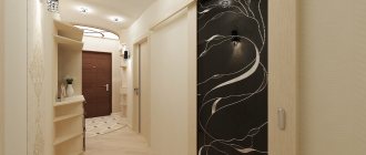
Hallway design
The hallway is the first one that welcomes guests into your home and gives an understanding of your apartment, so its design also needs to be approached meaningfully.
The first thing that designers recommend avoiding is dark shades in the decoration. Choose a practical but light finishing material for the walls, and you will see how the room will change dramatically.
An important aspect of the hallway interior is lighting. In addition to the main lamp, place several spotlights, they will add coziness. Place a large mirror in an original frame; it will also add light and depth to the room.
Second, maximum functionality of the furniture. A built-in wardrobe will accommodate outerwear and shoes, and mirrored doors will add volume. An alternative solution is an open hanger and a small bedside table for shoes. You can also decorate part of the wall with light leather, attach hooks for clothes - you will get an original hanger.
Pay special attention to the flooring. It is better to lay tiles (3-4 rows) near the door, and then it is quite possible to install laminate. If you have a combined hallway, this will allow you to separate it from another room.
Project photo gallery
Get the full catalog of design projects for freeYou can get detailed advice on choosing the style of interior design for your apartment by calling 8 (812) 925-66-52.
Bathroom and toilet design
Although the bathroom is not the most visited place in the apartment, the selection of design for it must be approached as carefully as for other rooms. The main criterion that you need to rely on when decorating a bathroom is a small area. Even if you have a combined bathroom and it seems to you that there is enough space, refuse dark colors in the interior; this is the prerogative of large bathrooms. Choose facing materials in bright, but not flashy colors. Combining several color shades will visually expand the room.
To visually increase the height of the ceiling, use one design trick - make several vertical rows of tiles that are darker than the main tone. Another win-win option would be large mirrors.
If the thought of a visible toilet is unpleasant to you, but you have no other choice, try to “disguise” it. A white toilet against the background of white walls will not be visible, or separate it from the main room with a low partition to match the walls, and it will not be “catchy” to the eye. As for stylistic trends, for the bathroom they most often use: modern, high-tech, classic, Japanese minimalism, marine themes.
As you can see, the apartment is 60 sq. m. is a sea of possibilities and design options. Choose your option and enjoy!
Materials
The main material used is concrete, which can be observed when examining the main large elements of the interior. The beauty of the large dark gray concrete planes is set off by the golden-nickel tones of the wooden panels and elements made in African limba ofram wood; the metal-clad kitchen pylon with a cantilever top also looks interesting.
