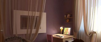
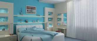
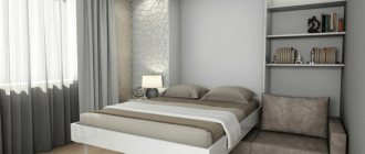
It’s good when the bedroom, living room and all other rooms have a standard, close to square shape.
Laying laminate flooring in a narrow long room.
If in your apartment or house there is a room whose shape is more like an elongated and narrow rectangle, do not rush to get upset: you just need to make a little effort, and it will become very comfortable, cozy and pleasant to live in.
Features of layout and design
A win-win layout for a rectangular room is one that visually brings its shape closer to a square. At the same time, it allows you to effectively use every centimeter of space. For this purpose, design techniques are used at the finishing stage, which we will talk about later.
The second option is to divide the room into several distinct zones, and move each of them individually closer to a square. Here we need an island layout and zoning with color and light. And if the total footage allows, then even partitions or plasterboard structures. Minimalist interiors look best in such complex cases. Pay attention to the modern contemporary style, which is entirely based on practicality and functionality. But with classic designs that tend towards symmetry and pronounced centers, there can be problems.
General recommendations
If the room is large enough, then you can allow a violation of symmetry when placing furniture. You can use corner sofas in the center of the room, it will look unusual and stylish.
You can also place a coffee table and a couple of chairs near the sofa; this will become a kind of center of the room.
When using styles based on minimalism, it is better to refrain from decorating at all; it will only take up space.
How to arrange furniture?
If the rectangular room is not too narrow, you can concentrate all the main furniture against one wall. A similar linear arrangement is often used in the kitchen - and as a result there is more space for relaxation and hobbies. But in rooms that are too elongated there is a high risk of getting the effect of a compartment car.
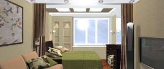
For clear zoning of the room, choose an island layout. Mentally divide the room into squares and design each one as a separate room within a room. Turn the sofa perpendicular to the long wall, use light through shelving instead of partitions, and set up a bar counter.
Instead of a large amount of furniture, try installing one wardrobe in the entire narrow wall from the floor to the ceiling. All your things will fit in it, it will cut off a long wall, and you won’t have to look for where to put chests of drawers and shelves. But if you can’t place it exactly there, then it’s better to abandon it altogether.
In spacious rectangular rooms, an unusual broken arrangement looks advantageous. For example, a sofa or bed at an angle to the wall attracts all the attention. There is only one problem with such layouts - most often the furniture needs to be made to order according to its dimensions.
8 Free Interior Design Software
Zoning a rectangular room
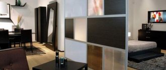
Zoning with partitions is the simplest and most obvious technique. These could be low plasterboard structures, Japanese-style sliding partitions, or modern glass blocks. In some cases, even curtains will do - it all depends on your layout.
The main visual technique is a combination of different finishing materials. This could be different collections of wallpaper companions, or a combination of laminate with ceramic tiles. To make the border less contrasting, when painting the walls, use one primary color, but in several adjacent shades. Or, on the contrary, make one of the zones a bright accent - brickwork or photo wallpaper.
Plasterboard structures do not have to be vertical. Multi-level ceilings with complex lighting for each individual zone are a completely workable option. On the floor there are podiums, which at the same time help to use different coatings without joints and thresholds. You can build drawers for things or even a pull-out bed into the high podium.
80 living room design ideas in Khrushchev (photo)
Floor
In order to create the illusion of the correct shape of the room, parquet or laminate flooring installed in the bedroom should be laid not in accordance with logic and common sense, but based on your interests. That is, along a short wall. Undoubtedly, this is more tedious and will take more time. But the desired effect will be guaranteed to be achieved. You can achieve a square floor pattern in the room or put a square rug on the floor. Their geometry will have a beneficial effect on perception.
Decorating: how to change the shape of a room?
The two most powerful visual techniques will help you adjust the shape of a rectangular room. Firstly, you need to knock down symmetry, erase clear boundaries and shift centers. Secondly, use bright accents that shift attention to yourself.
Floor
The best option for a floor in a rectangular room is a covering with the same elongated rectangular pattern. For example, parquet, laminate or tiles styled after it, which are laid along long walls. And for zoning, use small decorative carpets of different shapes and textures.
Walls
A short accent wall opposite the entrance immediately attracts attention. To do this, use textured plaster, bright colors, brickwork, stone cladding, contrasting wallpaper or a whole composition of bright panels. To add dynamics, move the active zone into this part: a coffee table with chairs, an armchair with a bookcase, a small green corner.
If you zone a room with different finishing materials, move their transitions. The point is that the joint should not be clearly in the corner or in the middle, but in some more unexpected place. This breaks the symmetry and immediately visually transforms the geometry of the room.
Remember that vertical stripes visually elongate the outline and raise the ceiling. Horizontal - they move the walls apart, but they need to be periodically broken up with perpendicular verticals. For example, by arranging furniture or compositions of paintings and photographs.
Ceiling
A strong technique is erasing the expressive boundaries between walls and ceiling. To do this, paint them tone-on-tone or choose a matte stretch fabric of the same shade. At the same time, a feeling of space, airiness and height will appear.
Do not use a single-level glossy ceiling for the entire room if it is very narrow. Reflection gives volume, but gives it upward - and this makes the situation even worse. In this case, it is better to make a multi-level structure and install glossy inserts in zones.
Lighting and backlighting
Lighting allows you to correct all those shortcomings that remain after choosing the finish and layout. It gives both a visual and a functional effect, so this aspect should not be neglected.
Chandelier and lamps
A central large chandelier in a rectangular room is simply ineffective because the light is not distributed evenly. If you want, use a series of pendant lamps zoned: above a table, sofa or bar counter. They can be complemented with wall sconces with streams of light directed upward - this will visually raise the ceiling.
The most comfortable light is provided by spotlights around the perimeter, especially with a dimmer switch. Or you can line them up in two rows along short walls to make them appear larger. They ideally complement multi-level ceiling structures: both tension and plasterboard.
Decorative lighting
Decorative lighting helps both for zoning and for creating atmosphere. Using LED strip you can highlight podiums, niches and plasterboard structures. The asymmetrical “floating” ceiling, which is made with LEDs, looks interesting. The same tapes are suitable for decorating shelves, work areas, cabinets or racks.
Polycarbonate gazebos: design ideas (70 photos)
Unwanted items in the bedroom
It is advisable to enhance the correct placement of the bed with the overall harmonization of the interior. Many items weigh down the space and negate all the efforts spent.
Table 1. What to avoid when arranging a bedroom
| Name | Description |
Massive things | This category includes bookshelves whose height is more than 1.8 m. Installing such structures above the heads of sleeping people is not acceptable. Any bulky piece of furniture in this area can cause insomnia. |
Volumetric chandeliers | Large chandeliers in the bedroom give the room an overly formal status and are considered a source of subconscious anxiety. They give off bright light. Such lighting intensity in a recreation area is not acceptable. |
Mirrors | There should be no mirrors opposite or above the sleeping area. In addition to the fact that they distract, according to Feng Shui, any psiche or dressing table is considered an energy reflector. Since during a night's rest a person is freed from negative emotions, the mirror will ricochet this negative energy in the morning. A person may wake up tired and depressed in the morning. |
Uncomfortable mattress | A poor-quality foundation will ruin your sleep even on a perfectly placed bed. |
TV or computer | The bed should not be located less than 3 m from electrical appliances. Harmful radiation negatively affects the physical well-being of the sleeper. |
Bunk bed | A dubious option from a feng shui perspective. It is believed that the person on the lower bunk will be under the psychological and energetic influence of the one sleeping on the top bunk. |
Water tanks | It is not advisable to install large water tanks in the sleeping area. It is preferable to place mini fountains and aquariums in the living room. |
Rectangular room - interior ideas
As we have already found out, rectangular rooms are not uncommon. And some rooms, like the hallway or kitchen, almost always look like this. Let's take a closer look at what you might encounter in real life!
Rectangular kitchen design
The main difficulty of a rectangular kitchen is not to turn it into that same compartment car. Move the active dining area to a narrow accent wall, use the window sill as a tabletop, and delimit the room with a bar counter. If there is a set near a short wall, a linear one will do, but in other cases, choose a corner or island set to conveniently place the working triangle.
Design of a rectangular living room (hall)
Based on where the seating area will be and how the sofa will be placed. In spacious rectangular rooms it will fit well against the long wall opposite the TV. But if it’s too small and narrow, pay attention to corner models, set it perpendicular, or even replace it with several chaotically placed chairs.
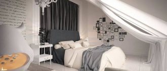
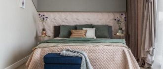
Rectangular bedroom design
A rectangular bedroom looks best with a minimum of furniture or with one large closet against a narrow wall. The main thing is to think about the location of the bed, taking into account the width of the room, so that there is a convenient passage on all sides. Move all other details to the opposite part of the room - and there will be that same expressive zoning.
Rectangular nursery design
In the nursery, you need to allocate at least three zones - for sleeping, for studying and hobbies, for games and leisure. In this case, a rectangular room is rather a plus, because you can simply arrange them one after the other. And if you don’t have enough space, use transformable corner sets, in which the bed is already combined with shelves, a closet and a desk into one multi-level structure.
Rectangular bathroom design
In the bathroom, the technique of shifting active centers works again: to do this, install the bath itself against a short accent wall. It is better to place furniture either in the corners of the door or in the form of a small linear set. But choose the most narrow and compact models, ideally with sliding doors instead of hinged ones.
Rectangular hallway design
A rectangular hallway that smoothly flows into the same corridor is a classic. And this is perhaps the only case where a large wardrobe or set can be left near a long wall. Here it is more important not to turn the room into a square, but to make it as practical and functional as possible, with all passages and doors.
Did you like the post? Subscribe to our channel in Yandex.Zen, it really helps us in our development!
