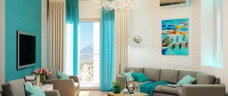
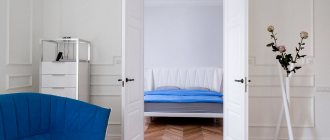
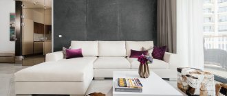
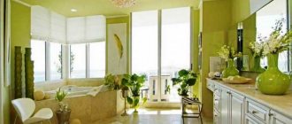
Psychologists have noted that many people perceive the color gray as something not very pleasant, but does not cause obvious negative emotions. Therefore, everyone understands the expressions where “gray” is known as a sign of something boring and inconspicuous. This can be explained by the fact that for many it is close to white and is perceived as an almost complete lack of brightness. However, it is not. It has its own advantages and bright accents that will make the interior unique and inimitable.
Proper use of gray allows you to create incredibly beautiful interiors in a variety of styles.
Unique properties of gray
A couple of centuries ago, this basic shade was associated with the color of aristocrats. And for good reason: such tones go with everything, even not very bright accents stand out against a nondescript background. To complement gray, you can use rich, complex shades of red, blue or green. At the same time, no one can say about a person with such an interior that he is tasteless.
The color gray has many shades and each of them has its own character, its own characteristics of use in the interior
Gloomy adds stability to the interior. It also calms, which is important for working people who are tired of the hustle and bustle and constant movement. This psychological impact is enhanced if you combine it with others: white, beige or black.
The influence of gray on the psyche
Gray increases self-esteem and self-confidence, promotes practical decision-making and increases intelligence. Of course, it is difficult to believe that the situation has such an influence on us. But it is so. Psychologists consider this color the epicenter of calm and balance.
However, with prolonged exposure to dark shades of gray without bright admixtures, depressive thoughts arise. Life turns into a dreary road of fatigue. There is no need to talk about the ability to make creative decisions here. But lighter shades relax and help restore strength.
Combination of gray with other interior colors
It looks good in a composition with white or light gray. However, in a living space, the interior of such colors will be too “lifeless”. Such combinations are an excellent solution for the office. It is recommended to dilute the design of an apartment in gray tones with natural shades - sand, sea, delicate lavender.
Diluting gray with natural elements or light splashes allows you to get a trendy interior
A monotonous gray interior is almost perfectly diluted with yellow, regardless of the mixing proportions
Enhances the brightness of other, even the most dim, tones. The atmosphere in the room changes depending on what colors are added to the interior in addition to the basic one. Gray with blue is refreshing. They will add elegance, freshness and lightness to an apartment in gray tones. Gray with blue looks much stricter, but does not remove the sense of style from the room. Blue helps to liberate the imagination. It also goes well with pink and purple. In such a union, he looks the warmest. Gray with red or sunny orange will help revitalize the atmosphere and add energy to it. Such combinations fit into retro style or the latest style. Gray and yellow give the interior joy and optimism. Bright yellow looks even more accentuated and attractive against this background.
Combining gray with beige gives a psychologically comfortable interior, ideal for rest and relaxation.
Delicate dining room
The alliance of light and mirrors is better suited for one-room apartments than anywhere else. One color scheme expands the space, and accent green inserts attract attention and help to concentrate on the main thing. The marble-effect tile hallway ends in the kitchen, where the flooring flows into elegant light parquet. It contrasts charmingly with the furniture's chocolate legs and green velor. The elegant combination of colors calms and sets the mood for leisurely conversations over a cup of coffee or a glass of wine. Corrugated surfaces really appear here and there, and absolutely unobtrusively, like beloved friends whose appearance in the house is always welcome. This simple geometry emphasizes the height of the ceilings and helps separate the kitchen and dining space.
The softest green chairs are like the first leaves on the trees - they are so bright and soft. It will be great to take a comfortable position on them and sit in it for several hours.
A little further away there is a gray sofa opposite the TV and console. The picture of minimalist comfort is complemented by abstraction on the wall, greenery of pillows and a living plant. There is a table next to the sofa. It blends beautifully with the tone of the curtains, giving a feeling of security and warmth.
Decorating different rooms in gray tones
Lead is considered neutral, so it is perfect as a background. By painting the walls in light gray shades, you can use furniture and accessories of almost any, even very bright, “accent” colors. At the same time, the interior will retain its zest, will not be “flashy”, will maintain consistency and peace.
The combination of gray walls and white doors in the hallway interior looks noble and rich
If there is an emphasis on details and furniture, then for the main surfaces it is better to take a light grayish tint.
Bedroom
There is no need to worry about lead in the bedroom. This tone gives the bedroom a calmness, which is what this room needs. Thanks to the gray color, the room creates coziness and harmony. A light tone will look good in the room, which goes well with elegant decorative additions: a vase, a figurine, a lamp.
The gray-green combination is pleasing to the eye, calms the nerves and promotes good rest.
Bathroom
In the bathroom it goes well with blue or beige. Gray walls will help give the room peace and relaxation. This color can also be used in the bathroom. But on the floor it will appear “dirty” and be associated with dark sand.
Gray ceramic tiles are less likely to show streaks and splashes of water.
Living room
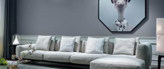
In the living room, gray gives the effect of chic and luxury, wealth. Light gray tones will look better. The atmosphere of the room will acquire a feeling of lightness. If you use darker shades of gray, for example, wet asphalt or lead, then the room will look strict and conservative. Noble textures and bright accent colors will help make the interior smoother and less harsh. Gray will prevent the room from being too busy. But such a living room is not suitable for a studio apartment.
In a small living room, it is better for gray to play an accent role
Kitchen
Gray is a symbol of purity and innocence. The kitchen is exactly the place where this perception “works to your advantage.” Most often, cleanliness is needed in the kitchen. Monochrome kitchens are popular not only in modern styles, but also in others, even the most elaborate ones. Kitchen furniture can be anything: matte, glossy, interspersed with sparkles or not. She will invariably retain her aristocracy.
The kitchen interior is often decorated in a cozy gray-brown combination.
This color is also chosen for kitchen floors, since dirt is not visible on it. In addition, gray is the tone of natural stone, which is why such tiles are widely popular. In a kitchen with a “non-flashy” color, a person feels especially calm and peaceful, but at the same time he does not have the desire to spend too much time in it. For comfort, the monochrome color must be diluted with bright accents or wood. For example, put laminate on the floor. You can use bright tiles and wallpaper to decorate the walls. Chairs and a table can also be made from wood. Such a room acquires a special “warmth” because it is associated with a person’s natural habitat.
Living room with open kitchen
In such a living room, it is better to avoid dark gray and turn your attention to lighter colors. They look great in natural light and add sophistication to the room. The room seems more spacious.
Gray kitchen-living room in Scandinavian style
Children's room
Gray is not considered good for a children's room. However, if the child is hyperactive, then this color will calm him down. But in combination with bright accents, it will stop being so boring and joyless. It will look good in combination with red or pink.
A worthy solution would be gray wall decoration in combination with light furniture
Cabinet
The design of the office should be compatible with work. Made in gray tones, it gives the room severity and restraint. In addition to gray, you can use brown or black. Blue accents will restore a feeling of energy and relieve fatigue. Green will help you get into a “working mood”.
Ash and steel colors are considered the best shades for creating a business atmosphere
Shades of gray: the best options for design
Below are some current tips from interior designers on working with this range.
The interior is made entirely in gray tones and is complemented only by shades of living greenery
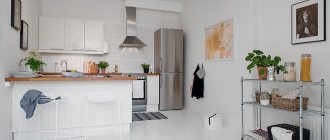
1. To visually enlarge a small space and fill it with light, choose the lightest colors with a glossy finish close to white.
Light gray color, close to white, makes this small kitchen lighter and more spacious
2. Dark colors are more suitable for large spaces or accent items, and a pronounced texture (velvet, wool, fur, textured plaster) helps to adjust the geometry of the space and hide unevenness.
The velor texture of the upholstery emphasizes the depth of the gray shade and makes the sofa an accent
3. Shades with yellowish and brownish undertones (for example, stone, clay, taupe) add warmth and coziness to small, dark rooms: this is an excellent choice for the bedroom, small living room and bathroom.
Light gray with brown undertones creates a warm atmosphere in this small nursery
4. Cool tones with a pronounced blue undertone (graphite, smoky, steel) should be chosen for spacious and well-lit rooms: due to the effect of natural shadow, these shades emphasize the volume and depth of space.
Cool gray in the interior of a large bedroom emphasizes its size and ceiling height
5. To create a trendy monochrome design in gray tones, pay special attention to the gradation of colors by saturation: the most appropriate would be a transition from a light shade on the walls to a darker and deeper one for furniture and decor.
In this monochrome gray interior, light shades are chosen for the walls and floors, and darker shades are chosen for the armchairs and decor.
In a monochrome interior, it is better to combine shades of the same temperature (either all cold or all warm): this way, any bright accents will look harmonious with the overall background, forming a holistic image of the room.
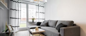
This living room features various warm shades of gray.
6. Greenish shades (gray-olive, muted khaki) have the most pronounced calming properties: this is the best choice for the bedroom and nursery.
A calming, muted shade of gray-green perfect for the bedroom
7. Pinkish and lilac-gray tones combine restraint and conciseness with softness and tenderness - an excellent solution for common spaces in a large family home (kitchen, living room, main bathroom).
A pleasant gray-lilac shade was chosen to decorate the walls of this kitchen-dining room.
8. The basic graphite and steel range can look ultra-fashionable: if you want to create the most trendy interior, pay attention to the combination of the two main shades of 2021 according to the Pantone Color Institute - background Ultimate Gray and rich yellow Illuminating.
The combination of the main colors of 2022 in the interior - Ultimate Gray and Illuminating yellow
Gray floors and walls
Neutral background walls help tie the rest of the colors of the details and door together. Gray on the walls is an excellent solution for a complete change in the interior, it will help give the room lightness. But to decorate walls in residential areas, it is better to dilute it with blue and pink so that the shade is not so faceless. These colors will definitely appeal to those who like Provence, romantic or classic. When choosing a shade, you must take into account the fact that the room will be transformed under the influence of daylight or artificial light.
Gray walls create a romantic atmosphere, enveloping the room in a mysterious haze
Gray wallpaper looks nothing like paint. They may have stripes, patterns or geometric shapes. If the emphasis is on the wall, then you need to choose wallpaper with a light print.
In a room with gray wallpaper, a floor with a pronounced wooden texture would be appropriate.
Using gray laminate in the interior
This flooring is often used in European classics. This flooring can be easily combined with white, gold or metallic colors. Also, this laminate will fit perfectly into the gray and white design of the apartment. But in order to avoid overload, you need to take into account several nuances when choosing a gray laminate:
- Gray on the floor visually makes the room smaller, so it is not suitable for a small room, a one-room apartment.
- Gray laminate in the interior of an apartment will “calm” the room, make it softer, fresher and more spacious if the interior has a lot of massive furniture. He is considered by many to be very beautiful and sophisticated.
- Grayish-beige, gray-violet laminate will create coziness in the room. This color is perfect for relaxation and creativity, creating unique projects. But for a work area this coating will be a bad solution.
Gray laminate flooring in the living room
Gray laminate in the bedroom
Gray laminate in the kitchen
Gray wallpaper - boredom or style?
Gray wallpaper for walls in the interior requires some addition. Walls covered in plain wallpaper are an excellent backdrop for brightly colored objects and details.
Furniture of unusual shape and color will look advantageous against a gray background. Properly selected lighting and decor will turn a room with gray walls into a real masterpiece.
Furniture and accessories in gray
Accessories in neutral colors always look great. This is due to the fact that they do not attract too much real attention and easily fit into the interior. They mute other bright accents and bring restraint to the interior. Pale gray colors mute other shades, so a feeling of “prestige” and sleekness is created. Silver floor lamps, lamps, vases also play a role in increasing stateliness.
Gray walls will serve as an excellent backdrop for bright pieces of furniture.
Gray furniture can be used to create beautiful and bold interiors with a fashionable and functional design.
Gray always looks harmonious and natural if you learn how to combine it correctly. It will give the interior a special chic that many strive for.
Current combinations in the hall and hallway
Furniture in gray tones is a traditional option for furnishing the hall and corridor. However, this does not mean that they cannot be used in high-tech, modern or loft styles. The main thing here is to choose the right decor.
Gray furniture for the hallway and living room is appropriate only when it is possible to keep the walls and ceiling in the same color. Moreover, in such a situation it is recommended to use different half-tones of gray.
Photo examples of using gray in apartment design
Graphic loggia
The bedroom and loggia are connected and form a common space. On the balcony there is an office where you can work or do your business alone. It is small, and the light walls will help supply it with “oxygen”. The same chair, only green, has already been found in the kitchen, and the soft velor chair is made in the same style. All together these details form a single composition of elements. Panoramic balcony windows are a plus for this beautiful apartment.
Neoclassical style in the living room
In our design studio there are especially many orders for projects in the style of delicate neoclassical style. This direction cannot be described in a few words. But in short, neoclassicism is a fresh and new look at a well-known classic. Stylish lamps, “carriage screed” in the upholstery of upholstered furniture, pastel colors, wall moldings - all this perfectly characterizes this direction.
Living room in neoclassical style
. Pillows of different sizes and shapes, but in the overall color scheme of the interior, will look great in the design of the living room.
Signs of style
. Neoclassical and classical styles combine the rules of symmetry in the arrangement of furniture and in the arrangement of decorative items. Neoclassicism welcomes laconic complex facades, stucco molding, wall moldings and draped curtains.
Living rooms in neoclassical style
Sockets
in the living room in gray
It is advisable to make sockets with a reserve and take care of their location in advance. Decide on the location of the floor lamp, table lamps and their number. It is very important to remember about the television zone. After all, there must be a lot of sockets that must be hidden. This can be done using a cabinet or TV. The same can be said about the electric fireplace. By the way, you can think about placing the New Year tree in advance. Or rather, about where the New Year's garlands will be included. About 15 sockets will be enough for this room.
TV in the living room
size and location
Placing a TV in the living room
. A TV with a large diagonal will look much more beautiful in the interior of the living room.
Location
. The most suitable and successful location for the TV would be on the wall opposite the sofa. Note that the distance from the sofa to the TV does not matter, because new models can be placed even close to the screen.
Cabinet or bracket?
At your request. It is very important to design the television area concisely and beautifully. Think in advance about a cable channel in which all the wires and all the necessary sockets will be hidden. In order not to spoil the design of the living room, you should hide all communications.
Height from floor
. The optimal location of the TV is 1 m from the floor to the middle of the TV. It is at this location that the eye level of a sitting person is located.
Diagonal size
. If you can afford not to save on a TV, then choose models from 50 inches. Small screen TVs look lonely and even a little out of place on an empty wall.
Film projector as an alternative
. A film projector will not need a screen if your walls are light and smooth. You can lower it yourself, but you can also purchase an electric model. Powered models will require power. Don't forget that all wires must be hidden. It is also very important to decide on a location for the projector. Decide whether you need a permanent mount or whether a removable mount that will only be used during movie viewing will suffice. In order to enjoy a bright and high-quality picture, do not forget about blackout curtains.
Lighting
in a gray living room
Lighting in the living room should be given special attention, because this is what gives you coziness and comfort. There should be a lot of light in this room. Think in advance about providing several different lighting sources at once.
Living room lighting
. Minimalistic lamps were matched to the brick wall. They may be from different collections, but they are united by one style – loft.
Lamps
- are part of the decor and should be combined with the overall style of the living room. Today it is very fashionable to use lamps from different styles in one room, but in the same style. It is advisable that the living room have several types of lighting at once: local, basic and intimate. After all, with a change in lighting, the general mood of the room also changes.
overhead light
- is the main type of lighting, which includes work lights and chandeliers. By the way, it is not necessary for the chandelier to shine brightly, but to support the overall style of the room. /p>
Toward the local light
include various floor lamps, lamps and sconces. However, regarding the last option, you should know that sconces are rarely used in modern interiors. As an alternative to this type of lamps, choose stylish lamps.
Intimate light
— this category includes candles and garlands. Garlands used in the interior provide an even, warm light. With their help you can make your living room more comfortable. Garlands can also be used as a night light.
Candles
. Here we should only talk about the choice of candles. Large, plain candles are best suited for the interior. The best options would be white candles with a matte or rough structure.
Zoning
. Lamps are an excellent solution for visually dividing space. This solution is especially relevant in combined rooms. For kitchens combined with living rooms, it is necessary to provide working lighting (for the cooking area), as well as several pendant models (above the dining area or above the bar counter). As for the living area, you also cannot do without main and local light. Cozy lamps near the sofa are perfect for this area, and it would be best to place a floor lamp near the armchair.
Blue in the interior
When we come to the sea, look at the water, breathe the sea air, we immediately relax. Blue in the interior has the same effect.
Blue-blue tones in the room remove aggression and restore peace of mind. For melancholic natures, dark blue is associated with depth and anxiety - it excites, desponds or depresses. Use it wisely and carefully at home:
— dilute in doses with other colors;
— choose blue for small rooms: it visually enlarges the room;
- use light colors (turquoise, azure, cornflower blue) for large surfaces (walls, ceilings), and rich, dark shades for accents.
Living room-office
Owners of small apartments know how difficult it is to find a place to work. That is why the bedroom or living room is chosen for the location of the desktop in such apartments. You need to choose the location and size of your desktop based on how often you plan to use it. If you use a laptop, then a table with a width of 50-60 will be an excellent option, but for a desktop computer you need to choose wider models - from 70 cm.
Living room design
. This project is clear proof that a work area can be made as inconspicuous as possible with the help of color. The shelves and desk almost merge with the wall, and the chair is used as a color accent.
Below you will see several convenient layouts with a work area in the living room.
1. Location of the desktop in the far corner. If you don't often work in the living room, then this arrangement will definitely suit you. To keep your workspace from being too conspicuous, use a shelving unit or a screen, and you can also choose a table of the same color as the walls.
2. A workplace by the window is one of the best solutions for freelancers. This desk with an extended window sill is perfect for working with a desktop computer. This solution will especially appeal to those who have a long and narrow living room, since such a table will visually make the room larger.
3. Desk in the closet niche. An excellent solution to prevent chaos in the room due to creative clutter. After work, you can immediately hide your workplace.
Desk in the interior
Correct opening of the door in the living room
In or out?
Opening the door in the living room
. To avoid drawing attention to the doorway, choose an invisible door without trim. By painting it the same tone as the walls, the door will become as invisible as possible.
Which way should the door open - outwards or inwards? There are no rules here, since everything depends on the layout of the room and the arrangement of furniture. It is important that you feel comfortable opening and closing doors and entering and leaving the room. Also, the door should not interfere with access to the closet or wardrobe. In some cases, there is only one solution left - to move the doorway. You can also install a sliding door-compartment or a folding door-book.
1. Excellent location of the doorway. When opened, the door will not block the entire corridor. The figure also clearly shows that this option does not interfere with visiting the room. However, there are also disadvantages - when opening the door will hit the cabinet.
2. Not a very good option. The door will take up a lot of space and block the entrance to the living room. It is advisable to change the direction of the door or install a folding or accordion door.
3. Bad decision. In order to open the door you will need to constantly step back. This will be especially inconvenient if the apartment has a small narrow corridor. In this case, it is best to give preference to folding or sliding models.
4. The most convenient solution. This way the door will not interfere with the passage to the room. In addition, this is a convenient solution from a fire safety point of view.
