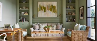
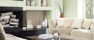
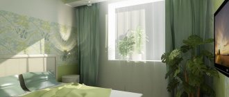
Olive color fills the interior with the warmth of nature, the freshness of summer and carefree charm. It contains calm and tranquility, which we transfer into the design of the premises. With the help of olive, they create surprisingly harmonious interiors that give home comfort and a feeling of joyful anticipation.
This color combines green, gray and yellow. It is a complex shade, which only makes it more interesting and mysterious. After all, it is its ambiguity that attracts us, on a subconscious level. In addition, olive harmonizes perfectly with many other colors, which only adds to its attractiveness. Even a novice designer can easily create a beautiful and noble interior with his participation.
Psychology of olive color
Olive is the sibling of green. It is classified as natural, therefore it is associated with freshness and youth. Symbolizes a bright and interesting life, full of positive moments. Dark shades represent wisdom and nobility. Olive evokes a feeling of security, a solid foundation under your feet.
Olive is also associated with conservative views on life, so it is often chosen by confident people who know exactly what they want from life.
This shade induces calmness and satisfaction from life, and removes depressive and depressing thoughts. It is often used in color therapy. It has a positive effect on the overall psychological state and promotes informed decision-making.
General rules for designing the facade of a private house
As mentioned earlier, working with olive color is not easy, so you not only need to find a good color combination, but also take into account a number of classic rules that apply to the facade of a home:
- For the most spectacular look, it is necessary to think through and create high-quality artificial lighting of the area around the house. The thing is that in the evening the facade of the house may seem dark and gloomy; the presence of high-quality lighting will eliminate this problem.
- When choosing outdoor artificial lighting, you should not use lamps that have a red or blue tint when illuminated. The luminous flux should be classic white, making the façade look lighter and airier even at night. It is best to give preference to LED spotlights.
- The facade of a private house must have light accent elements (light, but not bright). In this way, the olive color will appear fresher, cleaner and more springlike, for example, you can use white entrance doors and window frames.
As a result, I would like to note that olive color is an excellent solution for brave and self-confident people who want to bring themselves closer to nature. By correctly combining the olive shade with other colors and dosing artificial lighting, you can create a unique building exterior that will delight you day after day for many years.
Combinations with olive color in the interior
Olive is a full-fledged color that excites the mind and attracts us. But in combination with other shades it becomes even more pronounced and is capable of evoking emotions of a different kind. You should not use only olive green in the interior. Such an interior will cause the opposite effect. It will act depressingly and cause melancholy. Therefore, we have selected successful combinations that will only emphasize the nobility and richness of this tone.
Solving the furnishing problem
The olive color of furniture fronts is rarely used in the interior and most often such sets can be found in the kitchen, the walls of which are painted with light colors
The furniture must fully correspond to the general idea of the design, only then the final result will produce the desired effect. If you want to get a discreetly solid interior, then buy dark furniture that will contrast expressively with the main olive background. This ensemble is used in art deco and classics. But furniture with a facade made of light wood, on the contrary, will blend harmoniously with such walls. This is how small rooms are furnished or areas from which attention needs to be diverted are furnished. The olive color of furniture fronts is rarely used in the interior and most often such sets can be found in the kitchen, the walls of which are painted with light colors. You can play and assemble multi-colored furniture mosaics in the room. This way, it will be easy to place visual accents.
Olive furniture
Olive and gray
Gray is a great base color that will highlight olive and give it elegance and sophistication. This combination looks simple and at the same time very impressive, which is why this combination is one of the most beloved by designers around the world. Chrome-plated interior elements look especially good against a green-brown tone. This is especially true in high-tech or minimalist styles.
Drawing the line
A person quickly becomes bored with even the most luxurious home furnishings and his soul regularly requires changes. Moreover, the usual rearrangement of furniture does not save the situation. I would like to change the general background of the room, giving it an unusual look. As can be seen from our story, the easiest way to do this is by introducing olive color into the interior as an additional or even dominant shade. It has every chance to become the highlight of your decor if you place the accents correctly. Experiment, and you will certainly be able to create a fun, colorful and incredibly lively home atmosphere.
Olive color in the interior
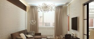
Olive and beige
Beige goes well with olive. The result is a gentle atmosphere of comfort and relaxation. This combination of colors has a positive effect on overall perception and psyche. Calms and gives a feeling of harmony. This is because it includes only natural shades that influence us in this way. The interior looks especially good with a beige background and intense olive accents. This is how the nobility of the latter is fully revealed.
Wide range of shades
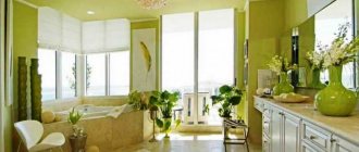
Olive color is unique in nature: it is so diverse in its shades that it can be used to decorate rooms for any purpose.
In the presented photos of the olive-colored interior, you can see and appreciate the richness of the colors of the materials used, from pale green to the darkest with a brown tint.
The most popular shades of the palette:
- The color of unripe olive and watercress;
- Shades of different types of moss;
- All options are khaki.
Olive color includes green, yellow, brown and gray colors. Such diversity allows you to create the most unusual, memorable, stylish interiors.
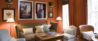
Olive and brown
The most appetizing and delicious combination. It fills you with a sense of fundamentality and freedom. It looks luxurious, charming, expensive and respectable. Olive walls will be an excellent backdrop for chocolate-colored furniture, especially those made of natural wood. Add accessories in green tones and the interior is transformed into an oasis of calm. In such an atmosphere it is easier to think and create logical chains in your head. Or just sit in a cozy chair with a cup of coffee.
Olive and white
A win-win color combination. It looks light and airy, while being strict, simple and concise. Make white the main background, and add olive accents. For example, one wall in the room, pillows, capes, poufs, candlesticks, curtains, carpet, coffee table. Your imagination is not limited.
Wall decoration
The combination of a light ceiling and olive walls in the interior of living rooms gives a unique feeling of freshness and home comfort.
- Plain wallpaper will visually increase the height of the ceilings, and plant patterns will make the space feel freer.
- For greater effect, you can combine plain and patterned finishes, thus highlighting different functional areas of the room.
Olive and blue
Blue, in combination with olive, looks gloomy and depressing. That's why white is always added to them. Next to it, primary colors acquire semantic and emotional meaning in a positive way. They become fresh, bright and light. If you add milk and coffee tones here, the effect will increase many times over. Blue immediately looks fundamental and evokes a feeling of peace.
Olive and yellow
This combination evokes positive emotions. Gives vitality and energy, lifts your mood and energizes you for the whole day. In addition, such a tandem increases appetite, which is not always appropriate. Combine the saturation of tones and get the effect you need. For a calm interior, use muted shades. For bright and dynamic colors - more saturated and juicy. Add white, milk, coffee to add solidity and elegance.
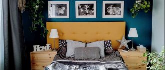
Olive and blue
A gentle and romantic combination that is perfect for the interior of a bedroom or nursery. This duo will be perfectly complemented by white color, which will dilute the brightness and saturation of the main shades. This design is associated with the warmth and hospitality of southern and warm styles. Such a room will become the personification of a romantic and vulnerable soul.
Olive and purple
An original, bright and unusual combination. This design looks feminine, a little naive, mysterious and romantic. This combination is associated with care and confidence in the future. Contains a feeling of freedom and relaxedness, while looking very elegant and sophisticated.
Purple looks especially good with a predominance of red: the color of plums and eggplant. These shades enhance the effect of femininity. Complement them with white, black or gray and the interior will sparkle in a new way. Basic colors add dynamism to a room. In any case, the interior will become the center of attention and will not leave anyone indifferent, as will the soft feminine energy.
