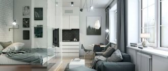
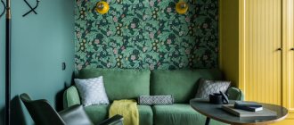
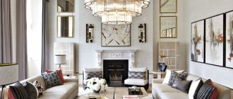
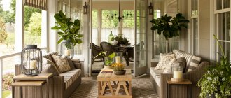
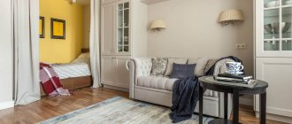
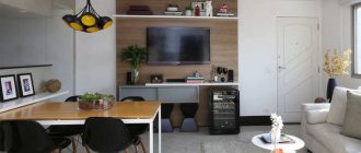
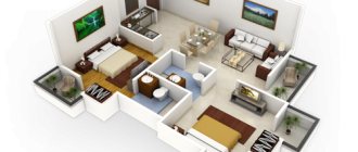
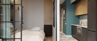
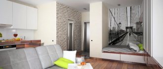
As sad as it may be, the area of most mid- and budget-price offers on the real estate market is 15-25 m2. Therefore, one-room apartments and studios with an area of forty square meters are quite a worthy option today. If you approach the organization of space with imagination, use the recommendations of experienced designers and available photos with the best examples, then the interior of an apartment of 40 sq. m. m. will turn out to be not only practical, but also very pleasant for life.
Planning and creation of a one-room apartment project
What needs to be done to make a small one-room apartment or studio sparkle with new facets, becoming not just a place to live, but a warm, cozy home with its own special atmosphere? A small living space dictates its own conditions:
· it is necessary to clearly imagine the final result;
· take into account the comfort and hobbies of all family members, including pets;
· you cannot purchase furniture and decorative items just “to have it” or being captivated by advertising and stylish design. The entire furnishings must be kept in an extremely laconic style and perform certain functions;
· well-developed design project for an apartment of 40 sq. m. - half the success. The room is divided into functional zones; there should be no empty, unused areas or niches.
If possible, it is worth agreeing on the redevelopment before starting the renovation. Usually the partition between the room and the kitchen is removed, combining them into one living-dining room. But this decision is ambiguous: the constant bustle, noise, smells when working in the kitchen, with the inability to isolate themselves from them, negatively affect the psychological comfort of household members. If we are talking about a studio, then it is recommended to separate the kitchen from the rest of the space and move it closer to the hallway.
Transformations of the internal space that will expand the area of a single room can be as follows:
· dismantling doors and windows onto a loggia or balcony. They are carefully insulated, double-glazed windows are installed, light and heating are installed. It turns out to be a cozy room that can be used as you please. It can be made completely closed using glass sliding doors, hanging curtains, or left open;
· instead of an uncomfortable storage nook, they make a spacious dressing room by dismantling the wall and installing doors and partitions from lightweight structures. The vacated area is also used as a small bedroom or office;
· combine a separate bathroom by installing a compact shower stall or a modern partition made of tempered glass. This creates space for placing a washing machine and water heater.
Examples of harmonious and effective zoning of small rooms can be found on the Internet. This article also presents photographs of the most successful ideas for planning studios and one-room apartments, which have already been tested by life.
You can develop your own design project using special editor programs. Or simply draw a plan by hand, observing the scale, and “play” with the arrangement of furniture and arranging the necessary functional areas.
Zoning options for an apartment of 40 sq. m
To fit into the design of a one-room apartment of 40 square meters. m. all the necessary furnishings, you need to plan everything carefully. After all, such living space is often home to families of 3-5 people, each of whom needs personal space, a place for relaxation, work and study, and creativity.
How to do it? Pay attention to the advice of professionals and choose the appropriate option for yourself.
Common mistakes
Not everyone can afford to invite a specialist to properly arrange furniture in a one-room apartment. Not everyone is given a sense of proportion and style. Not everyone has enough knowledge, patience and time to create a competent interior. That is why the result of planning turns into disappointment. To prevent this from happening, let’s look at the most common mistakes and try to avoid them when furnishing a one-room apartment:
- An illogical project - even in the smallest one-room apartment there should be room for a hallway, a guest area and personal space. But why combine the kitchen and the room if one person lives in the apartment? And if there are several inhabitants, it is simply necessary to zone the room;
- Excessive zoning is a standard option for one person or a couple - two zones in a room. A larger number of partitions without an appropriate number of residents will make living uncomfortable;
- Refusal to have a proper place to sleep.
- Immobile interior - when there are not enough meters in a one-room apartment, it is impossible to place stationary furniture everywhere. Think constructively;
- Transformers are not in place - if everything is transformed and assembled, then this space is needed for something. If you don’t need it for anything, then you can do without transformers and install, for example, a normal bed;
- An ill-conceived storage system for things - why do we need drawers and chests of drawers if there is a built-in set, a podium or a wall niche?;
- Unsuccessful eclecticism, or what style the room is in - you cannot overload one room with a combination of different styles, more than three colors, a variety of textures and light sources. The space must be homogeneous.
- Accumulation of unnecessary things and objects - get rid of unnecessary things in a timely manner so as not to turn your home into a storage room and yourself into a Box.
It may be one-room and small, but it is your apartment. What it will be depends on you!
Zoning the space of a one-room apartment
To visually divide the space, multi-level ceilings, high and low podiums, different types of flooring, painted brickwork, different types of wallpaper, wall paintings, contrasting wall colors, false columns, arches, wall and ceiling panels made of MDF and plastic are used, and part of the room is covered with clapboard .
To divide one room into several isolated rooms or compartments, plasterboard and plywood structures, both solid and openwork, are widely used. Glass, wooden and plastic partitions, shelving, built-in and regular cabinets are popular.
If the owners of the premises do not consider it necessary to spend money on a major refurbishment of the room, simple, lightweight options are available to them: thick drapes and light curtains, pendants made of stone, wood, glass, crystal, plastic, various screens in oriental and antique styles, made of fabric, wood , vines, as well as modern blinds, vertical and horizontal.
A separate line includes visual effects that are created using hanging and floor stands and racks for pots with plants, aquariums with fish, floor lamps and large tubs with decorative trees and shrubs, green walls, coffee and coffee tables, half-walls, sofas, couches, chests of drawers .
Adviсe
So, the method has been chosen. Before you go to a furniture store, check whether the intended result meets the following requirements:
1.
Partitions placed along a long wall greatly narrow the space.
2.
Sharing a window is a bad idea. The room will look stripped down.
3.
The smaller the area, the less decor.
4.
The color combinations are well chosen. Acid wallpaper will begin to irritate over time - bright colors should be in moderation.
5.
Those who decide to fence off the kitchen with curtains should take a closer look at non-staining materials. The spots won't take long to appear.
Interior styles of a one-room apartment
What style is best for a small apartment? Laconic or exquisitely delicate, strict, with a minimum of non-functional details and decorations. These include:
· classic version;
· cold-cozy Scandinavian;
· romantic Provence;
· practical American country;
· innovative high-tech;
· strict minimalism.
Mixed trends give the apartment a special charm, for example, eco elements in neoclassical design, or national Russian motifs surrounded by modernism. There is no need to be afraid to bring something of your own to the standard design. The main thing is that the whole composition looks harmonious.
What style directions are acceptable?
It all depends on the wishes of the owner. Fans of neoclassical styles can use basic elements:
- plaster stucco;
- painting;
- desudéportes (decoration above doorways);
- semi-columns;
- volutes;
- coffered ceilings;
- arches
The main feature: the details are chosen to be miniature, the painting is light, so as not to overload the interior.
It has become very popular to use Scandinavian style in the interior.
Modern
It is impossible to imagine without stained glass. In small rooms, a stained glass chandelier, sconce or floor lamp is enough, plus inserts for doors, and the room will acquire style features.
Japanese style
Often used in small spaces. Laconism, clear lines, light colors are features of the style . But this does not mean that the interior will be boring. Stylish details: decorating one or part of the wall with bamboo wallpaper, introducing small elements of natural colors (red, green, brown) into the interior will do the trick.
The Japanese know better than anyone how to best organize a small space
Minimalism
Men love strict lines and lack of pretentiousness. Such interiors cannot be called boring. The design involves a play of textures of different materials:
- furniture upholstery;
- textiles;
- floor covering.
Therefore, lighting is thought out to the smallest detail.
Minimalism is not a boring design without unnecessary details
Eastern styles
Fans of oriental styles: Indian, Chinese should not introduce a large number of bright decorative elements into the interior. Enough sofa cushions, lamps, a floor vase and appropriate accents are placed.
In oriental style, be moderate with bright accents
High tech
Will help you perfectly combine:
- metal reflective surfaces;
- glass partitions and elements;
- decentralized lighting and elements of constructivism.
As a result, the apartment acquires the dynamics of modern life.
Modern interior in high-tech style
Pop Art
The “popular culture” style often uses plastic, bright colored accents, and bright, eye-catching designs. All this connects almost stage illusoryness with reality. It is often considered a youth option that can be easily transformed.
Creative interior built on bright contrasts
Lighting in a one-room apartment
Modern design provides for high-quality artificial lighting. In addition to ceiling chandeliers, which are located above the semantic center of the room, or in each zone, additional lighting is equipped with:
· kitchen countertops, external and internal surfaces of cabinets, dining table;
· mirrors in the hallway, bathroom;
· ceiling along the perimeter or along the line of cabinets;
· places for study, creativity, work;
· balcony, if it is converted into a functional area or used as a dressing room or winter garden;
· headboard. If it is double, then sconces, table or wall lamps are installed on both sides. A multi-tiered bed requires lighting on each “floor.”
Mostly, economical LED lamps and strips with a spectrum close to sunlight are used - it is most comfortable for the eyes.
Kitchen
Proper organization of kitchen space saves 60–65% of the distance the housewife travels while preparing food, plus 25–27% of time. Let's use ergonomics. The main trio: stove, refrigerator, sink. They cannot be installed far from each other.
I mention this because some people recommend hiding the refrigerator in the pantry. However, installing a stove and a refrigerator next to each other, or a stove and a sink, is also not rational. You will have to put a lot of effort into maintenance.
A small kitchen complements the interior design
Fashionable and rational L-shaped placement of working planes.
Advice: Choose furniture with retractable cabinets. Hinged doors take up a lot of space. Organize lighting for cabinets and work tables - time savings are guaranteed. Fight clutter and the room will look larger.
The L-shaped placement of the kitchen unit saves space and at the same time there is enough space for work
Zoning can be emphasized by island placement of furniture. Install an electric or induction hob on such a cabinet. Stylish, comfortable and functional.
An interesting effect is achieved by using hanging cabinets and tables of different depths 300, 450 or 600 mm . This “breaks up” the space, making it easier to maintain order on the shelves (small items do not get lost in deep cabinets).
Zoning can be emphasized by island placement of furniture
Furniture
Do you live alone or with family? The choice of furniture depends on this. For singles or families without children, one massive item can be allowed. For example, a sofa. It will become the basic element around which the decoration will be built. In this case, the rest of the furniture should be weightless, tables with glass tops, cabinets with mirrored doors.
A bright contrasting color sofa is an acceptable massive object in the interior
But, the basic principle: do not overload the world around you with too bright colors, massive, even triple antique furniture. Maintain a balance: light plain walls - contrasting furniture, against the background of wallpaper with prints - plain sofas and slides.
Maintain harmony - a light interior with several bright accents
Replace regular wardrobes with sliding wardrobes. This furniture has a large capacity. Convenient internal filling and special fittings allow you to use the entire space, including the mezzanine. The furniture industry produces brackets for dresses, shirts, trousers and places them under the ceiling. If necessary, the bracket lowers to a comfortable height, and there is no problem in choosing the right thing.
Instead of massive walls, purchase modular hanging cabinets of different shapes or lightweight slides.
Interesting details: a combination of mustard and gray in a studio apartment
Hall design ideas
High tech
Provence style
Hall in classic style
English classic style
Hall in black and white
LOFT style
Ceiling
Dark ceilings definitely “steal” height. However, if the perimeter of the room is painted dark, framed with plaster rods, and the central part is left white, the visual effect will be fantastic. The height of the room becomes much larger.
For a small room, light ceilings are best
Advice for lovers of classic interiors: order an illusory ceiling painting. Artists who master this technique create unusual decorations that change the true idea of the height of a room.
The ceiling does not have to be white. Very light shades of the color palette are quite acceptable. But they should not be dissonant with the main background of the decoration.
Walls and ceiling in the same color scheme
For neoclassical, Provence and country styles, artificial and natural ceiling beams and coffers become wonderful decorations. It is acceptable to leave the natural color of the wood or paint the elements in light colors.
A wooden ceiling with beams and simple brickwork is an excellent option for a masculine interior.
A wonderful option is stretch ceilings. Quick to install and easy to clean. The variety is huge. These are not only purely matte, glossy or patterned options. Modern technologies make it possible to combine materials of different textures and colors. This helps to emphasize zoning and complement the wall finishing materials.
Stretch ceilings are convenient, easy to install and maintain
Don't get carried away by glass ceilings. Fragmentarily, yes, the ceiling will disappear. However, psychologists warn: a large number of reflective surfaces causes a feeling of anxiety and is irritating.
Design ideas for decorating a small home
A short video forces you to take a closer look at the design. It is necessary to use every free centimeter, but not to visually overload the space. For those who do not feel able to do such a good job, I recommend entrusting the task of improving the premises to a designer.
