- September 18, 2019
- Repair Tips
- Victoria Palady
What colors does orange go with in the interior? Due to its bright and bold nature, this tone can be quite intimidating to use in a design. If you add this color to your interior, it will easily bring warmth, creativity and a positive attitude to any living space. By using the right combinations of orange with other colors and dozens of its shades, you can create a very stylish, welcoming atmosphere in your home.
Basic psychological properties of color
Knowing how a certain shade of orange can affect a room is key to using that color. When done right, color can give you the dose of enthusiasm and motivation you need. When used poorly - too much, too frivolously and overly aggressive. The tone of bright orange is fun, joyful and playful. The yellow-orange interior promotes social interaction and communication.
It is also a shade that stimulates the appetite. Although the property is often attributed to red, it has more to do with different cultural perceptions of color. The color orange represents physical comfort and abundance.
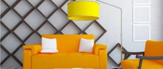
Photo of an orange living room
Note! Living room with a balcony - how to beautifully combine two interiors? (60 photo ideas)
Let's discuss this article together:
Click to cancel reply.
Positive properties of the shade
What colors does orange go with in the interior? This question inevitably arises if you plan to add elements of this tone. The primary task here will be to select its most harmonious shade. It's important to find a tone that matches your personality. After all, you plan to live surrounded by this color for a long time, so why not choose from the huge variety of shades that you love and that make you happy? Color saturation directly affects the intensity of the psychological qualities that you will feel while in the room. Agree that the shade of ripe tangerine or autumn pumpkin evoke completely different feelings compared to softer peach and delicate apricot.
Keep in mind that, like every color, orange has a number of negative characteristics. If you use too much of it or choose the wrong tone in combination with others, you can ruin the entire composition. Don't underestimate orange! What color is combined with in the interior should be carefully studied. Otherwise, he will seem a little frivolous or too psychologically overloaded.
Basic rules of orange interior
Orange has incorporated a whole cascade of shades and halftones that are actively used in design:
- Bronze;
- Coral;
- Apricot;
- Tangerine;
- Salmon;
- Honey;
- Ocher;
- Pumpkin;
- Terracotta;
- Peach;
- Rusty;
- Copper.
A wide palette helps you choose a color depending on the functionality.
Here are some rules for selection and use:
- The red color is optimal for those rooms where any productive activity takes place - kitchen, office, dining room, work area, living room or children's room. It is the red color that favors mental and physical activity. Therefore, you should not use shades of red in places of relaxation.
- It is appropriate to decorate rooms in orange tones in rooms with low light levels, whose windows face north. It is with the help of such bright accents that you can stop being sad, moping, and despondent.
- Color can visually enlarge the boundaries of a room.
- With the help of color you can visualize and expand the scope of the room.
A color scheme
Fans of retro style should use all shades of brown as orange companions or create a more modern combination with various shades of turquoise. Since blue is a complementary color to orange, it will make the orange color more saturated, and vice versa. A combination of tangerine and yellow will create a fresh and cheerful look. This is the color that goes best with orange in the interior!
Think about the mood you want to create when choosing a tone. This will also determine what colors to use to complete the color scheme. Some tones combine harmoniously, others will “fight” with each other and over time it will become difficult for you to live in such disharmony.
Combination with wood
Natural wood is traditionally associated with home comfort; it can balance the active orange color. The atmosphere will immediately be filled with harmony, comfort and natural beauty. You can choose wood that is several shades lighter or darker than the orange wall trim. In any case, the result will be a perfect union. You can add cream tones as an accent.
Dark brown furniture will soften the orange even in the bedroom. A double bed with a massive base can be decorated with decorative pillows and a blanket of the same color, a warm checkered blanket can be thrown over an armchair, or a lamp with an orange lampshade can be placed on a bedside table or chest of drawers.
Start with small accents
What are the main rules for the successful use of orange, what does this tone combine with in the interior of a living space? First, you need to like the shade. If this does not happen, look for another shade. Secondly, orange is not a relaxing color, so avoid using it in interiors where you plan to relax, do concentrated work, or sleep.
However, orange is a great color if you need stimulation or motivation if you will be using the room for entertainment, fun or socializing. Pay special attention to what proportion it makes up in the overall space, its location and combination with other colors. If you really want to use it, try starting with small accent spots, such as accessories that are easy to change or move.
In what style is orange appropriate?
We have already noted above that there are no style restrictions here: orange fits perfectly into strict classical interiors, and is perfectly revealed in expressive Mediterranean designs, and even harmoniously integrates into ascetic Scandi and hi-tech.
But under one condition - the correct intensity of the shade and its moderate dosage in space.
Let's take, for starters, modern popular design styles. For example, Scandinavian minimalism. Orange is introduced here in portions as bright color spots.
Or as a color for facades. It’s great if the headset has chrome parts and glass elements - this combination guarantees an original appearance, while the philosophy of modern high-tech style does not suffer at all from such a mix.
But for Provence and country, choose calmer shades of orange. Chestnut, mustard or honey shades are welcome - they look great against the background of the wooden texture characteristic of these design styles.
It is best to add not flashy orange to the good old classics, but a version of it with some shares of brown. This is a proven design technique that allows you to combine an expressive shade with the warmth and tranquility of a natural wooden surface.
In ethnic designs, bright orange is a frequent guest. This is characteristic of both the Mediterranean style, which has recently been gaining momentum, and African interiors, which are still rare among us.
Useful tips
Dark orange with a brown tint (terracotta) evokes a feeling of stability. These shades are suitable for the bedroom and living room, as they are soothing, noble and non-irritating. Remember that orange tends to bleed into other lighter colors. Therefore, if you want to emphasize some white spot, place it away from the orange. Even in low light, orange blossom makes a room brighter and lighter. Those who find orange too bright and provocative will appreciate its shades: rusty, peach or amber. These shades have all the qualities inherent in the main color. For example, if you intend to create a warm, welcoming atmosphere in your living room, use shades of orange combined with blue. Your guests will feel at ease and relaxed throughout the evening in the orange interior. Photos as an example are offered in the article, from which you can choose the appropriate design option. Don't forget about the details: frames of the same shade, curtains and cozy pillows will decorate the overall picture of peace.
Orange is used to decorate large areas and is mainly chosen as an accent color. Combined with white it creates a feeling of sunshine. This color enhances and cleanses the effect of cool tones.
Shades
The activity and perception of orange depends on which direction the undertone shifts: towards yellow or towards red. The closer to red, the richer and more aggressive the color is. Proximity to yellow gives a feeling of comfort and sunshine, creating the illusion of an increase in temperature in the room. But citrus does not have to be bright and concentrated - there are almost pastel variations that do not have an active effect on the psyche. There are many shades that deserve attention.
- Citrus fruits - orange, tangerine, grapefruit. These are the most luscious tones, only the names of which exude vivacity. In the overall palette, they should take the place of a color accent that will balance neutral colors.
- Peach, apricot - in contrast to the previous bright fruits, these tones, diluted with white and beige, tend to pastel colors. They can be used in any room, not only in decoration, but also in furniture or decoration. They refresh the atmosphere, but do not put pressure on the psyche, so they are often used in the bedroom and nursery.
- Amber is a darker and deeper tone associated with the warmth of autumn. It may be lighter with a yellow tint or turn brown. Pairs well with wooden elements and natural fabrics. It can also be used for decoration, but it is better to choose a diluted version. Or use it not on all surfaces, but to highlight an accent wall.
- Terracotta is the darkest of the popular shades, as close as possible to red. Makes the space elegant and cozy, goes well with any natural textures, be it stone or wood. Can be used in any room. Whether to use terracotta as a base or as an accent depends on the richness of the tone.
Instagram @solovyeva_natalia_designer
Instagram @linedesign_studio
Instagram @zhilin_brothers
Instagram @lavkadesign
Instagram @olegkurgaev_design
Color circle
Let's consider another important nuance. To find the perfect combination of orange in your interior, use a special wheel. It will tell you how to combine your favorite shade with your intended “companion”. Colors on the opposite side of the circle are complementary. For an ensemble with orange, you can choose one of those that are nearby, or those that lie on the opposite side of the color wheel.
A perfect example of a combination is pale rusty orange and blue, balanced by immaculate white.
Orange ideas in the interior - photo
Photos of finished projects are presented in the gallery. They will inspire you to create a new design in your apartment or house and help with color experiments.
Additional color
Orange lies between yellow and red - the two primary colors of the chromatic spectrum. On the opposite side of the circle lie shades of blue: ultramarine, dove, sky blue, dark blue and azure.
Colors that sit just above and below shades of orange, such as brown and beige, or next to it, such as yellow and red, can also be paired with orange. However, this fiery combination will have an energizing effect on the ambience of your home, as all the shades next to orange are very hot. To balance this, it would be good to know in advance what colors orange goes with in the interior. You can use neutral tones such as white, black and pale gray in your design.
What can you make orange?
Everything. There is only one condition - it is extremely important to maintain the dosage of color in the space and take into account the nuances of the layout. In this case, orange will not aggressively dominate the interior, and your eyes will invariably contemplate strict harmony and a color scheme adjusted to the smallest detail.
Kitchen set
Both the lower facades and the upper cabinets can be decorated in the same color. Orange will look best on a glossy surface. It is good if the facades have characteristic roundings. This smooth geometry better correlates with the orange mood and helps to optimally fit it into the kitchen space.
When there is a lot of usable area, it is advisable to divide the set by color into a darker shade at the bottom - and any of the neutral colors like gray or white at the top. This will make the room seem taller and, accordingly, more spacious. It is better to choose cream or light beige wallpaper for such an orange kitchen, without any pattern.
Designer tips
Irina
founder of the interior studio, architect and interior designer. The main area of work is kitchen design
A very winning combination with an orange set - especially if you are building an interior according to the principles of high-tech and contemporary - is a floor with imitation wood. Usually 15x60 cm dies are used, but if you want more organicity, purchase rectified porcelain tiles. All elements will be laid close to each other, so there will be no annoying seams.
Ceiling
An infrequent decision, especially in the context of the currently popular Scandi and hi-tech. Nevertheless, it looks unconventional and interesting in combination with a snow-white kitchen.
It’s good if you can organize a roll call of such a cheerful ceiling with furniture or decorative elements integrated into the interior.
Choose curtains or curtains that are lighter or darker so that you don’t end up with too many variegated shades.
Design ideas for various rooms
If you're thinking about an orange color scheme, don't just limit yourself to the living room, kitchen or dining room. Think of a place where you can easily incorporate this color into the interior. You can paint part of the hallway wall with this amazing shade. A very interesting effect is obtained when using this shade in the design of a terrace or pool area in a country house. Orange will help decorate a lively area for outdoor parties. Colored ceramic tiles and sandstone tiles will give your home a very attractive look.
Designers skillfully integrate such a bright color into bathrooms. Orange can decorate both walls and floors. In this case, colored mosaic tiles will enliven the interior. Even a floor mat and towels will brighten up a small room with a neutral color scheme.
Interior styles
Retro 60s style . Generation of dudes and hippies. Looks stylish when decorating a modern kitchen or living room.
Orange corner sofa in the living room
Country . In this case, a very soft color of pumpkin, straw, is used. The nursery looks very cute with these shades.
Minimalism . In this case, you can use a very bright shade, but only as an addition to the main calm interior. A beige or gray living room will be perfectly diluted with an orange chair or sofa. And in a neutral-colored kitchen, a terracotta set will look good.
Ethnic . Folk eclecticism and orange are made for each other. African, Mexican, oriental decorative styles coexist well and organically with orange. In this case, very warm shades are used, thick and rich. Also often used in this case is a terracotta shade - a mixture of orange and brown. This design looks natural in the bathroom and is also suitable for the kitchen.
Art Deco, avant-garde and pop art styles also welcome furniture in orange, but historical styles: baroque, classicism, rococo, empire - they do not “love” it and practically do not use it.
Orange furniture in a high-tech house
Living room
If you are energetic and adventurous and your family regularly gets together, enjoys parties and watches comedies, then an orange-dominated living room is just what you need. Warm orange with a brown tint makes this living room cozy. Neutral tones in the upholstery and rug provide the perfect backdrop and let the orange accent pieces shine. Overall, the living room gives a relaxing and stylish look. Tangerine pillows give the necessary boost of energy to the room. Without bright accents, this room would look dull, given the abundance of neutral palettes. Below is a vivid example of what colors orange is combined with in the interior. The shade of orange seems complex, but the result leaves you surprised and inspired.
You can use orange on the walls. It can only become a small accent. Another smart way to add a pop of color to your interior is to use orange as a base color for wall panels or on graphic wallpaper. Often, this active color is used in accessories. They look great next to light walls and dark pieces of furniture.
Orange sky, orange sea. What about orange in the interior?
In 2012, orange was the most popular color according to Pantone. Its shade with the romantic name “tangerine tango” has settled not only in bedrooms and living rooms, but also in our hearts. A lot of water has passed under the bridge in 6 years, but the Legko.com team continues to love this cheerful color. Why? We tell and show you in a new article.
Psychology of orange
Orange comes from the love of red and yellow. From one parent he inherited energy and determination, from the other - friendliness and optimism. This color is preferred by emotional and sociable people with a strong creativity. And he is also adored by small children who want to explore the world.
When we look at orange, the brain and stomach begin to work faster and more efficiently. As a bonus, it improves your mood. Now you know what color was sorely missed in the office and kitchen. However, be careful: an excess of orange negatively affects the psyche, causing fatigue and apathy.
Shades
Orange deservedly holds the title of the warmest shade in the color spectrum, because it has no cold tones. The names make your mouth water: peach, apricot, pumpkin, honey.
For interiors, muted tones are often chosen: ocher, terracotta, salmon, rust, bronze. However, daredevils will certainly like bright and slightly aggressive ones: tangerine, amber and coral.
Peculiarities
It’s not for nothing that orange is associated with peaches and apricots – it’s that kind of fruit. But with the right approach, this color turns into a kind wizard, capable of transforming the interior beyond recognition. Here are a couple of recommendations for taming it:
- Orange objects immediately attract the eye. A great option when you want to highlight one or more objects in the room
- You should not use orange in a room where the windows face south. It can be hot and stuffy there even without it - why intensify the sensations?
- For small spaces, choose light shades of orange. Dark or bright colors on large surfaces will overwhelm and visually make the room even smaller
Orange + pastel colors
Let's start, perhaps, with calm combinations. Orange looks harmonious with neutral shades and most pastel colors. They mute its excessive saturation. Here, for example, are two gentle duets: with pastel mint and delicate cream.
Orange + gray
Gray + orange is an example of a discreet but stylish combination. Remember about the superpower of gray to balance out too bright neighbors and give confidence to quiet ones? White performs a similar function. The combination of orange + white + black will help create a more graphic and non-trivial interior.
Orange + beige
Beige goes well with orange. All variations here are good: from coffee to deep chocolate. One is responsible for dynamics, the other for comfort. A win-win!
Orange + yellow
Are there any lovers of bright and rich interiors here? You will probably like the cheerful combination of yellow and orange, which reminds you of sunny summer and carefree childhood. Ideal for a games room.
Orange + blue
The combination of orange and blue is reminiscent of the sea and sun. For example, carrot + turquoise or orange + dark azure. A more versatile option is terracotta paired with steely shades of blue. It looks simply luxurious, especially if you play with textures. For example, a velvet sofa in a deep dark blue (or navy blue) and a bright woven carpet with a pattern, as in the photo below.
Orange in the kitchen interior
Orange is conducive to friendly conversation and stimulates the appetite - perfect for the kitchen or dining room.
If you are unhappy with the size of your kitchen or the low ceiling, try visually adjusting the space with color. Not enough coziness and intimacy? Use your favorite rich/dark shade of orange as the main one and enjoy the result.
Do you want to visually enlarge the space and add a feeling of airiness? We highlight one wall with color, and cover the rest with white/gray/beige paint - the ceiling will seem higher. And again we enjoy the result.
Orange in the living room interior
In the living room, use this rich color as an accent. For example, create a composition of orange curtains and an orange sofa standing opposite, or complement upholstered furniture in pastel shades with bright textiles. These techniques look harmonious in an interior in ethnic style, country style or minimalism, which cannot be said about classical styles (empire, rococo).
Orange in the bedroom interior
For the bedroom, pastel shades that do not strain the eyes are suitable: peach, apricot, salmon.
The rich orange color can be used in decoration - just a few pillows, a painting, a vase or a bedspread are enough to create an atmosphere of joy in the interior. In such a room you will recharge yourself with positive energy and sleep without problems.
The orange color will add a bit of coziness and warmth to any interior, which we miss so much with the arrival of autumn. Start the change with accessories: a pair of bright pillows and a soft blanket. We are sure you will not be disappointed.
Bedroom
For a bedroom, orange is too bright and exciting; it will not allow you to relax and unwind properly. But psychologists say that this color increases sexuality. So a few tangerine accessories won't hurt anyone. Small touches (lamp shade, vases, decorative pillows) will easily fit in even if you still doubt what colors orange will be combined with in the interior. On a soft purple background, for example, this shade looks truly stylish and at the same time creates a relaxed atmosphere, helping you forget about everything.
The right shade of orange is important for relaxation. Warm orange mixed with a neutral color can be soothing. At the same time, splashes of bright tangerine color in decorative details will help liven up the overall look and even create a feeling of happiness.
Sofa material in brown tones
Before purchasing furniture, you should decide on the upholstery material. After all, a brown sofa can be made from different raw materials. Let's briefly look at the materials that are most often used for upholstering a sofa, as well as their advantages and disadvantages.
- Velours.
This pile fabric is created by weaving five threads: four vertically, one horizontally.
Advantages: it is a pleasant fabric to the touch, high-quality velor is made from natural raw materials.
Disadvantages: wet cleaning is not possible.
- Flock.
This is a pile, non-woven material. Villi are glued onto its fabric base.
Advantages: it does not require special care, is difficult to damage with sharp objects, and is durable and elastic.
Disadvantages: absorbs odors very well.
- Chenille.
Manufacturing method: jacquard weaving with fluffy yarn.
Advantages: does not undergo deformation, the surface is resistant to abrasion and does not fade.
Disadvantages: it has low moisture resistance, the material is also easy to accidentally scratch, and scratches are visually very noticeable.
- Faux suede.
Advantages: material with excellent strength and elasticity.
Disadvantages: may become deformed during use.
- Artificial fur.
Looks like animal skin.
Advantages: faux fur is waterproof, durable, and also safe from an environmental point of view.
Disadvantages: the material can only be dry cleaned and is susceptible to external mechanical influences.
- Jacquard.
This lint-free fabric is formed by weaving ten transverse and longitudinal threads, with one half of the threads being natural and the other half artificial.
Advantages: material with excellent high strength, visually attractive, including due to intricate patterns.
- Scotchgard.
Cotton fabric onto which a design is applied by printing. The material is impregnated with special agents to protect it from dirt.
Advantages: Scotchgard is not afraid of grease, dirt and water, and this material is easy to keep clean.
Disadvantages: the impregnating agent may dissolve when exposed to hot water.
- Tapestry.
This fabric is 100% cotton. It is made on looms by weaving threads in an X-shape.
Advantages: environmentally friendly material, it has many different patterns, can be cleaned with water.
Disadvantages: the tapestry soon develops snags and fades when washed.
- Faux leather.
This artificial material is smooth to the touch and does not allow air to pass through.
Advantages: the material is resistant to water, it is easy to keep clean, it is not subject to fading, and is also durable.
Disadvantages: scratches appear, can easily ignite, and begins to crack over time.
- Genuine Leather.
This non-woven material does not have any artificial additives.
Advantages: the material looks great in appearance, it is durable, wear-resistant, environmentally friendly, and is also breathable.
Children's room
A bright, cheerful and slightly “straightforward” shade of orange will inspire your child to explore. The interior of the room in orange will strengthen the child’s desire to achieve goals. Add this tone to your exercise area.
To prevent the shade from being overwhelming, combine it with yellow, white or beige. Contrasting combinations that upset the balance, for example, with bright green or black, are inappropriate in a child’s room.
Orange and white
A sunny mood will be created by an interior in orange and white tones. White will make orange even more expressive and emphasize its brightness. This option is simply created for a minimalist kitchen, because it is here that a charge of inexhaustible energy and a joyful mood is required. These two colors will also look organic in the bathroom: snow-white plumbing fixtures on an orange background will give you cheerfulness in the morning.
This is also a great option for decorating a children's room. Orange for wall decoration looks cozy, and white furniture and decor neutralize its activity. Such an interior has a beneficial effect on the development of the child. You can add muted green tones to it, reminiscent of juicy tangerines, sweet persimmons and ripe oranges. An orange-yellow color scheme, reminiscent of southern summer and a sunny beach, is perfect for the play area. However, too much orange in the room can cause children to become hyperactive and unable to concentrate.
Kitchen
Juicy color promotes digestion and improves appetite. A laminated kitchen worktop in rust, copper, persimmon or saffron tones is sure to freshen up the look of a simple kitchen.
Country style is characterized by a combination of orange and natural wood. The salmon shade of orange and dark wood are characteristic of a stylish and respectable dining room.
Fresh orange adds an elegant, modern style to the kitchen. Bright and glossy surfaces will decorate even a very compact room without natural light.
A luxurious dining room will result if orange interacts with yellow and red colors. Yellow portrays a fun, playful and optimistic atmosphere, while red adds drama and intensity. Orange color encourages social interaction and tolerance of other people, and the kitchen is where the whole family gathers.
Orange kitchen-living room
The combination of two functional rooms into one most often occurs in the case of a lack of usable space - or, conversely, when there is a complete excess of it.
In the first option, this is typical for small studio apartments in a combined layout format. In the second - for private houses, made according to an individual plan in strict accordance with the wishes of the owners.
One way or another, both formats are characterized by the use of orange color for finishing the furniture group. This includes a kitchen set, a seating area with a soft corner, and dining sets with a table and chairs in a single concept.
Another way to play up orange is to use it to decorate your backsplash. It will be a bright spot of color in the room, but it will be properly dosed, so it will never get boring.
Take a unique approach to the design of curtains. If the room is large, then choose duller shades of orange, otherwise your eyes will get tired quickly.
Curtains
Curtains should complement the orange wallpaper in the interior. When choosing them, you can follow the spectrum technique presented earlier. Opting for black, white or gray curtains or a curtain fabric that combines these colors is another great choice. But consider the texture of the fabric! Glossy orange walls require the use of matte fabrics for curtains. This means that it would be ideal to avoid silk and satin fabrics. Cotton, linen, embossed, lace and sheer fabrics are some of the options to prefer. Choose white curtains with subtle orange accents in the design. These can be either floral or geometric motifs. They will harmoniously complement the orange wall. This option is especially good for children.
Decor - completing the orange interior
If your room lacks warm tangerine shades, and there is no money for repairs, this is not a reason to be upset. Nothing prevents you from adding orange accents to the interior of the room with the help of decor and accessories.
Let's see how this can be done:
- Buy new curtains . A plain orange fabric or orange patterns on a neutral canvas will help transform your room. For the kitchen/bathroom you can choose luscious blinds.
Succulent blinds can complete the design of an orange kitchen
- Choose suitable interesting decor . Various figurines, paintings, vases and other small accessories may be suitable for this.
Orange details on the table along with elements on the curtains go perfectly with white objects, neutral walls and blue chairs
- Buy new textiles . It is not necessary to purchase a new sofa for this; you can replace the upholstery on the old one. The easiest way is to buy bright orange blankets, throw them on a chair/bed/sofa and choose suitable pillows.
Using orange textiles you can make a room warmer without renovation
- Experiment with lighting . You don't need instructions for this. And now I’m not talking about spotlights, but about sconces or floor lamps, by replacing which you can see the room in a new light.
Orange chandeliers are great for creating accents
- Buy an artificial fireplace (if funds allow, of course). The fire in the fireplace will be a great source of orange color.
An artificial fireplace looks great in an interior with orange accents
Furniture and textiles
Orange color looks attractive in the interior if used for upholstery fabric of sofas, armchairs, ottomans and chairs.
Vibrant carrot cushion covers also add interest to a monochromatic sofa. An orange dining table top is a charming choice for a sophisticated dining room. While not exactly a piece of furniture, orange lampshades can also help add a pop of color to your living room, kitchen, dining room or bedroom.
Interior of the rooms
Kitchen
Preference in the kitchen interior should be given to orange, peach and other “juicy” shades, which perfectly stimulate the appetite. They will look harmonious in the apron or countertops of spacious kitchens. It is not recommended to use color for facades, as it may cause irritability and headaches.
If you choose calm shades for the facades, you can complement them with translucent frosted glass inserts, modern fittings in the set, and LED strips with soft white backlighting. Orange textiles are used for accents, such as tablecloths, towels, potholders, table napkins, and curtains.
Living room
The interior of the living room uses warm, “autumn” colors that will add home comfort and softness. The decoration of the walls can be plain or with patterns; decorative elements or paintings in tone, photographs in frames will highlight the overall concept. The palette goes well with wood, so it is recommended to use laminate, parquet or natural wood for the floor.
Furniture with orange upholstery will look juicy and unusual. In this case, the rest of the decoration should be neutral and calm, the main emphasis will be on the sofa and armchairs. If the ceiling height allows, you can use glossy orange stretch films.
Bedroom
There is no point in experimenting here, since the bedroom is intended for relaxation and sleep. Therefore, the colors should be calmer, softer, and go well with light curtains and bed linen. An excellent solution would be muted tones, emphasized by the correct placement of lighting fixtures.
Children's
Sunny, bright, positive orange color is ideal for a children's room. It can be used for the entire room, or you can use it to highlight a play area. This decision will give you a surge of joy and strength. In addition, it is perfectly diluted with other shades and is used for finishing walls, floors, furniture or decorative items.
