Layout
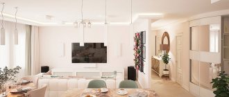
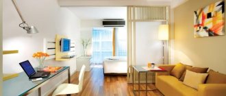
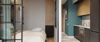
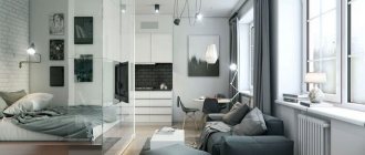
To make the apartment as comfortable as possible, the kitchen and living room were combined into a single space.
The bedroom was supplemented with a small work area, and a small children’s room was planned in such a way that it would be comfortable for two kids at once. The area occupied by the kitchen was slightly increased, taking away space from the bedroom. To do this, we had to move the wall, which made it possible not only to expand the main room in the apartment, but also to make it more convenient: a niche for a sofa appeared in the living room, and a niche for a storage system in the bedroom, of which there should be a lot in a two-room apartment for a family with two children . The entrance area was not fenced off from the living room in order to preserve as much open space as possible and make the hallway bright.
Two zones in one room
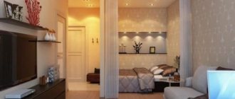
However, not all one-room apartments are large enough to create a separate room there. Therefore, often the whole family has to live in one room. The best solution in this situation is zoning. At the same time, in contrast to the layout of an apartment for one adult or a married couple, where the division into zones should be done solely on a functional principle and the activities that are planned to be carried out in each zone, here the main criterion for dividing the space will be the audience for which this part of the room is designed . This should create two zones: for children and for adults.
Children's area in a one-room apartment
Since there are two children, and they need no less space, and sometimes even more, than adults, because any child is constantly on the move, and it is very difficult for him to fit into a small space, the room should be divided exactly in half. Children should be allocated that part of the room that is further from the entrance, because they go to bed earlier than adults and, as a rule, get up later. This arrangement of zones will allow you to go about your business in the evenings, enter and leave the room without disturbing the children’s sleep.
The border between these two zones can be a small shelving unit. It can create a rather elegant, lightweight and functional partition. And this is important in a small room, where you have to fight for every meter. Such a rack can serve as a bookcase, shelves for small items or storage for children's toys. The only thing that should be taken into account when arranging the shelving is that it should not block the exit from the room and become an obstacle blocking the passage to necessary and functionally important places in the room.
You can also delimit the parents' area using a screen or curtains. The mobility and lightness of such devices allows them to be completely removed during the day, combining the entire space of the room into a single whole, and isolating parents at night.
Kitchen-living room 14.4 sq. m.
The white color of the walls, characteristic of the Scandinavian style, is complemented in the interior by complex blue and green tones. Blue wooden “blinds” on the storage system echo the blue apron of the kitchen area, adding a play of textures to the play of colors.
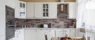
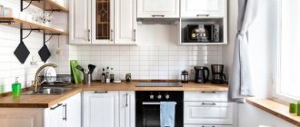
The dining room chairs are upholstered in faded blue, and the bright blue stripes on the Roman blinds add a touch of nautical romance. The design of the apartment does not look cold, despite the abundance of blue tones. They are softened by the delicate beige shade of the sofa upholstery and the warm creamy tone of the kitchen furniture. An unpainted wooden table and matching chair legs add homey warmth.
On the floor in the living room combined with the kitchen, a material with unique properties is laid - quartz vinyl. Tiles made from it are very resistant to abrasion, since almost 70% consists of sand, and not ordinary sand, but quartz. These tiles look as beautiful as wood, but will last much longer.
The walls are finished with matte paint that can be washed, since the designers from the very beginning planned that only very practical finishing materials would be used in the apartment for a family with two children.
A white brick wall came into the apartment from the loft. A sofa was placed next to it, and lighting was built in from below into the voluminous storage system suspended above it for easy reading.
It was not possible to allocate space for a dressing room, but instead, the designers placed spacious wardrobes in each room, as well as additional storage space. Almost all cabinets are built-in and reach the ceiling - this way they can fit much more things. Despite their considerable dimensions, the cabinets do not clutter up the space - decorative techniques have turned them into interior decoration.
Design in a two-room apartment: from Baroque to Oriental in a single space
In the modern mix of styles, it is difficult to choose the design of a two-room apartment that will be correct from a functional point of view, coupled with the main “signs” of a particular direction.
No one knows for sure whether you will ultimately like what will become the final product, whether the entire apartment will have the same design and whether it will remain in trend for several years to come. Our selection of popular interior styles will help you make the right choice.
Tatyana Vakueva, an architect and author of the projects, took on these intricate but solvable tasks. She managed to collect several architectural and design components at once in a small two-room apartment from the 50s (78 sq. meters) for the newlyweds - from Provence to the East, touching a little on the Classics and a little on the Baroque.
The task was to provide space for a children's room (the young couple did not yet have children). Tatyana dealt with it.
Children's
A separate space is allocated for the baby's room. The height of the ceilings made it possible to create a mezzanine for a second bed with an imitation of the 2nd floor.
The children's room is designed in Provence style with hints of American Country: natural finishing materials, pine timber and lining, wallpaper with a stylized floral print with multi-colored squirrels, a lot of white and blue textiles. The result was a stylized attic. Now this is a little boy's room
Hallway
When the main goal has been achieved, you can move on to describing the apartment in order. This is the hallway. It is designed in a classic style with the addition of eclecticism: the floor is laid out with “hospital” black and white tiles, a mirror in the form of an English vaulted window with shutters was hung on the wall, stucco on the ceiling is an untouched decor from the day the house was built.
The chest has found a second wind, is re-upholstered and carries a double load - decorative and has become a box for things.
Living room plus kitchen: manor theme
They are combined with each other, so there is a lot of space. The sofa has become the center around which the rest of the furniture revolves, and this is in addition to the working kitchen surface.
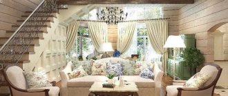
Stucco molding around the perimeter of the walls, a smooth ceiling in a boiling white hue - classic techniques of ancient estates. Bar chandeliers harmoniously insist that the window is the 21st century, and light textiles and home photographs are cozy accents of the kitchen space.
The kitchen set is made of natural wood with white varnish, and the wall has a fireplace console.
Bedroom in the spirit of a manor empire style
The interior of the bedroom is the personification of Pushkin’s times (Empire style). The wall panels are decorated with embossed glazing beads and painted olive green. Laconic sconces and a chandelier emphasize the aristocratic style.
The head of the bed pompously rises above the area of the bed, generously covered with textile bedspreads. The bedside table is a vintage piece from the late Baroque era.
For reference: Empire (translated from French as “Empire” - imperial style) is a direction of high classicism in decorative arts and architecture. Its homeland is Napoleonic France of 1803–1827.
On the opposite wall there is a floor mirror leaning against the wall.
Bathroom: East and Biedermeier
The bathroom is divided into two zones - with a bathtub framed by ceramic tiles with an oriental pattern and a part with a console under a walnut washbasin with a countertop imitating marble.
Here the design is made in a strict Biedermeier mood - a solid console, a wine-colored clean wall surface, a minimum of finishing.
Bedroom 13 sq. m.
The finishing materials of the bedroom are designed in an ecological manner: these are the colors of nature, different shades of greenery, and a print on the wallpaper that transports you to the atmosphere of a fairy-tale forest, and even a decorative element - a white deer head above the head of the bed.
The bedside tables on both sides of the bed work on the general idea - they are wooden stumps, as if they had just been delivered from the forest. They simultaneously decorate the bedroom, give it a natural charm, and do a good job as bedside tables. Another decoration is a chair. This is a replica of an Eames designer item.
The bedroom is lit by ceiling lamps, and there are additional sconces at the head of the bed. The floor was covered with wood - parquet boards.
Hallway
The hallway area is small - 6.65. The layout has not changed. The walls are light brickwork, a continuation of the overall interior concept of the apartment. Lighting - spotlights located at equal distances from each other. The storage system is organized using a wardrobe. Under the bench there is a shoe box.
Do you want an apartment designer to create an individual interior for you? Then contact the design bureau “Orekh” in Krasnodar, we will make a design project, help you decide on a style, and select finishing materials.
PS: Alina preferred project No. 2 with a bright accent wall.
Congratulations if you guessed right! Back to portfolio
Children's room 9.5 sq. m.
An important place in a two-room apartment for a family with two children is occupied by the children's room. This is not the largest, but perhaps the brightest room. Here, natural shades give way to rich red and blue tones. This color will be pleasant for both boys and girls. But the expressive blue-red ensemble was not without environmental notes: owl pillows on the sofa, decorative paintings on the walls soften some of the harshness of the bright colors.
For the nursery, fabrics made from natural fibers were chosen, and parquet boards were laid on the floor. The children's room is illuminated by spotlights built into the ceiling.
The design of the apartment is 52 sq. m. there are many storage spaces in all rooms, and the children's room is no exception. In addition to the closet, it has a shelving unit, and, in addition, there are large drawers under the bed that can be easily rolled out.
Our solutions
- Combine the loggia with the kitchen to increase the living space (you can find out more about finishing and insulating the loggia in this article).
- Demolish the wall between the kitchen and the future children's room, as a result, distribute the area in such a way as to free up 12 sq.m. for furnishing a living room.
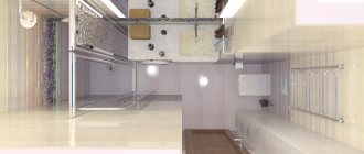
Bathroom 3.2 sq. m. + bathroom 1 sq. m.
The bathroom is designed in a combination of white and sand - an ideal combination that gives a feeling of cleanliness and comfort. In the small toilet room there was room for a narrow but long sink. The main part of the furniture had to be made to order according to the designers’ drawings, since the size of the room did not allow us to select ready-made sets.
Loggia-office
Let us remember that this apartment originally belonged to my grandmother, so it is not surprising that the loggia, although it was glazed, was used to store rarely used items.
There was also room on the loggia for a small office. Andrey often has to work late into the night, and Victoria is a very light sleeper, so the owners asked the designers to place the computer outside the bedroom.
The wall between the loggia and the kitchen was not completely removed, the doors were simply removed and the doorway was slightly widened. Of course, we had to insulate the loggia.
Another nuance - the loggia has a beveled corner. Useful area - 4.5 sq.m. Even such a small area must be zoned. A computer desk made to our dimensions was placed against a wide wall, and a sofa was placed in another part. It is assumed that children will spend time here while mother is busy preparing dinner.
The floor on the loggia is laid with the same ceramic tiles as for the kitchen - this visually unifies the space.
When planning the lighting, the space of the loggia was also taken into account - there are three small built-in spotlights on the ceiling. There is a block of sockets for connecting a computer and other office equipment.
