Limiting the kitchen area significantly reduces comfort for the whole family - it is difficult to have breakfast here, much less spend holiday evenings. But the dimensions of this room can create inconvenience for one housewife if she cooks a lot. And there is not enough space for dishes, utensils, and food - it all accumulates on the countertop, gets cluttered into all possible cabinets, takes up the windowsill, etc. The layout and equipment of a small kitchen needs to be thought out even more carefully than a spacious room. But design can also play a significant role.
Small-sized rooms usually include rooms up to 10 square meters. m, although even eight square meters is enough to arrange a comfortable, harmonious kitchen.
Provence style: features and advantages for a small apartment
A faded palette is the optimal solution for a small kitchen, and indeed the entire apartment, especially if it is a Khrushchev-era building. Light tones help to visually enlarge the space or at least make it less crowded. This is the color scheme chosen in the Provence style, which was formed in the French province of the same name on the shores of the Mediterranean Sea.
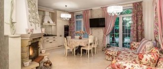
Warm climate, abundance of sun, floral aromas, rustic simplicity with French sophistication - this is how you can briefly describe the interior in this style. It has everything - alpine coolness, sea freshness, lavender scents, natural landscapes, aristocratic charm. Provence in France is an amazing region where the Southern Alps, pine and olive groves, lavender fields, and the luxurious Cote d'Azur with Nice and Cannes are located. All the associations that arise when mentioning the province are also inherent in the design in the style of the same name.
When choosing design techniques for a small kitchen, you should prefer the following typical solutions:
- exceptionally light, as if “burnt out” palette;
- simple forms;
- lack of ornate patterns;
- open shelves instead of bulky drawers;
- light curtains instead of part of the facades;
- wicker furniture or transparent chairs for visual “saving” of space.
Unlike other design options in this style, it is better to abandon richly colored wood, bright accessories and an abundance of patterns in decoration and details.
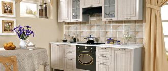
The photo shows a kitchen in a Khrushchev-era building in Provence style.
The absence of closed facades will make the set visually lighter, and the choice of furniture in the color of the wall decoration will generally free up the room, focusing attention on the free space.
Possible errors during registration
It is much easier for a modern person to make repairs in his own apartment on his own than to hire a team of craftsmen, since it is not so expensive, and you can also do construction work and interior decoration at any convenient time. The main thing in the process of drawing up a sketch of the future interior is to listen to the advice of experienced designers
But, unfortunately, people do not always pay attention to the tips and make many serious mistakes. The following is a list of flaws that are often encountered when independently repairing and arranging the interior design of the kitchen area
- Fear of tall wall cabinets. In fact, there is nothing wrong with them; on the contrary, there is an additional opportunity to free up kitchen space by hiding rarely used household items on cabinet shelves. In addition, wall cabinets can help hide external communications.
- Incorrectly selected headset. Dark-colored furniture should not be placed in a small kitchen space. To a greater extent, this mistake will affect the material component of the family budget. Dark color visually narrows the free space. In addition, they are impractical, tantamount to bright and saturated aprons. The problem can only be corrected by replacing the kitchen set from a dark to a light shade.
- Stationary installation of a hood with connection to ventilation. It is the connection system that contributes to the loss of free space in a small kitchen.
- Poor electrical connections. Initially, the electrical network is drawn according to the prepared layout sketch, we are talking about switches and sockets. This means that their number corresponds to the purchased set of household appliances. But every year more and more electrical appliances appear in the kitchen, but problems arise with connecting them. Of course, you can use extension cords, but if you purchase a product of poor quality, then when you connect it to an outlet, a short circuit may occur in the wiring. In order not to make new repairs, not to strip the walls and not to introduce new connection points, it is better to think through this nuance in advance - to make several additional electrical outlets. Let them stand idle temporarily, but after a month or a little more they will definitely come in handy.
- Incorrect layout of the kitchen space. The question is the placement of furniture and large household appliances. For example, you cannot place a refrigerator next to a stove. Of course, nothing will happen to the gas or electric structure, but the refrigerator may become unusable due to constant heating of the side wall. Do not place furniture near cooking surfaces. Splashes from the food being prepared will fall on the surface of the upholstery of the kitchen corner. It is easy to remove grease stains from a leather surface, but it will be very difficult to clean fabric material.
- Incorrect design of walls and textile products. Wallpaper, curtains, and a tablecloth with a large pattern visually narrow the free space of the kitchen.
Color of a small kitchen in Provence style
Considering the small size of the room, the decision on choosing a palette will be clear - it should be light. In this design it is not white, although it is also applicable in Provencal design. Preference is given to pastel colors in yellow, olive, and blue tones. Let's say gray, pale lilac, barely noticeable pink. Quite juicy details are used against this background, but in a small-sized kitchen you should not get carried away with them.
In the Provence style, accents of the following shades are chosen:
- brown - the natural color of solid wood;
- dark gray - a shade of natural stone;
- orange - terracotta tones of brick, ceramic tiles, clinker;
- turquoise - sea wave color;
- lavender is the natural surroundings of a house in the French province of the same name.
The photo shows a small kitchen decorated in Provence style with lavender details.
To create a harmonious composition, a couple of bright details are enough, which can be removed or changed if desired. For example, these could be small accessories - a vase, a kitchen towel, a pattern on the curtains (without abuse), a pattern on napkins for hot dishes, a cutting board or knife handles that hang on a magnet in plain sight. If you choose a larger-scale decor, the number of other details should be reduced, leaving only 1-2 accessories for harmony.
The main thing in a small apartment, and even more so in a small kitchen, like in a Khrushchev-era building, is to choose laconic color duets - not 3-4 colors and shades, but exactly 2-3, when two are light pastel background tones, and the third is an accent one.
Walls
As for decorating walls in the Provence style, there are several rules that are highly recommended to adhere to:
- No wallpaper. Yes, there are country interiors with wallpaper in the kitchen, but, believe me, it’s extremely rare. If you carefully study all the photos presented in this article, you will be able to verify this once again. Appropriately painted walls will look much more harmonious and natural in such a kitchen;
- Textured or regular plaster followed by painting or whitewashing. There is an unspoken rule here: if this is a kitchen in a country house, you can choose a rough texture or even whitewash; and if this is a city apartment, then it is better to paint the walls as smoothly as possible;
- Pastel, faded colors. Much has already been said about the palette in the previous section. Studying various photographic examples will help you choose the most suitable project;
- Sometimes stone, brick or old boards are used for cladding.
In urban environments, as a rule, they are limited to either partial (local) use of the above elements or do not use them at all. In a country house, the kitchen space and the lower level of “pretentiousness” allow you to painlessly use stone, boards, beams, tiles, bricks, etc. The main thing is not to overdo it and not turn the kitchen into something between a hallway and a garage.
Finishing a small kitchen in Provence style
The traditional small, unobtrusive pattern in the design of a small kitchen should be used carefully - even a tiny flower can become “bulky” if abundant. Therefore, ornaments are used in limited details, preferably in accents - in the apron of the working area, in curtains and tablecloths. Then the wallpaper, flooring and, of course, the ceiling should be as monochromatic as possible. The walls can be combined - choose either an apron with a pattern or an accent wall with a small flower to match the curtains with a similar pattern. You should choose paper or other matte wallpaper so that the texture looks like a plastered wall.
The floors in a small room are covered with light material with an unobtrusive pattern. This can be a tile with slight veins that imitate the natural texture of a natural mineral. Linoleum with imitation light boards is also suitable.
A Provence style ceiling is always matte, no matter how whitewashed or painted it is. Designers call stretch fabric a practical solution. In a modest kitchen, you should not use multi-level designs. Although they can visually make a room taller, in a small room they will visually reduce its area.
The advantage of the Provence style is also that such repairs can be done with your own hands - paste wallpaper, lay linoleum. Of course, if the choice falls on a suspended ceiling or tiled floor, then you will need the help of specialists.
Provence style sets: ideas for a small kitchen
The primary task when arranging a small room is to reduce the amount of bulky furniture. Ideally, it should be as small as possible. But! It is important that the existing drawers and cabinets accommodate everything that should be stored in them. It would seem that the task is paradoxical, because there are never enough utensils in the kitchen, and you also need to find a place for products that are not stored in the refrigerator.
Designers have one answer - furniture should be highly functional. For this:
- they make pencil cases that reach the height of the ceiling;
- all inconvenient corners are occupied by baskets, triangular stands, and open shelves;
- lower cabinets are filled exclusively with drawers - they are much more convenient to use and take items out of the “depths”;
- they use all kinds of organizers that help compactly store small things - bags of spices, jars, brushes, strainers and much more;
- Any non-standard spaces are filled with retractable structures with stands - for example, for bottles, cutlery, cutting boards.
A kitchen set with closed lower facades can be made visually lighter using glass inserts on the upper drawers. Open shelves are also suitable, as they look less bulky than closed cabinets. But, of course, they should also be smaller than traditional hanging structures. You can set aside some of these shelves for baskets in which utensils will be hidden, and some can be left for decor or storage jars. If forged shelves with “legs” would be appropriate in a spacious kitchen, then for a small kitchen you will have to prefer wooden ones. They should be narrow, as light as possible - preferably matching the color of the wall. Choosing furniture that matches the color of the walls significantly “lightens” the room, since the set blends into the background, visually increasing the area of the room.
Dining room of a small kitchen
Limited space for arranging a full-fledged working, and even more so, dining area forces us to look for universal solutions. Among the options that designers offer are a transformable table (folding out from a wall or window sill) or a bar counter, reducing the dining group to a minimum number of chairs and moving it to another room.
If it is not possible to move the table and chairs to the living room or to the balcony, you can choose one of the simple but functional solutions - a bar counter or an extension of the window sill (a folding option is also possible) and a couple of chairs. To ensure that such a dining group does not take up too much space, you can also use folding chairs, especially since in the assortment of most furniture stores you can find many interesting models - in natural wood color, painted white or colored. If you don't like folding stools, you can choose transparent plastic chairs - they are invisible, although they actually take up a certain place in the kitchen.
The photo shows a Provencal design of a small kitchen with a dining table as a continuation of the window sill.
A small table is not the most suitable option, although it may be needed if there is not enough worktop for cutting food.
The room is about 10 square meters. m you can safely use a bar counter or even a full-fledged dining area. But it all depends on the shape of the room. For example, in a long narrow kitchen you can arrange a parallel set and a dining area by the window - with benches or simple sofas opposite each other at a small table. You can make these with your own hands, even from a pallet.
The photo shows a narrow kitchen in Provence style with a dining area.
Combination of premises
Combining two rooms into one has both pros and cons. The undoubted advantages are:
- increase in area;
- the opportunity to implement interesting solutions;
- the ability to combine childcare and housework.
The disadvantages include the fairly high cost of repairs and the time spent on legalizing the redevelopment.
When combining two rooms, you need to take care of the hood so that the smells of food do not spread throughout the house. As for zoning, it can be done using shelving, screens, plants or contrasting floor finishes. The bar counter between the kitchen and living room will also become a natural border.
Accessories for small kitchens in Provence style
Traditionally, Provence design uses a lot of textiles, embroidered with your own hands, so the style is often chosen by needlewomen and connoisseurs of rustic, original decor. You can embroider almost all the textiles yourself - curtains (both for windows and instead of facades), tablecloths, napkins, cushion covers - for chairs, benches. The pattern that is usually embroidered to decorate a Provence kitchen is a small wildflower, olive branches, and lavender inflorescences. In such details lies the comfort created independently. There are no geometric patterns, continuous satin stitch embroidery, or large classic buds. In a small kitchen, it is important to use only a few of these details so as not to overdo it with its decoration.
The photo shows curtains in the Provence style, embroidered with your own hands.
The central lamp in traditional Provence can be of a forged design, which is unacceptable for a small-sized kitchen. Therefore, for such a room you should prefer ordinary glass shades or wicker shades - country models.
The photo shows a wicker lampshade for a kitchen in the Provence style.
Since the kitchen always needs additional lighting, it is worth considering non-bulky light sources. Here you should not use spotlights, which are easily built into a suspended ceiling. Hidden lamps are suitable - not visible to the eye - above the sink, above the work surface. To illuminate the dining area, you should choose a sconce in the same design as the central chandelier.
Selecting decor
The first and most important sign of the Provence style is the abundance of fresh flowers and many sources of natural light. Green plants can stand on window sills in clay pots, or delight the eye in the form of a field bouquet in an elegant vase on a wooden table.
Watches are usually chosen to be round in shape, with a floral print, even decorated with cockerels.
Seascapes, family photos, children's drawings, and still lifes will be an excellent excuse to fill empty space on the walls.
If you like handmade things, you can safely take on decorating dishes and storage containers, making wicker baskets for fruit or bread, and small ceramic figurines that serve an aesthetic function.
Products made from natural materials would be quite appropriate: wood, metal, stone. Thanks to this, you will be able to combine simplicity and elegance, resulting in the well-known rustic style.


