Photo: idei.club White color is a classic in interiors, because it gives such a valuable feeling of space, lightness and airiness. But many are afraid to use it in the kitchen - it is too easily soiled, impractical, looks bland and sterile. Is this really so - now we’ll figure it out! And at the same time, we’ll figure out how to create a truly spectacular white kitchen with a white countertop!
Features and influence of color on the psyche
In most religions and cultures, white symbolizes purity, spirituality, light, consciousness or divine powers. At the same time, it symbolizes innocence, motherhood, unity, spiritual transformation and rebirth. This is the color of absolute freedom, problem solving and something new that replaces the old.
In fact, white color is a combination of all possible colors, because an optically white beam is made up of colored waves of different lengths. Perhaps you've seen that legendary Pink Floyd cover with a prism? This is what it is - and it is this phenomenon that Newton discovered back in the seventeenth century.
Due to its optical and physical properties, white color creates a feeling of expanding space. This is due to the reflection of waves and the effect is easy to notice if you compare the effect of white with the contrasting black. Of course, this technique has been used in interiors for centuries to make a room brighter and more spacious.
White does not have a pronounced emotional color, so it does not excite the nervous system as much as red or blue. It goes well with any other shades and emphasizes their purity or depth. Finally, this is one of the best options for creating a neutral background – including in the interior.
Benefits of a light kitchen
As you can see in the photo of a bright kitchen, rooms with such decoration look fresh and elegant, light and festive. They give the impression of a neat, clean, gentle room.
Additional benefits of a light kitchen will be:
- Visual increase in space;
- Giving light and grace;
- Excellent compatibility with all other colors and textures of decoration, furniture, and decor;
- The ability to quickly change the interior without large financial investments;
- Emotional warmth and grace of every line;
- Creating a good mood, attracting calm and tranquility.
A light kitchen looks good and rich, it will not get boring for a long time, will not cause irritation or a desire to change the interior.
It is believed that the light surface is a mark and requires additional care. But practice shows that on such parts dust, stains and drops of water are much less noticeable than on dark countertops.
Choosing an interior style
White color is one of the few that fits into any style, from classic to contemporary. Only beige and gray in their light variations can compete with it. And in more rare cases - black and natural wood brown.
White kitchen with white countertops in a modern style
Modern style is a fine line between classic and functional high-tech. Universal white will amazingly unite and harmonize the combination of fashionable shapes with traditional materials. Against this background, dark, laconic sets with a white countertop, a glass table, shelves with chrome details and a brand new backlit bar counter look good.
White kitchen with white countertops in a classic style
Recreating the classic style in all its glory in a typical modern kitchen is quite difficult. It still requires space, some monumentality and an abundance of details. This is not easy to balance in a functional space like a kitchen. Once again, white comes to the rescue, lightening the interior with all its curls, gilded details, heavy furniture and antique fittings.
White kitchen with white countertops in Scandinavian style
In Scandinavian interiors, white is by far the main color, and there are two reasons for this. Firstly, such interiors require the maximum amount of light and a sense of space - just enough to fit everything you need in a small kitchen. Secondly, all the bright and unusual colorful accessories, photographs, patchwork pillows and handmade decorations look best on a white background.
White kitchen with white countertops in Provence style
Provence gravitates towards delicate pastel colors - lavender, vanilla, azure, mint and pistachio. But if you mix only them in the interior, even in such a small concentration you can get an overloaded motley “patchwork blanket”. Neutral white will help avoid this effect, and bleached wood for the countertops and facades is a classic of the genre.
White kitchen: interior design ideas (100 photos)
What does white color give to the interior?
Small kitchen in classic style with island
White color visually enlarges the room, adds purity or solemnity, pristine fundamentality or peace. It has no shades. This is an extremely pure color. It is universal and matches other shades. It has always been and remains out of fashion. And the design is created around it. In addition it becomes:
White is ideal for small spaces as it increases space
- A good background for furniture, decorative elements
- Gives the interior elegance.
- Indispensable for rooms facing north, for lower floors with limited natural light.
- Creates interesting duets with other colors.
- Such headsets suit different styles.
- Gilding of parts helps create a classic interior.
- This calm color does not irritate over time, unlike this year's super fashionable colors.
- It is very calming, which is important in our hectic world.
Checkerboard black and white tiles can transform any interior
The kitchen needs an addition that will provide visual variety. Curtains, lamps, tiles of the kitchen apron and floors, accessories of a different shade. You don't have to choose a bright option. For these options, you can choose one color with varying depths of shades.
Blue details on white reveal the deepest
There are small nuances that help prevent the room from turning into a hospital ward. Using them you can make the interior soft or festive, noble or calm, fashionable or peaceful:
Pastel turquoise gives an airy feeling
- Ivory;
- Baked milk;
- Pearl (various shades);
- Beige;
- Matt cotton or parchment;
- Ashen;
- A hint of milk cream;
- Unbleached fabric.
The trendy solution will be matte gray in a white room.
Do not use white in its pure form. Add other shades to dilute it. But do not introduce more than three nuances so as not to lose the attractiveness of whiteness.
Materials and textiles
When choosing white materials for the kitchen, you must not forget that you will still be cooking there. It is important that everything is easy to wash and wash, does not turn yellow, does not grey, does not absorb odors, and is not afraid of moisture and grease. In this case, caring for a white kitchen is not at all difficult, contrary to stereotypes.
Floor finishing
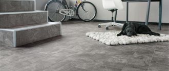
For the kitchen floor, white tiles or porcelain tiles are ideal, which can be combined with a bleached wood laminate in the dining area. If you don’t want gloss, pay attention to matte collections or special textured coatings, which are also safer. Pay special attention to all seams and joints - they must be thoroughly sealed and insulated from moisture.
Wall decoration
White wallpaper is not the best choice for the kitchen, even if it is washable vinyl or non-woven material. Decorate the work area with tiles, and use washable white paint for the rest of the walls. It’s easy to remove grease and dirt from it, and if you can’t wash off a stain, you just need to discreetly paint over it.
It doesn’t have to be sterile white: pay attention to milky and other shades. But the simpler it is, the easier it will be to find matching paint later to freshen up the renovation.
Ceiling design
Whitewashing in the kitchen is not the most practical option, because it is almost impossible to wash it properly. The same goes for drywall, which is also sensitive to moisture. Choose suspended ceilings with glossy, matte or satin fabric - all defects, communications and lamps will be hidden under it.
Curtains
White curtains in the kitchen can really be a problem, especially if the window is located near the work area. Avoid any fabrics that are too bulky or floaty - they will inevitably quickly get dirty and also accumulate dust. Take mixed or synthetic textiles, which are more durable and easier to wash. Or even change the tulle curtains to Roman blinds or other roller shutters.
Materials for the kitchen table
The most traditional and democratic material is chipboard with lamination. Has a limited range of colors and patterns. Chipboard is not very durable, but it is affordable.
MDF board coated with PVC has the best performance characteristics. The palette of colors, shades and textures is practically unlimited. Coatings that imitate wood are very similar to real wood, but are much more practical and more resistant to scratches, moisture, fats and acids in food.
Glass. Glass countertops are trending right now. Transparent, tinted and even matte. Because of their transparency, they do not clutter up the room. Durable, washable, but scratched over time. May break if dropped; may chip at the edge when objects fall on the table. Some people feel uncomfortable behind a glass tabletop – this needs to be taken into account when choosing a table.
Plastic is a relatively new material for furniture (street cafes do not count). It can be transparent or colored in volume. Very light and durable, transparent does not clutter the kitchen. Plastic chairs are used more often; tables have not yet caught on with us. Disadvantages: countertops are resistant to hot dishes and get scratched over time.
Natural and artificial stone are very strong and durable. They look stylish and expensive. They cost even more. Natural stone has a limited choice of colors. Artificial stone has many more colors and shades. Disadvantages: A heavy tabletop requires strong legs and may break if dropped. The stone is cold to the touch - this may not be to everyone’s liking.
Natural wood always looks great - varnished and painted, white, black, red, cherry, red and gray. But wood is not resistant to moisture - sooner or later the wood will absorb moisture and begin to warp. There are expensive exotic types of wood that are resistant to moisture. But the cost of such tables is exorbitant.
Wood is an almost ideal material for table legs. The legs can be smooth or figured (turned on a lathe).
Metal. Kitchen tables are not made from it, but pipes are a wonderful material for legs. There are nickel plated, coated with smooth and hammer paint (metallic with dots of a different color). Legs can be straight or curved.
Another uncharacteristic material is ceramic tiles. An ordinary kitchen table is covered with chipboard and MDF. The tiles are usually bright, colorful, with beautiful Moroccan or Arabic patterns. Used to style a kitchen in an oriental style.
Furniture and appliances
When choosing furniture and appliances for a white kitchen with white countertops, there are two traditional options. Or make a monochrome interior and continue to use white and the lightest shades. Or play with contrasts - with black, dark brown, gray or bright colors.
Work zone
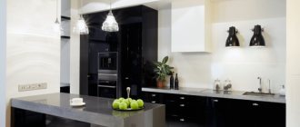
A black wooden set and the same black appliances look very impressive with a white countertop. To add color, pay attention to rich red, sunny yellow, calm green or cool blue. In a small kitchen, linear or corner sets are good, but in a large kitchen you can experiment with an island layout.
Dinner Zone
A dining table made of the same material as the worktop looks stylish and at the same time classic. But in a spacious room with clear zoning, you can, on the contrary, play with contrast. For example, take dark wood or glass under a snow-white stone. If a few seats are enough for you, instead of a dining table, pay attention to U-shaped sets or sets with a bar counter included.
Small kitchen in Khrushchev: 80 photos and design ideas
Design styles
Bright kitchens are ideal for any design. Thanks to the ability to optically enlarge space, delicate shades are used for small and spacious rooms and studio apartments.
- A classic kitchen is suitable for connoisseurs of comfort surrounded by ancient luxury and natural materials. Bright kitchens made of solid expensive wood, exquisite carving of facades, the same expensive fabrics and finishing materials, antique accessories will make the dream of an aura of prosperity and confidence come true
- The Provence style will take the inhabitants of the kitchen to an ancient French village, where the colors are somewhat faded from the bright sun and faded with the passage of time. This finishing option is suitable for lovers of elegant simplicity and rural charm.
- Snow-white Scandinavian cuisine will fill the apartment with the coolness of the ice fields of Finland and the expanses of the fjords of Norway. Delicate curtains, napkins and tablecloths, wooden furniture and floors will bring warmth to such a room.
- Minimalism is simply perfect for using white flowers. A bright room, a lack of decor, and the use of a minimum number of pieces of furniture and appliances will help to create a spacious room even in a small kitchen.
- Light high-tech will give pleasure to housewives who are not ready to spend most of their free time in the kitchen. Such a room is characterized by the presence of modern technology, simple surfaces that do not require long-term maintenance, and original opening and lighting systems. Light kitchens with dark countertops are a great way to infuse the space with much-needed energy.
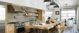
- The loft will help bring the most unusual ideas to life. A brutal style will be created by concrete-gray walls and ceilings, wooden or plastic furniture, and original decor that combines new technology with old items inherited from grandma and carefully restored.
Which apron to choose?
Although white is actually much easier to clean than is commonly believed, the kitchen work area will still get dirty. This problem is solved by an apron made of material that can be cleaned with a regular sponge and detergent. Tiles are combined with a white wooden tabletop, you can use the same artificial stone tone-on-tone for stone, and acrylic will be complemented by a spectacular glass plate or stainless steel.
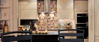
For contrast, an apron covered with black slate paint looks interesting. You can draw on it with crayons, write notes and recipes, just like on a blackboard. And the eternal classic is mosaic made from different types of tiles or even from different materials.
Caring for white table surfaces
Most people think that a white table is not practical to use.
You shouldn’t think like that, because nowadays there are a sufficient number of detergents that can cope with any type of contamination.
Even if you buy a black table, this does not mean that it does not need care.
IKEA will help you make the right choice. In the 21st century, thanks to modern technology, they were able to create furniture items with enormous advantages.
The IKEA white table serves its purpose in any room. Create comfort in your own home in such a way that it will be pleasant not only for you, but also for your guests.
- Which interior would suit glass tables?
- Modular sofas: why you should buy one
- Ready-made wardrobe or custom-made - which is better?
Lighting and backlighting
It would be strange to neglect the organization of lighting in a white kitchen, where so much has already been done to maintain the illusion of lightness and space. Use spotlights around the perimeter, and pendant lights above the bar counter or dining table.
Don’t forget about local lighting of the shelves, stove and work area - this will make it easier for you to cook in the evening. And be sure to pay attention to the color and temperature of the lamps you use so as not to turn your kitchen into a medical laboratory.
Kitchen 14 m2: beautiful design ideas (75 photos)
Selection of finishing materials for the kitchen 2022 in white
Marble or granite tiles in light colors or linoleum of a similar color will look good as a material for finishing the floor of a white kitchen in 2022.
The ceiling in a white kitchen 2022 can be simply whitewashed or made textured, decorated with expressive stucco molding in contrast, which will be combined with other accents in the overall ensemble. You can cover the ceiling with gold or silver leaf, decorate it with tiles, plastic or metal plates.
The walls can be painted or tiled with traditional tiles. There are no restrictions in the choice of finishing materials. The main thing is that they are equally resistant to dirt and easy to clean.
Furniture
This is an important part of the kitchen interior of a white kitchen 2022. When ordering a kitchen set in light colors, it is very important to decide not only on its style, but also on the types of facades. Glossy surfaces fit perfectly, look elegant and impressive in styles such as art deco and high-tech.
Eclecticism, loft, Scandinavian style do not accept gloss; for them it is better to buy matte furniture. This design does not attract attention, it looks discreet, expensive and noble. In addition, various contaminants are less noticeable on matte facades. They go well with masonry and natural wood panels.
In the interior of a white kitchen 2022, a table with chairs made of solid wood or colored glass will look great.
Apron
A white apron conveniently sets off kitchen furniture of any color. This is an important part of the kitchen interior. For the apron, plastic, glass, and mosaic are usually used. An excellent solution is tiles made in the patchwork style, which will give the interior a touch of the Mediterranean, and popular types of triplex made of tempered or laminated glass will help create visual space and make the kitchen area more comfortable. A wood-look apron will look harmonious in a white kitchen.
Lighting
A white kitchen fills the room with light. Ideally, it is necessary to use two types of lighting - primary (several spotlights around the perimeter of the room) and secondary (above the working surface). Glazed cabinets can be equipped with additional lighting - LED strip.
Glowing shimmering doors will add romance, comfort and magic to the room, and in an instant they will create the modern style of a beautiful white kitchen 2022.
Selection of textiles and decor
Bright tablecloths, napkins, pillows and dishes will help revive the pale kitchen decor. Products should be selected based on the main style. They should differ only in texture. Decorative accessories such as wicker chair cushions, white calico curtains, terry towels decorated with patterns, embroidered tablecloths, lace napkins with braid will not only become color accents in the interior, but will also effectively dilute the plain white color.
Accent decor can be kitchen utensils, dishes with a plain or colorful pattern in combination with a work surface of the same color. Colored pots and magnets on refrigeration equipment will fill the white interior with a festive and carefree mood.
Beautiful white kitchens, fashion trends and trends dictated by modern trends in the field of interior design 2022, will not leave anyone indifferent. After all, only this color can give a cooking room real sophistication, lightness and airiness.
White kitchen with white countertop - photo
White color is not at all boring or monotonous, because its simplicity and versatility have a downside. It can be used anytime, anywhere and with anything. And to show this in practice, we have collected a large selection of projects and ideas!
Modern white kitchen with white countertop
Although every season has its own trends, the white color in the interior seems to be out of fashion. Whether in neoclassicism, in modern style, or in futuristic high-tech, this is the basis for any further manipulations. Modern minimalism in all its manifestations, from Japanese to Scandinavian, is also built on it.
Kitchen with white countertop and splashback
An apron of the same shade and texture as the worktop is a very effective and practical technique. The fewer seams and joints, the neater the finish looks. And also, the fewer places into which spilled wine or juice can flow.
Glossy white kitchen with white worktop
White gloss is the maximum light and space that can be obtained by experimenting with finishing. Pay attention to this option if you have a very small kitchen and do not have enough windows or daylight. To make it less bland, combine several shades of white or combine it with other colors, depending on the desired effect.
Matte white kitchen with white countertop
Glossy white has long been familiar and understandable to everyone, but matte is much less common in interiors. This kitchen looks simple and unusual at the same time - just what you need if you are inclined towards individual solutions. Just carefully choose all materials and surfaces, because matte ones are often textured, and it’s really more difficult to care for them.
Corner white kitchen with white countertop
Corner kitchens are especially good if you have little space and need to use it 100%. In this case, white color only plays into your hands, because in itself it has the property of making the room larger. The corner module perfectly accommodates another cabinet, sink or even a small hob.
Black and white kitchen with white countertop
Black and white contrasts in the interior are always a win-win stylish, laconic and at the same time bright option. A black set goes best with a white countertop, and black appliances and plumbing fixtures look expensive and noble. Contrasting black accents in the decoration can visually adjust the geometry of the room, visually stretch it or raise the ceiling.
Did you like the post? Subscribe to our channel in Yandex.Zen, it really helps us in our development!
Light Symphony Instruments
Our orchestra includes:
- Spots - as an addition to the general lamp. At the same time, their light is directed upward to create reflected diffused light.
- Chandelier - well, where would we be without it? It will certainly become the center of the light composition.
- The lamp has a long pendant, and it’s good if its length is adjustable. This way you can create an intimate atmosphere.
- Sconce - if the table is near the wall, then several wall lamps can participate in creating the lighting design.
- An inclined floor lamp can easily replace a chandelier.
- White ceiling as a light reflector.
The skillful combination of these instruments creates that same atmosphere of hospitality and warmth.
It is important to use these tools correctly to create a beautiful composition.
- Spots as an integral part of the track system. They become almost indispensable if you have a folding table or do not have a permanent place for it. We moved the lamps, turned them in the right direction - and the illumination of the dining table was ensured. Use spots with a cone-shaped shade that provide diffused light. Some lamps can be turned towards the ceiling to create the effect of reflected light. Spots can play both an independent and an auxiliary role in lighting the dining area.
- A chandelier immediately organizes the space and creates the necessary aura. Her character and style can be very different. As a source of basic general light, it has no equal.
- Long pendants - their light should completely illuminate the tabletop, but not blind the eyes. Adjust their height depending on your needs. They, like a chandelier, can become an interior decoration. Think about how they will look when turned off. Try to make them an interesting art object, because they will definitely attract attention. Place at the correct distance from the table surface.
- Sconces will help highlight a corner for intimate gatherings. It is unlikely that it will be possible to illuminate the entire surface of the table with the help of a sconce, so let’s call on the general light to help. But in the evening, to create the right atmosphere for a romantic dinner, sconces do their job and do not need support.
- If at the renovation stage you did not provide space for the chandelier in the right place, and there is neither time nor desire to start reconstruction, and sometimes even the opportunity, based on the characteristics of the room, a floor lamp gracefully bent over the dining table will help solve the problem. It is unlikely that he will cope with this task alone; he will need additional lighting, but partly it will be suitable as an alternative to a chandelier.
- The white ceiling, of course, is not a lighting device, but it is capable of adding light and air to the atmosphere with its reflected radiance.
Lighting scenarios depend on the chosen room style. In order for the dining area to sound harmoniously in the overall ensemble, you cannot ignore this issue.
