To create a cool and modern wall design in the kitchen, you first need to choose the optimal finishing material and settle on an interesting color. Or an effective combination that will maximize your design concept, highlight all the advantages of the room configuration and, at the same time, neutralize the existing disadvantages. All the nuances of choice and options, as well as fashion trends that are worth paying attention to, will be discussed in this material.
Requirements for finishing materials in the kitchen
- moisture resistance - permanent high humidity should not affect the structure of the material and change its shade;
- fire safety - implies complete resistance to fire or low flammability;
- strength and durability - constant temperature changes should not reduce the performance characteristics of the material, as well as regular thorough washing using powders and other means;
- environmental friendliness - when heated, the material should not release hazardous substances into the air;
- ease of care - you need to avoid glaze on the surface, porous textures that accumulate dust, grease and dirt and are difficult to clean.
Tile
Ceramic tiles are a classic in kitchen design. Despite its venerable age, kitchen wall tiles remain the favorite material of any designer, whether he is a qualified specialist or an amateur beginner.
The advantages of this type of finishing include the environmental friendliness of the coating and its hygiene. It can be cleaned even with the use of chemicals, and fresh stains can be easily removed with ordinary water.
The tiles will not harbor unwanted neighbors in the form of microbes, mites, or mold.
The durability of the tile cannot be compared with any type of coating; it will live for decades, remaining as clean and neat as on the day of creation. Of course, if you look after her a little. The recycling process is also not difficult. All its components are natural materials.
Ceramic tiles will not lose color even in the sunniest kitchen. It is not afraid of changes in temperature and humidity. It does not absorb odors.
It is almost impossible to scratch or break.
The disadvantages of ceramic tiles include their cost, which will pay for itself during operation, and the complexity of installation. Very often, tiling will require the efforts of professional finishers.
Therefore, tiles are most often used to decorate problem areas.
What color to choose for the walls
The color of the kitchen affects a person’s emotional state: it not only invigorates or calms, but also promotes better appetite. Therefore, when choosing it to decorate the walls in the kitchen, you should abandon controversial and, especially, radical decisions.
To make it easier for you to navigate the characteristics of a particular color used in the design of walls in the kitchen, we have compiled a small but useful table for you.
| Color | Impact |
| Yellow | improves mood; invigorates well in the morning; works great in modern interiors |
| Blue | calms and relaxes; organically complements the Mediterranean style |
| White | creates a neutral environment; is basic and goes well with any other shade |
| Orange | creates an optimistic mood; completely removes stress; works well in modern and fusion styles |
| Green | perfectly pacifies; relieves negative emotions; goes well with classic interiors |
| Black | may cause anxiety; often used in loft and high-tech; requires a contrasting shade in pair |
| Red | energizes; widely used in contemporary art; visually reduces space |
| Grey | completely universal and neutral; brings order to the design |
Plastic panels
PVC panels are not as useful a material as their wooden relatives, but they are also often found in kitchen decoration.
They are characterized by ease of installation, many shades and patterns. The panels can perfectly imitate wood, marble, and stone.
They are not afraid of temperature changes and moisture. They are not subject to rot and mold.
Caring for them is completely simple, they do not attract dirt and are easy to clean with plain water. They are not afraid of chemicals either.
Inexpensive cost will be another advantage of this finish.
However, they are not very durable and environmentally friendly; they can fade when exposed to strong ultraviolet rays.
Modern finishing options
The walls in the kitchen can be covered with more than just wallpaper. There are many more ways to design them. It’s difficult to list everything in one article at once, but we’ll try.
Wallpaper
However, we’ll start with them, because wallpaper in the kitchen is a classic option for wall decoration. If you want the wallpaper you pasted to stay in the kitchen for a long time and not peel off, choose those that have a non-woven or vinyl backing. They can be washed easily. And they don’t fade at all in the sun, safely keeping the print fresh for years.
However, even the most expensive wallpaper has obvious drawbacks: they scratch easily and collect dust and grease on the textured surface. Therefore, get ready for grueling maintenance if you decide to go with this finishing option.
An alternative to conventional wallpaper for decorating walls in the kitchen is glass wallpaper and paintable wallpaper. Preparing the walls is the same as for wallpapering with regular wallpaper. The main advantage is durability, because they can be repainted up to 5-7 times, depending on the manufacturer. An undeniable advantage of fiberglass is that it can be glued in new buildings without fear of shrinkage of the walls. The slightest cracks will be hidden, but the walls will have to be leveled first, almost like before painting. To paint fiberglass in the kitchen, choose a special washable paint; the shade can be absolutely any.
Keep in mind that fiberglass absorbs paint very well, so to apply the 1st layer it is usually diluted with water 1:3. To obtain a uniform shade, you will need to apply 2-3 layers of paint.
Photo wallpaper
A real lifesaver in those moments when the kitchen seems boring, uncomfortable and completely outdated.
As a rule, thematic images are used to add variety to the environment:
- forks, spoons, cups, etc.;
- various dishes;
- fruits and vegetables;
- megacities and architectural structures, etc.
Of the minuses: they require a lot of free space to deploy a full-fledged panel. To admire the painting, it is advisable to leave the kitchen wall free, and for many this is an unaffordable luxury. In addition, photo wallpapers, alas, very often become boring.
Ceramic tile
One would like to call this material for interior decoration ideal. This is a practically indestructible coating that is not afraid of detergents with chemically active components, constant temperature changes, water or fire.
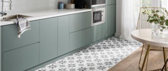
Tiles also have an amazing variety of textures and patterns. You can choose a classic monocolor, but if you wish, create a masterpiece of design art with the help of specific collections.
Kitchen set
A blue set will definitely attract all the attention in the kitchen, so it is better not to duplicate this tone in the room or choose very small decorative items to match the tone, for example, a vase or dishes. Antique metal handles look best on such furniture, for example, from:
- bronze;
- become;
- copper
Chrome or nickel plated surfaces are also suitable. Not everyone will decide to buy a completely blue set, so there are also analogues on the market - for example, a white or beige top and a blue bottom.
It is important to think about the apron - it should be combined with the blue kitchen. The following tones are perfect for this:
- grey;
- white;
- cream;
- brown;
- yellowish.
It is worth paying attention to the material from which the set is made. The options are completely different.
Tabletop and apron
Another design option in blue is the work area. This can be a separate apron or tabletop, or both items at once.
In any case, the work area should be in harmony with the rest of the room’s decoration - walls, ceiling, floor, and kitchen unit. Since the work area does not take up as much space as the set, its blue tone can be duplicated in curtains or a dining area.
Often the countertop and apron are made of the same material. This creates a very harmonious atmosphere, especially with a corner layout.
The classic combination of a white kitchen and a blue countertop. Pay attention to the fittings and small inserts in the apron
Materials for the blue work area
The blue color greatly limits the number of materials suitable for finishing the work area. For example, first of all you will have to abandon natural and artificial stone, as well as untreated solids. But there are still many options to choose from.
| MDF and chipboard | These panels are wood chips, just processed differently. In this regard, these options cannot be called durable. In addition, due to contact with water, they can swell, so such surfaces should be treated very carefully. |
| Ceramics | Ceramics have long since taken root on an apron, and on a countertop it will look very original. This is an excellent material - resistant to moisture and temperature. The only negative is the seams. They will become clogged with grease, dust and dirt, and over time, fungus may even appear. |
| Steel | A very practical material - durable, easy to care for and resistant to high temperatures, water and chemicals. It’s not for nothing that restaurant kitchens use steel for everything. But the kitchen in the apartment is not a service space, and the style of steel is very difficult to fit into the interior. Most often, comfort disappears instantly. |
| Strained glass | Another practical option - it does not absorb dirt and grease, and is not afraid of water and temperature. It is more suitable for an apron (more details in this article), since it is afraid of strong impacts and falls. But there are also glass countertops. |
Notice how beautiful it looks, not the typical white boar, but the blue one. Epoxy grout will keep the seams in their original condition for a long time
Wooden kitchen
Wood in the interior refers us to naturalness and nature. There are several options for introducing it into a blue kitchen: make a wooden apron and countertop, or choose facades with a wood texture.
This option will give the interior status and high cost. Photo: shutterstock
The first option will add coziness and warmth to the space, and the second will give the interior status and high cost.
Wood in the interior is an eternally fashionable trend. Photo: globallookpress
Matte kitchen
The matte smooth surface of the facades looks ultra-modern and does not require special care. But due to the lack of a “reflection” effect, such a set visually narrows the space.
This combination is very lively and rich. Photo: pexels/Houzlook
To level this out, you can make only the bottom row of cabinets matte, and for the top row choose facades made of glass or with a slight sheen. Another way to lighten the design is to paint the furniture in the color of the walls so that they merge as much as possible into a single whole.
Glossy kitchen
Due to the play of light, the blue gloss of furniture facades visually increases the area of any kitchen. But this coating has one obvious drawback - it requires special care. Since glossy furniture requires constant cleaning of dust, stains and fingerprints, most people refuse it. The marks are especially noticeable on facades of bright and dark colors.
The noble appearance gives the kitchen a sophisticated atmosphere. Photo: shutterstock
Wall decoration and kitchen style
Another table will help you quickly and clearly understand which finishing material is best combined with a specific design style.
| Material | Style |
| Siding | classic design |
| MDF panels | country, provence, classic |
| Plastic | minimalism, scandi, provence |
| Ceramic tile | any classic, Mediterranean interiors, Provence |
| Porcelain tiles | classic, hi-tech, contemporary, loft |
| Glass | classic, hi-tech |
| Cork | country, Provence, classic style, ethno |
| Decorative rock | loft, hi-tech |
| Brick and clinker | country, loft |
| Wallpapers and photo wallpapers | everywhere appropriate depending on the design or pattern |
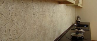
| Decorative plaster | Provence, classic designs |
| Painting | scandi, minimalism, hi-tech, ethno |
Geometric patterns
The difference between this technique and accent geometric patterns is that in the first case only one wall will be decorated with them, and in the second - all the walls. If you choose geometric prints for your wallpaper, don't go overboard. Plain, discreet patterns made with soft paint look better.
Photo: muralswallpaper.com
How to design an apron
This zone is primarily required to be practical. Therefore, any attempts to design it must be considered through the prism of healthy pragmatics and ergonomics.
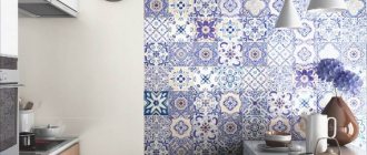
One of the key trends in recent years is segmented patchwork ceramic tiles. It enlivens the space and fits well with all modern designs.
Another current method is massive porcelain tiles measuring 60x120. Covers almost the entire area, creating a harmonious feeling of homogeneous space. The most common options are imitation marble and granite. Less commonly, slabs stylized to look like a concrete base.
The classic “hog” 10x20 and 10x30 appears less and less in interiors.
If we take a break from ceramics, then to decorate the apron you can also consider:
- threw off;
- steel panels;
- mosaic based on stone or glass;
- plastic panels with decoration.
The last option is the most affordable in terms of cost, but is only suitable when you are dealing with an electric stove.
Wall decoration above the dining area
Forget about the calendar and paintings - there are much more interesting options for decorating the wall in the kitchen near the dining table.
For example, a wall clock with elegant decoration. What if one of your family members collects them? In this case, you can beautifully place several on the wall at once, making an original composition out of them.
A magnetic whiteboard for notes would also look appropriate when decorating a free wall in the kitchen. You can always leave new drawings or messages to family members on it, thereby creating a sincere atmosphere in the apartment.
If the kitchen is not so large and you don’t want to fill it with cabinets, there is a reason to use open shelves and racks on the wall adjacent to the dining complex. There you can place various necessary items, as well as beautiful decorations and all sorts of useful little things.
A rare, but still interesting option in the design of kitchen walls is a mirror. It reveals itself especially organically in a modest-sized space, as it creates a lasting illusion of its expansion.
Decorating principles
When creating your own interior design, you decided to decorate the room, but can’t decide on the choice? Dont be upset! Thanks to our tips, you can easily create a custom kitchen interior.
Decorating principles and tips:
- Successful areas for decoration are the partitions between the windows and the area above standing furniture;
- Remember the symmetry of compositions;
- When choosing the number of room decorations, remember the phrase “less is more”;
- All wall decorations must match the interior design;
- Posters and paintings are hung at eye level.
“If there is an object in the room that does not fit the interior, choose a wall decorative element that matches its color.”
Design ideas in the kitchen-living room
The design of walls in a kitchen combined with a living room follows slightly different laws: to create harmony, you need to work on zoning and highlight accent areas.
In order for the walls to act as space dividers, they need to be decorated with different finishing materials. Or use different ornaments and images if the material is the same. Almost always, the division takes place on a functional basis - there are zones for cooking and eating (dining room) and relaxation (hall, living room).
A combination of painted walls and wallpaper is always a winning option.
Or ceramic wall tiles in the dining area + wallpaper or plaster in the living room.
If your interior is decorated in a classic style, try another interesting mix: decorative plaster in the dining room, MDF wall panels in the living room.
Decor
You can play up an empty wall in the kitchen using various decorative elements. As a rule, the following areas are registered:
- various niches and projections;
- wall near the dining table;
- apron;
- wall adjacent to the entrance to the kitchen.
No one limits your imagination in wall decor. But it can be directed. To do this, we will demonstrate several successful, in our opinion, options.
For example, a composition of saucers and plates on the wall. Firstly, the kitchen theme is followed. Secondly, the elements can be placed in such a way that they will form some kind of figure and express a greater meaning. Of course, for this you need to maintain stylistic unity and adhere to the rules of symmetry.
Mirrors always look impressive. For small kitchens, this is generally a godsend: they not only play well with the lighting, but also help to visually enlarge the space. They can be compiled from small fragments into some kind of conceptual solution.
The theme will also include beautifully designed kitchen utensils. For example, wooden cutting boards. They can be artificially aged and hung on loops. They can be accompanied by rolling pins, frying pans and, in general, everything that in one way or another relates to the topic of cooking.
More options:
- slate board for messages;
- vinyl stickers;
- stylized posters;
- painting with acrylic paints;
- interior letters;
- panel organizer, etc.
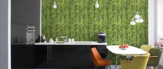
Photo wallpaper
Using photo wallpaper you can create a real art object in your kitchen. Many people choose this option for the same reasons as accent walls. Photo wallpaper with the right pattern can make a large kitchen more comfortable, and visually enlarge a small one.
Photo: homedepot.com
Fashion trends
If you do not follow current design trends, it will be very difficult to achieve fashionable design.
Let's try to identify the most noticeable trends in kitchen design:
- red and brown tones - especially if you need to create an accent wall;
- environmental friendliness - MDF and laminate on the wall surface;
- glass and metal - exactly on the apron, and they look organic in any style, even classic;
- antique motifs - appear in the form of decor on certain sections of the walls (columns, bas-reliefs, characteristic images and ornaments;
- greenery - use flowerpots to add more vital energy to the interior.
Wooden panels
You can create a beautiful, environmentally friendly, cozy room if you use wooden lining. The decoration is perfect for spacious rooms, making you remember a carefree childhood and an old house with the aroma of the stove and pies.
The tree is not afraid of temperature changes and is not afraid of room humidity. Especially if you pre-treat the wood with varnish or other protective agents.
Such panels are distinguished by their durability and soft texture, they are pleasant to the touch and maintain a pleasant temperature regardless of the environment.
They perfectly create a surprisingly fresh aroma of a summer forest, allow air to pass through perfectly, and regulate humidity.
Wooden panels are good sound insulators.
Pine and cedar boards can destroy pathogens, purify the air and help improve immunity.
Disadvantages include the difficulty of removing stains and the expensive cost of the material.
