The kitchen is a place of relaxation for every person, since eating is a kind of reboot between tasks for many of us. Therefore, it is important to decorate it in a pleasant color, combination of shades and setting. To do this, it is worth thinking through the desired nuances in advance, planning them and putting them into practice.
Cozy, versatile and stylish - this cappuccino shade is perfect for decorating the interior of a modern kitchen.
Main features of cappuccino color in the kitchen interior
Cappuccino cuisine is considered the best option for lovers of beautiful names and naturalness in the interior; this is precisely the association that most people have. This variety of beige color has different tones, depending on the saturation of grey, yellow and brown shades in them. But in any of these cases there will be a clear reference to tasty, aromatic and warm drinks: cocoa, coffee with milk.
Water splashes and dust are hardly noticeable on milky coffee-colored surfaces
The shade of cappuccino is found both in classic and Provence, as well as in high-tech or minimalism. In the first case, matte surfaces are used, in the second, as a rule, glossy surfaces are used.
Psychology of color
The well-known fact of the influence of color on a person’s mood and general well-being is confirmed by those who decided on a glossy coffee-colored kitchen (see photo below). Beige shades have a calming effect, bringing a feeling of stability, security and unity with nature. Also, most people associate it with the drink of the same name, which is adored by many.
The delicate shade of cappuccino pleases the eye, is associated with sweets and creates a pleasant atmosphere for eating
The color of café au lait is neutral, so it is neither warm nor cold
Light brown shades are subconsciously associated with natural landscapes and naturalness, simplicity and the absence of embellished unreal moments. And with this comes inner peace. However, you should not get carried away with the tone, as it risks remaining boring if not diluted correctly.
The intensity of the shade can be different, which allows you to bring the desired visual effect to the kitchen space
What psychologists advise
Most professional psychologists insist that coffee color can stabilize the nervous system. A cozy home helps to “talk” and discuss all possible problems. Since the milky color scheme does not imply the presence of cold colors, the winter period will be characterized by a warm environment. The absence of pressure on the psyche allows you to fully relax. In addition, the coffee palette in the interior is often called chocolate. And this product is a generally recognized antidepressant.
Let's look at some aspects of using this range:
- The room, which is decorated in coffee color, allows you to forget for a while from your worries. The interior does not have a burdensome effect on guests, and sets the hosts up for creative and intellectual work. Therefore, popular colors can often be found in offices;
- Brown wallpaper will be useful for those people who lead an active life. Because they just need a home corner where they can relax;
- Coffee color in the interior was previously used in the palaces of the aristocratic nobility. Thus recognizing him as chosen and elite. The color scheme of the room in chocolate wallpaper significantly adds solidity to the decor. This effect can be enhanced with the help of expensive furniture made from valuable wood species, as well as elements made from genuine leather. A luxurious Persian carpet on the floor can add a rich accent to a calm atmosphere.
Combination with other colors
A cappuccino-colored kitchen should have an interior design based on a competent layout and combination of colors. Depending on what effect the owners want to achieve, you can try combining several shades of brown itself. Or to add positivity and freshness, add:
- soft pink;
- fresh green;
- sky blue;
- tangerine, others.
For a stylish cappuccino-colored kitchen interior, the color combination allows for experimentation, but it looks harmonious with: burgundy, black, blue, ash and cherry.
Bright light green apron in a corner kitchen with cappuccino-colored facades
Contrasting combination of cappuccino-colored furniture with lilac accents
Kitchen vanilla cappuccino
The color of vanilla is close to pastel yellow, it harmoniously combines with colors reminiscent of coffee with milk. Such a decision will lift your spirits and remind you of aromas that bring pleasure. The interior will be transformed, it will become fresh, stylish, but not intrusive, which is also important for lovers of a calm atmosphere. Vanilla-cappuccino cuisine is a non-boring option for those who are looking for a feeling of stability, relaxation and a harmonious environment.
Cappuccino combined with vanilla creates a delicious composition suitable for decorating small spaces
Kitchen cappuccino with white
White color is considered a model of purity, but in the interior it is used carefully, as it has the property of becoming soiled. And yet, you can choose the right materials, correctly determine the location, then light shades will no longer frighten you with the need for too careful care.
The combination of cappuccino and white is ideal for a small kitchen
As a kitchen option: cappuccino bottom, white top. This means that the floor tiles, cabinet fronts and countertops are done in the color of coffee with milk, and above there will be a light area. This color scheme will not miss the main purpose of the basic color - naturalness, and will dilute the beige.
Cappuccino as an accent
Since this coffee shade combines well with pastel colors, soft pink, cream, it can become an accent in a bright room. Using the example of a kitchen set in the color of coffee with milk, when the room itself is light, the darker elements will attract the eye. The same is done with countertops or backsplashes, especially if they are a material asset and the pride of the owners.
A corner set in a minimalist style with coffee and milk facades looks great against the background of light finishes on the floor, walls and ceiling
The cappuccino color looks attractive to a dining group in a modern style.
An interesting combination of cappuccino-colored lower cabinets with a gray refrigerator and retro-style wall cabinets
Decor
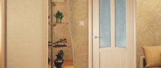
Particular attention is paid to window and door openings. To emphasize the lightness and airiness of the atmosphere, the first ones are decorated with Roman blinds or thin tulle surrounded by thick coffee curtains. It is recommended to decorate interior doors in light shades of wood or replace them with an arched opening. Light, natural fabrics with a rough texture are used in textiles. Burlap, cotton and iridescent silk will look impressive, adding depth to any shade. The walls are decorated with collages of paintings depicting cups with hot drinks, sweets or coffee beans. Open shelves provide storage space for decorative items: bottles, vases, figurines. A stylish addition would be to place a set of coffee cups on a stand in a place of honor. If you want to draw a parallel with the barista’s place of work, then hang a chalkboard on the accent wall and update the “family” menu on it daily. Also, the resemblance to a coffee shop will be added by the “highlight of the program” - a stylish coffee maker. The “confectionery” theme is embodied on the apron: it is decorated with thematic drawings (falling coffee beans, a sketch of a cup with “steam” above it from a hot drink). Indoor plants are welcome in the cappuccino interior, as greenery will add freshness to the atmosphere. One or two floor pots or a vase with fresh flowers on the table will be enough.
Materials used to decorate a cappuccino-colored kitchen
The market offers many options for materials to implement such an idea. Therefore, it is not difficult to choose them, both for budget solutions and for wealthy owners. For cabinets, for example, they often use cheap chipboard, and the front door is made of MDF. But you can also take a closer look at monolithic products, they are expensive, but they will last longer.
Ceramic tiles, paint and varnish mixtures, plastic or wooden panels are used as finishing materials.
An apron with a glossy surface made of ceramic tiles or tempered glass will make the vertical surface lighter
Which headset to choose
In order for the kitchen to please for a long time without losing its original appearance, great attention is paid to the choice of kitchen units and the materials from which they are made
Chocolate-milk glossy facades
Matte or glossy facade
Gloss visually makes the space more spacious and lighter. It reflects light well, so it is often used in small kitchens. In addition, glossy cabinets are easier to clean. The most convenient material to use is plastic. It resists damage and is easy to clean.
Glossy upper and lower cabinets
Also, for a glossy effect, PVC film is used, but over time it comes away from the surface and fades in the sun. Gloss looks beautiful in modern, high-tech and Japanese minimalism. Due to the smoothed surfaces and corners, the kitchen looks spacious and wide-format.
Decorating a small space with glossy facades
Matte facades are more suitable for spacious kitchens where there is a lot of daylight. It can only be cleaned with special products using a soft sponge. The matte surface is less visible to fingerprints and minor damage. Matte enamel cabinets look beautiful and are characterized by increased durability.
A complete lack of shine makes the kitchen too austere
Most often, metal fittings are chosen - handles, mechanisms, hinges, tracks. Stainless steel or titanium is used for production. They are more expensive than aluminum ones, but last longer as they are protected against corrosion. Some cabinets have chrome trim.
For the countertop in the work area, choose a thickness of approximately 10 cm. Stone is considered the highest quality material for manufacturing. It is natural, durable and environmentally friendly. Stone countertops come in different shapes, without boundaries or joints. They are usually a shade lighter than the facades, and can also be imitation marble.
Marble countertop
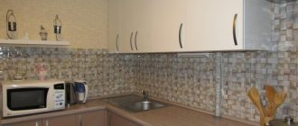
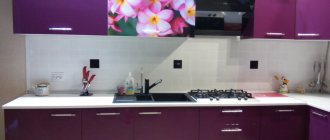
An interesting idea is to make a “confectionery” apron, for example, with a picture of coffee beans, various spices and sweets, or a freshly brewed drink. You can choose any material for the apron: ceramics, glass, mosaic. The most popular tile aprons are durable, practical and look great in the interior.
Thematic design of the apron
Most often, the set is installed in one or two rows. It is not necessary to use single-color facades. You can experiment and choose a combination of dark and light tones.
Materials
For the production of headsets, only high-quality materials are used that resist mechanical stress and external factors. Furniture must be resistant to elevated temperatures and humidity, steam, grease and dirt. The most common materials for facades:
Tree. This is a natural, moisture-resistant and durable material that does not lose its original appearance for 30-40 years. Typically, ash, oak, pine, and cherry are used for production. The big advantage is that solid wood can be restored several times;
MDF. The characteristics of the slab are almost as good as wood, but have a shorter service life. This is an environmentally friendly material that does not emit harmful substances. It is easy to care for as it does not attract dust and dirt. MDF costs less than wood and offers a large selection of matte and glossy options;
Chipboard. The service life of the plate is 5-10 years. To increase resistance to moisture, surface lamination is used. For furniture made from chipboard, you must ask for a quality certificate, since many types of chipboard, when used, emit hazardous substances to humans.
Headset location
The choice of shape depends on the size and layout of the kitchen. There are several popular forms of facade arrangement:
Linear. Used in kitchens with an area of 6-10 sq.m. The refrigerator, stove and sink are located along one wall. The dining area is located opposite and is represented by a bar counter or folding tabletop;
L-shaped or angular. The most common method of arrangement, as it creates a comfortable, ergonomic working triangle. Storage systems are installed in the corners. Often in a square kitchen a bar counter is installed as an extension of the countertop;
Island and peninsular. For such an arrangement you need an area of at least 18 square meters. m. The center of the kitchen is occupied by an island or peninsula, which serves as a working and dining area. Often a hob or sink is built into it, and many sections for storage are also made. Typically the dimensions of the island are 150*180 cm;
U-shaped. The arrangement of cabinets occupies three walls and uses almost the entire area;
Parallel kitchen layout. Facades and household appliances are installed on two opposite walls.
Selecting cappuccino-colored kitchen lighting
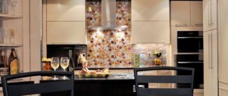
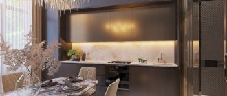
Modern kitchens make cappuccinos with a glossy effect (see photo below) to make them stand out. In this case, it will be correct to distribute the main or additional light, taking into account this nuance.
To illuminate the kitchen interior in a cappuccino shade, a chandelier above the dining table and numerous lamps built into the perimeter of the ceiling are suitable.
Experts advise using, if possible, two types of lighting: bright daylight and dim. This is necessary to create the right atmosphere at a particular moment.
A spacious kitchen will need additional lighting above the cabinets and high-quality lighting for work surfaces
Furniture and kitchen set
When developing an interior design, it is not necessary to focus on installing the headset exactly in the color of the main furniture. It is important to maintain a uniform style, but colors may differ, both in tone and contrast. These are acceptable points, since here functionality goes hand in hand with style.
A set of kitchen furniture does not have to be monochromatic; a cappuccino shade can be present either in the lower or upper tier, harmoniously echoing other rich tones
Glossy facades bring a special style to the interior and make it lighter and more spacious
Choice of curtains and lighting
To decorate small window openings, it is better to choose Roman blinds.
Another popular decoration option is a custom-made lambrequin.
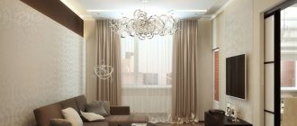
Thin tulle curtains are hung on standard-sized windows and complemented with thick coffee curtains.
Choose coffee curtains whose shade is close to the color of the set and wall surfaces. The material can be either natural or artificial. When choosing fabric, consider the decorating style of the room. Curtains with a pattern are best combined with plain wall surfaces.
If patterned wallpaper is used in the design of the kitchen space, they will be ideally complemented by plain curtains.
Important! The pattern on the textiles should be selected based on the style of decorating the kitchen. It is advisable that it be invisible - this will make the interior elegant.
In the interior of a coffee kitchen, it is appropriate to use LED spotlights, chandeliers and mixed lighting.
The advantage of LED strips is that they occupy a minimum of space and effectively transform the room. A chandelier with a lampshade will fit perfectly into such an interior. The backlight can be chosen with patterns or monochrome.
In coffee tones you can decorate a kitchen in any direction - from classic to high-tech. This palette is suitable for Provence, minimalism, loft and other styles.
The use of cappuccino color in kitchen design is becoming increasingly popular. A harmonious combination of decorative elements and surface finishes will make it possible to create a unique interior that will attract all household members.
Kitchen walls cappuccino color
The coffee-with-milk kitchen design (photo) may include walls of the same shade, there is nothing criminal about that. Especially when it comes to a competent interior, there are dilutions or accents that complement and highlight. After all, there is no taboo here, you just need to make sure that it doesn’t end up boring and unattractive.
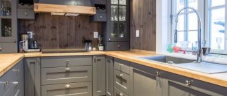
In a kitchen with “coffee” wall decoration, milk-colored furniture in combination with wooden countertops looks good
Light beige kitchen facades will look no less impressive against a cappuccino-colored background.
Combinations with coffee wallpaper
Coffee wallpaper or accents create the atmosphere of a cozy cafe, imbued with a pleasant invigorating aroma. This design is dominated by dark brown shades, which can turn the kitchen into a gloomy elysium.
To create a stylish interior and keep the room bright, shades of natural coffee are combined with lighter colors and materials. Powdery shades are becoming trendy: pale pink, beige, sand, ivory. This combination looks tasty and stylish.
Furniture is selected from natural materials such as wood, veneer or rattan. And figurines made of straw or wood and potted plants will serve as decorative elements.
The coffee theme goes well with the retro style. The kitchen is decorated with retro posters with images of coffee cups or beans. They also combine several images on one canvas or in the form of a modular picture. The result is a stylish decor like from the pages of a magazine.
Continuing the retro theme, stripes, checks and newspaper prints would be appropriate accents. They will perfectly complement the coffee theme and create the atmosphere of an old coffee shop in central London.
Dilute the brown interior with light furniture and decorative elements in yellow, olive or pink colors. The shades are calm, so they fit harmoniously into the coffee theme. They can be applied to curtains, tablecloths or chair covers.
The combination of coffee and green looks bright and fresh. For example, dining chairs, a sofa or a kitchen set are painted in bright colors. Living plants complement the interior. They not only serve as beautiful decor, but also make the contrasting combination calmer.
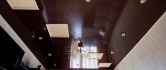
The ceiling in the kitchen is cappuccino color
The upper part of the room may look different in different buildings. But you need to remember one detail: the darker the color of the ceiling, the more it produces the effect of visually reducing the space. This is acceptable if the area is large and the ceiling is high. In small areas, it is better to think about light tones of the coating.
The correct choice of ceiling shade affects the overall appearance of the entire room
It is necessary to take into account the level of illumination of the room, the color of the furniture and the number of square meters of area
Additional design nuances
The color of the walls, coffee with milk, has a huge advantage - it is unpretentious. You don’t have to worry too much about delighting your guests and emphasizing the chosen decor option. It is enough to periodically buy new things, for example, bring souvenirs from trips, purchase exclusive tables with carved legs, some rare books, decorative vases. The walls can also be decorated with colorful posters or artistic abstractions. Designers have found use for all shades of coffee with milk.
Fashionistas often confuse this color with chocolate or chestnut. However, experienced hairdressers are sure: all the listed colors differ noticeably in the depth of shade.
If you are a coffee lover, you can scoop up a handful of roasted coffee beans and take a closer look at them. You will see a color that is not too dark, brown, decorated with gold and rich in tints of light. Your hair will be the same if you choose a dye from this “family”!
Who is “Coffee” hair color suitable for?
The ideal appearance for dyeing your hair coffee color is considered to be: dark skin, green or brown eyes. He makes such a girl very noticeable, paying attention to all her advantages, and leaving her shortcomings “behind the scenes.” If you want to stand out more, add some color to your look!
Do you have brown eyes and a deeply tanned face, or, on the contrary, cold blue eyes and pale skin? This appearance is also not a contraindication to the use of such paint.
In general, experts believe that it will work equally well on both light and dark strands. Hairdressers recommend “coffee with chocolate” for brunettes or dark-haired girls, and “coffee with cream” for light-blond girls.
Of course, coffee hair color can be different. But its most “basic” version is rich in warm golden notes. Noble, expensive, sophisticated - this is what the shades of this paint are called in beauty salons.
Do you really like coffee-colored hair, but you are not sure that you will look beautiful with it? Start exploring your favorite undertone by purchasing a tint balm. If you don't like the color, it will quickly wash off!
Cappuccino colored kitchen appliances
When purchasing appliances for the kitchen, do not neglect the selection of colors. If the room is bright, then metallic will fit well. But other colors should be selected more carefully. In some options, you can simply add additional trim to the front side if you really like the “filling” and the possibilities.
The color of household appliances can stand out against the general background as a bright accent.
Another option - painting built-in household appliances repeats the basic tones
So, shades of cappuccino in the kitchen interior are a popular solution that has a reason. After all, this color calms, gives a feeling of confidence in the future, gives stability to the present, and it is not difficult to choose. You just need to know the basic rules for selecting materials, arranging furniture and combining shades.
