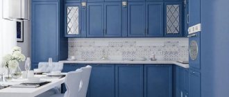
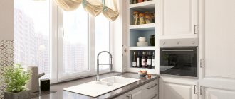
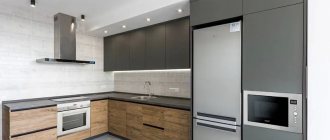
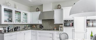
The refrigerator is one of the most necessary and large-sized household appliances that a modern kitchen is equipped with. Manufacturers offer a wide range of these units in different sizes and colors from classic white to black, with any “filling” and at any price. Recently, the gray color of the appliance has become popular - it adds modernity, solidity and novelty to the kitchen interior, organically fits into the industrial style, minimalism and hi-tech.
Important! Gray household appliances allow you to make the interior less strict, but dynamic and laconic, which looks expensive and luxurious. Innovative silver and steel colors look impressive and win-win in a kitchen with any design, adding charm and nobility. A gray refrigerator visually increases the space of the kitchen. There are no scratches or dirt on its surface, which allows it to maintain its presentable appearance for a long time.
Gray kitchens: pros and cons of color
“Gray is the second beige.” This is the golden mean between black and white, but the versatility of this color is not always beneficial. Let's see what advantages and disadvantages there are in using gray in kitchen design.
pros
- universal base: ideally combined with bright and pastel shades;
- suitable for almost any style;
- always in fashion.
In skillful hands, it can make almost any kitchen noble and harmonious. It is easy to work with and combines with all shades of the color wheel. That is why designers often use it as a neutral base for creating beautiful interiors in loft, high-tech and art deco styles.
Minuses
There are not many cases when it is better to refuse gray, but it is important to know them.
- Dark gray is not recommended for use in a small kitchen (up to 8 sq.m.).
Light gray, on the contrary, can visually expand a small space.
- Dark gray is undesirable when the kitchen has poor natural light due to small windows or a shady side.
- A monochrome interior can look cold and uncomfortable.
Gray has a huge range of saturation and has many shades - graphite, platinum, marengo, etc.
The right shade and its intensity are the key to success. We’ll talk in more detail below about how to use gray correctly to reveal its best properties.
Advantages and disadvantages of the combination
Advantages of a gray and white kitchen:
- The coloring turns out to be neutral, which means you can add accents with any third companion. The same applies to appliances: a stove or refrigerator can have a metal, black or white body - any will do.
- A combination of light shades will make a small kitchen seem larger.
- If the kitchen area is large, the furniture and decoration will not be lost, and the contrast will be maintained. You can also use dark, graphite shades of gray here.
- The color combination is universal and can be used for any interior style.
The disadvantages include:
- Formality, cool appearance. A gray and white kitchen in its pure form can resemble an office; it looks cold. To dilute it, add warm lighting, natural materials, accents in soft and pastel colors.
- The design turns out boring. Bright colors help solve this issue; they are used for decoration and placing accents.
- In the kitchen, constant contamination is inevitable; regular cleaning with modern household chemicals will help correct the situation.
Layout features
Does gray color play a role in choosing a layout?
Designer tips
Irina
Irina Polyakova is the founder of an interior studio, architect and interior designer. The main area of work is kitchen design
Shade can really be important when the size of the kitchen is very modest. For example, if the design concept involves dark gray facades, which are undesirable for a small space, then eliminating the top row of cabinets may be a compromise. Thus, dark shades only in the design of the lower tier of the set will not affect the visual perception of the size of the room.
Another solution is a combination of a gray bottom and a light top for a corner, straight and U-shaped kitchen.
The idea of a two-row kitchen is difficult to implement, as it will require taking into account not only the size of the room, but also its proportions. To prevent the space between two dark rows of cabinets from turning into a narrow portal, decorate the apron in light colors.
Watch a review of a beautiful U-shaped kitchen in the video :
Black refrigerator in the kitchen
This option is relevant for any modern kitchens, regardless of their color scheme. The black color is usually supported by at least something: if not household appliances, then an apron, tabletop or chairs.
A black refrigerator can match the kitchen facades if the overall room remains bright enough.
White and steel-colored household appliances, as well as transparent ones (made of glass), go well with a black refrigerator. Various combinations are possible: for example, refrigerator and hob - black, oven - white, hood - glass + metallic.
Matte or glossy - which facades to choose?
The choice of matte or glossy finish depends on the intensity of the color. Even minor dirt such as water marks will be more visible on the dark gray glossy surface of the facades, which is very impractical for the kitchen. But gloss can highlight light gray facades to their advantage and will not show fingerprints or stains.
Designer tips
Irina
Irina Polyakova is the founder of an interior studio, architect and interior designer. The main area of work is kitchen design
Complex, deep, and dirty shades look better on a matte surface. For example, gray-green, gray-blue and gray-beige color best reveal matte smooth facades
How to keep it clean
Owners of a white kitchen are often interested in the question of why the sparkling surface turns yellowish over time. The main enemy of the headset is sunlight! That is why immediately hang blinds or curtains in the kitchen.
The main rule for keeping the kitchen in its original form is express cleaning. It involves timely cleaning of surfaces immediately after cooking. Fresh stains can be easily removed with napkins.
Turn on the hood as soon as you start cooking. So, you can filter out the smallest particles settling in a white kitchen.
Clean the set every month with dishwashing liquid and warm water. At the end, be sure to wipe all surfaces dry. The tiles and the seams between them can be easily cleaned with a paste of soda and vinegar.
If the kitchen begins to turn yellow, prepare a mixture of a glass of vinegar and a spoonful of soda with two glasses of warm water.
Color combinations
Is it necessary to dilute gray with bright accents? In fact, monochrome design can be not boring. Shades of different intensities can be used, but thanks to the combination of different textures, the interior will not be pale and boring. For example, smooth matte facades can be complemented by a floor with a marble pattern or a concrete apron.
Brickwork from light to bright red shades will perfectly complement a monochrome interior.
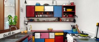
To make a gray interior more interesting, one small bright detail is enough - a tabletop, an apron, a chair, curtains and even one bright refrigerator, for example.
You can combine colors only within the facades. For example, blue top and dark gray bottom.
When combining facades of different colors, do not forget about an important rule: use dark shades in the lower row of furniture, and light shades in the upper row, so that the furniture does not visually overload the space.
The most spectacular combinations are with red, yellow, orange, emerald, and purple. Let's look at interesting combinations separately.
With yellow
Yellow and similar colors (turmeric, orange, mustard) are an ideal pair with gray as a bright accent.
Don’t get carried away: an abundance of bright details can be annoying. Add no more than 30% bright colors to the overall neutral background.
With brown and beige
Gray and beige work well together within the same room. Beige can have varying degrees of saturation, and its warmth will make the interior less formal and strict.
Gray can be successfully combined with both pastel and dark shades of brown. The most successful option for adding brown would be to use wooden surfaces in the design of the apron, countertop, dining table and chairs.
Taupe kitchen
Designer tips
Irina
Irina Polyakova is the founder of an interior studio, architect and interior designer. The main area of work is kitchen design
The mixture of these two colors gave the world a new complex gray-beige shade, which is now at the peak of popularity.
Gray-beige set
Light gray set on a brown wall with a brick apron
With blue and blue
Blue is as cold and strict as gray. But this does not cease to be an ideal match if the kitchen or kitchen-living room has large windows and a lot of natural light. To prevent the interior from seeming boring and faceless, dilute this duet with a bright accent or select materials with an interesting texture.
A dark gray set combined with a bright blue sofa. Light gray walls bring in more light Blue top and dark gray bottom set
When mixed, these colors also give an unusual, beautiful gray-blue hue.
Set with gray-blue bottom and white top
A bright and even shiny blue on the splashback can be a great complement to dark gray facades.
The blue tint will not add contrasts to the interior: when paired with gray, it merges and forms a monochrome interior. It is recommended to dilute this duet with white or beige.
And if you need to add mood, then you can use yellow, orange, coral or carrot colors in small quantities.
With pink and purple
Despite the fact that purple and its shades (pink, lilac) are ideal for placing accents, they must be used in very measured doses.
Gray reflects neighboring colors, and a kitchen that has too much pink or purple can give the impression of a solid bright spot.
With green
The combination with green and its shades - emerald, light green, malachite - deserves special attention. This combination is often found in nature. Therefore, green, like no other color, is able to balance the coldness and severity of gray.
Designer tips
Irina
Irina Polyakova is the founder of an interior studio, architect and interior designer. The main area of work is kitchen design
Bright green curtains in the kitchen-living room or a bright light green apron can change your idea of gray and appreciate it. Houseplants in white or black pots will help add some green color to the interior.
Mixing these two colors creates a beautiful gray-green shade that looks impressive in the design of smooth matte facades.
With white and black
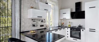
White will always correct the severity of gray and will save you in any situation when you need to dilute an interior that is too dark or too bright. For example, a white countertop will refresh dark gray facades and create a beautiful contrast, while light walls can make the room more spacious.
Black will contrast effectively against a light gray background.
Paired with dark gray, it looks brutal, but darkens the room too much. For a spacious kitchen-living room with large windows facing south, this fact is not scary.
The combination of gray and black is most often used in the loft style.
A kitchen with a black apron and glossy dark facades is impractical, but impressive and beautiful
With a tree
Surfaces with shades and textures imitating natural wood soften the cold aristocracy of gray, thereby making the interior softer and more harmonious.
A tabletop, apron, dining table or floor can be made to look like wood.
With red
Red in large quantities and against a dark background can look aggressive, which is undesirable for the interior. But small inclusions in the design of chairs, flower pots or curtains can enliven the interior.
Pastel shades
Are you afraid that a bright accent will upset the color balance in the interior? Then combine pastel shades of yellow, red, blue and any other color with gray. The interior will be calm, without harsh contrasts, with soft color transitions.
Light gray is ideal for a small kitchen, as it visually expands and refreshes the interior.
Scandinavian classic
A white kitchen is a typical design solution for the Scandinavian style. Often a mixture of cool grays, blues, indigo or dusty pinks is added to this style direction.
Another typical feature of the Scandinavian interior is natural materials, so wood is almost always chosen as the material for the countertop.
Open rails, slate boards, and various jars for storing food can also be called typical Scandinavian decor.
Gray in different styles
The versatility of gray lies not only in its ideal compatibility with other colors, but also in its ability to decorate the interior in almost any style. There are certain areas where gray is most appropriate.
Loft
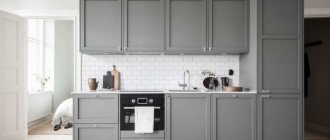
A gray kitchen set with both smooth and paneled fronts will fit perfectly into the interior of a loft-style kitchen.
Dark tones look brutal. But if the kitchen is small, then you should give preference to light-colored facades or dilute the dark bottom of the set with a white top.
Metallic facades against a red brick wall. An unusual and bold combination - just in the spirit of a brutal loft
Minimalism
Monochrome gray combined with white and black creates an ascetic space that does not need to be supplemented with bright details. Its only decoration can be complex textures like wood, stone, marble and other natural surfaces. In order not to disturb the order and rigor of a minimalist kitchen, it is better to give preference to facades with integrated (hidden) handles.
Gray wood kitchen
Neoclassical
Neoclassicism in gray tones is an excellent alternative to beige traditional interiors with massive furniture. A strict gray set will be decorated with elegant classic gold handles - antique brass, bronze, forged, etc.
Room tour of a neoclassical kitchen in the video below:
Provence
Pastel shades of gray are ideal for interior design in Provence style. Dusty and slightly faded tones in combination with lavender, olive or pale pink will become a style-defining color scheme.
American style
Another modern take on a classic. The traditional design of the set with facades with frames and panels in gray color will fit perfectly into a spacious U-shaped or island kitchen.
The versatility of the gray palette
Gray color can be more or less saturated, and can also be diluted with other pigments. This allows us to talk about the richness of its shades. Many of them, due to their originality, have gained great popularity.
The scale of light gray shades can be represented as follows:
- granite;
- concrete;
- pebble;
- lichen color;
- pearl;
- silver;
- white lead;
- smoky gray;
- vanilla.
The dark gray palette includes the following tones:
- black-brown fox color;
- twilight;
- cashmere;
- graphite;
- mineral gray;
- color of wet asphalt;
- steel (mouse, metal);
- marengo (blue with a grayish tint);
- coal-ashy.
When decorating a kitchen, most of these shades will cope with the role of a base tone. No wonder colorists jokingly dubbed the gray palette a “workhorse.” It not only serves as an advantageous backdrop for the room, blending perfectly with other colors, but also hides many design errors.
Gray kitchen interior design
The success of any interior design project depends on how harmoniously the finishing materials were selected in color and style. Let's talk about what finishing options for a gray kitchen will be the most successful, as well as what role curtains can play.
Decoration of walls, floors and ceilings
The design of finishing materials should be selected at the design stage. At the initial stage of planning a renovation, it is recommended to draw up a project that will indicate what color each interior element should be. This is the only way to create a harmonious color scheme.
Here you can consider the following recommendations.
- Stick to a balance of dark and light shades . For example, if the set is dark gray, then it is better to decorate the walls in light colors. And vice versa. Do not use more than three colors at the same time in the interior. And at the same time, it is not forbidden to play with their shades.
- Determine what kind of interior you want in the end : calm, in pastel colors, or brutal, bright, cheerful? Based on this, choose colors of appropriate saturation.
- For very bright accents, choose non-volumetric objects - curtains, vases, chairs, etc.
A white matte ceiling is always a universal solution. If there is no need to highlight it from the general background, then you should give preference to the win-win option in all cases.
You can focus on the ceiling if the height of the room allows. You shouldn’t choose flashy bright shades for it, because even a gray textured concrete insert in a suspended structure, complemented by a beautiful lamp, can attract attention.
As for floor finishing, the following options will be most successful for a gray kitchen:
- parquet, laminate, porcelain stoneware or PVC tiles in a natural wood shade;
- gray tiles from light to dark shades;
- light poured floor;
- marble-effect tiles (natural marble is impractical for the kitchen);
- tiles in pastel neutral tones.
Do not use dark gray shades for finishing the kitchen floor: they visually narrow the room.
For wall decoration, you can choose any color depending on the design concept:
- Gray wallpaper or paint is an excellent overall background. Choose light shades for small kitchens or when you need to create contrast against dark furniture;
In a monochrome interior, wallpaper can be embossed, imitating decorative plaster. And from gypsum plaster, using simple techniques, you can make an imitation of concrete.
- beige walls or white with a slight warm tint will add warmth and comfort;
- You can make only one wall bright;
Yellow walls against the background of dark facades attract attention, and the absence of upper cabinets allows you to make a small kitchen visually freer
- Wallpaper with a pattern is also suitable, for example, floral or with a graphic pattern.
Light gray set against a background of floral wallpaper. In the apron area the wall is covered with tempered glass
Tabletop
The ideal universal tabletop for a gray set is wood, light shades or snow-white.
An unusual option is a thin tabletop to match the gray-beige set.
And if you want bright colors, then you can place the main bright emphasis on this detail. As, for example, the designers of the “Housing Question” program did it in the project in the photo below.
Dark shades for countertops are impractical, as they immediately show water stains.
Apron
Gray facades allow you to be bolder in choosing your apron design. Bright tiles or skins will help make a bright accent.
Depending on the style of the kitchen and the overall color scheme, a textured apron imitating stone, brick or concrete can look interesting.
An apron with a small pattern will always look good with neutral facades.
A universal solution is light hog tiles and pentagonal tiles. With contrasting grout, these backsplash options look very stylish.
Curtains and textiles
Curtains traditionally set the mood of the interior. Bright short curtains, roller blinds or Roman blinds in rich yellow, red, blue, green tones can look great with a gray kitchen.
If the accent is already any other element of the interior, then it is better to choose curtains in the general color scheme of the room: light or dark gray.
Designer tips
Irina
Irina Polyakova is the founder of an interior studio, architect and interior designer. The main area of work is kitchen design
In addition to curtains, kitchen towels, upholstery of dining chairs, curtains on kitchen cabinets or doorways can play a role in the design.
Choosing a location
Another important factor for creating a cozy design is the choice of place where the device will be placed. Many people prefer to place this unit in a free corner of the room, where it does not interfere or create inconvenience during operation.
You should also remember that this large appliance should not be placed directly near the stove, as this may adversely affect the operation of both devices.
If the layout of the room is such that the refrigerator does not fit in any corner, then it is worth considering the option of placing it near the door. This should also be done if the device is very tall.
You can place the refrigeration unit in a special box so that it does not stand out too much from the background of the entire interior, or disguise it as a cabinet.
If you purchased a refrigerator in advance, and it does not quite fit into the kitchen interior, then the best way out of this situation would be to decorate the device. For example, if a gray refrigerator does not fit into a white kitchen, you can paint it with white patterns. And if you have made a modern kitchen in bright colors and think that the white appliance does not fit into the overall picture, then you can decorate it with rhinestones, colored stickers, painting and other available decoration methods.
Of course, gray and silver refrigerators are gradually replacing ordinary white appliances, since they are more practical in the kitchen: dirt or scratches are not so noticeable on their surface. These appliances have the most modern design, look more stylish and aesthetically pleasing, and add some zest to the kitchen, even in a strict classical style.
Proper selection of colors for the kitchen interior and household appliances can solve a large number of problems. For example, visually expand the space or, conversely, reduce it. You should not get carried away with one color in the interior unless you are sure that the result will not be monotonous and boring. It is best to place accents in kitchen interiors on household appliances in interesting colors. Fortunately, today there are no barriers to this. Feel free to imagine and create the kitchen of your dreams.
Furniture and appliances
The main elements of the furnishings of most kitchens are a kitchen set and a dining group. In a spacious room or kitchen-living room, a sofa and sideboard can be added. It is undesirable to choose furniture that matches the walls so that the interior does not merge into a solid monochromatic spot.
To highlight a set, sofa or chairs against the general background in a monochrome kitchen, choose their design a tone darker or lighter.
If you want bright colors, then you can focus on a bright sofa or multi-colored dining chairs.
The dining table is usually chosen in light colors or wood. A black base with a light or wooden tabletop will also be a good solution for a gray kitchen.
The gray set harmoniously combines appliances of any color in the same style - both built-in and free-standing:
- gray facades and metallic appliances form a single monolithic ensemble;
- Black appliances can play in contrast with light gray facades. For example, a glossy refrigerator will stand out very effectively against a light gray background;
- white appliances will look good with light gray facades in a small kitchen, as it visually looks easier in the interior;
- Colored appliances will dilute the decor of a monochrome kitchen.
White refrigerator in the kitchen
For bright kitchens in a classic style, a traditional white refrigerator is suitable like no other. An appliance with a different design can deprive the interior of a classic kitchen of harmony and stylistic integrity.
White refrigerator in the interior of a classic and traditional kitchen
Additionally, a white refrigerator is a good choice for a modern kitchen with white cabinets and/or white walls.
Lighting and backlighting
With the help of lighting, you can not only adjust the perception of the size of the room, but also change the shade and degree of gray saturation. A lack of artificial light will make the kitchen gloomy. Therefore, even at the renovation planning stage, it is necessary to consider lighting for each zone.
In addition to the main central light source, additional lighting is required for the work area, dining area and living room (if the kitchen is combined with a room).
For central lighting, choose diffused light fixtures. Diffused light will make the gray color softer and the atmosphere more comfortable.
Arrangement of the dining area
The placement of the dining area depends on the size of the kitchen. The most popular dining room design options:
Classic table and chairs. They are usually located away from the working surface. Sometimes this part of the room is isolated using contrasting colors. There are many design options: round, square, oval, triangular, or an irregularly shaped table. It can be complemented by chairs, stools, ottomans or armchairs. A suitable solution can be found for any style and design. At the same time, a gray kitchen can
to complement
dining area “matching” or in contrasting design;
Kitchen Area. Its peak of popularity has long passed, but still this option for a dining area remains quite in demand. In some cases, its functionality is expanded by making a corner with a built-in sleeping place (for overstaying guests or suddenly visiting relatives);
bar counter. This option is popular for small studios and small families. In large apartments, the counter is sometimes made an independent element in addition to the classic dining area;
wide window sill. Another popular option for miniature kitchens. This solution will not only save space, but will also allow you to admire the view from the window while eating. In some cases, such a kitchen table is made folding or sliding;
on the island. This solution, on the contrary, is suitable only for large kitchens. In this case, the dining area is moved to the island in the center of the room. This “dining room” looks simply grandiose. Moreover, it can be multifunctional (combined with a bar counter or work surface).
When choosing a layout, it is worth remembering the free approach. Any option will seem unsuccessful if the sofa or chair blocks the passage to the sink, and the bar counter prevents you from opening the refrigerator door.
Decor
The right decor will help make a cold gray kitchen cozy and homely warm. Small colored details diversify the interior: bright picture frames, colored wall clocks, decorative saucers, plates, home flowers, beautiful dishes in display cabinets.
In a small kitchen there is always a risk of going overboard with too many decorations and overloading the space. There are two rules to follow here.
- It is important that the decor is simple and at the same time effective.
- “Less is better, but better” - another golden rule that will save the interior from clutter
In a large kitchen and kitchen-living room in a classic style, a fireplace will be a beautiful decorative element.
Colored refrigerator in the kitchen
Most manufacturers offer refrigerators in colors - both bright and pastel. Some brands have entire collections, which allows you to match your refrigerator with a similar oven, dishwasher, etc.
Colored household appliances in the kitchen
However, as already mentioned, it is not at all necessary to create a kit. The color refrigerator is successful in its own right. If you include several large objects of the same color in the interior, the accent will lose its effectiveness. The color of the refrigerator can be supported by something not very large: for example, napkins, a vase, a lamp, a toaster.
Colored refrigerators in the interior
To create an atmosphere of calm and lightness, a pastel refrigerator in mint, turquoise, or soft pink colors .
Devices of rich colors - for example, bright red or dark green - are more successful in energetic and even “brutal” interiors with industrial motifs.
Real photos
You can get more ideas for inspiration in the following video:
Gray Ikea kitchens
"Budbin" apartment in Stalin
"Budbin" with black tabletop
"Knoxhult" - a ready-made economy class set
Gray-green set “Bodarp” Facades without handles (with integrated handles) “Vokstorp”
Gray kitchens Leroy Merlin
"Dark gray set of the Megion series"
Gray-green facades "Paloma"
Facades "Graphite"
Read more about Leroy Merlin kitchen furniture in a separate article - go to.
Let there be light
The presence of one lamp in the middle of the ceiling in the kitchen will narrow the room. An excellent solution is to have several lamps:
- central lighting;
- lighting of work surfaces to comply with safety regulations;
- lighting the table for eating, which not only helps to bring the fork to the mouth, but also creates comfort and beauty;
- lighting the bar counter (if available) using long lamps suspended from the ceiling.
- Electrician's recommendation! The placement of lamps must obey a strict rule: power 20 W for every 1 m2 of ceiling.
The type of lighting is selected depending on the room. In a small room, the lamps should be small in size.
Spots work great in the kitchen. They are attached to any surface and, in addition to lighting, decorate the kitchen environment.
LEDs are a design trend, as well as powerful energy savings and durability in use. The light of such devices is natural, does not dazzle, and is very comfortable for the eyes. Cool light is used above the desktop, which concentrates attention.
