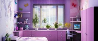
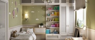
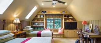
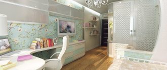
“Trailer” rooms, well known to most residents of the post-Soviet space, are a real headache for an interior designer.
It is difficult to turn a narrow and not very comfortable room into a cozy, functional space, especially when it comes to a room for a child.
How to properly decorate the interior of a narrow children's room, making it beautiful and comfortable to live in?
Several design techniques will help solve this problem.
Zoning
A children's room is a place where a child not only sleeps, but also learns, plays, and develops.
It is important to highlight separate functional areas for each activity. The same technique will help to visually expand the space, adding depth and spaciousness to it.
The most convenient way to zone a narrow room is:- proper distribution of furniture - it is better to place large furniture against short walls, and use book and souvenir racks, translucent screens, low chests of drawers as partitions between zones;
- color and lighting design - the room is divided into zones using different colors of walls or furniture, choosing a variety of lighting.
The main accents of a “narrow” interior
Non-standard room shapes always pose a certain difficulty for design. The problem is two long walls, especially if they have windows, and end walls, which exclude narrow doorways from variations in arrangement. In order not to carry out redevelopment, there are several techniques that not only eliminate the shortcomings, but also make the room comfortable - this is a children's room.
The main accents that need to be placed:
- choice of wall decor;
- selection of color solutions;
- door frame;
- ceiling design;
- zoning;
- lighting;
- flooring;
- furniture.
Color spectrum
Selecting a color palette for decoration is one of the primary tasks. If you look on the Internet for photos of narrow children's rooms, you will notice that there are practically none that are decorated in dark colors. No wonder.
Dark colors visually compress the space, while light shades seem to make the room larger and airier.
In a narrow room, it is recommended to choose calm, light colors for both decoration and furniture. There is an interesting technique: a combination of long pastel walls and brighter short walls visually expands the room.
Boy's age
The rebellion of a growing organism affects the formation of taste in both boys and girls. This should be taken into account when decorating a children's room.
The most important thing at this point is that the room should be tidy, but not according to the opinions and tastes of the parents. Because it turns out that they will make it for themselves, and not for the tastes, interests, hobbies of the boy
At this age, an adult design would be appropriate and comfortable.
To make him feel comfortable there, do not forget about the functionality of the room. Another year and the guy will get older and his needs will change. This is worth considering. The color scheme does not have to be boyish colors; it can be a neutral shade.
- Room for a boy 10-12 years old. There may also be children's design, cars, bright colors, toys. The room at this age still smells of childhood. But if you are planning to do renovations at this age, then it is better to choose something that is not so childish. Because in a few years, hobbies will change, and you will have to radically change the style of the room to a more adult one.
- Room for a boy 13-15 years old. Sharp changes and changes in tastes begin at this age. The desire for such changes appears in attempts not only to independently change the room, but also in appearance. The boy chooses his clothing style and preens himself. The children's room is already becoming uninteresting, but its own taste has not yet formed. In such a room, it is better to immediately remove the car-shaped bed, if there was one, replace it and put a sofa in the teenager’s room, or decorate it with a simple bed. Walls with children's drawings will also no longer be needed. And I no longer like decorating the ceiling with various hanging toys. The design becomes more adult, strict and details his interests: computer equipment, hobbies.
- Room for a boy over 15 years old. The boom of emotions and self-expression occurs at the age of 15. Hobbies become more and more, interest in the opposite sex appears. I want to divide the room into zones for communication and hobbies. Any person will tell you that at this age the main thing is to maintain good communication between parent and teenage child. Invite him to help you, let him choose the wallpaper, color of the walls and furniture. Of course, control the harmony in taste so that there is no outright bright bad taste.
- Room for a boy over 15 years old. The age at which many guys are already planning to leave school after the 9th grade and devote their time to their passion for their chosen profession. In other words, they already know what they want. There is absolutely no need to impose your opinion here. If it is possible to contact a designer, send him there with the young man so that he can express his opinion and see what the specialist proposes. He'll like it better. If not, let him decide for himself how it will be better for him. It is quite possible that he will want to leave everything as it is.
Every year the taste and life of a growing organism changes
It is extremely important not to resist this process during adolescence.
In a teenage boy's room, comfort and convenience should be combined with style and functionality.
For girl
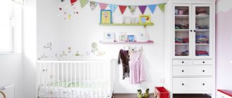
The interior of a narrow children's room for a girl is, as a rule, an elegant bed, a chest of drawers for toys and personal belongings, a play and work area.
The classic berry-pink color scheme goes well with milky, beige, and light purple shades.
Mirrors for visual enlargement
The main method of visually increasing the area of a room is the use of mirrors due to reflective surfaces: reflections are an extension of the room.
How to increase space in a room with a mirror:
- attach a tall mirror to the wall or make a mirror wall;
- decorate the ceiling with a composition of small mirrors or order a mirror surface;
- hang them opposite the windows;
- place behind a lamp or in front of a chandelier, inside a false fireplace;
- arrange a brightly lit mirror collection on the wall;
- add accessories and furniture with mirror surfaces.
Adviсe:
Mirrors are welcome, both standard and non-standard frames. With the help of shaped mirrors, a small space in a room is noticeably enlarged.
To prevent images from being distorted, mirrors are installed only vertically. Do not expose the mirror to direct sunlight, otherwise dark spots will appear on the surface and the mirror layer will fade.
You should not hang a mirror in the bedroom. As the ancient teachings of Feng Shui say, it takes away energy from a sleeping person.
For two children
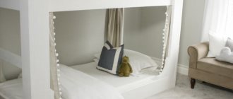
The task becomes more complicated if you need to decorate a narrow children's room for two children. A modern and comfortable bunk bed does not solve all problems.
The room should have workspaces and play areas (depending on age) for each child, as well as places to store personal belongings.
If children are of different sexes, it is necessary to create a cozy personal space for each of them. To do this, you can use stylish curtains or screens, beautiful partitions.
Children's room Provence - 85 photos of zoning and individual design of a children's roomChildren's room in a modern style - optimal solutions and options for exclusive design of the nursery (90 photos)
- Children's room in a marine style - stylish design options and examples of decorating a modern children's room (100 photo ideas)
Selecting the right curtains and decor
The choice of frame for a window should be made based on its location: on a long wall, curtains should be inconspicuous and blend in as much as possible with the decoration. On short ones, bright ones are acceptable, attracting attention and “bringing” the opening closer to the opposite wall.
Typically, children's rooms use floor-to-ceiling curtains. But roller or Roman blinds up to the window sill are also acceptable - this is especially convenient if there is a work desk or bed under the window.
Lighting
A single chandelier, even the brightest and most elegant, but located in the center of the ceiling is a bad option. Each corner of the children's room should be well lit if necessary, so it is wise to consider separate lighting for different zones.
The lamps do not have to be the same. The interior for a child is conducive to original solutions and bold experiments: a classic table lamp here can coexist with a charming night light by the bed, and LED strips on the ceiling are successfully complemented by lighting in the closet and in the toy boxes.
Correctly decorate the walls, ceiling, floor
Accents on short walls will help to visually reduce the length of the room. They are painted or covered with wallpaper of a darker tone than the main one, drawings are applied and decorated with bright details. Ideally, it is necessary to select decors that contrast in color. Successfully matched to the design of a long children's photo wallpaper or 3D wallpaper will also distract attention from the long walls.
Wallpaper with vertical stripes will help visually shorten long walls. It is appropriate to use such wallpaper only in one area or area, for example, near the bed or work area.
It is best to paint the ceiling in a light tone or cover it with wallpaper of simple texture. Stretch ceilings and suspended plasterboard structures will only make the space heavier.
On a note! The color for the ceiling is chosen a tone lighter than the main color for the walls. This trick will visually make the room wider and more spacious.
The exception is rooms with very high walls; a suspended ceiling with spectacular photo printing or a design to match the overall design will become the main detail of the interior.
The flooring also plays an important role in the design of a narrow, long children's room: it should be warm, environmentally friendly and at the same time hide the shortcomings of the room. The most acceptable options are carpet, laminate or parquet.
When laying laminate flooring, you must adhere to the main principle: the laminates themselves are located with a narrow part parallel to the wide walls.
The parquet is selected with a rectangular pattern and the narrow side is laid perpendicular to the end walls.
The designer advises! It is better to choose a rectangular carpet and place it so that the narrow part rests against a wide wall.
Pay attention to the shape and size of the doors. If possible, it is necessary to expand them. Hinged doors increase space well. The color of the doors should be matched to the tone of the floor covering.
Furniture selection
The main requirement for children's furniture is safety.
Natural hypoallergenic materials, rounded corners that protect against serious bruises and scratches are the key to the safety of active kids.
At the same time, furniture for a narrow children's room requires special attention.
First of all, you should give preference to multifunctional ergonomic furniture: a compact folding sofa that can be assembled in a couple of minutes, storage drawers built into the bed podium, spacious bookshelves that simultaneously serve as a partition.
Classic nursery - 125 photos of real examples of designing and decorating a nursery in a classic styleChildren's loft: current projects for modern interiors. 110 photos of stylish ideas
Children's room in Scandinavian style: the best interior projects, design features and zoning options for the children's room (125 photos)
Simple lines, devoid of pretentious shapes, light shades of wood and textiles are the best choice for a narrow room.
Photo of a narrow children's room
Help the project, share with friends

0

