Most owners of apartments with an area of 32 square meters face the problem of interior design so that it combines the comfort of living and the rational use of every square meter. Sometimes difficulties arise when creating a competent design for the interior decoration of a large house.
What to do if you only have a studio apartment for personal use? For most young people, whose homes do not have a lot of space, this problem brings great concern. Modern people in megacities strive to intelligently use every meter of free space so that it brings significant benefits.
Housing should be not only a place to sleep and eat, but also a fortress that will protect a person from emotional stress.
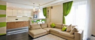
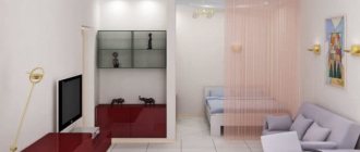
Of course, we won’t be able to expand the usable area of the apartment by moving the walls apart, but there are still small secrets for increasing the space. Photo of apartment 32 sq. m. shows that this problem can be solved in one way - to combine the kitchen area and the living room itself.
In this case, you get a studio with good space. This option will appeal to many homeowners with a similar square footage, but in practice it is not always possible to implement it. This is due to the fact that renovation of an apartment is possible only if this wall is not load-bearing.
It is possible to create an interior with various functions even when several people live in a living space of 32 square meters. A fairly common example is when a one-room apartment of 32 sq. m. m. is the first home for a young family, where a child has only recently been born. If this housing is intended for only one person, then the design layout will be much simpler.
When solving the problem of arranging an apartment whose area is 32 square meters, the principle of zoning comes to the fore.
So that the layout of the apartment is 32 sq. m went correctly, and the result was comfortable housing for living, you need to:
- determining the locations where functional areas will be located;
- selection of a single concept for the design of the room, which will form the basis for the development of interior elements of the apartment. This choice should include both the selection of plaster for leveling the walls and small decorative accessories.
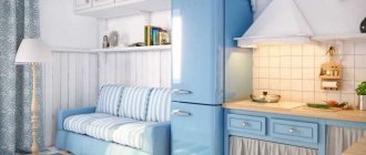
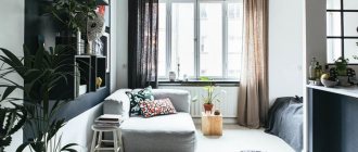
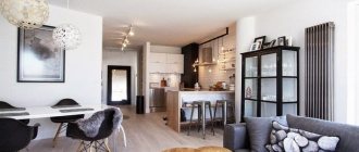
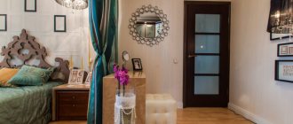
The photo shows an apartment of 32 sq. m presented options for solving the issue of space zoning. Let's look at this using the following examples.
Choosing a style
If you cannot boast of spacious housing, then do not choose loft, classic or futuristic design. Such styles are not for tiny apartments. They are best used in furnishing cottages and country houses.
Apartment design 32 sq. It is advisable to do it in some modern style direction, for example, minimalism, art deco, modernism. Mediterranean and Scandinavian styles, antique style, and fusion style are also welcome.
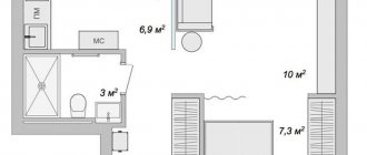
Variations of layouts of one-room apartments 32m2
The layout of a 1-room apartment of 32 m2 presents many difficulties in arranging furniture, and for greater comfort it is better to think through each room separately.
For the hallway
The arrangement of the corridor begins with determining its dimensions, ceiling height and location of doorways in the walls. Because often the location of the doors is so inconvenient that it does not allow placing this or that furniture and you have to redesign and move the door to the side. The layout depends on these parameters.
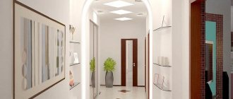
Light colors for the walls and furniture and replacing the doors to the room and kitchen with open arches will help to visually expand the space of the room. The headset should not be redundant or bulky. For example, a small closet that combines a wardrobe, a shoe rack, a mirror and a dressing table is perfect.
When purchasing a wardrobe, it is recommended to choose a model with hinged doors rather than a sliding door - this option is cheaper due to the lack of an expensive sliding door guide system. This will also save another 100mm of room width, which is needed for these guides.
You can visually increase the height of the ceiling and make the corridor brighter if you use ceiling lights on rails. Low-hanging lush chandeliers will have to be abandoned, since the layout of a 1-room apartment of 32 m2 will become traumatic.
For kitchen
When planning your kitchen space, you need to know exactly its size:
- Kitchen is more than 5 sq. m. It is recommended to roughly divide the room into 3 functional zones: a place for cooking, a dining table and an area for receiving guests. Curtains, screens or small bar counters are used as partitions.
- The kitchen is less than 5 square meters. m. In this case, it is recommended to abandon the interior walls, combining the kitchen area with the living area; such a redevelopment of the one-room apartment turns it into a studio apartment. The result is a spacious multifunctional area. But this version of the layout is not always possible. Therefore, to save space and be more original, you need to use a corner set.
It is recommended to use bright and colorful items only as accents, avoiding piling them up. Dark wallpaper and ceilings should be excluded. A light, minimalist design would be better.
For the bedroom
Bedroom layout doesn't have to be too difficult. It is enough to install a spacious bed, which, if necessary, folds into a sofa. The partition from the adjacent room will be a double-sided closet in which bed linen, clothes and small accessories will be stored.
To save more space, small items should be stored in niches cut into the wall. Wall sconces or table lamps are used as lamps.
For the living room
More often than not, this room is the largest in area, which is why it has more versions of layouts than other rooms. But even here, when planning, it is recommended to adhere to the general rules for decorating rooms in small-sized housing: do not clutter the room with furniture and small objects, stick to light colors and a minimalist style.
For the bathroom
The layout of the bathroom depends on whether it is combined with a toilet or located separately. In the first case, everything is simpler: you can easily install a large bathtub, a washing machine, and a bedside table with a washbasin.
When planning a combined bathroom, it is better to abandon the bathtub in favor of a shower stall. Extra centimeters will be saved by using the washing machine also as a cabinet for storing accessories. A wall cabinet with shelves and a mirror is used for the same purpose.
For the balcony
An extra room provides an area for maneuver: for example, it is recommended to organize a study, a wardrobe, a relaxation area or even a small garden here. Since the balcony is the coldest part of the living space, it needs to be insulated (glazed, heated floors, installed radiators).
When planning, combining a balcony with a room is possible only if they are not separated by a load-bearing wall. Otherwise, the layout of a one-room apartment of 32 sq. m will remain unchanged; government authorities will not allow the partition to be destroyed. Then it is recommended to simply remove the door and window row without damaging the wall.
Stylistic directions
Almost all stylistic diversity is available to owners of small apartments. It is not recommended to embody classics, futurism and loft in cramped rooms. These styles are best revealed in spacious apartments of private houses or luxury apartments with large footage. But this does not mean at all that they cannot be used. It is possible, but selecting compromise solutions with great care without compromising the main concept of the direction.
We recommend: Apartment 60 sq.m. m.: modern ideas on how to decorate an apartment. 80 photos of the best options
Conservatives and supporters of traditions choose modern, art deco, Biedermeier, colonial, Mediterranean, antique, retro, gothic, contemporary. For those who are young at heart and follow everything new, high-tech, avant-garde, minimalism, grunge, constructivism, fusion, and the Scandinavian direction are suitable. Lovers of cozy, “warm” interiors should pay attention to Provence, eclecticism, country, shabby chic, and Romanesque style.
Work zone
This is a place where a person can perform some types of work. As a rule, a modern workplace cannot do without a multifunctional computer desk, which will be comfortable to sit at. This table can be placed near the window.
The window sill, if it is wide, can act as a tabletop. Thus, more usable space is used. If there is no space in the room for a desk, it can be placed in the kitchen.
Styles and colors for studios 32 sq. m
The design of the studio apartment is 32 sq.m. The fact that the space is not delimited in any way must be taken into account. Such apartments usually have high ceilings and panoramic windows. A different kind of minimalism can be used here. The finishing should include imitation wood, brick or concrete. Furniture in a minimalist style will look great in combination with antiques. A large number of plants, accessories, figurines, decorative pillows, candlesticks will fit perfectly into the overall interior.
The living area of a studio apartment must be divided into two zones - public and private.
It is better to choose a folding bed. During the day it can easily be hidden in a closet. This solution will help save space. Mirrors should be placed on the walls or cabinets. They will visually expand the space. A similar effect will also be achieved by wallpaper with vertical stripes. Approximate design of a studio 32 sq. m. photo.
High-tech is also suitable for a studio apartment. Modern innovations help separate functional areas from each other, but do not take up much space. The effect of spaciousness is created by light colors and a lot of light. If there is no access to natural light, then lamps and a chandelier will come to the rescue. In the interior you can use not only wallpaper and paint, but also wood. This will help make the transition from different zones smoother.
High-tech with a predominance of white in the interior is the choice of those who want to impress others
Arrangement of space - ergonomics and zoning
If the redevelopment has been approved, then the kitchen is combined with the living room, and a separate corner by the window is allocated for the sleeping area. The office is moved out onto the balcony or placed next to the bed. When combining, it is important to follow simple rules for combining functional areas:
- The bedroom should be isolated as much as possible from the rest of the space so that nothing interferes with a restful sleep.
- It is advisable to place a dining area between the kitchen and living room, which will act as a “buffer”.
- The living room can be combined with a workplace, since both areas are designed for active pastime.
The furniture chosen is ergonomic, compact and performs several functions at once. Rational use of every meter should be the main credo of the designer. There are no restrictions on finishing materials, but experts do not recommend using a combination of a large number of different textures in apartments with small square footage. This will negatively affect the perception of space. In the kitchen-living room, you can create zoning using a combination of plaster or brickwork and vinyl wallpaper. In expensive apartments, veneer, cork or solid wood are used. In more budget options, plastic, wallpaper, and plaster are used. High ceilings are finished with plasterboard using frame technology. For minimalism, laconic white plaster is suitable. A stretch ceiling in light shades with a glossy surface will fill the room space with freedom and lightness. To finish the floor, use linoleum, laminate or more expensive parquet boards. In the kitchen area it is recommended to use ceramic tiles, which are easy to clean and will last for many years. The sleeping place can be placed on a podium, the contours of which will follow the frame ceiling. Zoning is carried out using screens, curtains, thin partitions made of frosted glass or plastic. Alternatively, you can use a through shelving unit, table, or sofa to separate zones.
The combination of different colors according to the principles of contrasts or analogy will also opaquely hint where one area ends and another begins.
Combining different textures and paired decor placed symmetrically on the sides of the conventional border will not overload the room, but will affect the visual perception of the room as a single space divided into sectors.
Hallway
In order for a small hallway to become the cozy “face” of the apartment, which is the first to welcome guests, it is designed in accordance with the principles of minimalism. Light shades in the decoration of walls and ceilings can contrast with a dark floor. A stylish solution would be large black tiles. If the dimensions of the hallway allow it, then a built-in wardrobe is placed in it, which will become the main storage system in the apartment. Instead of massive furniture, preference is given to an open hanger. For umbrellas and canes, place a metal container of an oblong shape nearby. A low pouf or bench will complete the design composition. Shoes can be hidden in hidden shelves under the changing area.
Sleeping area
Every person wants to have at their disposal a spacious, luxurious bed where they can sleep in any comfortable position without the risk of falling on the floor. A large bed for a small apartment is not the best solution. Unfortunately, it will take up too much usable space, which is unacceptable in conditions of meter shortage. For this reason, it is better to give preference to a folding sofa. If there is enough space, then a wardrobe with ergonomic sliding doors is installed in the sleeping area. Swing options are not considered at all. The bedroom is traditionally decorated in light shades. Natural, hypoallergenic materials are used for finishing. Optimally, wood and its safe derivatives, in the manufacture of which no toxic fastening compounds were used. In light styles (Provence, shabby chic, classic) wallpaper with floral patterns is used. The floor is finished with laminate or parquet boards.
An unusual option would be to arrange a sleeping area on a balcony or loggia, if their width, of course, allows for a full bed.
Recreation and guest area
In the living room, a sofa, a couple of poufs and a coffee table are enough for a comfortable rest. Opposite the furniture set, a large shelving unit is installed with a niche for a TV in the center. In the loft style, the accent wall is finished with brick or stone masonry in light colors. The traditional brown color of the material can visually reduce the space. Wooden and plastic panels will look good in combination with classic and modern interiors, respectively. Wallpaper and relief Venetian plaster will emphasize the solid ambiance.
Arrangement of the workplace
About a comfortable office in an apartment of 32 square meters. m. will have to forget. A small place with a computer desk will sit comfortably in the corner by the window next to the sleeping and living areas. If the desk also comes with a library, then you should think about moving the office to the balcony. Here you can also set up a workshop for handicrafts. Books are also placed on low shelves under a couch or trestle bed near the windowsill. Alternatively, the workplace can be disguised in a fake closet. Its internal content will consist of a table top with the necessary attributes, and the doors will have shelves for small items.
Kitchen
The kitchen is separated from the living room by a dining area. Vinyl wallpaper, ceramic tiles and sometimes PVC panels are used to decorate the walls of the room. The floor is covered with linoleum or covered with tiles. It is not recommended to use wood, textile or paper wallpaper in kitchen decoration. These materials do not fit well with its special microclimate. In the living room they also try to minimize the use of textiles, which are difficult to remove and wash. Since the boundary between the zones will be arbitrary, odors from cooking food will invariably spread throughout the studio and be absorbed by the fabric. To design a kitchen, several layout schemes are used, which take into account the location of the vertices of the “working triangle” (stove, sink, refrigerator):
| Parallel | Two work areas are located against one wall, and the third is located against the opposite wall. |
| U-shaped | Each vertex of the working triangle is located at one of the three walls. |
| L-shaped | The kitchen unit and work areas occupy only two walls. |
| Ostrovnaya | The layout is usually implemented in spacious rooms, but in a studio, the kitchen can be separated from the living room using a bar counter or worktop, which turns into a dining area. |
In a number of modern styles, this room is finished with marble or its imitation, and the facades of the set are made of chrome-plated material with a glossy sheen.
Bathroom and toilet
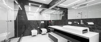
The bathroom is decorated with tiles, artificial stone or plastic. It is better to use an overhead sink, as the bowl will free up storage space in the cabinet below it. In addition, such a solution looks stylish and unusual in high-tech, eco-style, Scandinavian style, and minimalism. The bathtub is abandoned in favor of a compact shower stall. If the room is not large in size, then use a storage system of narrow wall cabinets. In combined bathrooms, the toilet is separated from the rest of the space using a frosted partition made of glass or plastic. The ceiling chosen is suspended. This option will protect the room from floods from above and emphasize the style of the interior.
How to arrange storage systems
In Khrushchev 31 sq. m it is necessary to install spacious multifunctional cabinets. They should be placed in the hallway, living room, balcony or loggia. Shelving and plasterboard structures are both a storage space and an element of room zoning. Before renovating an apartment, you need to determine the location for the cabinets. Storage systems take up most of the space, so they become part of the Khrushchev project.
An interesting design idea - drawers for storing clothes and linen, installed in the podium on which the bed is located.
We recommend: Design of a one-room apartment for a family with a child: apartment zoning rules
The color scheme of cabinets, drawers and shelving should be white and beige. To visually expand the space, the design uses exit doors mirrored or matching the color of the walls.
Design features for apartments
One-room apartments are in demand and there is a lot of evidence of this. For example, almost all new buildings have apartments of 32 sq.m. and they are sold out quite quickly. This apartment is an excellent option for young families. There are also small apartments in Khrushchev and Brezhnev buildings. Then we are talking about the secondary real estate market.
The arrangement of a small apartment largely depends on the number of people living in it.
Be that as it may, when purchasing property in a new or old house, you can remodel it the way you like. One-room apartments have significant disadvantages that are important to consider when planning correctly:
- small area;
- in most cases, such apartments have low ceilings;
- small kitchen and bathroom;
- narrow corridor;
- no mezzanines;
- in rare cases there is a balcony or loggia, but more often there are none - this one important nuance is often forgotten;
- One-room apartments are often located in high-rise buildings.
An undoubted advantage of one-room apartments is that they are always surrounded by other apartments, so they are warmer. With an apartment layout of 32 sq.m. you should adhere to these rules;
- You can't force free space. More light and space is the right solution. Minimalism looks better in one-room apartments.
- More light. If natural lighting is not possible, then sconces, floor lamps, and lamps will come to the rescue. Residents are lucky if their apartment is on the sunny side or has a large window.
- In a one-room apartment you can give free rein to your imagination and play with colors. In this case, it is not necessary to adhere to the standards: white ceiling, dark floor. The ceiling can be any color, but several shades lighter than the walls. This will help visually enlarge the room.
- A glossy ceiling and mirrors will visually increase the space.
- Built-in furniture is an excellent solution for small apartments, where every centimeter visually changes the “picture”.
- Use a cabinet, bar counter or rack, or niche as a partition.
Bathroom
In the small volume allocated by the designers for the bathroom (3.8 sq. m), the designers of the A8 studio managed to fit everything that the Customer wished.
There is a wall-mounted vanity, mirror, shelves for accessories, washing machine, toilet and an extended shower stall with a deep soaking tub enclosed by a clear sliding plastic enclosure.
Sleeping area
To save space in an apartment with a small living space, it is recommended to use a folding sofa instead of a standard massive bed. This will save space, and there will also be greater maneuverability in case the interior is rearranged after some time.
If you want to place a standard bed in a studio apartment with 32 square meters, then place it in such a way that it can be easily seen from the door.
The best solution for the sleeping area of such a small apartment would be to purchase a transformable bed. This is a convenient furniture option from all points of view. It folds easily and does not take up much space. When disassembled, the transforming bed is a full-fledged place to sleep, where every person will feel coziness and comfort.
Methods of zoning projects
One of the solutions for planning 1-room apartments of 32 square meters or zoning would be to use partitions to divide the room into parts.
There are many ways to divide housing into functional zones:
- An additional wall as a partition in a one-room apartment, the zoning of which can be quite creative. It can be made of concrete, wood, glass or other materials.
- Screens (movable partitions). They are comfortable because it is possible to remove them and free up an additional area. When assembled they do not take up much space.
- Drapes, curtains). Another mobile version of partitions. Suitable for enclosing a bedroom, giving it additional comfort.
- Headset It is recommended to turn a cabinet or rack into an additional partition, placing it perpendicular to the wall.
- Podium. This option is suitable for living space with high ceilings. In low rooms it is better to equip only the bedroom with a podium. In addition, it is used as storage for things (if equipped with drawers).
You can also use creative zoning projects such as large aquariums, fireplaces, phytowalls. This will make the layout of a 1-room apartment of 32 m2 more interesting and attractive.
Decor
The finishing touch to the interior design of an apartment is its decoration. A variety of things can be used as decorations - vases, figurines, panels, paintings, mirrors, ceramics.
The main thing is not to overdo it. In a small area, decor should be kept to a minimum. In addition, the selected accessories must correspond to the style in which the decor is designed.
In conclusion, we note that a small apartment is not a reason to be upset. And in a small space you can create a cozy and comfortable atmosphere, as well as an environment that meets the requirements of convenience and style.
Furniture arrangement in a one-room apartment according to Feng Shui
The very concept of “feng shui” implies harmony and comfort. It is believed that the correct placement of the headset will provide the home with streams of positive energy.
You can start arranging furniture from the main room - the living room. It is better to place the sofa as the main piece of furniture in the south side. Opposite it, in the north, a stand with a TV is installed. It is recommended to place the cabinets in the southwest, and fix the mirror on the western wall. If the windows face east, then you should place a table near them to receive guests.
There are several principles in the sleeping area: do not hang a mirror opposite the bed, cover sharp corners of furniture with fabric, place a lamp with a lampshade on the bedside table.
In the kitchen, you should not place the sink, stove and refrigerator in the same row. According to Feng Shui, it is better to place the stove in the southern part, but not near the window or opposite the entrance.
In the hallway, it is better to place a full-length mirror on the side of the front door. The space at the entrance should be as free as possible. Large wardrobes should be placed as far as possible from the entrance to the home.
The combined bathroom and toilet should be separated by a water-repellent curtain. Personal hygiene items cannot be placed on the surface of the bath; they require a special cabinet.
Feng Shui nuances in a one-room apartment 32 m2
Often the layouts of 1-room apartments are 32 sq. m. they do not allow the premises to be arranged in full accordance with the principles of Taoist practice.
A few simple universal rules for preserving favorable energy in the house will save the situation:
- the home must be cleared of unnecessary or old items that have not been used for more than a year;
- then you should sprinkle all surfaces with salt water and smoke the room with incense;
- doors to the bathroom and toilet must be kept closed;
- entrance and interior doors must be washed regularly;
- It is recommended to highlight the central part of the home with beautiful objects (crystal chandelier, carpet or other accessory).
Feng Shui color also plays an important role. If the kitchen, living room, hallway and bathroom have different shades, then each area of the apartment will acquire individuality.
Color spectrum
Light shades prevail in the color scheme. The only exceptions can be bright accent decor and a dark floor (if there are high ceilings). Modern trends use “delicious” shades that are like a breath of fresh air: olive, mint, tangerine, mustard, cherry, nut. In classic interiors, the brown color scheme in all its diversity is taken as a basis: coffee with milk, beige, mahogany, terracotta, chocolate, vanilla, ocher. High-tech styles use a combination of white with dark (asphalt) and light (haliotis, silver) gray. Also used in the palette are blue, yellow, pink, green, and coral. If there is little natural light in the room, then it is made more comfortable by using warm colors. Cold tones, on the contrary, are suitable for rooms whose windows face the sunny side.
Rest zone
The living area should preferably be located directly opposite the entrance. The furniture of the recreation area includes a standard set consisting of upholstered furniture and a small coffee table. If desired, you can place a soft corner there, which will give additional comfort to the room.
Don’t forget about the space that is located under the window opening. It can also be used to great advantage. However, it is better not to place large-sized furniture there, as this will create some inconvenience during use.
Styles and colors for apartments 32 sq m
The design and interior of a one-room apartment of 32 square meters is based solely on the preferences of the residents. On the modern market there are a huge number of ready-made projects that can satisfy even the most picky clients. Most often, residents, when making renovations in a small apartment, resort to minimalism.
Simple, roomy furniture with geometrically correct shapes is suitable for a room in a minimalist style.
We recommend: Design of a medium-sized studio apartment
Minimalism is simple but at the same time functional, which is an excellent solution. It is better to use light shades, a minimum of details and compact, functional furniture. In this case, there is built-in furniture.
Built-in furniture allows you to make the most of the space in a small apartment
For young families, the colonial style is original and at the same time stylish. It combines comfort and convenience. A characteristic feature of this style is the juxtaposition of exotic overseas inclusions with traditional motifs. Different materials do not conflict with each other, but complement each other. This could be wicker furniture next to metal lamps. All this creates a bright contrast between Eastern and Western culture, which comes together in this interior.
Colonial style is classic mixed with ethnic interior trends
For older couples, interior design in a typical Provence style is considered a good design solution. Wooden furniture is combined with bright textiles, which creates a special atmosphere of comfort and home. This type of interior is often used in America and can often be seen in movies. General family photographs will be perfectly placed on the walls; the main focus will be the kitchen.
The interior in the Provence style is characterized by an abundance of light, field themes and retro colors
High-tech is considered the complete opposite of the previous style. It has echoes of minimalism, but this style uses exclusively new items and combines basic colors: black, white, metallic. A bright accent is the shine, gloss of furniture, glass and mirrors.
Monochrome design emphasizes the rigor of high-tech - nothing superfluous, only black and white
In any style, you should avoid bulky and massive items that take up a lot of space and hide an already small space.
In the kitchen, it is better to use built-in appliances, placing the furniture in one line. For example, along the wall. The kitchen can be separated from the living room by a bar counter or a bookcase or wardrobe. In the living room, the TV should be hung on the wall, and an additional bedside table should be placed under it. In the work area, you need to change the lighting, place additional lamps and floor lamps there. The sleeping area can be separated from the main space, for example, by a curtain.
A compact set of direct layout will save space for the dining area
General recommendations
There are apartments with an area of thirty-two square meters. m. two types:
- One-room apartments in typical Khrushchev-era buildings. Typically, such apartments are a “gift” from Soviet-era buildings.
- Studios. They can be found in modern new buildings.
The second option is considered optimal for small spaces. Following the principle of “down with barriers and walls,” you can create an original interior design and compactly fit the necessary decorations in one large room, divided into zones. Of course, redevelopment is not always possible. If the owners want to demolish the load-bearing wall, then the entire project can be abandoned, since not a single housing inspection will approve such architectural changes. By the way, even if successful, you will have to be patient and visit many authorities before permission for redevelopment is obtained. To create cozy, comfortable apartments within a cramped apartment, you should listen to the opinions of professional designers and take on board a number of their tips:
- if the apartment has a pleasant addition in the form of a loggia or balcony, they are combined with the rest of the area. Here they set up a study, workshop, rest room, library or dining area;
- the design uses light shades and surfaces with horizontal stripes to make the space seem larger and the room wider;
- in studios or apartments with a modified layout, only light partitions or conditional zoning are used. Monumental walls will split the room into separate tiny zones, which will be very difficult to connect into a single composition. In addition, the space will be like a puzzle assembled from individual fragments;
- use multifunctional furniture. The bed turns into a compact sofa, the tabletop is fixed directly on the wall, the sofas fold, and the built-in wardrobes will hide the flaws of the non-standard shape of the room and allow you to use more space for organizing the storage system;
- It is not recommended to experiment with bright, catchy and slightly chaotic styles, in which the interiors are overflowing with small details and decor.
It is also worth paying attention to the shape of the main room. If you are dealing with a square, then it is possible to place zones around the perimeter or a central location of an accent area with additional ones near the walls. Rectangular rooms will have to be adjusted to visually bring them closer to the correct shape. In such cases, you cannot use a parallel layout and place sets of furniture against opposite walls.
Selection of finishing materials
Design of a one-room apartment 31-32 sq.m. m begins with redevelopment (demolition of unnecessary partitions and walls) or with the identification of functional areas in an existing project.
The small area is designed to be functional and comfortable for living. Therefore, they use zoning of the room using finishing materials. Materials are chosen to match the chosen style of living space.
To visually expand the space of an apartment of 31-32 square meters, adhere to the following rules:
- the walls are covered with light wallpaper;
- It is better to install light doors, matching the color of the walls;
- To add originality and modernity, it is recommended to combine wallpaper and tiles, decorative plaster or stone.
The photo shows an interesting design of a 31 sq. m studio. m using a combination of different finishing materials:
Lighting
If you have a studio-type apartment, then you can completely abandon central lighting. An excellent alternative is to place groups of lighting fixtures above each of the functional areas.
It is also mandatory to install floor, wall and table lamps - floor lamps, sconces and table lamps, respectively. It is appropriate to use a lighting system.
