Pros and cons of a white glossy headset
It is human nature to spend a lot of time in the kitchen. Therefore, choosing a glossy white kitchen with wood should be a responsible choice. Such furniture has certain qualities, which will be discussed in more detail below.
The advantages of a white glossy set include:
- Visual expansion of space. Suitable for small apartments where you have to save every square meter.
- Combination with all shades. You can decorate the kitchen in both bright and pastel shades.
- Fits into any style. The main thing is to choose the design of the furniture facade so that it looks harmonious.
- Psychological comfort. A white glossy kitchen in a modern style looks unobtrusive. It is associated with purity, so it does not cause psychological instability. Sometimes this color can cause discomfort because it resembles a hospital setting.
- Neutrality, so this color does not get boring. To make the design more lively, you can combine a glossy white kitchen with rich shades and different textures.
- Availability. Buying a snow-white kitchen with wood is easy. Glossy kitchen facades are supplied by all manufacturers.
Flaws:
- All cracks, scratches and dirt are visible on white glossy surfaces. This greatly simplifies operation. If necessary, you can carry out repairs and extend the life of the furniture. However, the cleaning process will be very labor-intensive, because... You will need to remove all dirt that is not visible behind furniture with dark facades. You will need to purchase special cleaning products that will keep the furniture white.
- Such furniture models do not seem very attractive if you like classics. To solve the problem, you can think of an unusual layout or use different textures and finishing materials.
Read: Gray kitchen - Nobility and grace of a kitchen interior in gray tones (75 photos)
Types of countertops
Wood makes any interior cozier and warmer. You just need to choose the right material.
Made from solid or laminated wood
The best materials for a kitchen worktop are hardwoods such as oak or ash. The service life depends on the density of the wood. The softer the rock, the sooner the surface will become covered with scratches and dents.
Solid wood is a longitudinal cut of wood, it is quite expensive, but it looks great and lasts a long time. The surface is resistant to shock and temperature changes.
Glued, or typesetting, solid wood is made from thin, well-dried lamellas, which are glued together under a press. The cost of such an array is several times cheaper than that of a solid one, but in terms of properties and characteristics it is not inferior to it. For example, such a surface is more resistant to moisture and less susceptible to deformation during operation. Glued solids can be solid-lamella or spliced. In a one-piece lamella, long lamellas are connected only along the width. The texture of such an array is more uniform, the seams are completely invisible, and the pattern is not interrupted along the length. In finger-joint gluing, lamellas 40-50 mm long are glued along their length and width, so on such a surface the structure is more noticeable and a characteristic pattern appears.
Instagram @aventuremaisondecolasuite
Instagram @our.victorian.place
Instagram @mazale_
Instagram @makram.ka
Instagram @marylovedeco
Chipboard
For a white kitchen with a wood-look countertop, chipboard is also suitable. Of course, this material is inferior in properties to natural ones: it is less durable, more susceptible to deformation and is not resistant to moisture. But with careful care it can last quite a long time.
There are two options for chipboard: covered with veneer and laminated with plastic. Veneer requires the same care as solid wood - from time to time it needs to be coated with oil and wax. Veneer cannot be restored, so you should carefully monitor it, wipe it regularly and limit contact with moisture. Chipboard laminated with plastic is the most affordable option, but also the most short-lived. But the coating exactly imitates the colors and structures of different rocks.
Instagram @amparo_lasnubes
Instagram @lacasadubonheur
Instagram @hello_nhome
- Kitchen
Decorating a kitchen in a studio apartment (50 photos)
What colors goes with white in kitchen design?
White color is considered universal. It looks beautiful with different shades, both bright and neutral. If you combine white with dark and rich tones, the design will be bright and contrasting.
Combination with pastel shades will create a gentle, warm and cozy interior. This will visually make the room brighter and more practical.
To create a sophisticated and luxurious design, a white kitchen with marble countertops looks beautiful with gold and silver accents.
. For laconicism and rigor, combine snow-white color with black, red and gray shades. Suitable for high-tech and modern design.
To make your kitchen look fresh and warm, combine white glossy kitchen furniture with green and yellow tones. This combination is used in Provencal or minimalist style.
To decorate your kitchen in Provence style, you can combine white glossy furniture with shades of blue or lilac.
Decor
An almost invisible, laconic decor is appropriate in a Scandi kitchen:
- translucent white tulle or organza;
— delicate ikebana in a glass vessel;
- cute tin cans and white plates placed on open wooden shelves;
- wooden kitchen utensils;
Photo from source: homedesigning.com
Table top Cedar 3829/Nw Bunratti Oak
- live plants in interesting pots;
- wooden shelves on an accent wall made of the same material.
Photo from source: homedesigning.com
Table top Cedar 3852/P Corsica Oak
Photos of white glossy kitchens with wood in the interior
If you don’t know what white glossy kitchens with wood look like, take a look at the real photos below and look at the reviews on the forums. This will make it easier for you to choose the right model based on the size of the kitchen.
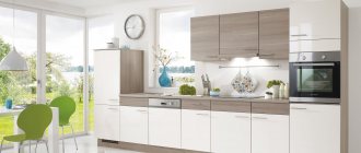
Glossy white kitchen sets with wood look beautiful and harmonious. They emphasize the sophistication and spaciousness of the space. Such furniture is suitable for any style, as it harmonizes with various shades.
Let's discuss this article together:
Click to cancel reply.
Lighting
A typical feature of the Scandinavian style is simplicity and conciseness. It finds its expression, including in the design of lamps:
— chandeliers with laconic white domed shades;
Photo from source: digsdigs.com
Tabletop Cedar 7052/FL* Wotan Oak
- ordinary incandescent lamps suspended on wires and built-in as sconces above the work area, etc.
Photo from source: digsdigs.com
Tabletop Cedar 1012/Cr Ceramics white
Which facade to choose: matte or gloss?
The choice of matte or glossy facades is not only a matter of taste, but often also of practicality.
We compared these two fronts to weigh the pros and cons. The results are shown in the table below.
| Comparison setup | Matt | Brilliant |
| Which is easier to care for? | It is more difficult to remove dirt, especially on textured surfaces. | Cleaning the surface is easier and faster. |
| Which one is more visible to dirt? | Fingerprints are less noticeable. | Fingerprints are more visible. This problem is solved by using appropriately selected handles that minimize contact with the façade surface. |
| Lighting requirements | There are no lighting requirements (except that it must be sufficient). | The wrong lighting can ruin an entire room by creating annoying glare. |
| Room size | Versatility. | Glossy facades can optically enlarge a small kitchen. But (!) with the right lighting. |
| How to choose by style? | Glazed facades can be combined with any style. | Glossy facades are inappropriate in classic, traditional kitchens. |
| Where do the windows face - into the sun or into the shade? | Again, the mat is universal. In kitchens with south-facing windows, it is recommended to use matte surfaces. | If there is a lot of sunlight in the room most of the day, glare from gloss can be annoying, but where there is little sunlight, gloss will help - it will compensate for its lack. |
| Fashion | The trend towards naturalness has its own rules - matte surfaces look more organic and at the same time do not irritate with active shine. Matte surfaces have become more fashionable. | Following a trend only makes sense if it does not contradict your common sense. If gloss is necessary or if the style you choose (for example, art deco) dictates the use of gloss, then why not opt for it? |
Which material to choose
- MDF stands for Medium Density Fiberboard. In short, MDF is a material made from compressed sawdust “bonded” with resins.
- The correct term for a kitchen made of MDF is “kitchen made of MDF”, since the frame, shelves and sides are often made of laminated chipboard, less often - of plywood and MDF;
Why is MDF better than chipboard and wood?
- Variety of finishes and designs (compared to chipboard). The MDF base can be: painted, covered with enamel (matte/glossy), foil, veneered, patinated (pictured below) and even concave/convex and milled;
- increased wear, heat and moisture resistance and resistance to external influences. Wooden facades can scratch, crack or dry out over time, and chipboard doors “loose” faster on their fasteners;
- Cheaper than wood.
Why are facades made of MDF inferior to facades made of wood and chipboard?
- MDF is more expensive than chipboard and weighs more, so it is rarely used for making cabinets;
- MDF is less refined and durable. Wood is better from an environmental point of view, lasts longer on fastenings and can be restored.
The service life of an MDF kitchen is 10 years or more if used carefully.
Festive table decoration options
The beautiful structure of a wooden table in Scandinavian-style kitchen-living room interiors is often left open. In this case, it is quite possible to use a translucent white path, on top of which transparent glasses with small pine branches will be placed, as well as candles in tall elegant candlesticks. An appropriate and authentic addition would be wooden benches covered with skins and fur.
Photo from source: curatedinterior.com
An interesting alternative to the spruce branches and garlands typical of Scandi would be sprouted bulbs in transparent glasses. It looks very unusual! In this case, candles can be in tall candlesticks, or in small low ones, or without them at all.
Photo from source: curatedinterior.com
A very unusual alternative is a festive Scandi table design in black. Tablecloths, candlesticks, dishes, and decorative elements look very solemn in this color. Greenery in transparent, laconic vessels will pleasantly dilute such an abundance of dark tones.
Photo from source: curatedinterior.com Scandinavian style
