Red and black are a bright and bold color combination, which not every person would decide to use when decorating a kitchen. You rarely see such an interior in real life, despite the perfect match of these two contrasting shades. This style is chosen by eccentric, self-confident and impulsive people who do not like to follow rules.
Red is a rather aggressive shade, and black adds even more expression and drama to it. A kitchen made in similar colors is not particularly suitable for cozy gatherings with the family, but it will be an ideal place for a romantic dinner by candlelight.
The main thing is not to overuse red. The room must not be allowed to look as if it is on fire. The ideal is to complement both of these colors with calmer and neutral shades, which will muffle aggression and make the atmosphere in the room more comfortable and calm.
Kitchen set - how best to combine a red and black palette
The set can be decorated in different ways, using red and black colors. It is important to choose the most ideal combination that will suit the chosen interior style.
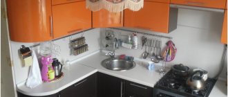
Black bottom, red top is perhaps one of the most common options for arranging a kitchen set in these rich colors. Perfect for creating modern styles - for example, minimalism and hi-tech.
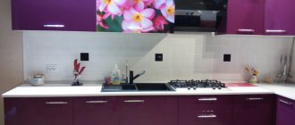
The surfaces of the facades can be glossy; metal fittings and glass elements act as accessories. To make the set look more interesting, it is recommended to equip the kitchen apron using ceramic or glass mosaics in black, red and gray. An apron made of tempered glass with red and black photo printing would look good.
Red bottom, black top - this option should be chosen only if the kitchen is spacious enough. The lower red facades can be made of chipboard, MDF, solid wood, plastic. For the arrangement of upper facades, it is advisable to choose more weightless and lightweight materials - for example, glass.
The walls and floor in such a room should be quite light (a light gray color is ideal). To arrange a kitchen apron, you can use porcelain stoneware, metal, tempered glass (colors: gray, white, black and red, silver, metallic).
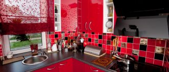
A red kitchen with a black apron is a worthy option for decorating a room. To make such an interior look as interesting as possible, the lower and upper facades of the set should be done in black and red tones, placing a black apron made of tempered glass or ceramic tiles between them.
An excellent addition to such an interior would be a black and white floor arranged in the form of a chessboard. The walls in the kitchen can be painted light gray, the ceiling should be completely white. If the interior style is hi-tech or minimalism, you will have to abandon the use of textiles.
Red and black kitchen with a gray apron - the lower and upper facades of the set should be done in black tones and decorated with red ornaments. A kitchen apron made of mosaics in various shades of gray will be a good element of the interior. In gray color, you should choose chairs, placing them around a black table. Working surfaces and countertops can be made of natural or artificial stone in light gray color.
A red and black kitchen with blue elements is an interesting option that can be used in a medium or large sized kitchen. The main thing is not to overdo it using blue. It should not be dominant; it must be added in the form of several elements.
For example, arrange an apron in black and blue tones, hang blue curtains on the windows, place blue decorative dishes on open shelves. The red and black set must be complemented with a black dining table with red chairs. It is better to make the walls gray, the floor can be black self-leveling.
A red and black kitchen with white elements is a classic option for furnishing a room that will be relevant at all times. These three shades harmonize perfectly with each other. It is desirable that in this combination white color dominates, then red, and only after that black. Only if the room is spacious enough can you use all three shades in equal proportions.
The façades of the furniture should be made in red and black tones, and a white shade will serve as an ideal background for them. As for the interior style, it should be modern.
Advice! To soften the red-black color scheme a little, it is recommended to use mirrored and frosted glass surfaces, as well as light marble textures when decorating such a kitchen.
Apron
When choosing an apron for a red and black kitchen, keep in mind that it should fit as harmoniously into its interior as possible. Its tone can either match the color of the countertop (in this case, pay attention to shades of beige and gray) or contrast with it.
The most successful combinations of apron and tabletop are:
- White apron and red tabletop and vice versa (red apron and white tabletop).
- White apron and stone countertop (natural or artificial).
- The apron and tabletop are in the same light tone (light gray, beige).
- Black and red checkerboard tile backsplash and light-colored countertop.
- White apron with red ornament and white tabletop.
As for materials, an apron made of glossy tiles or a plain glass apron (skinali) is perfect for such a kitchen.
For extraordinary individuals who value originality and individuality in the interior, a glass apron with photo printing is suitable, with the help of which you can realize all your desires, enliven the interior of the room, give it originality, and, with the right design, visually enlarge the space.
The pattern or ornament on such an apron should not stand out from the interior and maintain the overall color scheme. In this case, it is better to choose a tabletop in light colors.
An apron with black and white animal prints (colors imitating the skin of a zebra or leopard) looks very original in rooms with modern interior styles.
When choosing an apron with photo printing, you should avoid large patterns, which will make the interior of the room look tacky and even more aggressive.
What wallpaper should you choose for a red and black kitchen?
To decorate a kitchen in red and black tones, designers recommend using wallpaper in neutral light shades with a smooth texture, plain and without ornament. They will emphasize the dignity of the interior and act as a good background for its main tones.
To make the room as cozy as possible, it is necessary to minimize the contrast of colors. This means that shades of red should be muted and soft, they should be combined with calm tones of white: pearl, caramel, cream, ivory and baked milk.
Light wallpaper in a red and black kitchen will look great when arranging interiors in a variety of styles: minimalism, hi-tech, retro, shabby chic and modern. A large ornament with a clumsy pattern on such wallpaper would be inappropriate.
If there is a need to zone a room, you can use a combination of light wallpaper of different shades. A very original and stylish solution is the combination of the smooth surface of wallpaper with textured decorative plaster.
Interior style
Based on the red-black combination, you can build many style directions. Let's look at a few of them.
Minimalism is characterized by conciseness and clarity of lines. There are no frills, and the decor is characterized by an abundance of light and space. The uncompromising nature of the red and black duo fits well into this style.
High-tech is characterized by varnish coatings with metal and glass inserts, multi-level lighting and ultra-modern household appliances. The red and black kitchen is successfully complemented by white and chrome elements.
Black color in a classic style is the embodiment of luxury and respectability, but the use of bright scarlet can easily break the line between sophistication and tastelessness. To maintain the style, it is recommended to use accents of muted brick or burgundy color.
The photo shows a black kitchen in a minimalist style with muted red trim.
In country style, the red and black color scheme is also quite appropriate. Since the main material for decorating a country kitchen is wood, both the background and the furniture should be designed in a natural theme. Facades painted natural coral go well with dark wood. Black details - furniture handles, shelves, lamps - complete the picture.
Red and black in a Japanese-style kitchen look characteristic and noble. Japanese minimalism welcomes the use of light textiles and natural materials, such as bamboo and natural wood, and a distinctive design feature of facades, ceilings or partitions is the recognizable lathing.
For Art Nouveau style, red and black is ideal. It looks advantageous in combination with modern household appliances and furniture without unnecessary decorative additions.
Selecting curtains
The choice of curtains for such a kitchen depends on various factors: the chosen interior style, the size of the room, the degree of illumination, and so on. If the kitchen is spacious, with large panoramic windows, and made in a classic style, you can use long thick curtains of deep red, but not bright, but muted, color. You can tie them with a black or gray satin ribbon.
For a black and red kitchen furnished in country, rustic or shabby chic styles, it is best to use light curtains or short curtains in a black and red checkered pattern. For a kitchen designed in modern styles, designers advise choosing neat blinds or laconic Roman blinds.
Furniture for kitchen
The most original red and black kitchen set will become a real “highlight” in a room of any size. The design does not have to be monochromatic - black lower cabinets in combination with red and scarlet hanging cabinets look good. Checkerboard and gradient options look even more interesting and are made to order. When adding other, mostly light shades, they paint the tabletop and cabinet handles.
As a standard, the lower facades are made black, and the upper ones are painted red. But furniture with one predominant shade looks much more interesting when the second is used in the frame or part of the cabinets.
Tip: household appliances (refrigerator, stove, microwave, etc.) are also purchased in black and red colors. If one cannot be found, ordinary white objects are hidden behind closed furniture facades.
Choosing a black set is acceptable in spacious rooms, where there is enough space so that the color of the furniture does not absorb the free space so much that the kitchen ceases to be cozy.
Choosing a kitchen table in red and black colors
Table and chairs are an important part of every kitchen interior, regardless of the chosen design style. A red wooden table and black wooden chairs placed around it will look great in rooms designed in shabby chic, country, rustic and Mediterranean styles.
For a kitchen whose interior is made in a modern minimalist or high-tech style, it is best to choose a table and chairs made of synthetic materials - for example, red plastic and metal. The tabletop can be matte, glass, glossy. The presence of metal chrome elements in the decoration is welcome.
What furniture and appliances to choose
The red and black facades of the kitchen set harmonize well with the traditional colors of household appliances. Built-in appliances look beautiful, creating a monolithic and unified feeling of the layout. A dark oven or microwave harmonizes well with the background of glossy facades.
The refrigerator can also be the color of the main colors of the combination. A standard white refrigerator is used only if this color is found on the work surfaces, apron or countertop. Otherwise, the refrigerator will stand out strongly from the general background.
The kitchen table can be dark in the shape of a circle or rectangle. Glass will add a mirror shine. Chairs are chosen to match the table. Dark colors are diluted with red upholstery for chairs or a leather sofa.
Arrangement of a bar counter in the kitchen in red and black tones
A bar counter in the kitchen is appropriate in two cases: if the room is too small, and there is no room for a full-fledged dining table, if the room is too spacious, and with the help of a bar counter it can be zoned.
Before you begin arranging this element of the interior, you should carefully consider the overall style of the kitchen. If it is decorated in a minimalist or hi-tech style, the ideal option would be a bar counter in the form of a lightweight structure made of metal, chipboard, wood or plastic. It can be supplemented with lighting, shelves and hooks for storing glasses, etc.
To decorate classic interiors, you should choose a more solid and massive bar counter made of solid wood - of course, such a design is only suitable for a spacious room. The color of the bar counter also matters. The most win-win option that will fit perfectly into any style and interior is a black bar counter. If the interior is modern, its tabletop may be red.
Decor, lighting
The more dark spots there are in a room, the brighter light sources are needed. The luminous flux is recommended to be warm - it slightly softens bright colors, but does not distort them. Each zone is illuminated separately; decorative lighting is placed around the perimeter of the unit, floor, ceiling, and placed inside glazed cabinets. All significant elements are highlighted individually.
If red and black are used only as accents, then it is better to decorate the rest of the space in white or gray.
Fresh flowers and herbs with red or almost black leaves and flowers - begonia, poinsettia, coleus, basil, etc. are often purchased as original accessories. There is little useless decor here - it is completely lost on the red background.
Lighting also plays a big role in such an interior: the better the room is lit, the more restrained and cozy the room will look.
How to decorate a small kitchen in black and red tones
This option for arranging a kitchen can hardly be called successful. The fact is that the abundance of black and red shades visually make a small room even darker and cramped. You can decorate the interior in red and black colors only if the kitchen area exceeds 20 square meters. meters. At the same time, it is advisable to take measures to ensure that there is still more white in such a room.
To make the kitchen look more spacious and bright, red can be present in small quantities - for example, in the design of the lower facades, in tablecloths, and decorative dishes. Curtains and drapes should also be chosen in light colors.
It is strictly forbidden to install a red or black stretch ceiling, which will create the effect of a tightly closed box. You will also have to give up too bright and provocative shades of red, giving preference to more muted tones. When decorating a small kitchen, designers advise using glossy surfaces and glass, which will make the room look more spacious and filled with light.
An effective addition to a kitchen in red and black tones will be chrome elements made of stainless steel. A special accent can be placed with the help of crystal accessories and mirror surfaces (crystal chandelier, tableware decorated with crystals, mirror facades).
When choosing kitchen sets for a black and red interior, you should not give preference to only plain furniture. Original prints or floral patterns on the facades of the set will help to slightly enliven the room. The main thing is that all elements are in harmony with each other and the overall style of the room.
Designers also advise not to overdo it with red and black shades, even if the kitchen is quite spacious. The fact is that bright aggressive colors, the concentration of which is increased in the room, can cause anxiety and can cause unmotivated aggression. In addition, the abundance of red does not always indicate the good taste of the owners of the home.
Who's the boss in the house?
The choice of interior style will depend on which of the colors of this red-black duo will be dominant. More often than not, the leading part is performed by the red one.
It is a dynamic color that attracts attention even in small quantities. Dominant black will create a too gloomy atmosphere if not balanced with an additional neutralizing color.
When decorating a room, it should be borne in mind that this color combination is self-sufficient and completely excludes the use of any elaborate fittings, curls and stucco molding - only simple, strict lines.
The red-black duet can vary: black top - red bottom, red top - black bottom, the main thing is to maintain balance. Many designers advise achieving balance by incorporating a background color. For example, like in this photo.
Accessories
If your desire to get a red and black kitchen is great, but purchasing a bright set or changing the background color is not yet planned, try to diversify the existing decor with contrasting accents of the magnificent duet.
Anything will do: a lamp with a red lampshade, bright curtains with black monograms, rich sofa cushions and other textiles. Decorative plates, elegant vases or unusual bottles will cope well with this task. You can try to get closer to the splendor of a red and black interior by resorting to colorful vinyl stickers that will look great on the refrigerator and other light-colored surfaces.
red accessories
Tips for decorating a red kitchen: 10 design hacks
1. Selecting the central zone. You shouldn’t decorate the entire room with bright colors: choose a central zone (this could be a set, a dining group) - and give it a particularly expressive look.
2. Arrangement of point accents. An alternative option for introducing color into the interior is spot accents (serving dishes, household appliances, textiles, utensils). They can be evenly distributed in the interior, adding dynamism to the space.
3. Single accent. There can be just one red accent in the decor (refrigerator, apron, corner cabinet, sofa, wallpaper on the accent wall, kitchen island).
4. Glossy or matte red? The answer to this question depends on the chosen style and the desired mood of the interior. Do you want more expression and gloss? Choose gloss. Are you afraid that the red kitchen design will look too pretentious or glamorous? Stick with the matte option.
5. Harmonious combinations with light tones. To reduce the expression of color, choose neutral, but not too contrasting shades. Suitable beige, milky, light gray, light brown. But snow-white will become too harsh an option.
6. Combination with dark shades. Do you want a darker, enveloping palette? Combine red tones with blue, dark gray, dark brown, dark green. It’s ideal to add a spot of light color so that the palette doesn’t seem too gloomy.
7. A palette of bright colors. Have you decided to decorate a brighter, cheerful interior? Red looks harmonious in combination with ocher shades, light pink, warm yellow and mustard, reddish-brown. All of these palettes are warm and quite bright, they can be balanced if desired with a light color or a cooler shade (for example, milky or blue-gray).
8. Hidden red. A bright shade can also be hidden and not obvious: for example, this is how you can decorate the inside walls of cabinets or the back of curtains.
9. Elegant details. Continuing the theme of point accents and hidden design: red in the interior can appear quite minimally - in the most elegant, not immediately noticeable details (fittings, baseboards, sockets and switches).
10. Balancing. You can reduce the activity of a kitchen design with a red set not only with the help of other colors. By choosing a country, rustic or minimalist style for decoration, you will move away from associations with excessive pretentiousness. And by complementing the interior with expressive textures of wood, stone, and non-ferrous metals, it is quite possible to divert attention from the active tone.
Features of choosing a headset shape
For lovers of unusual interiors, designers suggest choosing a radius kitchen set . Rounded and smooth elements look original and with their help create bold and unique interiors. Radial facades are used to equip floor cabinets, worktops, and wall drawers.
They make kitchens to order , according to individual measurements. Such furniture is also suitable for kitchen-living rooms, where the radius kitchen acts as a zoning element.
For kitchens no more than 15 square meters, choose a linear or corner layout . The advantages of the first option are compactness, ease of assembly and affordable price. The advantages of a corner kitchen are its convenient location, drawer capacity and interesting appearance.
Particular attention is paid to island kitchens , where the island takes center stage. It is both a work area and a dining area. The island is brought into the center of the room. For convenience, a sink, washing machine, and freezer are installed in it.
Important! The shape and size of the dining group are chosen based on the area of the room and its features. For small rooms, use bar counters, folding tabletops or transformers. If space allows, a dining group made from an oval or square table, soft sofas or armchairs would be an excellent option. The color and texture of the dining area should be in harmony with the furniture and decoration.
Selection of material for the body and facade
Black and red kitchens made from chipboards look impressive . They consist of thin shavings glued together with a binder solution. These shavings are the result of processing wood and wood waste. Furniture manufacturers and consumers are attracted by the low cost of chipboards.
However, they have an impressive appearance, are easy to assemble, and are resistant to water and steam. The service life of a kitchen made from chipboard is about five years. For reliability, it is recommended to cover the chipboard slabs with an aluminum edge - it protects the facades from splashes of water and steam.
Another material for making a kitchen is MDF boards . They have a more durable structure and are made from environmentally friendly raw materials. The service life of a kitchen made from MDF is about 15 years; the facades do not fade under the sun and retain their attractive appearance.
In terms of strength, MDF is not inferior to furniture made of natural wood , which costs several times more. One of the most popular kitchen finishing options is painted MDF boards. With the help of paint, the material acquires a matte or glossy surface.
See also:
All about green kitchen furniture and wall color
Black kitchen design with dark facades
About the golden kitchen
In addition to the body and facade, it is important to pay attention to the choice of countertops . For their production they use:
- Solid natural wood : birch, pine, oak, larch. The wood has a pleasant structure and increased strength. The disadvantages of the material include high cost and special care using gentle detergents.
- Artificial stone - acrylic or quartz agglomerate. It has an attractive appearance, is easy to maintain, and shock-resistant. Excellently imitates natural stone, but has low heat resistance.
- Natural stone , such as granite or marble, is durable and environmentally friendly. The disadvantage is the high cost.
Glossy or matte kitchen set
The glossy set is suitable for decorating kitchens with an area of 13-20 square meters. m .
Gloss is able to reflect light, so the space seems a little larger than it actually is. The effect will be enhanced by mirror surfaces and glass doors. You can get a glossy effect by covering it with acrylic plastic or PVC film. The materials not only give the facades a solemn appearance, but also protect them from water. Caring for a glossy kitchen is easy; just wipe the surface regularly with a soft sponge and glass cleaner.
Important! Combined kitchen sets are in demand: matte bottom and glossy top. Such kitchens look unusual, especially if you complement the interior with themed decor.
Matte black and red kitchens are found in spacious and sunny rooms . It brings coziness and makes the kitchen more homey. A matte red kitchen with a black countertop looks original. Thanks to the porous structure, hand and food marks are less visible on matte surfaces. Take care of such furniture using cleaning products without aggressive components.
Shades and characteristics of red
Active red belongs to a rich and warm group of colors; bright shades awaken, and dark shades add solidity.
It is a symbol of action, fire, power and love. Red has strong energy, shares it, but with an abundance of red it also takes away strength. Stimulates the nervous system, blood circulation, awakens hidden leadership, and adds confidence. The kitchen set is neutralized by green and its shades, combined with cold and warm tones, white and black.
The photo shows a set with a white top and red bottom with matte kitchen facades and a marble countertop in a rectangular kitchen.
The red set looks different due to the intensity, brightness, saturation and depth of color.
Cool shades of red include:
- crimson;
- alizarin;
- cardinal;
- amaranth.
Warm shades of red include:
- scarlet;
- pomegranate;
- rusty;
- ruby;
- poppy;
- Bordeaux;
- crimson.
