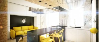
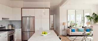
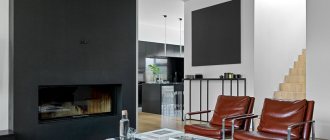
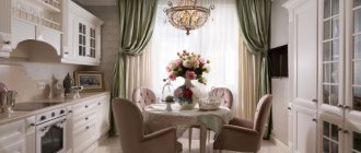
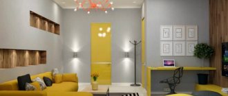
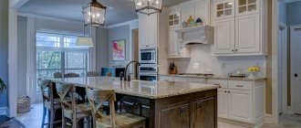
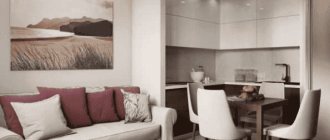
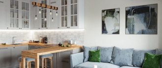
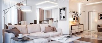
The kitchen-living room is no longer a fashion trend, but a fairly common phenomenon in modern housing stock. Many developers offer ready-made solutions where there is no need to combine anything - open-plan apartments and studios. We’ll tell you about the latest kitchen-living room design ideas, and a large selection of photos of real interiors will help you find your ideal option.
Layout
When creating a design project for a room, you need to start with the layout of the space. The key factors are the location of windows, the placement of communications, and the functionality of zones.
Usually, when purchasing an apartment, the space for the bathroom, which is a separate room, is already determined. Next we place the kitchen. This is also quite simple. Its location depends on where the communications are connected (water supply, gas, sewerage). We will distribute the remaining space according to our needs.
The first step is planning
The location of the kitchen and bathroom is often already prepared
You just have to properly distribute the free space
Since we started with the kitchen, let’s draw up its boundaries. You can do this by installing a bar counter on the border between the kitchen area and the rest. This territory should constitute ¼ of the entire apartment, if divided into equal shares. You can dedicate a larger part to the kitchen to create a dining area.
Next, we create a recreation area. It is advisable to separate it so that there is a feeling of comfort and is psychologically perceived as a place for sleep and relaxation. This can be done using a wardrobe. Thus, the closet performs 2 functions: practical use for storing things, and zoning space.
The recreation area should be separated
Sometimes zoning can be done using furniture
Then you need to allocate space for the living room. A bed is a place to sleep. Therefore, the apartment should also have a sofa. It can be replaced with a pair of soft modern armchairs.
Find out if you need office space. It can be done on the wall opposite the bedroom, because the bed will be associated with sleep, and its location next to it will negatively affect work productivity. If the apartment has a balcony, it is best to combine it with the room and make a work area on this part.
When planning, consider the functionality of future areas. Their location and size depend on this. It is advisable to conditionally separate them. Doing this with partitions or curtains is not a good idea. Therefore, create separation by properly placing furniture and room details.
There must be a sofa in the apartment
Zoning can be done using partitions or furniture
When planning, consider the functionality of future areas
Choosing furniture for the bedroom-living room
The combination of a bedroom and a living room should be carried out by conditionally separating these rooms. A thin arch, the installation of a light cabinet, or a shelf with a medium height will help limit the space for personal relaxation. If you have an insulated balcony, you can place a sleeping bed on it in the form of a mattress with a base (without sides or armrests). It is also suitable for organizing a child’s office, study or playroom. In the part of the room reserved for leisure activities, it is allowed to install a mini-wall with a TV. If the TV is mounted on the wall, you can place a chest of drawers or a cabinet under it for storing magazines and newspapers. Armchairs or chairs should be replaced with a sofa with internal compartments for bedding and non-seasonal items. On the wall above the sofa you can hang a couple of cabinets, shelves or make a hidden niche.
Studio benefits
- Increasing usable area.
- Free layout.
- The ability to independently regulate the area of each functional zone and their number.
- In the absence of partitions, the natural lighting of the room improves.
- The combined space encourages communication between family members.
Flaws
- Distribution of food odors into the recreation area. It doesn't matter if you like the smell of fresh baked goods and delicious dishes at home. If you consider it unacceptable for kitchen odors to penetrate into the living room, then purchase a powerful hood.
- Difficulties with zoning. Without clearly defined boundaries, it can be difficult for beginners to competently organize the zoning of a room.
- No matter how carefully the hood is selected, steam and grease settle on interior items. This means you will have to clean more often.
- If you are not a fan of cleanliness and order, it is better to cover the kitchen area with at least a sliding screen. Or abandon the redevelopment altogether.
Basic recommendations
Remember that when creating an interior on the available 26 squares, each thing in the house must perform one or even several functions. It is best to choose built-in or transformable furniture , as mentioned above.
In order to visually enlarge a room, you should consider expanding the windows. Even 30 centimeters can play a decisive role in the overall appearance of the apartment.
Design of a small studio apartment 26 m, photo
Don’t forget that you can glue photo wallpapers with 3D images to your walls. Those that are presented in the form of open windows on the terrace or depicting a road stretching into the distance will especially help to increase the space. This visual illusion will help expand the walls of a narrow room.
Do not be afraid to actively use glossy and reflective surfaces ; in addition, it is better to abandon pompous interior styles: traditional classics, baroque, rococo, empire and all other historical styles that are suitable for modern large apartments. And, of course, it is important not to forget about hanging shelves and mezzanines.
The difficulty in developing the design of a small studio apartment is that in such a small area you need to place all the things, while the apartment must remain cozy and comfortable. Therefore, it is worth thinking carefully about the layout of the apartment, so that even a small room is in no way inferior to a larger one - both in its spaciousness and in appearance.
Where to begin
- Coordination of redevelopment with the relevant authorities. If you decide to take this step, immediately consider the possibility of adding a balcony and loggia.
- Draw up a detailed plan for the location of functional areas. Think about how much space you would like to devote to preparing and eating food, and how much to leave for the living room.
- Using a computer program or on a sheet of paper to scale, draw up a furniture arrangement plan. Keep in mind that aisles must be at least 90 cm. If you have a bar counter or kitchen island, consider how you will subsequently move large furniture if necessary.
- If you decide to separate the bar counter from the living room with a sofa, consider how easy it is to clean the upholstery material, where crumbs will fall, and how easy it will be to clean.
Zoning
The studio assumes a clear distribution of functions between individual zones. They can be differentiated in various ways.
- Furniture arrangement. Traditionally, the kitchen is separated from the living room by a dining group or bar counter. Sometimes a shelving unit or sofa is used for this.
- Flooring that differs in texture, color and composition . With an elongated rectangular layout of the room, you can adjust its dimensions through the use of various floor materials. For example, install laminate flooring in the living area and decorate the kitchen with tiles. In this case, each zone will take on a more harmonious outline.
- Suspended ceiling . For high ceilings, multi-level suspended structures can be used. If the dimensions of the room do not allow this, friezes and stucco molding, artistic painting, and lamps in the form of artificial windows are used.
- Walls . The use of different finishing materials helps to highlight the main area and concentrate attention on it.
Pay attention to details
When completing a task, we must not forget about the details; they often help achieve the final result. Let's pay attention to furniture, textiles, decorations, as well as technical aspects.
Let's figure out what's necessary.
- Since we are creating a studio, take care of a high-quality hood in the kitchen, because you will cook on it.
- The same applies to the rest of the room - think about ventilation, because clean, fresh air is needed for sleep, rest and work.
- Do not install the air conditioner opposite your bed or desk.
Let's talk about furniture. For a small apartment, it is better to choose compact furniture in light colors. Dark, massive furniture weighs down the overall mood of the space and makes it smaller.
When planning your apartment, pay attention to small details
Use light furniture
In general, for a studio apartment of 26 square meters, try to use less furniture. It is desirable that it performs several functions at once (for example, zoning space and storing things). Also, be careful with the details: a coffee table will be completely unnecessary, and even more so a shelf with a lot of souvenirs and other small items.
In such an apartment, the details should be concise, simple and practical. But don't overdo it by removing parts, or you risk making the room dry. Add sofa cushions and curtains - this will add comfort and warmth.
In such apartments it is better to use the most necessary furniture
Use multifunctional furniture
Light shades can visually expand the room
Living room furniture
Try to purchase multifunctional furniture that can be easily transformed. For example, a sofa turns into a full-fledged double bed. And the chair serves as an extra bed in case your friend needs an overnight stay. A kitchen seating area can also provide shelter by turning into a comfortable bed.
Wardrobe beds are comfortable. However, they require enough space for you to fold out the shelf bed. At the same time, they are easy to maintain and keep in order. If you want to purchase a similar model, think about the storage system for your wardrobe, because... in the closet the bed will take up all the space.
Tall furniture in compact living rooms is good when made in light colors. Glossy and mirrored facades visually expand the space, blurring the boundaries. However, if your eyes get very tired at work, the constant glare from the lamps will irritate you. In this case, give preference to matte finishing materials and facades.
Just the kitchen, kitchen-living room or kitchen-dining room?
Owners of private houses are faced with an additional question - will it be a kitchen with a dining room, a kitchen-living room, or are you ready to give all 25 square meters exclusively to the cooking area?
No, the question is not strange at all. Why not, if there is a separate room for the dining room. In addition, it may be a matter of family traditions, because not every home usually eats in the kitchen. And long-term habits are also not so easy to get rid of. Some people prefer to eat in their room - with a book or in front of the computer, or simply in solitude. Everything here is very individual.
If you still prefer a kitchen-hall or a kitchen-dining room, then you should decide how much space the kitchen will take up, and how much you are willing to spend on the living room or dining room. This will be easy if you have already mentally answered the above questions and understand what we are getting at.
Kitchenette in the living room
Quite often, a spacious kitchen unit is not needed for a family of two. In this case, the kitchen is allocated a couple of square meters. Its configuration is quite simple.
- Domino hob.
- Washing.
- The cutting area is 40-60 cm wide.
- A convection microwave oven replaces the oven.
- Multicooker.
- 2-3 wall cabinets.
- Built-in refrigerator.
- 2 lower cabinets.
Containers for spices, knives and skimmers are placed on the kitchen apron.
Layout options for kitchen-living room 26 m
If the studio apartment will be used as a kitchen-living room, then you can consider several ways to decorate the living space. The layout can be of 3 types, which can also be combined with each other.
Linear
In this case, the kitchen modules will be arranged in a row. This option is advisable to use when there is a large space allocated for the cooking and eating area, as well as when there is a small amount of furniture and equipment.
However, you need to take into account the fact that there is no working triangle. In addition, such an arrangement will not be very convenient for two people cooking. The way out would be to increase the passage in accordance with generally accepted standards.
A linear layout allows you to expand the space for the living room. Instead of a dining table, you can put a bar counter, which is quite enough for dinner for two, but it is better to receive guests in the living room.
In cases with a narrow kitchen or the presence of a window, it is recommended to consider a two-line layout. The difference with the previous one is the number of modules and working surfaces. This option is suitable if you need a lot of space for equipment and cooking.
L- and U-shaped
Allows you to plan your work triangle and provides plenty of space for a relaxation area. If there is a window in the kitchen space, the window sill can be used as a dining table or as a work surface while preparing dishes. The main thing is to ensure comfortable ventilation of the room. The U-shaped look is also perfect for couples with children.
Island option
The difference from the others is the location in the middle of the room of 2-6 modules, including the sink. The remaining elements are placed around the perimeter of the kitchen space.
The layout is characterized by maximum convenience and is most often used in modern design solutions.
Operating points
In order for a studio apartment to be convenient not only for living, relaxing and working, but also for receiving guests, it is necessary, first of all, to pay special attention to the layout of the room, to decide how much space will be allocated to the kitchen area, and how much to the living room.
After the issue of space has been resolved, it is important to properly plan and equip the kitchen, because this is where housewives spend the bulk of their time.
As a rule, in most of these residential premises, the location of the kitchen is determined during the construction of the house in accordance with the location of the plumbing fixtures. The kitchen space should function to its maximum.
To make efficient use of the walls, you need to choose a set that has both lower and upper wall cabinets. The arrangement of furniture will depend on the format of the kitchen. So, if it has a square or rectangular shape, then the set can be located in the form of the letter G or P.
It is best to place large items in the corners, including, for example:
- pencil case;
- fridge;
- rack;
- tall cabinet for built-in appliances.
For small kitchen spaces, small-sized but multifunctional appliances are suitable . You can purchase a hob with 2 burners and a small sink. For built-in appliances, a pencil case is best suited. You can put a microwave oven or oven in it. It is worth considering the option of a rack with storage space for kitchen appliances used for specific purposes, but not every day (electric meat grinder, multicooker, etc.).
For textiles and kitchen utensils, it is best to consider railing systems suspended from the wall above the work surface.
If there is a window in the kitchen area, then the window sill can be used instead of a table for eating. It is easy to install a tabletop and several chairs that are suitable in height. At window level, a great idea would be to install wall shelves or small storage cabinets.
Zoning the kitchen and living room
Almost all designer kitchens are combined, but combining them just to follow fashion is a bad idea.
To make a layout and arrange the furniture correctly, let's think about the pros and cons of a combined kitchen, what they come from and how to turn everything to your advantage:
- A large free space is perceived and looks better than several small ones. But for this, it should not be interrupted along the ceiling (as is the case with a door or arch).
- There is a place to relax and meet friends in an informal setting, where cooking is combined with the party, and does not precede it. The one who cooks is not cut off from the whole family. But for this, the person cooking in the kitchen should not have his back to the living room .
- Fewer walls mean more natural light. It is necessary to tear down all the walls that do not have a specific role.
- A small kitchen and a small living room with a lot of compromises in design turn into a small kitchen-living room where you can already turn around.
- Noise from some devices. Not scary, except for the refrigerator. They write about this in reviews, be sure to read it because... The noise level varies greatly among different manufacturers.
- The need for approval and costs for redevelopment. But you save on wall finishing and one interior door.
- Clean more often. The kitchen is always visible and dirt is carried around. We create closed storage areas.
- If your ventilation is not properly designed, odors will spread.
Stop, but what is this for?
Let's check how well the kitchen-living rooms below meet these requirements. 3 types:
Doesn't match at all:
Already good, but not the same:
Ideal layout of the kitchen-living room: The design of the kitchen-living room begins with redevelopment, and it always pays off.
If it is possible to improve the layout by moving walls, you should always do it - in most cases it costs up to $1000 to demolish old walls, build new ones and remove construction waste.
For large cities this is less than the cost of one square meter. If initially your rooms are not combined and you have to tear down the walls, then do not be afraid. Many people are afraid of redevelopment; they think that it is difficult and expensive. In fact, dismantling a non-permanent wall costs around $6 per square meter, about the same as erecting a new one. Demolition is accompanied by a lot of noise and construction debris, but this is also not a reason to refuse. The basic rule: if redevelopment provides any advantages, then it is always worth doing.
Don't be afraid to tear down and build walls - it's worth it.
Nuance:
They will never agree on a kitchen-living room for you if there is gas in the house. The only option is partitions, sliding doors, etc., or without approval. You decide. Examples below.
Partition
Since you are mentally ready to organize the ideal furniture arrangement, let's look at the options.
The design of a kitchen combined with a living room begins with thinking through the junction of these zones. Usually they are still separated in one of the following ways:
- Bar counter
- Island and peninsula
- Dining table for kitchen dining room living room
- Sofa with back to kitchen
- The partition is not the full height of the room
A kitchen with a bar counter combined with a living room is the gold standard, but I advise you to always make the counter wider if space allows. Then it can be used as a full-fledged dining table, and modern bar stools are no less comfortable than ordinary ones.
The island and peninsula are convenient, but the area must allow.
You can see many interesting and unusual options for kitchen-living room layouts in the material about the design of a studio apartment.
If you are lucky and have a large, friendly family that actually eats dinner together while talking, your option is a kitchen-dining-living room. If you eat separately in front of screens (which is normal), then even if the space allows, I would think twice about installing a regular dining table.
For a very small kitchen-living room where there is no room for partitions, a sofa with the back to the kitchen is a normal option. It makes sense to use a permanent partition only if you clearly know why you need this partition and how it will be used (for example, for a TV). Otherwise, nothing prevents you from covering it with a tabletop and getting a bar counter, a bar table (if the tabletop is wider) or an island (if the height is the same as the work area and the sink or stove is removed). Remember the scenarios from the previous paragraph and remember an important rule:The sofa should not face the bar counter.
Finishing
What kind of flooring will you have in the kitchen area and living room area? If they are the same, then there are no questions. If there is a combination of laminate and tiles, where will their joint be? But laminate and tiles do not fit nicely and level. The joint should be made in the narrowest possible place and it should be level. Forget about curved joints. This is an ugly technical point that should be as invisible as possible.
The podium and height changes... they simply shouldn’t exist.
We will have 4 types of walls:
- The kitchen apron is the working wall between the lower and upper cabinets.
- If the sink is in a corner, then the adjacent wall is perpendicular.
- All walls that have countertops or tables adjacent to them.
- All other walls.
They differ in pollution load. The most dangerous is the corner wall near the sink. Everything is clear with aprons; they are made from the right materials. But for some reason they don’t think about the wall near the sink. In fact, water and dirt ALWAYS get on it. Therefore, we either go over it with an apron or cover it with decorative plaster (think in advance how to fit it in).
Other walls with adjacent countertops and tables are relatively safe, but once a year a stick shoots. In our case we are talking about spilling liquids (for example coffee). Skirting boards for countertops, washable materials for walls, or increased accuracy help out.
Upper kitchen cabinets should be up to the ceiling. Dot. To do this, you either need to initially choose the right kitchen, or lower the ceiling with plasterboard in the cabinet area.
Zoning by color
This is a game of contrasts. One of the walls is painted in a color opposite to the main one. At the same time, it must be played with other interior items. This move is often used in the kitchen near the stove. It is this wall that is most often covered with contrasting darker tiles.
Using the ceiling
The method is quite simple. Use a ceiling in the kitchen that is different in color or texture from the ceiling in the living room, and leave the floor common. This way the necessary area will stand out, and the style of the room will not be disturbed. The design will look harmonious.
Podium
A small elevation about 40 cm high can not only divide the living room into zones, but also act as a secret tabletop, and also hide a pull-out sleeping area.
The combination of dark and light colors in the interior looks beautiful. To select the right color, you can use the color wheel.
Texture difference
This method is based on visual effects and is quite difficult to implement. Its essence lies in the fact that glossy surfaces predominate in the kitchen, and matte surfaces in the living room due to textiles and upholstery. Thus, the division of the room into zones becomes obvious.
Hood in a combined kitchen
It is important to consider ventilation in a combined kitchen. In standard mode, air enters the apartment through slightly open windows and other small cracks (infiltration). It comes out through the ventilation ducts in the bathrooms and kitchen. And this is where many people make a terrible mistake : they connect the hood to the kitchen ventilation duct without making a free exit.
Due to the filters in the hood and the bending of the corrugation, there is not enough pressure for the air to pass this way when the hood is turned off. As a result, the ventilation duct simply stops performing its function, and when the hood is turned off, odors spread throughout the apartment. This issue is resolved by installing a double or tee (depending on the relative location of the hood and the ventilation duct). The second one must have a check valve, otherwise, when the hood is turned on, the air may follow the path of least resistance, and instead of the ventilation duct, it will exit into the kitchen through the second hole.
If the kitchen is up to the ceiling, then the free outlet is led into a grate on the ceiling step above the cabinets. If there are no steps, the issue is resolved individually, such as a grille somewhere on the side or bottom of the facade.
Comfortable kitchen with a pleasant eating area
[ads2]
Despite the fact that the kitchen is usually smaller in size than the living room area, it must accommodate many useful and necessary household items, while at the same time remaining pleasant to be in. Therefore, in order to relieve it, they try to purchase built-in equipment. You can also replace the hob with a two-burner one and purchase a small oven, which will really save space. It would also be a good idea to hang the microwave on brackets.
Important! When developing an interior design, you should not forget about the hood, since it occupies the main place when decorating the interior, so it is better to focus on corner or recessed models.
Remember that it is better to place all large items in the kitchen in the far corner . The ideal option is to buy corner furniture for the kitchen. It can be either L-shaped or U-shaped: the configuration depends on the size of the kitchen and the number of kitchen utensils.
If you prefer the second option, you can place the refrigerator in one corner, and in the second a hob with a corner hood. This will save space, and thanks to its dimensions, the entire smell during the preparation of culinary masterpieces will not spread throughout the apartment.
When choosing materials for finishing walls and floors, it is better to give preference to those that do not require special care and are considered the most practical . These interior finishing options include standard ceramic tiles.
The tiled surface is very easy to care for: various contaminants are washed off without much effort, which is important for the kitchen area, so when planning a studio apartment, do not forget to take this point into account.
To get an additional work area, you can choose a tabletop and window sill from the same material. Then the appearance of a spacious kitchen with a large and comfortable work surface will be visually created.
See a selection of photos of the interior of a studio apartment: designers’ recommendations for furnishing, choosing furniture and the nuances of planning modern studio apartments.
What wallpaper for the hallway and corridor should you choose? Choose your wall finish option here.
Which chandeliers are suitable for suspended ceilings? Read the answer to the question at:
Advantages and disadvantages
Combining individual rooms - both redevelopment and construction of your own home - is an opportunity to make the room truly spacious, bright and comfortable. Designing a kitchen-living room has its advantages and disadvantages. The first includes the freedom that the combined area provides. Such a room turns out to be ergonomic and functional.
But there are also a number of disadvantages, including the spread of odors, fat, and moisture. If you are setting up such a living room in an apartment, you should also take care of the neighbors below, since the “wet” rooms in multi-story buildings are isolated and located on top of each other. The disadvantages of such cuisine are especially noticeable when frying fish, which everyone in the household will know about, and the aromas during the preparation of such a dish are usually not the most pleasant, despite the result. Obviously, the design of a kitchen-living room of 25 sq. m requires careful planning and efficient equipment.
Rooms of different shapes also have their advantages and disadvantages, the arrangement of which depends on the location of communications, the number and location of windows, the shape and geometry of the room. For example, the design of a square living room 5 by 5 meters combined with a kitchen will be significantly different from a rectangular interior.
Real photos of kitchen-living room interiors
You can find more ideas for inspiration in the large selection of design examples in the photo below.
Kitchen combined with a living room in a Khrushchev building
In a private house
In the country
Kitchen-living room in country style with a real fireplace
With bedroom
Combined kitchen-living room in Stalin
Studio
Small kitchen-living room
Choosing a kitchen style with a living room of 26 sq. meters
The kitchen-living room with an area of 26 square meters can be decorated in almost any style, because this space is enough for both formal and minimalist designs. Although, of course, there may not be enough space for the full implementation of elaborate and openwork interiors, for classics and neoclassics you can always find more restrained, but no less noble options. And modern design in such an area will be fully functional and comfortable.
Classic
A style that does not lose its relevance is an elegant option for decorating a living room-kitchen with an area of 25 square meters. m. The classic is suitable for both private houses and apartments. Although such space may not be enough for this type of design, you can choose more restrained solutions - without pretentious decor and unnecessary openwork.
In a classic style, the kitchen-living room will be elegant and sublime. To do this, you do not need to decorate the room with an abundance of stucco and gilding. Such a room can even be decorated in gray. Refined decor, matte wooden surfaces, and elegant furniture will prevail here. By the way, to save space, a classic studio can be furnished not in a traditional way, but with popular and effective built-in wardrobes, because several facades are enough to maintain the style.
Loft
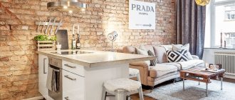
Still relevant in 2022, the style is best for combining the living room and kitchen. The combination gives a large free space, exactly what the loft needs. Nowadays the classic definition is no longer relevant, and loft refers to any interior where there are not hidden technical aspects. Concrete, brickwork, exposed wiring - it's beautiful. If this seems strange to you, the photos will convince you.
Loft loves surfaces with a heterogeneous structure, such as brick or concrete. And surfaces with a non-uniform texture love light that is directed along them. Due to heterogeneity, contour light creates shadows, and the surface looks three-dimensional.
Although initially everyone perceives this style with suspicion, it has already burst into modern design and has even become fashionable by 2022. Nowadays they don’t just stop hiding rough finishing materials, they are now imitating them. It would seem crazy to imitate dirty concrete with smudges and traces of formwork using expensive decorative plaster. But this is exactly what a good third of orders from decorators sound like now, and there will be even more of them.
If not a full-fledged brutal loft, then at least its elements are worth using. Read how to make a loft-style kitchen in an ordinary apartment.
Modern
Today, more than ever, monochromatic finishes in trendy colors and multifunctional appliances are in demand. This design concept can bring 26 square meters into an apartment. m. maximum comfort.
A harmoniously selected color scheme can visually increase the area of a studio apartment in the Art Nouveau style
Old Paris style
This style can also be called “Provence”. Light, faded textures can visually enlarge the living space. Simple but multifunctional furniture will emphasize the aesthetic taste of the owners.
Provence is associated with a special home environment, warmth and comfort
This concept will allow you to combine simple decor and finishing with natural ingredients. For example, a combination of painted walls or plain wallpaper with wooden furniture and structures looks very stylish.
Decorating an apartment in a loft style is often chosen by confirmed bachelors
High tech
Technological, functional high-tech style on an area of 26 square meters. m can be either minimalistic and simple, or extraordinary - with cosmic notes.
The predominance of glass and the widespread use of metal make this design quite cold. But this can be corrected with warm colors. In the photos of designer kitchens, it can be noted that almost all surfaces are glossy and there are no fittings on them. The facades in such an interior can merge with the decoration or act as a bright accent.
Scandinavian style
Current, practical, cozy and inexpensive to implement, a modern design style is ideal for a kitchen-living room. For brightness, colors are added with textiles and furniture. White, gray and wood finishing are the base. Dirty pink, dirty blue and mustard are accents. Interesting style without kitsch.
The basis is natural materials, the colors are white and wood.
Minimalism
The minimalism style, impeccable in its content, involves the use of simple and functional solutions. The absence of decor and even more elaborate details makes the space especially free and light. Usually it is chosen for small and modest rooms, but even in a 5 by 5 room, the living room with kitchen will turn out to be ergonomic and comfortable. This is an ideal option for active people who value comfort and are ready to give up decorations in favor of functionality.
Modern
Modernism can hardly be called a widespread style, but it is chosen by creative individuals who do not accept standard solutions. There are no straight lines or symmetry here, all forms are smooth and transitions are fluid. In this design, even zoning tools will not be ordinary - the traditional partition has a semicircular shape. The same can be a kitchen set with a peninsula and/or a bar counter.
Other styles
Popular design trends include loft, Provence, Scandinavian and contemporary style. Each of them has its own characteristics, color palette, and functional solutions. Choosing these will not help you find the best place for the refrigerator, but it will help you find harmonious design techniques.
For example, in the Scandinavian and contemporary style, the work area is usually not highlighted, but merges with the decoration. In this case, the set is usually made in white or with natural wood facades, which replicate the surfaces of the flooring and other furniture in the interior. In a loft, the living room and kitchen are almost completely combined without clear boundaries, and in romantic Provence there is always room for light floral decor.
Unity in the interior of a living room combined with a kitchen
The idea of combining the kitchen and living room appeared a long time ago, but today such layouts are especially popular. The interior of the kitchen-living room, designed in a modern style, will favorably emphasize the timelessness of the basic idea.
Monochrome range of steel and charcoal shades
view album in new window
view album in new window
In the photo: Modern kitchen-living room in black and white monochrome
view album in new window
In the illustration: Planning solution for a 3-room apartment of 116 sq. m.
The shine of matte and chromed metal, glass and polished stone are constant attributes of modern interiors. But what really looks charismatic is the uncompromising combination of ultra-modern style and black and white tones. Such an interior has a strict geometry of lines, a clear logic of construction and a clearly expressed purpose - to remain relevant for a long time.
Unifying radial pattern and creamy chocolate palette
A luxurious combination of art deco and classics, harmony of colors, lines and shapes visually unite the space of the spacious living room. A ceiling rosette with a stained glass window and a massive chandelier with lampshades and crystal pendants, made on a truly theatrical scale, accents the sofa area. The radial shape of the magnificent sofa echoes the ceiling decor and lambrequin curtains.
view album in new window
view album in new window
In the photo: Luxurious kitchen-living-dining room in Art Deco style
view album in new window
In the illustration: Furniture arrangement plan for a 6-room apartment of 167 sq. m
Furniture
It should be modern, stylish and practical. For example, in the living room it is good to place a soft sofa made of textiles or leather. Here you can place a small coffee table made of glass or wood.
Also in the recreation area there should be a TV and decorative elements that create comfort in the studio apartment.
It is advisable to choose a kitchen set based on your needs, the availability of allotted space and in accordance with the overall color scheme of the room. If a person spends most of his time in the living room, then the kitchen area can be reduced, thereby increasing the relaxation area.
Color palette
An equally important role in arranging a kitchen-living room is played by the color scheme, the choice of which must be approached when planning the design and purchasing furniture. Since there are no obvious boundaries between the kitchen and the recreation area, the transition of colors will also act as a kind of delimiter. Here it is important to take into account the fact that dark colors help to visually reduce space, while light colors, on the contrary, increase it.
Since the kitchen-living room is a small space, you should choose light pastel shades. To add richness, you can use one or two bright colors to decorate a niche or accent wall.
Lighting
An important point in arranging a studio apartment is its lighting. Give your choice to spotlights: they will allow you to illuminate the desired space, especially if one of the family members is resting and the other is cooking. Eliminate floor lamps - they will only “steal” valuable space in exactly the same way as bulky chandeliers.
The lighting is also affected by the color of the wallpaper and decoration of your apartment, so choose light and soft shades of the walls and floors; You can use contrasting elements, but only as decoration. For good lighting, choose light curtains, or rather, their shade; let them be dense in texture in order to ensure a restful sleep at night.
Style
The most suitable options for the interior will be modern, classic or hi-tech. But if you approach the design wisely, then almost any of the variations can be realized.
The peculiarity of modern and high-tech lies in the dynamism of lines and laconic facades, uniting zones and giving meaningfulness to the idea.
If you choose the classics, it is recommended to use antique forms.
Which style to choose
Conduct a competent design of a home with an area of 26 square meters. m on our own is a real task. But in order to solve it correctly, the owners initially need to set the design style. The following directions are considered the best:
- loft;
Allows you to combine simple finishing (for example, painting or gluing plain wallpaper without a pattern) and decoration with natural wood.
- minimalism;
Involves the use of simplified finishing and furniture with simple geometric shapes.
- modern;
Allows the use of ultra-modern single-color finishes, multifunctional equipment. This style will create maximum comfort.
- Scandinavian.
Optimal for visually increasing space and creating an unusual home. White tones are the main advantage of this direction. It eliminates the need to select finishes interspersed with other tones.
