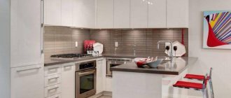
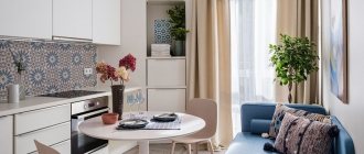
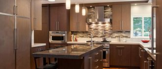
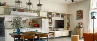
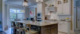
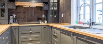
The kitchen is not just a place to prepare food. Lovers of home comfort and beautiful meals know how important it is to make this room special: functional, cozy, warm in terms of atmosphere. Create such a kitchen design on an area of 20 square meters. m. is not difficult, since a fairly large space allows you to bring a wide variety of ideas to life. Let's talk about the layout of the room, zoning options, popular style/color solutions and other details that will allow you to plan the space as competently as possible.
Planning and creation of the project
For 20 m2, it is important to wisely use the existing space configuration. A good layout is coziness, comfort and the overall visual impression of the room.
Important!
Linear (single-row) layout is considered the most unsuccessful for a 20-meter kitchen. It's all about the arrangement of furniture and appliances: a sink, stove, and refrigerator lined up in one line are inconvenient because of the time spent running back and forth.
The most popular options for planning a 20-meter area for a kitchen:
- U-shaped
- the most convenient in terms of cooking and cleaning; rooms of any configuration are suitable for it. In fact, in a U-shaped kitchen, everything is at hand - literally within a step or an outstretched arm. To make the room comfortable, the distance between the sides should be within 1.2-2.8 meters. - The L-shaped one
is not so convenient for a large kitchen, but it also has its place. The main inconvenience is the increased distance between the parts of the working triangle. But it also has its advantages - versatility and compactness, which is good for those who want to make the most functional kitchen and even combine it with the living room. In an L-shaped layout, the sink will be most convenient if it is mounted between the refrigerator and the stove. - Peninsular
. Based on the name, a peninsula is created in the kitchen - that is, a multifunctional table with its end resting against the wall. The same table is connected to a set, which seems to be its continuation. The advantage for 19-21-meter kitchens is that with a peninsula layout you can easily create a living area in the room, which you cannot do with a full-fledged island. Designers recommend paying attention to peninsular options if you have a studio or a kitchen combined with a living room or dining room, since such a layout is a method of zoning. - An island
kitchen for a 20-meter room is good only if there is a small island, for example, 1 * 1.2 meters. At the same time, the width of the passage between the set and the table should be from 1 meter for ease of opening drawers and movement. - A two-row
layout, when the set is located on both opposite walls, is suitable for an elongated and narrow space.
In general, the room allocated for the kitchen can be square, rectangular and with a niche (balcony or recess). The latter is especially convenient for installing a bar counter or hiding a dining area / shelves with dishes in a niche - this way you can save space, leaving more free space.
What do you need to know?
Lately, many people have been saying that the opportunity to purchase a studio is very attractive. At the same time, few people fully understand what it is. Therefore, it would be useful to spend a little time on how this apartment option differs.
To put it as simply as possible, we can say that we are talking about a one-room apartment. True, in this case, it will literally be one-room, since the space of the room will include not only the bedroom, but also the entire space, which should play the role of a kitchen-living room. In any studio project there are no dividing walls, with the exception of the bathroom.
Therefore, in a studio apartment, the kitchen, living room, and bedroom are located in the space of one room. This, of course, may raise certain questions and difficulties. At the same time, this option opens up many possibilities both for design and for making the most efficient use of space. This is why it is so interesting to consider the design of a studio apartment.
Zoning options in the interior of a 20 sq. m kitchen. m
The layout allows you to resolve issues related to the final version of the room: not too narrow, not elongated, moderately filled with interior items/equipment, and so on. Zoning, in essence, solves the same problems, and also makes the room as functional as possible.
The basis and reason for zoning is the need to separate the cooking area (appliances + food + refrigerator) and the corner for eating and relaxing. This is especially true when planning the design of a rectangular kitchen of 20 square meters. m.
Zoning options:
- Transparent glass partitions do not visually create the effect of a blank wall, and therefore will not reduce the space.
- Shelving can also be functional. For example, if the rack is made in the form of shelves, they can contain jars of spices or canned foods, cookbooks or collectible dishes.
- Pieces of furniture, such as part of an island kitchen or a sofa.
- A bar counter is a universal way of zoning, and in the absence of a dining table, it is also a place for eating.
Bathroom decoration
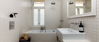
This small room requires the most functional and efficient use of space. Modern shower cabins with a glass design are a fairly ergonomic option that gives the environment a feeling of airiness.
The design of the bathroom should be made in light shades, have smooth color transitions and sufficient lighting. To create an unsurpassed ambience and increase the internal space, select white wall-mounted sanitary ware, showers with beveled corners, a thin heated towel rail, large mirrors and install a sliding door.
The photo shows the interior of a small bathroom in beige tones in the interior of a studio apartment of 20 square meters.
Choosing the style of the room
For such an area, one direction or a combination of several styles can be chosen. The main condition is to correctly combine details and resort to a combination of harmonizing styles.
Modern - kitchen design 20 sq. m.
, which is chosen by city dwellers and owners of spacious apartments who keep up with the times. Such kitchens are practical, laconic, with original furniture and the introduction of technological details. A combination of different eras is also appropriate, for example, a baroque painting or clock and a designer soft corner.
Classic
- for lovers of luxury and traditional solutions. A more modern option is neoclassical. In any case, such kitchens are characterized by symmetry, clear lines, the use of natural stone and wood, and the presence of classical finishing elements such as frescoes, ceramics or stucco. It is important not to try to implement all the features of the style in one kitchen - this will create the feeling of being in a museum. 1-2 details are enough to give the room the desired direction.
Country
- rustic simplicity and comfort, which can be implemented in a city apartment without interrupting technological solutions. In the interior they use aged furniture and clay dishes; they prefer to make the decoration wooden; beams are left or specially installed. The warm atmosphere of a country-style kitchen seems to take you back to childhood and will definitely not leave anyone indifferent.
Provence
as a type of country, it also refers to rustic motifs with floral patterns, porcelain dishes, and light colors. Provence welcomes homemade decor, light transparent curtains, and fresh flowers.
Fusion
- a solution for creative and extraordinary people. The peculiarity of the interior is a mixture of several directions, floral designs, and textures. A typical fusion style kitchen is a combination of antique and modern furniture, two to four color palettes, extraordinary decor and maximum functionality.
Colors
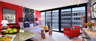
Studio room design 20 sq. m with a kitchen is usually done in a modern minimalist style . The basic rule of color design is the unity of zones. The gamma should be neutral and light. You can add rich and bright accents to avoid monotony, but they must fit correctly into the interior concept.
Attention! All zones will be located in a single space. Therefore, the design of a 20-meter studio with a kitchen must be thought through to the smallest detail. The zones should be decorated in the same style; this is the only way to create a harmonious interior.
The most suitable color combinations for a studio kitchen:
- white and its shades;
- colors of nature;
- pastel and neutral background.
Using a calm palette can seem dull and static. To give the room dynamics and life, bright accents are placed. It is important to distribute them evenly.
The following combinations will successfully dilute a light background::
- blue with brown or gray;
- orange and mint;
- green and light blue.
This color scheme will create a stylish and not boring interior , while maintaining the comfort of home. It is better not to use dark colors in large quantities. They can induce depression, especially in a small room.
When creating a kitchen design, you can turn to nature for inspiration . Wood is very important in interior design. Shades of green and blue go well with it. The use of wood gives the room a cozy feel. In addition, it can be coated with paint of any shade.
Light gray and white base are distinctive shades of urban design trends . Therefore, studio apartments are often decorated in modern styles. Also, soft and light shades fit into Scandinavian and eco style. They will create a serene atmosphere.
If dark colors attract you more, you need to correctly place accents, not forgetting the following :
- a dark ceiling looks lower than a light one;
- walls and floors made in the same color create a feeling of enclosure and conceal the space, so the floor should be made several tones darker;
- dark walls will visually move towards each other.
To make a small kitchen seem larger, there are a few things to consider.:
- It is better to complement a dark floor with light walls;
- Use vertical lines as an accent pattern on the walls.
Continuing the question of kitchen styles, it is worth focusing on those based on simplicity and conciseness . You need to choose a universal option that is suitable for the entire room.
The most successful style directions:
- Scandinavian style. The combination of wooden finishes and pastel colors will create a warm, cozy and light atmosphere. The predominant colors: white, beige, light blue and light brown.
- Japanese style. Cleanliness and simplicity, done in subdued colors, will create a calm atmosphere. The neutral design will be diluted with accents of traditional red or black.
- Loft. Fashionable and modern interior without partitions, borders or frames. High ceilings and brick trim are distinctive features of the style.
- High tech. It is distinguished by the use of a large number of mirror surfaces, which not only look stylish, but also visually increase the space.
- Minimalism. Here you can use contrasting tones and plenty of light. The main thing is to keep the shapes simple and the lines clear.
- Constructivism . The style assumes a clear color division. If you want to use different colors in the kitchen and living areas, this direction is ideal for you.
All of the listed interior styles do not imply an abundance of decor and furniture. After all, in a small space, every meter is important.
There is an option in which it is not necessary to follow a single style . You can combine several directions in one and create an original mix. The basis will be minimalism, and its complement will be bright accents from other styles.
Color solutions for a kitchen design project with an area of 20 square meters. m.
A well-chosen color palette sets the mood for the entire kitchen and depends on the style and preferences of the owners.
White
This choice of color increases the spaciousness of the kitchen and is great for minimalism, Provence and country. The versatility of white in decoration allows it to be combined with any colors and textures, be it brown furniture or bright decor. Since this is still a kitchen, the presence of contaminants in it is possible. Therefore, it is important to choose washable, light-colored materials, as well as equip the kitchen with a hood and properly plan the work and recreation areas.
Yellow/Lemon
The lemon shade not only refreshes the room, but also makes it light and airy. In order not to overdo it with color, it is better to use it point by point: for example, as the basis of textiles or for individual pieces of furniture, a set. If this color is chosen as a finish, then it will need to be diluted with neutral furniture (white), ornaments on textiles, and flowerpots.
Green/mint
Mint goes well with white, brown, peach, yellow and gray palettes. To create the rustic coziness of a house in the kitchen, use wicker furniture or baskets, pottery, elements of nature in the form of flowers, and curtains with ornaments.
Gray
The sufficient conservatism of the color does not make it a less popular solution for the kitchen. Designers recommend combining gray with yellow or white shades. Moreover, gray can be used as a finish or as the main color for textiles and furniture. Suitable for the implementation of classic and modern styles.
Red/garnet
A bright and extravagant color should be something you like so that it doesn’t end up boring you. More subdued options - raspberry and cherry - create a delicate interior. Rich burgundy will advantageously set off solid wood furniture.
Many people use a combination of red and white, which looks great with well-planned lighting.
Lighting
A spacious kitchen, which can easily accommodate a dining room, needs good lighting. Here are some recommendations from experts:
- You can level out the severity of the room by placing additional lamps above the dining area.
- Separate lighting is a solution to save energy. Having 2-3 switches for different groups of light sources, you can control its flow at a specific time.
- The work area needs to be illuminated quite brightly to make working with products convenient.
- The corner for relaxing and eating is dimly lit - this is relaxing.
- Decorative lighting will be created by LED strips under the upper cabinets or along the perimeter of the ceiling.
- To ensure sufficient light, but not blinding, purchase matte shades.
Fashionable ideas in kitchen design
The kitchen looks original in which furniture and household appliances are arranged along several walls, and in the middle there is a large rectangular dining table and chairs.
The design is made in a classic style in brown and white colors.
- A U-shaped arrangement of white furniture, which is diluted with black household appliances, separates the work area and the dining area with a corner sofa in white and gray tones. A minimum of decorative elements create a spacious kitchen space, decorated in Scandinavian style.
- An L-shaped kitchen with burgundy-colored furniture with white accents looks very original. The dark-colored dining table is adjacent to the wall. Combined kitchen layout.
Arrangement of furniture in the kitchen 20 m²
You can arrange furniture in the kitchen depending on the chosen layout and zoning option.
However, in any case, you need to follow the rule of the work triangle: its top is the sink, refrigerator and work area along with the stove. All these elements should be located side by side without partitions or other obstacles in the form of a sofa, for example. The approximate distances from the sink to the stove are from 60 to 180 cm, from the sink to the refrigerator - from 45 to 210 cm. The work area is located between the stove and the sink.
Multifunctional "island"
The ideal option for a large area is to create “islands”. In the center of the room there are so-called “islands”, a large cutting table, a stove or a bar counter.
Such an accent becomes an aesthetically expressive and functionally convenient interior solution.
The perimeter of the room will not be empty either, where a sink, refrigerator or corner set will coexist perfectly.
Recommendations for kitchen design 20 m²
- One wall should be free. In order not to clutter up the space, wall cabinets do not need to be mounted on at least one of the walls. This gives the room simplicity and neatness.
- Light / dark. The choice of colors also depends on the amount of furniture in the kitchen. If there is a lot of it, then it is better to give preference to a light design. If there is not enough furniture, then an intimate and cozy atmosphere will be created by saturation with darker shades.
- You can't go anywhere without a hood. This is one of the conditions for good cuisine. An extractor hood with a capacity of up to 1300 m3/hour will block odors that would otherwise be absorbed into furniture upholstery, textiles, pillows, and will also prevent the accumulation of greasy deposits on all surfaces.
- A large refrigerator is an extremely useful purchase for a family of 3 or more people. Side by Side models look like cabinets, only for groceries; they allow you to ergonomically arrange all the contents, which can then be easily found.
- A sink with several bowls will delight every housewife, as it significantly saves time and space. For example, while the dishes are soaked in one of the bowls, you can wash vegetables for dinner in the second.
Photo of a kitchen 20 m²
Below are photographs of different kitchen layouts and the implementation of different styles in a 20-meter space.
