Katrin
4274 0 0
Katrin February 7, 2018
Coffee beans on the wallpaper - stylish interior
A balanced interior can be achieved by using bold and unusual color schemes. For example, coffee-colored wallpaper for the kitchen will bring calm, harmony and comfort to your interior. Let's get to know them better.
This color is considered the basis of a classic style and can be easily combined with other shades.
My instructions will help you understand the features of using coffee shades in the interior.
Features of the color of coffee with milk
Why is cappuccino one of the most successful colors in interior design? There are several reasons for this.
- Compatibility. Cappuccino, or coffee with milk as it is also called, goes well with many colors, so it is easy to work with in design.
- Versatility. Suitable for both background and accents. It all depends on the degree of its saturation. Cappuccino color can be used both in the design of finishing materials and in the design of furniture.
- Neutrality. It does not irritate or cause negative emotions, therefore, from a psychological point of view, it can be considered one of the most favorable for interior decoration.
- Suitable for all styles.
- It compensates for the lack of solar heat in the room, so it is an excellent option for kitchens with north-facing windows.
- Suitable for both small and large kitchens.
Types of coffee-themed wallpapers
Such products are produced mainly in the following versions:
- wallpaper with large coffee beans for the kitchen;
- aromatic drink or grain in a cup and saucer;
- images of all kinds of coffee cans;
- “coffee” inscriptions, names of varieties in different languages;
- utensils for preparing coffee drinks;
- impulsive photos – a drink spilling from a cup, grains falling apart, etc.;
- “coffee ceremony” - a picture where coffee is complemented with seasonings, chocolate, fruits, flower bouquets, textiles, hearts made of smoke rising above the cup.
Today, of the existing wallpapers, vinyl coverings are most suitable for kitchen walls.
The materials used are also varied:
- paper and acrylic - are inexpensive, but do not tolerate even the most gentle methods of washing and removing dirt, quickly losing their appearance;
- vinyl is the best option for covering a kitchen area. They are not afraid of dirt, moisture, do not absorb odors, and are considered a soundproofing material;
- natural - made from jute or bamboo with non-woven fabric. The product is environmentally friendly and beautifully emphasizes the texture of the design.
Shades of coffee color
All coffee tones will look great in the hallway. But in this case, an unmistakable level of lighting should be arranged. Milk can look good even in low light, but darker shades will require a good light source or even steam. The colors of café au lait, peach and beige will look just great in the bathroom.
According to the recommendations of the designers, this design can be complemented with dark accents, which will be in the form of independent details. The main advantage of this color is its fidelity. Café au lait can be the perfect backdrop for any room, and pairing it with other color schemes can create a truly cozy design.
Stylish examples from designers
Coffee-themed wallpaper can be combined well with plain wallpaper and furniture that is similar in color.
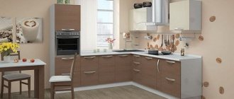
Designers recommend choosing wallpapers for the kitchen with a pattern in the form of coffee beans, coffee cups and other similar prints that are not too dark. This is especially important if the coating is not placed on one wall, but covers almost all vertical surfaces of the room. In the photo, the kitchen apron covered with coffee vinyl wallpaper looks great.
A coffee-themed kitchen apron looks very nice.
Coffee prints vary greatly between styles:
- classic - the drawing is not too bright, not excessive, it is something like neat repeating still lifes on a coffee theme;
- minimalism – photo wallpaper with a cup of coffee on the accent wall, no additional room decor;
- retro – “coffee” motifs are interspersed with yellowish “newspaper” fragments; coffee jars, an old coffee mill, a Turk, etc. are present as decorative additions;
- colonial - associated with hot Africa, there are many “warm” contrasts in reddish-brown tones, coffee beans inscribed in a rough abstraction are ideal;
- modern - inscriptions, geographical maps, and plot paintings are “laid out” on the wallpaper from coffee beans;
Tip: huge coffee beans covering an entire wall look good on the far wall of an elongated room - in a small room there is not enough perspective to contemplate them.
Coffee wall color: features, ideas and materials
The beige color scheme is the basis of the basic interior. The coffee-milky shade is included in the beige-beige range. This is a complex color that is achieved through a combination of brown (coffee range) and white (milky shade). These two colors combine harmoniously and form the perfect shade for any interior.
Coffee with milk on walls, furniture and fabrics is cozy, but with a strict and elegant design. The undeniable advantage of warm cinematic colors in the interior is the optical expansion of the room.
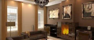
The combination of two shades of coffee - dark and light - makes the room accessible, and the presence of a fireplace adds a feeling of coziness
Other advantages of beige gamma decor:
- There are dozens of crimson and beige shades in combination. Everything fits perfectly in the interior.
- Bejei's accents hide the lack of space.
- There is no visible dirt or dust on the surface of the coffee.
- Coffee with milk goes not only with neutral colors, but also with bright contrasting colors. Inside you can see a coffee-milky hue with orange, red and even sophisticated purple hues.
- Pastel beige tones are warm, beautiful and cozy. A calming and calming room in a coffee-with-milk shade: it is often used in the living room, bedroom, and bathroom.
There are no uniform rules for interior design in popular colors. Here are some tips on how to arrange your space and furniture:
- for large sunny rooms, use a darker format, for example, for chocolate - they level out too much space;
- small rooms with a slight convexity, format them in light shades of milky coffee - these tones visually increase the space;
- Contrasting ones will help to dissolve the monotony of coffee beige, but they are closer to the color scheme: orange, seductive, earthy;
- for a variety of decorations, play with the facts: count wood and stone, silk and cotton, leather and plastic inside.
- collect the same accessories, decorations and fabrics: wooden furniture, boxes, photo frames;
- neutral color of coffee latte and a good background for natural decor: decorate the walls of the cafe with paintings, mirrors, installations;
- Take narrow coffee rods with you to the coffee shop - they will protect you from too bright daylight and create a warm background.
If you are creating a latte interior, do it in several layers. Decorate the walls with paintings, move the grilles, create a rug and decorate the room with gold accessories. The more coffee and milky shades, the more varied the room looks. Incorporate nearby shades of beige and brown into your design, and the room will no longer feel dull and unhappy.
The ideal furniture for a coffee and dairy room is leather and wood. These materials emphasize the elegance of the cafe interior. The floor is also wooden: use light weather to expand the space, dark weather to level it out. The ceiling is made neutral - white or light beige.
The main emphasis in beige interior design is on the walls. To decorate the walls, use paint, wallpaper or facing materials.
What color should I choose for my countertop?
The contrasting combination of a light cappuccino shade and a more saturated color of the tabletop looks great. The countertop should be much darker.
Coffee walls
Paint and wallpaper are not the only options for modeling walls. For wooden, Scandinavian interiors and halls there is stone decor - cladding with artificial or natural wood, wood.
Delicate materials in a coffee-with-milk shade look natural and imitate natural materials. These elements perform not only a decorative function, but also a practical one: stone and ceramic fabrics are resistant to damage, wear and abrasion. Where to use natural decor in the shade of coffee with milk:
- in the kitchen work area, the walls are finished with tiles, stone or porcelain stoneware;
- in the bathroom the walls and floor are tiled and mosaic;
- in the living room, the accent wall is decorated with a fireplace, country brick or wood panels;
- Decorative stone and wood are used in the bedroom;
- in the corridor and in the window the walls look like artificial stone.
Stone furniture protects walls from scratches and damage and further insulates the room. Selected materials in natural shades will complement painted or green café au lait walls.
Bathroom tiles are placed on both walls and floors: coffee, beige and chocolate - this is a great combination
Cafe au lait paint for walls
Milky color is a suitable option for painting - it goes on smoothly and hides imperfections in preparing the walls for painting. Added bonus: the perfect coffee shade doesn't require many layers.
Coffee-milky color is slightly darker than beige. To paint your walls a coffee color, choose text matte anti-reflective paint. You can paint the walls a neutral coffee shade and add bright accents. Accompaniment cakes suitable for coffee with milk:
- revenge;
- blue and white;
- dark crimson;
- chocolate;
- orange;
- lemon;
- apple;
- hooligan;
- creamy;
- cane;
- lavender.
Milk coffee belongs to the gourmet category and goes with all edible flowers. But you don’t have to get carried away with contrasts - the atmosphere of warmth and comfort will disappear from the room and a feeling of solidity will appear.
Milk coffee paint visually aligns walls and expands space due to its maturity and anti-glare effect
Coffee wallpaper in the interior
If you don't want to sit on the wall, add coffee with milk. This popular shade is found in almost every collection: with different bases, facts, models. Add chocolate wallpaper as a coffee pot - it will break the neutrality of the room.
For the kitchen, you can use washable non-woven wallpaper with a themed pin or slip ring. In the warm half, combine coffee with milk with other shades and decorations: stucco, beads, fabric.
In the bedroom, plaster beige wallpaper and combine it with a coffee wall at the head of the bed or in a niche with shelves. Darker shades are ideally combined with the task of zoning a room.
Coffee wallpaper is also used for other rooms. The calm palette of coffee and milk will fit perfectly into the room - the main color of the walls does not distract from work. If the booth is small, reduce space constraints by using a heavy wallpaper combination—a vertical opnum visually elongates the room and adds
The latte top, chocolate bottom and beige border on the butt create a small room of space and volume.
Transit zones - the exterior and the building - are covered with neutral wallpaper in beige and coffee tones. Light shades of coffee are combined with brown furniture: garadero, chest of drawers, chest of drawers. If you need to adjust a room, use these basic guidelines:
- vertical height - raise a low ceiling;
- horizontal angle - expands the frame;
- light walls and mirror surfaces create the effect of additional volume.
If you need to make an emphasis on the interior and image, stick a light, warm photo wallpaper of a coffee maker to the focal wall. This decor can be used for additional wall coverings with artificial or natural stone.
For an accent wall, choose funky coffee-and-milk wallpaper—it's part of the focal point of the entire room.
Wallpaper in the interior
The selection of patterns on coffee cloths is carried out based on the functional purpose of the room. If we are talking about the kitchen, then the theme of small cafes will be a beautiful decoration. Contrasting ornaments and brown borders will look good in the hall. Because wallpaper alone is clearly not enough to welcome guests. For the bedroom, you can use Art Nouveau curlicues above the head of the bed. The coffee color can occupy one or more walls. In the study, you should use the alternating method: use spectacular dark wallpaper at the bottom, and light shades at the top. Where there will be a joint, you can place a decorative border.
In the hallway it is better to use a shade of milky cappuccino with vertical stripes, since the room is usually characterized by its cramped space. The contrast with wooden furniture will allow you to profitably increase the space and create a harmonious cocktail. Dark colors should be avoided. But photo wallpapers with still life, abstraction or engraving are welcome in every possible way. Industrial style also allows for the use of talented imitation of brick walls in the corridor.
Coffee color: combination with other colors
If the main background of the room is coffee with milk, it must be diluted with other shades, but at the same time maintain a single decor palette - brown. Milk and coffee have many characteristics: basic, light, spicy. Use them when choosing a corporate color.
For a delicate palette, choose the same soft shades: pastel, cream, cream. The combination is suitable for a bedroom, bathroom, nursery. Shades of coffee, chocolate and cocoa are suitable for interiors with a cinematic atmosphere. This combination is ideal for a classic guest bedroom - it will decorate the interior and give it an elegant look.
Cocoa shade combines with shades of coffee and beige in a classic bedroom with a modern twist
The basic shade of coffee with milk makes the interior restrained and simple, unpretentious and excessive. But this does not mean that brightness should be avoided in decor. Add pops of color in fabrics and accents to transform the room visually.
The perfect combination of coffee colors:
- Monox - with shades of body type. Single room with different coffee shades is not suitable for all rooms due to its silence. It is better to decorate a bedroom or kitchen in a coffee shop. They relieve boredom in a monochromatic interior due to various fabrics, individual materials and accessories.
- Bronze. FURNITURE AND BRONZE FURNITURE, BRONZE AND DECORATION: All these details complete the neutral coffee-milk color.
- Grey. Shades of gray go with all colors. The combination of hot and cold gray coffee milk is especially successful - the combination will speed up the lack of space. Cool tones provide a visual increase in space, and warm light brown tones provide additional volume. The combination of gray and coffee is often used in small kitchens in a modern style.
In the color scheme of a room, a balance between architecture and decor is important. When choosing a color company for the coffee base, select the size of the room and the style of the interior. Don't overload a small room with bright colors and lots of details. In simple rooms, it is also not necessary to paint with one color - the volume and variety of shades will add subtlety to its display.
White
White plus café au lait is the perfect base for any space. This kind of interior always wins: cool colors, fresh palette, unobtrusive decor. Collect different facts to dissolve the dominance of white and white: leatherette furniture, glossy surfaces, wood texture.
Olive
It is easier to work with such a duet if both colors are of low intensity. With rich colors (and not only in a combination of cappuccino and olive, but also in combination with other tones), you can experiment with modern design, but add a neutral third that will balance the bright colors of the interior, for example, white, light gray, light beige , vanilla or ivory.
Pale olive and cappuccino create a beautiful combination that is typically found in Provence style kitchen projects.
In a modern interior, this combination occurs if you want to create an interior with a combination of natural and natural colors.
Beige
The beige color associated with the cappuccino shade can act as a base on which individual parts of the chocolate color can be highlighted. For example, the interior of a kitchen will look beautiful if the walls and kitchen units are made in beige or vanilla, and the chairs and curtains are the color of milk chocolate.
Nautical inspirations
The golden hue of latte often appears in nautical settings. Beige is a great counterbalance to shades of blue and white, as well as unpainted wood elements. The rough texture of the walls looks beautiful. Coffee and milk look great in combination with blue, cool and warm shades balance each other, making the environment fresh and cozy at the same time.
Orange
Light coffee and orange are a bright combination, especially suitable for rooms designed in ethno, modern and high-tech styles.
You have two options: apply these tones in equal proportions or make the milk predominant.
Yellow
The color of coffee combines with yellow, but not brightly, but plays. This room looks unusual, but very modest.
Bright colors
A modern interior is a great opportunity to combine beige with expressive colors:
- red,
- turquoise
- orange.
Contrasting bold colors combined with a cream background will create a harmonious and original composition. An interesting effect is achieved by the combination of beige and black colors. This combination can decorate a large living room or office.
Materials for body and facades
In order for the coffee kitchen to serve for a long time and not lose its appearance, you need to pay special attention to the choice of materials from which the set is made
For the production of furniture frames they use:
- Chipboard (chipboard). This is the most affordable and budget option. Due to its low density, the material is easy to saw and other types of machining. Chipboard can be painted and covered with special films. But such furniture is exposed to water and elevated temperatures. In a room with high humidity, the body and facades quickly deform. Another disadvantage of chipboard: over time, the material may begin to release toxins.
- MDF. In terms of production, the material is similar to chipboard, but is of higher quality and reliability. Thanks to the addition of special additives to the composition of chipboard, it is possible to impart fire safety, moisture resistance and heat resistance. Due to the use of special impregnations, MDF is not afraid of mold and other fungi. You can decorate slabs of this type in a variety of ways: using paint, film, plastic. High-quality MDF boards are as similar in structure as natural wood and are environmentally friendly, but at the same time have an affordable price.
- Array. Only premium furniture is made from natural wood. Experts warn that solid wood furniture is susceptible to water and moisture. This set requires special care and frequent polishing.
Each of these materials has its own advantages and disadvantages. When choosing, you need to take into account not only the appearance and style of the furniture, but also take into account financial capabilities.
To give the facades a completed look, the following materials are used:
- Laminate. Most often used for finishing chipboard facades. Lamination is inexpensive and inferior in reliability to other finishing methods.
- Plastic. The material is resistant to mechanical damage, water and moisture. You can create both a glossy and textured surface.
- Polyvinyl chloride film (PVC) is an affordable and one of the most common materials for finishing buildings and facades. The coating lies flat on the surfaces to be pasted and is resistant to various types of damage.
- Enamel. Facades finished with enamel look stylish and modern. Glossy surfaces are created that are more suitable for modern style trends. A distinctive feature of this coating is its wide color variety. More than 700 color options can be found on sale.
- Acrylic. Environmentally friendly and reliable material. Acrylic not only looks great, but also prevents scratches and abrasions and does not fade in direct sunlight.
Each of these materials has its own advantages and disadvantages. When purchasing a set, experts advise giving preference to furniture made from MDF or solid wood. Chipboards have many disadvantages. It is recommended to buy furniture made from this material only if it will not be actively used.
Glossy or matte facades?
The appearance of the set and the entire room depends on the type of facades. When choosing, you need to consider the following points:
- glossy facades are most often used for modern trends, while matte ones are appropriate for classics;
- glossy facades visually make the room more spacious, so they are ideal for small kitchens;
- Any dirt is more noticeable on a glossy surface, but the surface is easier to clean than a matte one;
- abrasions and scratches on matte facades will be less noticeable than on a glossy surface.
Designers do not advise ordering furniture via the Internet and claim that before purchasing sets you need to carefully examine and touch them. This is the only way to evaluate the quality of the material.
Style selection
The shade of cappuccino will harmoniously fit into any style. Classically, it can be used in mixtures with beige, brown, sand, champagne, etc.
In modern trends, it can become an excellent background or complement to rich and bright colors.
Provence
Cappuccino is a shade that creates a Provencal style, as it perfectly emphasizes the romantic and calm atmosphere in a rustic spirit.
Pairs perfectly with other shades characteristic of Provence: lavender, sand, ocher, olive, pistachio, blue and blue, khaki.
Scandi and eco
Interiors in Scandinavian or eco-style, in their concept, strive to be closer to nature, and coffee shades only emphasize the calm atmosphere. This design involves the use of predominantly natural materials, especially wood.
Classic and neoclassical
Cappuccino can be an excellent alternative to the beige and brown tones of a classic interior. In such a complex shade, the classic can reveal itself in a new way - elegant, expensive and festive, and at the same time more interesting due to its complex undertone.
Cappuccino, diluted with a light gray, milky or white shade, can add a modern touch to a traditional classic interior. Therefore, the use of this shade is an excellent field for experimentation when creating interiors in the style of eclecticism and neoclassicism.
Modern
For modern and technological trends such as minimalism and high-tech, cappuccino is ideal due to its neutrality and restraint. At the same time, its complex undertone will smooth out the severity and visual asceticism of these styles, adding softness and comfort.
When designing surfaces with complex textures and pronounced textures, the shade of coffee with milk will reveal its full aesthetics.
Using glossy colors in the kitchen interior
As mentioned above, the use of coffee bean color is strongly encouraged in the kitchen. This tradition has been around for many years. Modern subtleties of professional design suggest the possibility of using noble colors in any interior. It can be a romantic style, rustic, ultra-modern high-tech with metal elements, etc. Decorating the decor with the help of original accessories can well complement a glossy furniture set. Mirror surfaces visually increase the area. Harmonious combinations may imply the following set:
- A combination of milk wall racks and brown floor stools is used to create a lighter ambiance in the kitchen space;
- If you need to increase your appetite, then you should use a combination of brown and red elements on the cabinets;
- The use of gold fittings contributes to the atmosphere of luxury in the Byzantine style;
- The use of frosted glass in combination with the brown texture of dark wood allows you to create a sophisticated modern decor;
- The feminine form of the design involves mixing milk chocolate with pink elements. However, Switzerland has already begun to produce a pink product. Therefore, soon the shade will be called pink chocolate.
A coffee tone will also look good on glossy tiles. However, it is important to complement it with light shades so that the contrast neutralizes the slightest manifestation of a depressing impression. If a corner sofa is made in this range, then local lighting will be the way out of the situation.
Advice from psychologists
Many professional psychologists claim that coffee-colored wallpaper stabilizes the nervous system. Such a welcoming space allows people to talk and discuss pressing issues.
Considering that the milk line assumes the absence of cold shades, the winter period is characterized by a warmer environment. In addition, the absence of pressure on the psychological state allows you to completely relax. Inside, the coffee palette is often called chocolate. And, as you know, this particular product is the best antidepressant.
Main aspects of using the coffee line:
- A room decorated in coffee tones allows you to forget about your worries for a while. Such an interior does not have a painful effect on the guests - the owners, in turn, are committed to intellectual and creative work. Therefore, such a popular color scheme is often found in workshops.
- Brown wallpaper will be useful for people leading an active lifestyle, because they need a corner of the house where they can truly retire and relax.
- Previously, coffee shades were used in palaces where aristocratic nobility lived. Therefore, they were recognized as elite and privileged. Decorating the room with chocolate shades significantly adds solidity to the room. This effect can be enhanced with the help of expensive furniture made of quality wood and genuine leather.
Accessories and interior decorations
Latte can be used in interior design not only as a base, but also as an additional decor. For example, natural beige fabric materials made from cotton, wool, and linen warm up any interior quite eccentrically.
Latte accessories will help add warmth and light to the room. Figurines, pots, sculptures and many other porcelain and ceramic products of a certain color range can be used as decorations.
Latte color is valued by designers for its sophistication, delicacy and harmony. The shade is universal and popular, so there are many interior options for rooms for different purposes with a predominance of coffee color in all sorts of style variations.
Advantages and disadvantages
A kitchen in coffee tones, depending on the color of the facades, can be decorated in both warm and cold colors. Psychologists warn that cold and warm coffee tones have the ability to awaken appetite because they remind you of coffee drinks and chocolate. If you want to decorate your kitchen in a coffee style, you should first understand what features this shade has.
The advantages of a kitchen in the color of coffee with milk include the following qualities:
- the cozy shade of cappuccino promotes relaxation and relieves stress after a working day;
- the color of cocoa with milk in the kitchen interior is considered universal because it is easy to match finishing materials and furniture to it;
- the coffee shade is practical, since drops and stains from water are not visible on it;
- coffee tones go well with both warm and cool shades, balancing bright colors and making pale ones more saturated;
- A cappuccino-colored kitchen set can fit into any style direction (Provence, hi-tech, minimalism, classic, etc.).
- the chocolate-colored set brings novelty to the conservative design;
- even if the room is decorated in the same color scheme, it will not look overloaded and heavy;
- cappuccino color visually expands the space (if the facades are finished in gloss), so this set is suitable for small rooms.
As for the disadvantages, the chocolate-colored kitchen with milk has practically none. One of the disadvantages is that a set in light shades will constantly become dirty and will have to be washed very often.
Interesting color combinations
Coffee combines well with gray tones, makes friends with white, looks original in a duet with shades of yellow and more.
Grey
The cool range of gray combined with warm shades of cappuccino works to expand the space
It is important to maintain color balance; do not overload the interior with an abundance of accent details, even in spacious rooms
Bronze
The neutral coffee and milk background will sparkle in a new way if you add bronze accessories. These can be floor lamps and lamps, a chandelier, decorative elements of a set, frames and moldings. Bronze figurines, candlesticks, vases and flower pots, and textiles of appropriate design are suitable.
White
Brown-white dominance attracts with its unobtrusiveness, freshness and amazing sensitivity to powdery colors of the natural palette. The combination of different textures is favorable: a luxurious set with a glossy facade emphasizes the noble appearance of leather furniture; the composition is successfully complemented by a thick woolen carpet and jacquard curtains with nylon tulle.
Orange
Light cappuccino and muted orange work well in a duet in modern, high-tech and ethnic interiors. Most often, the beige palette dominates; bright colors are used in doses. However, when creating stylish compositions, even use of milky coffee and orange colors is also allowed.
Green
The combination of natural shades of greenery and cappuccino with the addition of steel colors is considered successful in arranging a room for a teenager. The solution will easily fit into the design of an eco-style room if you use exclusively natural bases.
Ocher
Yellow in the shade of ocher with small splashes of brown is a winning combination for projects in the ethno style. In a small room it is worth adding light colors, cream, pastel colors. In the design of spacious rooms, the tandem of ocher and cappuccino is successfully complemented with muted blue, green and red-brown notes in small quantities.
Windows and textiles
As for window decoration, the modern variety of textiles and other materials will allow you to highlight the aesthetics of your bedroom in coffee tones.
Depending on the chosen style of the bedroom, for classics you can choose cream silk or satin curtains with lamrequin; for minimalism, white Roman curtains are suitable; sea green linen and cotton can be chosen for eco-style.
To decorate the bed, you can choose a bedspread and decorative pillows to match the curtains.
Textiles are also used to make soft wall panels, for example, for the head of a bed or decorating the walls of a room. Such black coffee or cappuccino colored panels will add even more softness and comfort to your bedroom.
The headboard of the bed with a large floral ornament of chocolate color, enclosed in a wide, similar in tone, wooden frame with lighting, which smoothly goes to the ceiling above the bed, looks very impressive.
Coffee shades will add grace, splendor and even nobility to your bedroom, regardless of the chosen style. All colors in the interior should be in harmony and not contradict each other.
Photo
Natural colors and shades are very popular in the design of living spaces for a reason. They pacify, give tranquility, they connect us with nature, which makes the atmosphere in the room soft and enveloping.
Among the entire natural palette, shades of brown occupy a special place, especially those that are associated with pleasant and tasty things - chocolate, cocoa, coffee. Coffee color is very popular among them, because it gives the room rigor and style, inner nobility and at the same time comfort.
Basic shades used in decoration
Don’t think that coffee color can only be dark brown; don’t forget another wallpaper color – coffee with milk. It is very different from the original shade, but, nevertheless, it is also usually classified in this group, so we will look at the features of each option in more detail.
Coffee color
This option is also very often called chocolate, so don’t be surprised if this particular option appears in the wallpaper article.
Let's look at the main features of this group of shades:
Premises decorated in the color in question create an atmosphere of peace and allow you to relax and fully unwind from numerous worries. It’s comfortable to be in such rooms, they don’t have an irritating effect on people and set them up for productive intellectual work; it’s not for nothing that this finishing option is very popular in offices.
A luxurious coffee-colored ornament on a light background is a win-win option for a study
As psychologists testify, brown wallpaper creates an atmosphere in the room in which you can relax and escape from worries
This option is especially good for people leading an active lifestyle, for whom complete relaxation is important. Since ancient times, the color of coffee has suggested a certain exclusivity and aristocracy. This color design was often found in noble estates and palaces of kings, which is why even today chocolate wallpaper creates an atmosphere of fashionability and solidity.
To further enhance the effect of luxury, you need to choose the appropriate furnishings: wooden furniture, leather upholstery and expensive carpets on the floor.
If you decide to use this option in your home, you should remember a few simple recommendations:
Coffee wallpaper for walls is great for spacious rooms with good natural light
But this does not mean that they cannot be used in small rooms, you just have to decorate only one of the walls in this way, covering the rest with light wallpaper, this will allow you to focus attention on a separate area of the space
To prevent chocolate walls from having a depressing effect, you need to use light accessories, as in the photo, and use high-quality lighting
It is very good to use this color option when finishing wallpaper for painting - the surface structure will be highlighted in the most favorable light. If you do the work yourself, then consider the following factor: a matte surface highlights the texture of the material much better than a glossy one. Very often you can find coffee bean wallpaper for the kitchen; this option is quite interesting and is perfect for this type of room. In this way you can decorate one of the walls or decorate an apron over the work area
It all depends on what you want to get in the end, but it’s important not to overdo it; coffee beans are good as an accent, but you shouldn’t use them as the main background.
A very stylish kitchen design option
Coffee with milk
The closest color to this option is beige, but it is several tones lighter. Coffee with milk wallpaper in the interior may not look very bright, but it’s worth diluting and complementing it with several shades - and you get a very cozy and stylish environment.
The color of the wallpaper coffee with milk can be the main color in the interior, but without appropriate decoration it will look inexpressive
This option has the following properties:
- It belongs to neutral shades and promotes mental activity and fruitful learning. That is why it makes sense to cover the work area in the nursery, office or library in a similar way.
- Using this background, you can highlight the most important elements of the interior and highlight them favorably. The combination with dark coffee color looks very good; this option is classic and has been widely used for at least several centuries.
Wallpaper in the color of coffee with milk in the interior of the kitchen looks great
You don’t need instructions on how to combine such wallpaper with the interior; they match almost all natural shades, so decorating it yourself won’t cause any difficulties.
Decorating different rooms of the apartment with colors
Designers offer the following options for decorating rooms in a cocoa tone:
The living room can be decorated like this - paint the walls with a whitened cocoa color, for which brown and white paints are mixed. The curtains on the windows are the color of coffee with milk. The floors are covered with wood laminate. The sofa and coffee table are purchased in a cocoa shade. It is better to choose leather upholstery for the sofa. 3 sets of chairs are chosen for the room - 2 in a set. One set of armchairs has milky upholstery, the second has brown upholstery, and the third has a combination of brown and milky tones. The dining table is purchased with a milk top. The bedside table against the wall is a combination one – with milky legs and a brown tabletop. Carpets on the floor with a geometric pattern of chocolate and milk tones. The pillows on the sofa are of different shades to match the main colors of the design. You can recreate this interior with 3 colors by adding gray, but it is more difficult.
A bedroom with cocoa colors can be created as follows. The floors are covered with wood laminate. Recreate the same color on the walls. Buy a trestle bed, which should be placed with the head against the wall. The wall above it and part of the ceiling should be made in the form of beige tiles. Place a golden blanket and brown and beige pillows on the trestle bed. Choose bedside tables near the bed and a chest of drawers opposite in a light wood tone. Hang light tulle without a pattern and heavy chocolate curtains on the windows. Place a striped carpet on the floor - stripes of chocolate and beige shades. Buy lamps with chocolate lampshades for bedside tables. This design will not visually reduce space, but has all the advantages of the chocolate range.
In a kitchen where cleanliness must be visible, and dark tones are not suitable, the cocoa color can be recreated on the countertop of the work area, in the color of the dining table and in accessories. If the walls in a cocoa-colored kitchen are painted in a chocolate tone, you can play with the contrast. To do this, the doorway and windows are made light, and the floors are decorated with tiles in shades of milk.
The bathroom can be decorated in chocolate shades. It will be beautiful to decorate the walls with cocoa-colored tiles and make a screen under the bathroom of the same shade. Against the background of a white bathtub, toilet and sink, you will get a rich interior.
See photos and videos of various rooms in cocoa color above.
The topic of the psychological impact that color has on a person’s health and mood is quite relevant today and has been widely studied. Traditional and unusual in design are wenge, zebrawood, acaju, carmelite, capuchin, cocoa color in the interior.
You can have a positive attitude towards the theories of chromotherapy or not recognize them at all, but a person will always react to the color palette. There are colors that are loved, others that are not so much, and some can even become a strong irritant, causing depression and depression.
So, cocoa color. Perhaps for some it is a reminder of childhood and sweets. But cocoa is a soft and delicate woody shade of brown. Very popular in traditional interiors, it is often used in the design of quite creative and ultra-modern projects.
The color of cocoa is distinguished by its extraordinary warmth and comfort, instills a feeling of confidence, and gives a feeling of peaceful calm. Photos of design solutions with a combination of different shades of cocoa color in the interior evoke pleasant emotions.
Origins of popularity
The demand for cocoa color increased at the end of the twentieth century, when naturalness and exoticism were at the height of fashion. The cocoa color itself was singled out as a separate color in the palette much earlier. But then it was tan, brown, light brown, dark brown.
Modern artistic variations are cocoa with milk, cappuccino, chestnut, tobacco, copper, cognac. The color texture was monotonous and represented exclusively by “marble” variations. Now there are an abundance of tones in catalogs: coffee with milk, terracotta, coffee, pale brown, brick, milk chocolate, vanilla, beige... There is room for the designer’s imagination to unfold.
What style does it suit?
It’s not for nothing that coffee cuisine is considered universal. As practice shows, a set designed in similar shades can be successfully integrated into almost all style trends, but such a set would look more appropriate in the following styles:
- Classic (combination of basic neutral colors with straight lines).
- Minimalism. To create such an interior, it is recommended to purchase modular furniture and built-in household appliances.
- Modern. The direction is characterized by red, white, and black tones. A coffee set with a bright stone-look countertop will fit perfectly into such an interior. The surface may differ radically from the color of the body and facades, for example, it may be red.
- Provence. Involves the use of pastel wallpaper and a kitchen coffee set with matte fronts. The shade of the furniture can be either light beige or chocolate.
