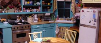
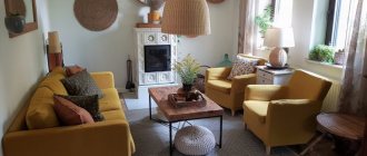
An important role in interior design is played by the color scheme. The main color of the room's surroundings can serve several practical functions at once. With its help, you can visually change the parameters of a limited space and adjust the quality of visible light. Thus, it is able to directly influence the mood of the owner. To achieve the desired effect, you need to know the basic color combinations. Harmonious shades will create a comfortable environment for staying or living in this room. One of the brightest trends of recent times is the orange color in the interior. Adapting a positive, but at the same time somewhat aggressive color to the conditions of the room is quite a difficult task. To cope with it, it is worth familiarizing yourself with its physical characteristics and the psychology of its impact on humans.
Pros and cons of orange in the kitchen interior
Orange is often called orange - and it organically combines the life-affirming energy of impulsive red with the captivating warmth of yellow:
- helps create a pleasant mood even on the most dreary autumn or winter day;
- invigorates and energizes you in the morning, increases appetite and optimism in life;
- perfectly plays “secondary roles” - harmoniously complements the main color scheme, helping the basic shades to better reveal themselves;
- suitable for creating a bright color spot - guarantees richness and expressiveness of the shade;
- there are many variations of orange, each of which is universal in genre and fits into both classic and modern high-tech interiors;
- Suitable for both a very modest room and a decent-sized kitchen - if the intensity of orange is minimal, objects do not visually increase in size, and the original proportionality is preserved.
However, any solution always has a downside:
- if there is a lot of it in the decoration, it can tire and even cause irritability;
- attracts attention, which is especially evident in small kitchens;
- requires increased attention and caution when combined with shades of other temperatures;
- can often seem bad taste - however, this pattern is applicable to all emphatically bright colors.
The disadvantages of using orange in kitchen design can be compensated by its obvious advantages. And if you show the necessary caution and an intuitive sense of harmony, then without any problems you can get an interior verified from a design point of view, in which everything will be in its place - and your eyes will be happy.
Basic psychological properties of color
Knowing how a certain shade of orange can affect a room is key to using that color. When done right, color can give you the dose of enthusiasm and motivation you need. When used poorly - too much, too frivolously and overly aggressive. The tone of bright orange is fun, joyful and playful. The yellow-orange interior promotes social interaction and communication.
It is also a shade that stimulates the appetite. Although the property is often attributed to red, it has more to do with different cultural perceptions of color. The color orange represents physical comfort and abundance.
Variety of shades
If orange for you is exclusively the color of a ripe orange fruit, then get ready to break the pattern: there are more than a hundred (!) of its shades. They differ not only in color temperature, but also in their influence on the mood in the interior:
- apricot - bias towards pale yellow, zones the space well;
- aurora - lightened orange-pink;
- vermilion - bright scarlet with an orange tint;
- chestnut - reddish-brown;
- coral - pink-orange color, gentle and delicate, universal;
- tangerine - named after the fruit, creates an active, cheerful background;
- honey - between orange and brown, creates a peaceful atmosphere;
- carrot - a bright and joyful shade;
- peach - reddish light orange, better suited for wall decoration;
- orange - a burning and dynamic orange-red, for spacious rooms;
- rusty - dark, red-brown;
- tango - orange with a brown tint, optimal for ethnic interiors;
- amber is a mixture of orange and yellow, very rich and dark.
Characteristics of the palette
Orange is characterized by its assertiveness and defiant appearance. He demands attention and actively influences everyone without exception, even if he does it in different ways. Depending on the purpose of the room (be it a bedroom or a kitchen), its shades should vary. Because priority should be given not so much to creating a fashionable interior, but to providing the room with an atmosphere of comfort.
On the color spectrum, orange is the warmest shade, falling between red and yellow. This largely determines its symbolic component, which can be characterized as life-affirming, sensual, and dynamic. The mixing of the meanings of the two surrounding colors here does not seem random; rather, it accumulates their common energy.
Associations with strength, speed, youth, and some spoiledness only complement the image of a charismatic color. They help to cope with negative trends in a person’s life, to cleanse oneself of filth and simply a sad mood. His presence can symbolize imminent changes, the opening of new horizons.
What can you make orange?
Everything. There is only one condition - it is extremely important to maintain the dosage of color in the space and take into account the nuances of the layout. In this case, orange will not aggressively dominate the interior, and your eyes will invariably contemplate strict harmony and a color scheme adjusted to the smallest detail.
Kitchen set
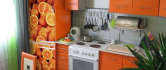
Both the lower facades and the upper cabinets can be decorated in the same color. Orange will look best on a glossy surface. It is good if the facades have characteristic roundings. This smooth geometry better correlates with the orange mood and helps to optimally fit it into the kitchen space.
When there is a lot of usable area, it is advisable to divide the set by color into a darker shade at the bottom - and any of the neutral colors like gray or white at the top. This will make the room seem taller and, accordingly, more spacious. It is better to choose cream or light beige wallpaper for such an orange kitchen, without any pattern.
Designer tips
Irina
founder of the interior studio, architect and interior designer. The main area of work is kitchen design
A very winning combination with an orange set - especially if you are building an interior according to the principles of high-tech and contemporary - is a floor with imitation wood. Usually 15x60 cm dies are used, but if you want more organicity, purchase rectified porcelain tiles. All elements will be laid close to each other, so there will be no annoying seams.
Ceiling
An infrequent decision, especially in the context of the currently popular Scandi and hi-tech. Nevertheless, it looks unconventional and interesting in combination with a snow-white kitchen.
It’s good if you can organize a roll call of such a cheerful ceiling with furniture or decorative elements integrated into the interior.
Choose curtains or curtains that are lighter or darker so that you don’t end up with too many variegated shades.
Start with small accents
What are the main rules for the successful use of orange, what does this tone combine with in the interior of a living space? First, you need to like the shade. If this does not happen, look for another shade. Secondly, orange is not a relaxing color, so avoid using it in interiors where you plan to relax, do concentrated work, or sleep.
However, orange is a great color if you need stimulation or motivation if you will be using the room for entertainment, fun or socializing. Pay special attention to what proportion it makes up in the overall space, its location and combination with other colors. If you really want to use it, try starting with small accent spots, such as accessories that are easy to change or move.
What does it go with?
This question always appears after choosing the main color to decorate a particular room. In the case of orange, the space of options is outlined, if not very broadly, then at least with a good margin for your imagination.
With white
The case when it is impossible to lose. Indeed, the neutrality of white combines well with the fervent enthusiasm of orange in all its many manifestations. It is no coincidence that one of the most common combinations in the kitchen is a flashy orange set against the backdrop of restrained white walls.
You can do it differently: decorate one accent wall in orange, and accompany it with the remaining three white ones.
Don't forget about proportions. In small kitchens, the ratio of white to orange should be 3 to 1, especially if we are talking about dark and rich shades like terracotta or pumpkin.
With black
This vigorous combination guarantees your kitchen a special sophistication and gives every centimeter of its area a unique thick and viscous atmosphere. But only if an experienced and talented designer actually worked on the project: here there is a subtle game on the verge of a foul, a step to the left or to the right - and now you are already dealing with suffocating bad taste.
Therefore, some third companion color is often used as a saving straw. For example, white or beige.
Possible options:
- black and orange set against a background of light beige walls;
- black ceiling and walls with orange furniture;
- orange kitchen with black countertop.
With brown
Most often, orange is friends with brown in rooms decorated in a classic style. Since both colors are warm, they are great for creating a homely atmosphere in neat pastel colors.
There are a lot of compilation options. For example, make the base brown and paint 3 walls with it, and decorate the 4th as an accent wall. Accordingly, the remaining elements are selected in calmer shades to avoid possible color confusion.
Another winning way to interact is with brown furniture. This includes not only the kitchen set, but also the entire dining set. You can use orange to decorate the apron, add the floor to it, and also place bright accents around the perimeter. Give preference to red or peach - they are not so intense and will help create the right interior harmony.
Finally, don’t forget about the richest brown options - dark coffee and chocolate. In the right proportions, they perfectly balance bright orange tones and bring homeliness to the room.
With gray
Everything is logical: the variegated orange color is muted by a neutral gray background. This way the atmosphere in the room becomes calmer and even peaceful.
Orange goes well with the entire gray group: from classic light to deep anthracite.
You can often find a kitchen set with this combination. It looks especially impressive if it is finished with chrome elements and contains glass inserts.
With beige
Be careful with this mix: if you indiscriminately combine beige with orange, you end up with a completely gloomy and boring kitchen in which you are unlikely to want to spend much time.
It is ideal to use light beige walls and bright orange furniture. Additionally, you can again scatter colorful spots in the form of decor or kitchen utensils. Or, as an option, use orange to decorate your dining room. In any case, the situation is extremely clear: beige is the main color, and orange comes into play, creating a cheerful orange mood on the peaceful beige base.
With blue
An unusual combination typical for ethnic interiors. In particular, for the Mediterranean style, which welcomes bright colors and a non-trivial color oxymoron.
This mix greatly refreshes the interior, adds maximum light to the room and, moreover, makes small kitchens more spacious. An illusion, of course, but from a visual point of view everything is in perfect order.
Pumpkin or carrot shades go best with blue. Which of the pair to choose as dominant is up to you to decide. Remember that if there is still more orange, the room will sound warm and homely.
The apron is usually decorated in blue. It is especially advantageous if decors are used to decorate it.
With green
This combination is best used in cases where there is no need to calculate the usable area. In a spacious kitchen, green and orange tones create a beautiful and unobtrusive mood.
The intensity is adjusted by choosing the desired shade. Want pastel colors? Take classic green as a decoration for the set, and use a paler apricot as a background.
If you prefer a brighter range, then the light green-tangerine combination will enliven the space, but will require the introduction of a companion in order to muffle the overly flashy tones in some places.
The green apron looks very advantageous against the background of the orange facades of the kitchen set.
Children's room
A bright, cheerful and slightly “straightforward” shade of orange will inspire your child to explore. The interior of the room in orange will strengthen the child’s desire to achieve goals. Add this tone to your exercise area.
To prevent the shade from being overwhelming, combine it with yellow, white or beige. Contrasting combinations that upset the balance, for example, with bright green or black, are inappropriate in a child’s room.
In what style is orange appropriate?
We have already noted above that there are no style restrictions here: orange fits perfectly into strict classical interiors, and is perfectly revealed in expressive Mediterranean designs, and even harmoniously integrates into ascetic Scandi and hi-tech.
But under one condition - the correct intensity of the shade and its moderate dosage in space.
Let's take, for starters, modern popular design styles. For example, Scandinavian minimalism. Orange is introduced here in portions as bright color spots.
Or as a color for facades. It’s great if the headset has chrome parts and glass elements - this combination guarantees an original appearance, while the philosophy of modern high-tech style does not suffer at all from such a mix.
But for Provence and country, choose calmer shades of orange. Chestnut, mustard or honey shades are welcome - they look great against the background of the wooden texture characteristic of these design styles.
It is best to add not flashy orange to the good old classics, but a version of it with some shares of brown. This is a proven design technique that allows you to combine an expressive shade with the warmth and tranquility of a natural wooden surface.
In ethnic designs, bright orange is a frequent guest. This is characteristic of both the Mediterranean style, which has recently been gaining momentum, and African interiors, which are still rare among us.
Comments
EMILYA says: 05/06/2013 at 2:05 am Hello! Please tell me about the choice of curtains. The thing is that in my living room the light wallpaper gives off a slightly light-light peach tint, the carpet is orange-brick, the sofa is gray with pillows a brighter tone and with dirty milky pillows, the table and chairs are made of solid wood, and the upholstery of the chairs is light orange floral .
I’m thinking of either adding orange or gray curtains to the tulle on the sides. And there is also an idea to combine organza from pieces of these two colors, the room is 6 by 5 somewhere, 6 of them are occupied by the side where the curtains will be. Suggest your options, maybe that’s not what I had in mind at all)))))))))))))
Jul says: 04/03/2013 at 10:28 pm I really liked the combination and we implemented it in the children's room. Now it’s a matter of accessories)))) Please advise what colors can be used for curtains (north side + balcony), room for a 7-year-old boy, furniture with a reddish tint, dark floor, orange sofa. Thank you in advance.
Yulia says: 01/03/2013 at 1:00 am it’s a very noble combination. the photo is just a peek
Svetlana says: 03/03/2013 at 12:20 pm Good afternoon! Great site! Based on your articles and recommendations, we have already done renovations in the kitchen and in the hallway. It has come to the living room :) Please advise me on the choice of shades. In a small living room (3*6) I want to decorate the interior with a combination of gray and orange colors. I want to paint one wall (small opposite the window) orange, I don’t know what shade to choose that would go with the main color of the walls, gray (I don’t know the shade yet, but I want the room to seem more spacious).
Since I want to divide the living room into two zones (a relaxation area for parents and an area for 2 children), near the orange wall there will be a wall bars for children (black), a small table with chairs (what color is better to choose?). Please help with a choice of colors for furniture and textiles in the recreation area (door, TV stand, sofa, carpet, curtains or tulle, pillows) and what color accessories should I choose? Thank you!
Svetlana says:
16/03/2013 at 7:11 am Hello, ticca! Once again I carefully read the article and found answers to my own questions :) This is how I see my living room: Two long walls will be light gray in a neutral shade, one wall (which is opposite the window and which I want to highlight for the children's area) will be orange, if I understood correctly, any shade will do here, and you can start from it when choosing accessories.
The wood-effect floor is a light honey shade, the curtains or just tulle are light yellow (but not brighter than the walls), the furniture is white (TV stand, shelving, table and chairs for children) Chandelier and lamps in the color of chromed metal. All that remains is to choose a sofa and a carpet. I understand that a white sofa will do, but I’m afraid that small children will ruin it :) And here we need your advice. Which sofa (cushions for it) and which carpet should I choose to make the interior complete?
LARISA says: 10/02/2013 at 7:43 pm HELLO! PLEASE HELP WITH SOLUTION TO THIS QUESTION. I HAVE GRAY CURTAINS WITH A SHOW IN MY BEDROOM. WHAT COLOR IS BETTER TO CHOOSE THE WALLPAPER. FURNITURE IN THE BEDROOM “WOOD LOOK.” IS IT BETTER ONE COLOR OR WITH A PATTERN? THE BEDROOM IS SMALL. THANK YOU, I AM WAITING FOR HELP.
Elena says: 01/13/2013 at 10:56 am Thank you very much! Very useful article. You're really helping. And if the floor of my aunt’s northern six-meter kitchen has light gray porcelain tiles and pale gray tiles were purchased for the apron, then what color do you think is best for wallpaper and curtains? Would she like an orange and white kitchen - or is it better to look at another - has it been chosen, but not yet purchased?
ticca says: 16/01/2013 at 6:59 am You can have an orange and white kitchen, everything will be ok with it. Then it is better to make the walls white too - in a six-meter kitchen this is an excellent solution, don’t be afraid of getting dirty, if you take smooth wallpaper for painting and paint it with special paint for kitchens (Tikkurila has one), then it can be washed with a brush, and dirt will not stick to it. And curtains are better not curtains, but light curtains of light gray or light yellow or light pistachio color.
Olga says: 07/24/2012 at 12:59 am This is it!! hooray! I've been thinking about this combination for weeks, and now I know the names of “those” colors: tangerine and glowing orange! At the same time, I learned that I need to be very careful with the cold cream shade that I planned for the walls... I’ll think about it. Thank you very much for the article, and for the site as a whole - it is simply a storehouse of useful and fresh information!
Anonymous says:
05/06/2012 at 10:50 pm Good afternoon! Thank you very much, all the articles are very useful and interesting! You write about complex things so easily and simply that everything becomes clear! Please tell me, I have this idea, I bought white wallpaper with a metallic gray pattern for the hallway, all rolls with a twisting vertical stripe and one roll with large painted flowers (the same gray metallic). I want to glue wavy wallpaper, and in the center there is a square of flowers, and around the perimeter there is an orange molding, i.e. the effect of a painting hanging on the wall in an orange frame.
The question is tormented by what size to make these same paintings? What to start from? Is there a relationship between the size of the wall and the “picture”? The corridor is winding, so I planned one such “painting” for each wall. Is it better to lay laminate flooring under “red” wood or under “gray” wood? And is there any point in doing this at all? How to combine this kind of wallpaper correctly? Thank you!
ticca says: 12/06/2012 at 3:28 am Very good idea, I deeply approve. Look here https://ticca.ru/ostatki-oboev/ and here https://ticca.ru/kartinyi-iz-tkani/ some ideas for making such paintings.
Yes, proportions are important. But there are no ready-made recipes. You need to walk along the corridor and understand the main things for each wall: a) the height of the painting stickers (I think the center of the painting should be somewhere at the level of your eyes, and not in the center of the wall) and b) the width of the painting (I think somewhere 60-70 cm, no more). And the molding is better to be wider in order to more clearly separate the paintings from the background - about 4 cm.
Redhead is better on the floor
