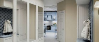
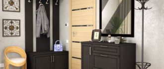
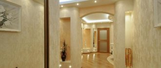
The first room a person enters when visiting a house is, of course, the hallway. The color of the walls, the furniture and the design style will form a general impression on the guests who step through the threshold for the first time. Therefore, the hallway can rightfully be called the calling card of any home. But since it so happens that these rooms in the apartment are not large, designers recommend decorating the hallways in white.
What does a white hallway give?
White color is a symbol of purity, so it always makes the interior look neat. But it has two main properties. It makes the room bright, which is very important for a hallway without windows. And it is known that the white design of the hallway, or any other room, visually expands its space.
Therefore, even very small rooms look much more expressive with white walls. You can breathe easily in them and feel freedom, since there is no feeling of oppressive walls.
The design of a hallway in white is also modern; this design trend is relevant for many interior design styles. For example, Scandinavian style is unthinkable without white furniture and white walls. The minimalist style also implies a light, airy design.
This is also true for classics; white solid oak furniture, bleached wooden doors and parquet flooring create an atmosphere of nobility, high cost and luxury in the interior.
To create an atmosphere of enhanced aesthetics, a white hallway is also very relevant. After all, thanks to such a background, you can create a contrasting, expressive accent. And the interior of the black and white hallway photo, which is presented below, looks especially stylish and creative.
Interior design of a hallway in an apartment - photo 2021
"Look"
Design of a narrow hallway - design and ways of combining with the corridor
"Look"
Built-in furniture for the hallway
"Look"
Modern direction
The modern white hallway is distinguished by its strict lines and pronounced asymmetrical layout. The internal filling of cabinets in this style consists of the latest storage systems and transforming units.
The decoration looks stylish in unusual combinations of glass, metal inclusions, concrete, brick trim, natural or artificial stone and wood. For a small and narrow dark hallway, white will be the ideal background for light, dark brown, graphite or black furniture.
Is white color practical?
It is rightfully believed that any dirt is visible on white. In fact, this is true, but on the other hand, it teaches accuracy.
Some people may not like this decision, but one should not draw premature conclusions. The design of a white hallway will remain neat not only immediately after renovation, but the rest of the time without much effort if you choose practical materials for its decoration and if you follow some rules.
Since this is the first room we enter from the street, it is not advisable to choose light tiles for finishing the floor. The floor is the fastest place to get dirty, so the ideal color for flooring is dark: brown, gray, etc.
The decoration of the walls in the hallway involves materials that can be wet cleaned: white washable wallpaper, wall panels, smooth paint and other similar materials will make cleaning easier in case of contamination.
How to decorate the interior of a hallway in an apartment with high quality - photo
"Look"
Which mirror to hang in the hallway? Photo
"Look"
Banquette in the hallway: photographs of original, beautiful models
"Look"
What to combine white with
To prevent the interior from turning into a hospital ward, you don’t need to do everything in white in the hallway. An overly white hallway will not make the interior cozy, so it is better to combine it with a different color palette. White goes well with gray colors; the hallway in white and gray in the photo below looks fresh and stylish.
It is accepted that the background is always light walls; it is against their background that the picture of the interior is created. It is important to distribute colors in the hallway in such a way as not to lose the effect of visual expansion.
Therefore, the walls should be left white, but with the rest of the elements: doors, furniture, hangers, etc. can be realized in other colors.
The black and white combination looks very stylish in the interior. For example, a floor hanger, door handles, lamps, shelves and a mirror in a black frame look great on a white background.
To add more cheerfulness, other brighter colors can be used: blue, orange, yellow and others. This color is used not only for small details, but also for large ones, such as the decorative panel of the front door, furniture facades, etc.
For hallways with low ceilings, it is recommended to use vertical stripes. For example, black and white striped wallpaper on one of them will easily create a similar impression.
Entrance doors
Previously, white entrance models represented public institutions, today they are beautiful, the front entrance to a residential building . It can be seen in luxurious cottages, as well as in neat private houses; in the first and second versions it looks festive and aesthetically pleasing.
Advantages and disadvantages
A white door always looks elegant, on any walls, with different colors.
Pros:
- Attractive look with any fittings.
- Large selection of models.
- Visually expands and lengthens the wall.
- Emphasizes the style and architecture of the building.
White entrance doors always look rich and beautiful
Minuses:
- a light door gets dirty quickly, dirty spots and dust are very noticeable against a light background;
- Frequent care required;
- must be under a canopy that will protect it from weather conditions, rain and snow.
But all these are mere trifles compared to the beauty it gives.
Combination with the interior
When choosing a model, it is very important to take into account the design and style of the house, its architecture. Then the doors will fit harmoniously into the walls of the building. White door leaves with light walls look sophisticated. Door designs with glass inserts or mirrors are perfect for houses in Provence or country style. Models with large double-glazed windows look beautiful.
Models with large glass units are a good choice for visualization
At home, where the hallway is small and dark, openings with an additional light source are used. This option will visually expand the room.
Distribution of zones in a white hallway
If the hallway room is large enough, it is recommended to zoning the space in its interior. For example, it can be divided into an entrance area and a place where outerwear is stored. It is also possible to select a separate area for a banquette with a mirror.
The design of the hallway is done individually in each case, since its layout can be different: there are rectangular, elongated, L-shaped and other structures.
Zoning is done using a variety of materials for walls or floors. Wooden furniture in natural colors, etc. look great against white walls.
Zoning with lighting is also important for the hallway. Moreover, it can be produced both on the ceiling and on the walls and floor. In the latter case, zoning using spotlights looks very interesting. In the case of ceilings, plasterboard construction and LED or spot lighting are used.
Zoning also implies the distribution of elements such as wall hangers, a key holder on the wall, shelves and other items without which the hallway would not be comfortable and complete.
Hallway design in Khrushchev
"Look"
Wallpaper for hallway photo
"Look"
Design of a small hallway photo. Finishing methods
"Look"
Color combinations
White color harmonizes perfectly with most shades. In addition, white furniture fits perfectly into the design of any hallway. Of course, the classic combination is black and white.
Note!
Shelf in the hallway: 170 photos of design ideas and video description of how to create a stylish shelfHallway walls: design ideas, tips for choosing a style and the best wall decoration styles (140 photos)
- Hallway design: beautiful projects, options for decorating and decorating the hallway (video + 185 photos)
Polar opposite colors complement each other. The white tone refreshes the black, while the black eliminates the excess purity of the snow-white color.
Often, white hallways are complemented by black facades or crisp white furniture combined with a black floor. But this combination is more suitable for a modern interior and would not be appropriate in a classic one.
White matte hallway or glossy
Matte design makes the interior less strict, lighter, but it is worth keeping in mind that the matte surface does not reflect, but absorbs light. Consequently, it is not as effective in visually expanding space. But in many cases of using decorative stucco for all classic interiors, only a matte wall surface is appropriate.
Glossy surfaces will fit perfectly into the interior of very small hallways. Because they carry a mirror effect. The reflective surface literally doubles the space. But don't be too zealous with it. Otherwise, the interior of the white hallway will turn into an uncomfortable and repulsive space.
It makes much more sense to combine such surfaces in a home interior. For example, choose matte paint for wall decoration. And along one of them, install a built-in wardrobe in the hallway with white glossy facades or with mirrors. This balance of contrast creates a very harmonious atmosphere in the interior.
The text of the article belongs to the project cornas.ru
High tech
In the photo of the white hallway, made in the high-tech style, you can see a practical, functional and comfortable room, to some extent reminiscent of minimalism. But there are still clear differences in these styles.
Unlike the minimalist direction, High-tech is a more technological and futuristic style.
High-tech often uses metallic textures, glossy surfaces, chrome fittings, unusual functional furniture, glass and plastic elements. The style is characterized by the presence of a silver tint and complex multi-level lighting.
