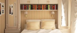
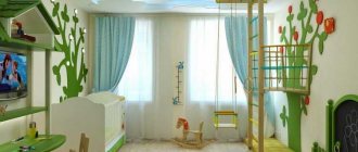
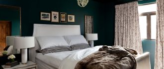
Features of planning and design
Proper planning solves several problems at once:
- things necessary for life are placed in a limited area;
- there is a place for sleeping or any activity;
- The room looks as cozy as possible.
When the apartment was originally an ordinary one-room apartment, remodeling it into a full-fledged studio will require the signing of some “permitting” documents. In rare cases, it will not be possible to completely rebuild a room - demolishing partially or completely load-bearing walls is dangerous, as this threatens the collapse of the entire building. In a separate room there will be only a bathroom - shared or separate. Sometimes it can be “squeezed out”, freeing up to two meters of square territory.
The studio looks more spacious, brighter, in a very limited area there will be no temptation to store all sorts of unused rubbish - it simply won’t fit here. The disadvantage is that no more than two people can live comfortably in a cramped apartment. It is advisable to make all household appliances built-in, choosing the most compact and, if possible, silent ones. Be sure to use the window sill, balcony space, and ceiling height.
Since the apartment is very small, its high-quality improvement will require very little time and money.
How to properly zone space
Proper zoning of the room will allow you to compactly place all your things without cluttering the space too much.
The main zones are distinguished:
- for sleep, relaxation;
- for food;
- for work.
They are made as separate as possible from each other, especially if the apartment is intended for two. Professional designers advise sticking to a single color scheme, complemented by individual accents in different logical zones.
Zoning is done using:
- sliding screens;
- openwork screens;
- curtains;
- podiums;
- furniture items;
- differences in ceiling height;
- different shades of floors and walls;
- arches;
- bar counter.
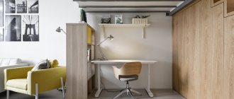
A screen separates the child’s crib and sleeping place, the study will be located behind a high shelving unit, the kitchen will be separated from the living room by a bar counter, the sitting area on the loggia will be separated by an arch, the hallway will be separated by a closet with a full-length mirror. Zoning an apartment with a square or rectangular shape usually does not cause difficulties, but successful design of rooms of complex shape is also possible.
Color spectrum
The basic rule for visually increasing the space in the living room is to adhere to the correct selection of colors in order to create a harmonious room. With the right color combination, incredible miracles will be created with the room.
Important!
First, it is better to choose the main color, and then 2-3 colors that will complement it.
White living room
Light shades are universal, as they have the ability to fit into various interior designs. Warm light colors are perfect if the living room is dark and cold. Professionals recommend using them in small spaces because of their amazing ability to fill them with coziness and increase space. This color goes well with modern, classic, styles.
Suitable stylistic directions
In conditions of extremely limited space, it is not possible to recreate every style in full. Therefore, basic elements are used that hint at a particular style:
- minimalism - excludes everything unnecessary, clothes, dishes, any other items, neatly stored behind any closed doors, there is practically no decor;
- Japanese - a sleeping place is organized on one podium, a kitchen set is on another, meals are eaten at a low table, in the center of the room there is a reed mat;
- classic - wooden furniture and floors, light finishes, a small amount of plastic stucco on the ceiling, long curtains on the windows, elegant shelves on the walls;
- ecological - natural finishing materials, textiles in natural shades, potted plants on the windowsill, light floral patterns;
- loft - brick walls, brick-like photo wallpaper, large windows without curtains, a loft bed above the office, animal skin instead of a bedspread or carpet;
- high-tech - an abundance of glass and metal surfaces, chrome parts, silver blinds on the windows, the latest household appliances.
Studio apartment kitchen
Decorating the kitchen
In the kitchen of a small apartment, everything is small:
- Headset
- Cooktop or panel with 2 burners.
- Narrow cabinets on the walls and a dining area.
Since such apartments are designed to accommodate 1-2 people, the storage areas for dishes and food will also be compact.
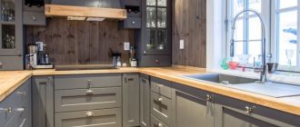
You can put a microwave or bread bin on a small refrigerator. In general, every centimeter of horizontal surface in such a tiny kitchen is used wisely. Install a hood in the cabinet above the stove. In a cramped apartment it is simply necessary.
Finishing methods
There are many design options for interior decoration, each using different finishing materials. But not everyone is acceptable for a tiny 17-meter apartment. Stone, with the exception of sheet stone, is not suitable - it is very voluminous, taking up up to several tens of square centimeters. Two or three-tier suspended ceilings made of plasterboard can be used as a zoning element, but very carefully and only if the height of the room allows it.
The flooring is made uniform throughout the entire apartment - this makes it look more spacious. Natural wood, laminate, ceramic tiles laid diagonally, thick linoleum, self-leveling flooring are suitable. If desired, only the kitchen space and bathroom are tiled.
The walls are made in approximately the same color scheme - the sleeping area is covered with wallpaper, wooden panels, the kitchen area is decorated with tiles or plastic. The color gradient looks original - each place has its own main color, gradually turning into another in the next zone.
The ceiling is preferred to be light - stretched, painted, decorated with foam panels. Small differences in height are allowed to highlight different areas, for example, a hallway. In the bathroom, all coatings are chosen to be waterproof and have reliable protection against mold and mildew.
Subtleties of arranging a room of 17 square meters. m
The main recommendation is that there should be maximum free space in the room. It is better to place furniture around the perimeter of the room. We leave the central part unloaded.
It is better to finish the walls in light colors. This can be wallpaper with a small pattern or vertical stripes, paint or plaster. It is not advisable to overload the walls with decor.
For paintings and photos, it is better to choose light frames. The light color of the walls will perfectly set off the set of darker tones. If you prefer rich shades in the interior, decorate one of the walls in whole or in part in this palette.
Do not forget that all the details of the furnishings must be in harmony with each other in color.
The photo shows a room measuring 17 square meters. It can be seen that using wallpaper with a photo print depicting a forest path, sea or endless field stretching into the distance, you can add space and fresh air to the room. The same result will be achieved by an image of snow-white clouds floating across a blue sky that extends to the ceiling.
The room is 17 sq. m cast iron radiator looks very bulky. It is advisable to replace it with a modern model - it is less noticeable.
The optimal design of the ceiling is to bring maximum light and space into the interior. The ideal option would be a stretch ceiling with a glossy surface.
Properly selected and placed lighting fixtures will effectively complement its appearance. The tension structure looks most advantageous in a room with a low ceiling.
As for the color, it is not necessarily white. Today, consumers can purchase a stretch ceiling of any shade.
Speaking of flooring, it must meet the following requirements:
- High quality.
- Strength.
- Environmental Safety.
When zoning a room, it is allowed to combine different types of coverage. For example, carpet will look good with laminate.
Color solutions for a small apartment
The lighter and warmer the colors are used, the more spacious the room appears. For apartments with large windows facing south, it is permissible to use cooler, richer tones.
Popular combinations:
- snow-white with sky blue;
- pink with violet;
- sunny yellow with spring green;
- pear with melon;
- antique azure with light brown;
- golden with rich sand;
- periwinkle with cornflower blue;
- apricot with slate blue;
- milk with light coffee;
- purple with beaver;
- swamp with bottle green;
- dahlia with mustard;
- pearl gray with khaki;
- tea green with red chestnut.
The main color is taken to be the one that is lighter - it accounts for up to 65% of the space being designed, the auxiliary color will take up approximately 30%, the rest are small color accents.
Selection and arrangement of furniture
In the kitchen area, the most important thing is a powerful hood. It will prevent food odors from spreading throughout the room. There is also a kitchenette here, which includes everything you need:
- washing;
- gas stove - preferably a two-burner or hob;
- small refrigerator - vertical or horizontal;
- hanging cabinets - they are made up to the ceiling;
- working plane.
Hanging cabinets are chosen with open shelves or decorated with glass - they are made up to the ceiling. The compact dining area is a folding bar counter or an extended window sill. If there is a loggia, a heated balcony combined with a room, it is taken out there, decorated with a small table, a kitchen sofa with storage sections.
In another option, a work office is placed on the balcony - this will allow you to significantly save on lighting, especially in the summer. It is decorated with a computer desk with many drawers and a comfortable chair. For women, there is also a dressing table here - applying cosmetics in daylight is much more convenient.
Upholstered furniture is represented by a folding sofa, on which people sleep at night and use it for sitting during the day. A good option is a wardrobe-bed, which leans against the wall during the day and lowers at night, forming a full-fledged place for one or two people to sleep. If necessary, a crib for a baby is placed in the room, and next to it there is a changing table-chest of drawers that can accommodate some of the baby’s linen and baby care items. If there is a bed on the podium, various things are also stored in it. A sofa chest is an equally useful acquisition; it is often complemented by armchairs, soft poufs, and folding chairs.
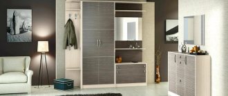
In the dressing area there is a straight or corner wardrobe, with the help of which the hallway is separated from the living room. If possible, they store not only clothes and shoes, but also some household appliances, sports accessories, etc. The bathroom here is very cramped, so they make do with several wall cabinets, shelves under the bathtub, a wall-hung toilet, a corner sink, and a shower. If you have a child, furniture for him is selected in a suitable size or height-adjustable.
When an adult and a child, two people, live together, the sleeping area is decorated with a bunk bed.
Creating a spacious living room
If you decide not to destroy the walls, you need to take care to create a spacious and functional living room. Every detail should work to free up space.
Walls
In panel houses they are quite thin, so you should pay attention to sound insulation. During repairs, the walls are treated with antifungal solutions
To make the living room look spacious, it should contain light, uniform colors.
A large pattern, dark or bright color will create clear boundaries. If you want something bright, you can give one wall to a riot of imagination
In small rooms, pay attention to pattern and texture. Wallpaper with a small pattern is quite suitable
The direction of the drawing works well on the space, vertical – visually pulls up, horizontal – to the sides.
The walls can be plastered or painted. It is good to use decorative plaster; it helps to hide all the flaws and irregularities. Stereoscopic wallpaper works well for the volume of the territory.
Ceiling
In panel houses it is usually low. It is worth considering some tricks to “push it aside”. A glossy stretch ceiling will cope with this task perfectly. The room will be reflected in it as in a mirror. Moreover, a dark color has greater reflectivity than white. Thanks to the varied palette of colors, the stretched fabric can be easily matched to the interior.
To create a beautiful ceiling, you can use putty. With its help, the surface is leveled, but this must be done perfectly; any unevenness will immediately become noticeable as soon as the light turns on. In the design you can use sockets for a chandelier or stucco molding.
Sometimes ceiling tiles are so deformed that they cannot be leveled with plaster. In such cases, drywall will come to the rescue. It will make any surface smooth, but will take up more than 10 centimeters of space. In order not to weigh down the top of the room, you need to select a small chandelier adjacent to the ceiling, or it is better to completely abandon it and use spot lighting along the walls.
Floor
Hall – a room for guests, relaxation, games and work, for all occasions. The load on the floor is heavy, and its creation should be approached with all responsibility. It is generally accepted that the surface of a small room should match the adjacent area in color and texture.
But sometimes designers allow themselves to zone even small rooms with different types of floor coverings. For example, laminate is combined with carpet or tiles.
The favorite floor coverings today are parquet and laminate. Parquet is made from natural wood of different textures and colors. It is environmentally friendly, looks beautiful, but is moisture resistant and susceptible to scratches. Laminate has the same properties. It is based on a multilayer chipboard-type structure.
If you want to visually increase the area, you need to choose a glossy floor.
Furniture
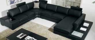
Living room furniture should serve many functions, but at the same time not overload the space. Typically, the room contains upholstered furniture, a modular wall or cabinet, a TV stand, racks, shelves, a table, a cabinet or other types of structures for equipment. This entire set is optional; each family is guided by its own taste.
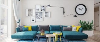
It is advisable to choose a uniform upholstery for upholstered furniture that does not attract attention, in order to leave the opportunity to make more interesting accents in the room, for example, on paintings, a fireplace or stereoscopic wallpaper.
Light, airy furniture will create an additional volume of space, but in contrast with wallpaper in delicate shades, dark furniture will also work. In a rectangular room, all furniture should be located along the walls.
Creating a second tier as a way to increase space
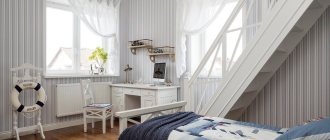
If there is a high ceiling, a kind of second floor is created in the room, on which the sleeping area is located, and if the room is more than four meters high, there is an office. A staircase leads there, located along one of the walls; it is fenced with handrails, like the floor itself. Below there is an entrance hall, a kitchen, a place for receiving guests or a children's room. It is convenient to organize many sections for storage in the steps - books, toys, accessories, shoes, etc.
A children's room on the second floor is also sometimes created, but only if the child is already big enough. Security issues are carefully considered here.
Lighting
In addition to the main overhead light, local lighting of each zone and decorative lighting are provided. The main ceiling chandelier is chosen to be as flat as possible - a large, multi-tiered one obscures the view. The study area is illuminated with a table lamp, the sleeping area with a sconce, the dining area with a pendant lamp with adjustable height, and the food preparation area with a lamp on a special rail.
In the hallway, the light is mounted directly above the mirror, which is sometimes decorated with LEDs around the perimeter. In a bathroom with an area of less than three meters square, one lamp, well protected from moisture, is enough; in larger ones, every plumbing fixture is illuminated. Decorative lighting is mounted along the bottom and top of the kitchen unit, creating a “floating” effect; glazed cabinets are illuminated from the inside.
If there is a second floor, it is illuminated separately.
Zoning
Due to the fact that the room is multifunctional, it is important to properly zone its space. It should consist of several parts:
- lunch;
- for relax;
- for storing things.
Large windows will make the room much brighter
Combining living room and balcony
They need to be divided in such a way that each zone stands out and at the same time creates a harmonious picture as a whole. First of all, you need to correctly arrange the interior items and place them so that they do not limit movement around the room.
The recreation area contains upholstered furniture, the types of which were mentioned above. In addition to the items already mentioned, you can use a variety of poufs and small chairs. As a rule, the sofa, which is located in the center of the composition, is installed opposite the TV, which will allow family viewing of films and television shows. The TV itself is located in the storage area. We have already discussed what items can be used to furnish it.
Advice! If you are planning to install a set for arranging the dining area, it is better if it is located away from the previous two parts of the room.
1
4
You can divide the room into zones, highlighting each, in the following ways:
- Visualization - the use of different interior items and decorative elements.
- Lighting – use different types of lamps for each part.
- Color design – involves painting surfaces and materials in different colors.
Using several techniques at once looks impressive. Let's take a closer look at how to do this.
Palace for decorating the dining area
Wall decor with family photos
When decorating a room, you can choose several shades, but they must combine well with each other. If you are separating all three zones of the room, you can use a color combination scheme or choose them to your liking. An ensemble of green, blue and peach colors or a bolder combination of beige, green and brown looks impressive.
When creating a lighting system, several types of lamps are used, which must fit into one style:
- a large ceiling one and several small ones with autonomous switches;
- chandelier and sconce.
Advice! A floor lamp looks great in this room, as it can be used to create a special atmosphere. It is usually located in the recreation area. This type of lamp refers to general lighting.
Stylish floor lamp near the sofa
Zoning using lighting
The visualization effect is created even without your participation. It’s just that each space uses its own type of furniture, which differs in shape and materials. But you can achieve a greater effect by using separate rugs for each zone.
Advice! To zone the living room, you should use partitions and curtains. The peculiarity of this room is that the space should be open and all parts should be visually visible.
Division into zones using lighting and furniture
Decor, textiles
There shouldn’t be a lot of decor - a few trinkets on the shelf under the TV, a couple of framed photographs, a homemade embroidered panel. Indoor plants are acceptable, but there should not be too many of them.
Textiles are preferred to be plain, light or with a discreet pattern. A large carpet that combines most pieces of furniture, bedspreads that match the window curtains, and chair covers that match the sofa cushions are appropriate here. Sometimes a rug is placed in each separate area, dividing the space with a fabric, crumbling curtain.
