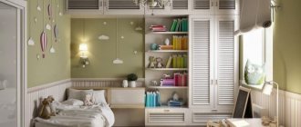
Coziness and convenience are the main components when creating a comfortable environment in the home. The interior of a children's room 2022 is a special case when you need to please the tastes of small household members. When planning it, you can play with your imagination and bring extraordinary design solutions to life. Unlike the design of other rooms, organizing the space of a child’s room is sometimes difficult. Children's room 2022 is a kind of transforming construction set that must constantly change. Children grow quickly, so the room should reflect their age and be flexible enough.
Children's design features
An interesting design for a children's room should not only be visually beautiful, but also meet certain requirements:
- Safety. The younger the child, the more attention should be paid to the absence of sharp corners, hidden wiring and other elements. Transformation. Children grow quickly and their nurseries should also grow with them.
- Easy to clean. Boys and girls enjoy smearing paint on walls, gluing play dough to furniture or the floor, and showing off other artistic talents. It is better for parents to prepare for this in advance - choose washable paint, non-staining furniture, etc.
- Free place. A room for children is primarily a playroom, so the sleeping and work areas should be placed so that there is room for entertainment.
- Emphasis on age. For a child under 2-3 years old, a crib and a storage area are enough; preschoolers and schoolchildren will need a workplace; teenagers will probably ask for a TV or computer in the room.
Children's interior design
140 photos
64.
Very delicate nursery design. And the yellow color is especially good here - it adds enthusiasm and brightness to the interior.
63.
The colors of this nursery seem to be diluted, muted. But this does not make the interior boring or dull. On the contrary, thanks to the abundance of white, pastel shades look much brighter.
82.
A very bright and modern design project for a children's room. An accent wall looks non-trivial, and besides, such a pattern with perspective works to expand the space, which is important for small rooms.
42.
With a slight movement of the hand we create a bunk bed based on the character, interests and gender of your children.
66.
We believe that a stylish children's room does not mean a lack of bright colors, and a bright children's room does not mean a lack of style. Another thing is that these concepts should not exclude, but complement each other.
57.
Delicate and airy interior of a room for a girl. A reading nook with an accent wall is especially great!
36.
A charming nursery for two children.
48.
Charming children's room design for sisters. Such a plywood house can become not just a room decoration, but a storage space or, for example, a night light.
80.
Here is an original combination of patterns on the wallpaper. In company with a yellow sofa they look even more interesting. You need to be careful with such active walls, otherwise you can achieve the opposite result and go from style to overkill.
87.
In this room you can see a clear distinction between zones. By the way, the beds do not have legs - they are just high orthopedic mattresses, but due to the podium they look very organic.
88.
The design of a nursery for a little lady is all very noble, discreet and elegant.
84.
Wallpaper with an active pattern looks great on the wall behind the crib and fits perfectly into the Scandi style. But you shouldn’t cover the entire room in this way - one accent wall, as a rule, is quite enough for a harmonious interior.
76.
Having thought through the design of a children's room or, more correctly, a teenager's room down to the smallest detail, you can try and free one of the walls to make it a real art object!
75.
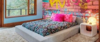
An accent wall, decorated in the style of a black and white comic book, creates a completely unexpected effect of blurred space.
91.
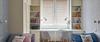
It is immediately clear that this room for a teenager is modern and laconic. By the way, the idea of converting a window sill into a desk saves a lot of space and can be used both in a child’s room and in any other room.
85.
The girl's room is decorated in a gentle neoclassical style - a very pleasant and unobtrusive combination of simplicity and grace.
83.
A cool idea for zoning space – and not just for a child’s room! There is enough space for books in the work area, so we decided not to load the remaining walls with various shelves - this makes the children's room look more spacious and brighter. There was also room for a very cute wall with a pattern. 
79.
Quite a bold arrangement, which made it possible to place a large amount of furniture in the room and at the same time leave a lot of free space. I must say a special thank you to the mirrors - they greatly expand the space!
74.
The interiors of children's rooms with classic elements always look very elegant. But, since a pure style is somewhat boring, especially in a child’s room, it is better to dilute the classics with something modern. For example, Scandi style.
73.
Inserts made of thin wooden slats are often found in modern interiors. And this is a real find for the designer when you need to add lightness to furniture, create a translucent partition, or add additional verticality to the design.
72.
Such an original cabinet that creates a niche for a crib is not a cheap pleasure. However, the result is worth the money spent!
67.
Blue and white is a fresh combination that can be called classic. However, you should still remember that the active color - in our case blue - should not be too much. Two walls are enough.
65.
A swing in a nursery is a special chic! There are probably no girls who would disagree with this. And probably boys too.
59.
In contrast to the previous one, this nursery design project seems even more airy. A very stylish meringue room. 
58.
A nursery for a very small baby. It will be comfortable here for both baby and mother.
55.
The design of a nursery, like any other room, is important to think through thoroughly. For example, it is better to make a decision with a sports corner not on the principle of “so be it”, but in the event that the child is active and he really needs to spend his energy somewhere.
49.
Another option is how you can use bright wallpaper so that there is no visual overkill.
47.
If the previous project was designed as a bedroom for girls, then this room, of course, is more suitable for a boy. Here, too, there is a bright accent wall, on which cloud night lights are very nicely placed.
46.
Any mother will appreciate such a closed wardrobe for a nursery - it is so beautiful, original and, most importantly, roomy.
45.
Any interior of a children's room should be created taking into account the character and preferences of the child. Like, for example, this one is a great option for a fidgety girl. 
44.
It is very difficult to call this interior childish. Nevertheless, it is true. 
43.
Any boy will love this elevated bed. And the podium hides a wonderful place for storing toys, clothes and vital little things. It's easy to put things in order) Cool children's room!
41.
If space allows, then pay attention to this design of the children's room. Both boys and girls will love this cozy bed-house.
40.
Designer wardrobes are a wonderful solution for almost any nursery.
39.
Option for a cute, gentle and bright room. 
38.
This technique of painting the ceiling creates the illusion of space, and sunny yellow charges with positivity and energy.
37.
A bright and very positive children's room for a boy.
35.
It is better to combine colorful wallpapers with plain ones so that the pattern does not “pressure” too much.
33.
Boudoir of a little princess.)) A comfortable tabletop under the window is an alternative to a desk.
31.
Many parents like the modern interior of a children's room. But when creating a project, I always recommend consulting with your child too - after all, he will spend most of his time in the room.
30.
For some, it is important to have two work areas. Here they are arranged in a mirror manner, each child has his own rack.
28.
To decorate a nursery for a very young child, it is better to choose natural materials and colors.
23.
When the baby grows up, instead of a crib you can put a table, for example.
22.
Color combination plays a huge role in the design of a nursery. Soothing mint shades are usually chosen for girls.
21.
To further zone the space, you can decorate the walls in different ways. Here, for example, artificial brick belongs to the work area, and near the bed we see coziness.))
20.
Just a dream, not a child’s dream: a sports corner, a table for receiving guests, a pear-shaped chair, and a wall for drawing with chalk... Beauty, and that’s all!
19.
Another similar nursery interior. Painted houses and stripes on the wall really liven up the room!
18.
Here's another example: this nursery design is designed in light colors to create a calming effect from the moment you enter. 
17.
The walls and main furniture may well be neutral colors. All you have to do is add bright prints to frames and an unusual chair, and the room will be transformed before your eyes!
16.
A boy's nursery is always visually different. Although all you have to do is change the color and toys here to completely change the look!
15.
A very gentle and fairly budget-friendly option for children’s furniture. Try to select pieces of furniture so that they are visually similar. It’s good if they are from the same collection - like the bed and the tube. This is how the room becomes complete.
13.
But why shouldn’t a teenager live in such a classroom? I myself would not refuse, to be honest, although I have long since passed the age of a teenager. 
12.
Pale pink in combination with delicate green gives a very interesting effect: it seems as if spring has come to the room.
11.
And here is a room for twins, a boy and a girl. While the children are small, they can live in the same nursery.
10.
The boys are enthusiastic about the idea of sleeping in a loft bed. First of all, it's cool. Secondly, no one sees or touches you. And thirdly, under the “attic” you can make a room within a room!
9.
Sometimes one carpet attracts more attention than anything else. 
8.
In general, the design of a children's room is an endless space for creativity. The cabinet fronts can be made in any color, and a niche in the wall can be turned into a cute bug.
7.
Not everyone is lucky enough to have large rooms as a child. If you are also limited in space, a two-story bed saves a lot of space, and high sides will prevent the child from falling.
6.
An excellent option is bright elements that can be easily replaced with others. For example, a carpet or plastic boxes, a picture frame or magnets in the form of buttons.
5.
Well, yes, this is also a children’s room, although compared to the previous photographs it’s hard to believe. 
4.
Vinyl wall stickers are a win-win option for a children's room with smooth walls!
3.
Large inscriptions and letters on a bright wall also look cool.
2.
Another example with letters.
Choosing the right color scheme
Just a few years ago, the design of a children's room was inextricably linked with the gender of the baby: for boys - blue and dark blue, for girls - a pink palette. Today, the boundaries have blurred and others have been added to the standard gender shades: white, gray, green, yellow, red.
Modern designers, when planning renovations in a children's room, pay more attention to the features of the room (size, lighting), as well as to the chosen style.
Small children's rooms require a light palette: white, gray, beige, delicate pastel shades. Spacious ones can be arranged in a light palette, but using large dark or bright surfaces.
If the room's windows face north, pay attention to warm shades that will charge the children's room with sunlight: yellow, orange, sand. In a room that is too bright, on the contrary, create a soothing coolness: a color scheme based on blue, green, and gray will cope with this task.
The photo shows modern children's furniture in gray tones
In the design of a children's room it is also worth considering the psychological impact of different colors:
- White. Increases self-esteem and encourages the development of creative abilities. It is better to combine with other shades.
- Grey. Gives a feeling of stability and peace. May promote withdrawal.
- Yellow. Promotes the development of intellectual abilities.
- Green. Helps you concentrate. Relieves insomnia.
- Red. Stimulates the central nervous system and cannot be used as a dominant one.
- Orange. Non-aggressive red, improves mood, energizes.
- Blue. Calms, stimulates relaxation and sound sleep. In large quantities it can cause depression.
Newborn nursery
Beautiful decoration of a children's room for a baby who has just been brought from the hospital is not so important. At first, he needs his mother and a cozy, comfortable sleeping place. The newborn must have:
- Bed with sides. The canopy decorates, but does not serve a useful function. It usually gets in the way and collects dust.
- A chest of drawers with a changing table on top that can be folded up when not needed.
- Sleeping place for parents: sofa or bed.
Renovations in a room for a newborn should be made from natural, high-quality building materials that do not smell. Flowers should also be removed from the nursery.
This caution is necessary for a child who may be allergic to certain substances or pollens.
What to consider when repairing?
The design of a children's room is complicated by high requirements for safety and environmental friendliness.
For walls, choose breathable natural materials that do not emit harmful substances and allow air to pass through. Plain paper, original fabric, cork wallpaper, special paints for children's rooms. Wood trim is suitable - for example, if there is lining underneath and wallpaper on top.
In the photo there is a figured headboard of a children's bed
The floor in the interior of a nursery is a favorite place for games, so it is advisable to insulate it. Lay anything on top of the “Warm Floor” system: laminate, parquet, linoleum. If the apartment is warm, floor heating is not necessary - just lay a carpet or mattress on top of the floor covering.
A plain ceiling will complement the interior design of any style. Do you want something unusual? Decorate it with drawings, glow-in-the-dark stickers, and a starry sky.
Recommendations for arranging small children's rooms
- It is not recommended to zone a 9-meter bedroom with arches, niches, multi-level ceilings, bulky shelving and plasterboard structures - all this will visually make the room smaller and create a feeling of enclosed and oppressive space.
- Remember that any furniture will not last as long as it serves an adult in the bedroom. Children are growing up, they are more active, so breakdowns, a change of interest and, accordingly, the need to replace interior items are possible.
- Curtains, cornices, lamps, cabinets - there is no point in choosing too expensive furniture and accessories. Or be prepared for the fact that after some time something will get dirty, torn, broken, and so on. But this does not mean that furniture should be without quality certificates and meet all safety standards.
- Take care of your safety. It should be manifested in everything: from finishing materials to the shape of furniture. All of them must meet environmental standards. Fragile composition, sharp corners, antistatic properties - all this should not be in the nursery. Also, do not make a lock from the inside of the room so that the child cannot lock himself in it. All electrical wiring must be hidden in the wall or under the floor, and sockets must be closed with curtains or special plugs.
- All necessary items must be within reach of the child's height. That is, you should not make racks for toys under the ceiling. A nursery is a small world, and a child should feel like a master in it. Use cabinets of low height; switches should also be mounted low. Optimally - no higher than 1 meter from the floor.
- For floor finishing, it is recommended to choose natural materials such as cork or boards. But it is better to save tiles or linoleum for other rooms, as well as carpet, which is considered a dust collector and a potential allergen. Soft flooring can only be left in the play or recreation area.
- Complex patterns are something you don’t need to be afraid of when decorating a nursery. The fact is that the child will be interested in looking at them, and this trains the imagination and vision. If you have a neutral background for the walls, you can use decor in the form of paintings, walls, stickers.
- Expensive silk wallpaper or liquid plaster are not something worth spending on when renovating a bedroom. The walls of the nursery are susceptible to scratching, drawing with felt-tip pens or paints, and mechanical impacts from balls. In this case, you can install a large chalkboard on a piece of wall or update the paint/wallpaper on the walls as needed.
- The child's bedroom must be provided with good sound and heat insulation. To do this, it is important to choose high-quality double-glazed windows with child locks, as well as a self-leveling floor with a “warm floor” system.
- To finish the ceiling, treatment with plaster, primer and white acrylic paint is suitable. And the water-based composition collects dust and can cause allergies. If you want to install a suspended ceiling, pay attention to fabric options that lend themselves well to decoration: a starry sky or another image.
We select and correctly arrange furniture
Requirements for furniture for a children's room:
- no sharp corners;
- environmental friendliness;
- easy cleaning;
- ergonomics.
A crib for any age should be longer than the child's height. Minimum width for comfortable sleep: 80-90 cm. The frame is of less importance in comparison with the mattress: from a very early age it must be of high quality and orthopedic, so as not to harm the posture.
The workplace also depends on the height of the child. Here is an approximate table of the height of a chair and table for a children's room:
| Child's height, cm | 90 | 120 | 140 | 160 |
| Seat height, cm | 22 | 30 | 37 | 40 |
| Tabletop height, cm | 40 | 52 | 62 | 67 |
Today on sale you can find models of working desks with adjustable tabletop and chair heights - this is the best option so as not to change furniture every year.
The photo shows an example of a functional two-story bed with storage
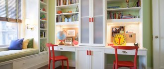
Try to organize storage in the children's room so that they themselves can get the necessary items and put them in place. To do this, on the lower shelves of cabinets, cabinets and chests of drawers, place what the baby can take independently, and on top what is only with the permission of the parents (for example: paints, felt-tip pens). In a teenager's room, the real owner of the room will independently decide what and where it is more convenient for him to store it.
Furniture is arranged with maximum space saving, especially in a small nursery. To do this, the bed is placed in a niche made of cabinets, for example. Or they install a two-tier structure, where there is a sleeping place on top, and a study or storage area below.
In the photo there is a large bed in a niche made of cabinets
Where to buy furniture for a children's room
Having decided on the design, all that remains is to choose where to buy furniture for the children's room. You can do this at a furniture store or order it on a furniture website.
The good thing about the store is that you can see and touch the kit, but on the Internet you will have to be content with only the image.
But usually ordering online is cheaper, because the manufacturer does not need to spend money on renting premises and paying for the work of sales consultants.
So the choice, as always, is yours.
Nuances of zoning
A high-quality design of a children's room necessarily divides it into zones. There are basically 4 of them:
- bedroom;
- wardrobe;
- working;
- gaming
The first contains a place to sleep: a comfortable bed or sofa. Clothes and useful accessories for the baby (diapers, cosmetics) are located in the dressing area.
The workspace includes a chair, a table, an area for storing office supplies and a computer.
The play area includes boxes with toys, comfortable poufs or chairs, and consoles.
If a child has a hobby, you can add a fifth zone: for example, a piano or an easel is placed there.
Zoning in the design of a children's room is of two types:
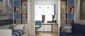
- Horizontal. Curtains are hung between zones, screens and shelving are installed. Or they use visual techniques for dividing space: for example, different wallpapers. Suitable for relatively large (16+ sq.m.) rooms
- Vertical. The sleeping place is located at the top, below it is a work desk, and next to it is a spacious closet. The remaining space is used to create a playroom.
In the photo there is a desktop on the windowsill
Furniture
Furniture for boys in descending order of importance
- A full bed with a good mattress. Posture is formed during the period of growth and you cannot save on this.
- A work desk is preferably near a window and with a good chair. It’s not so critical for a preschooler, but the space needs to be allocated in advance because... again posture. We make a lot of sockets in this area.
- Sports corner with horizontal bar.
- Storage area with wardrobe and baskets for toys.
It is in this order that the storage area comes after the sports corner.
We are not talking about professional sports, which are harmful to health. I’m talking about the necessary minimum, which will have a positive effect primarily on the boy’s psyche. Excess weight and physical weakness, on the contrary, can become a reason for bullying. Children can be cruel.
Therefore, a horizontal bar is required. No matter how small the room is, you can always find a place for a horizontal bar, even in the doorway.
A horizontal bar is a mandatory attribute in the interior of a boy’s nursery.
We use baskets for storing toys, because... Over time, they will not be needed and there is no point in making full-fledged furniture for toys.
Instead of a regular sleeping place, you can make a loft bed . At any age, boys are nimble and dexterous and climbing the 2nd tier is not a problem. In a nursery for two boys, a bunk bed is simply standard and there are no problems with it.
This will save up to three square meters of usable space. The space under the bed can be used for a storage closet, multiple drawers, or even a work area with a desk for study and creativity.
What decor would be appropriate in a nursery?
The design of a children's room is the richest in decorations. At the same time, decorative design is achieved not only through accessories, but also through functional elements.
The first part of the decor is finishing. The walls can be painted or covered with photo wallpapers with your favorite characters, animals or other interesting subjects. A more practical option is interior stickers. They can be removed or replaced without redoing the repair.
Furniture can also be a bright spot in a child's room. For example, a bed in the shape of a car or a headboard in the shape of a Mickey Mouse head. A soft chair with bunny ears, a pouf in the shape of a cat or a bear is not only a comfortable seat, but also a wonderful toy. Cabinet furniture can also be unusual - a shelf-house or a pencil case in the shape of a rocket will become the highlight of the interior.
In the photo, the decor of the room is in a flight theme.
Popular ideas for children's room interior include wigwam and canopy. Moreover, the latter does not have to be hung above the bed; you can attach it to the ceiling above the floor, and throw a few soft pillows below.
Functional floor decor in the form of shaped rugs or mattresses will prevent a child actively playing on the floor from freezing.
In the photo there is a canopy in the interior
Space planning and zoning
Before you begin the renovation, it is important to think about how and where the main interior items will be located. The layout and zoning determine the functionality of the room in the future: how comfortable it will be for the child to study, whether he will have a secluded place to relax, whether the limited square meters will be enough for a play or creative hobby area. Several zoning and planning rules:
- “No” to unnecessary details and decor. Interior of a children's room 9 sq. m. should be as comfortable and cozy as possible for the child, and therefore it is not recommended to clutter it with unnecessary furniture and other items, and leave the central part completely free for ease of movement.
- Relaxation area - maximum tranquility. The relaxing atmosphere of the relaxation area is the key to good health and good sleep for the child. To achieve this effect, you need to pay attention to pastel colors when decorating.
- Facing materials for zoning. Wallpaper, paint, flooring - it is not necessary to select the same materials; different textures, patterns, and contrasting colors are allowed. It is important that the finish is in harmony with each other.
- Separation by color. A good zoning option for rooms with a small area. In the play or hobby area you can add a colorful carpet, bright bean bags and colorful storage boxes. You can also use color accents to decorate a room for two children of different sexes.
- Lighting as a zoning option. Allows you to create accents in the right parts of the space. Colored lighting is well suited for a children's room. Zoning option: for example, one central chandelier, spotlights, table lamps near the work area and a sconce or night light near the bed.
Remember!
When zoning a child’s room, it is important to correctly identify three main zones: for relaxation, for extracurricular activities, and for sleep.
In what style is it better to decorate a room?
The style of the children's room and interior design are chosen based on the general style of the apartment, the interests and temperament of the child.
- The loft will appeal more to teenage boys. Provence is more suitable for gentle natures.
- Classic style - for reserved and timid children. A children's room in the neoclassical style, on the contrary, will appeal to almost everyone.
The photo shows a room for a girl in a classic style
- Modern children's rooms are often decorated in Scandinavian style - it is versatile and cozy, but some children may feel a lack of bright details. Therefore, their presence should be considered in advance.
A room for two children can be divided into two halves, which will differ in both style and color. But you will have to take care of a smooth transition between the two parts so that they look like a single whole.
In the photo the design is in subdued colors
Children's room for two
If two people live in a room, then it is more difficult to arrange it. Depending on the gender of the children, furniture and decor are selected.
Boys prefer a more laconic design with a minimum of accessories, while girls' rooms are always full of trinkets and decorations.
Classic nursery - 125 photos of real examples of designing and decorating a nursery in a classic style- Children's loft: current projects for modern interiors. 110 photos of stylish ideas
Children's room in Scandinavian style: the best interior projects, design features and zoning options for the children's room (125 photos)
The children's room for two is 9 sq. m. buy a bunk bed, which will help significantly save space. If the sleeping places are separate, then these areas can be decorated in different colors.For children of different sexes, the space should be divided into separate zones, each should have their own corner. In the nursery, a common area must be set up where children will play together.
You can use universal design options in neutral colors. If children constantly quarrel, then it is better to buy two narrow closets and arrange separate work areas.
Children's room for a boy
Boys are considered less fastidious inhabitants of the premises. Blue, light brown, gray design colors and simple pieces of furniture are perfect for them.
Of much greater interest to representatives of the stronger sex will be original lighting systems, unusual technical innovations in the form of doors with photocells, elevator systems for opening cabinets, and light relays.
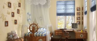
For parents who find such an interior too boring, you can use unusual styles of children's interiors and decorate the room in the form of a medieval castle, a pirate ship, or a racing car garage.
Layout features
To create a room for your beloved child, a room facing south or southeast is most suitable. Such placement will allow you to illuminate the room in a natural way as much as possible and do this at the most suitable hours for wakefulness.
Usually, children are given the smallest room, but if there are several rooms, it is necessary to provide a larger room for the child so that they can create a separate place for sleeping, active games, physical exercise, and quiet time.
Decoration for a girl
Any style can be made not only for a boy’s nursery, but also for a girl’s. Warm shades of red, lilac, pink, purple, muted green, crimson tones, white and light beige may predominate here.
The classic style for girls is emphasized with ruffles and bows, Provence - with flowers and other decor. Thematic styles include cartoon and fairy tale heroines, princesses and castles, and dolls.
The photo shows a children's interior for a girl in a classic style with beige checkered wallpaper.
Children's room for girls
Traditionally, they try to depict the interior of a girl’s nursery in all shades of pink, use all kinds of images of princesses, and place the maximum number of ruffles, bows, dolls and soft toys.
However, this option does not always reflect the child’s character. Some girls prefer designs in different colors and with different decorations.
Therefore, before you start decorating the room, you should ask the opinion of the child himself. But limit his imagination to certain limits, otherwise you can end up with a beautiful, but completely unsuitable dollhouse for life.
