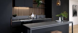
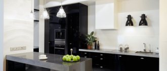
This article contains for you the best design projects and photos of renovations with black kitchens implemented by the Fundament Group. The design of a black kitchen can be very multifaceted: furniture, countertops, aprons, finishing, floors and walls can be made in completely different shades. But the most popular combinations remain black and white, black and gray and black and brown kitchens. Let's look at them together!
Black is like the new white in kitchen interiors
We encounter unusual and sometimes very controversial trends while exploring new trends in interior design. For example, kitchen design with a large number of dark shades. The kitchen design world has always focused on white as the preferred color choice.
Classic tandem of white and black
White is definitely a “safe” choice, it fits into any design, will always be modern, and with it we don’t risk getting bored in our kitchen in a few years. Lately, however, another color trend has been picking up steam, and I personally really like it: Have you ever thought about a black kitchen?
Spaces with it seem more integral and international, a little mysterious. Shades of black, navy blue or dark brown add what white kitchens cannot - a seductive allure that conveys sleekness, sophistication and individuality at the same time.
A safe choice for a fun-filled interior
This will be interesting to you: REVIEW: Kitchen design ideas in a private house: 130+ photos and layout options
Choosing a style
As we noted above, among the advantages of this color scheme is its versatility. Dark shades are appropriate in classic and modern interiors. The only difference is in the proportions: somewhere dark will dominate, and somewhere it will act more as a complementary or accent color.
Classic
High tech
Minimalism
For the English style, loft and art deco, the dark color scheme of the interior is often style-forming.
Loft
English style kitchen
Art Deco
A few simple rules for a dark kitchen
In my opinion, there are a few simple rules that need to be followed to create a kitchen with a modern, sophisticated style (and also avoid the end result feeling gloomy).
Here are my four simple rules:
- Matte finish . For a modern chic result, opt for a matte finish: this effect softens even strong colors, making darks more subtle.
- Lighting . For a dark kitchen, I think the best thing is to have ample lighting and avoid upper cabinets. So keep the top of the kitchen bright, choosing open shelving instead of closed cabinets, or even leaving a wall bare (perhaps painted in a contrasting tone such as white or light grey). If you need upper cabinets (as lack of space is always an issue), choose white upper cabinets to maintain a bright, light effect.
- 3 possible choices for the countertop: black, wood or marble. For a clean black design, go for a charcoal countertop. If you want a warmer and cozier effect, then wood is definitely the best choice for you. Finally, if you want an elegant, super-chic kitchen instead, you need to choose marble.
- Add a few touches of gold or copper (on the faucet or in the details, for example).
For a dark kitchen, arrange good lighting
For nearly two decades, white cabinetry has dominated kitchen design. Almost every homeowner needed a white kitchen. From cabinets to appliances to tiles, white has seen huge sales across the design industry. Considering all this, it sounds incredible, but now dark kitchens are ruling the market. You might even say that black is the new white.
New white: kitchen furniture
Use black cabinetry just on the center island or throughout the unit to give the entire kitchen a pop of color.
Tip Every room should have at least some small spot of this color. It's a great accent color and also a great backdrop for other elements in the room.
Looks harmonious in combination with a wooden tabletop
Chances are that most readers would consider an all-ink kitchen unacceptable, and they would be right. But there are also supporters of everything unusual. They will find a way to make a dark kitchen so that the space is trendy, warm and bright enough.
Of course, dark colors are perceived differently in large and small rooms: in some they can emphasize architectural features, while in others they can act depressingly.
You can only use it for furniture fronts, chairs or dining table in a small kitchen. All other surfaces should be in light warm shades: milk, cream, light beige, pale yellow and others. This will help maintain the visual volume of space.
Kitchen design in red and black colors
Tip Black cabinets make a space stand out, especially when paired with brass hardware or lighting. Dark stone countertops offer a stylish alternative to light granite or marble. A black oven, range hood or refrigerator provides a bold contrast in a spacious kitchen. A wooden or onyx tiled floor will look chic, and besides, it is not easily soiled.
This color is good because it goes well with any other colors, as well as white, cream, and wood. Use your favorite combination of colors in the interior, this way you will distract attention from the abundance of dark tones, making their inclusion harmonious.
Black looks bright with many colors
This will be interesting to you: REVIEW: Kitchen design with a balcony (100+ Photos): We are for combining space!!!
Black cabinets
Whether you're installing brand new kitchen cabinets or updating the look of existing ones, you may want to consider a bold style choice: black kitchen cabinets. Since most kitchens tend to have lighter colors, these cabinets can provide a bright, eye-catching contrast.
Remember that black does not have to mean the color of dark midnight or an inky shade.
Black kitchen cabinets in the interior
Paint manufacturers now offer a wide range of colors, many of which have interesting shades that almost fade into gray. The color and style of the other part of the kitchen, as well as the bold statement you want to make with your cabinets, will likely determine the shade of black that's right for your kitchen cabinets.
It's a different matter if you have black kitchen cabinets as the cabinet material. It shouldn't be considered an exclusively modern color, but it works well on laminated cabinets.
A softer black, sometimes with a slightly weathered effect, can also work great if your cabinets are more traditional, especially with contrast from light colors on the walls and countertops.
Add a little gray
They enhance any kitchen style, be it rustic, traditional or modern. If they were previously used in European kitchens, they now appear in all styles. This is a throwback to more traditional designs, as a reminder of the Victorian era.
In Victorian times, dark woods such as walnut, cherry or mahogany were used and stained almost black. Pairing them with cream granite or marble countertops will give you a beautiful look.
Corner kitchen with cabinets
Tip Try pairing frameless cabinetry with glass inserts, stainless steel appliances, art glass pendants, and mosaic glass tiles. The color will make the lines of the cabinet expressive and become a background for other elements in the room.
When the interior is completely in one color
Lighting
Even if you have a lot of natural light, still use the maximum amount of artificial light that your kitchen is capable of so as not to turn it into a black hole.
Tip: Dark furniture can show stains and fingerprints more easily than wood, so consider your cleaning routine.
Don't forget about good lighting
This will be interesting to you: REVIEW: How will a white kitchen with a white countertop transform the interior? 145+ Photos of styles and varieties of design solutions
ProEXR File Description =Attributes= cameraAperture (float): 36 cameraFarClip (float): 0 cameraFarRange (float): 1000 cameraFov (float): 48.2441 cameraNearClip (float): 0 cameraNearRange (float): 0 cameraProjection (int): 0 cameraTargetDistance ( float): 770.884 cameraTransform (m44f): [{1, 0, 0, 209.111}, {0, 0.00477598, -0.999891, -604.873}, {0, 0.999989, 0.0147751, 105.999}, {0, 0, 0, 1 }] channels (chlist) compression (compression): Zip16 dataWindow (box2i): [0, 0, 2999, 1874] displayWindow (box2i): [0, 0, 2999, 1874] gamma (float): 1 lineOrder (lineOrder) : Increasing Y pixelAspectRatio (float): 1 screenWindowCenter (v2f): [0, 0] screenWindowWidth (float): 1 tiles (tiledesc): [64, 64] type (string): “tiledimage” =Channels= B (float) CESSENTIAL_Direct.A (half) CESSENTIAL_Direct.B (half) CESSENTIAL_Direct.G (half) CESSENTIAL_Direct.R (half) CESSENTIAL_Emission.A (half) CESSENTIAL_Emission.B (half) CESSENTIAL_Emission.G (half) CESSENTIAL_Emission.R (half) CESSENTIAL_Indirect. A (half) CESSENTIAL_Indirect.B (half) CESSENTIAL_Indirect.G (half) CESSENTIAL_Indirect.R (half) CESSENTIAL_Reflect.A (half) CESSENTIAL_Reflect.B (half) CESSENTIAL_Reflect.G (half) CESSENTIAL_Reflect.R (half) CESSENTIAL_Refract.A ( half) CESSENTIAL_Refract.B (half) CESSENTIAL_Refract.G (half) CESSENTIAL_Refract.R (half) CESSENTIAL_Translucency.A (half) CESSENTIAL_Translucency.B (half) CESSENTIAL_Translucency.G (half) CESSENTIAL_Translucency.R (half) CGeometry_NormalsDotProduct.A (half) CGeometry_NormalsDotProduct.B (half) CGeometry_NormalsDotProduct.G (half) CGeometry_NormalsDotProduct.R (half) CGeometry_NormalsGeometry.A (half) CGeometry_NormalsGeometry.B (half) CGeometry_NormalsGeometry.G (half) CGeometry_NormalsGeometry.R (half) CG eometry_NormalsShading.A (half) CGeometry_NormalsShading. B (half) CGeometry_NormalsShading.G (half) CGeometry_NormalsShading.R (half) CGeometry_UvwCoords.A (half) CGeometry_UvwCoords.B (half) CGeometry_UvwCoords.G (half) CGeometry_UvwCoords.R (half) CGeometry_WorldPo
Tabletops
When it comes to countertops, if you have your heart set on granite or soapstone, then don't choose cabinets in that same color. Light countertops, such as light granite with dark areas or marble - if you're willing to splurge - contrast well with a dark set.
A metal countertop, such as stainless steel or a less common choice such as zinc, pewter or copper, will stand out much better with black cabinets, as they will reflect a lot of light.
With metal table top
Apron
The same goes for your apron - don't leave it in the dark. Take advantage of the black scene and go for an intricate, vibrant tile design for it.
Devices
As for appliances, dark and stainless steel are made to order. Whether you're using it as an island or one wall away from cabinetry, black appliances are the perfect complement.
White tiles on the floor
Tip For floors, you can choose white marble or limestone tiles, or oak flooring, which will give a warm combination.
This will be interesting to you: REVIEW: Freshness and safety of Green in decoration: 130+ Photos of green kitchen in the interior. What does this natural color give?
Black and white kitchen
This color mixes easily with white. In fact, there are many changes you can make to your white kitchen to stay on top of the latest trends.
Dark technique
We all have a need for devices. With a popular range from refrigerators to microwave ovens, the appliances serve as kitchen staples. Even if your appliances are old or just outdated, a white kitchen with black appliances looks incredible. It is also convenient that the devices are quite easy to replace and do not cost a lot of money.
Combined with wooden beams on the ceiling
Accent wall
Another great way to keep your kitchen trendy is to paint your kitchen wall a charcoal shade . This could be the entire wall, or a small part of it - say, the space between the upper and lower cabinets. It will be small enough to make a statement, but not so much that it will completely overshadow the bright kitchen.
Tabletops
There are many materials that we can use for our countertops. From granite to marble, soapstone to laminate, there's an option for every budget. If you don't want to spend a lot, a black countertop or a white countertop with black accents is the perfect addition to any kitchen.
Black and purple interior
Apron and mosaic
Want to make fewer changes to your kitchen while still wanting to stay on trend? Consider a black and white mosaic behind your countertop or sink. An apron or mosaic is not only fashionable, it will attract the attention of your guests and make the right addition.
Cabinets
Let's say you want to take a big step towards this trend. Then cabinets or even just an island is the way to go.
A bold statement, black cabinets look great when placed on a lighter floor.
They also help you clearly highlight the design, such as gilding and hardware, and contrast well with marble countertops.
These cabinets look great on light floors.
So, stay on trend with small changes even if you have just made changes to your design.
This will be interesting to you: REVIEW: Kitchen design with a balcony (100+ Photos): We are for combining space!!!
Apron material and color
The apron is usually made from one of the following materials:
- Tile.
- Mosaic.
- Stone.
- Glass.
The color scheme can be almost any. A black apron will visually increase the space, a gray apron will create a smooth transition from a dark work surface to the upper light cabinets, and a bright apron will attract attention and dilute the severity of a black and white kitchen. Many apartment owners choose photo printing to decorate their backsplash; a well-chosen image will add its own flavor to the room.
Black and White Kitchen Cabinets
They help give the kitchen a clean, modern look, while muted gray will give you something more elegant and calming to tone down the dramatic tone of the moody tones. Too much black, like too much of another color, can be overwhelming. Its proportion depends on the statement you want to make and what you want to convey in the room.
Too much black can be overwhelming
You should keep in mind the other details in the room that surround the cabinets. The countertops should be combined with the flooring, which will need to be mixed with the paint on the walls, which is emphasized in the lighting. This mixing in cabinets produces beautiful results. An expert designer will help make this combination harmonious. You can also work with design software on available home decor websites.
In a kitchen with dark cabinets, lighting is just as important as color choice to maintain a balance between the darkness of the cabinets and the lighting of the room. Therefore, you will need to consider the number of windows and natural light already in the room and what additional lighting you need to achieve the desired effect.
The countertop must match the floor
Tip For a large kitchen with lots of cabinets, consider placing an island with dark cabinets in the center, then keeping the rest of the cabinets white. This will give you a clean, modern look without creating a dark or overpowering feel. A splash of color, such as red mixed with black, also creates a bold, fun look.
The type of paint used is also very important with dark paint because, contrary to popular belief, it is very durable and all defects are visible on it. Gloss black will show fingerprints and smudges more easily, so matte will be the preferred choice for easier maintenance. Both will require careful planning and placement.
The gloss shows all the fingerprints
Useful video
Watch the video with modern aprons for the kitchen below:
You should be especially careful when choosing a dark kitchen apron. After all, this rather large detail in the design of a room can weigh down the interior, making it gloomier or more alarming. Whereas a correctly selected apron will only emphasize their contrast with the lighter colors of the main color and, if necessary, slightly muffle, elevate and make the overly bright shades of the walls and kitchen furniture less striking.
Black-red
One of the unusual color combinations that people choose when designing their home. The red and black combo is rightfully considered the most expressive combination in the world of interior design. This kitchen will be an excellent choice for women who love these two colors.
She is expressive, edgy and modern. These are two contrasts on the color wheel that are very easy to combine, but only the right combination creates the right kitchen.
The most expressive duet
Balancing two primary colors
Both colors are primary and need a common ground. The easiest way to do this is to add a little white. Both also come in many shades, blacks range from charcoal gray to soot, reds also range from light red to deep red-brown. It's a good idea to combine glossy and matte shades for maximum effect and balance in your interior.
Design ideas
Matte red walls create a cozy atmosphere in the kitchen. Add a white ceiling and floor, black countertops, cabinets, and a red rug on the floor. Red appliances in metallic shades will add expressiveness. For maximum contrast, use matte red walls with glossy black.
Add brightness with accessories
Go for walls with white and black patterned tiles and contrast with glossy bright red cabinets.
Black granite countertops and shiny chrome appliances and accents like cabinet and drawer handles look stunning. Add a fun element with a black and red apron.
Tip: Paint one wall red and one wall black. Use accents of similar colors on the other two walls. Add a large bay window to let in plenty of natural light, if the window opens onto the garden even better. Add a dark decorative natural stone countertop and flooring with open glass shelving on the walls.
Using contrasting walls
Using texture
When using strong colors, it is recommended to use a minimalist design and use textures as a design element. A rough-hewn dark stone floor, a textured red wall, and red veneer with textured contrasts add depth to the decor.
You can add accents such as a potted plant with large leaves, or a sheer white curtain tied with red and black tassels to add a soft touch to a strong kitchen design.
Apron as a bright design accent
You are advised to be very careful when designing a brightly colored kitchen. If you add too much white, you'll lose the punch, but if you apply these colors too intensely, you risk ending up with a visually heavy design that looks unattractive.
Tip Go for a minimalist design to maintain crisp and clean lines. Your furniture should have impeccable lines.
It's better not to use a lot of white
This will be interesting to you: REVIEW: The magic of color that influences our perception of the interior: Red kitchen design in bright colors (115+ Photos)
Lighting Features
The harmony of color, light and texture makes the design of a black kitchen harmonious and logically complete. Three light sources are used in the kitchen:
- Basic. These are chandeliers and other ceiling lighting (for example, LEDs on a suspended ceiling).
- For the cooking area. Long LED strips or lamps are installed above the tabletop.
- Additional. Sconces, candles, floor lamps, etc.
The intensity and brightness of light in these zones can be either the same or different. It depends on the effect that the designer plans to create with the help of light. For example, for a secluded and cozy atmosphere, dim lighting sources are used. These could be candles or garlands on the windows.
Lighting is selected depending on the warmth of the color used in combination with black. If it is cold, use bluish-white light. If warm - soft warming.
For example, cold neon lighting will suit a black and white kitchen. And black-brown - warm diffused light.
Black and green
Another unusual trend in the kitchen that you can see lately is impossible not to love: the combination of green and black. It usually means green cabinets and black marble countertops, but you can play it up all sorts of ways, all of which are pretty lovely. Colored kitchens have gone a little out of fashion lately, so it’s doubly nice to come across something unusual. (Not to mention it's a great combination in any room.) Let's take a closer look.
An unusual but very beautiful combination
Dark green
Dark or dirty greens are expected to remain popular in the coming years, displacing bright, acidic greens. It can be a shade of algae, moss or juniper shades. If this color appeals to you, consider one of these approaches:
- Complement it with warm tones . Green is a good partner with earthy tones that evoke a warmer atmosphere. Bright orange and soft terracotta in handles and clay pot; light beige on wooden walls, floors and countertops; ocher on the shelf.
- Focus on the floor . Patterned indoor floor tiles remain extremely popular. Choose geometric patterns that will be a nice accent to more traditional ceramic tile designs. They are suitable for modern kitchens.
Looks great color combination
Tip For a more modern look, choose cabinets without handles and a slightly less subdued shade of green. Instead of having a bright floor, you can also try hanging a large abstract print on the wall or a promotional poster in complementary colors to create a similar effect.
- These are the two most popular options when it comes to shades of green. Pair it with marble countertops or backsplash and choose your lighting carefully.
- Enhance your room design with art. Marble accents, antique oil paintings, a little more brass. Art can enhance a kitchen and send the imagination to whatever era you'd like to go back to - be it Colonial, Modern or anything in between.
- Play with gray. Choosing a shade that borders on taupe is another way to use green in a modern space, as gray has modern connotations.
Tip In kitchen design, there is a long-established tradition of using two cabinet colors, with the bottom being a darker tone and the top being a lighter tone. Applying this unspoken rule always works because it makes the kitchen look large and airy, with a high ceiling.
VIDEO: The versatility of black in the kitchen interior
Black kitchen design
Elegant and stylish color
