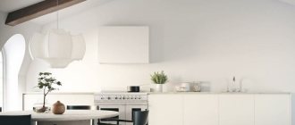
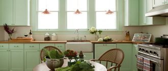
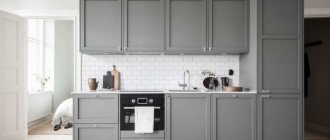
The kitchen interior, decorated in red and white colors, is a bold and original idea. This option is suitable for people who do not follow stereotypes and are not afraid to realize their own fantasies.
The white and red interior will always invigorate in the morning, and in the daytime it looks elegant and solemn. There is no shame in showing off a kitchen in these colors to guests; it looks modern and unusual.
The main thing when arranging a room is to correctly determine the proportions of red and white colors, not to go too far with scarlet elements, so that the kitchen does not look cheap and vulgar.
What style is suitable for decorating a kitchen in red and white colors?
By furnishing your own kitchen in white and red tones, you can create many different styles. You should consider those that will look most harmonious when decorated with the indicated colors.
“Eco-style” , “classic” or “Japanese” style - to decorate such kitchen interiors, it is best to use matte furniture in a muted red color. Moreover, there can be quite a lot of red facades, but this color should predominate in the upholstery of chairs, the finishing of a kitchen apron, mosaics on the wall; decorative vases and dishes can be red.
Walls, curtains (they can have red patterns), ceilings, and work surfaces should be made white.
Art Nouveau style - when creating it, an abundance of red color is welcomed. It is advisable to use glossy versions. Coral shades are suitable for facades, curtains, and decorative elements. You can add several red lamps made of glass.
Even the walls can be red, but then white should prevail in the kitchen set. When creating such an interior, you should give preference to expensive materials.
Provence style - this cozy, calm and sweet rustic style will also look great in red and white shades. Of course, it is best to avoid using furniture in purple colors - ideally, if it is white. Red color should be present in the form of colorful curtains on the windows, lace tablecloths, and kitchen utensils.
Above the dining table you can hang a large lamp with a red textile lampshade. The finishing touch will be a white kitchen apron, decorated with large scarlet polka dots.
“High-tech” and “minimalism” style - even such austere interiors can be played up with the help of red, provided that it is skillfully combined with a white shade. The main thing is to choose the most modern furniture made from synthetic materials - glass, plastic, artificial stone, metal.
The predominant and main color here should be white, red will only add accents and emphasize the futuristic nature of the interior. You can choose scarlet colored household appliances; such a solution will look bold and unusual - just in the spirit of “high tech”.
Country style - red and white shades suit it just perfectly. When choosing furniture for such a kitchen, you should choose a set made of natural wood or its imitation. The color of such a set can be white or natural (with a wood pattern).
The walls and ceiling should be white, red should be present in textiles - in the form of red checkered curtains on the windows, a checkered tablecloth, a small rug under the dining table. Dishes and some kitchen utensils (for example, pots displayed in a visible place) can be red.
When arranging a kitchen in a Mediterranean style, it is best to avoid using red, since all shades of blue, green, as well as beige, olive, brown and gray will look more natural in this interior.
A wealth of styles
1 A striking blow to high technology
Straight strict lines, an abundance of glass, plastic and metal, precise functionality of space down to the millimeter are the main features of the high-tech style. Not a home, but a favorite office.
But you want warmth and comfort. Even the most office-like kitchen can be easily domesticated if shades of red are used in the design. Dark cherry, raspberry, scarlet go well with chrome parts and black and white inserts.
A relatively new direction in high-tech design is eco- and bio-tech. These styles, with the same rigor and pragmatic approach to organizing space, do not argue with nature, but conduct a dialogue with it.
When decorating a room in these styles, a combination of antagonist colors is used - green and blue. It is appropriate to decorate with a red-orange duet.
2 Industrial loft sound
A relatively young architectural style has reached our latitudes. Loft (from the English loft - attic) was very popular in the bohemian environment of New York in the 50-60s of the last century.
Then creative people began to use factory, warehouse and office space for studio apartments. They cost an order of magnitude cheaper than ordinary apartments and promised considerable opportunities for the implementation of creative ideas.
Even a small-sized “Khrushchev” can be turned into a bohemian loft. The main thing is to correctly zoning the space and choose a palette.
A raw brick wall in terracotta or deep red makes the perfect backdrop for rough-hewn wooden shelving and glass-topped metal chairs and tables.
3 The understated sophistication of Victorian England
Typically, living rooms, offices, and sometimes bedrooms are decorated in this style. But even your favorite kitchen, when combined with noble burgundy and dark wood, can transport you to Victorian England in the mid-19th century.
The peculiarity of the style is eclecticism. Rococo, classic, gothic and exotic are combined here. Exotic, in this case, is exclusively Chinese or Indian. Leave other oriental delights for another style.
The main thing to consider when choosing this style is that the entire apartment should be designed in the same spirit. Victorian England does not tolerate competition with other design trends.
4 The East is a delicate matter
The most beneficial choice for red cuisine is oriental style.
All shades of red are actively used in interior design in Arabic, Moroccan, and Chinese styles. The only difference is in the decorative details, color combinations and space style.
Openwork carving and abundance of ornaments are characteristic of both Arabic and Moroccan styles. The only difference is in the selection of colors.
Arabic style is characterized by the use of basic neutral tones with bright accents, including red, burgundy, ruby and terracotta.
Moroccan style involves the use of more saturated, heavy “spicy” color ensembles: a combination of dark blue, purple with burgundy, carmine red, warm yellow, emerald.
Chinese style also favors red. The space is clearly zoned with decorative screens, textiles and wallpaper are painted with images of birds, flowers, and mythical animals.
Chinese style, like no other, has a natural combination of colors: dark green, blue, white, black, purple, gold - and all this within one room.
Rules for combining red and white colors when arranging a kitchen
A kitchen decorated in red and white colors is often called royal. It emphasizes the individuality of the home owner and looks bold and unique.
In order to “pull out” the full potential of a room furnished in such colors, you should competently approach the issue of their combination - in other words, choose the right proportions and place accents. The main options for combining white and red should be considered separately:
White top and red bottom
In this case, the lower part of the kitchen facades and the floor covering may be red. This option can be chosen for arranging a kitchen in the “modern” or “high-tech” style. In this case, red can be glossy, and white can be matte.
To make your kitchen look expensive and stylish, you should choose more muted shades of red or burgundy, avoiding too bright tones.
White bottom and red top
It is known that red color has the ability to visually “bring closer” objects, this is especially acute on a white background. Accordingly, the choice of combinations of “white bottom and red top” is possible only when arranging a spacious kitchen with a high ceiling. Otherwise, such a room will look somewhat aggressive. In any case, the red color in this version should not be bright, but muted, preferably matte rather than glossy.
White kitchen with red apron
An excellent option for arranging a kitchen in almost any style. To make the room more interesting, you can adopt one of the following options: decorate the backsplash with bright ceramic mosaics, make an apron from tiles in the form of a red and white checkerboard, or choose a bright red ornament made on white tiles.
The option of using monochrome red color when arranging an apron is also quite good.
White kitchen with red countertop
This option is suitable for decorating a kitchen in the style of “minimalism,” “modern,” “high-tech,” and “art deco.” It is best to use artificial stone, tempered glass or plastic as the material for the countertop.
Zoning a white kitchen with red details
An excellent solution for arranging a kitchen that also serves as a dining room. Some levels of suspended ceilings and bar tops may be red. Red color should also be present in the decorative elements of the room.
Kitchen-living room scarlet color
Classic scarlet is rarely found in ordinary apartments, because their area does not allow it to fully reveal its potential. He is quite capricious and eats up free space with amazing greed.
But in the context of spacious kitchen-living rooms there are no problems with this. The absence of partitions does not prevent the intense scarlet hue from spreading over the entire area. Therefore, it can be used a lot without any risk of getting a color imbalance in the room. For example, as the base shade of a kitchen set.
Or for decorating furniture. There is traditionally a lot of it in kitchens and living rooms.
Most often, scarlet is combined with gray and white. Everything is logical: they favorably emphasize its intensity and at the same time contribute to the establishment of color harmony in the room.
True, there are other, much more exotic options. It’s worth considering them, especially if you are partial to originally designed interiors.
The combination of red and white with other shades
When decorating the kitchen interior in white and red tones, it is not at all necessary to use only these two colors. They can be successfully complemented with other shades that will give the room even more charm and make it more interesting.
So, which third color should be preferred in this case? There are not many options, since not all shades will look harmonious in combination with red and white.
Black color
Perhaps this is the most successful solution. Black will fit perfectly into any style, while it harmonizes wonderfully with other shades. When arranging a red and white kitchen, you can make the floor, some furniture fronts, countertops, and chairs black. Beautiful black dishes will fit perfectly into such an interior.
Grey colour
Also a good option, discreet and stylish. In any case, gray color will remain neutral and complementary to other shades. It is best used as a background - for example, paint the walls gray. Gray can also be used for window blinds, work surfaces and some decorative elements.
Brown color
If used skillfully, it will look very good in the interior of a red and white kitchen. This shade is best used when arranging interiors in the Provence, Country, and Classic styles.
Some elements of the kitchen set, chairs and table may be brown. The kitchen floor can also be brown. The main thing is not to use this color too intensively; it should still act as a kind of background, and not the main color.
Drawings and texture of materials
Quite often, designers play up the richness of red through a combination of textures and prints. This technique is especially used in modern styles and neoclassicism.
- "Animal" and plant patterns. with their help you can decorate one of the walls in the kitchen. These can be either discreet lines or large drawings.
- Wood has an interesting feature of softening even the roughest interior. A red and white kitchen with shades of light wood is considered the most harmonious design option. Wood can be present both in the form of shelves and as flooring - parquet or laminate.
- Figured tiles. “Boar” or “scales” will add home comfort to the kitchen. Most often, an apron is decorated in a similar style. You can choose either plain or patterned tiles.
- Stone. It will help balance the riot of red color and is perfect for finishing the floor, decorating a tabletop or apron. Preference should be given to natural stone, but artificial stone is also allowed.
How to choose curtains for the kitchen in white and red tones
Textiles in the kitchen (if its presence is provided for by the chosen style) play a big role in arranging the kitchen, and can literally transform it. Well-chosen curtains will emphasize the elegance of the room, make it more comfortable or stylish, add elegance or add brightness.
When choosing curtains, first of all you need to take into account the overall color saturation of the kitchen. In other words, if there is already so much red in it, it is better to refuse red curtains on the windows.
Such curtains are not suitable for a small room with insufficient natural light - in such cases it is worth using white textiles. If the design allows you to choose red curtains, you also need to choose a tablecloth, towels, soft chair seats, and some decorative elements to match them.
Choosing the right shade
What makes red so attractive is that it can be presented in both cold and warm shades.
You need to choose based on the configuration of the kitchen and the options for opening its windows - on the north or south side.
| Cold | Warm |
| carmine red | scarlet |
| alizarin | carrot |
| cardinal | Red tree |
| crimson | Titian |
| watermelon | pomegranate |
| ruby | coral red |
| burgundy | tomato |
| wine | port wine |
| Red Rose | red chicory |
Designer tips
Irina
founder of the interior studio, architect and interior designer. The main area of work is kitchen design
Remember a simple rule: for a kitchen with windows facing north, all shades with elements of yellow, orange and brown are suitable. Get a cozy and warm space with a well-balanced color balance. And vice versa: in kitchens facing the southern part, purple shades and a blue bias will be well revealed.
What wallpaper to choose for a red and white kitchen
Red wallpaper can be used to decorate not every kitchen room - the use of this color depends on the chosen interior style and other factors. You should not choose red wallpaper if the kitchen is small. In this case, it is better to use this color when decorating other details, and still make the main background white.
Red wallpaper is appropriate when decorating interiors in the style of “country”, “minimalism” and even “high-tech”. The main thing is that the room is spacious. When arranging a kitchen in a country style, it is best to choose patterned wallpaper rather than monotonous red wallpaper.
In the remaining proposed options, the wallpaper should have a monochrome red color, without patterns. You can decorate such walls with the help of decorative elements - paintings, mosaics, hanging clocks, etc.
Photos of small kitchens
For a small room in a Khrushchev-era building, a set with a combined scarlet bottom and a top in white, beige, brown or gray shades is suitable. Also, facades decorated with glass inserts will help add additional lightness to the room.
In a small kitchen, it would be better to install a set in more muted colors so as not to oversaturate the interior or use fiery color in the form of individual decorative elements.
To decorate a small red kitchen, it is recommended to choose a more modern style direction, characterized by a minimum number of decorative details.
Floor and ceiling in the interior of a red and white kitchen
When decorating the ceiling in the kitchen, you should not make it completely red. This color can only be used when creating a multi-level ceiling, for some of its parts - and then only if the room being furnished has a sufficiently large area.
In small and cramped kitchens, it is categorically not recommended to make the ceiling red, but a red floor will look quite harmonious in them.
When arranging a red floor, you can use different materials - ceramic tiles, laminate, wood; a good option would be to use a self-leveling floor. The shade should not be too bright; it is preferable to choose a burgundy color, which does not look so aggressive.
When arranging your own kitchen in red and white, it is important to stick to the golden mean and not go to extremes, then the room will look stylish, expensive and elegant.
Color Features
There are several characteristic features:
- Fiery shades not only have a positive effect on a person’s mental activity, but also give the room a more comfortable and welcoming look.
- With proper proportions, this color visually expands the area of the room.
- In psychology, it is believed that energetic scarlet tones excite the nervous system, stimulate blood circulation, stimulate appetite and have a positive effect on the emotional state.
- Since the red palette is hot, in rooms located on the south side, it is better to use it in minimal quantities or in combination with cool companion colors, such as blue, light blue or gray.
- This color scheme is practical, which is especially beneficial for a room where dirt often occurs.
- Feng Shui philosophy does not encourage the use of a lot of red in the kitchen, since an excess of the element of fire can be created in the room and an aggressive atmosphere can be formed.
Red and white kitchen real photos
Red set
Red furniture can be found in many modern kitchens. Facades are often made from MDF covered with veneer, melamine or plastic.
In the manufacture of the most budget options, laminated chipboard is used.
Luxury furniture is often made from natural wood. Red woods are ideal for this.
Modern technologies and a variety of colors make it possible to obtain an incredibly wide color palette of shades of red, thanks to which everyone will find the optimal solutions for themselves.
The metallic effect on the facades will look stylish and impressive. Glossy surfaces look simply amazing, both in small and fairly spacious rooms.
Application
Kitchens with red colors are not as simple as it might seem at first glance. Due to the large number of shades, they can fit perfectly into virtually any style, neatly complementing it, bringing uniqueness and uniqueness to the interior of the entire house.
The color red is also associated with order and the precise arrangement of all objects in the room. That is why it is very important to carefully calculate everything, only then such an interior will look excellent.
Gray trim and curtains
About everything except the headset itself.
Walls and lighting
An important point: even with a gray kitchen, accents on the walls are not needed, they should just be a neutral background.
The reason is too high a load of objects + no free walls. I already wrote about this in an article about choosing wallpaper for the kitchen, but in short, there is usually a maximum of 1 wall near the dining table, which can become an accent wall. The rest have a window with a radiator, a set of furniture, and an interior door.
Therefore, the best option for walls for a gray kitchen is plain or with an unobtrusive texture, white or gray. This can be achieved with paint, paintable wallpaper, or decorative plaster.
The only exception if you really want something bright is an apron. Patterned or marbled tiles fit well into gray interiors.
Are you afraid that it will be boring?
The answer for modern renovations is, as usual, lighting.
Lighting is the basis of stylish design.
For a kitchen, at least backsplash lighting is required. Moreover, it should be turned on with a separate button at the entrance, and not on the apron itself.
When you're not cooking or cleaning, but just stopping by to grab a snack or make coffee, there's no need to use a bright overhead light.
If you make it convenient to turn on non-main lighting at the entrance, you will use it more often than the main one.
The second important place is the dining table or bar counter. It’s nice to eat food when it’s well lit, but in the room itself the light is not bright (have you noticed that this is the case in all restaurants?). Therefore, if there is a dining area, pendant lamps above it are required.
These are at least 3 lighting scenarios, thanks to which even a monochrome kitchen in gray tones will not be boring.
By the way, we are in:
Ceiling and floor
With a ceiling for a gray kitchen, everything is as simple as for any other:
- White, matte, smooth - no brainer
- Ideal when the upper cabinets reach the very ceiling
If the ceiling is low, point 2 can be achieved by making the upper cabinets larger. When the ceilings are 2.6+ meters, then either 1 more level of cabinets is made (based on the mezzanine principle), or a plank is installed, or the ceiling is lowered exactly in the cabinet area.
Floor options for a gray kitchen:
- In contrast to the tabletop and apron (the brightness should be appropriate - not too bright and not too pale).
- Gray floor with a different texture (concrete, stone, marble).
- It looks interesting when the same porcelain stoneware is used on the floor and backsplash, for example, to match the same marble or concrete. Minus - you will have to overpay for holes in porcelain stoneware (it is difficult to drill).
- Standard wood laminate. In short, you can use it in the kitchen, but be careful that there is no puddle left that would not dry up on its own within an hour.
What not to do: combine different types of tiles and lay out patterns from them. This is the last century.
About choosing a floor for the kitchen.
Red table top
If you are a fan of creative and non-trivial designs and a red kitchen seems too banal to you, use this color as an accent color. We advise you to pay attention to the tabletop of this color.
Products made from laminated plastic will delight you with the richness of textures and an incredibly wide palette of shades.
A noble and solid appearance is guaranteed by countertops made of artificial stone. They are very similar in texture and color to natural ingredients.
To prevent such a countertop from seeming alien in your kitchen, for its edge choose the same material that you use when decorating your work apron.
Key disadvantages of red kitchens
1. Excessive activity. Color should be used in doses.
2. Excessive emotionality. Even lovers of bright spaces can eventually get tired of the expressiveness of red.
3. Difficulty in choosing a range. Red is an active color, and it often makes sense to pair it with neutral shades. However, in combination with the most commonly used ones - white and black - scarlet tones can look too contrasting, and even vulgar. It is important to choose a color scheme that would look appropriate and harmonious with your shade of red, and this task is not an easy one.
4. Vulgarity. Continuing the previous drawback: the color red (especially the brightest, most catchy versions of it) is often perceived as vulgar. Especially if you do not observe the measure when introducing him into the situation.
5. Associations with tasteless design. Just a few decades ago, red sets with glossy facades, intricate shapes and aprons with photo printing were found offensively often in domestic interiors. And although scarlet facades themselves are not bad at all, for many they still evoke associations with tasteless design.
6. Difficulty in decorating. Kitchen design in red is active; photo collages, paintings on the walls and other decor may already be redundant.
Selecting curtains
It is better to combine a neutral shade of curtains in light colors with a red set. Kitchen curtains can have red stripes, red loops or tiebacks, burgundy embroidery or inserts.
The optimal length would be short curtains over the sink, Roman curtains, roller blinds or blinds.
Long curtains are suitable for a window near the kitchen table.
For the kitchen, it is better to choose a mixed fabric, synthetic with dirt-repellent impregnation, which will not fade in the sun and tolerates frequent washing (organza, a mixture with viscose, polyester).
Combination of facades
Red kitchen sets can be plain or made up of two or three shades. Modern headset configurations allow you to combine tones in different ways - horizontally, vertically, in a checkerboard pattern. You can take ideas from the presented photos of red kitchens.
Red with white
This classic combination is suitable for a kitchen with a low ceiling. In this case, the upper cabinets should be white and, if possible, reach the ceiling (three-tier set with mezzanines). Due to this, the upper parts of the walls are perceived higher. For the opposite option (red top and white bottom), it is better to take a softened shade of red. It can be either light or dark.
Another classic option is a red beige kitchen. The contrast in this case will be less sharp, which predisposes to creating a cozy atmosphere. The rules for combining the colors of the upper and lower cabinets in this case are the same as with white.
Creamy and creamy tones also harmonize well with muted shades of red. Wooden furniture, painted in muted reddish tones, is well suited for country and classic interiors.
Red with black
Most of the area of the facades in such sets is usually occupied by scarlet color. If you choose black as the dominant color, there is a risk of getting an overly gloomy and dramatic interior.
Since black and red furniture looks quite gloomy, it should not be placed in cramped spaces with a lack of natural color. The walls and floor with such a set should be neutral.
Lower cabinets are usually made black; in this case, it is better to choose them matte, and the top ones - glossy. An option with a checkerboard alternation of elements is also possible, which helps to slightly smooth out the contrast of these catchy colors. In this case, the apron can be made white.
Another option is a matte red kitchen, complemented by a black salt and pepper countertop. This set fits well with the decoration of walls and floors in gray tones.
Red with gray
For a red-gray kitchen, deep shades of gray with purple undertones are usually used. Their combination with rich scarlet is suitable for kitchens in modern styles - from simple minimalist to avant-garde options.
This set will be complemented by a gray countertop, steel fittings and open built-in appliances. The apron in such a kitchen can be decorated with slate paint. Cold beige and light shades of brown will help lighten the interior.
Red with wood
This option is well suited for country style. In this case, the red set should have matte facades and a muted color (dark or pale). Artificial aging would be appropriate. The tabletop and fittings are made of wood, and the apron can be made in brown tones.
Red with yellow
A set in this range creates a sunny atmosphere in the room and is suitable for a poorly lit kitchen with windows facing north. But so that the design is not perceived as too “hot”, it needs to be diluted with neutral tones - beige, light brown, milky.
Also, when combining facades, you need to decide on the main and complementary tones: two warm colors, taken in equal proportions, will not give a very harmonious interior.
Red with green
This solution looks lively and expressive. But, having chosen it, you need to remember the importance of choosing shades: choosing a harmonious combination of green and red tones is quite difficult.
It is better that both colors are clearly cool (for example, emerald with raspberry) or warm (lime with orange-red).
Red with blue
This is a good option for a sunny kitchen. In this case, cool shades of red are used, otherwise in the summer the kitchen will be perceived as especially hot. If the windows face south, red shades require dilution with neutral and cool tones.
With brown
This combination is less harsh than with black, and also has a calming mental effect. Brown feels good in styles such as country or Provence.
It is complemented with garnet, but it should not be aggressive; burnt or muted shades are suitable for better contrast with matte finishes.
How to decorate the floor with red tiles?
Whether you want the orange-red tones of terracotta or a screaming fire engine red hue, you can achieve a truly impressive effect with a tile floor like this. It will be invigorating and energetic, and the secret here is to let the gender play the leading role and be careful with other colors .
Red tiles can be used as a bright accent
Do not repeat it on other large surfaces!
No matter how much you love red flooring, the color cannot be replicated on other large surfaces such as countertops, walls, furniture and appliances. It's a strong color that can easily become overdone.
When you enter the kitchen and see the “sea of red”, the eye will not notice individual elements, including the floor.
Repeat it in accents
However, adding a few small red accents will highlight the floor. You can use a teapot or pots, or include patterned fabric with red for windows, chairs or napkins. If you have open shelves or glass-fronted cabinets, paint the back walls red.
Add other colors
If you don't want a weak onion, add other colors. Three will be enough, and this rule works great with a lot of interiors, especially with the 60-30-10 rule. This means using 60% of the dominant color and 30% and 10% for the second and third colors, respectively.
Color cannot be repeated on other surfaces
If you don't have a lot of wall space, you should allow red to become the dominant color. Wood details, metallic finishes or earth tones of tiles do not count. Use light neutrals such as:
- bronze;
- Ivory;
- white;
- light grey.
Colors like black, taupe and taupe are much more difficult to highlight, but the result mostly depends on how much you decide to use on one element.
The gaze should be directed upward
A red tile floor usually serves as a focal point, but you don't want people constantly looking at it. You can elevate the focal point with a gallery wall featuring framed art or a display display with a collection of vintage china.
Option for using red tiles in the kitchen
You can hang art glass pendant lights over the island, or even hang a chandelier over the table. Windows should be complemented with top details such as fringe.
VIDEO: Chic interiors of red kitchens
Red kitchen
Magnificent interior
Red and green design
Red can also be combined with green by choosing the right shade. The best option for many may be olive, herbaceous, light green.
This is a very effective design move that will definitely be appreciated by lovers of bold, non-trivial experiments.
Focus on green by using red as accents: chandelier, textiles, dishes, household appliances, vases, napkins and even dining room furniture.
Experiment with both shades and combinations. Ideas can be drawn directly from nature, where such combinations can be found very often.
Types (glossy, matte)
Based on preferences, the red set can be glossy or matte; you can also combine the type of facades, for example, make the top glossy and the bottom matte.
Glossy kitchen set
Reflects light, is suitable for any kitchen, can be cleaned, but is also easily soiled by hand marks.
The photo shows a red glossy corner set in a rectangular kitchen with a gray kitchen apron and countertop.
Gloss in red tones is combined with a matte floor covering and work surface to avoid oversaturation of gloss.
Matte red set
It looks discreet, does not show fingerprints, is suitable for a classic style, and can be combined with matte and glossy floors. Discreet and familiar appearance of the facade.
The photo shows a matte kitchen set with a glass splashback with a print and neutral Austrian curtains.
