If a black and white kitchen is a guideline for your next renovation, then start planning it now. In order for a monochrome interior to really look interesting, stylish and cozy, you need to take into account the key aspects of the perception of a contrasting pair, as well as accurately calculate the proportions of the color combination. It’s not that simple, but with the help of real examples we will tell you about all the secrets of design and show you the most successful options, in our opinion.
Pros and cons of black and white kitchens
But first, let’s weigh all the pros and cons. The first one includes all the advantages of choosing a black and white color scheme for decoration. The second includes obvious (or not so obvious) shortcomings. There are enough points in both groups.
pros
- excellent reflection of light - thanks to this, the room seems more spacious, and the selected lighting reveals well in dynamics;
- stylistic versatility - such a kitchen can be decorated in both a modern and classic style;
- ample opportunities for zoning - one area is easily separated from another by a contrasting pair;
- therapeutic effect - works with muted tones in a cozy intimate environment;
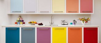
- combination with bright shades - a black and white pair helps to greatly reveal the potential of the introduced companion color.
Minuses
- difficult to care for - stains are clearly visible on a dark surface, but a white surface gets dirty very quickly;
- fine adjustment of the balance - it’s easy to end up with a gloomy and uncomfortable room or, conversely, a sterile hospital environment;
- not suitable for kitchens with small windows - if in the evening the lack of lighting is corrected by well-placed lamps, then during the day the room looks downright dim;
- a more stringent selection of accessories and decor is required - not all shades will be able to organically fit into the contrasting pair you have chosen;
- the volume of the room decreases - this effect is observed in cases where black is used with white in a ratio of 1:1 or lower.
Features of color perception
Black color almost completely absorbs light rays. Because of this, it needs to be used in doses when decorating a living space. When used correctly, you will have a modern, elegant interior with a deep atmosphere.
White just neutralizes all the darkness of a dark shade, creating that interior balance that we need to feel psychological harmony. It is ideal for a contrasting pair not only because of its location in the color wheel: if black blurs the boundaries of space, then white, on the contrary, helps to emphasize them, streamlining it. As a result, the room acquires the correct geometry with accents beautifully placed throughout the entire area.
Read more about decorating a kitchen in white here.
Design secrets
You can make a real “candy” out of a monochrome kitchen if you know the basic nuances of interior design and correctly take into account how black and white colors are revealed in space.
Correct proportions of color combinations
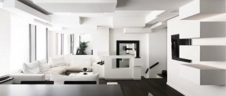
There is no exact answer as to which of the two colors of the pair should dominate the space. In principle, you can maintain a 1 to 1 ratio and decorate the room in such a way that both black and white are harmoniously distributed across all main zones.
Designer tips
Irina
Irina Polyakova is the founder of an interior studio, architect and interior designer. The main area of work is kitchen design
There is a simple rule that can help: the smaller the room, the more light shades it should have. And vice versa: in spacious kitchens, black reveals its potential better, so it needs to be used more.
There is a clear logic in the words above: white color eliminates the lack of square meters, creating a lasting illusion of expanding space. Therefore, it should be used in a ratio of 3 to 1.
But if there is an excess of usable space, it is better to stick to a 2 to 1 ratio in favor of black. This is a reliable way to create a harmonious living space without being overwhelmed by a dark background.
Bright accents in a monochrome interior
If the black and white interior you modeled seems empty and lifeless, introduce additional bright accents into it.
This is not so simple: if they are selected incorrectly, they will look inorganic.
Therefore, follow some rules:
- allocate no more than 10% of the entire interior area to accents - while the contrasting pair accounts for the remaining 90% in different proportions;
- a bright lamp placed in the center or a colorful sofa in the dining area will dilute the overall monochrome and make the atmosphere more vital;
- the fewer accent shades you use, the more noticeable they are;
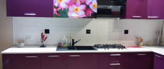
- If you have a strictly minimalist design and have nowhere to place bright decor, use an apron - it will stand out from the general background and transform your kitchen.
Read about fashion trends in kitchen apron design in our separate article >>> go.
Lighting
The black color itself “remarkably” conceals space and absorbs light, so without properly adjusted lighting in a monochrome kitchen it will not be possible to achieve comfort.
A clear and well-thought-out lighting scenario is required, completely eliminating the appearance of dim areas. For this:
- think over the lighting scheme BEFORE repairs;
- when determining the number of lamps in a room, proceed from the total area of the room and the arrangement of the main zones in it;
- use auxiliary lighting to create spectacular accent areas (for example, sconces above the dining area);
- Mix and match different types of fixtures to get the most effective lighting possible, but stick to the overall style aesthetic.
Lighting in the kitchen
Dim light, which is replete with harsh shadows, will make a black and white room very uncomfortable and will not allow it to look impressive. Therefore, the ideal lighting would be a soft and warm white option. But you are unlikely to be able to achieve such an effect with just one chandelier. Install wall sconces and floor lamps, as well as point sources around the entire perimeter of the ceiling. Don’t forget about lighting the furniture, work and dining areas - this will play into your hands and transform the monochrome in an unusual way.
Thanks to the right lighting, you can adjust the geometry of the kitchen. A narrow kitchen will be corrected by lamps located along one wall, but if you have low ceilings, wall sconces directed upward will help. Despite all the benefits of proper lighting, there is no need to flood the room with too much light. Also don't forget about saving. Use LED lamps, they will significantly reduce energy costs and last you much longer than incandescent lamps.
Finish options
The effectiveness of implementing a contrasting black and white pair in the kitchen space is determined not only by the proportions, but also by the material used for decoration. And also the place of its application.
Floor, walls, ceiling
Decorating the walls with black is a bold decision that you can only afford if you have a significant supply of usable space.
It is much more reasonable to take a snow-white coating as a basis and complement it with contrasting inserts. Wallpaper is most often used in the kitchen. Ordinary ones won't do - you need washable ones, because when cooking, fat and soot will invariably settle on the surface.
You will find fashion trends in kitchen wall design in our separate material >>> go.
A compromise option is a combination of black and white. Paired or in unequal proportions - not so important.
As for the ceiling, there are also no surprises here - it is best to design a classic white stretch ceiling. If you want a beautiful play of light, go glossy - you will get really interesting light scenarios with artificial lighting and decorative lighting.
Of course, there are also black ceilings. As a rule, they act as a contrast to a room decorated in white.
The floor is made of either linoleum on a polyurethane foam base or tiles. Don’t buy laminate: it is, of course, easy to install, but even waterproof ones suffer from frequent temperature changes. The voiced options are much more practical to use. A completely black floor should only be done if the facades of your kitchen unit are decorated in white. Otherwise, the contours will merge and the room will lose its correct geometry.
But an always relevant solution in terms of color distribution is a black and white floor made of ceramic tiles laid in a checkerboard pattern. It looks especially impressive in combination with exactly the same apron.
Apron
It is recommended to make the apron black only if you have a strong predominance of white in the room. Then it will be a spectacular dark spot and eliminate the feeling of hospital sterility. Along with this solution comes the problem of maintenance: stains and drips on it are always clearly visible.
In all other cases, it is better to make an apron:
- monotonously white - does not require special attention, beautifully emphasizes the black countertop;
- a combination of contrasts - both black and white in different proportions;
- any other color - this will be a so-called companion, as close as possible in temperature, for example, gray.
The trend now is the patchwork style - a combination of different patterns on one plane in equal segmented shares. Look how organically this mosaic fits into a monochrome interior.
Other popular design solutions include snow-white porcelain tiles imitating stone, with characteristic streaks of gray or black. It’s good if the tile is 60x120 in size - then it will look monolithic and impressive.
Designer tips
Irina
Irina Polyakova is the founder of an interior studio, architect and interior designer. The main area of work is kitchen design
If you have a loft, then try decorating the apron with artificial stone based on concrete. You can take a basic white brick, treat it with varnish to prevent it from collecting dust - and you will get a wonderful imitation of brickwork. If you prefer black, a simple method works - painting. Or, as an option, buy already painted bricks that are completely ready for laying.
Tabletop
The choice of texture depends on the style of the room. For classics, imitation granite or marble is best suited. Since contrasting design is used, the color of the countertop should contrast with the facades. However, black has an obvious disadvantage - all the stains are visible, so maintenance will be difficult.
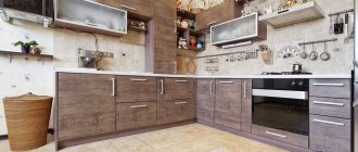
If you have a minimalist interior in the Scandi spirit, wood finishes will look quite harmonious. There are excellent options with a fawn texture: it is as close to white as possible and greatly refreshes the room.
Floor and walls
The color of the walls and accent colors are discussed in detail in the article “What you need to know about white kitchen facades”; the colors of these colors are also given there. The walls can be painted in these colors or covered with wallpaper. Don't choose floral wallpaper. The ideal option is colored wallpaper with a white pattern. The white color deserves a separate discussion . Against their background, the white kitchen dissolves, visually increasing the space. This effect works for small and large rooms. But there are several difficult points here:
- use this technique only with black or steel equipment
- avoid snowy white shades,
- use very rich accent colors.
Why are white walls so good? Shadows and highlights on the surface of black equipment, especially glossy ones, will not contain reflected light from colored walls. The black color will become deeper and more concentrated. This clear contrast will remain even in daylight. White floors will make the kitchen space even more voluminous; the boundaries of the floor, walls and ceiling will disappear. This technique requires additional visual reference points; they are often floor-to-ceiling panoramic windows. If there are no panoramic windows in your kitchen, use more traditional flooring options - wood, black and white tiles (quadrangle or octagon), light tiles with a geometric pattern.
Small white kitchen with white walls and floors.
Such floors will emphasize the boundaries and structure of the room.
Choosing a style for a black and white kitchen
We have already mentioned one of the advantages of a monochrome interior - it can be designed to suit almost any style: from classic to brutal loft. Let's consider its implementation methods in more detail.
Modern directions
This is fusion, Mediterranean style, and contemporary - in any case, the black and white palette reveals its relevance, but only in combination with companion colors.
Classic and neoclassical
The good old classics are characterized by the use of dark carved facades and snow-white stone textures to decorate the countertop or work area. Or vice versa, if the room is small and does not tolerate too much black color in the space.
The geometry is as close as possible to the correct one, but ornate outlines are allowed - one of the features of the neoclassical movement. Massive curtains also contribute to the distribution of contrasts, but in a small room it is not recommended to use black for them - it will look even smaller.
High tech
The black and white design seems to be created for a strict and ascetic high-tech style. Perfect ergonomics are complemented by simple geometric shapes.
Facades are most often glossy; the use of chrome fittings or steel elements in the space is encouraged.
A good solution is a dark table with metal legs. Household appliances should also be selected according to the contrast method: for example, on a white countertop - a dark microwave, etc.
Minimalism
It often echoes high-tech, but differs from it in the smaller number of details in the interior and a clear focus on the predominance of white over black. As a rule, it dominates in a ratio of 70 to 30 (%).
Decorated in black:
- kitchen facades;
- work zone;
- floor.
But it’s better to refuse curtains: they can be replaced with more modern roller blinds or classic blinds.
Loft
This style is distinguished by its emphasis on the industrial atmosphere, which is why the decoration contains metal elements and brick. Of course, he loves space: it is convenient to decorate the kitchen-living room with active use of chrome and steel elements. They actively dilute the monochrome aesthetics with industrial motifs, but do not destroy the color balance.
Since there are enough square meters, you can use scorching black facades or even decorate one of the walls with glossy dark tiles. Unlike matte texture, it perfectly reflects light and saturates the space with its marvelous play under artificial lighting.
Features of choosing wallpaper, curtains and decor
The choice of finishing and decor will depend on the interior style and color scenario. In a monochrome kitchen, you can use decor to support a dark countertop by using small objects in the interior as black accents. For example, a bold and unusual decision would be to make black curtains in the kitchen to match the black countertop or paint one of the walls black. The last option, by the way, is an excellent technique for creating optical illusions: a black wall visually dissolves the boundaries of the room and creates a feeling of endless space, which is very important for a small kitchen.
If in the interior, in addition to black, white and their shades, other colors are used, then with the help of wallpaper, curtains and decor you can harmoniously distribute tones and place bright accents.
Notice how the colors are distributed in this interior in the photo below. Upholstered kitchen chairs serve as bright spots. The main emphasis is placed on them, but in the overall color scheme blue occupies no more than 20%. A blue glass vase neatly and unobtrusively emphasizes the main accent and does not argue with it. Wooden elements in the design of the floor and chair legs act as a second shade and further soften the black and white contrast.
A color scheme
Your final harmony when using the kitchen depends on how exactly the contrasting pair is implemented in the interior space.
White top black bottom
The same balance that, if not everyone, then at least the majority, strives for. The space is extremely balanced, the furniture is decorated in black and has clear geometric contours.
It is not at all necessary to make the floor strictly black: you can use a combination with white and lighten the room a little. But if you have a large kitchen of 10 sq. meters, then try: use linoleum with an unobtrusive pattern or porcelain tiles stylized as stone or wood.
Black top - white bottom
Not the most common combination, but it is quite justified if you are not building an original interior according to templates and prefer a corner layout.
However, you should refrain from using a large number of details: with such a distribution of color load, they will look extremely intrusive - and the perception of the kitchen will be seriously distorted.
Instead of full-fledged cabinets, you can use open shelves or racks.
Black apron and white set
If you have purchased a beautiful kitchen set, then a blue-black apron will perfectly highlight its snow-white facades. But if the kitchen is small, it still wouldn’t hurt to have at least a small amount of patterns or white inserts on it.
In other cases, this is a wonderful combination that ennobles the interior and at the same time wonderfully organizes visual order.
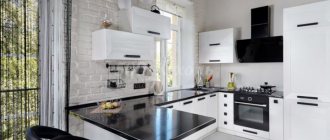
Black countertop in a white kitchen
The deep black color looks impressive against the background of snow-white facades. This creates the illusion of expanding the space, so this combination is recommended when arranging small kitchens.
The material for the countertop can be used:
- glass;
- stone (marble);
- MDF
- plastic.
The choice of glossy or matte surface is entirely up to the owners. Each option has disadvantages - scrupulous care will be required in both cases.
White countertop and black furniture
This combination works well to expand the space: the visual composition of the set is facilitated by the illusion of rounding the upper and lower cabinets. True, you should take the choice of material seriously: laminated boards will only be a temporary solution, but acrylic stone will solve all problems for many years. In addition, it can be sanded, so scratches are absolutely not a problem.
There is not and cannot be any connection to the style: the combination is extremely harmonious both in classical design and in modern designs: high-tech, contemporary, fusion, etc.
White set and black dining group
A very smart combination that corrects too much white in the interior. The contrast with light facades makes the kitchen more interesting, emphasizing its depth and significantly expanding the space.
This is a good tool for setting the right accents, even if black is used exclusively on table legs or chair trim.
Black appliances in a white kitchen
This is a real life hack for those who want to see a contrasting kitchen, but are afraid to introduce a lot of black into the space due to the lack of usable space. Not only small appliances like a coffee maker or toaster can be black, but also large household appliances: for example, a refrigerator or oven.
Also, this combination looks great in the format of Scandinavian interior and hi-tech. Or any other style based on clear geometry and conciseness.
Small black and white kitchen
In medium and large kitchens, black and white colors are most often used in equal proportions. With small rooms, this approach carries the risk of visually reducing the already modest space. Therefore, white color should dominate the design. It not only reflects light, but also facilitates perception, causing a pleasant feeling of lightness and freshness. The recommended percentage combination is 70 to 30.
At the same time, it is important to give the dark shade the correct role in the interior:
- use below - while white will raise the ceiling, creating the illusion of expanding space, black becomes the foundation of the room, from which they start when decorating;
- for countertops - creates additional volume, works well in depth.
Avoid black sets, otherwise, instead of comfort, you will get complete discomfort in the environment. If it seems that there is not enough dark, introduce it point by point: in the form of decor, chair covers, free-standing equipment, etc.
And don’t overdo it with furniture: minimalism and scandi styles are ideal for the interior of a small black and white kitchen. There is nothing superfluous in such interiors - and you can calmly enjoy the environment without any visual overload.
Textile
Textile elements must be combined with the overall character of the space. Conflict can be avoided by choosing plain curtains, tablecloths, pillows or chair covers.
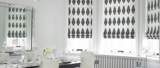
If you carefully look at the photos of a black and white kitchen on design forums, you will notice a main trend: light milky curtains or the Roman version of light-colored roller blinds are more often chosen.
A stylish “yin-yang” kitchen will force its owners to work hard to create the right image. But by listening to the advice of professionals, everyone can solve a difficult problem.
Kitchen-living room in black and white colors
Spaciousness and versatility are what distinguishes this kitchen from all other options. True, even these advantages can be lost if the proportions of white and black are incorrectly distributed, even in a large space.
The contrast here can be used to create accent areas: for example, relaxation and cooking.
However, it is still recommended to use white as a base. They decorate the walls, and then add black details. The presence of free square meters only allows you to introduce it in larger quantities than in the case of a conventional kitchen.
Choosing a quality coating
An important condition for creating a beautiful black and white floor is a high-quality floor covering. As such, PVC, ceramic or stone tiles, laminate, parquet or engineered board can be used - in general, almost any type of floor covering.
Another example of a black and white floor in the interior
Advice! For apartments located on the ground floor, as well as for private houses that do not have a heated floor system, it is recommended to use laminate flooring. This is the warmest type of flooring material.
Black and white laminate pattern
But the most interesting compositions in black and white can be created with tiles.
