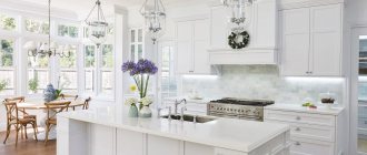
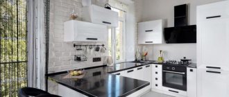
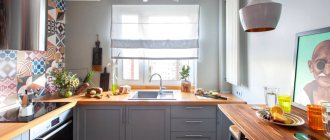
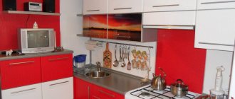
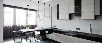
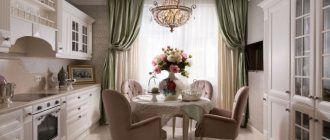
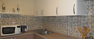
Despite the abundance of modern design ideas and trends, some methods of decorating premises have not gone out of fashion for many years. For example, white kitchens with wooden countertops. They are always popular and fit any interior style. Let's look at a photo selection showing such kitchens in various design methods.
Advantages
First of all, it should be noted that such an interior has a number of advantages:
- Visual increase in space. Thanks to the predominance of white in the design, the kitchen will look much more spacious. This is especially true for small spaces. In large kitchens the effect is also present, so here white can be diluted not only with a wooden countertop, but also with other accents.
- The countertop itself plays an important role - it relieves the white kitchen of the monotony inherent in monochromatic interiors and becomes a kind of colorful stroke. Therefore, we recommend not to settle on exclusively light wood - dark wood in this case can look much more advantageous.
- Saving on lighting. Strange as it may sound, a white kitchen really allows you to save on lighting fixtures. Due to its reflective properties, white color diffuses light in space, making it possible to use less bright lamps.
- Practicality. This point also causes a lot of controversy. Some people think that it is very difficult to care for white kitchens and all the dirt is visible on the white. This is true, but there is also a plus - since the stains are visible immediately. You remove them without waiting for them to penetrate deeply into the structure of the materials, so cleaning takes less time and is much easier. In addition, for the main area of contamination - the countertops - you use wood or its imitation, materials that are easy to clean. Thus, paradoxically, a white kitchen with a wooden countertop is one of the easiest options to clean.
- Wood against a pure white background looks much more noble and more expensive , even if you use imitation.
- Unlike more capricious tones, white is a self-sufficient color , so the kitchen looks expensive and elegant.
If you want to save on lighting, feel free to complement your white kitchen with light wood.
The only downside we note is that you will still have to clean it more often - despite the fact that cleaning will be easier, since all the stains are visible, it will have to be done regularly.
Dirt on a white set is more noticeable, but timely cleaning solves the problem
Combination with curtains
It is better to choose curtains of short length or with a lifting mechanism, Roman or roller blinds. Curtains with grommets and cafe curtains are also suitable.
In color they can be white translucent, coffee, red, green, matching the shade of the walls. From fabrics, it is better to choose linen and cotton with admixtures of synthetic fibers viscose or polyester so that the fabric retains its shape and color after washing.
The photo shows an example of decorating a wide window with translucent tulle with clamps that do not interfere with the passage of air and light into the room.
Creating a harmonious composition
Even if you decide to design an all-white kitchen with wood countertops, a few extra color accents won't hurt. Use our recommendations to create a harmonious interior.
For example, you can lay a covering on the floor designed to match the countertop, leaving the facades of the furniture and the entire main interior white. This way the composition will look very holistic, but the purity of the shade will not be compromised.
A plain tabletop and floor will look harmonious
The kitchen looks interesting, where the apron and countertop are decorated in wood, and the remaining surfaces are made in a matte or glossy white tone. However, keep in mind that such a white kitchen is not suitable for a small kitchen - the technique visually conceals the space, so the room will seem even smaller than it actually is.
Owners of a large kitchen will benefit from a wooden apron to match the countertop
If such decisions seem too large-scale to you, add harmony to the kitchen with the help of a variety of decorative elements. These could be wooden table and chair legs, picture frames, dishes or small decorations.
A good addition to the tabletop would be wooden boards on the wall or stools
You can use any wooden accessory - even spatulas or a bread basket
Bright colors can also emphasize the integrity of the interior, but add them at a minimum - no more than 1-2 items, so as not to destroy the monochromatic composition.
To dilute the white color, add a couple of bright objects to the kitchen
A bright pattern on the curtains and matching flowers will stand out in a white kitchen
For a white kitchen with wooden countertops, it is important to pay attention to the clean finish of the room. White goes with everything, but it is quite demanding. Any shortcomings in the repair will immediately be evident against such a background.
Have you decided on a white kitchen? Make sure everything is in perfect condition
In addition, you will have to carefully consider the interior - from curtains to decorative details. Otherwise, the set may look somewhat alien, standing out from the stylistic design of the room.
In such a kitchen, everything should be combined with each other.
Lighting
In a white kitchen with wood, modern design involves unusual lighting solutions:
- compositions of ring-shaped lamps - as a rule, are placed above dining groups or kitchen islands;
Photo from source: wattpad.com
- spherical lampshades connected by gold tubes in different directions - also, most often, become an accent decoration and additional lighting for the dining area;
Photo from source: casadevalentina.com.br
- transparent spherical lampshades hanging nearby, but at different heights - look especially good above the table and bar counter;
Photo from source: casadevalentina.com.br
- a pendant lamp with a tube made of satin galvanized metal, around which flasks are attached in a spiral - spherical shades made of white satin glass;
Photo from source: riflessi.it
Apron
The apron is one of the main kitchen elements, so when decorating your kitchen, pay special attention to it.
It is important to choose the right material that will be easy to care for and will withstand temperature changes and high humidity well.
The tiled apron is easy to clean from grease stains and other dirt
If you want to keep your entire kitchen white, look for materials that can be easily painted.
Glass aprons have proven themselves well. You can make it completely white or translucent by lighting it from the inside. This solution is perfect for kitchens in high-tech or modern style.
Glass splashbacks are also easy to clean and also reflect recessed lighting.
You can also apply a print to the apron - regular or 3D. Floral or ethnic motifs harmonize best with a wooden tabletop, but it all depends on the style of room decoration you choose.
You can use your favorite landscape as an apron
White ceramic tiles are also a great choice. It is easy to care for and inexpensive. However, please note that all seams must be carefully sanded. Otherwise, the kitchen will look very sloppy.
An unusual but very stylish solution for a white kitchen with a wooden countertop is a brick apron. It can be either white or colored. The main thing is that the shade is in harmony with the tone of the countertop. This technique is suitable not only for a loft, where brick is one of the main materials.
You can use it in Scandinavian style, chalet, Provence. Choose bricks that are not too large - they look much more interesting.
An apron made to resemble real brick will easily collect dust, but will look more impressive
In general, you shouldn’t get hung up on the white color of the apron. It can become the main color accent of your kitchen. The main thing is that the chosen tone is combined with the shade of the wood of the tabletop and is in harmony with your stylistic idea.
The colored apron should match the countertop. The imitation of wood can be continued on the wall.
Design options
The simplest and most modern appearance of any countertop in a work area is clean, straight lines. If this design seems too rough to you, the front ends can be rounded.
Milling is also used on the front and open side ends - it can repeat the pattern on the facade, thereby merging with it.
Advice! Don’t skimp and order a countertop that includes side ends—closed sides give the kitchen a complete look.
In addition to decorative cuts, there are also quite functional ones: for example, near the sink it is logical to make a small bevel and ribs so that water from washed dishes or food flows back into the sink.
The photo shows a kitchen without upper cabinets, the design is a combination of brick, wood, and tiles
Choosing the color of the tabletop
To choose the right decorative elements and finishing materials, you need a starting point in the interior. In a white kitchen, this becomes a wooden countertop. It is very important to choose the right tone - it can significantly change the visual perception of the room.
Warm and rich shades will relieve the white kitchen of excessive sterility. Choose rich brown, honey, cognac tones.
We recommend avoiding wood that is too light - ash, light oak. They will simply get lost against the background of white facades and will look too inexpressive.
Light wood will be almost invisible in a white kitchen, which should be taken into account when choosing a color
Wenge and black wood are allowed if there are other shades in the kitchen: for example, green or yellow walls, rich flooring. Otherwise, the contrast will be too sharp. For most kitchen design styles this is unacceptable - with the possible exception of high-tech.
Much depends on the location of the room. If your kitchen has little natural light and faces north or west, choose rich, warm colors. Cool shades of wood can be used in light kitchens, where they will smooth out excess light.
Combination with wallpaper
Wallpaper in delicate shades of pink, blue, green, cream and beige, wallpaper with a golden pattern, white wallpaper, bright orange, dark green, light brown, gray, lilac will suit a white kitchen.
The photo shows a combination of gray wallpaper with a pattern of brickwork near the work surface, where the wooden tabletop looks organic.
Wallpaper can be plain or with a design. It is better to choose vinyl wallpaper with a non-woven backing, which can be wiped with a damp cloth without harming the color and texture of the wallpaper.
Styles
As we wrote above, the peculiarity of such kitchens is that they can fit into almost any interior.
A white kitchen with a wooden countertop in a classic style looks amazing, especially if you choose natural materials for decorating the facades and select the appropriate shade of wood.
To prevent the room from looking too boring, add appropriate decor. This could be an elegant patina on the facades to match the tabletop, a figured chandelier, paintings, beautiful dishes. Try not to overdo it with other shades: an excess of colors is not inherent in the classic style.
In a classic kitchen, you shouldn’t experiment with fancy accessories or bright colors.
For the Baroque style, choose the most textured wood. These should be expensive wood species or their imitation. In this case, the combination of wood with metal elements: gold, bronze, copper looks very advantageous. For baroque, white may be too simple, so dilute it with appropriate decor: lamps, curtains.
Baroque is a style of wealth, so even imitation wood should look as expensive as possible
To complement the style, you can make the sink gold
Pay attention to the decoration of the room: the wallpaper and flooring must be impeccable.
This type of kitchen looks ideal in a country style. The abundance of various little things, bows, jars and elements of rural life on a white background look very interesting and unusual. Experiment with the shape of the headset. Kitchens with a deliberately rough design look good - imitation boards and simple facades are considered a trend this season.
In country style, you can use the already known technique with wooden accessories.
When choosing a dark countertop for a country style kitchen, don't forget to add bright elements
If you want to add color, choose an unusual background - turquoise, blue, pale yellow walls. This technique is also suitable for Provence style.
The latter is characterized by the presence of free space and an abundance of light. It is this effect that white kitchens with wooden countertops can provide even in Khrushchev-era apartment buildings, not to mention larger rooms. Give preference to kitchens with carved facades and rounded furniture. It is better to make the tabletop light or in yellow tones.
In high-tech style, special tricks are not needed. Yes, wood is considered not a very popular material for this style. However, the correct selection of shades will help you create an original interior. It is better to choose dark wood tones. Wenge, too contrasting for most styles, will look perfect in this case.
When choosing a dark countertop, dark colors on the walls are also acceptable
To add a distinctive high-tech touch, complement your white kitchen with wood countertops with a metal sink. However, other elements can be made of metal - lamps, door handles, facade edging. It is also important to understand which curtains to choose for such an interior. Classic curtains are absolutely not suitable for a complex stylistic idea - it is better to opt for blinds or roller blinds.
Minimalism style is another modern trend. Give preference to glossy textures of facades and not too textured wood. In this case, imitation looks better than natural wood - perhaps the only exception to the rule “natural is always better.” Set off the set with bright, plain wallpaper or panels - this will make the kitchen in a minimalist style “sparkle.”
Minimalists can safely purchase countertops that imitate wood
A white kitchen with wooden countertops looks best in a Scandinavian style. This is where this trend was borrowed from. Choose matte facades that are not too pretentious in shape. For finishing, give preference to natural materials. Brick also looks good in the chalet style - preferably white.
An unexpected and modern solution - pop art style. Diversify your interior with bright prints, choose unusual curtains, for example, with large polka dots. This kitchen looks very unusual and stylish, but requires attention to detail. It is imperative that the shade of the countertop resonates with other elements. This could be a dining table, window sill or wall decoration.
Pop Art Adds Life to a White Kitchen, But Don't Go Overboard
Another interesting option is to use such a kitchen in the shabby chic style. It is usually used with great caution, since shabby is characterized by the use of many decorative elements. However, a white kitchen gives a lot of scope for creativity - against a neutral background, you can not be afraid to overdo it with decorative elements.
If we talk about a kitchen in a modern style, then any combination is permissible. The set will fit perfectly into even the brightest combination of shades and textures - the main thing is to find at least one common element. This could be the common material of the facades, a similar tone of the tabletop, or a furniture design style that is consistent in the same spirit.
As you can see, white kitchens with wooden worktops are used in a wide variety of design styles - maybe you have your own unique idea? Go for it!
What material to choose for kitchen decoration
The choice of modern materials for the manufacture of kitchen sets is very wide. You need to focus on your preferences and financial capabilities. The frame of kitchen furniture is most often made from:
- wood;
- laminated chipboard (sheet chipboard made by pressing);
- MDF.
Wooden furniture is the most durable, it looks expensive and is easy to care for. But such kitchens can be found rarely due to their high cost. MDF and chipboard are more popular. Both materials are produced by pressing. But MDF is stronger and more resistant to high temperatures and moisture. At the same time, it is more expensive.
The facades of modern kitchens are made from the following materials:
- solid wood;
- chipboard;
- MDF.
The most expensive solid wood furniture. Such facades can be either flat or three-dimensional (with milling), they can have a natural shade or they can be painted.
Doors made of laminated chipboard are the most budget option. But such facades are not very durable, especially if the material is of poor quality. Chipboard tends to swell from moisture and steam and becomes deformed over time. The material looks quite simple. Moreover, it is impossible to do milling on such doors.
MDF is a wood board of fairly high density. This is the most common material for the manufacture of kitchens and kitchen facades. At the same time, it can look completely different, it all depends on the technology used for processing the external surface. The following types of facade treatment are popular:
- Film. Special technologies make it possible to apply PVC film to compressed wood material. Film facades are the most popular. They can be either flat or voluminous. You can choose any color. There are several shades of white alone. MDF film facades are relatively inexpensive. But they also have a drawback. Under the influence of high temperatures (steam above the stove, heat when opening the oven), the film may peel off over time.
- Plastic. This option has been very popular lately. The advantages include good resistance to moisture and high temperatures. The plastic does not peel off from the MDF base, even over time. The color palette is wide. But the material also has disadvantages. The junction of the plastic covering and the base may be visible. Over time, chips appear on the plastic. When exposed to ultraviolet rays, the coating may slightly change color (fading). And another disadvantage is that surfaces with plastic cannot be made into shapes.
- Painted (acrylic). In this case, MDF facades are coated with special paint. Acrylic compositions are very popular, which give the surface a glossy appearance. But matte white is also in high demand.
- Veneered. Such furniture looks noble. Natural veneer looks natural. But over time, it may move away from the base. In addition, this coating option is quite expensive.
White furniture looks very noble. When used in the interior, you can create an interesting design even in a Khrushchev-era building. Light-colored facades go well with a regular gas stove, a white hob, and black appliances. There are a lot of options.
When choosing a material, it is worth considering that glossy surfaces look very beautiful, diffuse light intensely, but they are also more difficult to care for. Matte white facades are more practical. There are also super matte materials on sale. Such facades are rough to the touch. They have a slightly porous structure, but they do not absorb dirt.
On a note!
Plastic facades have little resistance to strong chemical detergents. It is best to wipe down such surfaces frequently to avoid the need to use alkaline products later to remove stubborn stains.
Painted facades are practical in that over time they can be re-coated with a layer of paint to refresh the surface. This significantly reduces the cost of kitchen renovations. Moreover, you can take a different color.
When choosing a kitchen, you should also pay attention to the fittings. Doors without handles are at the peak of popularity. You can open them with the touch of your hand. It is very convenient and practical. Over time, handles corrode and lose their appearance. Refusal of them allows you to avoid wasting time and money on selecting and replacing fittings.
Real photo examples
Textiles and decor
A gray kitchen does not have to be consistent in one tone. It can be diluted with extravagant flashy decor or original textiles. For more conservative interior designs, products made of wood, stone, glass, and clay are ideal. This can be not only catchy decorations, but also dishes. You can also hang an original panel in a new, but already popular food art.
For a more daring interior, textiles with rich splashes of bright colors (pillows with geometric patterns), handmade products and decorative plants of unusual shapes (for example, Japanese moss or Crassula) are perfect. Do not forget that the kitchen should be functional and practical. Any elements of textiles and decor must delicately complement the atmosphere and space, but not clutter it with their abundance.


