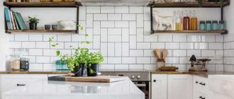
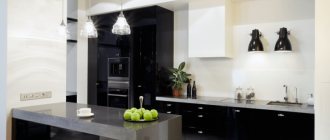
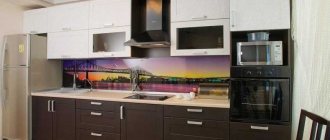
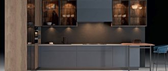
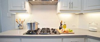
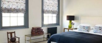
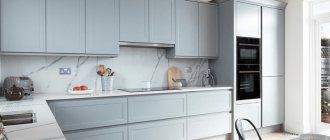
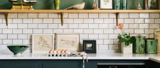
A kitchen in a classic style is cozy, luxurious, elegant, sophisticated. And many more epithets can be listed. After all, classics are the mother of all styles and trends in interior design. Here every detail has its own meaning. It is important that everything is balanced. And the cozy, luxurious classic did not come close to the grotesque. In this article we have collected detailed information about the features of this style and you can easily implement it in your home.
What is the meaning of classic design?
Kitchen interior design in a classic style means strict lines of cabinet furniture, high-quality fittings, nothing superfluous. Every detail, as they say, is in its place. This can be assessed from the presented photos of classic cuisine.
Refined style, grace and at the same time simplicity, rigor - all this is inherent in the classics.
And also the noble tones of furniture made from high-quality environmentally friendly materials: natural wood or MDF. The countertop is marble or artificial stone.
Home appliances - no compromises
The main requirement for appliances in a classic kitchen is not to stand out too much. Even if this requirement is not met, the technology hides behind the façade. To make it easier to find suitable equipment, you should pay attention to collections created specifically for the classic style.
The hood is selected only of the dome type. Yes, modern inclined models look interesting, but they are only suitable for modern styles. But the large dome of the hood will resemble a fireplace in the house, which is important for people who value traditions.
Ideally, the hood will have a wooden decor - this will instantly increase the level of comfort in the room and the house as a whole to the maximum value.
If such models seem outdated and inappropriate, you can always look towards built-in technology.
It is also advisable to hide the microwave oven behind the facade. But you can’t hide the kettle, so it’s worth choosing it in a retro style. Manufacturers have made sure that such models are easy to find. The main thing is that there is no metallic gloss in the equipment. For the same reason, the kitchen sink is made to look like stone, and not from glossy stainless steel.
Are retreats possible?
Do not perceive the classics as a prim, outdated version. This style has variations and additions. Modern designers even allow for a certain eclecticism in the classic interior, which can incorporate elements of such styles as modern, loft, hi-tech, Provence, grotesque and even romantic.
It is noteworthy that often kitchen designs in a classic style differ due to national trends. The difference here lies in the traditional ways and life of different peoples.
European classics
The interior of a classic kitchen in the European style is very rich in colors. We can use the Italians as an example. This design cannot be called exclusively aristocratic and, moreover, boring.
There is a lot of expression in Italian classics, which correlates with the characters of the inhabitants of this country. They love to decorate their kitchens in shades of pistachio, olive, and turquoise. The priority is a noble gray and beige palette, as well as very bright colors: red, fuchsia, blue.
Italians decorate their kitchen windows with light curtains, or Roman blinds, or blinds. The overall impression is clear lines, competent design, rigor in the execution of almost all interior details.
Wide palette of shades
Classics do not limit the choice of tones when decorating interiors. You can use any color from a wide range of palettes. But there is a rule here: do not “paint” the kitchen in all the colors of the rainbow, using only a couple of shades, without overdoing it with color.
Choosing a color
The classic color of the kitchen is pastel. Preference should be given to no more than 3 tones.
It is advisable to select them from a related spectrum of warm or cold shades of gray, beige, natural peach, brown, vanilla and milk.
When decorating classic interiors, designers recommend the following color combinations:
- Black and white.
- Ivory.
- Soft vanilla.
- Caramel.
- Tender apricot.
- Olive.
- Tones of natural wood textures.
Light shades will complement elements made in gold or silver decor, but there should be few of them. Literally a couple or three. A combination of contrasting tones is also acceptable. For example, red with vanilla, yellow with black, blue with white.
Scandinavian restraint
The classic style also involves the creation of a white classic kitchen. This is traditionally preferred by residents of the Netherlands and other countries on the Scandinavian spectrum.
In this option, in order not to achieve the impression of a hospital room, you can choose not a boiling white color in the design, but its milky or creamy undertone. Strict lines and clear outlines precisely characterize a classic light kitchen.
Forming a layout
In this part, it is possible to design both the kitchen itself and the combination of a relatively small room with neighboring rooms. So it’s worth considering the option of a classic kitchen-living room.
If there is access from the kitchen to the loggia, it is advisable to combine these spaces. The interior layout of the living room kitchen in a classic style is a combination of design elements and style of both rooms.
Designers say that such a living room should not have furniture that is radically different in design and color from the kitchen. The same rule applies to the design of walls, lighting, and framing of window openings. Everything is in the same style, strictly and emphatically noble.
Combination with other styles
The classic style is classic so that it can be easily combined with other design trends. Sometimes the resulting combinations are so unusual that they are even a little shocking:
- Loft. Classic and industrial styles can coexist together if they are combined in very measured detail. For example, in the kitchen-living room you can find a fireplace decorated with stucco, and next to it there will be a glass coffee table on metal legs. The style will be more reminiscent of modern classics.
- Country and Provence can be called simplified types of classic style, so combining them is quite simple. It is necessary to get beautiful ceramics and leave them in a visible place, replace luxurious curtains with loose curtains with a floral pattern. Use more wood than stone in decoration.
- Modern. This unusual combination encourages you to abandon excessive luxury and decor. The color scheme is close to natural, and floral patterns appear. Porcelain stoneware, parquet, and marble are used in floor finishing. The walls will be decorated with panels and fillets.
- Art Deco. Some even call art deco a modern classic, but there is a slight difference: art deco is a bolder movement that can afford more, for example, the presence of unusual geometric shapes. Both art deco and classic require expensive materials, so mixing styles should occur through decorative elements - for example, ivory figurines, a beautiful unusually shaped vase or candlesticks. Retro posters will also be in place.
The classics do not accept global combined solutions, but you can dilute the “boring” traditional atmosphere with interesting decorative elements from other trends.
Small classic kitchen set
It is advisable to make cabinets in a small room up to the ceiling. This is very beneficial for creating optimal storage conditions for everything you need. In addition, dust and dirt will not accumulate on the furniture, and the space itself will seem more harmoniously built, without clutter.
For a small kitchen, it is imperative to choose predominantly light colors of decoration and furniture with bright or darker accents. It is advisable to integrate large equipment.
Wallpaper
There can be nothing pretentious in decorating walls with wallpaper: a plain material or a faded pattern. The cooking room has high humidity, so fiberglass or vinyl is more often used.
A variety of colors are allowed: floral patterns, medallions, stripes, checks, damask, monograms, Venetian plaster. Photo wallpapers and frescoes depicting ancient streets of European cities or great paintings fit in appropriately.
When choosing wallpaper, focus on the lighting in the kitchen:
| 1 | In a bright, sunny room, wallpaper in cooling shades (pale blue, snow-white, blue, beige) is preferable. |
| 2 | For low ceilings, choose wallpaper with vertical stripes |
| 3 | In a dark room with windows facing north, wallpaper is used in warm colors. |
Large classic kitchens
It is recommended to decorate wide spaces in the same style. In this case, classic is an excellent solution. The apron can be paved with bright large tiles, or a mosaic structure can be mounted in this area, but no less bright. Moreover, the colors of the furniture and countertops can be dark or pastel.
An oak dining table with a small corner sofa looks beautiful in a large kitchen. If this option is not suitable, it is advisable to build a bar counter in the eating area, abandoning the massive structure. This is also considered a classic element if the stand is made in strict proportions, with clear lines.
By the way, in a spacious kitchen one of the walls can be made an accent wall by decorating it with contrasting wallpaper. Moreover, the remaining walls must be covered with wallpaper of a lighter or darker shade, but of the same color.
What's worth hiding
It is better to remove household appliances from prying eyes. The washing machine and dishwasher are easily hidden in spacious cabinets.
If the kitchen is small, it is advisable to find a place for appliances in the bathroom or hallway. It is necessary to create harmony and comfort, and for this purpose, as few details as possible should be left in sight.
Classic kitchen lighting
It should be bright and uniform. You should not give preference to a large chandelier ala nineties or a lampshade like a sconce. Here it is advisable to arrange spotlights mounted in the ceiling.
In a large kitchen, it is advisable to install a switch that turns on all the lighting at the same time, or in separate zones. This will save electricity when you don't need to illuminate the entire space.
Let's say there is a dim background light in the classics. It is necessary in the area of the dining table so as not to distract the family from a relaxing meal, especially in the evening.
In large rooms with a multi-level ceiling structure, it is permissible to decorate transitions with LED strip to create beautiful lighting.
Curtains in a classic interior
Even though this style dictates simplicity, at the same time, rigor and clarity of each element are relevant. Therefore, it is recommended to design the windows of a classic kitchen with lightweight structures. These are weightless curtains, translucent short or long curtains.
It is important that they are combined with the general tones of the furniture and decoration of the room. A mesh curtain or chintz curtains look very good in the kitchen.
Products created on the basis of natural fabrics are durable, they can be washed often, which is important because when cooking, drops of fat fall on all kitchen surfaces and curtains are no exception.
Let there be light!
Lighting is a very important attribute of the classic style. There must be a lot of it to visually enlarge the space and add even more luxury to it. The rule is: the larger the chandelier, the better. But it is important to maintain proportions between the dimensions of the lamp and the room as a whole.
It could be a crystal chandelier (even a two-tier one) or just a large beautiful candelabra with light bulbs stylized as candles. The following materials are considered the best for chandeliers:
- bronze;
- ceramics;
- glass;
- crystal.
If one light source is not enough, then you can additionally use sconces and floor lamps.
If the kitchen is small, then you should not look closely at large chandeliers. A good lighting option would be a chandelier with shades made of glass or fabric and a frame made of brass or gold plated. Such a chandelier does not look massive, so it does not load the ceiling, but it has classic features.
You can fit several small lamps or point light sources into the work area, but you need to make sure that they do not fall into your eyes.
Blinds as an alternative to curtains
This is an excellent option, including for a classic interior solution. In such a kitchen, blinds look natural, especially if the slats are vertical plastic. These practically do not wear out and wash well. The design does not weigh down the space, which is important even for a large room.
Blinds can also be made of aluminum with horizontal slats. With these you can choose a light short tulle that will beautifully frame the window opening.
Ceramic and marble tiles
The size of the tile really doesn’t matter, although its classic dimensions are 8x15 centimeters. Ceramic or marble glossy, matte, diamond-shaped and square tiles made by hand or machine are used.
If you need to refresh the interior, this can be achieved by adding “subway” tiles, popularly called “hog”, or replacing them with tiles measuring 5 x 15 cm, 5 x 20 cm, 5 x 10 cm using grout of a different color.
A few words about choosing an apron in a classic interior
This area is covered with durable and easy-to-clean materials for a reason. The apron is designed to protect the walls in the kitchen workspace area. It is mounted from the stove to the sink and completely covers the surface that is most often exposed to splashes of water and grease.
Designers recommend purchasing ceramic tiles to suit your interior type and style. In the classics, the apron is not flashy, but can serve as a beautiful decor.
Nowadays, many people make an apron that imitates brick or stonework, or make a marble-like wall. This is also typical for classics, when everything is verified, clear, beautiful, strict, and not pretentious.
Glass or mirror aprons are also allowed. But in this option, it is important to match the proportions and not overload the space or make it “cheap”.
Walls
The work area must be tiled. It is better to choose very high quality tiles.
The rest can be covered with wallpaper or plastic panels mounted on the walls. Full tiled walls made from materials of different shades that combine with each other look good.
In the kitchen space, it is important that the walls can be cleaned of dirt and dust. If the owners choose wallpaper, even if it is of very high quality, it is advisable to purchase a good hood.
More attention to detail
When planning a kitchen renovation in a classic style, you should take into account all the nuances. It is not enough to decide where the elements of the set will be located, or to determine the type of furniture.
It is important to take care of the correct location of switches, sockets, the order of opening cabinet doors, and determine the types of fittings in order to order everything in one version.
For example, if the handles on the doors and towel hooks are silver, then the finish of the apron should be cold, without a golden undertone. The same applies to fastenings and hangers for curtains.
Taking into account even seemingly insignificant details, you can achieve a high-quality and beautiful kitchen interior in a classic version. In addition, the classic does not tolerate anything unnecessary, so there is a minimum of elaborate decor and an abundance of items on the cooking table.
If it is possible to “hide” household appliances in closed niches, it is advisable to build a coffee maker, microwave and other appliances into them.
Furniture
The furniture in a kitchen with a classic interior is distinguished by its naturalness. Wooden models of wall and floor cabinets are used. The dining table can be white or brown. A special feature of such items is their elegantly shaped legs.
Chrome and plastic parts should absolutely not be used. They will only disrupt the overall situation. As a result, the classic interior will turn out to be a failure. Upholstered furniture is characterized by the use of models with natural upholstery. Floral fabrics look good on wooden sofas in the dining area.
You should not refuse headset options that contain carvings and gilding. They perfectly emphasize the main idea of the interior of the room.
On a note! If household appliances do not correspond to the classic style, then it is better to use built-in models. They are easy to hide behind the wooden facade of furniture.
Option for arranging a kitchen with a window Source www.meb100.ru
