2019-06-11
Author: Belfan
From this article you will learn:
- Where to start choosing kitchen furniture
- What are the key rules to follow?
- How to choose the color of kitchen furniture
- What materials are best to choose kitchen furniture from?
- What style to choose furniture for the kitchen
Without a comfortable and beautiful kitchen, even the most comfortable home will be incomplete. Therefore, those who are planning renovations always ask many questions about this room. How to choose furniture for the kitchen and at the same time not go wrong with quality, as well as stay within the budget? You will find a lot of rational and practice-tested advice in our article.
No. 1. Determining what furniture is needed for
Some aspects of kitchen use may differ from family to family, so different furniture will be needed in different situations. It is important, before purchasing an entire kitchen or its individual parts, to clearly define for yourself the scenarios for using a given room, so that later it does not turn out that some pieces of furniture are not functional, not needed, and some are completely missing.
So, a kitchen can be in an apartment “for beauty,” no matter how strange it may sound. If the owners do not like to cook and do it extremely rarely, then minimalism should reign in the kitchen: only the most necessary items to perform the simplest things when needed. If the housewife is a businesswoman who wants to devote a minimum of time to cooking , then the organization of space will need to be approached with the utmost care so that all objects are located very close, and it takes a minimum of time to perform some action.
Those who like to cook something delicious to please their family, and all those who spend a lot of time in the kitchen creating the next culinary masterpiece, can be advised to pay attention to kitchens with the maximum possible number of shelves, cabinets and bedside tables that can only fit into the space . But do not forget that it is very difficult to transfer communications, so you should choose furniture sets very carefully, or opt for modular systems.
If a lot of time is spent in the kitchen outside of cooking, for example, during family conversations, drinking tea , and there are often guests , then it is important to pay attention not only to the work area, but also to the dining area. It should be as comfortable as possible and conducive to long gatherings. It would be nice to somehow separate it from the food preparation area, if possible: different finishes, zoning with a bar counter, etc. are used. By the way, a bar counter , which often becomes a decoration for studio apartments, is an excellent option to separate space, but at the same time make good use of every square centimeter of space. A combined kitchen and living room, in which you can place a dining area, is convenient, stylish and fashionable, and the kitchen space increases by one and a half to two times, and you can fit much more useful things in the form of furniture and appliances.
How to make a beautiful kitchen divided into two zones - redevelopment
The kitchen is divided into 2 zones:
- The work area where food is prepared may occupy a small area;
- The dining (dining) area should be spacious and comfortable, well lit. You need to think about free space for moving chairs and the passage between them.
It is not necessary to zone (divide) space with walls - zoning can be conditional, since visually dividing areas is also quite possible.
No. 2. Furniture color
It would seem that choosing the color of furniture for the kitchen is not so difficult, but in order to end up with a harmonious, stylish room, you need to think through many details in advance. You can use the services of an experienced designer, or you can try to cope on your own by looking through successful examples on the Internet. It will be best if the furniture is matched to the kitchen that is being renovated: you can immediately choose the appropriate color for the walls, tiles, linoleum or tiles and other details. You should immediately decide whether one color or a pair will be used, what color it will be, and then use the selected shades as a starting point when choosing everything: from the furniture itself to curtains and accessories.
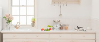
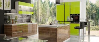
As for specific colors, it all depends on your preferences, and kitchens can now be of all imaginable and inconceivable shades. The well-known rule applies here: light shades visually expand the space , so if you have a small kitchen, then you should not load it with dark furniture , which will look harmonious in a spacious room. You can opt for bright colors : orange, green, yellow, red, and then the kitchen will become a stylish, interesting place. You can even use contrasting rich shades , but remember that they are only appropriate in spacious rooms. In small rooms, light and pastel shades save the day, and to prevent the kitchen from looking too boring and faded, simply add a few bright accessories: curtains, tablecloth or napkins. In addition, shades such as light green, light blue, light yellow, peach, light gray, etc. are suitable for miniature kitchens.
By the way, psychologists have long proven that our mood largely depends on the color that surrounds us. To improve appetite , bright colors typical of fruits and vegetables are used in the design: green, yellow, orange, red. White in this case remains neutral, but is able to enhance the impact of other colors. If inducing an appetite is not in your plans, but proper nutrition and diets are planned for the coming years, then for the kitchen you can choose colors such as gray, olive, marsh, blue, purple, blue.
The degree of lighting also affects the choice of color scheme. If the kitchen faces south, it means the sun will constantly shine, and to make the room visually a little cooler, you can use cool colors: blue, green, purple, indigo, gray. If the situation is exactly the opposite, then your option is sunny warm shades: yellow, peach, sand, orange.
Filling and accessories
After the color and material of the kitchen set has been chosen, you need to decide on the fittings and filling of the cabinet. When answering questions about which kitchen is better to choose, you can clearly answer, with high-quality and reliable fittings. These are the elements that you definitely shouldn’t skimp on.
Even the most beautiful furnishings can be ruined by peeling handles, loose doors and rusty guides.
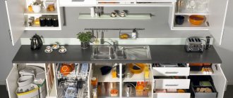
In addition to the standard filling of cabinets and shelves, you can supplement the kitchen set with additional shelves, dividers, baskets and hooks that are hung on the doors and inner sides of the cabinets.
You can turn to non-standard solutions - install a rotating shelf in the corner of the furniture, attach a trash can to the door, use a base drawer between the base cabinet and the floor.
No. 3. Deciding on a style
Choosing the right color is only the first step; then you need to decide on the style of the kitchen, which will determine the style of the furniture. There can be a lot of options: as many as there are currently interior styles. The choice should be based on your own tastes, as well as some features of the premises.
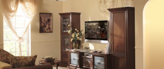
The classic style will certainly not go out of fashion, at least in the next few decades, so such a kitchen will always be relevant. True, such a solution will not be very cheap for the owner, since the style involves the use of natural wood or materials that are as close as possible to it in properties and appearance. Such kitchens are usually massive, so they are suitable for larger rooms with high ceilings and large windows.
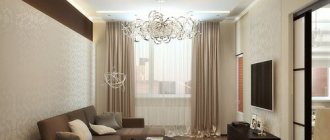
Modern is an excellent option that will fit into any kitchen of any size. The main thing here is simplicity and functionality, and every detail is thought out, only the necessary furniture is present, which amazes with the laconicism of its forms. In addition, kitchens in the Art Nouveau style are most often executed in light colors, and there is no place for dark, contrasting and flashy colors.
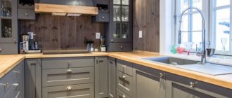
A country style kitchen is comfort, beauty and functionality. The so-called rustic style is very well suited for arranging kitchens, however, this will require a sufficient amount of space. Everything natural is held in high esteem: wooden or wicker furniture, clay pots, linen textiles.
High-tech is one of the most modern interior styles. With it, the kitchen looks as if it is from the future, and all thanks to the presence of the most modern appliances and furniture with clear outlines, made of metal, glass or plastic. Such kitchens captivate with their simplicity, bordering on maximum convenience.
Close to high-tech and modern, minimalism , in which only the most necessary pieces of furniture are present, but at the same time they can be made from almost any material. The main thing in style is simplicity, the presence of free space and a single color scheme.
In addition, there are a lot of other styles that are also used in the kitchen, but less often: Japanese with its simplicity and compactness, Scandinavian with a predominance of light shades, Provence with an abundance of floral prints.
Feng Shui in the kitchen
Now let’s turn to the ancient Taoist practice, a set of rules for the harmonious design of space through which flows of qi energy flow freely. What does Feng Shui say about the kitchen interior? First of all, this room symbolizes abundance and wealth, and even according to Taoist practice it is one of the most important.
The location of the kitchen relative to other rooms and the front door plays a big role. It is clear that apartment owners do not have to choose, but those who are just starting to build their own home should place it away from the hallway or hall. When entering a house, a person should not look at the open kitchen from the threshold.
According to Feng Shui, this arrangement contributes to the “leakage” of useful energy, which is responsible for well-being and prosperity. You can correct the situation by installing doors or hanging light curtains. Another option is to hang bright decor in the hallway that will attract attention (a painting, a ceramic composition on a table, a backlit mirror).
Feng Shui experts do not recommend zoning the kitchen using a podium. Changes in floor height “cut” the flows of qi energy, like ledges in a cascading waterfall, after which it “flows” chaotically. The popular idea of using a podium to highlight the dining area should also be abandoned. The kitchen, first of all, should coincide in levels with the dining room.
The stove cannot be placed next to a window, as its heat, symbolizing the well-being of the family, will “leak” to the street. Avoid using mirror tiles and bulky ceiling decorations (massive chandeliers). Catchy, juicy red color, according to Feng Shui, is taboo for the kitchen. Don't clutter the room. Ruthlessly get rid of unnecessary utensils, keeping only what is actually used.
No. 4. Furniture material
No matter how stylistically different and dissimilar the pieces of kitchen furniture may be, there are not so many materials for their manufacture.
Let's start with the frame material , which is hidden from our eyes. Wooden kitchens are luxury kitchens that are environmentally friendly and of high quality. But such material will require a special approach in difficult kitchen conditions, since it does not tolerate moisture well.
Due to the high cost of wooden furniture, its analogues are increasingly used. For example, furniture made from MDF is environmentally friendly and easy to maintain. Since such boards are plastic and flexible, furniture can have any shape, and at the same time it is also affordable. The disadvantages include not the highest durability and a high risk of peeling off the cladding.
Chipboard also has good performance qualities: modern processing technologies allow such furniture to withstand the negative effects of moisture and temperature, remaining in its original form for a long time. The cost is also reasonable, but the shape will be simpler than that of MDF, since the material bends poorly.
Another alternative to wood is multiplex , a material made by gluing together thin sheets of natural wood of different species. The result is a material that is resistant to deformation and moisture.
As for the facade of kitchen furniture , the range of materials used is expanding. In addition to the chipboard and MDF mentioned above, specially treated wood is also used, which will not warp when exposed to moisture. Plastic, glass and metal inserts can also be used.
MDF can be covered with enamel , in this case the kitchen facade will be resistant to moisture and deformation, will retain its original appearance for a long time, and at the same time there are a lot of options for appearance: a bunch of colors, glossy and matte surfaces, etc. If PVC film , then the quality of the furniture decreases: these are not the most durable sets, and in the area of the sink and oven the film will soon begin to peel off and fade.
Kitchen furniture can also have a plastic facade : in this case, the material is glued to a base made of chipboard or MDF. Quality depends on the type of plastic and how it is processed. In any case, this is a material whose disadvantages are more than offset by its advantages: varied appearance, resistance to sunlight and aggressive chemicals, moisture, etc. But laminated chipboard , although it remains the most budget option, will not last very long and is suitable for office space or as a temporary option.
Today, furniture designers combine aluminum profiles with other materials: plastic, wood, slabs, glass, and the result is stylish and original furniture, although aluminum may darken over time. But glass elements , which can be easily combined with any material, have been held in high esteem for many years: they add lightness to the kitchen and originality to the furniture.
As for the interior space of the furniture , the modern proposal is simply amazing. Kitchens combine pull-out shelves, bedside tables, rotating shelves, corner cabinets with completely different opening/closing mechanisms. You need to choose an option so that all the elements are convenient to use and so that they are located as ergonomically as possible. Also, do not forget that storage spaces can be expanded with all kinds of shelves, hooks, etc.
Design and layout features
The correct layout of the kitchen will create all the necessary conditions for its convenient use. Experienced designers know about the concept of the “working triangle.” This conventional geometric figure places its vertices at three points: tile, refrigerator, sink. The zones must form a triangle, only in this case will it be convenient for the housewife to move around the kitchen while cooking.
L-shaped kitchen
The L-shaped layout is considered the best option for most kitchens, but works best in square-shaped spaces. The headset placement option allows you to set up a separate area and easily position the vertices of the working triangle against two adjacent walls.
The L-shaped layout leaves plenty of space to organize a dining area. The advantages of this option include the possibility of using built-in equipment. The only exception where an L-shaped layout would be inappropriate is in very narrow rooms, where the length of one wall will be more than twice the length of the other.
U-shaped kitchen
U-shaped or U-shaped layouts are widely used in rooms of different sizes, but are considered the optimal solution for kitchens with an area of 12-15 sq.m. The set is located along three walls. It is possible to arrange a working triangle, each of the vertices of which can be located against a separate wall.
The U-shaped layout allows you to place a variety of technical fillings with virtually no restrictions. Among the shortcomings, experts note only the impossibility of through movement, but for a non-passable room it is not necessary. It is not recommended to use a U-shaped layout in cramped kitchens of Khrushchev-era apartments and in overly spacious rooms of luxury apartments. In the first case, it is better to “cut off” one side and resort to an L-shaped model, and in the second, to an island one.
Linear kitchen
Linear or single-row layout is suitable for small spaces. This compact option is often used in modern studio apartments, where limited space is allocated to each zone and the kitchen is not one of the areas that “dominates” the area.
The model for the location of the kitchen set lies in the very name of the layout - linear, that is, the furniture is located in a line along the wall. On the one hand, this greatly saves space, leaving the other three free, but on the other hand, the rule of the working triangle is simply impossible to comply with. Experts only advise placing a sink in the center, and a refrigerator and stove on the sides. This option will be more convenient than the other two.
Island and peninsular cuisines
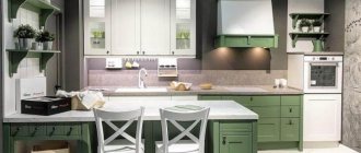
The island layout is characterized by the presence of a small “oasis” that protrudes forward, as if separated from the rest of the kitchen “mainland” left behind. On this symbolic island you can place a stove, a work or dining area, or a bar counter. This option is suitable for very large rooms and combined apartments.
The “island” seems to combine two spaces into one and at the same time unobtrusively delimit it into a culinary area and other zones. The peninsular layout repeats the island layout in every way, with one small exception: the island is not “detached” from the “mainland” completely, but is connected to it on one side.
In fact, such a kitchen can be L-shaped or U-shaped, but the second or third side is not placed along the wall, but replaces it, leaning against the end. This option ideally zones the kitchen into two areas: for cooking and for eating. Both types of layouts are not suitable for small apartments. In island and peninsula kitchens, it is easy to organize a working triangle by placing one of its vertices (usually a stove) on the island.
Double row kitchen
Double-row or parallel layout is a popular option for walk-through rooms and rooms whose area exceeds 15 sq.m. The kitchen set is divided into two parts, which are located along opposite walls. With this layout, it is easy to follow the rule of the working triangle: the sink and stove are placed on one side, and the refrigerator on the other.
The kitchen takes up a lot of space and allows you to arrange a large number of utensils and kitchen items in numerous storage systems, and to integrate household appliances. The only drawback is the difficulty of placing the dining area. There is simply no room for it in a two-row kitchen, although the eating area can be moved outside the kitchen area by slightly “shortening” the length of the set. This decision requires thorough work on the project so that the design organically complements each other.
No. 5. The right countertop
The choice of countertop material is a separate issue. This is the place where all kitchen processes take place, such as cutting, washing, cleaning, etc., which are accompanied by constant exposure to moisture, splashes of grease, and possible mechanical deformations, so the material of the countertop must be such that it can withstand all this and not lose its original appearance.
Today, countertops are made from a variety of materials. A few words about the most popular of them.
- wooden table tops is an example of beauty. They are durable and environmentally friendly, and the wood is treated with special oils that nullify the influence of moisture and other negative factors. But the beauty of natural wood requires special treatment: you can’t put anything hot on such a countertop, naturally, you can’t cut anything directly on it, and periodically you’ll have to use special means and wipe the material to increase protection, and drops and puddles of water must be wiped off immediately. Such care, combined with a high price, can be intimidating, especially since there are many other interesting options;
- laminated countertops - an absolute modern hit, as they are inexpensive, and at the same time the variety of options is amazing. This tabletop is made of chipboard, which is lined with laminated plastic, or laminate. The layers are impregnated with special substances to withstand the influence of kitchen processes; there is also a layer with a certain pattern, so such a tabletop can imitate stone, wood, leather, and depict excerpts from films. The protective surface makes such countertops resistant to high temperatures, moisture, scratches, detergents, sunlight, and fire. However, it is better to wipe off all moisture immediately so that it is not absorbed, causing the material to swell. This disadvantage is compensated by low price, ease of installation, variety and other advantages;
- stone countertop – a real ideal for the kitchen. Natural stone is not affected by moisture, detergents, temperature, does not scratch, and does not lose its visual appeal. Depending on the stone, the countertop may look different: granite, marble, and basalt are most often used. At the same time, it is a heavy and expensive material;
- artificial stone has almost the same advantages as natural stone, only it is lighter and cheaper. And the features of its manufacturing allow it to be given any shape, so this is an excellent option when you need an irregularly shaped countertop. This material is not afraid of scratches, moisture, temperature, it is easy to care for, and can imitate any breed;
- brushed steel It has such advantages as durability, strength, hygiene, and resistance to most negative factors. And scratches on it are easy to sand out. This is not the most expensive option, but it will last a very long time, fits perfectly into a modern kitchen, however, steel does not differ in the variety of shapes;
- glass table tops – it’s beautiful, but not very practical. Yes, they are not afraid of moisture, temperature and even aggressive chemicals. But still, the risk of chipping and cracking is high. Since tempered glass is used, even when a heavy object falls on it, blunt fragments are formed that do not fly apart and are not capable of causing harm. But the very possibility of damage can repel most users, although their appearance is indeed stunning, it also needs to be taken care of: dust and fingerprints are visible, and abrasive detergents can leave scratches;
- The tabletop can be designed as a regular one tiles, which lined the kitchen apron - this is an excellent option for country-style kitchens. The tile also provides resistance to moisture and temperature, but the seams will require additional care;
- acrylic countertops – a combination of acrylic resin, pigment and mineral filler. They are resistant to fungus, moisture and detergents, and even cigarette marks can be easily removed, while the variety of colors is very pleasing.
Features of choosing a kitchen set
Everything is important in the kitchen: both finishing and filling. This room is used daily, “extreme” conditions are created here (high temperature and humidity), during cooking, a large amount of waste (water, grease, dirt) settles on the surfaces of furniture and decoration, which is why the room is cleaned regularly (much more often than others premises).
Furniture must withstand such loads, withstand sudden changes in the “climate”, be easy to clean and serve people faithfully for a long time. For kitchens, they often use not individual items, but sets - furniture complexes.
They first appeared in the USA back in the last century and housewives liked them so much that their mass production was quickly launched. Europeans adopted this experience from the Americans, “tasting” the idea. In Soviet times, sets were colloquially called “walls” and were actively used not only in kitchens, but also in living rooms. Furniture selected by the manufacturer eliminates the need for the buyer to “assemble” a set of different items on their own.
Perhaps this is the main advantage of headsets. In addition, the price of the set is lower than the total cost of all the items included in it if purchased separately. A furniture set usually consists not only of a “wall”, but is also complemented by a dining table, chairs and movable elements.
When choosing a kitchen set, you should pay attention to four characteristics:
- Aesthetics (appearance).
- Functionality.
- Long service life.
- Ease of use (ergonomics).
Let's talk about each of them in more detail.
Aesthetics
The aesthetics of a headset is its beauty from the point of view of the person choosing (this is important, because everyone has their own ideas about beauty). What can you say about the appearance of kitchen furniture? Of course, it should look appropriate in combination with other pieces of furniture and at the same time please the hostess and household members.
You can’t just choose a model you like, for example, in Provence style, and put it in a kitchen that is already decorated in a high-tech style. The filling and finishing must match each other.
Functionality
You can determine what opportunities a set provides to the housewife by getting acquainted with its contents, that is, its components. What should be included in a kitchen furniture set for it to be considered complete and fully satisfy the requirements of the person using it? The standard list of modules and add-ons is as follows:
- Floor structures. These include cabinets, cabinets and shelving systems (mostly closed types).
- Pencil cases. Tall narrow cabinets that are designed to accommodate built-in household appliances and kitchen utensils.
- Wall-mounted lockers. Can be closed or open. Usually they present a mixed storage system of shelves and drawers.
- Mobile elements. Screens, partitions, tables on wheels, transformable furniture. Such elements are usually complemented by sets designed for cramped kitchenettes.
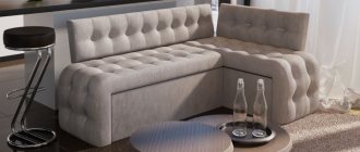
- Free-standing furniture: tables, chairs, corner sofas.
The contents of the set are selected depending on the characteristics of the kitchen and the needs of the housewife, that is, individually for each home. Some people need more drawers, while others would prefer to give up half of the storage system for new household appliances.
Ease of use
Any furniture should be comfortable to use. Even before buying, you need to “try it on”, that is, try out what it’s like at work, whether the height suits the owner, whether the shelves are conveniently located, whether it can reach all the drawers. Next, you should carefully take measurements and think in advance about the location of the headset in the room. You need to take into account the ease of movement between the vertices of the work triangle and the possibility of creating additional “routes” from the dining area to the work area, stove and refrigerator.
Durability
The durability of a headset is primarily determined by the materials from which it is made. Solid wood is considered optimal for the body and facades. It is better to choose countertops from natural stone. A kitchen apron will last longer if it is made of stainless steel or made of ceramic tiles.
No. 6. We are drawing up a project
It is important not only what quality of furniture you buy, but also how you place it, which will determine the comfort and ease of use. That is why it is better to measure all the parameters and decide what will be placed where: you need to take into account the location of communications, the features of the layout, and personal convenience. It doesn’t hurt to draw a diagram or create a model in special programs. We arrange all the necessary furniture, sink, household appliances, table and chairs, etc. to scale. Make several options so you can choose the best one later.
While arranging a dining area is not so difficult, the working area requires close attention, because it is important that you can cook something there comfortably and quickly. The stove, sink and refrigerator - key elements - should be located in close proximity, so take this into account in your design. There are several options for the location of these elements:
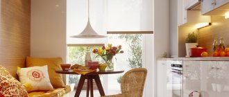
- linear option suitable for small kitchens. In this case, there is a sink around the sink on one side and a refrigerator on the other. Between the sink and the stove is the work area. Such a kitchen can smoothly flow into a dining table, which is placed near the window, or even a folding table can be arranged near the window sill;
- two-line option often used in through and walk-through kitchens. For example, a stove and sink are placed on one side, and a refrigerator on the other, with the minimum distance between the two lines to ensure functionality and comfort is 1.2 meters. In this case, the table is used movable or folding;
- L-layout Suitable for any kitchen, except narrow and long ones. It allows you to effectively use two walls, organize spacious storage spaces: corner, retractable, rotating, etc. The dining area will not interfere with the passage and is located in the corner;
- U-layout – one of the most convenient options for arranging furniture. In this case, there is no through movement through the working area, and this is a bonus for convenience, but the distance between opposite walls should not be less than 1.2 meters and more than 2.8, otherwise cooking will be inconvenient;
- island layout - very convenient, since you can place a work surface, a dining table, and storage space on the island, but at the same time, the kitchen area must be at least 16 square meters so as not to block traffic.
Design of a standard kitchen in a nine-story panel house
An apartment with a small kitchen is like a panel house. In such houses, any design should strive for minimalism. Extra decorations are useless, as are large pieces of furniture. Monograms and stucco in small rooms will make them visually even smaller. The main rule is comfort and practicality, functionality and a minimum of occupied space. Neutral shades, a minimal set of furniture, simple and comfortable designs - this is what you need. What else can I recommend:
- Apron on the work wall in two colors.
- Vibrant colors on large surfaces.
- Mosaic or print on the walls.
- Multi-level storage facilities.
With storage room
In both panel and brick multi-story buildings, a storage room is built nearby. And this is an excellent option for increasing the area. The foam concrete partition can be removed in an hour, we will spend another hour plastering the new opening, and a day for finishing. Find out about cheap kitchen corners here.
In order not to increase the amount of work, communications (water supply, sewerage, ventilation ducts) can be installed in place, and a recreation area, a place for storing food or kitchen utensils can be arranged in the new area.
If the partition is part of a load-bearing wall, it is prohibited to touch it.
Kitchen with niche
Significantly saves space, which can be used in different ways in the future.
Advantages:
- Visual expansion of area and space saving.
- Unique design for a specific room.
You can easily play up a niche, often found in panel high-rise buildings, by installing an additional cabinet of non-standard width, or arranging a countertop for a microwave or oven.
Negative points:
- The work area is visible to everyone, so the order in the sink and on the table should be perfect.
- When redeveloping a niche location, it may be necessary to relocate communications.
No. 7. The right kitchen table
The kitchen table must be comfortable. Ergonomists have calculated and established that each person sitting at the table must have at least 70 cm of space in order to feel comfortable. This is exactly what you should start from when choosing a kitchen table, knowing the number of people who regularly gather around it. In case of guests, there are transformable tables with retractable additional slats that can increase the size of the table by 2-4 times.
For a classic kitchen, a table made of wood or its imitation is suitable. But for more modern kitchens, you can choose a table made of glass, or even plastic or metal , or a combination of both. Transparent glass tables on metal legs are an excellent addition to a small kitchen, since despite all their functionality they do not clutter up the space, and since a person sees everything that is at the table, the tabletop is not perceived as some kind of object: therefore, the room seems more spacious.
Round tables are not so dangerous because they do not have corners, and more people can be seated there, and a more trusting atmosphere is created. However, a round table cannot be pushed all the way to the wall, so there may be some positioning issues. Oval tables have the same characteristics, but at the same time they are even more spacious.
Square and rectangular tables are true classics, comfortable and functional. But if square tables placed in a corner are an option for only two people, then a rectangular table is suitable for the whole family. Moreover, if you place it in the center, then you can receive a respectable company of guests. Tables with triangular, irregular or polygonal shapes are not an option for everyone, but they will attract attention and, with the right approach, even become comfortable.
Chairs for the table are selected in the appropriate style: material, presence of decorations, backs and handles - all this is individual. The main thing is that the entire set fits and is comfortable and practical.
No. 8. Selection of household appliances
A kitchen is unthinkable without appliances. If you still have an old refrigerator or washing machine, you will have to work hard to choose a suitable kitchen, or have it made to order. But if you need everything completely, then in the store you can choose a complete set so that there are no problems when combining: a guarantee that all items will match each other. True, if you take furniture and appliances separately, you will be able to save a decent amount.
By the way, today built-in appliances are not only fashionable and stylish, but also very convenient. It allows you to organize space as ergonomically as possible, and even save about 20% of the area, not to mention the harmonious appearance. But there are also disadvantages: you will have to buy new equipment, and if you want to change the arrangement of furniture in the kitchen, problems will arise.
Useful tips for choosing a kitchen
- To save time and money, turn to local furniture manufacturers. This can be very high-quality furniture, which is in no way inferior to its European counterparts.
- The most practical color in the kitchen is white gloss. There is practically no visible dirt on it.
- There should be chipboard inside the boxes, and MDF or laminated chipboard on top. At best, natural wood.
- Upper cabinet drawers with hinged opening are no worse than lifting doors, which are more expensive.
With the help of useful tips and important information, you can learn how to choose the right kitchen and not make a mistake in your choice.
No. 9. Decorating the kitchen
Accessories should be present in the kitchen in optimal quantities. You can also use quite functional things as decoration: curtains, tablecloth, napkins, pillows with bright interesting colors . If the colors match, the kitchen will turn out incredibly stylish. Beautiful dishes, salt and pepper shakers, cutlery, glasses and other elements, even fittings are excellent kitchen decorations. In addition, appetizing paintings or photographs , plants, and decorative lamps are appropriate here. Even ordinary kitchen utensils hung on the wall can become decorations and create a cozy homely atmosphere.
How to properly plan the placement of cabinets
You can plan your kitchen rationally according to the “Working Triangle Rule” . That is, distribute the cabinets in a clear sequence “storage - washing - cooking”.
First there is a refrigerator, cabinets for storing vegetables, cereals and other products, then a sink and dishwasher with a cabinet for drying dishes, and then a hob with an oven and cabinets for pots, pans, etc. It is this kind of layout that will save the time and effort of the housewife, who will have everything at hand at the right time.
