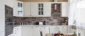
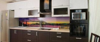
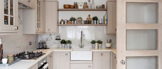
It has always been this way: the smaller the dimensions of the kitchen, the more every centimeter of free space is valued. And it is not surprising that, based on the photo of a 2 by 2 meter kitchen, every person strives to make the room as useful as possible. You, of course, can seek the services of specialists, but in fact, you can cope with this task yourself.
Features of the design of a small kitchen space
Which color to choose
The main rule for creating an elegant interior for a small-sized kitchen 2 by 2 meters is a detailed calculation of all the details, from the color of the walls to the type of doors. The main guidelines for you should be a feeling of convenience and compliance with your taste preferences.
In conditions of limited space, the color of the finish should visually increase it. And light, pastel colors cope best with this task. If you want to use multiple volumetric designs, you must remember that at the visual level they will make the kitchen smaller. But this does not mean that you need to abandon them completely.
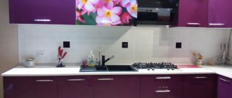
Important! In order to add some charm to the decoration of a kitchen with dimensions of 2 2 by 2 2, you can use single images of medium sizes, a fashionable print. The most important thing is that they will not have any negative impact on the spaciousness of the kitchen space.
To a large extent, the color design of the kitchen is determined by the stylistic direction that you give preference to.
Some important tips
To make your kitchen feel more spacious while still keeping it light and cozy, use space-saving techniques with modern appliances and multifunctional kitchen equipment. These can be roll-out shelves, drawers, baskets, etc. Instead of a huge stove, you can purchase a hob and a separate oven, which can be placed in a niche for appliances.
When selecting furniture, pay attention to its dimensions in different states. For example, chairs for a small kitchen must be chosen so that they can hide under the table and take up as little space as possible. The same applies to the table - it is important to find a balance between ease of use and size
To create a comfortable kitchen interior, it is better to make furniture to order, taking into account everything down to the smallest detail. To avoid clutter, a feeling of cramped space in the kitchen and gain some space, reduce the depth of the niche of the hanging cabinets.
To prevent your kitchen from looking like a warehouse for kitchen appliances, buy only the essentials that you use all the time. It is better not to buy equipment that is used once a month, as it takes up space and leads to unnecessary waste of money.
Style selection
The main point of initial actions associated with creating an interior can be considered the determination of the style direction.
Attention! Don't try to be analytical in every direction. It’s enough just to be guided by your feelings, “like it or not.”
The main directions known today:
| Provence | characterized by an abundance of floral patterns, rough ceiling decoration, and pieces of furniture in light colors. All this creates the impression of carefree, cozy atmosphere. Provence is more common in private homes, but this does not mean that it would be out of place in an apartment. It’s always nice to plunge into the atmosphere of rustic simplicity after a busy day at work. |
| Country | This is wooden furniture, a low chandelier hanging over the table, a classic version of the hood, door cabinets without stained glass. The main condition for such a design is that everything should look as simple as possible. Pathos and glamor have no place here. Country style is also called rustic; it is always associated with homely warmth and comfort. The palette includes beige, sand, white, olive, light blue. Surface finishing with stone and tiles looks good |
| High tech | in this case, the design of a kitchen measuring 2 by 3 meters is completely subordinated to functionality and practicality. Allows you to achieve spaciousness even in limited space. For this, modular furniture is used, an abundance of glass is welcomed, and maximum illumination is ensured. This direction is for those who love modern technology. |
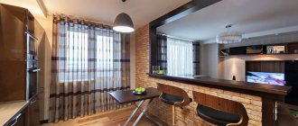
| Loft | allows you to combine the most daring ideas with individual needs. But don’t forget about the frames, because otherwise the room can be oversaturated with unnecessary elements. As you can see in the photo of a 2 by 2 meter kitchen design, the main highlights of the loft are the brick ledges, wooden floors with boards, and plastered walls. |
Harmonious arrangement of furniture is the key to the convenience and spaciousness of the kitchen
Interesting! In pursuit of the goal of decorating your kitchen in an original way, you can also use styles such as modern and classic. If you approach it correctly, the result will please you.
Kitchen layout
First you need to analyze all the technical parameters: the size of the room, the location and shape of doors and windows, the presence of projections or bay windows, ventilation.
Modern design of a small kitchen, thanks to successful zoning and furniture arrangement
Important! You need to consider how many people live in the apartment and how many can gather at the table at the same time. The possibility of placing a dining area in the kitchen or the need to move it to the living room depends on this.
Dining area in a small kitchen
The most popular layouts:
Corner kitchen
Ergonomic option. Fully utilizes the space at the junction of two walls. A sink is usually placed in the corner module.
Zoning a small area with a corner kitchen
On the left and right there is enough space for a work surface. A stove is installed on one side and a refrigerator on the other;
Linear kitchen
All elements of the kitchen unit, stove, refrigerator are installed along one wall.
Linear kitchen set in blue for a small kitchen
This allows you to increase the dining area;
U-shaped kitchen
The furniture is located along three walls. One of the sides runs along the window.
Using a window sill and two adjacent walls to arrange kitchen furniture
The dining area is designed as a bar counter, a window sill, a roll-out structure, or moved into the living room.
An example of installing a sink near a window in a U-shaped small kitchen
Attention! For safety reasons, do not place the stove close to the refrigerator or sink. If the gas stove is located next to a window, then it is better to replace the curtains with blinds. For a small space, proper ventilation is very important.
Roller blinds on the kitchen window
What else can be used for a 9 square meter kitchen to make it look modern?
- Photo wallpaper.
- Plants. Be closer to nature.
- Turquoise details.
- Black and white tandem.
- Bright colors.
What to do if you need to put a refrigerator in a kitchen that has a balcony?
Also place it near the window, not forgetting to leave room for the balcony door.
A real example of how people built a refrigerator near the balcony.
Nearby, by the balcony door, you can place other furniture, including a set.
An option when the exit to the balcony is open.
Additional guidelines for designing straight kitchens
A narrow module must be placed between the refrigerator and the freestanding stove. For built-in equipment, it is not necessary to adhere to this rule. Perhaps provide a protective panel so that the side wall of the refrigerator does not suffer from grease and steam during cooking.
It is not recommended to remove the dishwasher and washing machine from the water supply and drainage systems for installation if there are problems with water pressure. Also, when moving the sink, you should provide for this (for example, install a pump).
With high ceilings, a two-row arrangement of wall cabinets with different depths looks more modern than the classic increase in height and framing with a cornice.
Retractable work surfaces and bar counters will help you organize your workspace more conveniently when cooking.
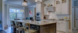
Island compositions for studio kitchens and dining areas complemented by sideboards and wall cabinets make the design of a straight linear composition more interesting in the interior.
When developing a direct kitchen project in modules, you should adhere to generally accepted standards of kitchen furniture.
How to arrange furniture correctly
It has been determined in practice that the most comfortable line of furniture is from 2.5 meters. Less or too long a strip will cause more trouble than benefit and convenience. You will need to give up familiar, practical things or waste extra energy.
Any layout begins with installing a sink. It’s good if the communications output coincides with the plan and suits you. Otherwise, the point is moved to another place: to a corner, to an island, or shifted. There should be a gap of 50 cm between the stove and the sink. It is best to place it in the middle.
To improve functionality, you can use some tricks:
- Fill all the free space with all kinds of drawers, cabinets, shelves, rails;
- At the preparation stage, draw a plan indicating the dimensions of the furniture, area, communications, location of sockets, lamps. The diagram will allow you to evaluate the merits of the arrangement and eliminate shortcomings before starting repairs;
- A white, straight kitchen will always be a winner because of the influx of light, the visual expansion of space, and the feeling of cleanliness, which is important for the room where they cook. Wood-effect facades with a glossy surface in solid colors are also popular.
Kitchens 9 sq m with a refrigerator - photos of new items for 2022
The refrigerator is usually left in the kitchen. The question arises: “How will it fit into the project and where will it be placed? Check out our new photo collection. Here you will find the answer to your question.
- The refrigerator looks great next to the window.
- Or you can put it near the door.
- The built-in refrigerator will harmoniously fit into the design and complete the overall look of the room.
