Unobvious things about the design of the kitchen-living room:
- Lighting and the location of switches critically influence the interior of the kitchen-living room, and everyone does it wrong .
- The ideal partition between the kitchen and living room is a bar counter (specifically a counter table, i.e. wide or an island). Possible with an attached sofa.
- There are specific scenarios for using a combined kitchen, thanks to which it has become so popular. But if you don’t yet clearly imagine them, then you risk adding to the collection of the most mediocre layouts. Next there will be scenarios and how they affect the kitchen-living room project.
- Zoning by gender is nonsense. About the kitchen floor.
- We unite the space and the design task is to maintain both the kitchen area and the living room area in the same style, and not separate them, as for some reason many people think.
- You can make sure that odors do not spread and ventilation works normally, but this is done at the design stage.
We will analyze each point in detail using photo examples of real kitchens and living rooms, I will tell you how to avoid standard mistakes, but first things first.
Go.
American style
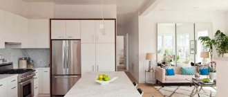
It is suitable only for large rooms, but the interior of a kitchen of 30 sq. m., completely allows you to follow all the canons of this style. In most cases, the kitchen with this layout is combined with the living room. Also, a kitchen island is usually allocated.
The room should be dominated by natural, eye-catching colors. The furniture is distinguished by its simplicity of decoration and form, the main emphasis is on its functionality.
Interior decorative elements
The decor should not deviate from the overall interior design and color scheme. The most noticeable decorative elements in the kitchen-living room are, of course, curtains, bedspreads and sofa cushions. They can be selected in the same range or contrast with each other. Textiles can be selected to match anything - wallpaper, sofa upholstery, large carpet, etc. If fabrics of the same color are selected, they may differ in density, material, texture.
Lamps also serve as decoration. Beautiful wrought iron sconces, stylish chandeliers, table lamps with stained glass elements or figurines, etc. The interior design will look more harmonious and complete if the metal elements of the lamps are the same color.
What else is suitable as decor:
- Vases;
- Figurines;
- Stylish carpets;
- Paintings;
- Photo;
- Candles;
- Live plants in pots, bouquets of flowers.
Various ways to decorate the interior of a kitchen-living room of 30 sq. meters are presented in the selection of photos below.
Art Nouveau style
One of its characteristic features is a craving for space and plenty of air. There are no definite boundaries in the choice of material used in the interior; the use of wood, plastic, metal, etc. is allowed.
It is worth noting the abundance of glossy and glass surfaces. A rather unusual feature of Art Nouveau is that dishes and various utensils are used as a kind of decoration and most of them are in plain sight. Bright and contrasting colors can easily take root in a room.
Don't forget that in such a spacious kitchen you can afford to overdo it.
A spacious kitchen allows you not to limit yourself in choosing colors, prints, textures, decorative or architectural elements. So, for example, you can use wallpaper or curtains with a large print to decorate the interior without fear that the space will be greatly reduced. Instead of light tables and chairs, you can use chic and massive ones.
Also, instead of plain white and beige tones, use rich and even dark colors and other more complex color combinations. Below is an example of a 36 square meter living room kitchen design in a yellow and blue color scheme and contrasting details.
It should also be noted that rich shades, especially warm ones (red, terracotta, brown, yellow), can create a feeling of cheerfulness in a spacious kitchen.
Loft
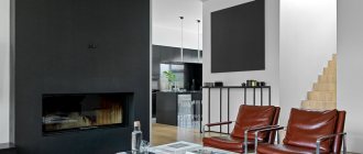
Premises in this style are somewhat reminiscent of factory floors. The loft is distinguished by the rough decoration of the room at first glance: textured walls (brickwork, cobblestone), uncovered and exposed pipes, open shelves.
Wooden furniture predominates, but the interior also contains glass and metal. A loft-style room should resemble a factory or plant of the 19th century, which gives it a special charm.
But this is only a small part of the existing styles; it all depends on your tastes and preferences. You just need to pay attention to the “appropriateness” of the kitchen design. For example, so that it matches the decor of other rooms and looks natural.
It is not recommended to choose southern styles that require a large amount of natural light in a room where there is clearly a lack of it.
To keep cleaning a large kitchen simple, avoid surfaces that are impractical.
Caring for a large kitchen is much more difficult than a standard one, especially if we are talking about a combined kitchen with a living room or a kitchen with a large dining room, because clutter in the work area spoils the overall appearance of the room.
Here are some helpful tips to help you create a kitchen that is easy to clean and difficult to smudge.
- Avoid using facades, countertops, splashbacks and floors in dark colors (black, graphite, dark brown, dark green and dark blue). On dark surfaces (especially glossy ones), dust, crumbs and stains are very noticeable.
- For cladding countertops and backsplashes, give preference to artificial rather than natural stone. Other suitable options are tile and wood (for countertops).
- The most practical material for finishing the floor is tiles or porcelain stoneware. Using these materials in the kitchen-living room, you can decorate only the work area, and the rest of the room can be finished with any other material. Different floor finishes not only make cleaning easier, but also zone the space.
U-shaped
This method is not suitable for small kitchens, while in larger ones it leaves a lot of free space in the center.
Subtleties of redevelopment
If you are lucky and the wall intended for demolition turns out to be non-load-bearing, you can calculate how much area will be freed up after demolition. Let the width of the structure be 10 cm and the length 3 m. The area occupied by the wall is obtained by multiplying these numbers: 3x0.1 = 0.3 m2. It doesn’t seem like much, but it’s enough for a medium-sized gas or electric stove, for example, 50x60 or 60x60 cm.
Before starting renovation work, at the planning stage, the following issues need to be addressed:
- Agree on the rework in advance. Before drawing up a design project, you must obtain permission to demolish the wall and move pipes (if required).
- At the planning stage, locations for electrical outlets are selected and the location of lighting fixtures is thought through. Separate lighting will be needed for each functional area.
- Choose a design style and color palette. An interior in light and pastel colors is preferable, as a light ceiling appears higher and the studio itself visually looks more spacious. On the other hand, the living room and kitchen area are 25 square meters. m is enough to decorate it using dark and rich colors.
- Finishing materials are chosen based on the style.
- Determine what furniture will be needed and how to arrange it.
With an island
Here the furniture is lined up along the walls, and the role of an “island” is a massive dining table, a sink with a countertop, or floor shelves with a countertop.
Availability of a kitchen area of 30 sq. m. allows you to choose any of the listed methods of arranging furniture.
What you need to know about the pros and cons of combination
Owners who decide to redevelop are going to receive the following benefits:
- Opportunity to show your imagination . In a standard-sized kitchen you have to adapt to a modest square footage and limit your desires. The open floor plan will turn your dreams into reality. It doesn't cost anything to move the sink to the windowsill, install a stylish bar counter, or decorate the interior with a custom-made kitchen with an island.
- Possibility to adjust the size of zones . It depends on the preferences of the owners whether the kitchen will remain small or its area will double, and the process of preparing breakfast and lunch will turn into a pleasant experience. A large living room will be needed in a house where guests often visit.
- Possibility of communication . A 25-meter kitchen-living room unites relatives; all family members can cook and communicate, including the one who is currently conjuring dinner.
It is important to understand that the idea of a combined room may have the following disadvantages:
- Impossibility of arranging a studio room . The problem becomes insurmountable if you start a redevelopment and it turns out that the wall that needs to be removed is load-bearing. SNiP rules prohibit demolishing load-bearing walls, and it will not be possible to coordinate such a project with the state.
- Difficulties of redevelopment . When arranging, you will have to take into account the geometry of the rooms, the number of windows and doors, and the location of communications. You will not be able to move the sink outside the wet area if the apartment is located in an apartment building. To legitimize the alteration, you will have to come to terms with this (and similar) rules and act within the framework of the SNiP instructions.
- Design limitations . Design ideas for a kitchen-living room of 28 square meters also have their own subtleties. m; the design of a square room will differ from the design of a rectangular-shaped interior.
- Difficulty of operation . Kitchen smells are not always pleasant. If they do not go beyond the boundaries of a standard kitchen, then there is no insulation in the studio, and the aromas spread unhindered throughout the room and are absorbed into the upholstery, carpets and curtains. For a spacious studio, one hood may not be enough; a powerful ventilation system will be required.
Nuances of furniture arrangement
Regardless of which version of the kitchen layout is 30 sq. m. you choose, you should consider that:
- It is better to arrange the stove, refrigerator and sink by following the rule of the triangle: the sink should be its central vertex, and the stove and refrigerator should be at the sides. The distance between the peaks should not exceed 1.5 meters. This arrangement will make the cooking process much easier for you.
- It is better not to place the sink close to the wall, especially to the corner. Dirt and grease flying onto the wall will accumulate in the joints and will be difficult to clean.
- The “working triangle” should be well lit; spotlights can help with this.
- To avoid regular jogging, it is better to place cabinets with dishes, spices, etc. closer to the “work triangle.”
Create even lighting.
Even the most ideally designed kitchen can become uncomfortable if the lighting is not planned correctly. At 36 square meters it should be uniform, not dull and not too bright. To do this, in addition to the ceiling chandelier, additional light sources should be used. It is best to use spotlights located around the perimeter of the ceiling at a distance of approximately 30-70 cm from each other. Please note that they cannot illuminate the entire room, but only the work area. You can also use wall sconces and floor lamps to create uniform light.
- Ideally, the chandelier should be placed not in the center of the kitchen, but above the dining table (at a height of 70-90 cm from the tabletop). It is better if it is multifaceted, so that you not only illuminate the dining area, but also visually divide the space.
- The island is best illuminated by a pair of three pendant lamps of a laconic design.
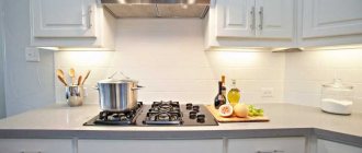
- It should be illuminated in the work area - above the countertop and above the wall cabinets.
- If the kitchen is combined with the living room, then the living room should be equipped not only with general lighting, but also with independent lighting. Floor and table lamps will create coziness and make a spacious room more intimate.
Zoning
Kitchen projects of 30 sq. m. usually include dividing the room into several zones. Usually distinguished:
- Food preparation area.
- Lunch.
- Tea area/relaxation area.
The simplest way is to visually divide the room using:
- Differences in color and texture of the walls.
- Different floor coverings.
- Different lighting.
- Arranging furniture into groups.
More complex methods include:
- Selection of zones using multi-level ceilings and floors.
- Using arched structures and wall projections.
- Using screens, partitions, thread curtains.
In addition to the above, a bar counter, the back of a sofa, or any other large piece of furniture can be used as a separator.
Zone the space into a work, dining and/or living area.
To make the interior of a combined kitchen look orderly and comfortable, it should be divided into zones; kitchen, dining room and living room. Here are some ideas on how to do this:
- Decorate the walls, floors and/or ceilings in separate areas with different materials or different colors. Example: tiles on the floor in the kitchen + parquet boards in the living room, or, say, dark beige walls in the kitchen and light beige in the living room.
- Separate areas with ceiling beams or other suspended structures.
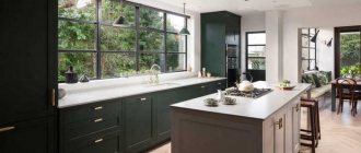
- Use furniture dividers: island, sofa, armchairs, breakfast bar, shelving, etc. Below is an inspiring example of a zoned 36 square meter kitchen with dining and living areas.
- Build partitions from glass, wood, plasterboard, etc.
- Install sliding doors
- Install screens
- Use hanging curtains
- Lay a rug in the living room
Of course, all areas (living room, kitchen and dining room) should have the same design in terms of color, decor, interior style, textiles, etc.
Photo of a kitchen 30 sq. m.
Category: Kitchen
Design tips
Modern trends involve the use of different styles when decorating premises. There are also no restrictions for the kitchen. Classics, minimalism, English and Scandinavian styles, ethnic and country, modern, modern eclecticism and fusion, as well as a combination of different fashion trends are still popular.
Designers advise decorating the living room based on your preferences, taking into account that it should be in harmony with the rest of the rooms. If the entire apartment is designed in a classic direction, then the kitchen can be decorated in the same way or use the English style. But there are no strict rules.
Studio apartment 28 square meters
The design of the studio is made in a modern style. The bedroom area is separated by glass doors. A small workspace was allocated in the living room area; a couple of coffee tables made from a log house were used for decoration. The hallway has an illuminated mirror and a built-in wardrobe. The bathroom is made in dark colors, with dark striped tiles chosen as an accent.
Studio 28 sq. meters - design in gray tones
The design of the studio is made in gray tones. There are three main zones: kitchen, living room and bedroom. Plasterboard partitions were used to zone the kitchen, and a sliding screen was used for the bedroom.
Each zone has several light sources: main lighting and backlighting.
To prevent the studio from being monotonous, contrasting accents were made on white furniture in all areas.
