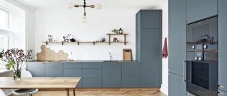
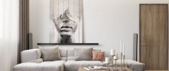
Choosing an interior style
A kitchen area of 3 by 4 meters is quite enough for most modern and classic interiors. The main thing is to approach the issue thoughtfully and not overdo it with details. Then the room will turn out stylish, creative and practical.
Kitchen 3 by 4 in modern style
Modern style harmoniously combines functionality and aesthetics, cold calculation and home comfort. He takes the main features of the classics and reworks them in a new way. Therefore, natural stone and shabby wood in such interiors are combined with acrylic, glass and metal fittings. And so that it doesn’t look too pretentious, use a simple layout and laconic geometric shapes.
Kitchen 3 by 4 in classic style
For all its decorative pomp, the classics are very strict: they have simple forms, a symmetrical layout, geometry and pronounced centers. The color scheme is natural, but complex: beige, sand, dark wood, deep burgundy, emerald or mustard. The decor includes carvings, stucco moldings, gilding, antique fittings, large monogram-ornaments on walls, panels and textiles.
Kitchen 3 by 4 in Scandinavian style
Scandinavian style is one of the most comfortable among popular modern interiors. Its light color scheme, bright accents, natural materials, textiles and handmade decor fit particularly well into the kitchen. Leave plenty of light, avoid artificial gloss and plastic, choose natural fabrics and use clay and porcelain kitchen utensils instead of jewelry.
Kitchen 3 by 4 in Provence style
Delicate Provence is completely designed in pastel shades, with shabby bleached wood and romantic decor. Use more cotton and linen textiles, decoupage, carvings, decorative inserts. Small floral patterns, classic stripes or even polka dots look good in the decoration. And the best decorations are cast iron cutlery, your favorite set, a collection of porcelain and even your jars of spices, jams or cereals.
Kitchen 3 by 4 in loft style
The space in the 3 by 4 kitchen is enough to bring to life a careless and deliberately rough loft. Leave the raw brick or concrete wall, use old rough wood furniture, and complement it with bright and shiny modern appliances. Loft is one of the most creative and eclectic styles, so there are practically no canons and restrictions in it. Just create for your own pleasure.
Color spectrum
In a 3 by 4 kitchen, you don’t have to limit yourself to pastel colors and shades of wood. Monochrome white minimalism, rich colored accents or even a stylish dark interior look equally good here.
White kitchen 3 by 4 meters
White color in kitchen decoration still remains universal: it is a good basis for hi-tech, Scandinavian style or even pop art. It will set a neutral background for extravagant combinations and harmonize the most eclectic interiors. If you don't like sterile snow-white, pay attention to warm shades of milk and cream - they are especially cozy.
Black kitchen 3 by 4 meters
Black interiors are by no means as gloomy as they might seem, but they are always stylish and unusual. In small kitchens there is no room for such experiments, but 3 by 4 meters is already quite enough. Black looks great both in the mirror gloss of acrylic facades and in the noble matte finish of modern household appliances and fittings.
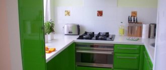
Green kitchen 3 by 4 meters
Green color in interiors gives energy in the morning and helps to relax after a busy day. It goes well with any other natural shades: brown, sand, red, yellow or blue. For classic kitchens, deep emerald is suitable, for minimalist and Scandinavian kitchens - rich herbaceous, for Provence - mint or pistachio, and for high-tech - neon light green.
Red kitchen 3 by 4 meters
Bright, expressive and slightly aggressive red color is rarely used as a basis for living room interiors. But in the kitchen it is more appropriate than ever, because it has long been known that it stimulates the appetite. And if juicy scarlet is too flashy for you, pay attention to noble burgundy, delicate coral or calm brick.
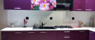
Purple kitchen 3 by 4 meters
Purple is the color of creativity and experimentation, which always has a place in the kitchen. Dark grape shades are suitable for classics and contemporary, delicate lilac for Provence, warm beetroot for Scandinavian interiors. Cool shades of purple add a touch of futurism to modern interiors.
80 inspiring kitchen design ideas 12 sq.m. (photo)
Materials and design
To choose materials for kitchen finishing, focus on their practicality and functionality. This does not depend on the area of the room, because all surfaces should be non-staining and easy to clean. The kitchen is always full of humidity, temperatures, grease and odors, so unsuitable materials will quickly become unusable.
Wall decoration
The simplest and most unpretentious coating for walls is ordinary painting with moisture-resistant paint. Tiles never go out of style, and wall tiles are also cheaper than floor tiles. More original options are laminated panels, non-woven or vinyl washable wallpaper, glass wallpaper or textured plaster.
Floor finishing
The best choice for kitchen flooring is durable ceramic tiles that are easy to maintain and won't stain. As a last resort, use a moisture-resistant laminate, but then you will have to carefully insulate all joints and junctions so that it does not swell or deform from moisture. If you prefer stone, pay attention to artificial marble, because real marble is too sensitive to coloring substances, such as wine or juice.
Ceiling design
A perfectly smooth and practical kitchen ceiling is a stretched glossy, matte or satin canvas. Multi-level plasterboard structures are suitable for zoning, but choose moisture-resistant sheets. Both options are separately good for building in lamps and hiding communications.
Textile
If in the living room or in the bathroom you can still get by with a minimum of textiles, then in the kitchen this is simply impossible. Don’t miss this moment when planning your interior, because coasters, napkins and potholders in the same style will become a full-fledged accent and decoration. Only avoid fabrics that are too heavy, bulky or delicate - they are unsafe near the stove and are more difficult to care for.
How to adjust your kitchen space
The kitchen is a multifunctional room where quite a lot of furniture is placed in a small area, so it is worth using some design tricks that will help visually adjust the geometry and expand the area at a visual level, namely:
1. Kitchen set. A kitchen set with open upper tier shelves or cabinet doors with glass inserts will help make the kitchen space more spacious. Also, a good solution would be to install a two-color set, where the lower tier is made in dark colors and the upper one in light colors.
2. Shiny surfaces. In a small kitchen, you should give preference to glossy surfaces that can reflect the surrounding space and create the desired volume. These can be glossy facades, suspended ceilings or self-leveling floors. Mirrors, especially those placed opposite windows, are no less effective at increasing space.
It is better to avoid heavy dark curtains if the room is small. Light light tulle will add air and volume.
3. Finishing materials. Give preference to light-colored walls and ceilings. A good option is striped wallpaper, which allows you to adjust the space in the desired direction. For example, vertical stripes on the walls will “raise” the ceiling visually, while horizontal stripes will expand the room, as you can see in the following photos.
4. Apron. Even such a seemingly insignificant detail as decorating a wall near a work area can create a very significant effect. An apron made in dark colors, in combination with light furniture, will create a stunning feeling of endless depth. You can also install skins with a 3D image or a mirror surface.
To correct an elongated area, designers often resort to the design of figured ceilings and asymmetry in the placement of lighting fixtures.
Lighting and backlighting
There is never a lot of light in the kitchen, and natural daylight is not always able to compensate for this. In this case, modern multi-level lighting comes to the rescue: separately - the ceiling, separately - the walls, separately - local lighting. To make the light comfortable and uniform, replace the classic central chandelier with a series of spotlights or compact pendant lamps.
Interior design of a small kitchen (90 photos)
Zoning
Obviously, a room that performs two functions - cooking and eating - should be divided into zones. There are several techniques for this.
- Bar counter. It looks organic, can be used for its intended purpose or replace a table, but it takes up a lot of space and is not suitable for children and the elderly.
- Lighting. If you hang a low lamp above the dining area and choose spotlights for the workplace, two separate spaces will be clearly visible.
- You can divide the space using color and wall design. Contrasting finishes, different materials and textures provide real scope for creativity.
- You can also zone the space using a separate low cabinet.
Decorating a kitchen is quite an interesting activity if you approach it correctly. The main thing is to decide what you would like to see in the end and tune in to the creative wave. A couple of visits to a hardware store, sharing experiences with familiar new residents - and brilliant ideas will not keep you waiting.
Furniture and kitchen appliances
Choosing a set for a 3 by 4 kitchen is not difficult: almost any set will fit here. To leave space for a full-fledged dining area, choose a linear or corner layout. If the work surface and more equipment come first, a U-shaped set will cope with this.
And if you dream of a small bar counter that will replace the dining table, pay attention to the island layout. The same format is suitable for rooms with a non-standard layout or work triangle arrangement. But then it is better to make furniture to order according to individual measurements.
Consider whether you need open shelves or whether closed and pull-out sections are sufficient. Choose fittings and facade doors: hinged, sliding or “push to open” system. For cases, MDF, chipboard, laminated chipboard or an entire array is traditionally used, but the facades can be either plastic, acrylic, or glass.
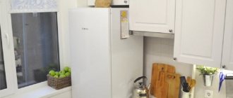
The most popular refrigerators are ordinary floor-standing ones up to 2 meters, and they can be either open or built into a cabinet case. But this is no longer the only option, because it can be replaced with two separate low units: a refrigerator and a freezer.
Consider whether you need a stove as a separate unit or whether a tabletop hob is sufficient. Do you need an oven and dishwasher, what size sinks do you prefer? Will you have to install a TV or washing machine in the kitchen?
Don't forget about the details: all kinds of hooks, holders, stands, baskets, magnetic strips and organizers will help keep things organized. Your brand new designer interior will always look like something from a photo in a glossy magazine.
Advantages and disadvantages of direct cooking
Straight kitchen with dark top and light bottom
A rectangular kitchen 3 by 4 meters can be planned using the principle of zoning, when, with a limited area of the room, zones are created that perform different roles depending on their purpose. Optimization problems for a rectangular kitchen:
- Maximum comfort and safety when placing functional areas.
- Availability of sufficient free space for movement. It is important to correctly arrange household appliances, sockets and switches so that communications do not interfere. Using tall cabinets to store a lot of things and save space. Built-in equipment will save working space as much as possible.
The presence of plumbing, heating and electrical appliances requires compliance with rules to prevent fires and short circuits. For example, a distance of 40-80 cm must be maintained between the refrigerator and the hob so that the refrigerator does not heat up.
Example of arrangement of household appliances
The main options for planning a 3 by 4 meter kitchen can be:
- A linear (direct) version of the distribution of zones - on one side there is a work set, on the other - a dining set.
- Corner or L-shaped, when the work area occupies a corner with two walls, a place for eating is equipped against a free wall.
- Island, when the sink or stove is built separately from the set.
- Parallel - furniture is located along two parallel walls.
The apartment has a straight kitchen 3 by 4 meters, a design, photos of which can easily be found on the Internet, often arranged according to the principle of linear placement of elements of the work area (cabinets, appliances, countertops, sinks). This layout has undeniable advantages:
- compactness. Frees up space for the dining area;
- rigor and orderliness, the ability to combine even with the most intricate kitchen interior;
- the ability to purchase a ready-made headset without spending money on individual orders;
- There are no expensive corner models.
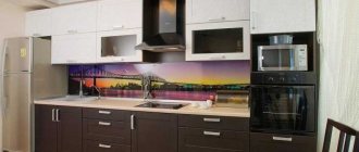
Kitchen with a straight (linear) design
The main disadvantage of a direct composition is that when arranging the work area, the classic triangle, convenient for any housewife, is not observed - refrigerator, stove, sink. If the straight composition is 3-4 meters long, this will require unnecessary expenditure of effort and energy in moving between sections, which is very labor-intensive for large volumes of food preparation.
A straight set is more suitable for a kitchen with an elongated and elongated layout that has access to a loggia, balcony, and other doorways that prevent the placement of non-linear furniture.
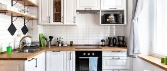
Kitchen 3 by 4 meters - photos of real interiors
Modern kitchens with an area of 3 by 4 meters combine brightness and functionality. Just look how many options can be implemented in such a relatively small area!
Kitchen design 3 by 3 meters: beautiful ideas (70 photos)
Layout options – angular and linear
For a kitchen of 12 square meters, angular and linear layouts have the following advantages:
- They don’t take up too much space in the room and are compact;
- allow you to clearly delineate the cooking and eating areas;
- provide spacious passages, saving space for the dining area.
With a straight layout, it is better to place the kitchen set with appliances along a long wall. The use of shelving racks, retractable countertops, rotating, transforming elements of the kitchen set will help save space. The dining table can be either classic or in the form of a bar counter. In addition, instead of chairs, you can put a small sofa.
If the kitchen is small, it is quite possible that it will not accommodate a linear composition. In this case, the design of a 3 by 4 meter kitchen with a corner placement of the work area will allow you to make maximum use of the selected angle.
The corner layout allows for rational use of space due to the 3-corner placement of the refrigerator, stove, and sink, which eliminates unnecessary movements between them.
Often, a corner layout visually makes a room smaller. The use of design techniques to visually expand the area - shiny (glossy, mirror, glass surfaces), play of tones (3-D images), the advantage of light colors, a combination of horizontal and vertical lines, backlighting and lighting options - will eliminate this problem.
A 3 by 4 meter kitchen, combined with a living room, allows you to create a spacious, ergonomic and comfortable space. But these advantages can be offset by the disadvantages of this alternative - the difficulties of redevelopment and the spread of odors and high humidity into the living room area.
Example of a kitchen combined with a living room
