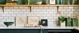
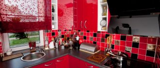
Do you think that a kitchen with an area of 3 square meters is something out of science fiction? Not at all. In old houses, such tiny rooms are found all the time. For owners of apartments in new modern buildings, it seems impossible to equip a functional kitchen in such an area. But, as practice shows, nothing is impossible in the world of design. Of course, in this case, you cannot use standard practices that allow you to arrange all the necessary furniture and household appliances. In a small area, it is necessary to carefully consider the appropriateness of using each element. Only in this case, it is possible to achieve the creation of a functional room.
Space layout
The kitchen is the family gathering place. In a small room, the owner’s needs must be taken into account, and every thing must be in its place. With this approach, even in a small apartment you can create a room with an excellent design that will be pleasant to be in.
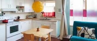
For a room with an area of only 3 square meters, it is better to buy modern furniture. For example, a correctly chosen set, even in a kitchen cabinet, will not take up much space, but will still allow you to place a sufficient number of different storage modules. In the photo above you can see an example of the ideal layout of a small room.
Before purchasing a headset or equipment, you should definitely take preliminary measurements of the length and width of the room and make at least a schematic drawing. It is worth thinking about which items are necessary in the design of the room and which are not. If space is limited, you have to choose between installing a dishwasher or an oven.
For owners of narrow and long kitchens, it makes sense to refuse to install a door, and instead leave only an arch. This technique will visually expand the space a little.
When planning a straight kitchen with a refrigerator, it is important to follow the principle of the “working triangle” in design. It would be nice if it was isosceles. With this aspect ratio, it is convenient for the housewife to cook and move between three key points in the kitchen.
Direct kitchen
For a straight kitchen measuring 3 square meters. m should choose an L-shaped layout. The design of the corner set is convenient because it is quite spacious and also increases the usable area of the room. But it will cost more than the linear option.
The short side of the L-shaped layout can be turned into a work area, and the perpendicular wall can be used to install a refrigerator, stove, or sink.
A single-row layout is also suitable for a small room. It involves placing furniture and equipment along one wall. But a linear kitchen is quite impractical and leaves little space, so this type of layout is rarely used.
You may be interested in: Loft-style kitchen - interior and decor features
Corner kitchen 3 meters long
A corner kitchen with an area of 3 meters has disadvantages:
- it is difficult to choose a suitable set; you often have to make it to order, which results in big expenses;
- The sink is often placed in the corner, which is not very convenient.
3 by 3 layout options
Kitchen design begins with an assessment of the initial data: where the room is located, what are the pros and cons of its layout.
An area of 9 square meters cannot be called tiny, but irrational use of space can make it so. Before creating a project, evaluate:
- presence and size of window or balcony
- location of communications
- number and location of sockets
- original condition of electrical wiring
The photo shows options for kitchen layouts of 9 square meters. m.
Does your room have access to a balcony? Take advantage of this: by placing a dining area or additional storage space there, you will increase the available space. It is prohibited to remove utilities by city planning regulations, so the location of a work zone here is excluded. But dismantling the window frame and balcony door will make the window sill a suitable place for eating.
The absence of a balcony presupposes the presence of a window, which can also be used advantageously in a 3 by 3 kitchen layout. By sacrificing several upper cabinets, create a work area with a sink or countertop under the window. In addition, the window sill is an excellent place to place kitchen appliances.
Tip: if you want to place a microwave or other equipment on the windowsill, take care in advance of placing sockets in the window slopes.
In the photo, kitchens combined with a balcony
Furniture selection
Once the layout has been chosen, several equally important problems need to be solved. How many cabinets are needed? Which technique should you prefer? What design is suitable for a 3 sq.m. kitchen? m? The answers to these questions will depend not only on the wishes of the owners, but also on the size of the room. Only the essentials will fit in a 3 square meter kitchen.
It’s good if you can combine the kitchen with a balcony or corridor. You will have to abandon the traditional stove, leaving only a hob with two burners. In this case, there will be no oven, but there will be more space for storing utensils. The refrigerator may also need to be moved to another location, such as a hallway. All equipment should be purchased built-in - this solution will save up to 30% of the room’s area.
Cabinets for a small kitchen should be wall mounted, tall and without sharp corners. An addition can be hanging shelves on which you can store things that are often used. Unfortunately, it is unlikely that in a kitchen measuring 3 square meters. m will be able to set up a table. But a narrow bar counter can be made near the window, thereby creating a place where 1-2 people can dine.
How to arrange a kitchen?
Proper lighting ensures comfort while preparing and eating food. A ceiling chandelier in the center of the room cannot provide light to all the necessary areas. The workplace requires a separate light source - this can be tabletop lighting under the wall-mounted modules, wall sconces or ceiling spotlights. A pendant light will highlight the dining table. If its role is played by a bar counter, install spotlights or track lamps above it.
The photo shows a stylish dining area in the kitchen 3 by 3 meters
The main decorative element of any kitchen is the apron. A glossy or mirror finish will allow you to increase the area, or an unusual design on glass or bright tiles will attract attention.
Textiles in a 3 by 3 kitchen are no less important than in the bedroom. The choice of curtains is dictated by the layout features. In a room combined with a balcony, you can do without them. If there is a countertop or dining table under the window, it is preferable to use blinds, Roman or roller blinds. Laconic Japanese panels or, for example, Austrian curtains will elevate an open window.
Dimensions and standards
In stores you can find ready-made kitchen sets of standard sizes. But first you need to prepare a kitchen project with an area of 3 meters with dimensions, and then make custom-made furniture. In this case, you need to remember the following rules:
- The height of the lower cabinets should be at least 85 cm. If the owners of the apartment are tall, then this value can be increased to 90–92 cm.
- It is more convenient to make upper cabinets with closed doors, since a room with such furniture will visually look less crowded.
The photo shows which distances are best to choose when planning a room.
What to consider when renovating a small kitchen?
The choice of materials for renovating a 3 by 3 meter kitchen depends on the goals and objectives that you set for yourself. You can expand the space of small kitchens using glossy textures and light shades; this rule works on all surfaces.
Ceiling
A shiny stretch ceiling actually reduces the height of the room, but visually makes it taller due to the reflection of light. In case of painting or whitewashing, choose a vibrant white color - it will add volume. Complex plasterboard structures will make the kitchen smaller and simplify the design, but if they are necessary, use lighting to “lift” them.
Walls
Washable wallpaper, painted walls, ceramic tiles, panels, decorative plaster - when purchasing materials for kitchen walls, proceed from your budget and chosen style.
Coloring is preferable for Scandinavian style, minimalism, and hi-tech. Wallpaper and panels are suitable for Provence, decorative plaster in different designs for design in classic and loft styles. The apron is decorated with tiles, panels, mosaics or paint.
A plain color or small pattern works best. Vertical lines will make the room taller, horizontal lines will make it wider. Large-scale patterns and relief on the walls will make the room smaller.
The photo shows a 3 by 3 meter kitchen design with original wall decor
Floor
In a space of 3 by 3 meters, laminate, linoleum or floor tiles are suitable. There is a large selection of colors and textures of these materials on the market. Also consider the features of their use:
- A practical option for flooring is tiles. It is durable, easy to clean and is not afraid of moisture. The disadvantages are the high price and difficulty in installation. In addition, tile is a cold material; for comfort you will need a “warm floor”.
- Laminate is not so cold, but it is afraid of moisture - any leakage can threaten the replacement of the floor covering.
- Linoleum is easy to lay and is not afraid of water spilled from above, but getting it underneath can provoke the development of fungus.
Color solution
After all the furniture and appliances are installed, there will be little space left in the room. Choosing the right color scheme will visually expand the area. It is better to do the design in white or beige - there will be more space and light.
It is strictly not recommended to use dark colors in the design. Also, do not make bright accents - in a cramped room they will only irritate the eye. It is advisable that all cabinets and other furniture be in the same color scheme.
Glossy surfaces look very good in the design of small rooms. The floor and ceiling also play a role. Geometric designs and variegated colors also visually reduce space, so it is better to use a light, uniform color.
You may be interested in: Neoclassical style in a kitchen interior in light colors: design photos
In order for the space to look visually larger, you need to pay special attention to light. The lack of light sources affects a person’s mood and perception. It is best to make several lighting options - ideally at least three. For example, a volumetric chandelier in the middle of the room, lighting around the perimeter of the ceiling, plus an additional lamp above the work surface.
Kitchen design 3 square meters
For the kitchen of the smallest area, designers advise adding more light. This can be either LED lighting on the ceiling and along the apron, or light colors in the lining of the headset. Such techniques have long been known to everyone and make it possible to achieve a visual expansion of space.
If you have somewhere to hang a mirror, use it. A mirror will visually enlarge the space and enhance existing lighting. You can make a “mirror” kitchen apron. True, there is a significant disadvantage here - the surface is easily soiled, which will have to be wiped more often.
A bar counter in a small kitchen instead of a dining table is the simplest and most stylish option. You can combine it with a window sill, which will expand the visible area and make the design more modern.
Style selection
You can create a beautiful design, as in the photo, even a straight kitchen with an area of 3 meters, without the help of a specialist. First you need to decide on a style.
- Classics never lose their relevance. This style is distinguished by natural materials, a large amount of decor and furniture that is predominantly beige.
- Provence. The intricate rustic style is loved by many. This design will look appropriate even in a kitchen with an area of 3 meters.
- Minimalism is a strict interior in which there is room only for the most necessary things.
- Scandinavian - it is distinguished by a large amount of light and functionality. There is little decor, and the furniture is made of wood. This design will look fresh in a straight kitchen.
- Modern. It is distinguished by the presence of wide work surfaces, minimalism, and the rejection of templates. Straight kitchens in a modern style look interesting and thoughtful.
- Modernity puts first place not the appearance of a thing, but its functionality. This design is suitable for those who value practicality.
- High-tech follows the principles of minimalism. In spaces with this design, strict geometry, neutral colors prevail, and the technology is the most modern.
If you have little experience and are afraid to make a mistake, then it is better to choose a classic or Scandinavian style - it is impossible to make a mistake in them.
In a narrow kitchen you can place the necessary things without sacrificing the aesthetic side thanks to design solutions. By installing a corner set and using light colors in the interior, you can visually expand the space and ensure that every centimeter is used for its intended purpose.
Decor
To decorate a small kitchen in Khrushchev, the materials must be not only beautiful, but also practical. Therefore, it is advisable not to use wallpaper in this part of the house, at least washable or paintable. Venetian plaster and tiles are suitable. It is best to put moisture-resistant laminate or linoleum on the floor. The second option is more resistant to water and other liquids, which is important for the kitchen.
The ceiling can be painted with white water-based paint, or it can be covered with plastic panels. Despite the fact that stretch ceilings reduce the height of the room by several centimeters, and in Khrushchev it is already small, they can also be used. You just need to choose the right materials - mirror, transparent and glossy. The photo shows an example of a successful design for a small kitchen of 3 square meters. m.
Color, of course, will not add meters, but it will help make the kitchen not so small and cramped, at least visually.
- Use light pastel colors in your design: white, beige, light yellow.
- You can paint three walls with the same pastel shade, and the fourth with a contrasting dark shade. This design technique also expands the space.
- Glossy and mirror surfaces will help make a small kitchen look larger. It is better to avoid embossed details.
- It is also better to take furniture in light shades, for example. White facades create a feeling of lightness, which is also good for a small kitchen. To prevent the bright interior from seeming boring, add a few bright accents: shelves, curtains, kitchen apron, lamps.
Consider the psychological impact of colors in design. Red and orange increase appetite, while blue and other cold tones reduce it. Orange color promotes activity, green, on the contrary, calms.
Lighting and the design of lighting fixtures are also important for the perception of the interior.
- Large hanging chandeliers will make the room feel cramped. Laconic lamps on long wires, on the contrary, will increase the space.
- Sconces and LED strips are suitable for lighting. They can be placed in such a way as to smooth out the imperfections of the room and highlight the right places.
- In addition to general light, you need local lighting of work areas: stove, table, sink.
- You can combine different light sources: natural light with electric light, general light with spot light, chandelier with LED strip.
- The shade of light should match the color scheme and design of the kitchen. For an interior in cold colors, the light should be cold; for warm colors, warm light.
There should not be a lot of accessories, they should not be large and bulky. If these are curtains, choose light, light fabrics. The window sill in a small kitchen is used as a work surface, so curtains should not impede access to it. Living plants will refresh the kitchen, but they should not be too lush.
In a kitchen with a small area you can place everything you need without sacrificing aesthetics. You need to follow certain rules that will allow you to rationally use every centimeter of free space and get a beautiful and cozy kitchen.
Recommended Posts
Proper kitchen planning
Small kitchen design
DIY kitchen decor ideas + photos
Refrigerator under the window in Khrushchev + photo
How to decorate a kitchen window with curtains + photo
Kitchen-living room interior 30 sq m
Standard sizes of kitchen cabinet fronts
It is always cheaper to buy facades of standard sizes than to order non-standard ones. It's also faster: custom ones will have to wait for them to be made, while standard ones can be purchased in stock. Therefore, when designing a kitchen, we start from a table of standard sizes of facades. The result will be significant savings. With the right approach, non-standard facades will only be needed for end modules. Which, however, can be made in the form of open shelves.
The layout of standard sizes of facades on kitchen cabinets can be more clearly represented in the drawing.
It is also recommended to take a tabular form from the manufacturer in advance - for example, Ikea’s standards differ significantly from the generally accepted ones. And already design the kitchen based on what you have.
By the way, kitchen facades can be equipped with almost any furniture in the house: good options can be selected for making children’s rooms, wall slides in the living room and other low cabinet furniture.
Kitchen with peninsula
A kitchen with a peninsula is a more compact alternative to an island layout. Unlike an island, a peninsula can be leaned against a wall and/or against a unit.
The layout is recommended for:
- Small kitchens in which the dining table can be replaced with a peninsula table.
- Spacious kitchens.
- Kitchen-living rooms, when the dining area can be moved into the living room.
- “Working” kitchens, when the apartment has a dining room.
Pros: A kitchen with a peninsula is convenient for preparing food and at the same time more compact due to the fact that one side is leaning against the wall and/or the rest of the furniture.
Cons: The peninsula is a little less convenient than the island, since it cannot be circumvented from all sides. As a rule, a peninsula plays the role of both a desktop, a place for dining and a place for storing things, which means that it cannot fully replace a dining table either in terms of capacity or ease of use.
Tips:
The same recommendations apply to the peninsula as to the island table.
Here are a few photo examples of the interiors of square kitchens with a peninsula.
So which kitchen should you choose?
When choosing a kitchen, you need to proceed from the features of the apartment and the kitchen itself, as well as from your wishes. But, based on general opinions, the following conclusions can be drawn:
- If you want to create a large dining area in the kitchen, then you should choose a straight design
- The small size set allows you not to store unnecessary things due to the small space
- If there are a lot of products and household appliances, then you should choose a corner kitchen set.
Height of apron and wall panel
The length of the apron is determined based on the size of the kitchen working area, because the apron is a covering that protects the walls from grease, steam and temperature changes. Based on these considerations, it is necessary to determine the finishing area.
Much more questions arise when calculating the height of the apron. What do you need to consider?
Man's height. The height of the apron determines the level at which the wall cabinets will be located
For a short person, for example, it is important to install wall cabinets so that you can freely reach at least the bottom shelf.
- Hob type. In a kitchen with a gas stove, the height of the apron under the hood can reach 800 mm: this is due to the need to place the hood higher. In a kitchen with an electric hob, this distance can start from 500 mm. The best option is always 600 mm.
- Design features. If the set does not have upper cabinets, then the empty wall can be completely covered with an apron.
Choosing materials for finishing
You can choose any materials that are most preferable to you. Their texture deserves special attention. Matte items seem softer and cozier, but they will not help create the illusion of expansion. Gloss is a completely different matter, since it has the following features:
- glossy surfaces are easier to clean;
- they look more modern;
- because they reflect light, it makes the room feel larger.
It is also important that the materials are practical. For example, you should not choose a finish that is traditionally found only in the bedroom, for example, carpet on the floor
Make sure surfaces are easy to maintain. Since we are talking about finishing, this aspect is especially important. After all, the appearance of the kitchen in a few years depends on how well the material is preserved. If splashes of grease or ketchup stains cannot be quickly removed from some texture, there will no longer be a neat appearance.
Floor
There are not many wishes for floors in a small kitchen. It is necessary that they are not slippery and at the same time wash well. This is where ceramic tiles come to the rescue. In general, tile floors in the kitchen are a classic of the genre. However, in small rooms several conditions must be met in order for them to look harmonious.
- Choose relatively light-colored materials. Of course, black floors look stylish, but they will look out of place in a small kitchen. It's better to go with nut color.
- Imitation wood always looks great.
In addition to tiles, you should also pay attention to linoleum. This option is budget-friendly, but when buying material, try to choose a type for commercial use
The floors in the kitchen are heavily used, the furniture in it is heavy, so household linoleum will not retain its attractive appearance for a long time, and commercial linoleum, on the contrary, will not deteriorate for a long time.
Ceiling
An unshakable rule for renovations in small dining rooms is that the ceilings should appear high. So, it is worth abandoning matte coatings, for example, plaster. A glossy stretch ceiling will look much more harmonious here. In addition to the fact that it will reflect light and thereby make the room brighter, it will also expand the space, as it has a mirror effect. Partially reflected, the room looks larger. Another significant plus for the kitchen is ease of cleaning. Stretch ceilings can be washed carefully, so that grease and other fumes can be easily removed from their surface. They do not absorb odors.
A common option is to use a tile ceiling in the kitchen. When choosing this cheaper alternative, try to choose glossy plastic panels to achieve the visual effect of expansion. This will make the room look more attractive. The big advantage of the panels is that if one tile gets damaged, you don’t have to replace the entire ceiling - you can only change a part.
Walls
When choosing a material for walls, the main thing is to choose washable ones. This can be either wallpaper or tiles. It is not recommended to choose ordinary paint, because no matter how well the walls are painted, they are still easily scratched and deteriorated
For a small-sized kitchen, this is especially important, since there is little space and people will often touch the walls. Painted surfaces will quickly lose their appearance
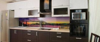
When renovating, most people try to combine materials, covering most of the walls with washable wallpaper, and installing a tiled apron above the sink and along the work surfaces. By the way, it can not only be assembled from tiles, as was done before. Now aprons are made from plexiglass and beautifully decorated, depicting landscapes, still lifes, and sometimes panoramas of cities. For a small kitchen, as for any other, the main thing when choosing materials is their practicality.
