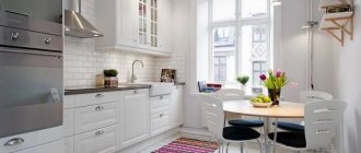
Features of the new Ikea line
Today, when choosing a kitchen set, it is important to pay attention to the size of the kitchen, the style in which it is made, as well as geometric features.
Ikea made sure that the client had the opportunity to choose the design he liked, taking into account the required sizes and shapes.
Thanks to the principle of modularity, the new furniture collection will become an integral attribute in modern design.
Module sizes
As part of this system, the company produces modules of several possible sizes:
- width: 20, 40, 60, 80 cm;
- frame height 80 or from 140 cm (pencil cases, sideboards and tall cabinets for built-in appliances)
- depth: 61-62 cm and 38-40 cm.
Standardization of IKEA furniture sizes is both an advantage and a disadvantage of the METHOD system.
On the one hand, standard parameters allow you to assemble the headset yourself by selecting modules of the desired type and functionality.
On the other hand, the system does not take into account the design features of the premises.
Small kitchen with U-shaped set METHOD (gray facades “Budbin”)
Despite its shortcomings, the IKEA METHOD system still remains one of the most popular among buyers. A wide range of sizes allows you to assemble a set that will suit most kitchens in apartments or private houses. This meets the main principle - universality.
Kitchen IKEA METHOD “Ringult” (glossy) in a Khrushchev apartment
Another important principle is practicality, which is expressed in the ability to quickly and easily replace the necessary elements - frame, plank, cornice, etc. This is convenient and practical in case of damage to individual parts or if you want to inexpensively and without unnecessary hassle update the kitchen interior that has become boring over the years.
The METHOD kitchen can be composed of several functional and additional parts:
- frames of floor and wall cabinets;
- facades;
- table top;
- plinths and legs;
- overlay panels, strips, cornices.
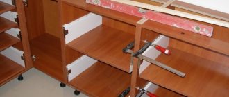
For a series of videos on how to assemble a METHOD kitchen from IKEA with your own hands, see below:
- Assembly of frames (in 2 parts):
- Installation of the countertop (part 3):
- Installation of cornices, plinths, panels (part 4):
- Installation of sink, siphon, mixer (part 5):
Advantages of Ikea furniture
Despite the main advantage in the production of branded products, the company ensures that all materials for the manufacture of furniture, additional modules and accessories are environmentally friendly.
An important factor is the interchangeability of modules. This means that if you want to make any changes to the headset, there will be no problems.
The variety of modules will allow you to change any detail or individual element of the kitchen without losing the previous layout.
And the ability to combine different styles and colors will help you create a truly original design, and at an affordable cost.
The release of the new line did not affect the quality of the product, its technical characteristics and service life. Therefore, Ikea kitchens of 2020 can be used both in houses with large dimensions, non-standard-shaped rooms, and cramped apartments, saving space due to the functionality of the modules.
Kitchen "Budbin"
One of the most popular options in the updated line of Ikea modular kitchens. The main feature is the attractive paneled facades made of fiberboard with a wide frame, which can easily be considered an appeal to classical motifs. They are extremely smooth and tactilely pleasant due to the matte varnish coating.
Available in three color variations:
- warm white;
- grey;
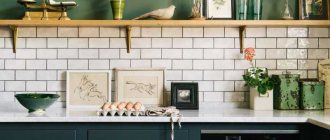
- rich dark green.
Approximate prices:
- from 3,000 rubles for a wall cabinet;
- from 3,850 rubles for a floor cabinet.
An important advantage of this model is that it belongs to the METHOD modular system. This allows you to choose a set for you exactly in the configuration that you need: you just need to enter all the necessary dimensions into the planner on the official website and mark the necessary modules - and the system will prepare a project for you with already calculated prices.
In any case, there is room for options: for example, the height of wall cabinets ranges from 40 to 100 cm. In addition, it is possible to choose original glass doors with bindings - they not only make the design aesthetic, but also expand the space if the kitchen is not boasts a solid timing.
Despite the classic design in general, the Budbin kitchen from Ikea also looks great in less traditional interiors.
An example of classic white facades “Budbin” in a 220 cm set. With a wooden tabletop “Ekbakken” under dark oak it looks so harmonious that you literally fall in love with this kitchen at a glance.
The gray color is also attractive and, as you can see, fits perfectly into the Art Nouveau style.
Interesting assembly with white facades. The total amount of the project is about 162 thousand rubles.
Options for planning furniture solutions for the kitchen
Modern and fashionable Ikea kitchens are a guarantee of saving the family budget and are valued not only for their affordable cost and quality, but also for their choice in layout.
Note!
U-shaped kitchen: pros and cons of the U-shaped layout. Methods of arranging furniture, dividing into working and dining areas. Photos and videos of design ideasKitchen facades: TOP 180 photos and video reviews of kitchen facades. Types of frames, criteria for choosing materials and color solutions
- Short curtains for the kitchen - features of using short curtains in small and large kitchens. Advantages and disadvantages of fabric materials (photo + video)
Equipment and interior components
Built-in electrical appliances, as well as chairs for the IKEA kitchen, must be thought out in advance; the location of the sockets will play an important role. The lack of power supply locations can be eliminated by using additional sockets or an extension cord.
Using hidden wiring, such manipulations will be invisible to guests or friends, and all equipment will work in unison and stably.
Depending on the design, you need to select the appropriate scheme for this; if you do not have confidence in your own abilities, it is better to turn to specialists for help.
Angular arrangement
The standard and most common layout method is a corner or L-shaped layout of kitchen furniture.
It allows you to compactly install a wall in which you can easily integrate a standard set of household appliances combined with storage units.
At the same time, free space is preserved for eating, and in some cases, creating an independent dining area.
Tips for decorating a blue kitchen
Use as an accent
To prevent the room from looking gloomy, a touch of freshness was introduced into the interior; blue should only be used as accents. For example, the upholstery, curtains, tablecloth, part of the furniture, or the wallpaper of one of the walls can be blue. Designers note that if you paint or paste one of the walls blue, it will visually move away. This will make the kitchen more spacious.
Avoid decorating your dining area near a blue wall, as it will make the food look less appetizing. If you really want it, then let it be a turquoise or blue shade. Be sure to dilute the blue with orange and yellow flowers that stimulate the appetite.
“Warming up” the atmosphere with wood
The abundance of natural wood in a blue kitchen will make it cozier and warmer. Woody tones always pair perfectly with blue in any style. Wood makes blue more noble. At a minimum, the countertop and floor should be wood.
Dilution with white
In a spacious, well-lit kitchen, blue may well become the main color of the floor, walls and furniture. The optimal proportion of blue dilution is considered to be 1:1 or 1:2
Adding bronze, copper and gold
The warm shades of these metals look richer than steel and silver. Copper, gold and bronze are considered the most appropriate in classic, ethnic interiors, as well as in loft and art deco. Metal in the kitchen can be a mixer, handles, household appliances, decor, and various curtain holders.
Linear layout
This layout is more suitable for large rooms, but it can also be used in small kitchens, where you can limit yourself to a minimum number of storage modules and household appliances.
This way you can save space for a full dining area.
Note!
Water filter for the kitchen: functions and benefits of a water filter in the kitchen. Types of filters and mechanisms, their pros and cons (photo + video)Kitchen in high-tech style: 135 photos and video master class on organizing space and design
- Kitchen in modern style - 160 photos of the best design options and features of the style
Blue curtains in the kitchen
Plain elegant textiles are suitable for a window in the dining room or if the kitchen is connected to the living room. In an ordinary kitchen, you should hang curtains with stripes, checks, patterns and flowers with blue splashes.
Not sure if blue is the color for you? Alternatively, you can use turquoise shades. Turquoise kitchens in the interior can also look very advantageous.
U-shaped layout
This layout method is used when it is necessary to place the maximum number of household appliances and storage spaces, taking into account window openings. Both open shelves and standard kitchen cabinets can act as hanging modules.
This is especially beneficial in large square-shaped kitchens, since this arrangement of modules leaves a lot of space in the middle of the room.
You can distribute it at your discretion - leave it for free movement or organize a dining area if there is no separate room for this purpose.
Current color solutions
When making furniture and fittings, Ikea uses soft tones that go well with both bright and calmer shades.
The neutrality of colors allows you to embody the most original ideas, since facades made in this style of color scheme harmoniously combine with any interior.
The best kitchens from Ikea have the following color options:
The classic style, made in snow-white tones, has been and will be popular at all times. Glossy or matte facades with a smooth or textured white surface are combined with any background, while visually expanding the space.
Beige tones are no less popular. They look great with fittings in brighter colors of the same tone, which gives greater contrast, thereby making the furniture stand out from the general background.
Shades of blue are trending this season. Deep shades combined with a base color scheme of lighter tones are suitable for large to medium sized kitchens.
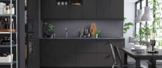
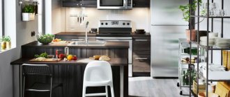
For lovers of a strict, dramatic style, kitchen sets made in dark colors are perfect. Such facades go well with metallic shades and mirror surfaces.
People with unlimited imagination and design taste can combine modules of different colors or tones. This way you can create a bright, dynamic design.
Small details and designer fittings are important when choosing kitchen furniture. They help complement and emphasize the image being created.
Blue apron in the kitchen
A blue apron is an interesting idea because blue evokes a feeling of cleanliness. By decorating a fragment of a wall, you can visually expand the space. Please note that against a blue background, food loses its appetizing value. Elements of yellow, red or orange colors will help correct the situation.
Stylistics of the 2022 collection
Without delving into the style, all furniture from the new line can be divided into two categories - modern and classic kitchens. The first is distinguished by the fact that most of the kitchen facades are made in a minimalist style.
Such models are distinguished by their functionality and conciseness. This style is characterized by furniture elements with a smooth matte or mirror surface.
As for the classics, the style itself also has more modern trends. Monograms, carved and forged elements faded into the background.
This is due to the design and modernization of modern household appliances, which have a quite decent appearance and do not spoil the interior.
In this regard, many kitchen sets are equipped with transparent glass inserts, doors and shelves.
Choosing an IKEA kitchen: 3 simple steps
To prevent the selection process from taking too long, follow these simple instructions.
Step 1: Planning your placement
Assess the parameters of your room, take accurate measurements yourself or with the help of a specialist. Determine where each module will be most conveniently located and choose a good layout. Be sure to visit the IKEA interior exhibition. It shows ready-made options with the most successful color combinations and carefully selected accessories. They will definitely not leave anyone indifferent. At the same time, compare the options you like with the capabilities of your kitchen (size, layout, etc.).
Step 2. Design
- Shelves on the wall for the kitchen: ideas on how to make them yourself, photos
Table restoration, tools, furniture preparation and work stages
Do-it-yourself restoration of old chairs: disassembly, upholstery, seat, assembly, painting, decor, decoupage, photo
There is a free planner in Russian on the IKEA website. In order to get started, you need to register on the site. You must remember your login and password so that later a specialist in the store can view the project you created. The system enters the dimensions of your kitchen, taking into account all the projections, pipes and sockets. The first step is to correctly place the sink and household appliances (stove, refrigerator, dishwasher, etc.). You can also add other equipment if desired (decorative interior items, for example). As a result, you will receive a 3D model of your ideal kitchen and the price for all added products.
Step 3. We go to the store with the finished project
For convenience, you can print out the project and write down the login and password for the consultant. Additionally, delivery and professional assembly services may be offered. They are paid separately, so prices must be clarified in advance when placing an order. It is also easy to install the headset yourself, because the product always comes with detailed instructions.
