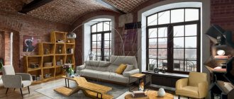
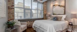
It is no coincidence that we associate the loft architectural style with something industrial and factory-like. This the style originated in the 40s of the 20th century in New York, when a jump in land prices in the city center forced owners of industrial enterprises to move production to the outskirts of the city, and to sell former factory and warehouse premises at a low price. People bought these premises and turned them into unusual spacious studios. However, you can equip a small apartment in a loft style if you try.
Photos of designs
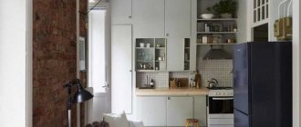
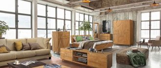
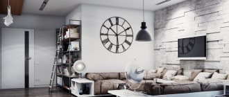
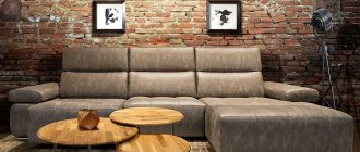
The loft style can be created in a small apartment if you create the illusion of space in it by successfully arranging the furniture. After all, another feature of this style, along with the use of industrial elements (unfinished brick walls, ceilings, beams and ceilings covered only with plaster) is minimalism. Below we have selected some good solutions.
In light colors
Comfortable ottomans and sheer curtains
Dividing an apartment into functional zones using furniture
Sleeping and working space in a small space
Sloping roof with large window
Comfortable sofa and lots of shelves
How to decorate a small bedroom in the loft style according to all design rules, read in this article.
Zoning options for studio 30 sq. m
- Height difference. Creating a podium in the layout is a free and interesting solution for highlighting a sleeping area or living room (sofa with table). If the height of the room allows, multi-level ceilings are installed, which play the same role.
- Lighting. A simple and effective way of zoning without unnecessary use of free space. For the kitchen and bedroom, diffused, spot light is used, while for the living room it is central and bright.
- Furniture items. In addition to the sofa, you can use shelving, a bar counter, a fireplace, an aquarium, a table, and a chest of drawers for zoning.
- Mobile partitions. Screens and curtains perfectly separate the room, but can be folded and put away without taking up extra space.
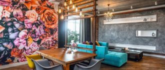
- Finishing. Interesting wallpaper, decorative plaster, photo wallpaper can be used to highlight an accent wall or area. This technique is also used for the floor: in the kitchen - tiles, in the room - laminate or parquet, carpet.
Before arranging zones on the plan, you need to decide what functionality the apartment should have. A kitchen and bedroom are mandatory elements of housing, as is a separate bathroom. To clean the air in the kitchen, a powerful hood is installed. The rest of the space is used for an office, living room, hallway, playroom, etc. For example, if an office is not needed, the free space can be used as a convenient dressing room.
An interesting option would be to create a two-story apartment, if the ceiling height allows it. In this case, the second tier occupies only part of the space. A bed with a bedside table would be perfect on top, and a dressing room and work area below, which will significantly save space. In addition, you will not have to install partitions to separate the sleeping area. You can also arrange a children's room at the top, but then you need to think about safe partitions that will prevent the child from falling.
Ceiling
High ceilings are desirable for this style. If the apartment has low ceilings, they will have to be “raised.” At the same time, there is only one way to do this directly at the expense of the ceiling: try to “disassemble” it. Older houses have suspended ceilings left over from the days when it was fashionable. If you are lucky, all that remains is to remove the suspended part itself and the ceiling will actually become higher.
Otherwise, you have to play with visual perception. The best options are to place low furniture or illuminate the ceiling with a floor lamp or wall lamps (the light of which is directed upward). There are other ways to visually raise the ceiling (patterned curtains, plain curtains with a pattern at the top, a vertical pattern on the walls, the most effective is covering the ceiling with glossy, “mirror” paint), but they do not correspond to this style and will look inappropriate.
Info As for covering the ceiling, you can return to the classic version and use only plaster, or, if this seems too uncomfortable to you, paint the ceiling beige or light gray.
Beams at the top are a common solution in a loft
White ceiling expands space
Redevelopment
Initially, the studio was an open space with two windows and a French balcony. There were no internal partitions built in the new apartment; to the left of the entrance there was a riser for water supply and sewerage, and to the right was a ventilation duct dividing the room into two parts. A bathroom was installed next to the riser; on one side of the ventilation duct, a living room area and a spacious dressing room were installed. On the other is the bedroom (it was hidden behind a curtain). To prevent the noise of the ventilation shaft from causing discomfort, the box was soundproofed.
They decided to make the dressing room wider than the adjacent ventilation duct. To equalize the width of these rooms, the ventilation duct was laid with tongue-and-groove blocks.
Kitchen modules were ordered with a depth of 53 cm. Cabinets with a standard depth of 58 cm would block the opening of the French balcony. The legs of the table and chairs are adjustable in height - this way the dining set can easily be turned into a bar set
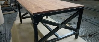
A kitchen was planned in a small area behind the bathroom. The furniture set is quite compact, but it managed to accommodate all the essentials - a refrigerator, a microwave oven, a two-burner hob and a dishwasher. Considering that the housewife spends a lot of time at work and rarely cooks, it was decided to abandon the oven. The conventional boundary separating the kitchen and living room is the dining group - a height-adjustable table and three chairs. A sofa was installed in the living room area; on the contrary, in the partition between the windows, a TV was hung. There is also a small work area behind the curtain in the bedroom. The table for him was made of metal. This, at first glance, strict, unfeminine option fit perfectly into the decor.
A load-bearing element protruded in the center of the ceiling. It was hidden behind a plasterboard structure, inside of which there was electrical wiring for pendant lamps. The table in the work area is made of metal
Walls
In general, the rules are standard for this style - from one to three (all four are possible, if it looks good) walls must be unfinished (or finished to look unfinished), that is, at least one wall must be red brick masonry . The remaining walls can be decorated to your taste, adhering to the following rules: it is better to use paint rather than wallpaper, and it is better to give preference to light colors for the walls.
You can learn how to plaster walls with your own hands and what types of plaster there are in a separate article.
In a small apartment, it would be very appropriate to make one wall mirrored, for example, by filling it with sliding wardrobes with mirrored doors.
One brick wall
All walls are made of brickwork
How to distinguish a true loft?
Story
A good loft should have a story. Initially, a loft was housing in a non-residential building where something used to happen. You will always find a hint of this in the form of, for example, elements of old equipment.
Raw walls
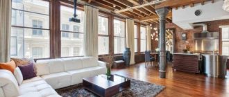
This is the most recognizable feature. Especially the red brick walls. Often, factory buildings were not plastered both outside and inside. But it could also be concrete if the lofts were made in buildings of a later time.
Open communications
Initially, communications were left open due to lack of funds. And there was no point in stripping and hiding the wiring in unplastered walls. And how can you hide large ventilation pipes?
High ceilings and large windows
A distinctive feature of all factories is huge windows to use daylight in the work shops, and unusually high ceilings. Because of these features, lofts often lacked any partitions.
Open plan
“Open space”, popular in modern offices, came to us precisely from the loft. But the rooms were still sometimes divided by walls that did not reach the ceiling.
Horizontal rooms
With our small ceilings, you can hardly afford a mezzanine, but in the lofts they made “horizontal” rooms where the owner’s private area was set up - the bedroom.
Mixing old and new
The poor residents of the first lofts furnished them with whatever they could get their hands on. They used things found at flea markets, made some with their own hands, and gave others as gifts from colleagues. Therefore, modern industrial objects can coexist with antique ones in a modern loft.
Interior
The interior of a small loft-style apartment should look spacious , and for this you need to carefully consider the layout. It's no secret that mirrors are one of the best ways to create the illusion of additional space, which is why they are often used in minimalist designs. But style does not tolerate a large number of identical small objects, so it would be best to install, as we wrote in the previous paragraph, a cabinet with mirrored doors, thus making the entire wall mirrored.
Maximum use of limited apartment space
When choosing furniture, you need to remember the need to save space. The apartment should not be crowded. If you can walk freely between the furniture, this is not yet space. We advise you to pay attention to multifunctional furniture, for example, a table from which you can extend the cooking surface. There are a lot of similar ideas on the Internet.
At the same time, when choosing furniture for a loft-style apartment, you need to constantly ask yourself the question: “is this thing needed in the apartment?” It would be great to use that mirrored cabinet that we talked about to store all the things that need to be stored in the apartment. At the same time, you need to ensure that the depth of the cabinet is not greater than necessary: nothing should take away the space. The photo below shows several loft interiors in a small apartment.
Combined living and dining room
Mirrors and a large window
Plenty of storage space
Minimum necessary furniture and plenty of light
Colors, decor and details
Standard colors for the loft style are light (they also help create the appearance of spaciousness), such as beige, white and light gray, as well as shades of brown. All other colors are complementary. You can’t make your apartment colorful; there shouldn’t be so many flowers. A light shade, brown, and another complementary color that goes well with the first ones, for example, dark blue, will be enough. “Children’s” bright colors like rich pink will not work here. You can see what a loft style should look like in white here.
Give preference to light colors
The abundance of decor and details in this style is unacceptable, and yet they must be there. Classics for the loft style are various kinds of maps and globes (for example, outlines of continents on a wall or brickwork), small green plants in classic brown pots are also suitable.
Small rectangular shelves made of dark wood will look good, on which you can place books, plants or small decorations like a wooden cat figurine. The main thing is not to overdo it. Black and white photographs in strict thin frames will look good on the walls. The rug, if present, should be a single color and should never cover the entire floor—most of the floor should be “bare.” At the same time, a good floor covering is wood.
Materials appropriate for this style are wood, glass and metal (these are also the most desirable), but plastic is also acceptable (though then it is better that a plastic object does not look “lonely”).
This style loves good lighting, so sometimes curtains are not hung on the windows. There should be a lot of artificial light sources. Moreover, light creates space. It is better to hang blinds on the windows.
Brown tones go perfectly with the brickwork of the loft
In a studio apartment
A distinctive feature of a studio apartment is the absence of a partition between the kitchen and living space. And this is to our advantage! This style likes to distinguish “zones” (in this case, such a zone will be the kitchen), and the absence of partitions will allow the entire space to be perceived as a single whole. You shouldn’t highlight the kitchen too brightly: just paint the walls of the corner of the kitchen in a different color (not too close to the main one, but not too contrasting either).
You can learn how to lay a kitchen tile backsplash from this article.
Examples of loft-style apartment design are presented in this video.
Or you can simply separate the kitchen from the rest of the room with a long bar table, “outlining” the kitchen space: separation with long cabinets and tables is a standard solution for studio apartments in any style. By the way, an open bar would be very appropriate. It is not necessary to place alcohol there; you can also put coffee syrups. The coffee machine will also look great in the interior.
Expanding space with white walls
Successful division of a room into zones
Lighting
Artificial lighting is the last important design element. The room must be illuminated in the most careful way so that its operation does not cause any difficulties or negative emotions. Lamps must fully comply with the general concept of the chosen design.
Read
