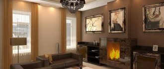
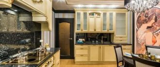
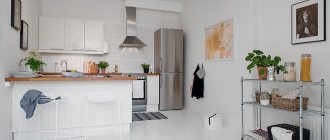
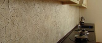
Psychologists have long noticed that the color of the walls in the kitchen seriously affects a person’s emotional state and appetite. To ensure that every day family meals at home take place in a pleasant environment, it is necessary to take a responsible approach to the choice of background shades for the kitchen interior. The most original designs use combinations of several colors at once.
Plain walls - the simplest design option
Color for kitchen walls: selection rules and recommendations
Everyone has their own favorite colors for the kitchen, but not everyone is suitable for wall decoration. There are proven developments that are used in design practice:
- Bright colors will attract all the attention and will tire you if you spend a lot of time in the kitchen;
- Furniture that matches the color of the walls looks respectable, but a beautiful set will be lost against a related background;
- When deciding what wall color to choose for the kitchen, remember that cold colors reduce appetite, while warm colors provoke the desire to snack;
- Personal preferences do not always fit into interiors. Unlike clothes, you cannot use acidic shades or use 5-6 bright colors. The ideal “kitchen trio” involves a light background and two contrasting colors;
- In contrasting combinations, you cannot use “50 to 50”; a light shade should fill ¾ of the surfaces. Dark colors are suitable for contrast or graphic accents.
In principle, it is not so important what color to paint the walls in the kitchen; the main thing is to choose a good combination, correct the design flaws and place accents. According to the rules of Feng Shui, if you choose a cold color scheme, light shades are a priority. Textured surfaces (plaster, wallpaper, panels) look impressive only in combination with the smooth facades of cabinet furniture.
You can use a ready-made table of color combinations in the kitchen interior.
What wall color to choose for the kitchen, remember that cold colors reduce appetite, while warm colors provoke the desire to snack.
Shades “taken” from wallpaper
Interior designers recommend that part of the kitchen can be covered with wallpaper, and part can be painted. Colorful wallpapers can hide visually uncomfortable elements such as an air duct or a load-bearing column, but that’s not all: they can become a treasure trove of color solutions.
After all, in good wallpaper everything is very competent and professionally balanced. Just “get” the primary colors from them. You can make them lighter or darker, it’s your choice.
Author of the project: Evgenia Mishina. Photo: Sergey Krasyuk.
Author of the project: Evgenia Mishina. Photo: Sergey Krasyuk.
Basic combination techniques
When choosing the color of the walls for the kitchen, it is important to take into account all design elements, including metal fittings. A harmonious combination can set the emotional background of the room.
Important combination techniques when choosing kitchen colors:
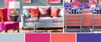
- Pearl gray is suitable as a background for spectacular combinations with pink, blue, lilac, red and blue;
- The milky tone harmonizes with warm shades and is suitable for dark shades of the cold spectrum;
- The beige color of the walls in the kitchen is considered universal - any combination of colors and shades;
- Light brown, akin to beige, looks good with white, turquoise and azure complements;
- The pale pink color of the walls goes well with the gray, raspberry, chocolate and caramel colors of the facades;
- Burgundy and cognac look perfect with milky, pale blue and black and white contrast;
- A lavender kitchen in a Provencal style is combined with olive and pale blue walls;
- Peach and apricot combine nobly with cream in contrast with brown;
- Golden, yellow and lemon are combined with purple, black and granite;
- Turquoise and azure go well with crystal white furniture.
Black is an extravagant color, but as the main color of the walls it is not always suitable for a white “kitchen”. It is important to maintain color balance. The “cosmic” color of the walls is able to “absorb” space. Black gloss has a mirror property.
When choosing a dark color, consider the texture and light absorption of the surface. Glossy and matte textures are perceived differently.
The beige color of the walls in the kitchen is considered universal - any combination of colors and shades.
Recommendations from psychologists
Any color has an impact on a person’s psychological state. Before choosing, you should read the recommendations of psychologists.
Experts do not advise using very variegated and bright colors, as they activate the nervous system. Depending on your temperament, psychologists advise using the following colors for the kitchen :
- Cholerics should use rich red or orange.
- Phlegmatic people are prohibited from using red and orange shades.
- Sanguine people need to paint the kitchen yellow or light green.
- For melancholic people, calm shades of white, blue, indigo and brown are suitable. A similar range can be used by phlegmatic people.
Those who love bright colors should know that red has a strong effect on the psyche - it not only activates the body to action, but also increases appetite, so this solution may be required for people with anemia.
It is forbidden to use red for hypertension, unbalanced people and those prone to sudden mood changes. The solution is not suitable for those who are always trying to lose weight.
Orange has similar qualities as red, but the effect on the psyche is milder. Such walls improve your mood and improve the functioning of your digestive system. Green shades have a good effect on digestion.
Psychologists also advise taking into account the area of employment, the main type of work. Because during active everyday life it will be quite difficult to be in a bright room.
Dark shades can negatively affect a person’s mood; in addition, they are not used in small areas. If dark colors are present, they will definitely need to be diluted with softer, lighter ones.
Black and brown paints are rarely used for the kitchen, as they visually make it small and create the effect of constant dirtiness. Such a decision can worsen appetite and affect mood.
Too bright and saturated colors tire and irritate any person; warm shades give vigor, and cold shades can calm.
Choosing a light color can enliven the design; dark ones will make the kitchen restrained and calm.
Features of the geo-location of the kitchen
The degree of illumination is an important nuance when deciding how to choose the color of the walls for the kitchen.
- In low light conditions, it is advisable to choose light shades of warm colors. In the northern room, it is advisable to choose yellow, lemon or orange walls. The reflection of light will enhance furniture with a glossy facade;
- The southern location will be “cooled down” a little by blue-blue or lilac colors. A modern kitchen in purple complements well with a pink or light gray background;
- Bright shades of kitchen sets are suitable for the shaded side of the house; they are compensated by light wallpaper or plaster;
- Kitchen windows facing east receive little sunlight, so a light color scheme is recommended;
- The southwest rooms are well lit in the afternoon. Direct sunlight promotes fading. It is suggested to choose pearl gray, pale lilac or beige for the walls in the kitchen;
- Mint, lettuce or pistachio are suitable for the kitchen-dining room; they are a good alternative to bright greens.
In low light conditions, it is advisable to choose light shades of warm colors.
The main principles of color scheme in the kitchen
The main color of the kitchen is the one in which large objects (kitchen furniture), as well as walls and floors are painted. For them, it is better to choose neutral, natural tones that are in harmony with each other. You can add contrasting and accent shades to the main shade - there should be two or three of them. It is advisable to use the main and secondary ones in proportions of 60:30:10. It is important to understand that using bright colors in large quantities will only spoil the impression of the interior, making it difficult to perceive. Contrasts should be no more than 10% of the entire composition.
When choosing primary and secondary colors in the interior, you can use the color wheel. This diagram represents a rainbow spectrum. Designers and artists actively use it when creating their works. Examples of combinations:
- Scheme 1. Monochromatic combination.
In this case, the kitchen interior in warm or cold colors is made with shades from only one segment.
The result is pleasant, relaxing compositions. But often such design solutions turn out to be too boring and monotonous. To prevent this effect, create contrasting combinations of dark and light shades.
- Scheme 2. Contrasting color schemes.
In this case, the colors located opposite in the pie chart are connected. These shades are also called complementary.
This solution allows you to achieve a bright, non-uniform design. But you should not use these combinations in their pure form - add neutral white, beige and other shades to the interior that will soften the atmosphere a little. Also, colors selected from the circle can be used, for example, in muted, whitened or deep variations. Otherwise, the interior will seem simple.
- Scheme 3. Harmonious combinations.
Here, adjacent colors located nearby on the circle are selected as the main ones. Such shades are also called analogous. The result is universal, harmonious combinations that perfectly complement any kitchen interior in warm colors. For greater brightness, you can add several contrasting shades.
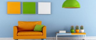
For example, we are all familiar with the combination of yellow, green and orange. These colors are located close in a circle, so this combination looks as harmonious as possible.
- The colors you choose for the kitchen should resonate with the style direction.
Usually we perceive the main style of a room through the color scheme, and only then our gaze falls on the characteristic pieces of furniture. Let's look at which shades are suitable for different styles:
- For the classical direction, as well as for modern art deco, both warm and deeper tones are suitable. Painting is used to decorate the walls, this creates a feeling of naturalness. Classic does not allow the use of bright accent elements, but you can play with contrasting transitions.
- Shabby chic, Provence, as well as Gustavian and French styles are kitchen designs in warm colors (see photo below) without any contrasts or accents.
- Loft and industrial style are decorated in muted tones; warm color combinations are also allowed. The basis of the style is factory elements (brick, inserts made of wood, concrete, metal).
- Rustic, minimalistic, eco and country - these are mainly natural motifs (the color of sand, grass, clay, stones, wood).
- It is better to decorate the kitchen floor and work surfaces in light colors.
All housewives know that stains, crumbs, dust, animal hair, and dirt always stand out very clearly on dark surfaces of furniture and floors. However, to clean such surfaces to perfection, you will need to spend a lot of time and effort. That is why many deliberately choose a kitchen interior in warm colors, buying light-colored furniture, countertops, floors and splashbacks.
- When choosing and arranging lighting fixtures, it is worth considering the location of natural light.
If the windows in the kitchen are directed to the north, you can artificially recreate the feeling of light and warmth. Use a lot of white, as well as other warm shades - yellow, red, orange, pink.
Therefore, if there is little natural light in the room, it is better to postpone cool shades in the interior. This applies to boiling white, blue, light blue, and violet flowers. In the dim light they seem gloomy and uncomfortable. Pastel colors are also not suitable for such a kitchen. They look advantageous only in combination with natural light.
If the kitchen is flooded with sunlight every day, you can safely choose cool tones - they will bring a touch of freshness to the room. Soft pastel shades are also suitable. When there is a lot of light, it is better to avoid warm colors, as in the sun they become too bright and intrusive.
How to choose warm colors for your kitchen interior that will suit you best? Designers recommend the following method: take an A4 sheet, paint it in the chosen shade and hang it on the wall in the room. Throughout the day, you will be able to observe how this tone looks in daytime and evening light. A similar technique can be used when choosing floor coverings, the color of kitchen units and other items.
- For small kitchen spaces, it is better to choose light shades.
Light beige colors will help you visually expand the kitchen space. If most of the furniture, as well as the floor and walls, are decorated in a beige tone, the boundaries of the room seem to expand: it seems lighter and more spacious.
- Cool colors pacify the appetite, warm colors excite.
If you like to create culinary delights and then delight your family and friends with your dishes, light, warm kitchen tones will suit you. If you are a supporter of strict dietary rules, you can decorate the space in cooler shades.
- When choosing the color of the interior, you can proceed from the existing shades of furniture and decoration.
If you do not want to redo the finishing of the walls and floors, or change the main set, you should choose the missing interior elements to match the color of existing items.
- It is much more convenient to visit furniture stores with a ready-made color palette.
When choosing furniture and other furnishings, you need to keep in mind the selected palette of shades. To make your task easier, you can prepare a color palette or moodboard in advance, which will indicate the main colors of the future interior. You can use online resources (the Kuler program, for example) or create a palette yourself in a graphics editor. At the same time, it is very convenient to use examples of finished kitchen interiors in warm colors. Save the resulting image to your phone so you can refer to it every time you buy furniture.
Another method will help you in choosing a kitchen environment. You can cut out pictures depicting headset items and combine them into a collage (you will find pictures on the seller’s websites). This will help you visualize how furniture and other items will look in a single interior.
Associative properties of color
A large adjacent room will appear “cold” in blue tones. It is advisable to dilute it with more friendly companion flowers.
Walls are the basis or background for the entire interior. Before choosing the color of the “kitchen”, it is important to clarify the preferences of all family members. Small children will not say that they don’t like it, but they will be capricious and refuse to eat if the kitchen is purple or black with a red facade.
People prone to depression should not rely on the “dreary” gray-green color scheme. It is unlikely that it will be pleasant to cook and dine there in cloudy weather.
Fans of extravagant kitchen color combinations should take into account that the black ceiling “presses”, and the white and mirror floor makes one dizzy from instability.
The diagonal pattern will “brighten up” the difference in the height of the walls. Colorful wallpaper will hide small defects.
The decor of a small kitchen should be of a small format so as not to divide the space into blocks. Crushing will make it visually even smaller. Several small paintings in a row will visually lengthen the wall.
Dark shades slightly reduce the area. Light reflections reflected from glossy facades “fill” the room with cleanliness, air and light.
The decor of a small kitchen should be of a small format so as not to divide the space into blocks.
What tones are warm
The world around us consists of many shades. Everywhere you can see a huge number of color compositions and combinations. But this is only a small part of what is visible to birds and insects! Previously, artists used a system of decomposing white into seven tones. Today, designers use a more advanced structure - a diagram of warm and cold shades. This system of color separation allows you to more accurately convey warm or cold moods in art, including in interior design.
Human vision is capable of perceiving only 7 shades. Moreover, as experiments with color prove, all these tones can be obtained from three basic colors - yellow, red and blue, as well as an additional white color. With three basic shades you can achieve absolutely any color. If you need to make the composition warm or cold, you just need to add more yellow, red or blue.
To decorate the interior (including the kitchen), it is possible to use three color groups:
- Warm colors: yellow, red, orange.
- Cool shades: blue, cyan, purple.
- Green tones that can be either warm or cool. Designers tend to consider green a balanced, neutral color.
This division of colors into groups is quite arbitrary. It is much more important to choose the right color composition, in which the tones will be in harmony with each other. When choosing shades, you need to rely on our perception of specific combinations.
We perceive all colors only through the organ of vision. However, if we talk about warm and cold shades, the instinctive, receptor perception of cold and heat is connected here. This is why we can divide colors into two corresponding groups.
Recommended articles on this topic:
- Cupboard for kitchen utensils: decorating your interior
- Italian style chest of drawers: 6 types for your interior
- Solid wood kitchen (30+ photos): noble luxury and home comfort
The influence of shades on mood and well-being
Without knowing which colors are suitable for the kitchen and which are not, it is easy to make a mistake - the emotional background of the room depends on this. It is known that psychologists have noticed the relationship between color and mood.
It is not recommended to choose flashy shades, especially if you have small children. They will happily eat in a room with a yellow-green or pink-raspberry design.
The red color of the walls in the kitchen excites active children, then it is difficult to put them to bed. Blue color calms, but discourages appetite.
Children are disgusted by a black kitchen, even with mirror tiles. The situation will be corrected by decor with flowers, fruits or bright citrus slices.
The red color of the walls in the kitchen excites active children, then it is difficult to put them to bed.
How to introduce shades of yellow?
Carefully use additions in the versions suggested by the manufacturers Lemonade or Mellow Yellow, as well as ocher and yellow mustard. Velvet carpets and even ceramic decorations are perfect for this role. In bolder kitchen interiors, yellow can be used on the walls.
There are three options to choose from: trendy custom geometric yellow decorations such as stripes or circles placed on one wall, one wall painted a rich color, or the entire kitchen covered in yellow paint or wallpaper.
Ideas for combining wall colors and furniture
The kitchen walls are a large format plane. Furniture determines the style and functionality of the kitchen. They must harmonize in color.
An elegant purple kitchen set has a light background:
- Gray-lilac tone;
- White;
- Pale blue;
- Fashionable color “dusty rose” (gray-pink tone).
If you have a white kitchen set, the walls can be any color. It will “get lost” against the background of white walls, so it is advisable to play up the texture of single-color surfaces. White marble countertops will look noble.
Not everyone manages to use gray tones beautifully in their design, but the color of the walls in the kitchen is in harmony with the white furniture. This is an ideal option for a high-tech kitchen. For dark facades, it is better to take the lightest tone in this range - it will be much more interesting than white walls.
If you have a white kitchen set, the walls can be any color.
Creamy and lilac
A wall painted in a different color than the kitchen front visually enriches the space. See how this can be done with companion shades of the pastel range: cream and lilac. Try to make your own “map” of pastel shades - companions.
Author of the project: Margarita Delacroix. Photo: Ivan Sorokin.
Author of the project: Margarita Delacroix. Photo: Ivan Sorokin.
What color is best for the kitchen space?
White color is considered universal. It can be offered to those who have not decided what color to paint the walls in the kitchen. It is used in all styles and design concepts.
Alternative to crystal white:
- Pearl grey;
- Pearl;
- Lactic;
- Cream;
- Light beige;
- Soft lilac;
- Blurred blue.
White color has several shades - light gray, white-blue, cream (yellowish) and pearlescent. It is not recommended to use them at the same time, otherwise against a pure white background they will look like “dirty” or “old” surfaces.
Nowadays the delicate peach color of the walls in the kitchen is widely used, but it requires gold or copper fittings. The silver-gray tone goes well with the chrome details of modern furniture - an ideal solution for urban minimalism and high-tech style.
Nowadays the delicate peach color of the walls in the kitchen is widely used, but it requires gold or copper fittings.
Stages of color selection
The first thing you need to understand is the scope of the work, so before you start designing and choosing the color of the walls, it is important to study the recommendations of designers, psychologists, and look at photographs in magazines. It is recommended to select 10 optimal options that you like and print them. After examining possible solutions, the following steps :
- The style of the kitchen is determined. Having chosen the ones you need, you will need to study all the subtleties, features and choose a shade.
- Decide on what you like, and not imitate fashion. If a certain color evokes delight and improves your mood, then you need to focus on it. This can be a base for walls or a complementary color for tables, furniture and other kitchen accessories.
- Before buying paint, take a few photographs of the kitchen, show them to the consultant, perhaps he will recommend several good options.
- It is better to choose 3 colors from the entire range. They must match the style, decorative elements, and mood. If the kitchen is planned in warm colors, you can choose a country-style kitchen, which will highlight the details.
- When purchasing, you need to use not only a photo of your kitchen, but also a small list of possible colors and additional accessories for the room. Be sure to clarify the quality of the paint, its advantages and disadvantages.
After all the stages have been completed, you can move on to decorating and painting the kitchen.
Color solutions that visually change the size of kitchens
When deciding what color to paint the kitchen in an apartment, you cannot ignore the layout features. In most projects, the cooking area is often limited in size.
When choosing options, take into account the dimensions of the kitchen, ceiling height, daytime and evening light, and existing furniture. For a small kitchen unit you need light colors, maybe in cold colors. In a kitchen where there is a large area of walls, avoid bright colors, they are tiring. Black color “steals” part of the space.
Light warm colors visually expand a small space, for example, if it is the beige color of the walls in the kitchen. A cool palette will slightly expand the narrow layout if cabinet furniture is located along the working wall.
Vertical stripes of walls and glossy stretch fabrics will “raise” the ceiling. Horizontal stripes of contrasting colors along the perimeter will make the kitchen appear wider. Diagonal lines on tiles or colored wallpaper add more dynamism to the design.
A good mood is guaranteed in a white kitchen with a silver patina in vintage style. The option in beige and apricot tones looks impressive.
Horizontal stripes of contrasting colors along the perimeter will make the kitchen appear wider.
Countertop: quality or style?
There are no strict rules for choosing in this case. Most often, a neutral palette is selected: gray, beige, white, black.
The imitation stone looks interesting. This option will suit any style.
Main requirements:
- good quality material;
- high performance properties;
- compatibility with apron, facades.
Brown - goes well with almost the entire palette
Color combinations
There are ready-made principles for choosing the color of the walls in the kitchen, which are used by famous designers:
- Black and white version. Suitable for modern interior;
- Favorite color. It is not always possible to properly integrate it into a room. An extravagant fuchsia kitchen will be emotionally balanced by white walls and curtains;
- Monochrome kitchens are an excellent solution for those who do not like diversity. Beige, sky blue, gray-lilac, peach or cream shades look good. Pastel colors and some shades of green are suitable - mint, yellow-green, but you can choose the calm color of apple green;
- Classic duets. Win-win variations - blue and white, caramel-beige cuisine or white and dark chocolate. An emerald-colored kitchen is well complemented by pale blue walls, and a delicate lilac background will set off a plum-colored kitchen;
- Combinations from the color wheel. Use shades within the same color, opposite and adjacent combinations.
Those who want to slightly dilute the interior of a white kitchen are invited to decorate the kitchen floor and backsplash with tiles with a graphic pattern.
Monochrome kitchens are an excellent solution for those who do not like diversity.
Calming and relaxing green - color trends for 2021
Several different shades of green have emerged among the 2022 flowers. The trending shade for the kitchen is Back to Nature S 340-4, which is an olive-light green with warm tones obtained by adding bronze. This color, which we associate, among other things, with meadows and nature, promotes contemplation and tranquility.
A dark, strong shade of bottle green, Adeline, has been announced by British company Graham & Brown. This color, according to the brand’s specialists, is a way to update the trend of the currently fashionable emerald green, and it is also associated with the mature greenery of tree leaves.
The greenery-inspired color palette also includes a tranquil sunrise shade known as mint grey. This subtle shade of warm gray mixed with colors such as green and blue is meant to evoke the morning sky and, like the dawn, be a symbol of new discovery.
Among the colors for the kitchen, there was also Dunn-Edwards' Minty Fresh DE5687, which is a cool, pastel green with clear menthol tones. WGSN also chose to forecast color trends, listing the minty, light shade of Neo Mint as one of the top five colors for 2022.
A kitchen painted green will not only be more cozy, but also relaxing. Nothing is more relaxing than being in touch with nature. This color can be introduced into interiors both in the form of the colors of 2022, i.e. Adeline, Back to Nature, Tranquil Dawn or Minty Fresh and Neo Mint, as well as other fashionable shades, such as sage or green peas.
Manufacturers offer us not only kitchen interior paints in these colors - which can be used to paint all or only selected interior walls. These colors are also available in the offer of floor and wall tiles, wallpapers, kitchen furniture, leisure sets, lighting or accessories, ceramics.
The best color combinations
Everyone loves natural combinations, where the entire design palette is based on shades that are associated with something from living nature.
The simplest combination is a two-tone kitchen. You can experiment, not forgetting that one color should be brighter, the other muted.
Extravagant trio - white, red and black. He has the right to live when they don’t know what color is best to paint the kitchen. White is by far the best background. This option can be played up if there is a soft red for the walls and a black gloss on the façade of the set.
Four shades within one color are the designers’ recommendation. For example, a lavender-colored kitchen complemented by purple, lilac and white.
The simplest combination is a two-tone kitchen.
Sunny and warm yellow - fashionable interior colors of 2022
Yellow is the color that reigned supreme at the 2021 Interior Design Show. It appeared not only - as has been customary for several seasons - in accessories, but also on the walls of rooms, kitchen fronts and even the upholstery of living room furniture. The choice of Tikkurilla, one of the largest paint manufacturers in the world, was Lemonade H300.
It is an optimistic, warm and gentle, muted shade of yellow with visible brown additions. As brand experts explain, this color is associated with the first rays of the sun in the morning, immediately after dawn. Thanks to this, it can add comfort and a positive attitude to life.
The institute that believes yellow in particular will be owned by 2022 is also WGSN, a color trend forecasting company. Its specialists pointed to a strong, warm, earthy shade of Mellow Yellow as one of the key colors, which can be called a shade of retro mustard yellow or bleached ocher.
What colors should not be used in the kitchen interior?
Today there are no “forbidden” combinations, but some colors will not look decent if they are not played up.
- The dark green color of the walls is associated with the older generation with the Soviet period, when there were problems with paint, it is replaced with emerald or azure;
- Dark gray has several noble “stone” shades, but it is not recommended to use it as a basis;
- Orange is a pleasant color in all respects, but it is used in an “aggressive” trio with white and black;
- A kitchen in gold or silver looks ambitious; this is “Rublev bad manners”.
The dark green color of the walls is replaced with emerald or azure.
Define your small kitchen with light colors
Although interior designers have mixed feelings about using pastels to decorate kitchens, white, cream, light yellow, soft orange or pale olive, these color schemes are especially useful for a cramped small kitchen because they can make it appear lighter and airier. If you want to highlight your kitchen design, it's a great idea to pair dark wood floors and cabinetry with an off-white color palette adorned with soft orange, terracotta or light olive accents.
You can also choose ivory, which is ideal for small kitchens. Containing white with a hint of gray-green, ivory will shine through your kitchen, providing visual simplicity, uniformity and the impression of more space.
Besides choosing the right color for a small kitchen, you can make it look bigger by keeping all other elements including curtains, pillows, tablecloth, etc. in the same color family. If you plan to add a backsplash, glass or metal tiles will increase the light in the kitchen, making it appear larger.
Expert advice
To understand whether it will be cozy in a room with a particular shade of walls, it is worth hanging a sheet of colored paper of the chosen shade in front of your eyes or eating area. If it is perceived negatively, you should abandon the idea even before the walls are completely transformed. In percentage terms, it is important which color will be the main color in the room; the rest will be regarded as additions and accents.
Some shades of brown and terracotta look quite noble, others are “dirty”. They are not suitable for classic interiors, but they significantly enliven ethnic and country style.
For classic kitchens, pastels, wood shades, and duets with a white or beige background are suitable. You can select noble additions by duplicating them in furniture and textile designs.
Furniture is most often the basis of interior design. When choosing a successful trio or duet, they focus mainly on the color of the facade.
For classic kitchens, pastels, wood shades, and duets with a white or beige background are suitable.
Today there is no perfect palette - with every renovation you have to summarize new trends and previously purchased furniture. Some people like monochrome, when everything is one color. This solution in interior design has a drawback - it often looks boring and faceless, especially in gray. However, each tone has at least 4-5 shades. You can choose several advantageous combinations from them when deciding what color to paint your kitchen.
Curtains for windows
Window decoration is essential in any interior. Thick, good-quality curtains will be inappropriate.
It is best to choose light, thin fabrics that match the rest of the interior. They do not burden the perception of space.
Gray color is universal
Curtains can be plain or contain prints that match the style of the room. Bright colors are rarely chosen; usually preference is given to a calm color scheme, white.
Choose a semi-gloss or high-gloss finish
When it comes to choosing the right color for a small kitchen, semi-gloss or high-gloss finishes are your best allies. Not only are these finishes more durable and hold up to cleaning much better than flat and satin paint, but they also reflect light around the room, creating a feeling of spaciousness. For example, a semi-gloss off-white, cream or other unobtrusive color will reflect light in dazzling ways, reducing or eliminating the visual barriers offered by interior wall corners. To make your small kitchen feel even more spacious, paint the walls, trim and ceiling the same color.
In conclusion, to make a small room look bigger, you need to implement a few relatively simple visual tricks. It is important to come up with different color combinations that will perfectly complement the color schemes in other rooms along with trims, fabrics and furniture to create a well-balanced and harmonious interior design concept.
