It is not always possible to choose the right colors for interior design. To achieve a good result you will have to put in a lot of effort.
Drawing up a color scheme for a room is a serious job that deserves the lion's share of the designer's attention. Incorrectly combined colors in the interior can cause a negative reaction; the space will seem alien and unpleasant.
The rejection can be so strong that you don’t want to be here. It is easy to exclude such a turn of events by choosing the right combination of colors in the interior.
Color characteristics
Creating an interior is like writing music. Palette - musical staff. Colors - notes. I would like a violin to sound quietly in the bedroom, a guitar to call friends in the living room, and an accordion to play in the kitchen. And each instrument, like in an orchestra, sounded in unison.
To achieve such harmony, you need a clear understanding of color compatibility. This is the only way to turn a simple interior into a work of art.
- Colors vary according to temperature. There are warm and cold ones. Warm colors include fire colors - red, yellow, orange. Cold ones are represented by shades of ice - blue, cyan, violet. Lilac, green - neutral.
- White, black, gray - universal. They are friends with the whole palette.
- Brightness of tone is the original state of color, without impurities. The addition of black makes it rich, white adds lightness and turns it into pastel.
- An admixture of gray to the main color makes the latter muted and soft.
Contrasting color combinations in the kitchen interior Source buvbaze.lv
Some features of the combination of white and black
Want to make your room taller? Combine black color for the floor - and contrast it with white walls and a similar ceiling. It’s good if you choose wood texture as a floor covering - it looks great both in laminate and in ceramic granite format.
The opposite situation: high ceilings in your room cause you not so much a feeling of comfort as some confusion about the general shortage of living space. The parallel design of the floor and ceiling in a single black color, and the wall surfaces in classic white, will help remove this flattening effect that puts pressure on the psyche.
Even more photos using dark/light contrast in the interior
Rules for combining colors in the interior for different styles
When choosing a color, consider the following:
- The desired colors in the interior are determined by the design style.
- You should not use more than 5 tones in one room so as not to disturb the harmony.
- Neutral and mixed shades are in favor.
- Rich colors are appropriate for accent.
- The foundation of decoration is the basic tones. They must be represented in large numbers. Painting walls, ceilings, floors is the main field of their use. Also present in furniture upholstery and window decoration.
- Two primary colors cannot be divided in half. There should be more of one, less of the other.
- 1-2 additional tones add variety. Their presence is noticeable, but not excessive.
- Be careful with contrasting colors: three is the limit.
Contrasting color combinations in the interior Source pinterest.at
- With bright walls, furniture should have restrained colors. Walls in pastel colors beg for prominent furniture.
- Size. Cold tones visually enlarge, and warm tones make the room smaller.
- The purpose of the room is one of the main conditions for determining the color composition. A person’s psychological comfort depends on this.
The color of the interior has an important impact on a person. The wrong combination of colors can ruin your mood and harm your health. There is even a color energy treatment method. It's called color therapy. Therefore, it is necessary to approach the color design of the design thoughtfully and responsibly.
A kind of tuning fork - a color wheel - will help in the difficult task of choosing. The color wheel, Itten circle, closed spectrum - that's all about him. Without his help, it is difficult to achieve success in the design field.
See also: Catalog of companies that specialize in interior redevelopment.
Psychology of color: what shades are associated with
Each shade is reflected in the human soul, so it is wise to select colors from a psychological point of view. The right colors in the interior help you cheer up, calm down, get ready for work and even fall asleep. And on the contrary, even your favorite shade can depress the nervous system. Do you plan to regularly update your interior? Then immediately select the optimal combinations. Let's look at popular shades and their effect on the body.
White
If we consider the circle of colors for the interior, then white is not a shade, but the absence of color. But this does not prevent it from being both a base for other combinations and an independent tone in the interior. Associations with white: peace, freedom, wide space. This color visually increases the area of the room and harmonizes with bright shades. Secrets of using white will help you create a unique design.
An example of using white in design
Red
People have radically different associations with this color. Some perceive it as an aggressive shade, while others find it warm and invigorating. Red shades awaken the appetite, but can be very tiring. It is better to use it in doses, for example, in the design of accessories or as a bright spot against the background of other color combinations.
An example of using red in design
Terracotta color in design has similar properties. Like red, it excites the imagination, creates an exciting atmosphere and warms with warmth.
Black
If we take into account the Itten circle and color harmonies in the interior, then black is an accent shade. It perfectly complements other tones and creates a feeling of mystery. If you need to create an amazing ambiance and some intrigue, feel free to use it in your design. Here are a few ideas to help you experiment with black.
An example of using black in design
Orange
Orange is an energetic, rich color that creates a good mood and encourages communication. With the help of orange shades you can revive an unsuccessful interior and add brightness to the room. It is also recommended to use it in kitchen decoration because it stimulates the appetite.
An example of using orange in design
Advice! Orange makes cool tones more expressive and deep.
Grey
This color is rarely used as a main color because most people find it depressing. Shades of gray are good to combine with bright tones. In tandem with other colors, they acquire depth and evoke a feeling of peace. From another article you will learn how to successfully integrate gray color into the decor of rooms.
An example of using gray in design
Brown
It is a neutral color that blends in with most other shades. It evokes pleasant associations with reliability, protection, and tranquility. And brown can be the base color in any room. This is an ideal option if you want something original and discreet. We offer ideas for using brown in decor.
An example of using brown in design
Violet
Alluring, luxurious and mysterious purple evokes conflicting feelings. The abundance of this shade can make you nervous and tiring, but moderate use will give you a feeling of comfort and euphoria.
An example of using purple in design
Blue
This is a shade of a cold range, judging by the color wheel of combinations in the interior. Blue visually increases space and calms. Can't get ready for work or household chores? Use shades of blue in your decor. They are suitable for any room - from the nursery to the bathroom. Find out more about how to wisely use blue in the interior.
An example of using blue in design
Green
The color of nature, peace and relaxation. In the green room you will feel cozy and calm. However, you should be careful with shades - too dark ones can provoke depression. This range is best combined with other cool colors and neutral tones. The designers gave some tips on how to decorate a room using green. We also offer options for using shades: noble olive and alternative pistachio.
An example of using green in design
Yellow
A pleasant sunny tone tones and increases concentration. The color has many shades, including delicate cream ones. Yellow is a reliable assistant in creating comfort, but some may find it intrusive.
An example of using yellow in design
Blue
This color has a magical property - it can normalize blood pressure. If you need a cozy corner where you can completely relax, incorporate shades of blue into your decor. The Interior Designers Color Circle states that it is a cool tone that will visually expand a small room.
An example of using blue in design
Table of color combinations in the interior of different styles
The color wheel helps you choose the right color harmonies. It is designed simply and clearly.
- The color tuning fork is represented by 3 circles.
- In the center are the primary colors - red, yellow, blue. Primary because the remaining 4 colors of the rainbow are their derivatives.
- The combination of each pair of primary colors produces secondary colors. This is the 2nd round.
- Tertiaries live on the 3rd circle. The result of a combination of primary and secondary.
- There are no white, black, or gray tones in the circle. They do not exist in nature in their pure form, but are used in interior design.
Character of color: warm and cold tones
Some colors evoke associations with summer and the sun, others with coolness, wind, ice cubes, and sea breeze. The first ones will be warm, and the second ones will be cold.
Warm colors contain more yellow pigment, cool colors contain more blue pigment. To understand the principle, the Itten color circle can be divided into two parts, as shown in the photo. In one sector there will be warm tones, in the second - cold.
There is a third group of shades - neutrals. Examples: black, variations of gray, white. Such tones do not evoke associations with yellow and blue, and therefore do not have a conventional thermal color. But they serve as an excellent base for combinations of shades. There are several ways to create a stunning interior with neutral colors.
Scheme for determining cold and warm colors on a circle
Principles of forming color compositions in the interior
There are 2 types of color combinations: monochromatic and polychrome.
Solid type
The analogue triad principle. Three shades are used, located side by side. The trio is indispensable for monochrome decoration. The transition between neighbors is smooth and soft. It is not used often because it is boring.
Analog triad principle Source pobetony.ru
Complementary or contrasting combination of colors in the interior
Colorful, elegant type of design. Some find it a little annoying. Popular with creative people.
Contrasting tones in the bedroom Source houzz.se
- To determine the contrasting color you want, draw a straight line through the middle of the circle. The other end of the line will point to the antipode.
- The principle of the contrasting triad. The actions are similar to those stated above. But you should not take the opposite color, but two adjacent ones. One is dominant, the other 2 are auxiliary.
- The principle of the classical triad. It is considered the basis of design art. It is determined using an isosceles triangle inscribed in a circle. One vertex rests on the selected color, the other two show compatible ones. Despite the high contrast, the harmony is not disturbed.
Contrasting color combination with dominant purple Source seattlehelpers.org
- You can inscribe an isosceles triangle. You will get 2 main colors and an accent color.
- The principle of contrast tetrad. A rectangle inscribed in a circle will indicate colors of a pairwise complementary type of interior. One main, 2 additional and an accent.
- The principle of the square. Four colors, located at the same distance from each other. The tone is different, but the image does not suffer.
Itten's circle is divided into 12 parts. Each part contains all shades of the same color. The intensity increases from the center upward, towards the edge.
The color wheel is a convenient tool for design decisions Source dizain.guru
Rules for choosing colors for floors, walls, furniture and ceilings
If we talk about any type of design, then it is based on one color, other colors should only complement it. For example, if contrasting colors are used in the interior, then one main color is taken, which covers most of the walls, and all other objects will be of a contrasting color. Furniture and wallpaper should not be the same color, this can only make the room more boring.
Floor
The floor should be made in calm and neutral colors, it should not attract attention; for finishing the floor it is better to choose classic materials that are used in most interiors. It can be brown, gray or another calm color.
Walls
The walls should be painted with a primary color if a contrasting design is used. If multiple colors are used, the wallpaper should be a light shade of the first color on the color wheel so that the ideal shade can be selected.
Ceiling
The ceiling is also best done in neutral colors. In addition, you can make the main emphasis on it and make it in a bright color, in which case the rest of the elements should contrast with it. A bright ceiling is a very bold decision.
Furniture
If we talk about choosing colors according to the color wheel, then it is best to use two different tones of the second option from the color wheel, this way you can not go wrong with the shades. Before starting repairs, you need to determine what the first and second base shades will be.
Rules for combining 3 and 4 colors
There are rules for working with polychrome combinations. Compliance with them is a guarantee of quality results.
- The contrast triad scheme is presented in 2 options. First: two main tones, one additional. Second option: one main, two accent.
The principle of the classic triad in the interior Source vdome.club
- Scheme for the classical triad. One color is used as a basis. The other two are useful for emphasis.
- Scheme with a contrasting tetrad (rectangle). In order not to get cacophony instead of music, you need to take one tone as the main one, three as additional ones.
Contrast tetrad (rectangle) Source seattlehelpers.org
- Scheme with a contrasting tetrad (square). Serves as the basis for an interesting interior, with a lot of colors. Not everyone will like it. Demanded for furnishing housing in boho style and for oriental interiors.
An example of a contrasting notebook in interior design Source www.stocvet.net
Decoration style has a major influence on the combination of colors in the interior.
Interior design and 5 mistakes in color solutions
As a rule, it is difficult for people far from artistic images to create a good design project on their own without a certain skill, so they allow some errors in nuanced composition. To help avoid mistakes, you need to familiarize yourself with the most common ones.
5 color mistakes:
1. Too much white will make the room dull and impersonal. And while for a small room this may be a completely acceptable solution, for spacious rooms it risks becoming a disaster. However, if the use of snow is a highlight from the designer for some verified style, then this is a different matter.
This interior design in white and minimalist style is a good creative idea, but not for everyone
2. Playing with contrast often ends badly: the room becomes like a child's bedroom or playroom. Especially when they combine red and green in a rich base. Again, if such nuances are a “trick” of a style, for example, pop art, kitsch or pin-up, then this is not relevant to the topic.
The proposed interior design option in the kitsch style is very well thought out, but will not be suitable for everyone
Color combination in the kitchen interior
General recommendations. When decorating a kitchen, it is permissible to use no more than 3 colors. Cold tones help reduce appetite, warm tones stimulate appetite, improve digestion, and give energy. Excessive presence of red can cause anxiety.
Classic style requires monochrome design. The presence of 2-3 restrained tones is allowed, bright ones are excluded. The colors of caramel, cappuccino, ivory, milk, and cream are the basis of the interior. The accent is the decor with gilded elements. In a large room, a combination of brown and beige is acceptable.
Kitchen in classic style with wooden furniture Source lubestoremilano.it
Kitchen in a classic style with wooden furniture and modern appliances Source uamebli.su
Neoclassicism is a lover of light shades. Light pink, peach, lilac, creamy, cream, sand - each is better than the other. A good solution is a combination of light colors with mother-of-pearl. Possible contrasts: white, black. Non-standard approach - white facade and black household appliances. The duet of ivory and turquoise will refresh the decoration. A mix of sand and chocolate tones looks great.
Scandinavian style: highlights white color and its shades: milky, creamy, creamy, ivory, baked milk. Beige, light blue, soft green, gray, and linen are an excellent addition. Saturated ones are suitable for accents.
Scandinavian kitchen in white Source legko.com
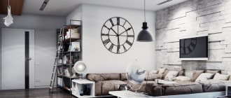
Loft prefers cool light colors - gray, white, metallic. When choosing gray, you can use both light and dark tones. Accent colors: brown, burgundy, black, blue, green, but without unnecessary variegation.
Color combination for a loft-style kitchen Source pinterest.it
Loft-style kitchen with brick walls Source blog.bluprin.com
Country music in the Russian image is a recreation of rural life. This can be easily achieved by using the color of chocolate in the design - from milk to bitter. The kitchen can be in light colors, for example, cream, vanilla, sand, but a combination with brown is mandatory. The decor is purely rustic - vintage dishes, a kerosene lamp. Textile elements are required - tablecloths, napkins, towels.
Cozy country style kitchen in a private home Source remontbp.com
Country style kitchen with decorative element above the stove Source pinterest.com
High-tech is a follower of minimalism. The color scheme is monochromatic, cold. Metallic, gray, white, black are complemented by red, yellow, blue.
White in the high-tech kitchen Source frei-atmen.info
High-tech kitchen with black matte furniture Source kryub.in.ua
Colors that should not be combined
On the color wheel you can see shades that are not in harmony with each other. This does not mean that they cannot be combined at all - if you want to experiment, give free rein to your imagination. To make it easier to be creative, study the most insidious combinations.
| Main color | Which ones doesn’t go well with? |
| Red | Yellow, chestnut, red-yellow, brick, purple |
| Orange | Red |
| Pink | Brown, purple, lilac, red, blue |
| Yellow | Pink, burgundy |
| Burgundy | Brown, red, purple, gold, blue |
| Blue | Burgundy, purple, lilac |
| Violet | Brick, terracotta, red |
| Lilac | Gold, pink, burgundy, red, blue, terracotta, brick |
| Blue | Pink, brown, green, brown, lilac |
| Grey | Terracotta, dark brown, beige |
Color combination in the bedroom interior
General recommendations. The best choice when decorating a bedroom is pastel shades. They have a relaxing, calming effect on the body. Relieves anxiety and stress, improves sleep.
Classic style. The bedroom has no choice - it must be luxurious. It is made this way by noble tones: vanilla, cream, peach. Gold helps them in decoration and furniture made of expensive wood. Whites are allowed to be present in minimal quantities. The role of accent is given to turquoise.
Beige bedroom in the classics Source 3ddd.ru
Bedroom in beige tones framed in gold Source idahointeriordesigner.com
Scandinavian style loves light colors: light green, light blue, gray, light shades of brown, but white is beyond competition. Additions in the form of bright pillows, paintings, and lampshades enliven the interior.
Scandi bedroom in wood and chocolate tones Source iraivanovadesign.com
Cozy bedroom with decorative elements in gray tones Source lovingit.pl
Loft is a simple guy. He is satisfied with the colors of natural wood and brick. He agrees to add white and gray in all variants, red, black to the gentleman's set. Will tolerate pink - just a little.
Loft bedroom with hanging chair in cool colors Source yandex.ru
Loft-style bedroom in warm colors Source m.roomble.com
Neoclassicism is luxury full of dignity. The priority is the aristocratic color scheme: peach, pale blue, beige, linen. Rich tones are only used as an accent. The same role is played by gilded decorative elements.
Neoclassical bedroom Source theluxuryhomeslifestyle.com
Shades of light beige for the neoclassical style in the bedroom interior Source rehouz.info
Country music in the Russian style prefers natural materials. Textiles are ideal in this regard. Patchwork style bedspread, pillows of different sizes and colors. Different colors are acceptable in the decoration, but it is better to stick to a muted range. Decor – family photographs, antique watches.
Country style for a bedroom with large windows Source idnes.cz
Country style color combination for a bedroom with an arch and fireplace Source chidaneh.com
High-tech does not like unnecessary things. The choice of colors is strict: metallic, black, white. Can't stand pastels. It hardly tolerates blue, red, carrot, brown, and beige inclusions. Precisely inclusions, because the accent is usually represented by one object. A rug by the bed, for example, or a pillow. The decor includes large black and white photographs on the wall.
High-tech bedroom with podium bed and lighting Source blueridgeapartments.com
Delicate warm colors for a high-tech bedroom interior Source thewikihow.com
Popular color combinations of gray and white
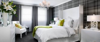
There are many win-win color combinations with gray, among which white contrast deserves special attention. A good example of this is a bedroom with gray walls and white plank floors.
Those rooms also look great in which one wall is perfectly flat (gray), and the second acts as its contrast (white), and even received a textured coating or decor (brick or moldings).
Alternatively, all this splendor can be decorated with a spectacular artistic painting, highlighting an entire wall for it.
Complex combination scheme
This is one of the most popular schemes. It is absolutely universal and will suit any interior style. The main shades in this scheme will be white, gray and beige; they can be complemented with a variety of bright colors, as well as accents. If you want to change the interior, you can simply change the accent colors. After such a rearrangement of accents, everything will immediately sparkle with new colors. If you plan to create a classic interior, then you don’t even need to use a color wheel, you just need to use basic and bright colors. However, using a circle you can see what all these shades will look like.
