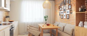
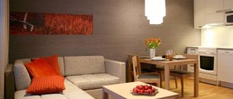
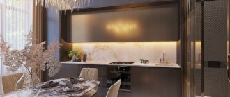
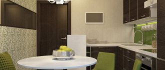
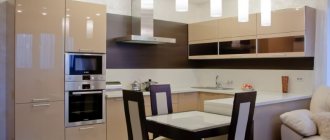
It just so happens in our lives that we spend a lot of time in the kitchen - not because we love to cook or eat endlessly, but because it’s more convenient and cozy there. Our kitchens began to perform the combined function of kitchen + dining room, kitchen + bar, kitchen + living room.
This is why the design of the kitchen area is so important to us. Having achieved multifunctionality, we rejoice like children.
A 10-square-meter kitchen is an ideal option to place almost everything you need in its area. If its design is developed “anyhow,” then a good percentage of the usable area will be lost, and you will have to forget about comfort and functionality.
Layout
The placement of furniture and appliances in the kitchen depends on the layout of the room. There are three main types of layouts:
- corner;
- rectangular;
- square.
Square kitchen
A square kitchen can accommodate everything you need, leaving plenty of space for a dining area. Any furniture arrangement is suitable to create a harmonious space. This layout option is considered the most functional and ergonomic.
To make cooking in a square kitchen as convenient as possible, it is recommended to install tall furniture with a large number of shelves and small drawers. The space under the window can be used by turning it into an extension of the kitchen unit.
Rectangular kitchen
In a rectangular kitchen, it is recommended to place the headphones in two ways. A single-row or linear arrangement of cabinets along one of the two long walls is considered practical. This type of headphone placement is often used in elongated rooms.
In a rectangular kitchen, the furniture can be placed in two rows. This option is suitable for not too narrow rooms. The recommended room width should be medium.
Merging with the living room
Having obvious advantages, the main one of which is a noticeable increase in area, this solution also has a number of disadvantages. For example, kitchen smells and traces spread into the living room area. The noise from operating kitchen appliances is much louder. And there is not enough privacy, especially if the family is quite large.
Bay window
A bay window is a protruding part of the facade, having a rectangular, oval or faceted shape. This room can be used as a dining or work area if you install a sink, countertop, and cabinets to accommodate kitchen utensils. In addition, it is advisable to place a sofa here for relaxation or arrange a place for your favorite activities (reading, knitting, and so on).
With window and balcony
The transition of the countertop to the wall with a window is the standard for small kitchens
In short, the standard height of a kitchen countertop from the floor is 85 cm. If the window sill is about the same height, you can adjust and rotate the countertop at an angle by installing it instead of the window sill. This is the standard and there is no problem with it.
If the height is much larger or smaller, then since an area of 10 square meters is enough for the kitchen, it is better not to experiment and choose only the right curtains.
Combining with a balcony
Combining it with a balcony is unlikely to double the area, but it will certainly make the layout more interesting, and in the photo this kitchen design with an area of 10 m2 looks more profitable. You can also completely or partially remove the wall. For example, a bar counter or workplace often consists of a partition.
Before planning a renovation, it is necessary to agree on the demolition of the walls. And this is a troublesome and lengthy process - be prepared for it. In addition, you will definitely need to install a heated floor system for the cold season and additional insulation of glazing and balcony doors.
With bar counter
To save space in the kitchen, a bar counter is used instead of a large dining table.
An elegant and sophisticated solution will create a homely atmosphere in the kitchen, conducive to communication. Bar counters are a continuation of the kitchen unit or are attached separately to one of the walls of the room. They match the color of the kitchen shelves and walls.
Low window sills
Window sills that are too low can be easily pulled apart and turned into drawers and cabinets for storing kitchen utensils, as well as comfortable armchairs. The following pictures show how to decorate these seats with cushions or mattresses.
Very high window sills
If the height of the window sills allows, you can place a stylish design element near the windows - a bar counter. In this case, you need to buy high bar stools, and a convenient corner for a quick lunch is ready. It is easy to extend such a plan along the wall, thereby creating a new tabletop for the hostess and the opportunity for all family members to sit by the windows.
Sofa
The principles for choosing a sofa for the kitchen are somewhat different from those when buying a sofa for a “dry” room in your home. The kitchen sofa will one way or another be exposed to high humidity, steam, and elevated temperatures. The risk of contamination with greasy and other stains, spillage of coffee, juice, etc. also increases many times over.
Therefore, you should definitely pay special attention to the upholstery material and frame of the kitchen sofa.
A spacious corner sofa in the kitchen provides additional sleeping space.
You also need to decide in advance for what purpose the sofa will be used. Exclusively as furniture for communication and eating, or as an additional sleeping place if necessary? These and other nuances need to be considered before purchasing.
For the kitchen, it is better to choose sofas with a frame made of natural wood (pine, birch, oak), impregnated with a moisture-proof compound. This will extend the life of the product in the kitchen. Regarding upholstery, the most practical is natural or artificial leather. If this material is not suitable, take a look at fabrics based on a cotton/polyester mixture, jacquard, flock or chenille. The filler is also important - for the kitchen we recommend choosing polyurethane foam or holofiber.
Upholstery options: leather, jacquard (top right) and flock.
The model and shape of the sofa, in other words the functionality, depends on the purpose of use. If the sofa will serve as an additional sleeping place, choose models with a high-quality folding mechanism and plan the arrangement of furniture in such a way that there is free space in front of the sofa. If the sofa will only serve as a seat for relaxing and dining, then compact models are perfect: benches, couches, corner models, semicircular models.
Choosing an interior style
The interior is a mirror of your taste and style. He knows how to tell guests a lot about the character of the hosts and their aesthetic preferences. Therefore, choosing a stylistic solution is a purely individual matter and should be approached with all responsibility.
Scandinavian
Natural materials are mainly wood, textiles, glass, plaster, wallpaper. The furnishings are simple: laconic sofas, low tables, structures made up of modules with shelves and drawers. Plants or images of greenery can be found throughout the room. Antique accessories predominate: vases, deer motifs, antique sets, candles - all this is on display. Textured rugs, patchwork runners, colorful pillows and blankets are used. The color scheme is clear, without bright accents.
Modern
Glass and plastic are used in any modern design. This direction is a vague concept and sometimes combines several solutions. Different colors are used: black and white, light and soft.
Ethno
Depending on the specific style of any country (Chinese, Japanese, Egyptian, etc.), appropriate accessories are selected. Ethnicity provides an opportunity to emphasize ethnicity or express love for some exotic place. Multi-level floors, partitions, curtains, natural stone, and rugs are welcome. Characteristic tones of ocher: yellowish, golden, terracotta.
Classical
Natural materials are used in the design of the classics, which makes the room a little pompous. Usually, household appliances are hidden behind furniture facades so as not to disturb the overall style. Neoclassicism is characterized by nobility and luxury (using modern materials). The furniture is installed laconically and symmetrically. Natural colors (warm, soft, natural). The use of textiles in decoration, the presence of ornaments and patterns in the form of greenery is encouraged.
Minimalism
The style involves a minimum of large objects and a maximum of space and light. Furniture for a modern kitchen is installed in compact sizes, regular geometric configurations, and exclusively built-in. Modern materials were used: plastic, glass, decorative plaster. Colors: white, black, various pastels.
Before you start renovating a 10 sq. m kitchen, choose a suitable interior style, which can be seen in numerous photos on the Internet. Depending on the focus, you need to purchase furniture, curtains, appliances and accessories.
Loft
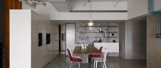
The popular trend features rough brick, plank or concrete walls, old pipes and no partitions. All this is diluted with modern furniture and appliances, posters and posters. The colors are predominantly gray, cream, black, with bright accents possible. Matte self-leveling floors imitate stone, concrete, boards without a pattern, and high ceilings are often plastered. Furniture in the loft style is smooth, geometrically correct, plastic, glass. Sofas, sideboards, and antique elements look good.
High tech
High technologies allow you to abandon frills without sacrificing design. A kitchen in this style is distinguished by multifunctional built-in appliances, glossy surfaces and a large number of point light sources. It is worth using neutral colors white, gray, beige, black, brown and their shades.
To prevent interiors from becoming boring, designers recommend combining different textures.
Country
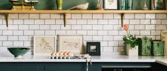
The main features of the style are aged furniture, for example, cladding - stone, brick, open shelves for placing kitchen utensils. Accessories of village life: hanging bunches of vegetables, simple plates and other decorative items (as if they were brought from the village). The colors are pastel, but with bright accents (for example, bluish curtains with small succulent flowers).
Modern
Modernism has incorporated many trends. Initially, the style was characterized by asymmetry, smooth lines and pastel colors. Now designers recommend choosing glossy finishes and natural materials for facades and ceilings, combining strict shapes and soft curves.
Sea style
A nautical theme in the interior does not necessarily mean a blue and white geometric pattern, an anchor and a ship's steering wheel as decorative details.
The design is based on natural colors and natural materials
You can paint the walls beige, sand, or any shade of blue, decorate the backsplash with mosaic tiles, add wood-look furniture or universal gray or white colors.
Provence
The French style is distinguished by slightly shabby wooden furniture, light fabrics (cotton, linen), forged elements, simple dishes and floral decor. The room has a lot of space and light thanks to large windows, huge chandeliers, small lamps. Light colors are used - delicate shades of blue and brown, beige, cream.
Ideas for a kitchen apron
Tile splashback
In my opinion, tiles are the best choice for decorating a backsplash. Even after years, such an apron will be in demand! And today there are so many different types of tiles that there shouldn’t be any difficulties with choosing! There are such interesting options as mosaic, triangle, hog. A choice for every taste!
Tempered glass apron
When decorating a kitchen, a tempered glass backsplash gives you a lot of different ideas. This apron will definitely appeal to lovers of minimalism, because plain painted walls can be hidden behind transparent glass. You can also hide wallpaper behind such an apron. For kitchens in the neoclassical style, this is the best option. There are also aprons with photo printing, but they are rarely seen in interiors.
Wood effect apron
Those who are tired of the asceticism of a modern-style kitchen will definitely like a wood-effect apron.
Previously, laminate was used as an apron. Laminate is a very practical material that is easy to care for. But its seams are afraid of water and can swell greatly. Nowadays, many people choose wood-imitation tiles instead of laminate. Lots of ideas for an apron!
Color palette
Color can significantly affect the mood of the inhabitants of the apartment, as well as hide or, on the contrary, focus attention on certain details. Based on this, it is necessary to approach the choice of color with all responsibility and understanding.
Beige kitchen color
Shades of beige can serve as a starting point for creating an overall kitchen interior. A beige room and appliances of the same color are popular with many designers, as it is a very practical shade that can calm people down.
The beige color will bring coziness to the atmosphere and will go well with all other elements. In a 10 square meter kitchen you can also create a cozy atmosphere with the help of warm shades of this color, as they actively fill the room and add a sense of harmony.
White color
Many people associate white with a special lightness and purity. Kitchens of this color pleasantly surprise with their spaciousness, and sometimes it seems that even the air inside them is cleaner.
Of course, the main advantage of this color is the visual increase in free space. It's no secret that light shades can create the effect of a large room.
White color will make a narrow space look much wider, and the floor and ceiling in this color will make the room look taller.
The design of a white kitchen is monochromatic, when most of the interior elements are based on a shade, in our case, white.
This design option requires high-quality finishing and the use of exclusively natural materials. The interior of such a room can be contrasting if the white color is complemented by dark elements - black, dark gray, and so on.
Purple kitchen
Purple is considered a rather complex color in the spectrum, as it is achieved by combining two opposing colors - blue and red.
If you decorate your kitchen correctly in this color, you can get a stylish room. Many designers know that an easy way to make a kitchen more elegant is to use purple in upholstery and curtains. Corduroy and velvet will look especially unusual.
Red color
Shades of red quite actively influence the psyche of people, so you should not abuse this color. Red should be used sparingly, in the right shades and combinations carefully studied.
When decorating a kitchen in this style, you should take into account the optical properties of red. When developing a kitchen design, it is better to use red shades only as an accent on certain elements, so as not to overload the space.
Brown color
Brown has always been distinguished by practicality, versatility and a positive effect on a person’s mood. On the other hand, shades of brown sometimes seem too dull, making the space appear smaller.
This color is very popular for flooring and is not always expressed only in wood planks or parquet. Ceramic tiles or even natural stone can also be brown.
However, you should not choose a material that is too dark, as it will darken the color and make the room appear smaller.
Green color
All shades of green are the colors of nature. They bloom and enliven the room. Green color is great for the kitchen, because being in such a room, a person relaxes and feels as comfortable as possible.
Kitchens decorated in this color can be very diverse: in modern and traditional styles, bright and pastel shades. If you are designing a kitchen of 10 square meters, then it is better to choose light and bright shades of green - mint, salad, and so on.
The furniture can also be green, in which case the walls should be decorated in neutral colors - white, beige, etc.
Pink kitchen
Many people know that pink can calm people down and improve their mood. That is why quite often this color is used in the design of not only kitchens, but also children's bedrooms.
In no room will the positive properties of this shade be superfluous. When creating an interior in pink tones, it is necessary to take into account the temperature of the shade.
If you have a dimly lit room, shades like peach, blush and tea rose will make it more comfortable.
Ways to save space
In order to save free space without compromising the functionality and aesthetics of the room, there are the following methods:
- The use of light colors and shades in the decorative decoration of walls and ceilings.
- Choosing light colors for furniture.
- The use of additional functional elements - bar counter, window sill.
- Choosing a minimalist interior.
A small space will become visually wider if you abandon heavy, dark curtains on the windows, open cabinets and shelves filled with utensils, and many accessories and decorative elements.
Decor and textiles
Textiles and decorative elements can be combined in color with the upholstery of the sofa, thereby helping to create an atmosphere of integrity and harmony.
In the photo, the sofa cushions are combined with the curtains, and the overall color scheme is typical for choosing the color scheme for the entire kitchen.
TV in a white kitchen
An excellent option would be to choose curtains, tablecloths, napkins that match the sofa upholstery and other textiles in the living room - this way you will support a holistic idea.
Among the new products we can note unexpectedly heavy curtains in a common color scheme with other textile and other furnishing elements.
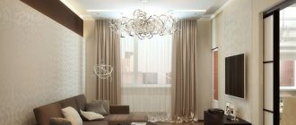
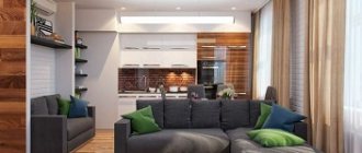
Modern kitchen-living rooms with a sofa are a great way to bring more comfort and harmony to your home atmosphere.
Ceiling and floor decoration
A matte white ceiling is a great solution and will fit perfectly into any style. If you are an inexperienced person in interior design, then you should not make colorful glossy two-level ceilings - they are difficult to work with and they rarely look good on 10 square meters.
For more information about what material to choose for the ceiling and what finishing options exist, read our separate material: How to make a ceiling in the kitchen - making the right choice
When choosing finishing materials for the floor, you should also be guided not only by the practical properties of the materials, but also by the design.
The following types of materials are most practical for the kitchen:
- PVC tiles;
- porcelain stoneware;
- linoleum.
Laminate and parquet are impractical flooring in kitchens. Truly waterproof materials are very expensive, although they also have their advantages: unlike porcelain stoneware, laminate is not as cold and tactilely more pleasant for the feet.
The design of the floor allows you to adjust the shape of the room if the kitchen is too narrow. To do this, you can lay out porcelain tiles in a diagonal pattern.
Bright tiles or porcelain tiles with an interesting pattern will also become a fashionable trend. To make it stand out in your interior, keep the overall design in neutral colors.
conclusions
The kitchen is not only a place for preparing food, but also a room where people gather around the dining table
In this regard, it is important to carefully consider the furnishings in the room. Choosing a sofa for the kitchen should take into account the configuration of the furniture. In a small room, corner sofas will look good, and when zoning from the living room, or for spacious rooms, it would be good to choose straight or folding structures. You can choose a variety of design styles to decorate your kitchen.
Much depends on the size of the room and how the furniture will be arranged in the recreation area. When decorating a recreation area, you should not overload the room with various accessories. It is important to maintain the style and complement it.
Interior door
The standard swing design takes up a lot of space. You can install a sliding mechanism or an accordion mechanism, which is more suitable for a small room.”
Even better if you can eliminate the door entirely. If necessary, the entrance can be disguised with a decorative curtain.
When decorating adjacent rooms in the same style, it creates the impression of a continuation of the interior. This technique visually expands the boundaries.
Lighting
A medium-sized kitchen dictates the need for multiple lighting zones. If possible, equip the ceiling with a suspended structure with many built-in light bulbs. But if the opportunity has already been missed, do not be discouraged, because you can illuminate the work area with different sconces. They are also able to supply the right amount of light into the cooking chamber.
Having taken care of additional lighting, proceed to choosing the main light sources. These can be long lamps suspended above a table or bar counter, or a standard chandelier that is in harmony with the overall message of the interior.
With a balcony
The balcony connected to the kitchen allows you to increase the space of the room. You can remove the window frame, insulate the balcony and place a small dining area or bar counter on it.
Kitchen connected to the balconySource links-stroy.ru
Kitchen designSource dizainexpert.ru
You can also place a small sofa on the additional area for relaxation.
You can extend the kitchen set onto the balcony or place it completely, freeing up space for a dining room or dining-living room.
This idea is suitable for small spaces and one-room apartments. Before starting repairs, you will have to remove all pipes to the balcony.
Placing part of the kitchen unit on the balcony Source nasosov.by
Kitchen design with a balconySource vplate.ru
Decor and textiles
Even the most sophisticated interiors, with the exception of some variations of modern style, need spectacular furniture that will become the final milestone of the overall design. Among the mass of ideas for decorating a 10 m2 kitchen, we have identified some of the most popular:
— A set of plates and saucers on the wall. You can paint the dishes yourself or use a service that you haven’t been able to find for a long time. At the same time, do not forget that together the objects should form a single composition both with each other and with the rest of the furniture. The same can be done with specially aged cutting boards.
- A plaster or slate wall is ideal for daily messages to families and creativity for children or adults.
— Large colorful letters are now at the peak of popularity. They are worth paying attention to, because they can transform even the most ordinary and boring interior into an attractive and “talking” one.
Wallpaper
Using wallpaper you can not only decorate a room, but also correct its shortcomings. For example, a low ceiling will be raised by wallpaper with vertical stripes. A narrow rectangular kitchen can be visually brought closer to ideal proportions if you paste wallpaper with a horizontally oriented pattern to a smaller wall.
Neutral wallpaper with a discreet pattern or simply textured wallpaper is always a winning option.
You should not choose wallpaper that is large or has a 3D pattern. They will make the room visually smaller.
You can choose colored wallpaper as a bright accent, but in this case you need to focus on only one wall so that the kitchen does not turn into a solid light spot.
Don't skimp on wallpaper for your kitchen. Since they need to be serviced in fairly aggressive conditions, their durability is important. Washable and durable wallpaper cannot be cheap. The best solution is vinyl wallpaper. If your budget is limited, you can take a closer look at thick non-woven fabric.
Curtains
Curtains for a 10 sq. m kitchen are needed if:
- The kitchen is designed in a classic or traditional style.
- The windows face south and there is a lot of light in the room during the day.
- there is access to the balcony, and it is necessary to close the balcony door, which spoils the interior.
When can you replace curtains with curtains or completely abandon them?
- Whether the kitchen is made in a minimalist style or in a high-tech style.
- If the room has small windows and little sunlight.
Curtains are the finishing touch in kitchen interior design, which can not only decorate the room, but also add a flaw to a successful overall design. The choice of style and color of curtains simultaneously depends on several factors.
Organization of the dining area
Dining group - table and chairs, preferably located near the window. The emphasis above the tabletop can be made with the help of pendant designer lamps, a multi-level ceiling or a podium.
White kitchen 10 sq.m Source modernplace.ru
If desired, the chairs can be replaced with a corner sofa. To save space, designers recommend using built-in household appliances and multifunctional furniture.
Furniture arrangement in the kitchen 10 sq m
Before moving on to design, you need to know the basic safety requirements and ergonomic rules:
- The main rule is the “work triangle”. At a distance of no more than 180 cm, the refrigerator, sink and stove are arranged in a triangle pattern.
- You need to plan the layout from installing the sink.
- Next, place a plate, from which the distance to the sink should be 40-180 cm.
- The steps must be maintained (about 120 cm).
- It is best to place the refrigerator closer to the sink.
You can gain additional space by using smaller appliances such as a refrigerator, dishwasher and washing machine.
Before purchasing furniture, you need to consider some details, which include:
- number of family members;
- a place to eat;
- frequency of cooking.
You can then make a list of the furniture items you need and furnish the room according to modern layouts.
U-shaped
For a U-shaped set, an area of 10 square meters will most likely seem small, since there is practically no space for an ordinary dining room. If the kitchen serves only as a “technical” room for cooking, and the dining room is located in another room (for example, in the adjacent living room), then this fact is not critical.
A U-shaped arrangement in a 10 square meter kitchen design is only advisable when you need a large work surface and a lot of storage space.
With a U-shaped layout, you can use the window sill as a work surface.
A U-shaped kitchen can have a built-in bar counter. For a small family of 2 people, this solution will allow you to kill two birds with one stone: organize a large work surface with an ideal work triangle and equip a dining area. And the question of how convenient a bar is as a permanent place to eat is, of course, debatable.
Single row
For a narrow, elongated area, a single-row layout is ideal. The linear version is compact, versatile, easy to install and has no corners. Suitable for those who cook infrequently. The downside is that it does not follow the "work triangle" rule. This is necessary so that the headset reaches the ceiling (to increase the area and accommodate various items).
No corners and space saving are the main advantages
With an island
Recently, unusual kitchen designs with several levels have become especially popular.
One of the levels is used for eating. Island countertops located at different heights allow you to cook while standing on one side and sit on a chair to have breakfast or lunch on the other.
An island in a forge saves space and makes the room more functional.
Double row
Arranging furniture elements in two rows creates a “working triangle”. Suitable for elongated and walk-through kitchens without a dining area. The disadvantage is the narrow space between the 2 parts of the headset.
Corner kitchen set
The corner type set is placed along the walls. In this case, the parts of the headset are located perpendicular to each other. The corner option is considered the most optimal from a practical point of view.
Many will agree that such a kitchen is effective in terms of saving space. Convenient placement of all elements, space saving and pleasant appearance are factors that have positively influenced the growing popularity of corner kitchen options.
Today, several forms of such kitchens are known:
L-shaped. In this case, all elements are perpendicular to each other. This shape is in great demand due to its versatility and small size.
U-shaped - these headphones are placed along three walls of the kitchen. The name “U-shaped kitchen” comes from the shape of the arrangement of all the elements. Many agree that this corner shape of the kitchen takes up a lot of space, but at the same time remains functional and practical.
Linear kitchen set
The linear arrangement of the kitchen is the most primitive option for arranging a kitchen unit without additional furniture in the form of corners and islands.
Table and bar counter
The kitchen table is an integral part of this part of the house. If you want to create a truly elegant and unusual space, you need to abandon the standard table options.
Today, tables of various shapes are available to you: rectangular, square, round, semicircular and corner. All options have certain advantages, and each of you should choose a table based on your preferences and financial capabilities.
Bar counters are also very popular, and there is a logical explanation for this. This part of the kitchen can become not only a beautiful element of the interior, but also a real helper, saving a lot of space.
Thanks to bar counters, you can significantly increase the functionality of the kitchen. This element will come in handy in any kitchen.
Chairs and kitchen corner
Kitchen chairs are a necessary attribute, the quality of which determines the convenience and comfort of people in the kitchen.
Comparing chairs with stools, we can conclude that the former are more comfortable and beautiful, therefore, in addition to their main purpose, they are also used as decorative elements. Models made of natural wood, plastic, metal and so on are available to everyone
Kitchenettes are also very popular. This is an inexpensive and practical piece of furniture that can make the kitchen more comfortable and cozy.
Choosing a kitchen corner is a rather complicated procedure. By choosing the right model of this furniture, you can significantly improve the functionality of your kitchen.
With a sofa
A comfortable sofa will help make the kitchen more functional and cozy.
Using a sofa, an additional area is created in the kitchen - a dining area. Due to the lack of excess free space in the kitchen, it is important to choose a compact sofa that takes up little space.
It is best to pay attention to corner structures. The sofa is placed in a free corner in front of the kitchen unit. One of its sides may be adjacent to the window. Therefore, when choosing furniture, it is important to know what the maximum allowable height of the back of the sofa can be.
Opening upper cabinets
Swing
I consider this option to be the best of all existing ones. In addition, it is the most inexpensive.
Folding
This option does not accept cheap and low-quality fittings. Low-quality gas lifts are quickly damaged and they cannot hold the doors wide open.
Folding
These doors open very beautifully and easily. But there is one caveat - their price. And they won’t be very comfortable for short people.
Technique
Built-in hood
Everyone is accustomed to the fact that built-in appliances are expensive. And this is true, but not for hats. A built-in hood is even cheaper than a regular one - from $35 for a regular built-in hood and from $50 for a telescopic one. It makes sense to choose among the cheapest ones, since they are no different from the expensive ones. The advantage of such a hood is the space around the pipe in the cabinet, which does not disappear, as in ordinary cases. We store all the tea/coffee/spices there. Compare. Ordinary:
Built-in technology
For comparison, the photo below shows design options with built-in and free-standing appliances. Okay, is there a difference?!
An independent refrigerator visually cuts through the room. And the space above it is not always rationally used. To prevent this from happening, you need to:
- initially order a built-in refrigerator with a kitchen front hanging on the door;
The refrigerator is located to the left of the oven
- Build a free-standing refrigerator into a cabinet niche. Large manufacturers of modular kitchen furniture (for example, IKEA or Leroy Merlin) have the opportunity to design a set with upper cabinets above the refrigerator. It's even better to make your kitchen custom-sized.
When building a free-standing refrigerator into a niche for headphones, order cabinets under the upper ceiling. This is rational from a storage point of view and correct from an aesthetic point of view. The space between the upper furniture and the ceiling must be covered with a frame and decorative frame.
The same goes for the dishwasher, oven and microwave.
A stand-alone refrigerator has the right not to be built in if it is a bright accent in the interior.
The kitchen area of 10 square meters allows you to install a tall cabinet with a built-in oven, which, in combination with a built-in refrigerator, forms a single monolithic structure. This furniture wall, consisting of 2 tall cabinets, allows you to make the overall appearance of the kitchen seamless and harmonious. And using an oven installed at chest level is also very convenient.
Refrigerator
Inside the 10 sq.m kitchen there is enough space to install a refrigeration appliance. The traditional and best option is to place the unit in the center of the kitchen unit. If the color of household appliances differs from the facade of the furniture, it will turn out to be an interesting accent on the product.
The refrigerator can be placed in a corner, in which case it is better if it is in harmony with the tone of the environment. To ensure that the device does not interfere with free movement in a space of 10 square meters, it is installed at the entrance to the kitchen or hidden in a ready-made or pre-designed niche.
By purchasing a small appliance in the form of a separate refrigerator or freezer, you can place a kitchen unit under the countertop.
The photo shows a kitchen design with a small refrigerator in the corner next to the window.
If the kitchen is 10 sq.m., combined with an insulated balcony, then the block is placed on the loggia.
In a room where a corner kitchen unit is installed, an excellent solution would be to place the device by a window located near the work area. This will make the cooking process more convenient.
TV
By the way, this is an attribute not only of the kitchen-living room, but also of a simple kitchen. Thanks to him, the daily life of a housewife in the kitchen will never be boring. The ideal place for it is one that is visible from all seats in the dining area.
In a square kitchen with a corner location, one of the walls can be freed from the upper wall cabinets. This will be the perfect place for your TV.
Another better place for a TV is in the corner above the dining area.
When making a custom-made kitchen, you can pre-prepare a place for the TV in one of the cabinets, which is most clearly visible from the dining area.
Zoning
Zoning will make the interior more comfortable and visually ordered. Thus, the kitchen working area can be represented by a predominance of glossy surfaces, tiles, blinds, and the recreation area can include textiles, upholstered furniture, and curtains.
It is necessary to prioritize the functionality of the zones in advance. If you plan to use the room mostly for cooking, then the main emphasis will need to be on arranging the necessary cabinets, cutting surfaces, and household appliances. Another option is the kitchen as a place of relaxation, a living room. In this case, a minimum of space is allocated for kitchen utensils, and the main space is occupied by a dining set and places to accommodate household members and guests.
Lighting
The kitchen space requires a special approach to lighting, especially if the kitchen is divided into functional areas. Ideally, each zone should have its own main source of lighting in the form of a large ceiling lamp and several additional lamps. But for a small kitchen of 10 sq. m, one central lighting chandelier is quite suitable, and built-in lamps in the work area and wall sconces in the recreation area would also be appropriate.
Spot lamps are installed above the cutting surfaces, sink and stove. They are built either into the surface of the suspended ceiling or into the lower part of the kitchen unit
Wall sconces in the dining area will additionally illuminate the surface of the table, which is important when eating, and visually create the atmosphere of a separate cozy room
It is worth remembering that a large number of lighting fixtures, as well as household appliances, will place a significant load on the electrical network. Therefore, before starting repairs, it is necessary to take care of replacing or repairing all wiring.
Finishing
Lighting in the kitchen space, especially if it is divided into zones, is already a kind of decor. Light sources accentuate parts of the room, create shadows and highlights, highlight advantages and hide disadvantages. However, the decor of the walls, ceiling and floor also plays an important role. If you are planning a full renovation, then to transform the room you can think about suspended ceilings in several tiers, unusual wall decoration, and choose a suitable floor covering. So, for a clearer division into zones, you can use laminate in the dining area and tiled floor tiles in cooking areas.
Wall decoration can be made of moisture-resistant materials that are easy to clean
This will be important at the stove and sink.
Color solutions
The shades in which the design will be made largely depend on the chosen style. However, there are some nuances that allow you to select finishing elements, decor and colors:
light colors visually increase the space; dark or rich – give comfort and create a homely atmosphere; a combination of light and dark shades visually delineates the zones; playing with contrast will add unique sophistication to the room; bright accents on calm color planes will attract additional attention.
Decor
Whatever style the kitchen design is in, it is important to adhere to the principles of harmony and not clutter the space. Large decorative elements, such as volumetric panels, panoramic paintings and photo wallpapers, macro-patterns on tiles, will look more advantageous in a single copy and only in one of the zones
To maintain the style direction, the furniture must be in harmony with each other in texture and design, but may differ in shades.

