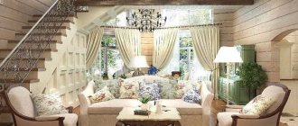
A standard city apartment has a small area suitable for the comfort of several people. It will not be easy to accommodate a large family and guests. To expand the useful space in “Khrushchev”, “Stalin”, new buildings, and other “small-sized” buildings, many combine the kitchen with an adjacent room - a hall or living room.
To do this, the common wall is dismantled - the increased size of the room provides more opportunities for effective use. In the article we will tell and show how a small or large-sized studio kitchen can be furnished, look at photos of the design of modern and popular styles, what layout, furniture, lighting, textiles, finishing materials to choose in order to achieve maximum convenience and functionality of one of the most important things in the home premises.
Features of redevelopment
Creating a comfortable, functional interior in a small studio kitchen requires much more time and effort than ordinary renovation.
The combination of rooms is preceded by obtaining permission from the relevant government authorities, because demolishing monolithic partitions is prohibited. This can provoke the destruction of the building structure of the entire apartment building.
The problem is complicated by the presence of gas - its presence in the apartment is only possible if there is a wall between the kitchen area and the adjacent room.
You also need to take into account: the smells from cooking will spread throughout the apartment, permeating the furniture and textiles. This can be avoided by installing a powerful electric hood above the hob.
In order for the interior to look stylish and neat, the kitchen area must be in impeccable order. Built-in cabinets and large spacious niches allow you to avoid cluttering the usable space with dishes, household appliances and various utensils.
Flaws
When creating a studio kitchen, you often have to demolish the wall between the small kitchen and the living room, which requires additional financial investments and special permission.
In addition, the disadvantages of this layout include the following sub-items:
Note!
U-shaped kitchen: pros and cons of the U-shaped layout. Methods of arranging furniture, dividing into working and dining areas. Photos and videos of design ideasKitchen facades: TOP 180 photos and video reviews of kitchen facades. Types of frames, criteria for choosing materials and color solutions
- Short curtains for the kitchen - features of using short curtains in small and large kitchens. Advantages and disadvantages of fabric materials (photo + video)
- When cooking without a good exhaust hood, all odors from the kitchen will spread throughout the room.
- Inability to privacy in the absence of other rooms.
- The noise from kitchen appliances can disturb family members who want to relax.
Zoning
The room, expanded by the room adjacent to the kitchen, should look holistic and harmonious, be functional and comfortable for all members of the family.
At the same time, it is divided into three interconnected zones: cooking, eating and resting , due to which it acquires a certain rigor and orderliness in design.
We will tell you in more detail what design techniques, interior items, furniture, finishing materials, textiles and lighting are appropriate to use for zoning an open-plan kitchen space.
Arch
To visually fence off the kitchen, you can use a piece of the remaining wall, decorating it with finishing materials that are repeated in the interior, or make an arch from moisture-resistant plasterboard sheets.
However, you need to remember that the arched structure takes up a lot of usable space, so in small apartments with a low vault it should be abandoned - it would be appropriate to make a lightweight ceiling with colored glass.
In large rooms, voluminous arches complemented by high decorative pillars look great.
Bar counter
Usually it is erected near the remaining wall. The bar counter visually differentiates the living room and the food preparation area, making the kitchen space more modern and stylish.
It allows you to save free space by serving as a dining table. It is made from different materials - it all depends on the style of the room and interior decoration.
If necessary, the rack can be equipped with shelves and built-in drawers, resulting in additional space for storing food, utensils, and dishes. In addition, you can organize a small bar inside it.
A traditional addition to the furniture design are high stools or chairs.
Internal partition
The interior wall can be partially dismantled: some part can be left for the convenient arrangement of a kitchen studio. It can be replaced by a partition, which takes up significantly less space than a brick wall.
There are several known ways to zoning a kitchen space:
- Construction of partitions from plasterboard sheets.
- The use of sliding systems - “accordions”. The best penetration of sunlight is provided by models made of frosted glass or translucent PVC.
- Curtains made of dense and lightweight fabric, which are simple, easy to use, easy to clean from dust and dirt, and with proper care can last for many years.
How to separate the kitchen from the room?
The most popular zoning options.
Partitions
They are the most practical and convenient solution. Quite often in the interior there are partitions made of wood or plasterboard, which can differ in a wide variety of shapes, or less heavy structures made of glass, plastic and even textiles.
The photo shows the interior of a modern kitchen-studio with a partition made of plasterboard.
Arches
They are not only an excellent space divider, but also allow you to endow the surrounding design with special luxury and elegance. Arches are often complemented with columns or niches in which flowers, themed accessories, decorative figurines, etc. can be placed.
Decorative finishing
By using cladding with different colors and textures, it is quite easy to zone a room. For example, for the kitchen area, tiles can be used on the floor, and ceramics, artificial stone, brickwork or decorative plaster on the wall. The rest of the space has walls decorated in the form of wallpaper and flooring with laminate, parquet or carpet.
Multi-level ceiling and floor
In a more spacious and tall studio kitchen, zoning using a two-level ceiling, which can also have built-in lighting to create an even clearer visual boundary between the two parts of the room, would be quite appropriate. Also, a podium floor is installed as a separator, which makes it possible to elevate and visually highlight the kitchen area.
Lighting
To delimit space, various lighting systems are also used, which provide the opportunity to achieve stunning visual effects and further increase the area. In the design of a kitchen studio, all sorts of combinations are often made with the help of a chandelier, spotlights or LED strips.
The photo shows the zoning of a spacious studio kitchen using ceiling spotlights.
Furniture
Furniture items that do not disturb the harmonious combination of all interior components and at the same time create visual boundaries and thematic zones cope no less successfully with zoning.
Decor elements
An undeniably interesting zoning decor are mobile screens, which suggest a visual division of space without defining clear boundaries. Also a fairly common delimiter is a fireplace or ceiling beams.
The photo shows a studio kitchen with a fireplace in the form of a partition in the interior of a country house.
2-level finishing
In large rooms with a high vault, a raised floor, under which communications and pipes are hidden, allows separating recreation and eating areas from the kitchen. This is a fairly effective technique, however, by increasing the height of the floor, it appears that the room is “falling” under it.
Advice! For kitchen flooring, it is better to use materials that are resistant to humidity and temperature changes: tiles, porcelain stoneware or natural wood; they are easy to use, do not require special care, and can last longer than laminate or linoleum.
To zone the kitchen-studio, a multi-level ceiling made of plasterboard sheets is also used. It is important that it fits naturally into the overall environment and does not violate the integrity. This division of useful space looks best in the interior decoration of spacious country cottages.
Layouts
This option requires particularly careful redevelopment and special attention to each element in order to achieve the most harmonious combination of rooms. Before redevelopment, first of all, study the floor plan and identify load-bearing walls. Very often, a studio is equipped in houses, one-room apartments and other apartments, such as Khrushchev or Brezhnevka, that have an inconvenient layout. The interior solution for a studio kitchen is selected taking into account the number of people living; it can be a young couple, a family or just one person.
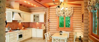
The photo shows the design of the layout of a kitchen studio in a wooden house.
Furniture
The most popular and practical way to visually divide a room into functional zones is the correct arrangement of furniture items.
An “island”, “peninsula”, or a dining set with a table and chairs will help to separate the cooking area from eating or relaxing.
At the same time, the functionality of the “peninsula” or “island” can be addressed to both areas - from the kitchen side they can be equipped with drawers for storing dishes, food and utensils, from the living room - decorated with display cases with transparent, multi-colored glass doors, spectacular LED lighting .
The living room is also separated from the kitchen using a corner or straight sofa. In the first case, it is possible to create a comfortable recreation area, isolated from the rest of the room by rear walls.
Arches and columns
Having carefully examined the floor plan, we find out that the anamnesis is burdened by a load-bearing wall. Therefore, it will not be possible to completely eliminate the annoying barrier between the kitchen and the room. We'll have to get out.
Load-bearing columns and an arched opening can help out here. The main condition is that columns cannot be purely decorative; they must bear the main load. Therefore, the issue of choosing a material for future support must be approached responsibly and it is best to contact a specialist so as not to get an unpleasant surprise in the future.
Color palette
Modern interiors do not accept monotony; it is better to decorate them with several shades that are in harmony with each other. To delimit zones you can use:
- different shades of the same color - more saturated in the food preparation area, calm and pastel - in the relaxation area;
- various light colors with the same bright accents;
- multi-colored wallpaper - with bright patterns, is glued to the wall, forms an accent, and makes the main part of the interior decoration. Differences in the design of individual functional areas are obtained by combining vertically and horizontally located patterns.
Important! The possibilities of the color palette should be used carefully, otherwise you can overload the space and visually make it even smaller.
Style solutions
Very often, recently, spaces are decorated in a loft style. In contrast to this style, you can decorate the room in a French country style. However, it can be the sensational Scandinavian style, hi-tech, minimalism, in general, everything that will be close to your soul.
In studio kitchens, the interior design can be absolutely anything. Here, of course, you can seek the help of a professional. But if you want to solve all the problems yourself, and become a kind of specialist in the field of interior design, then turn your attention to styles that are convenient from a functional point of view, where you do not need to work out all the details with special care.
Lighting
For differentiation, point light sources are also used, which make it possible to obtain soft sliding transitions. They are usually placed above a counter or placed on an arch.
Built-in ceiling systems, which are arranged in a rectangle or circle, are also effective. LED lighting for the hood, sink and work surface looks no less original in a small kitchen.
Using LED strips, it is possible to visually delimit the eating area from the kitchen along the perimeter, without using a partition or arched structure for this.
You can create contrast by placing hanging lamps in the kitchen of a small apartment, and floor lamps or table lamps in the living room.
It is better to place work surfaces near the window and complement them with pendant lamps, which are useful in the dark. Note that artificial light sources in each zone must be independent of one another.
Options for delineating the interior decoration of a combined kitchen, hall or living room using artificial lighting are presented in the photo gallery.
Whatever method you prefer (and usually several options are used at the same time), it is important to maintain integrity and organicity in the design of the useful space.
For small rooms, it is better to use neutral, calm light, which will not irritate with variegation and excessive saturation, and will fill the atmosphere with tranquility, homely warmth and comfort.
Bright color accents - painted dishes, natural textiles, various decorative elements - allow you to diversify the interior of the room If necessary, they can be replaced with new ones when they get bored or seem uninteresting.
Appliances
In the absence of walls, the issue of noise remains very important. It is better to integrate the equipment - the facades provide additional sound insulation. Pay attention to the technical characteristics of the devices: the refrigerator should not make noise more than 40 decibels, the hood should not make more than 50.
Don't skimp on technology! Firstly, the more expensive the equipment, the more its developers cared about the noise level. Secondly, the most important detail of a studio kitchen is a powerful hood, which you shouldn’t skimp on.
Remember: if you buy a weak economy option, you risk saturating the rest of the furniture with cooking smells.
Interior styles
The interior decoration of a modern kitchen studio is distinguished by functionality, a large amount of free space, and a minimal number of decoration items. Mixing different styles should be done with caution, because if done incorrectly, you can end up with an unattractive kitchen space. It is better to stick to the given style.
Particular attention should be paid to household appliances - they must be consistent with the chosen decorative direction and meet the overall style idea.
There is a wide variety of modern kitchens with integrated appliances, made to order, which allows you to choose an option based on individual measurements, colors of furniture, walls and ceilings.
Among modern decorative trends, finding the most interesting, functional option will not be difficult. You can verify this by getting acquainted with the photo gallery of designs and interiors of large and small kitchens, made in a modern style.
"Eco" style
The fashionable theme of “eco” design in the interior decoration of kitchens is revealed by natural “earth” and “wood” tones, which contain a pleasant yellow-brown color. The decor uses many different options with patterns.
A striking example is the large surreal flower that extends from the living room wall to the ceiling.
High tech
This style is used in large rooms with a minimum number of decorative elements.
- To decorate the walls and vault, monochromatic colors are chosen.
- There are many shiny steel and glass surfaces.
- The design is dominated by black and white, light brown and gray shades.
- As for the furniture items, their decor is dominated by clear, straight lines. There are practically no facts.
- Individual bright accents - hanging spotlights, sofa cushions, a carpet with an elongated fleece - can make the atmosphere soft and harmonious.
- Window openings are decorated with blinds, the space is divided by a decorative glass partition or lattice.
Loft
The interior decoration of a small-sized kitchen in the loft style is best decorated in soft pastel colors, which allows you to visually expand the room. For this, whitewashed brickwork is usually used, with a kitchen apron serving as a bright accent.
Zoning is done by individual furniture elements - for example, the sofa's back is turned towards the cooking area.
Great importance is paid to the shape of the room. So, in a long narrow room it is not recommended to place a set near the walls; it is better to place pieces of furniture in a U-shape, which will allow you to carve out space for a table.
A great idea is to decorate the opposite wall with a mirror with horizontal and vertical steel slats painted black, which will visually expand the usable space and get the effect of another window opening.
It is better to arrange a rectangular room in this way: place furniture and household appliances near one of the walls, on the contrary - an “island” or “peninsula”, which will divide the space into a working and dining area.
When there is very little space, a converted window sill can also become a dining table. It is recommended to paint the walls white, part of the “island”, and the countertop should be black. Such a play of light allows you to visually expand the room, create a feeling of harmonious geometry, dimension and order.
Minimalism
In a minimalist style, the interior design of a small-sized kitchen is done exclusively in subdued tones - gray, beige, light brown, black.
Furniture made from natural wood, metal, and glass is used.
Textiles should be as simple as possible, monochromatic without intricate patterns.
The optimal solution is the use of glossy, matte facades and integrated technology.
Blinds and plain curtains are best suited to such decoration.
Lighting is provided by spotlights or contour LED lighting.
Classic
The design of a kitchen interior in a classic style is distinguished by a natural tone palette, high-quality natural materials, uniform lighting, antique-style appliances, symmetry of shapes and an abundance of textiles with traditional patterns.
The design idea is selected depending on the size of the room.
So, to obtain a larger area, the optimal solution is to combine the kitchen with the living room. With a U-shaped placement of a furniture set, it is possible to obtain many work surfaces and also use the window sill.
The window opening is made open, decorated with blinds or Roman shades - they do not block the penetration of sunlight. An “island” is installed in the center, which is equipped with a sink.
A bar counter connected to an “island” will organically fit into the interior design of a classic-style kitchen.
A marble table top with high stools or wrought iron chairs with openwork backs looks great from the outside. The hood is hidden behind hanging cabinets or panels made of PVC or fiberboard.
Note that a classic-style studio kitchen may contain decorative elements of other stylistic trends: minimalism, modernism, high-tech. And the correct geometry of the furniture design harmonizes wonderfully with a round table and soft armchairs.
Scandinavian style
It is similar to minimalist, but has an expanded color palette - green, dark blue, and brown shades are added. Its main feature is the use of only natural materials (metal, wool, leather, wood) and simple forms. In a mandatory case, there is good artificial or natural lighting.
The floor and walls in the kitchen are as light as possible, uniform in texture, transparent white curtains. An integral component of this style is bright color accents: various containers for storing seasonings and cereals with decorative inscriptions, clay dishes, multi-colored textiles, a chalk menu board. Photos and color pictures decorated with a baguette or frame are placed above the bar counter.
Country
Comfortable home style, implying a combination of simplicity, naturalness and maximum functionality. The use of steel, plastic panels, and synthetic materials is unacceptable. When decorating a kitchen space, only natural materials and natural tones are appropriate.
The general background of the ceiling, walls and floor is done in milky, light brown, beige colors. Black, burgundy, yellow, and dark green tones are used as accents.
Furniture items are aged artificially. Items made from wicker and natural wood perfectly complement the country-style interior.
Modern
This style is an ideal solution for furnishing kitchen studios with an area of up to 16 sq.m. The interior decoration uses smooth mirror surfaces made of plastic, chrome, plain and colored glass, strict geometry furniture that is organically combined with contrasting tones and smooth shapes.
As for household appliances, they should be multifunctional and modern. Asymmetry is appropriate in the design; the finishing of work surfaces should be in contrast with simple geometric patterns. There cannot be too much textile; it is best to replace it with blinds.
These are just some recommendations for arranging the interior decoration of the kitchen. There are a large number of options for implementing design ideas. Whether or not to use common styles is your decision.
Expanded kitchens, decorated in an oriental, Mediterranean, Parisian bistro style, look no less original and beautiful. To get the perfect interior, you can combine two or more directions, the main thing is to remember its functionality and convenience.
Pros and cons of a combined interior
It is a mistake to believe that studios are just tiny apartments of up to 25 sq.m., with no room to spread out. The real estate market sells apartments with an open plan and an area of up to 50-60 sq.m., which is already equivalent to a full-fledged two-room apartment or three-room apartment.
Why are such apartments in demand? Here are the main reasons.
- Complete (or almost complete) freedom in arranging furniture.
In an open space completely devoid of interior partitions (the bathroom does not count), you can allocate space for a kitchen, living room, bedroom, office based on individual needs. It is this idea that is so attractive to residents of one-room “Khrushchev” and “Stalin” buildings, who break down the partitions between the kitchen and living room to create a single space with a comfortable kitchen and dining room.
The photo below shows a one-room Khrushchev house converted into a studio. The wall separating the kitchen is not load-bearing, so such a redevelopment can be agreed upon under certain conditions. The combination with the living room made it possible to place a large dining area and make the space brighter and visually spacious.
You can read about the conditions under which you can agree on a redevelopment to combine the kitchen and living room in our separate material - go.
- You can choose your own layout.
It can be much easier to build walls than to break them down. And you can build a partition in any convenient place. When the open space gets boring and no longer meets the needs, it can always be redone by arranging isolated rooms. Of course, if space allows.
- You can create a creative and custom design.
The ability to install a sofa and dining table not along the perimeter near the walls, but right in the middle of the room, will definitely be appreciated by creative people and everyone who is open to non-standard solutions.
- Lots of light and air.
Partitions create additional shadows and a feeling of enclosed space, which can have a depressing and gloomy effect. An open, spacious room is perceived better from a psychological point of view.
Of course, there are also disadvantages to this layout. And some of them are quite serious. Therefore, you should think a thousand times before buying such an apartment or converting your existing one-room apartment into a studio.
Minuses:
- Not suitable for everyone.
This will be a comfortable option for one person and possibly a couple. But for families with children or for a family in which there is one freelancer, who is often in the mood for work at night, this will be a real problem. The studio kitchen assumes that all household members will live in the same routine: wake up and go to bed at the same time.
- Kitchen arrangement options are still limited by the location of communications.
Some developers sometimes come up with not the most convenient planning solutions with a completely illogical location of the ventilation duct and sewer outlet.
- You can’t leave guests to spend the night in the studio kitchen. More precisely, they can stay overnight, of course, but in such conditions they will be uncomfortable.
- Lack of sound and smell insulation.
A noisy refrigerator, a humming hood, a buzzing blender - all this will irritate those who want to relax in complete silence in the living room while another family member is eager to cook a pie in the kitchen.
And the smells of fried fish will penetrate into all corners of the apartment, even if the most powerful hood is installed.
- It is not always possible to allocate a separate sleeping place.
In small studios with a room up to 18 sq.m., as a rule, there is a choice between a full bed or a folding sofa. Not a single sofa can replace a sleeping place with a comfortable mattress, and the need to regularly unfold it is not the most pleasant thing.
- An ill-mannered cat will walk on the table.
Not obvious, but a minus. If there is a pet in the house, then its fur can become a seasoning for any dish.
- No change of locations.
The same environment within four walls can become boring and cause apathy.
Interior of a studio kitchen in a spacious house
Premises for cooking and eating in country cottages can be represented by various architectural solutions. You can find classic spacious options and unique construction projects developed by qualified architects.
In a private house, the kitchen room can be large or small, elongated or combined with other rooms, a passage, combined with an extension. Its dimensions depend not only on the area of the free local area, but also on the material resources allocated for the development of an individual design project and the purchase of building materials.
Decoration of the backstage area
Professional finishing will allow you to adjust the shape of the kitchen. Calmness and taciturnity are typical if you have a narrow kitchen.
- Light, light tones of the walls can be painted and wallpapered, with a drizzling pattern.
- It is possible to diversify the walls with photo wallpapers with thermo-neutral or landscape patterns.
- You can use any type of material for the floor, as long as you place the patterns in the right direction.
- The ceiling should not be flashy, but monochromatic.
- It is better to use the placement of lighting devices in the form of multi-point lamps or chandeliers.
Some design tips
- Curtains in a studio kitchen should be treated carefully. When the room is large and the windows are located near the countertop or hob, they can be decorated with thick curtains with transparent tulle. If the dimensions are small and the window openings are placed along the working surfaces, then the amount of textiles should be minimized; it is better to use roller blinds or Roman blinds.
- The countertop, sink and stove must be freely accessible. In a small room, you should also take care of the functionality and practicality of furniture pieces. The ideal solution is to use retractable cabinets and sofas with closed compartments for storing various kitchen utensils, dishes, and products.
- When brick or stone masonry is used in the architecture of a low-rise building, you should give preference to a strict and restrained classic interior.
- It is best to decorate a house made of wood in a home style - Provence, country, etc.
- In a cottage with large panoramic windows, it is better to use minimal occupancy and maximum functionality. Scandinavian, minimalist, high-tech or “eco” style would be appropriate here.
- When the cottage has siding, it is better to decorate the kitchen in an industrial, classic or Scandinavian style.
- Houses located on the seashore will be decorated with Provence, Mediterranean, beach interiors.
Visual division into zones
Despite the fact that the basic rule for decorating a studio kitchen is to use one stylistic direction, it is still necessary to visually separate the living area from the food preparation area.
Note!
Water filter for the kitchen: functions and benefits of a water filter in the kitchen. Types of filters and mechanisms, their pros and cons (photo + video)Kitchen in high-tech style: 135 photos and video master class on organizing space and design
Kitchen in modern style - 160 photos of the best design options and features of the style
There are several variations for this, and each of these ideas is good in its own way. Here are a few such photo examples.
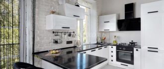
A stylish solution would be to install a bar counter or use different tones when choosing pieces of furniture and wallpaper.
Large indoor plants can also visually divide one single room into several functional zones.
Square kitchen
If a private house has a square-shaped kitchen, which is a separate room, then you can be sure that it will not require long-term arrangement. In such a room, all the necessary furniture is simply installed; it can be placed along the walls or in an L-shape.
When the size of the kitchen allows, you can place a large rectangular or square table in the center. As a result, the room will be delicately divided into full-fledged areas - food preparation, dining room.
An “island” can also be placed in the central part of the room, and it will be used as a dining table or countertop.
A square kitchen can also be divided into isosceles triangles: one can be equipped with pieces of furniture with a stove and a sink, the other with a seating area and a table.
To make more efficient use of the free space between the work area and the living room, you can place a stand.
Rules for constructing a working triangle
The work triangle in the kitchen is an area limited by three points: the sink (washing area), the refrigerator (storage area) and the stove (food preparation area).
The rational organization of the work triangle is extremely important for a studio apartment, as it allows you to make the cooking process easier, eliminating unnecessary movements around the room.
To achieve this effect, you need to follow two rules:
- the distance between zones should be 1-3 m;
- the sum of the sides of the triangle should be between 4 and 8 m.
For each headset layout there is its own, most optimal location of the working area points.
| Kitchen shape | Organization of the work triangle |
| L-shaped | the stove and refrigerator are installed on different rows of the unit, and the sink is in the corner; |
| U-shaped | the stove and refrigerator are on the vertical side rows, and the sink is in the central horizontal row; |
| I-shape | the sink is located in the middle, and the refrigerator and stove are on either side of it. |
Combined with dining room or living room
The optimal solution for a small studio kitchen with a shortage of several m2 is to combine it with an adjacent room. In this case, you need to take care of a powerful hood, which will not allow foreign odors to spread to other rooms.
The kitchen, combined with the living room, forms an integral space, however, the rooms have different practical purposes.
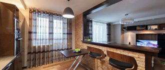
To demonstrate this, different zoning methods are used. For example, at the border of the work area or rest area, a counter with stools and chairs, a worktop or a rectangular, square kitchen “peninsula” or “island” is installed.
Sometimes furniture cabinets are complemented by a partition up to the ceiling made of transparent glass.
Recommendations for choosing furniture and equipment
Some tips for making the right choice:
- With such a layout, it is advisable to purchase a more powerful and silent hood, which will clean the air and rid the room of unpleasant odors.
- It would be better to equip a studio kitchen with a sufficient number of storage systems for order and a neat appearance of the room.
- Preference should be given to lighter and more mobile furniture, such as transforming tables or models on wheels.
- To create even more free space, it would be appropriate to use built-in or wall-mounted furniture to achieve a harmonious environment, especially in a small studio.
Narrow kitchen in the house
Initially, what you should take care of when arranging such a room is model furniture, which should not lose its usefulness and practicality.
When the aisles between pieces of furniture are very narrow, it is appropriate to reduce the depth of drawers and cabinets. It is also worth abandoning mezzanines hanging overhead and protruding facades. We recommend furnishing the room with furniture of a simple geometric shape and using a solid worktop, which will give the narrow room a harmonious and holistic appearance.
If you are worried that there will be nowhere to put all the utensils and dishes, then take care of spacious niches and rails - metal rods mounted on the wall for placing or hanging kitchen utensils.
If you don’t know where to place the table in a narrow kitchen, use one of the “shortened” walls. By installing a soft corner or poufs instead of ordinary chairs, it will be possible to increase the number of seating areas and make more efficient use of the usable area.
To visually expand the space between the walls, cold halftones should be used in the design: green, blue, lilac. A worktop combined with a window sill will also help to widen the passage; this is especially appropriate when the sink is located in close proximity to the window.
Important! A narrow kitchen does not accept dark shades, because they reduce an already small space - light bedding colors are appropriate here, which we recommend using on the walls and the facade of furniture.
Choosing a kitchen set
Buy a kitchen only to order individually in order to rationally use every precious centimeter. Ideal if it is possible to make it completely built-in.
Even at the design stage of the set, calculate: how many dishes and household appliances you need; where it should be located. Start from this.
Wide, monochromatic modules without unnecessary fittings look much more advantageous and comfortable - there is less chance that you will cling to handles in a small space. The “click - open” system or hidden profile - handles will come to the rescue.
In order to save space, you should pay more attention to the height of the cabinets than to their width. This will not only provide room for maneuver, but will also visually enlarge the apartment if you make cabinets directly under the ceiling.
Important nuances when planning a studio apartment
- Zoning of space. For these purposes, design techniques such as a bar counter, shelving, and sliding doors are used.
- The kitchen work surface should be at least 60-80 cm in length. Such a table will be enough to make cooking convenient.
- Light shades of furniture allow you to visually enlarge the space. The kitchen surface can be glossy or matte.
Similar article: Kitchen with built-in oven
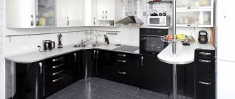
Kitchenette with dark bottom and light top.
The top row of furniture continues the entire length of the wall.
Kitchen paraphernalia and decoration
The amateurish image of the cook's room will certainly make it a favorite place in your apartment. However, the kitchen will be filled with living comfort, long life and a friendly, non-abstract face with cute subjective things.
- You can, at your discretion, choose exhibits and finely decorative “things” that will add your own uniqueness to it.
- For lovers of the classics, there shouldn’t be a lot of decor. The colors are also neutral, matching the color scheme of the room.
Sometimes it is not at all necessary to remove household appliances and handy kitchen appliances, often used in everyday cooking, from the working surfaces. This will create the impression of fullness of the area and tell something personal about a certain family.

