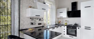
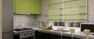
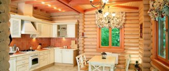
A large kitchen is a luxury that not everyone has. Khrushchev and Stalin buildings offer their owners 8 - 10 square meters, on which they need to fit a kitchen, a dining area, and appliances. It seems that the task is not an easy one. But even for such a small area there are interesting design solutions. We will talk about them in this article.
General solutions for a small kitchen
A small room can be depressing. Visually, you can expand the space and, on a psychological level, get rid of the feeling of confinement. If you remove the door and design the opening to the kitchen in the shape of an arch, more air and lightness will immediately appear in the interior.
When this option is not suitable and a door is still needed, take into account sliding partitions or accordion doors. As a last resort, they resort to more global changes and demolish the wall between the kitchen and living room, combining these rooms. In this case, the kitchen is no longer limited to four walls and a feeling of spaciousness is created. The dining area is sometimes moved into the living room or a small bar counter is placed. In any case, there is more space and it can be used more functionally.
Layout options
The layout depends on the location of gas and water pipes, windows, doors and the dimensions of the room. For rectangular or square rooms without sloping walls or extra corners, standard types of arrangement of furniture and equipment are suitable.
Small straight kitchen
A single-row kitchen layout is suitable for a studio apartment or a separate rectangular room. For example, in a room 2x5 m, you can place a set along a long wall, and opposite - a narrow tabletop. This will allow you to install a stove with 4 burners (60 cm), a convenient sink (50-60 cm) and a refrigerator, maximizing the work area.
An option for those who are not used to cooking a lot is to equip a full-fledged dining area by placing the kitchen set along a short wall. After installing a hob with 2 burners (35 cm) and a sink (50 cm), a little more than 1 m of countertop will remain. This is enough to cook dinner for 2-3 people.
U-shaped small kitchen
In a room of 2x3 or 2x4 m, the U-shaped layout allows you to make the most of the space. You can either install a bar counter near the window, or create a full-fledged work triangle: place the sink, hob and refrigerator at arm's length (but you will have to move the dining area to the living room).
Corner kitchen
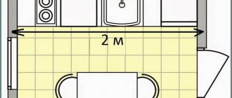
L-shaped furniture arrangement is a universal solution. If two walls are 2 m each, then a U-shaped layout is impossible.
In this case, a corner set will not look as compact as a linear one, but will allow you to place more storage space and make the work area more spacious.
Corner kitchen layout.Choosing a style for a small kitchen
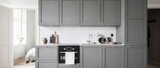
In a small room it is not advisable to use many small parts. They fill the perception and the room will seem even smaller. Simplicity and elegance will give the kitchen an airy feel. This is exactly what you should strive for in a small kitchen. Based on this, we will tell you in what styles it is better to decorate the kitchen so that it is cozy and you want to come back here again and again.
Interior options
If it is not possible to place the minimum required set of furniture and appliances, then it is worth considering the option of combining a balcony or loggia with a kitchen, or expanding the room by adding a storage room or corridor.
It may be worth moving the refrigerator out of the small kitchen or creating a dining area in the living room to gain more freedom in interior design.
The dining area can be moved into the living room.
Combining it with a loggia will unload the small kitchen space.
More options for placing the dining area.
Minimalism
Ideal option for a small kitchen. Minimum details, maximum benefits. Simple lines and shapes, grace and elegance. This style usually uses a monochrome color scheme with the addition of an accent third color. For example red, yellow or green. Based on your preferences, but don't overdo it. The accent should be 10% of the overall color scheme.
Kitchen Vinyl Flooring
Flexible and easy to install, vinyl flooring allows for quick transformation inside. And when you get tired of it, it’s easy to remove this coating yourself without taking much time. The price is comparable to laminated panels, but does not give the unpleasant “knocking” effect. New generation vinyl flooring also perfectly imitates natural materials such as wood, ceramic and stone. The range of designs is virtually unlimited, so it's easy to choose a finish to suit your interior style.
Advantages:
- can be laid on old floors;
- warm and pleasant to the feet;
- waterproof and non-slip coating;
- inexpensive material.
Flaws:
- not very resistant to scratches and cuts;
- Not everyone likes the “plastic” look.
High tech
This style echoes minimalism. But it has its own recognizable features. Materials used: metal, glossy surfaces, glass. Color scheme using only cool shades. Cold steel - this is how you can describe this style. The technique of unusual design forms will add additional zest to the interior. For furniture, clear, strict forms and visible color differentiation without smooth transitions are used.
Kitchen floor - concrete
Concrete floors pair perfectly with minimalist interiors with large glass areas, as well as industrial and loft-style designs. Smooth concrete surfaces optically increase space and provide an excellent neutral background for kitchen furniture and accessories. They go well with any type of wood. Using special paint, you can paint such a floor entirely or according to a pattern using a template.
Advantages:
- relatively cheap solution;
- the floor is durable, resistant to abrasion and cracking;
- easy to clean (no gaps), does not require maintenance.
Flaws:
- cold and hard, so it is recommended to install heating;
- installation takes a lot of time.
Modern
An unusual style, suitable for those who strive for originality in everything. Smooth lines and rounded details. Strict lines are not acceptable here. A refrigerator in the style of the Soviet ZIL, rounded corners of the table, a conical teapot - this is how this style is presented. The color scheme is chosen in calm, light colors. Gloss can be used with caution.
Style solutions for kitchen furniture
The main goal of designing any kitchen interior is to create a beautiful and practical environment in which it would be convenient to cook and pleasant to eat. The interior of a square kitchen is influenced by both the chosen style and its dimensions.
Kitchen 2x2
A small, square kitchen has few layout and style options. When developing a design, the set of parts and accessories is limited using the following solutions:
- Stylistics. Simple and functional styles are suitable: minimalism, Scandinavian, hi-tech, ethno. Art Nouveau is used with caution: large and flashy details are excluded.
In a modern style Source 4.bp.blogspot
- Finishing. Overall light, helping to make the interior more airy. The laconic interior is diversified with stylish 3D photo wallpapers.
- A mirrored apron, open shelves, and glossy surfaces (including the ceiling) will help expand the space.
- The central chandelier can be replaced with several ceiling and/or wall lamps; Lighting will also be needed above the tabletop.
- For furniture, the best option would be an L-shaped arrangement; shallow cabinets can be made to order.
Non-standard approach Source s1.prima-interior
Japanese
The entire interior is built in severity and bright contrasts. Drawings in Japanese motifs are acceptable. The calling card of this style is natural materials, light wood patterns combined with black details. But these details must be large, which run like a red thread through the entire room.
Classic
Classic style can be different. In this case, a simple and strict English style with a touch of modernity is suitable. Light milling on facades, using strict lines or a small wave. Don't get carried away. You just need to make a hint of the classic style. Simple forms and conciseness in the design of the kitchen should remain unchanged.
Layout: linear or angular?
When the kitchen is small, every centimeter should be as functional as possible. A corner kitchen is an ideal option for this. If the layout of the room allows you to install a corner kitchen, it is better not to abandon this idea.
Such kitchens are incredibly spacious; they will expand the work area and food storage area. You can store significantly more dishes or food in the corner cabinet.
If you don’t have this opportunity, don’t worry, linear kitchens can also be made somewhat more spacious.
For example, you can slightly increase the height of the cabinets. By increasing the depth of the cabinet, you may lose free space, but the height is the ideal solution to increase the capacity of the kitchen.
It’s not necessary to build cabinets to the ceiling, but sometimes this can give you a few extra free shelves for dishes that you don’t use all the time.
In any case, whether it is a corner or linear kitchen, by changing the height you can get additional space for storing dishes or food.
Small kitchen design mistakes
Bulk furniture, baguette decorations, heavy multi-layer curtains, chandeliers with many details - in general, everything that will make a small kitchen heavier and smaller. If you have a collection of figurines or you absolutely need small floral paintings, do it in doses. Organize the space in such a way as to distribute these elements in the interior so that they look harmonious and light.
Design Mistakes: What Not to Do
The most common mistakes in small kitchen design:
- Lots of open shelves. This may be convenient, but it visually burdens the interior (even if all things are in their place) and adds to the cleaning effort.
- The upper cabinets do not reach the ceiling. A full-height set of rooms is not only a trendy design technique, but also a good opportunity to get additional storage space for rarely used items.
- Rounded corners of furniture. Clear boundaries look better in small rooms. Smooth horizontal lines will add width to the room, while vertical lines will visually increase the height of the ceiling.
- Multi-level dark ceilings. This visually reduces the height of the ceilings, so that the kitchen will look even smaller than it is.
- Massive handles on the doors. In a small kitchen, such elements will not allow you to add other accents, because they will attract attention. It is worth choosing laconic handles or ordering facades with a push-to-open mechanism.
By following the designers' recommendations for interior design of a small kitchen, you can turn a cramped room into a comfortable, stylish and cozy room for cooking and eating.
Color scheme in a small kitchen
Color is a magical tool. With its help, you can “clean up” the kitchen, or you can change the perception for the worse. We all know that dark shades eat up space, which means there is only one solution. Use light colors with dark inserts and accents.
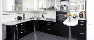
White, sand, light shades of yellow, green, purple. A black and white kitchen option is also suitable. Only use black in doses, like an artist, with a slight movement of his hand, applies selective strokes to the canvas.
Also use gloss. Due to its reflective properties, it will add additional volume to the kitchen. Don't worry about fingerprints remaining on it. It is very practical; cleaning the gloss takes 5 minutes without interrupting the overall cooking process.
Interior design and kitchen layout 5-6 sq. meters
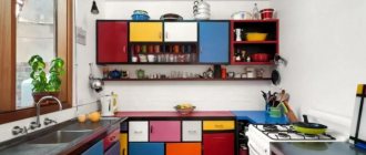
In the interior of a kitchen with an area of 5-6 square meters, minimalism is valued above all else. This does not mean that you should take this particular style as the basis for your project, just adhere to its basic principles for any design option. For example, do not buy too many bright items, and if you want multi-colored dishes, take pastel (pink, blue, yellow) colors.
Convenient layout for a 6 sq.m. kitchen. meters
One of the most standard kitchen layouts with an area of 6-7 square meters (or even 4-5 square meters) looks like this. Of course, not much can fit here in a standard size, so it’s best to use everything (even dishes) in a smaller format.
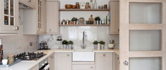
And this is what the interior of such a kitchen will look like after the renovation is completed. In this case, it is decorated in a country style with a beige set, gray flooring and a wooden tabletop. It turned out very cozy!
Such a kitchen will be an ideal addition to a small apartment in a panel house. In addition, if you make an entrance to the kitchen from the living room, then due to the passage in the corridor you can enlarge the bathroom and toilet if you want. Or you can move the dining group into the living room, and expand the bathroom and toilet using the wet kitchen area.
Kitchen layout 6 sq. meters along the wall with a window
Another option for arranging furniture in the kitchen is along the window opposite the door, where there is a dining group on the left, and a kitchen set in front on the right. This layout is very versatile and can also suit a kitchen where the window is on the left or right.
And this is how such a kitchen will look in real life, when the dining group is on the left, and the suite is in front and on the right. You can carefully place the upper cabinets so that they are located in different parts of the room without blocking the window.
Kitchen layout 6 sq. meters standard type
This option has a dining room for two people and an L-shaped set, which is quite suitable for small rooms. Carefully consider this and other layouts and try to try each of them on in your kitchen. This way you can figure out what suits you best.
Below we see what this layout would look like when decorating a kitchen in a Scandinavian style. It uses a high table with bar stools, which can also be a worktop.
Layout and design of a narrow kitchen 6 sq. meters
A narrow kitchen with an area of 6 square meters is especially inconvenient. But you can arrange the furniture so that there is even enough space for a fashionable bar counter. Take a look at the layout and interior photos below.
But in practice, this is how such a layout will look from the corridor. On the right there will be tall modules for built-in appliances and storage, and the countertop will be along the window and along the right wall.
Kitchen layout with countertop along the window
Below is an excellent kitchen layout with an area of 6 square meters with a refrigerator, dishwasher, sink and stove, as well as a bar counter with a worktop instead of a dining group. Please note that the door to the room in this case can be located on the lower wall on the right or on the right wall.
This is what a similar kitchen layout will look like if you place furniture modules on the right wall. This kitchen really has an area of 6 square meters, but the beautiful bright apron and floor, white furniture and walls make it visually more voluminous.
Textiles in a small kitchen
Textiles in the kitchen should always be light. In any size room. These are fire safety requirements. It is appropriate to make heavy designer curtains only if you have a kitchen-dining room with a clear demarcation of functional areas.
Moreover, it is not advisable to use heavy, voluminous curtains in a small kitchen. Use Roman shades or blinds on the windows. Roller or simply short curtains that can be beautifully fastened so that they create beautiful atmospheric waves.
The kitchen is the epicenter of odors and greasy dirt. Therefore, even from a practical point of view, lightweight curtains will be more convenient. They are easy to remove and wash. Or clean it with a special compound.
Tile laying methods
There is an opinion that when decorating the interior of a small kitchen, ceramic tiles can be used for any surface, and they will cope with their functions perfectly. Therefore, you don’t even have to think about other alternative options, such as plastic, wallpaper , etc. Although it is worth remembering that these should be different types of tiles: in order to avoid a monotonous design, it is recommended to use different types of materials for cladding individual areas so that you can clearly distinguish between the food preparation area and the dining room.
You can also give the room an original look if you use a non-standard technique for laying finishing materials. Most often, tiles are laid in the following ways:
- In a checkerboard pattern. Since this option often involves the use of contrasting combinations, it is best to use this method for decorating the floor. This installation scheme is universal, so you can use it without any fear in a kitchen of any interior style, from Scandinavian to classic;
- If the finishing is carried out in a large kitchen area or the room is decorated in white tones, then you can choose appropriate bright combinations and non-standard masonry methods. To decorate the floor or apron, you can use the patchwork style, create bright ethnic patterns or a contrasting pattern.
- Herringbone laying. This installation method allows you to create the effect of parquet flooring. In addition to the fact that the floor takes on an updated look, it fits perfectly with the style of the kitchen and does not lose its attractiveness.
- Laying diagonally. This is an excellent design technique for zoning a kitchen;
- Use of decorative mosaic. This installation method should be used in cases where you want to create something unusual in the kitchen. Therefore, if you have long wanted to abandon the standard cladding, then you can decorate the main areas of the room with mosaics - the kitchen apron, floor and walls. A simplified version is also appropriate - stylized tiles, as well as a full-fledged artistic panel.
Dining area in a small kitchen
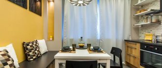
In a small space it is difficult to find space for a full-fledged table along with chairs. After all, you need space to simply move around the kitchen. Therefore, we have selected three solutions to this problem for you.
Bar counter. You can order it in a furniture showroom and choose a comfortable height so that it is at the level of the dining table at a distance of 750 mm from the floor. The main idea here is to reduce the depth and increase the length of the table. This solution is like a temporary island to drink coffee or have lunch. It will no longer be possible for the whole family to gather around such a table.
Window sill table. In this decision, the table area will be only a convention. There is a horizontal surface on which you can place your morning coffee. Otherwise, we can say that this is a last resort measure. Not comfortable and not functional.
Folding table. The most convenient of those offered. There are tables that can be folded in half and placed against the wall. This way you will always have a small table, and if necessary, you can always turn it into a more spacious tabletop.
Decoration Materials
When choosing materials for walls, ceilings and floors in the kitchen, you need to take into account the functional load on the room.
It is worth giving preference to practical and weather-resistant finishing options.
Flooring
In terms of practicality and ease of maintenance, tiles are the best choice for the kitchen. This coating is not without its drawbacks:
- if the base is wooden, then you first need to screed;
- the ceramics are cold (you can lay a warm floor underneath it, which will greatly increase the cost of repairs);
- tiles are slippery (there are collections with relief, but they are more difficult to clean);
- Over time, abrasions appear.
Linoleum is not inferior to ceramic tiles in terms of resistance to water, the material is warm and durable (if you choose class 23 or commercial 31), is quickly installed and easy to clean. But attention should be paid to preparing the foundation. The concrete screed or sheet material must be level.
Other coating options are rarely used: laminate is not moisture-resistant, porcelain tiles and natural wood are too expensive, self-leveling flooring is cold and cannot be repaired.
How to decorate walls
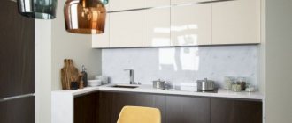
It is better to decorate the walls to match the furniture facades. This will visually lighten the interior. You don’t have to stop at classic white, but pay attention to cream or milky shades, ivory, and ivory.
The material most often chosen is wallpaper, and tiles for a kitchen apron. It is better to buy non-woven or vinyl wallpaper. This material is moisture-resistant and wear-resistant.
Such wallpaper can be washed, it does not absorb odors, and is not afraid of grease and dirt.
Ceramic tiles have almost the same advantages as high-quality vinyl or non-woven wallpaper. It is even more easy to maintain.
You can consider other wall finishing options:
- Painting. An inexpensive option that can easily be updated with a new coat of paint. Suitable for dining area only.
- Decorative plaster. A plastered surface can be washed, but it is not the best choice for areas in direct contact with water.
- Natural and artificial stone. It withstands all possible influences in the kitchen.
- Wooden lining. Not suitable for a small room because it hides 4-5 cm of space.
- Plastic panels. They have good performance characteristics, but are not wear-resistant enough.
What kind of ceiling should I make?
The best option is a plain light ceiling. If the base has flaws, then it is better to make a tension one or first sheathe the surface with plasterboard. In both cases, the height will decrease by 5-15 cm. In order not to lose centimeters, you can simply whitewash, paint or wallpaper the ceiling.
