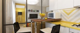
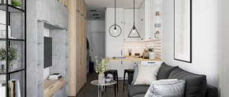
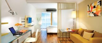
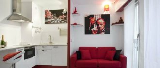
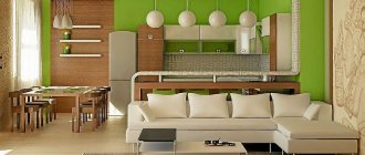
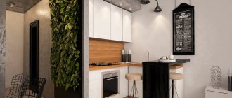
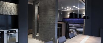
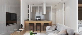
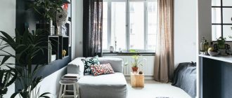
Currently, studio apartments are becoming increasingly popular. If until recently this trend of Western fashion was considered something rare or outlandish, today it is a common thing. The apartments, which represent a single space, without corridors or partitions, appeal to creative people who prefer everything exclusive, unusual and non-standard. The first studios appeared about a century ago in the USA. The apartment was limited only by load-bearing walls around the perimeter. There was no division of space into rooms at all. The division of the room into zones was carried out by light partitions, mobile screens and pieces of furniture. You could change the interior at any time without spending a penny. Let's look at how you can design a 24 m2 studio.
Features of the studio apartment
The secret of the popularity of studio apartments on the real estate market is that their cost is lower than classic rooms with walls, and there are incomparably more opportunities for creating an original design. The advantages of rooms with open space over the usual one-room option include:
- Possibility to change the interior frequently;
- Renovating a studio is much cheaper than a classic apartment due to the absence of interior walls and the small dimensions of the room;
- Competent and skillful zoning of the room creates a cozy and most comfortable atmosphere;
- Opportunities for the implementation of the most daring design plans - for the placement of furniture, household appliances, the use of various materials and decorative elements;
- Cleaning a small room is not labor-intensive and does not take much time.
However, the interior of a studio apartment also has its disadvantages:
- Lack of personal space and privacy. In essence, a studio is one large room. Therefore, it is suitable either for singles or for a childless couple. This is unlikely to be suitable for a family with a child;
- Distribution of sounds and smells throughout the apartment.
studio apartment design photo 24 and 25 m2
Many buyers of small apartments are wondering how to make a small room functional and useful. In this example, we will look at the design of a photo studio apartment of 24 and 25 m2 located in Zvenigorod, namely the Lermontovsky residential complex. You can be confident in the typical points and apply them in practice in your new building.
- We have a typical area where communications are located in the middle of the apartment, the location of the front door may vary slightly, and the location of the closet in the hallway will depend on its final location.
- First of all, decide for yourself that you want to place a shower or a full bath. This is practically the most important thing.
- Next, depending on the bathroom, there will be a toilet, washing machine and sink. Try to place everything as compactly as possible and calculate every little detail.
- Try to take only standard sizes of items; if you use non-standard ones, this will lead to a significant increase in the final cost of the project.
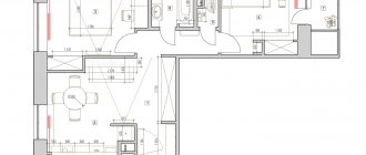
General floor plan, studio apartment design photo 24 and 25 m2.
The resulting layout indicating the types of finishes.
studio apartment design photo 24 and 25 m2
So let's start looking at visualization. All materials, be it tiles, sinks, toilets, are taken from catalogs and they are real, you can buy them.
- The finishing material used in the bathroom was Uralkeramika Watercolor. You will find more information about the layout of tiles and the method of counting quantities in the materials below.
- The shower cabin is 1100 mm by 750 mm in size, which is quite enough to accommodate soap accessories and take a shower.
- The distance between the wall and the washing machine was 600 mm, which is enough for one person to pass through and will not interfere with the opening of the machine door to pick up the laundry.
- And in the place of washing we have enough space and nothing gets in the way. In addition, we placed a small cabinet measuring 500 by 400 mm in the corner of the bathroom to store household chemicals, towels and accessories.
- The main task when designing small rooms is to make the available space as functional as possible.
- For example, if instead of a shower stall we installed a bathtub. It can also fit, the layout will not change significantly, but we would lose the wardrobe in the hallway, and then we would need to move the refrigerator into a room where there is already little space.
Top view of a bathroom decorated with Uralkeramika Watercolor tiles.
All tiles are real and have their own name: Uralkeramika Watercolor series.
View of the entrance to the bathroom.
View of the shower stall.
Entrance hall in a studio apartment design photo 24 and 25 m2
- Since we chose a shower stall, we got a full-fledged closet in the hallway with a refrigerator placed next to it. This was the customer's wish.
- On the right at the entrance there is a small dressing room for outerwear with an electrical panel and a router.
- Everything turned out simple and functional.
Hallway view from above.
Visualization from the room.
Place for outerwear and electrical panel.
500mm deep cabinet for everyday items.
View from the entrance to the hallway.
Let's move on to the kitchen.
- In this room we placed a corner kitchen with a bar counter, a full-fledged sofa measuring 1800 mm, a wardrobe at the entrance from 300 to 500 mm in depth, as well as a workspace with a TV.
- Since it was not possible to place a full-fledged table (it would have to be cleaned every evening or made foldable), we made a bar counter for four people.
- There are a lot of variations in style and color, choose any option, the main thing is the concept.
3D visualization of the kitchen, view at the entrance.
There are two lighting sources installed in the room (two full chandeliers).
Everything is controlled by pass-through switches. 4. You entered the room, turned on the light, sat down at the counter to drink tea, there are walk-through switches on the right, removed the excess lighting, went to the sofa, there are also walk-through switches installed there. Plus an additional two sconce type lamps.
We draw up a design project
The main problem that needs to be solved when solving the space of a studio apartment of 24 square meters. m - this is to place the maximum of necessary things in a small area, without overloading the interior with various objects. Whatever the design of the room, you need to adhere to these basic rules:
- Dividing the room into zones cannot be ignored! For example, the kitchen area is perfectly separated from the rest of the room by a bar counter, multi-level floor or ceiling;
- There is no need to overload an already small apartment with furniture. The use of built-in household appliances, as well as lightweight transformable furniture, is encouraged;
- A balcony or loggia can be used as an adjacent functional space. As a rule, a place for work or rest is placed here, which saves space in the apartment;
- The presence of dark tones in the interior is undesirable. An exception to the rule may be a high-tech style, where the dosed presence of black would be justified. The use of light, positive, sunny tones when choosing shades of furniture, ceilings, wall and floor coverings allows you to visually expand your home;
- In a small studio, it is convenient to zone the room using lighting fixtures: sconces, ceiling chandeliers, groups of spotlights or backlights.
What it is?
In general, a studio apartment is a living space in which there are no interior partitions, only the bathroom and hallway are separated. People call such apartments “gostinki”, as their layout resembles a hotel room. However, studio apartments can be not only small-sized, but also very spacious in area. Such apartments are considered elite.
In this article we will talk about the more common type of studio apartments - a small-sized “living room” with an area of 24 square meters. m. Now there are a huge number of them in new buildings, they are winning more and more fans.
Zoning or proper planning
The main functional areas of the studio are:
- Kitchen;
- Bedroom;
- Living room.
To separate the kitchen and living room areas, you can use a dining table or bar counter. There are also options for placing the dining table inside one of these two zones. The possible layout is as follows:
- Bachelor type of apartment. In this case, there is no bedroom area. This bedroom-living room is a popular option for a single person or newlyweds. A sofa with a convenient transformation mechanism is used as a place to sleep. At the same time, the room seems more spacious; there is space to place a wardrobe or dressing room. The lack of a bedroom in limited square meters can also be compensated for by a cozy multifunctional kitchen.
- Placement of a sleeping place in a common space. This design is for introverts who do not plan to receive guests too often. You can delimit the sleeping area using a decorative screen, curtains, blinds or shelving.
- Limiting zones using sliding partitions. This makes it possible to clearly delineate all three functional zones.
Examples of interior design ideas
Modern designers will not be intimidated by a studio apartment of 25 square meters.
On the contrary, experts believe that there is every opportunity to show your imagination, ingenuity and style in the design of each room. Of course, you can create your own ideal place to live. However, for those who are not confident in their abilities, it is better to resort to the help of specialists so as not to waste extra money, nerves and time. You can find examples of interesting designs on the Internet in advance. For example, you can create an apartment in a Scandinavian style. It has a fairly simple design, ideal for a small area. The basis is the modularity of space. The design usually uses light shades, laconic furniture, and a simple interior. This style will help free you from a lot of information when making complex design decisions.
The advantages of the Scandinavian style include color shades. Beige, brown, and blue colors are used here. Light colors help to visually expand the space and make it feel freer. The most important thing is to arrange the furniture correctly, which will help you compactly store the necessary things, without cluttering up the space. With the help of furniture you can also quickly and easily change the atmosphere in the apartment.
You can also furnish the room with simple accessories. Photo frames with images of loved ones, flower vases, and original figurines are perfect. This style involves the use of natural materials. This will help give your apartment special comfort, warmth and positivity.
Another stylish and fashionable option is the minimalist style. It remains relevant in every season. This style is also suitable for decorating such small studio apartments. In contrast to the Scandinavian motif, a variety of modern materials are used here. These include plastic, aluminum, glass. With their help you can create interesting options for your apartment.
Regarding color, in this style it is customary to use mainly black and white. Particular emphasis is on contrast. It is better to use more white shades in interior design. This way you will visually increase the space of the room. You can decorate your apartment using a mirror surface. This way you will also visually increase the space. Designers recommend using glass tables and chairs. They will help make the space even more free.
A distinctive feature of the style is the use of a small number of accessories and simple furniture to save space. To separate one functional area from another, you can use various partitions, for example, made of frosted glass. The furniture with which you furnish your apartment should not only be ergonomic, but also easy to move and transform. Blinds are also suitable as partitions.
A few more ideas that will help make your studio apartment cozy:
- A curtain in a recreation area can be created not as a single panel, but as consisting of a number of curtains. This way, you can quickly and easily reduce/increase the light level of the sleeping area and the degree of closure of the area.
- The ceiling in the kitchen area can be made a little lower. Let a rectangular hood and built-in lamps be hidden there.
- If there is a niche near your bed, you can turn it into a convenient shelving unit.
- For a small bathroom, choose a non-standard narrow and long sink model.
- Light stools, including those with creative designs, can be used as coffee tables. It will be good if they are stored like nesting dolls. This will add originality.
Thus, in this article we looked at how to correctly create a creative design for a studio apartment with an area of 25 square meters
Each layout is based on your individual preferences, a clear plan, attention to detail, accuracy and self-reliance. Don’t skimp on materials or design assistance
Otherwise, you may end up spending much more than your planned budget. Let your apartment bring you only joy, comfort and positive emotions.
Style selection
The first thing that comes to mind when choosing a style is minimalism. However, this is far from the only option. At the same time, there are basic rules that it is advisable to adhere to, regardless of the chosen style option:
- A single design for decorating the living room and kitchen areas. The same applies to the bathroom and balcony (if it is used as a functional space);
- The use of shiny and mirrored surfaces creates the illusion of spaciousness;
- Less dark tones! By filling a room with light, you visually enlarge it;
- The statement that furniture should be placed along the walls, and the center must be left free, is erroneous. The room will not be comfortable enough. You can correct the situation with a coffee table and several poufs in the middle;
- The simpler the design of the furniture used, the more opportunities there will be to create a charming design in a limited space;
- Curtains with lambrequins and bulky details are not suitable for a small room.
The use of corrugated, roller curtains or blinds is much more appropriate. As for styles, experts recommend a fashionable and comfortable Scandinavian design for a 24 sq. m studio apartment. To describe it in a nutshell, it’s comfort and extreme simplicity. Scandinavian style involves the maximum use of natural materials - stone, wood, leather, glass and textiles. Having open space is also important. Furniture takes up less than half of the usable space, which adds comfort and functionality to the home.
Another option suitable for a small area is a strict “high-tech” high-tech design. Such an interior is characterized by the use of furniture with transformation mechanisms and built-in household appliances. At the same time, housing should be very convenient and comfortable. High-tech is an exception to the rule when the use of black is allowed in a small area. At the same time, it should not be dominant. The main shades are gray and white. All items must have clear geometric contours (hood in the shape of a square or triangle, rectangular tabletop).
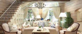
The Provence style looks unusual and beautiful. This is a delicate interior, with an abundance of light textiles and small floral prints. The natural light color palette creates the impression of spaciousness. And wooden pieces of furniture and airy curtains on the windows will make the interior very cozy.
It is generally accepted that the loft style is appropriate only in large rooms. Oddly enough, industrial style elements will look very organic in a small studio. Light monochromatic furniture, brick-like or rough plaster wall decoration, mirrors and exposed communications will look very organic.
"Contemporary" is a combination of different styles. A more common name for this design is “modern style”. These are simple and concise furnishing elements, combined with unusual accents and decor. It is possible to include classic design elements.
Features and nuances in creating an interior in a 24 sq. m studio
Studio apartments are present in almost all modern new buildings, however, in houses built several decades ago, you can also make a spacious studio from several small rooms.
Such living spaces are distinguished by a non-standard layout, in which there are no ceilings.
Features and nuances in creating an interior in a studio of 24 sq m in a one-room apartment
If the apartment was not initially designed as a studio when it was built, then it will be necessary to carry out a small redevelopment. Taking into account the location of load-bearing walls and obtaining permission for redevelopment, you can remove the wall between the kitchen and the room and recreate several zones in a combined space.
Visually the apartment will look much more spacious.
Features and nuances in creating an interior in a 24 sq. m studio in a two-room apartment
This option is more labor-intensive, since it is necessary to carry out a serious redevelopment, getting rid of several partitions between rooms. The main difficulty is obtaining permission for redevelopment. Most likely, some walls will have to be left, but this can be played up with the help of decorations, recreating a relaxation zone in a part of the apartment closed from the general space.
Today, many consumers choose non-standard studio apartments.
Materials and finishing methods
The choice of materials for a small apartment depends on the chosen style and financial capabilities:
- Floor coverings can be used to highlight functional areas. For example, in the kitchen it could be ceramic tiles, and in the bedroom and (or) living room area it could be laminate or linoleum;
- Types of ceiling finishing - conventional painting with water-based paint, the use of plasterboard and tension structures. The last 2 options look beautiful, but there is a minus: they reduce the already small 2.5-meter ceiling height;
- For walls, light wallpaper (possibly in combination with artificial stone) or decorative plaster are optimal. It is permissible to use low plasterboard partitions.
Perfect style
Achromatic colors with the addition of metal will create a fashionable, slightly futuristic look for a studio apartment: hi-tech, minimalism. Why are popular urban trends good for small spaces, and what ideas should be considered for use:
- gloss, mirrors, glass, clear geometry;
- completely devoid of excesses: only rationality;
- have extreme comfort and high demands on surrounding things.
- a light gray and white base will not overload the room;
- a combination of expressive textures will complete the look.
The industrial features in the design will appeal to young, dynamic owners, but other options that reveal the potential of a small space are also suitable for a studio apartment:
- Calmer versions of modern style involve the addition of a fresh color, such as orange, but they are still distinguished by laconic details in the design. Fashion trends, often based on a combination of glossy and matte surfaces, must be present: velvet, colored glass, muted shine of metal.
- The Scandinavian style, with its snow-whiteness, is quite practical and cozy when high-quality natural materials and wood are used.
- Eco style. Soft light shades for the main surfaces, shades of green, live plants, thin wooden lattice panels - an extremely serene atmosphere.
Choosing functional furniture
For a studio apartment, it is convenient to purchase multifunctional furniture. If there is no space for cabinets, it can be used as a storage system. Furniture for a sleeping area should be as compact as possible. The best option would be a sofa with a transformation mechanism or a folding bed. The number of pieces of kitchen furniture is minimal. It is advisable if the furniture itself and household appliances are built-in. Shelf and door systems in kitchen cabinets are state-of-the-art.
Selection and arrangement of furniture
In the kitchen area, the most important thing is a powerful hood. It will prevent food odors from spreading throughout the room. There is also a kitchenette here, which includes everything you need:
- washing;
- gas stove - preferably a two-burner or hob;
- small refrigerator - vertical or horizontal;
- hanging cabinets - they are made up to the ceiling;
- working plane.
Hanging cabinets are chosen with open shelves or decorated with glass - they are made up to the ceiling. The compact dining area is a folding bar counter or an extended window sill. If there is a loggia, a heated balcony combined with a room, it is taken out there, decorated with a small table, a kitchen sofa with storage sections.
In another option, a work office is placed on the balcony - this will allow you to significantly save on lighting, especially in the summer. It is decorated with a computer desk with many drawers and a comfortable chair. For women, there is also a dressing table here - applying cosmetics in daylight is much more convenient.
Upholstered furniture is represented by a folding sofa, on which people sleep at night and use it for sitting during the day. A good option is a wardrobe-bed, which leans against the wall during the day and lowers at night, forming a full-fledged place for one or two people to sleep. If necessary, a crib for a baby is placed in the room, and next to it there is a changing table-chest of drawers that can accommodate some of the baby’s linen and baby care items. If there is a bed on the podium, various things are also stored in it. A sofa chest is an equally useful acquisition; it is often complemented by armchairs, soft poufs, and folding chairs.
In the dressing area there is a straight or corner wardrobe, with the help of which the hallway is separated from the living room. If possible, they store not only clothes and shoes, but also some household appliances, sports accessories, etc. The bathroom here is very cramped, so they make do with several wall cabinets, shelves under the bathtub, a wall-hung toilet, a corner sink, and a shower. If you have a child, furniture for him is selected in a suitable size or height-adjustable.
A few words about the bathroom
You can solve the issue of insufficient space in the following ways:
- Give up a bath in favor of a shower;
- Use small-sized plumbing fixtures, including bathtubs and sinks with a corner location;
- There are two options for placing the washing machine: purchase the most compact washing machine or move it to the kitchen area;
- Use a wall-hung toilet, as it takes up less space than a traditional one.
The design solution should be as thoughtful as possible so that the bathroom is not just beautiful, but also comfortable. Naturally, the toilet and bathroom are located together. The entrance can be highlighted with artificial stone.
Basic zoning rules for a studio apartment of 25–30 square meters. m
When marking out your living space, it is important not to lose sight of any functional area:
- cooking and eating;
- receiving guests, relaxing;
- Job;
- dream.
They can be combined and overlapped.
There are also more opportunities to use cabinets as delimiters - on the Internet there are a large number of real photos of such zoning of studios of 25-30 square meters.
Another principle is stylistic uniformity. Designers advise decorating an apartment in the same style, so that harmonious interior elements will complement each other. Large differences in design style will tire the eye and create visual chaos.
Just as in the case of a small studio, in a large studio it is recommended to make the most of all available space, avoiding clutter. This will help:
- built-in furniture (for example, storage space);
- transformable furniture (folding sofas, beds);
- different levels (creating residential mezzanines, podiums with built-in drawers, bunk beds, etc.).
Methods for zoning a kitchen-living room of 24 square meters. m
First you need to decide on the leading zone. The type of kitchen furniture and the size of the workplace depend on how often the housewife cooks. The division of the room is carried out both with the help of partitions and without them. It’s worth taking a closer look at all the available options:
Arches together with sliding panels can not only highlight a functional area, but also partially solve the problem of insulation
The kitchen is hidden from guests, focusing attention on the living room.
Use of cabinets and other furniture segments. For an organic separation, you need to take care of good lighting, which should freely penetrate into any part of the room.
Podium
Placing the work area at some elevation from the floor visually divides the area into two separate sections. In an apartment, the height of the podium should not exceed 10-15 cm. For a country house, about 40 cm is allowed.
Using textiles. Curtains allow you to quickly and inexpensively separate the living room from the kitchen. The advantage of this option is convenience and maintaining uniformity of design.
The bar counter acts not only as a place for eating, but also as a partition between zones. The color of the furniture depends on the functional role. If you need to create an accent and distract attention, then choose bright colors. Otherwise, use the same shade as for decorating the walls.
Using a sofa set with its back to the work area, a living room is distinguished. But it is advisable not to install furniture near the dining group. Food crumbs and stains on the upholstery create an untidy impression. Ideally, there should be a small passage between the sofa and the table or counter.
Through the play of color. They try to decorate the interior of the combined room in the same style and palette. But thanks to the play of shades, they create an original corner that demonstrates the delicate taste of the hostess. For the facade of the furniture, upholstery of upholstered furniture and decorative elements in the living room, the same color is used in different gradations. There is a feeling of completeness of the picture.
In the kitchen, they use adhesive tape with diodes and furniture lighting, which provides the lighting intensity necessary for cooking. In the recreation area, brightness is inappropriate; it is better to create some muting and softness. Floor lamps, sconces on the wall and a beautiful small chandelier above the table add coziness to the interior.
The difference in floor finishing also zones the room. Tiles are laid near the sink and stove, which are easy to clean from accidental dirt. The rest of the room uses laminate flooring. The shades should be in harmony with each other. A special visual effect is achieved by contrasting color carpet in the dining area.
Different textures and heights of ceilings create an emphasis on a certain area of the room. The main thing is that the same color is used for finishing. If the family budget allows, then a large aquarium can act as a partition and at the same time decorate the interior.
