head of design studio
If the interior design of the apartment is not as priority for you as the design project of the kitchen, then it is she who plays the leading violin in your home. It’s so nice to gather in the kitchen over a cup of tea or coffee, regardless of whether you have a two-room, three-room or small one-room apartment.
Today I and my fellow designers will try to tell you how to make a kitchen beautiful and functional. In particular, if you have a kitchen of 12 square meters, you are in luck. A two-room or three-room apartment can boast of such kitchen layouts. But regardless of the size of the kitchen, I will try to tell you how to arrange the furniture correctly, what facades to choose and what colors to choose when decorating.
Our design studio, Moscow and leading designers say that a 12 sq.m kitchen allows you to roam around. And here they take into account not only the functionality, the desire to fit everything and everyone in the kitchen, but also the design of the apartment as a whole. I will try to tell you everything in detail and will start with the shape of the kitchen set.
Read more
Kitchen layout
Kitchen set shape
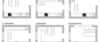
If the layout of the house provides for a large square area of the kitchen, you can choose the shape of the kitchen set taking into account your own preferences. If you have a kitchen of 12 meters. then you can choose between such headset shapes as U- or L-shaped, straight or with an island. Thus, each set can transform the interior of an apartment and kitchen beyond recognition, but it is important to take into account the strengths/weaknesses of each.
Direct kitchen
If the kitchen area is 12 m2, then the straight shape will not look the best in the interior. The designer's advice will certainly not contain renovation ideas with this kitchen format. And all because her working triangle, which is washed in this way, is the longest. But what is this working triangle? This is a kind of triangle, the vertices of which in the kitchen abut three points - the sink, stove and refrigerator, and while cooking a woman will cover kilometers in the process of cooking.
If the kitchen is small in size, no more than 8-10 m2, then the shape of the set does not have any special meaning. Here the working triangle will be minimal, but the problem is different - the main thing is to fit everything necessary for cooking and storage into useful square meters.
L-shaped (corner) and U-shaped kitchen
In my opinion, these are the most convenient kitchens for the housewife - everything is at hand, and in the sets themselves everything is at hand, there is always a place to hide all sorts of little things, and even small household appliances. Therefore, for many radium housewives, this particular version of the kitchen set will, in my opinion, be the most ideal, which will harmoniously fit into the interior and satisfy all, so to speak, functional needs.
Kitchen with island
This is also not the best and most convenient option for a kitchen set, despite its presentable appearance. Its ineffectiveness lies in the fact that due to the rupture of the working surface, the cooking process is also interrupted. And since in the kitchen many processes take place at the subconscious level, they all take place on the main work surface, and everyone simply forgets about the island. And you must admit that constantly transferring everything to the island is inconvenient and will require additional body movements from the person.
The greater the distance between the points in the kitchen - the sink and the stove, the more convenient the cooking process is. This is the very surface that is needed for cooking and it is ideal if its length is at least 90 cm. This will allow you not to jostle around in a small working area, but to work normally.
Kitchen 12 sq m with TV
TV is an integral part of our life. The photo shows options where you can hang it to make it look harmonious.
- On the wall opposite the dining area . Relevant for people who watch TV while eating.
- Opposite the exit . For those who like to watch TV while cooking and cleaning.
Next, we’ll figure out what to do with the TV in the kitchen, where there is a refrigerator. How to combine them?
- Hang the TV above the refrigerator.
- On a perpendicular wall . As far apart as possible.
Arrangement of equipment in the kitchen
Fridge
This is the most popular place in the kitchen for everyone. It is optimal to place it at one end of the kitchen unit, for example, closer to the dining table or exit. But built-in appliances will fit perfectly into a classic/modern kitchen. If you are planning a design in a loft or Scandinavian style, from the standpoint of a competent interior, it is better to install the refrigerator separately.
Sink
Based on my practice, I will say that I place the sink in my kitchen at a distance of 40-60 cm from the refrigerator itself, because during the cooking process you will have to take out and wash the food. If there is no need to wash them, you can immediately place them on the work surface of the table located on the direct refrigerator-sink.
Dishwasher
If the family is small in size, only 2-3 people, it is enough to choose a machine with a width of 45 cm. It is roomy and at the same time compact, capable of washing all the pots, dishes, frying pans, and so on. But if the number of household members in the family is larger, you should choose a wider machine, 60 centimeters, but the downside is that it cannot fit into every kitchen.
Coffee machine
If this is a free-standing model, then it is optimal to place it on the countertop area between the sink and the refrigerator. And all because you take water from the tap, but coffee beans come from the refrigerator, where according to the rules it must be stored.
Oven
If we talk about most of my customers, they place them in the kitchen at a comfortable height for themselves - at chest level. But this is justified if the oven is combined with microwave functions, in all other options, if it is just an oven, feel free to allocate a place for it under the hob. And at a convenient height, place something else that you use more often, for example, a cabinet with tea and sweets.
Washing machine
If it is not installed in the hallway or bathroom, many users place it in the kitchen, integrating it into the kitchen set. But if the machine on the forge stands separately, it is optimal to cover it with a facade, so the kitchen set will look nice and aesthetically pleasing.
Hood
If it stands alone and looks great from all sides of the kitchen, I wouldn’t be surprised if you chose a loft style or a country or classic style. But in modern times, according to the statute, hoods are hidden in furniture and built into them. Yes, and this is more convenient, since when built in, you get additional, albeit small, shelves. And already there you can put a lot of necessary spices, rags, small equipment.
Hob
It is optimal to place it exactly at a distance of 9 cm from the sink - this is the very distance that forms the working space in the kitchen. This is where you will cook your signature dishes, wash food, or something else. But when you love white and want to make the forge white, take it, don’t hesitate. And all because the black glass panel is more easily soiled and impractical.
Chopper
The thing is quite practical and convenient in the kitchen, which could generally be imagined in the kitchen. Residues from food and peelings from vegetables, and all that - it can be ground in a few seconds and washed down the drain, eliminating such unpleasant phenomena as an unpleasant odor, stagnation. But only the packaging will remain in the bucket, nothing unnecessary or foul-smelling.
Water filter
And here it’s also worth remembering that you should leave space under the sink for installing filters. It is optimal to opt for a reverse osmosis system with sufficient filtration volume. I can say about myself that on the modern market there are faucets with two holes - one for the tap outlet for tap water, the second for filtered water. Therefore, there is no need to damage and drill the countertop itself in order to remove the faucet for filtered water.
Stove and refrigerator
The gas stove should be no closer than 50 centimeters from the sink. The space between them can be used as a work area. Next, determine a location for the refrigerator. You shouldn't place it next to other household appliances, but try to install it so that it is within reach.
Immediately think about the placement of the oven. The best option for its location is under the hob or separately in a high module.
Opening upper cabinets
Swing
Inexpensive, the most popular option for opening the door in the upper cabinets of the kitchen set. And personally, I like this option the most.
Folding
For this type of facade, it is optimal to choose models with good, high-quality fittings. If the parts are not of such high quality, then the doors will fail and the fittings will not be able to keep them open.
Folding
This is the most expensive, but at the same time beautiful option for opening the facade. With just a flick of the wrist you can open an entire closet. But this option will be inconvenient for anyone who is short.
Where to put the sofa?
- A corner with a seating area next to the table, opposite the kitchen unit.
- Place the sofa on the kitchen furniture.
- Have fun with options in kitchens that have access to a balcony. You can place the sofa closer to the window.
Or a small sofa not far from the door. For the balcony door, choose a material that will harmonize with the finish of the sofa.
Convenient kitchen design
Heights, dimensions, ergonomics
Lower cabinets
According to the standard, the height of the lowest bedside tables should be exactly 90 cm. But since the bedside tables have adjustable legs, the height of the tabletop itself can be adjusted to a height of 86 to 91 cm, with a standard tabletop height of 4 cm. But when you are tall, Accordingly, there is a need to install the tabletop at a height above average. And this is where a thick tabletop can help. If we talk specifically about the lower cabinets in the set, in the kitchen it is worth using as many retractable mechanisms as possible, where you can successfully store kitchen utensils and small household appliances.
Working surface
This is the very space in which you will prepare food. And the most convenient size of this working surface is 9 cm, ideally the working space between the sink and the stove should be 120 - 150 centimeters.
Upper cabinets
Their standard depth is 35 cm, but the height can be very different, for example, 60, 72 or 90, or 120 cm. If you have a modular kitchen in your kitchen, such cabinets have two heights, namely 72 and 90 cm. But, for example, I see in modern kitchens the height of cabinets that reach the very ceiling. It looks quite impressive, however, it is very inconvenient and not so practical. And all because the mezzanine most often contains the most unnecessary things that are practically never used.
At what height is the hood?
I often encounter questions from my clients such as the height of placement and installation of the hood. Some can mount it at a height of 60, others - 80 cm from the tabletop. Although I have always said and will continue to say, ideally it is hung at a height several centimeters higher than the height of the tallest member of the family.
Modern style
in the kitchen interior 12 meters
I always like and will like that the kitchen is built into such a niche - it looks beautiful, and it seems like the house was planned along with the kitchen.
Well, that seems to be all, the ergonomics, as well as the functional purpose of the kitchen, have been sorted out - let's smoothly move on to its appearance. And the first thing that catches the eye of a modern kitchen is the smooth kitchen facades. Today, the most popular facades in the kitchen are painted MDF. The paint itself can be either matte or glossy. And the best option for many is plastic facades; they look the same as painted MDF, but their cost is an order of magnitude lower.
Often, kitchen units in modern kitchens come without handles - the function of the latter is performed by special push-up fittings, which you simply press. But an even more common option is handles in the form of recesses in the facade of the kitchen unit.
Lots of modern kitchens!
Light colors
Choose light wallpaper with thin stripes or small prints, give preference to kitchen facades in light, pastel shades, decorate the room with contrasting textile decorative elements, and your kitchen will become spacious, cozy, and fresh.
As for the floor, the ideal option for the kitchen is a finish that imitates natural wood, preferably in light shades.
Neoclassical style
and design of a 12-square kitchen
It seems that we have sorted out the functional content, arrangement of furniture and content, then we move on to the interior in the neoclassical style. They are exactly the same as modern kitchens in their design. But the difference is only in the facade - in neoclassicism you can more often find facades with panels, and accordingly this style involves the use of standard handles.
When replacing the façade with flat ones that do not have panels, a modern kitchen style emerges.
Neoclassical kitchen is here!
Ideas for a kitchen apron
Tile splashback
The most common, popular option for finishing an apron in the kitchen. And even after centuries, the tiles will continue to lie on the walls. Plus, modern tiles have a lot of textures and colors, so you can create any pattern, even a real masterpiece.
Tempered glass apron
It is this finishing material that has found the widest distribution in modern kitchen style. You can, for example, use it to decorate a kitchen in a minimalist style, when a painted wall or wallpaper is visible behind the glass. So the last option with wallpaper is a good solution for the neoclassical style. If it is glass with photo printing, this option is acceptable, but in my lifetime I have rarely seen it.
Wood effect apron
An excellent option, and previously, for example, laminate was used for this - the material is practical and washes excellently.
But its disadvantage and enemy is moisture, since when it gets into the seams, the tiles themselves swell and deteriorate. But the modern market has found a replacement - tiles that imitate the surface and color of laminate. Lots of ideas for an apron!
Sockets
in the design of a 12-meter kitchen
In a modern kitchen, each built-in household appliance should have its own separate outlet. The refrigerator and dishwasher, like the microwave, don’t forget about the chopper under the sink - all of this requires its own separate power supply. It is definitely worth placing 2 groups of 2-3 sockets in the area of the kitchen apron itself - this is necessary to connect small household appliances, for example, a kettle or a meat grinder, or a blender. Rich in small household appliances - install at least 6 sockets, or even more importantly, so that you have enough.
Work triangle rule
To make the room for cooking and eating as convenient as possible, it is necessary to place the sink, stove and refrigerator next to each other.
Lighting
in the interior of the kitchen 12 sq m
And here the lighting itself should be built according to the logic of lighting other rooms - there should be three types, namely general type, local and decorative. If this is general lighting - it is turned on when receiving guests, as well as during cleaning, then with the help of decorative light - they emphasize the surface of a wall or a picture in the kitchen. If this is local lighting, this is used in the evening to create the most cozy atmosphere. Don’t forget about lighting the working surface in the kitchen.
Small kitchen design
in a standard apartment
Many standard kitchen formats were designed a long time ago, when household appliances such as a microwave or dishwasher, as well as other appliances, were unknown, and even if they were, not many had them. That’s why kitchens were designed to be small, for example, all in the same Khrushchev buildings - refrigerators were the size of a bedside table. That’s why in many apartments refrigerators were located in the hallway. But already in modern houses built in the P44-T series, the kitchens themselves are at least 10 m2 - this is already an order of magnitude more convenient and comfortable than the famous buildings from the times of Brezhnev or Khrushchev.
A standard format kitchen also provides for a standard arrangement of furniture. And here it is already difficult to place the furniture in any other way than the architect thought through. But to be more precise, the furniture can be placed differently, but here comfort will not be a priority.
Small typical kitchens!
White kitchen
Design ideas
If you are interested in white forges - no problem, then cleaning as such does not scare you. But it’s worth immediately making a reservation that white kitchens are cleaned no more often than kitchens of a different color. It is enough to thoroughly wipe the table after cooking, remove the facades once a week or two, and that’s all. Therefore, there is no need to set the ideal frequency every day or worry about this issue - standard cleaning is quite enough in your case.
For greater practicality, I advise you to combine materials in the kitchen, in the set itself. For example, it is recommended to make such lower facades as easily soiled as light wood, not white. But the topmost cabinets can be safely made white. If you consider yourself a supporter of ideal cleanliness, you should choose stone or wood facades; simply sweep other textures aside.
Lots of white kitchens!
Grey colour
kitchen design has 12 squares
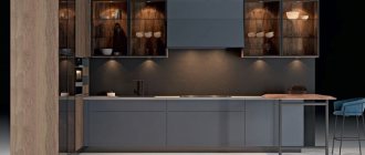
It was with him that his own special story happened. A couple of years ago, it was he who was considered depressive and dull, but today it is gray that is considered in favor. And this makes me so happy. This color brings maximum severity and seriousness to the interior. If you combine it with bright colors and shades, it will become noble. For example, I really like the combination of yellow, known to us since kindergarten, with gray, which turns out to be an olive color.
There are gray kitchens here!
Beautiful examples
The options below may inspire some bold projects to take on in your kitchen. Here are 7 successful examples of kitchen design of 12 square meters. meters.
A very calm and seasoned classic. The bright space does not seem cramped and compressed; there is plenty of room for a sofa. But if you decide to place it against the wall, you will have to hang the TV somewhere.
The corner sofa represents a full-fledged relaxation area in the kitchen. A compact dining table will not interfere with watching TV. There is still room to manipulate the sofa. The protruding part of the headset serves as a space zone.
This is not quite a standard sofa, but such a solution can be interesting. The kitchen looks very summery thanks to bright color accents and a wicker chair.
A brilliant color scheme for a modern kitchen. In this case, the sofa cannot serve as a sleeping place, and there is no TV opposite. But if you do need a corner kitchen sofa, this project is very good.
The kitchen is narrow, but light colors in the decoration soften this perception. The owners chose an ottoman that is in no way inferior to the sofa. The idea with photo wallpapers and their perspective can be called excellent - a good technique for visually expanding the space.
Clear zoning, calm colors, a living room area and a dining area fit into one area. A sofa that folds out looks like a convincing element of the kitchen when folded.
An interesting option for arranging a square kitchen. The sofa is very nice and will also serve as a sleeping place. A correctly selected color scheme does not “compress” the space.
Beige kitchen
Interior Design
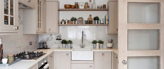
I always adhere to the principle that beige is the best option for the interior. This is a warm and natural shade, because in nature there are a lot of materials of this particular beige color. That’s why almost all of our studio’s kitchen interiors are decorated in beige – it is considered a universal color that goes well with a wide range of colors and shades. Therefore, visit our website and get a lot of ideas from there.
Beige kitchen ideas!
If you ask a question - what materials to use for finishing, is it possible to lay laminate on the floor in the kitchen or choose parquet, and what materials to use for finishing the apron? All the answers to these and other questions are in my new article Tips - there you can find the most useful information!
Floor
Floor finishing should be given serious attention. Self-leveling polyurethane or epoxy floors have proven themselves best. They can be of any color, even with a 3D pattern. This coating is durable, does not burn, takes on the function of waterproofing, is easy to apply, and dries quickly. When using them, there is no need to remove the old floor to concrete, for example, parquet or tiles - it is enough to apply a special primer 8-24 hours before the main coating.
The service life of such floors is tens of years. There is also a minus - it is very difficult to dismantle them. The cost depends on the amount of composition per square meter of floor: on average, it costs 1000 rubles per square meter of area. The layer thickness is no more than 2-3 mm.
Porcelain tiles, laminate, linoleum are often used, and a little less often natural cork is used. The latter will be the most expensive - more than 2,000 rubles per square meter; linoleum and laminate remain the cheapest, but their lifespan is short. The advantage of laminate is that it does not require leveling the floors separately.
