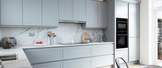
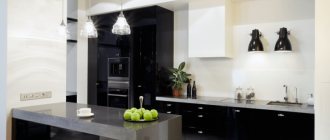
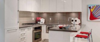
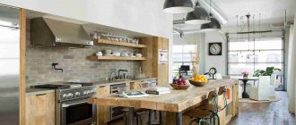
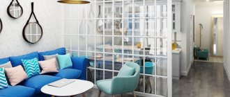
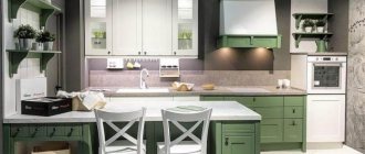
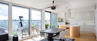
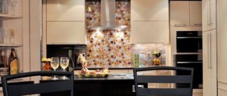
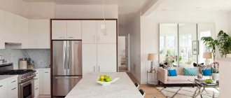
A kitchen area of 9 sq. m gives much more possibilities. Already in Brezhnevkas, the quality and convenience of the premises, increased by 3-4 sq.m., compared to Khrushchevkas, increases significantly. This kitchen area is also found in panel houses and in modern new buildings.
Despite the fact that the space here is already more comfortable than in Khrushchev buildings, a medium and large family of 5 or more people will still be cramped. With such an area, it is problematic to organize simultaneously a full-fledged work area with a full range of equipment and storage space, and a dining room that can accommodate all family members.
With the right approach, it is quite possible to achieve comfortable conditions.
See also modern kitchens Q9 2022.
Despite the small area, you can decorate a 9 square meter kitchen not only in a modern, but also in a classic style. Although it cannot be said that a truly traditional interior with stucco, frescoes and massive furniture is possible here. It will be a modern classic with elegant furniture of a laconic design without voluminous textile design and restrained decor.
With a refrigerator in the niche. Apartment in a steel panel building
Kitchen 9 sq.m. with access to the balcony
Thoughtful design based on a real example with tips:
Also see: 30 ideas for arranging a 9 sq.m. kitchen. m with a balcony.
Option 1. Corner kitchen 1.6x2.3m in a modern style
Quite an interesting corner kitchen. The tabletops are equal in width, which is rare in the production of built-in sets. The original color combination of lilac metallic and black gloss allows you to visually increase the space.
The kitchen combines modern elegance and classic functionality. The facades are made of MDF, which makes the set less susceptible to moisture and easy to maintain.
Advantages of the kitchen set:
- There are many spacious roll-out drawers and a free work surface, allowing housewives to comfortably prepare food.
- The corner sink has an additional platform on which you can fold dishes for drying. Another original design solution can be considered a rectangular sink bowl, geometrically repeating the shape of the table.
- Along the perimeter there is a glass apron depicting a picturesque city at night. It is unpretentious in cleaning and perfectly complements the overall look of the set, making a soft transition between contrasting tones.
Tip 5. Avoid large, bright prints
Catchy large drawings on furniture visually reduce space. They are appropriate in spacious kitchens. Compared to a large print, a small room seems even smaller. In the design of a cramped kitchen, both large drawings and an excess of small ones are inapplicable. The graceful patterns on the doors together visually form one design block, which is perceived as a single large image.
Option 3. Burgundy and white corner kitchen 1.6x2.3 m
The streamlined, strict set, with MDF facades, attracts housewives with its spaciousness. Large cabinets and fully roll-out drawers with metal boxes allow for optimal distribution of dishes and food. There is a basket for fruits and glasses on the chrome counter. Curved fronts with contrasting colors of burgundy and white, arranged like dominoes, give the product elegance and functionality. The corner white ceramic sink harmonizes with the moisture-resistant countertop. Disadvantage: there is little open work surface.
Ways to increase kitchen space
The purpose of a kitchen remodel is primarily to increase space. This can be achieved even without demolishing the partitions. To do this, during the repair process you can perform the following steps:
- Remove the door frame. Instead, the kitchen opening can be equipped with an arch. Thanks to this, the room will become larger.
- You can throw away cast iron batteries and install modern radiators instead.
- If there is a pantry next to the kitchen, you can use it to implement the idea. For example, break through a wall in a closet to install a sink or refrigerator there.
- Increase the area with a glazed balcony. To do this, you need to dismantle the door and install a countertop instead of the window sill.
Visually, the room can be enlarged by expanding the light opening of the window. To do this, you will need a metal-plastic window with a narrow sash.
Color techniques and effects
The kitchen in a nine-story panel building is not large in size, so it needs to be expanded visually. Designers recommend using color schemes for this. It is best to use pastel colors in the interior. The most preferred colors are white, light green, beige, and light brown. It is recommended to leave the ceiling white. If the height allows, you can make a tension glossy structure.
Very bright and rich shades will make a small room feel cramped.
Paintable wallpaper, decorative plaster or washable panels are perfect for wall decoration. It is recommended to avoid large drawings, as they will only visually reduce the size of the room.
It is preferable to choose pastel colors for the interior
Option 6. Gray and white corner kitchen 1.5x2.3m
Very stylish corner model. The combination of gray bottom and white top gives the product charm and sophistication. The facades of the set are made of MDF, which makes it as practical as possible; the film prevents moisture from entering the body. The bottom fits tightly to the floor, which will prevent dust from getting under the headset.
A strict and moisture-resistant tabletop completes the laconic ensemble. The main feature of the headset is functionality and a large amount of working surface. A smart combination of glass and open top drawers gives the product lightness, and smooth fronts without sharp corners make the set safe for children. A ceramic sink with two side platforms emphasizes the taste and minimalism of the owners.
Tip 10. Sufficient lighting
The rays from electric lamps are reflected from the glossy surface of the furniture, and the room seems more spacious due to the brightness and play of light. Sufficient lighting gives it lightness and spaciousness.
The work area is illuminated with overhead or recessed lamps. Spot lamps and spotlights are installed along the perimeter of the ceiling or along the line of furniture. Rotating lamps on a rail system are convenient because you can change the direction of the beams. A lamp with a decorative shade is placed above the table.
Using the tips given above, you will be able to decorate a small kitchen in an apartment so that it seems more spacious and use the space in it rationally. Let this special room for the whole family be stylish, pleasant and comfortable!
Option 7. Corner modular kitchen Aurora
A multifunctional corner set with MDF facades is ideal for a 9m kitchen in a panel house. The perimeter of the facade is decorated with frescoes in the form of Egyptian patterns, giving the set a unique appearance. The kitchen is made of modular wall drawers. The combination of a light facade and a dark body gives the product elegance and charm.
The model is designed for installing a stationary slab, which can be used to complete the ensemble, and the last cabinet can be moved to the main drawers, then there will be more work surface. Railings installed around the perimeter and a bright ceramic apron give the kitchen comfort and completeness.
Tip 7. Install a bar instead of a kitchen table
This is a very stylish solution. The bar counter is not wide and high, freeing up space. Chairs with long legs also create more space. This is an original option, suitable for any style from loft to classic. If a wide, durable window sill is installed, it can also be used as a table.
Option 8. Corner burgundy and white kitchen 1.5x2.3 m with a free-standing stove
High corner kitchen set for a large family. Suitable for tall people (the top drawers and shelves are located quite high from the floor).
The model is designed for a stationary stove, which can be used to complete the ensemble, and the last cabinet can be moved to the main drawers, then there will be more work surface. The kitchen combines modern elegance and classic functionality, which is especially important for placement on an area of 9m2. There is a lot of free working surface, allowing housewives to prepare food comfortably. The thick, moisture-resistant tabletop is practical and highly durable.
Tip 2. Use a minimum number of parts in your kitchen set
To make the room look spacious, eliminate the excess of small furniture elements. In a kitchen set for a small kitchen, nothing is used that clutters the interior:
- many open shelves filled with jars and dishes;
- furniture decor in the Baroque style with moldings and patterns;
- asymmetrical pieces of furniture - this requires space;
- numerous souvenirs that are just for beauty; You can decorate the interior with several functional items: jars for cereals and spices, a vase or an indoor flower.
Option 9. Beige corner kitchen 1.6x2.2 m
Quite an interesting corner kitchen for an area of 9m2. An elegant combination of light facades with a dark body and a stylish moisture-resistant countertop will perfectly fit into the modern interior of a standard 9m kitchen.
The facades of the set are made of MDF, which makes it as practical as possible; the film prevents moisture from entering the body. The kitchen is made of modular wall drawers. The closed base will prevent dust from getting under the headset. The main feature of the headset is functionality and a large amount of working surface. Glass and open top drawers give the product lightness, while the radius front and spacious corner cabinet add a special twist. The rounded tabletop makes the set safe for children.
Tip 8. Build in all your existing kitchen appliances as much as possible.
A refrigerator, dishwasher, microwave oven are quite large electrical appliances. They take up space and require space so that their doors can open freely. Appliances are built into kitchen units instead of cabinets or between them.
The microwave is installed on a wall shelf or in a niche, in a sliding cabinet. If the kitchen is very small, large appliances are placed on the adjacent balcony, in the hallway, or the pantry is converted into a niche if it is nearby.
Children's
The children's room in the design of a small 3-room apartment is the largest and brightest room. It was created with two children in mind, and designed in accordance with these plans.
In order to leave as much free space as possible for children's outdoor games, the idea of installing two beds was abandoned, replacing them with one roll-out bed: the second bed at night “rolls out” from under the first, and each child is provided with an orthopedic bed for healthy sleep.
So far, this room only has a storage closet and a study on the former balcony. Part of the room is reserved for a sports corner; a metal structure for gymnastic exercises has been reinforced there.
The design of the apartment is 63 sq. m. bright color accents are used, and they are especially relevant in the nursery. Green chair cushions, a multi-color world map on the wall and a red partition near the sports equipment greatly enliven the interior. Behind this partition there is a dressing room with its own entrance.
Problematic devices
Even the proud owners of a kitchen in Khrushchev with dimensions of 6 square meters. m, like less fortunate colleagues with 5 sq. m. m, everyone still complains about the impossibility of placing large household appliances like a refrigerator there. Theoretically, it can be installed, but in practice it becomes a dilemma: either keep a refrigerator in the kitchen, or eat it here. And if you put both a table and a refrigerator, there is very little room left even for just one person to stand, not to mention the whole family.
The trouble is that when the unforgettable Lagutenko designed his panel houses, honestly “borrowed” from his European colleagues, no one imagined that such a device would be placed in such apartments. Instead, refrigerator cabinets were developed under the windows, where builders of later periods gladly stuffed radiators.
Another problematic appliance that is often installed in kitchens today is a washing machine. The fact is that the size of Khrushchev’s bathrooms does not allow placing this equipment there. But not everyone wants to knock out the wall between the toilet and the bathroom in order to gain a few meters and in this way “settle” a “washing machine” here. And the kitchen remains an option.
In recent years, another large appliance has appeared, the placement of which in the kitchen requires special ingenuity - a dishwasher. Although there are similar devices of small size, it is also not easy to fit them into the above-mentioned quadrature.
Combination with a balcony
This advice will be a real lifesaver. However, it is not suitable for residents of the first floors, since in most Khrushchev buildings they do not have balconies. Also, its implementation is problematic for those buildings that have access to the loggia not from the kitchen, but from another room.
In other cases, combining a kitchen with a balcony will solve many problems. Moreover, there are two design options: remove the doors and window between the kitchen and the balcony, or leave it as is, moving part of the furniture there.
There are options in which the stove and crane are moved to the balcony. However, one must be extremely careful with such experiments.
- More footage, you can place everything you need.
- The balcony can be turned into a dining room.
- Better room lighting and ventilation.
- This method is not available to everyone.
- If the balcony is not insulated enough, it will be cold in winter. So you will have to take care of installing an additional battery.
- Laundry drying on the balcony may smell like the kitchen.
Textile
When considering the organization of lighting in the design of a small kitchen, it is worth addressing the issue of window opening design. It is unlikely that you will be able to leave the window without curtains, but you should not strive for lush draperies. The use of heavy and dark curtains is inappropriate. You can create a harmonious design in a small kitchen if you use:
- Short translucent tulle.
- If the task is to hide the interior of a small kitchen from prying eyes in the evening, resort to the help of blinds. In addition to metal and plastic items, bamboo products look impressive in the design.
- The idea of decorating a small kitchen window with Roman blinds or roller blinds is welcome. A laconic design in a small area always wins.
Advice! Regarding the texture of the fabric, preference is given to synthetic fabrics that are impregnated with fire-resistant and water-repellent compounds. Such curtains are less dirty and easy to wash.
The photo below shows the design of a small kitchen of 7 meters in a panel house:
Decorating a room in a panel house
In an apartment with one room, it is very difficult to change the interior. If the living room area allows it, then a suitable option would be to install a plaster partition, thereby separating, for example, a children’s room from the living room.
You can hang beautiful paintings or frames with family photos on the partition. In this case, roller blinds and Roman models will look impressive on the windows, thereby not cluttering up the missing space. An armchair - a bed or a small sofa that can be folded up at any time - is suitable for a child's room.
Rules and ideas for successful design
Correctly selected headset
Here it is important to give up unnecessary items and, if possible, purchase multifunctional equipment.
- Furniture should be equipped with convenient and compact storage systems.
- It is important to choose the right layout. Depending on the shape of the room, it can be installed L-shaped or linear.
The first is a universal option that rationally uses corner space.
Corner layout creates an ideal work triangle
A linear layout is not as convenient as a corner layout, but it may be the only possible option for a narrow kitchen.
Linear set in the interior of a kitchen 9 sq.m.
A U-shaped layout with such an area is possible if you use the window sill area or move the dining room outside the kitchen, for example, to an attached and insulated loggia or to the living room.
- You can sacrifice spaciousness for the sake of visual space. Order a kitchen with a non-standard width - already 10-15 cm. You can compensate for the trimmed part and functionality by installing a high top row of cabinets under the ceiling.
- A kitchen without upper cabinets looks more spacious, but may not be as spacious and uncomfortable, because... requires bending over more than usual.
