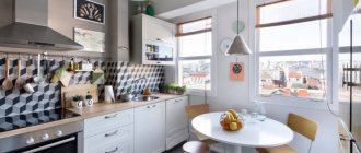
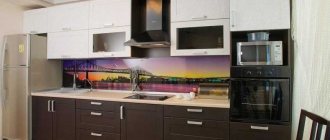
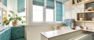
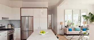
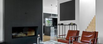
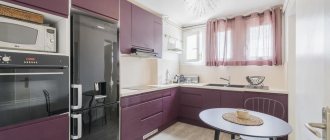
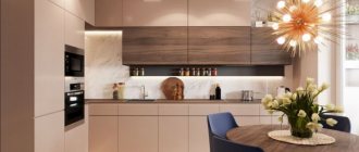
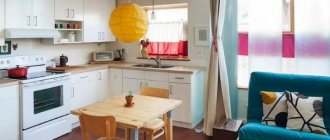
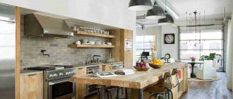
Immediately photo proof of my love for U-shaped kitchens:
Yes, I think a U-shape kitchen layout is the ideal layout for a modern style. Let's look at all the nuances of size and design.
What is a U-shaped kitchen?
The U-shaped kitchen is located along three walls, in the shape of the letter “U”. Which walls to use for this (including those bordering the window) are chosen by the owner, to his taste.
However, there are some rules that should be followed.
Island
There is another possibility: you can position the kitchen set in such a way that one of the legs of the letter P separates the kitchen from the room, forming a kind of peninsula. You can choose from these two options only by trying both.
The bar counter creates a feeling of lightness, although it serves as a kind of barrier between the room and the kitchen.
A peninsula from a kitchen cabinet creates additional space for storing utensils and supplies, performing the same function as a delimiter of functional areas.
Layout features
These modules have strengths and weaknesses.
- A U-shaped kitchen becomes a decoration of the home and allows you to realize the most daring design ideas.
- It is suitable for almost any style, from classic to modern.
- There is only one exception: the “country” style; in its setting with rural motifs, the kitchen set does not fit.
- Large rooms are ideal for the design and any color is suitable.
- The models have good capacity: all utensils are conveniently distributed among numerous drawers and cabinets.
- It's easy to plan so that the things you need are always at hand.
However, there are several limitations.
Such projects are intended for large kitchens, because they occupy a significant part of them. If the available area is less than 11 square meters. meters (or the space is narrow), it is recommended to look for other options.
- The exception to the rule is a studio apartment. Here the dining table is usually placed in the living room, and the kitchen is used only for cooking.
- Buying such a kit is an expensive pleasure. After all, it will require more materials than conventional headsets.
Another nuance is the so-called “dead” corners (places on turns). To use them, pull-out shelves, “carousels” and similar fittings are used. Their high cost is combined with insufficient reliability (they can break).
Preparation
When planning a U-shaped kitchen, the following parameters are taken into account:
- Area and shape of the kitchen;
- Location of windows, doors;
- Places where communications pass;
- Placement of equipment.
The desktop is made with a width of 0.7 m. But for the drawers to open conveniently, another 30 cm is required. In total, the working area from each of the three walls will be 1 m.
There should be a distance of at least 0.9 m between the edges of the kitchen set (preferably 1.2 m). This will provide the necessary comfort and avoid accidental injuries.
There is a “triangle” rule, where space is divided into three areas:
- Initial food processing area (this includes the countertop and sink);
- Cooking space (stove, oven);
- Storage area for tools and products (cabinets, shelves, refrigerator).
This ensures convenience in cooking, free access to the necessary ingredients and equipment.
Design with window
A U-shaped kitchen with a window has a number of features. The homeowner should consider how necessary such a layout is.
If this project is implemented, two problems will arise:
- Window glass will be difficult to clean;
- It is difficult to insert mosquito nets.
In typical apartments, complications with the countertop are added:
- It turns out to be higher than the window sill;
- If a heating radiator passes under the window, the kitchen countertop will block the heat flow (the temperature in the room will drop).
In the first case, a sink is installed instead of a work surface (water pipes will need to be installed).
The second incompatibility can be solved by providing slots in the body of the table top, this will ensure the passage of warm air.
Disadvantages of this solution
Despite the obvious improvement in lighting conditions, moving the sink under the window is associated with the following nuances:
When washing dishes, fruits and vegetables, numerous splashes will fly off onto the surface of the window, which will require additional care efforts.
Note!
Kitchen studio - 155 photo examples of how to make a large kitchen stylish, spacious and comfortableKitchen sink: 130 photos of choosing a model and do-it-yourself sink installation features
MDF kitchen apron: advantages and disadvantages of the material. Varieties of MDF aprons. Features of external decoration. DIY installation instructions (photo + video)
After each “session” of washing, you will need to pick up a rag so that the window does not look dirty. And if this is not difficult for a careful housewife, then it is a stretch to rely on the rest of the family members.
If on a hot day you need to open the kitchen window to provide fresh air, then due to the high mixer, this will only be partially possible.
Bar counter
This design is used instead of a separate table. Sitting at it, it is convenient to have a light snack; on average, it serves two people.
The recommended height of the product is up to 1.1 m. Placed either on the edge of the kitchen or opposite the window.
It is important to understand the practicality of the chosen option. A U-shaped kitchen with a bar counter is suitable under two conditions:
- A small family (two people) lives in the apartment;
- The living room has plenty of space for family events.
"Island"
This model is an additional table. Can be of any shape: square, rectangle, with rounded corners. You can either cook or dine on it. Placed only in large rooms (more than 20 sq. m).
Plays the role of a decorative element. They can fill visually empty space. Additionally, it is decorated with antique utensils (items are placed on the wall, above the table).
There are two-tier projects. Their lower level (height - 0.76 m) is convenient for kneading dough, the upper level (0.9 m) is for slicing.
IMPORTANT. When placing an island, it is important to maintain color harmony with the rest of the furniture. The item is made from materials corresponding to the set.
Small apartments
Miniature U-shaped kitchens are popular in studios.
- Feature: The role of the third wall is played by the space between the living room and kitchen.
- There are no upper cabinets and shelves in this option.
- All necessary things are placed in the lower compartments.
ON A NOTE. If the living room and kitchen are separated by a partition, then it will have to be demolished. It is necessary to take into account the position of the wall: very often there is a load-bearing slab above it.
Strive for symmetry and focus on the center of the headset
In order for the kitchen design to look neat and noble, it is necessary to ensure symmetry in the layout and beautifully emphasize its center. If you have the opportunity to use this method without sacrificing convenience, by all means do so. The center can be a hood over the stove or a sink with a beautiful chandelier.
Photo: cremafriends.com
Sofa
It is useful and convenient to add a corner sofa to the project. It is often combined with a dining table and placed at the end of the kitchen.
Another option is a transforming sofa. It will additionally provide a place for rest; it has storage shelves.
The dining table is often chosen to have a folding design. This saves space: The compact model is convenient to store, it unfolds easily and quickly if guests come.
Flaws
It is worth mentioning the disadvantages of this layout. It is not suitable for small or elongated spaces due to the heavy load on three walls of the room at once. The room visually becomes smaller and narrower.
Often the kitchen also becomes a dining room, but if such a design is used, this will turn out to be almost impossible, since there will be simply nowhere to place the dining table.
Kitchen too narrow
Recommendations
The design of a U-shaped kitchen can be improved in various ways. To visually enlarge the kitchen, the main part of the set is selected in white with a glossy surface. This color can be diluted with colored fabrics above the workplace.
When cabinets of flashy colors are chosen, the walls should smooth out the effect - calm, light colors are suitable for them.
U-shaped modules are demanding on lighting. Light sources can be enhanced with LED lamps, spotlights, sconces and other small devices.
The bulkiness of furniture is reduced in two ways:
- Large upper cabinets are replaced with compact pencil cases;
- The interior uses a variety of open shelves.
If all the above conditions are met, then the kitchen will turn from an ordinary place for preparing dishes into a real designer decoration that pleases the eye. It will be a pleasure not only to dine here, but also to socialize, spend time with your family or a group of friends. Photos of a U-shaped kitchen demonstrate a variety of solutions and possibilities.
If there is a tight and inconvenient passage, use a narrower and sloping set
If one side of the set is located close to the doorway and makes it difficult to enter the room, it can and should be narrowed a little - up to 45 cm. This solution is not only relevant, but actually indispensable for small kitchens in which the distance between the sides does not reach 120 cm .
Photo: home-designing.com
