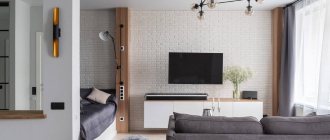
If your room is asymmetrical, be prepared for difficulties in finding suitable furniture. It is difficult to place standard furniture in an irregularly shaped room. However, you will agree that there are such irregularities that we do not consider a drawback, but on the contrary, we consider the highlight of the entire apartment. You can fall in love with the apartment because of the large wall-to-wall windows in the bay window area.
Square room shape
The square space of the room is balanced, but there is still a risk of not filling it properly, and the room will end up feeling empty or too crowded.
It is worth highlighting a separate corner for the dining room. Here you need to place round tables with chairs. Fill the rest of the living room space with several L-shaped sofas and delimit the room with benches, armchairs or poufs. If you want to place two sofas facing each other, then the distance between the walls should be at least 4 meters.
Daria Poverennova: my famous grandfather left Klara Luchko after one phrase
The doctor called the unusual effect of taking medications by patients with COVID-19
Could have become a champion in gymnastics: why Aronova became an actress and not a sport
Surface finishing
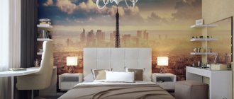
Using the right finish, you can visually correct the shape of the bedroom. There are the following design techniques for walls:
- Long walls should be finished in cold colors, and short walls should be finished in warm colors.
- Using squares as a pattern creates a subconscious association of the room with this shape.
- A horizontal stripe on short walls will lengthen them. But you shouldn’t carry it across the entire room: this will return the bedroom to its irregular shape and visually cut off the height.
- They prefer light finishing colors: white, beige, yellow, blue.
Avoid dark colors and small patterns: this will create an uncomfortable tunnel atmosphere.
As a floor covering, it is preferable to use a floor close to natural: parquet or laminate. Ceramic panels and tiles are completely inappropriate here: they are slippery, cold, and unpleasant to step on with bare feet. Floor elements must be fastened diagonally or towards a long wall.
Another way to correct the proportions of a room is to use a multi-level ceiling with a square shape in the middle. Under no circumstances should you glue wallpaper to the ceiling along a long wall. It is better to give preference to modern tension and suspension structures or use the classic win-win option - paint it white.
L-shaped room
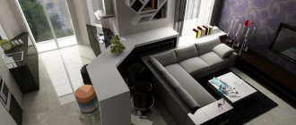
If the room has this shape, then most of it needs to be arranged so that it is conducive to relaxation and conversation. To do this, you need to place sofas and armchairs around the perimeter, using a fireplace or audiovisual module as a guide. Place a coffee table in the center of the composition.
Set up a smaller part of the room as a dining room, placing a table and several chairs or armchairs if there is enough free space.
Ergonomics of corner bedrooms
In order to successfully distribute interior items in a small corner bedroom, you need to take into account every detail. The wall color you choose and how you use that color plays an important role in creating a relaxing and inviting space . Several other components, such as furniture, accessories and lighting, help transform a small, awkward bedroom into a spacious and comfortable one.
Making the most of every available space
Painting and color
The colors you choose for your bedroom and how you use them will determine whether the room will feel spacious or cramped.
Tip If you want to use a rich color on the walls, paint all the walls except the ledges and except near the ceiling line.
Light but rich color in the bedroom
A light color covering the walls and ceiling makes the room feel more spacious and bright. It also gives the illusion of visual height. Never use a dark color in combination with a light color in the corners and ceiling in a corner room with a non-standard layout. This will emphasize the unevenness of the layout and make it visually smaller.
Furniture
The size and placement of furniture in the bedroom has the greatest impact on how cramped or spacious you feel in it. The fewer pieces of furniture you have in your bedroom, the more the space will open up. Smaller items that will be used for multiple purposes will ensure maximum impact.
Overhang walls or areas with a sloped ceiling are often left empty, but you can fill them with furniture that you sit or lie on, freeing up space in the rest of the room for taller elements.
The space in front of the window should not be wasted either. A small table, chair or bench located under the window creates a cozy reading area.
Built-in bookcases or wall shelves next to each other will allow you to make use of vertical space, but resist the urge to line all your walls with something useful. Otherwise, you will again emphasize the corners, as well as the small size of the room.
Room with a sloping ceiling
Lighting
A corner room appears darker, so choose your lighting carefully.
Tip: Avoid heavy fabrics for covering windows because natural light is the best choice here. Choose lightweight or clear window coverings that allow in natural light.
Recessed or wall mounted lighting eliminates the need for lamps, which can take up valuable space. Mirrors placed near or opposite windows also reflect light and help brighten up the space.
Saturated bright lighting of the room
Accessories
Having a bedroom full of accessories emphasizes the small size of the room, so instead of choosing many small items, use a few larger ones. For example, instead of hanging a collage of pictures on the wall, hang a single large piece of art.
Round rugs and tables visually round out the room to avoid focusing on the corners. Use accessories to bring color to the space. Bold colors in bedding, curtains, art and other elements add texture and pop to your overall bedroom design, drawing the eye away from corner walls.
Focus on curtains and carpet
Open plan
Many people choose an open floor plan living room. However, the disadvantage of such a room is that it is quite difficult to arrange it.
What habits and phrases should you give up to overcome self-doubt?
The guy gave the girl chewing gum to meet her: she broke into a smile
5 cases that prove that sometimes styling and light makeup are enough
The ideal option would be to separate the living room from the kitchen and dining room as much as possible. To do this, you need to make visual distinctions. The sofa can be located at the back of the kitchen or perpendicular.
Photo gallery
Our gallery presents photos of the best projects that will inspire you to implement bright and unconventional ideas in a small living room.
Irregularly shaped room
It often happens that the living room has some kind of diagonal wall, columns or a secluded corner. Each such case requires an individual solution.
For example, if the wall is diagonal, then the more spacious part should be allocated to the living room, and the rest of the area to the dining room. If there are columns, then you can place a sofa next to them or integrate a fireplace into them. If there is a secluded corner, then you can put non-standard furniture in it.
Furniture selection
In conditions of limited space, when choosing furniture, you need to be guided not only by your tastes. Modern designers have come up with many interesting furniture solutions for the interior of a narrow bedroom.
The bedroom must have a place to store bedding, pajamas and other things. An interesting idea would be to connect a wardrobe and a bed together, giving preference to a folding design. This will save a lot of space and looks stylish. There are full-fledged furniture systems with a folding bed. By placing it along one wall, the furniture problem is immediately solved completely.
When filling the space of a small room, you must not forget that furniture can be located not only on the floor. It is convenient to use hanging cabinets and shelves that are mounted above other elements: a table, a bed, etc. Hanging them at different heights will make the room cozier. The TV is also hung on special brackets.
Instead of armchairs, you can give preference to poufs. And combine the dressing table with a desk, hiding everything you need in drawers. Be sure to have bedside tables or a table near the bed: it’s convenient to put all sorts of little things on it for the night, charge your devices, etc.
Living room with two doors
Sometimes it happens that a room is a passageway and has a door that leads to another room.
When arranging a living room, you need to place sofas as far as possible from the door, and also put a pouf, but only so that the passage remains clear.
Growing cucumbers in bags and getting the earliest harvest: a simple trick
Anti-meteor windows and insulation: how much will a mortgage on the Moon cost?
Lessons with the power of thought: Skolkovo is developing a new method of teaching schoolchildren
Advantageous lighting
When creating the design of a long and narrow bedroom, special attention is paid to lighting. Proper use of it can radically affect the visual presentation of the room.
Having natural light from a window in the bedroom is key. You can place a mirror opposite it, then during the daytime the light from it will be scattered throughout the room.
There is no point in hanging massive lamps here: it will only worsen the situation. It is better to give preference to several small lighting fixtures in functional areas or spot lighting along the square perimeter of a multi-level ceiling. It is worth equipping a short wall with additional light if there is no window on it.
As a decorative element, you can equip hanging shelves with lighting.
Be sure to provide additional lighting to the area near the bed. This could be a small night light on the bedside table, a lamp built into the headboard or a sconce above the bed.
It will be convenient to build in a light brightness control, which will allow you to adjust it from bright lighting for work or cleaning to intimate, muted twilight.
Styles for custom solutions in kitchenettes
To make a small kitchen truly comfortable, you don’t need to do any special effort. The most important thing is the availability of financial capabilities, choosing the appropriate style:
Provence
– delicate pastel shades, many floral patterns, vintage furniture with metal elements.
Photo from source: 3ddd.ru
Tabletop Cedar 3042/1 Semolina beige
Loft
– communications are open, the brick remains “bare” without finishing, the furniture is brutal, deliberately rough. This kitchen is suitable for freedom-loving, bright people.
Photo from source: almode.ru
Tabletop Cedar 3093/1 Black Marquina Marble
Minimalism
– a calm and comfortable style, in which there is nothing superfluous - no bright elements, no flashy colors, no open shelves. Everything is in harmonious combination.
Photo from source: oopsdecor.com
Tabletop Cedar 6651/Qr Greek Travertine
Hi-tech
– gray and white gloss, chrome elements, mirror inserts, tinted glass predominate.
Photo from source: promsteklo.com
Tabletop Cedar 111/1 White
Country
– plank floor; tiles imitating stone; exquisite wooden furniture. In this case, it is better to hide the equipment behind the facades, that is, choose built-in models.
Photo from source: designmyhome.ru
Tabletop Cedar 4136/M Wood stripe
Mono- or multi-functionality?
The classic option is the main, central room, where everyone gathers in the evening after work or receives guests. However, such use is perceived as irrational. Redevelopment options are appearing, where the wall between the room and the kitchen is completely demolished (as an option, a large arch is made) and combined, which gives a significant gain in space. This is also a great way to make even small rooms appear larger.
If in your apartment or house the kitchen has an adjacent wall to the living room, then this simply cannot be used, either with or without redevelopment.
And for those who need a dining room, such a combination is immediately “3 in 1”. But here you can’t do without the services of a competent designer: the likelihood of a pile-up where one thing does not fit with the other, unclear zoning, and frankly unsuccessful compromise solutions is very high.
Eco + Loft – a non-standard stylish duet for the kitchen
Some people love natural motifs, while others prefer rough, brutal details. If your family members can't find a solution, choose a compromise! It will be given by combining two styles in one kitchen, which embodies eco-loft. It looks very harmonious. Details, or rather, their skillful use, will help you create such a design for a non-standard kitchen-living room:
• the ceiling surface imitates old boards;
Photo from source: design-homes.ru
Table top Cedar 2347/soft Blanco Marble
• lamps with jute ropes, as if from a ship, with wires woven into them. They can be distributed throughout the kitchen to create different lighting scenarios;
Photo from source: lazon.ru
Tabletop Cedar 811/1 Metallic
• blue colors in the design palette;
Photo from source: mykaleidoscope.ru
• tiles in Mediterranean style;
Photo from source: panceramic.ru
Table top Cedar 7354/S Stromboli brown
• denim curtains;
Photo from source: mykaleidoscope.ru
• solid wood details with interesting lighting;
Photo from source: almode.ru
• “floating garden” by the window – it’s convenient to grow aromatic herbs here, then pick them and add them fresh to dishes;
Photo from source: inmyroom.ru
Tabletop Cedar 3831/M Douglas light
• hand-painted plates, in which the pattern of the floor tiles is partially repeated.
Photo from source: inmyroom.ru
Tabletop Cedar 7024/1 Imperial Marble
Without what details is it impossible to create a trendy kitchen?
It is impossible to create the interiors of non-standard kitchens so that they correspond to modern trends if without such details as:
• concrete/stone in design - a kitchen countertop, even if it is of non-standard size, non-standard width, made from these materials, is quite common. But if you see a stone or concrete facade, you will probably be surprised. The material used for this door is gray composite material, which goes well with wood facades.
Photo from source: olimpmebel.com
Tabletop Cedar 1110/S White
Artificial stone is easy to process, so you can create any shape from it. Closed cabinets created from such monolithic surfaces are an excellent solution!
• clear geometry – kitchens with non-standard rounded corners in the style of the sixties of the twentieth century are in trend today. Blind facades, the fittings of which are hidden, are also popular. There are no decorations on them. Their coating can be made of enamel/plastic. A linear layout is used, combined with an “island”. The bottom row is made up of horizontal cabinets.
Matte veneer, made from natural wood, is used for the geometry of several levels. Plastic facades are coolly combined with an island, decorated in a single tone and combined with a dining table.
Photo from source: alkamebel.com.ua
Tabletop Cedar 1021/Q Black
• original storage systems, located from the floor to the ceiling, are very spacious. Moreover, they can be anything: a shelf in the form of a triangle with shelves/cabinets with drawers, shelves, narrow shelves, small niches. If the kitchen is small, use rails.
Photo from source: imall.com
Don’t forget about the technical content of the headset (roll-out surfaces, pull-out sockets). Try to use all the space.
Photo from source: slavstol.ru
Table top Cedar 0446/S Granite chips
