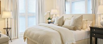
The sophistication and airiness of creamy cuisine amazes with its impeccable cleanliness and nobility. Even in the photo, she attracts the eye with ease and calmness, beckons with comfort and warmth. Surrounded by cream-colored furnishings, it is pleasant to gather with the whole family in the evenings or start the morning alone with a cup of coffee.
Soft color adds charm and sophistication
And if you think that creamy cuisine is beautiful, but not pragmatic, then you are mistaken! The practicality of the interior in light colors has been tested by time.
What does cream color look like?
Cream color is not beige, not peach, not pearl, or even pink. He absorbed all these shades. It is generally accepted that cream is a light shade of white with a yellow tint. It is called a classic of warm colors. Look at any interior photo from our gallery at the end of the article: cream looks different in each photo.
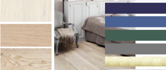
Color Chart
The color is so multifaceted that it is difficult for the untrained eye to catch its shades and understand the tones. Its essence is light halftones. It's not even the color, but its condition.
It contains minor inclusions of shades such as:
- yellow;
- grey;
- straw;
- and even green.
If you're looking for an alternative to white, this is it. It is noble and rich in nuances. Take a look at the photo.
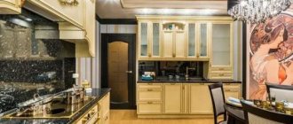
Kitchen space in cream and brown tones.
A kitchen made in cream tones has a number of significant advantages, and its interior:
- does not look too sterile, as in the white version;
- is perceived much more interesting than in beige;
- looks cozier than the classic light gray design.
Valid combinations
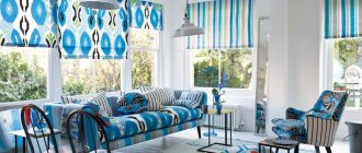
Photo: celebration and chic in a cream-colored living room
The best combinations of cream color are obtained when using contrasting, rich colors. The most successful of them are chocolate and cream color.
You can also successfully combine gray and cream colors, which especially effectively emphasize the practicality and beauty of a modern interior.
You can get a good color palette if you use the triad: creamy vanilla, caramel and coffee. This tone combines very organically with the colors included in the autumn and summer color palette.
Suitable Styles for Cream Kitchens
Cream color is universal. It suits different styles in light colors. The color lost some of its popularity during the fashion for minimalist design. Then the palm was held by crystal white color. But the comfort of cream and its ability to never get boring helped the color come back.
Today, creamy cuisine is not uncommon. But even looking through photos in design magazines, one cannot dare to call it banal.
Classic perfection
Classic kitchen design is becoming increasingly popular and in demand. Light facades allow you to focus on the original decor and other details.
Cream furniture fronts in a classic style
If you complement the design with harmonious stucco on the ceiling and curtains in warm colors, you will get a comfortable kitchen with a classic style.
Retro kitchens
Scandinavian, rustic, Provencal and country styles often focus on cream furniture. It may be slightly pink, even peachy, yellowish or greenish. Such kitchens have maximum comfort and warmth.
Kitchen in Provence style
Furniture for rooms in light colors is chosen with matte facades. An apron in such an interior should not stand out from the overall style. Instead of tiles, surfaces with a craquelure effect are often used. Light abrasions and artificial aging of textured tiles are appropriate here.
Modern
The dynamics of modern style in kitchen design is expressed in the use of simple functional furniture, blank facades and cabinets. Frosted glass and steel fit well into the interior.
Modernity accepts this tone
The upper modules of the headset are decorated with glass doors, and the lower ones can be made a tone or two darker.
Art Deco
The luxury and richness of this style is expressed in the use of interesting details of a laconic form. The dominant feature of the kitchen is usually the furniture set, which plays here with an abundance of shades. The shape of the furniture is played up by the rich palette of the apron and walls.
The interior includes spotlights. The dining area is decorated with tiles with a metallic sheen.
High tech
There was also metal in the high-tech style. Strict lines and straight shapes predominate here. The technological interior uses metal, plastic and tempered glass. Here beige gets along well with cold metal and makes it more cozy and homey.
The apron is finished with gray, brown or beige tiles.
Monochrome or contrast?
A cream interior can easily do without companion flowers. A kitchen in pastel colors always looks elegant. Here you can play with shades. A light-colored ceramic tile backsplash with darker, thicker, more densely colored lower modules works well.
Monotonous cream “expands” the room well. To enhance the effect and move away from traditionalism, glossy furniture facades and mirror surfaces are used. For example, a set with a stainless steel countertop or a glass apron will make the kitchen expressive. The gloss of light shades will additionally create interesting highlights even in kitchens where the sun does not shine.
If you want to play with color combinations without risk, feel free to choose cream and chocolate. This duet is suitable for tiles, suitable for facing an apron and is considered a win-win option. Steel, gray or natural oak are suitable as a third color. Light furniture is well set off by dark tiles or brown countertops of any shade.
When combined with bright colors, the cream becomes neutral. It remains in the shadows and serves as an excellent background for more saturated shades. Lovers of complex colors will appreciate these properties. It is combined with purple, fuchsia and burgundy shades.
If you don’t know what color to combine a cream color with, take a closer look at its shade at least in the photo. Greenish cream will make friends with terracotta, olive, orange and yellow colors that match green. A pink kitchen will become more seasoned if you choose cream furniture to match it. The surface of the facades can be glossy or matte.
From cold ones, you can choose a light blue color. In tandem with cream, it creates a calm interior. A pastel warm kitchen will include all shades of brown, sand and gray. This design will be appreciated by fans of natural colors with bright accents.
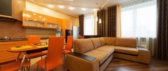
Little secrets of a beige sofa in the interior
This is a unique piece of furniture, a kind of “chameleon”. It adapts to any textures, shapes, and colors. A dim sofa goes well with pastel tones in the decoration, and a sofa in a rich, bright color goes well with the same expressive shades.
For variety, original decorative pillows are used. They can be plain or with pillowcases on which an animalistic pattern is applied. The most successful solutions will be products in dark blue, green, burgundy, brown and black, with leopard prints, zebra, tiger or giraffe. Instead of chair covers, they sometimes use artificial skins, and, of course, place nearby flowerpots with houseplants that match the style.
What else can be done to avoid the dominance of beige and to maximize its positive qualities? Add bronze, copper and gold elements, cover the walls with original wallpaper, hang beautiful Roman blinds on the windows, place a fancy-shaped floor lamp near the chair.
If we talk about the models themselves, then the classic is a formal sofa with a curved back, armrests and graceful legs, fabric upholstery with embroidery or a pattern. For modern styles, corner beige sofas or products in the shape of “U”, “C” with plain upholstery are more suitable.
PERFORMA | VIP sofas also invite you to take a closer look at the beige color scheme. It can decorate any interior, you can see this for yourself. Look at ready-made solutions in our catalog or order the production of a sofa, bed, chairs, armchairs or chest of drawers according to an individual project. Our specialists will be happy to make your dreams come true! Hurry up to place your order before the New Year!
Expert: Nadezhda Gumennaya
Benefits of cream color in kitchen design
- Neutrality. The cream color does not hurt the eyes. He knows how to be dominant and humble. Cream goes well with almost all colors. If you have cream furniture, then you can easily choose the color of the walls, floor, ceiling and windows.
- Ability to expand space. Cream, like other light colors, can visually make a small kitchen wider, taller and longer. Promotes peace. This color is always calm. It does not irritate, does not excite, does not cause rejection.
- Coziness and comfort. The color evokes warmth and well-being.
- Practical and easy to care for. If all the errors in cleaning are visible on white, then cream is more loyal in this regard. Minor scratches, dust and other traces of use are less noticeable on facades of this color.
- Stunning visual effect. Even inexpensive cream furniture looks noble. Light-colored headsets are becoming popular. This trend affects pricing: cream kitchen furniture is rising in price.
The cream color is unique. He has the power to turn an ordinary kitchen into a cozy corner. There are no difficulties with him. They say he's boring? Maybe. But only if the entire kitchen is decorated in a single color, without any accents. Monotony in decoration can really cause boredom.
If the kitchen design is developed based on the play of shades, combinations of light and dark tones, then you can get a kitchen even better than in the photo in the most fashionable magazines.
