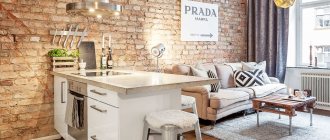
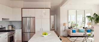
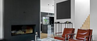
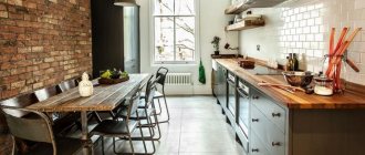
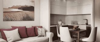
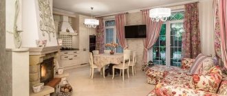
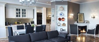
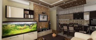
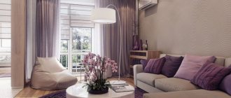
The layout with a combined living room-kitchen, as well as studio apartments, will have both supporters and opponents. Indeed, this option has its own nuances.
I like this idea, and not just like it... I have been in the kitchen-living room for over 20 years. And when I was still a teenager in my parents’ apartment, and now with my large family.
I can't imagine a small isolated kitchen. I feel stuffy and uncomfortable in it. Don't turn around. Although for a couple or one, the opposite is possible.
We suggest considering design techniques that can be used to completely hide or make the kitchen area as inconspicuous as possible.
As you know, it is the presence of a kitchen in the living room space with its communication systems and household appliances that causes the most criticism.
So, if you have made your final decision or are already the happy owner of a spacious living room-kitchen, take on board the ideas proposed by experts that will neutralize the effect of being in the kitchen!
The very idea of combining the kitchen and living room space is very popular. But in the practical implementation of such projects, homeowners are faced with many nuances.
However, professional designers claim that with the right approach, this technique can be incorporated into both a standard one-room apartment and modern apartments with an improved layout.
What color scheme should I use?
Looking at the bare walls after renovation, this is the first question that owners ask themselves. Although everyone's preferences are different, and there is hardly a color that will not fit into the kitchen design, one general piece of advice can be given.
Kitchen interiors designed in “edible” shades are especially cozy, because they evoke pleasant associations with fresh, aromatic food, lift your spirits and stimulate your appetite.
Examples of “delicious” colors for kitchen decoration:
- cream;
- wheat;
- citric;
- orange;
- peach;
- mango;
- light green;
- pistachio;
- strawberry;
- olive;
- carrot;
- beet;
- honey;
- walnut;
- coffee.
The photos above and below show examples of kitchen interior design in eye-pleasing “edible” shades.
Now let's talk about successful combinations of shades. To achieve a harmonious kitchen design in your apartment, follow simple rules.
Rule I - no more than three primary colors. Even with the use of one leading tone, you can create an original and not boring kitchen interior in an apartment or private house, two is a Solomonic solution, and three is already quite bold.
If you want to take a risk, take as a basis one of the best principles of combination: contrast - 60% is the dominant color, 30% is the secondary color and 10% is the bright accent color; monochrome - the main color plus two of its close shades are used; connected - three adjacent shades of the palette are taken.
As a background or leading color, you should not choose catchy and aggressive tones, such as canary or scarlet, and in the case of a cramped kitchen, you will also have to resist the temptation to use a dark and deep color as a basis: black, dark brown, burgundy, night blue. It is better to prefer light neutral shades, which are easy to complement: white, soft pink, pearl gray, light green, coffee with milk.
Kitchen design in cool colors - blue, light blue, violet, lilac, turquoise - can be very successful, especially if this decision is supported by harmony with the overall style of the room.
Rule II - the color scheme matches the style. For a kitchen in a modern style, bold contrasting combinations are suitable, and for an interior in a classic style it is better to choose one leading color, which is calm and discreet.
Each design direction implies its own favorite ensemble of shades. For example, in a kitchen in the Provence style, calming lavender, beige and olive motifs reign, shabby chic - romantic lilac, pink and powdery, loft - brutal steel, ash and brick, and in eco-style - natural wood, marsh and grassy ones.
Rule III - area and geometry are taken into account. Color is a powerful tool for designing, zoning and visually correcting the shortcomings of any room, and the kitchen needs it more often than other rooms.
General principles of how shades work:
- light, cold colors push the walls apart and raise the ceilings;
- light, warm ones create an atmosphere of comfort and charge with positivity;
- dark cold ones bring dynamics and audacity;
- dark, warm ones make the kitchen interior richer and more solid.
Not only color is important, but also its location. Does the kitchen have a low ceiling? Place wide vertical stripes along the walls. Is the room too narrow? Make the short wall light and the long wall darker. Is the room an irregular shape? Place a mosaic or checkerboard pattern on the floor. Any planning problem can be solved by color.
The photos above and below show examples of harmonious and stylish kitchen design in cool, subdued colors.
The best photos of kitchen-living room design
Let's start right away with the most stylish examples:
Have you noticed that this is a single space without artificial division?
Firstly, the entire kitchen-living room is designed in the same style and color scheme. There is no “visual zoning” and there shouldn’t be. The color scheme is neutral, because... color combinations in an open space are more difficult and there is a risk when using bright colors.
Secondly, all but 1 kitchen is to the ceiling, they have a lot of closed storage areas, and the style is modern and with a touch of minimalism. Clutter and excess trash in the kitchen combined with the living room instantly destroys the entire design.
A photo of two mistakes at once : the kitchen is not up to the ceiling and there is trash accumulated there, there is a step on the ceiling where it is not needed. If they had lowered the ceiling in the closet area, it would have been a different matter.
But the lighting should be separate and it is important to think through the switches in detail in advance. And yes, the interior of the kitchen-living room critically depends on proper light.
We count the contours of light:
- Separate main overhead light in the kitchen and living room areas.
- General decorative lighting including all hidden background light and apron lighting , LED strips under the bar counter.
- Light above the dining area and, because... It is usually in the center of the room; it is better to choose stylish, catchy designer lamps.
- Floor lamp near the sofa.
It's minimum. The LED strip under the arrow should be turned on from the same switch as the apron.
About the first 2 points:
Bright overhead light is usually used only during cooking or cleaning; the rest of the time, functional and background light is used. Hanging an overhead light on 1 switch directly above the kitchen and living room is a mistake because... it is almost never needed there at the same time.
But background light is needed everywhere at once and it should be on 1 button located at the entrance to the room (can be duplicated with a pass-through switch near the sofa).
And as they usually do: the kitchen workers make the lighting under the upper cabinets and turn it on with a button there, the rest is installed by the finishers and is also turned on locally. But you don’t want to be in the kitchen area when the living room is completely dark, and vice versa. Run from one end of the room to the other 2 times to turn it on and off too. That's why:
Don’t even think about switching on the LED strips on the apron itself. Place the switch where everyone else does - at the entrance to the kitchen.
This is all laid out at the very beginning of the renovation when installing electrical wiring, so in the material about the kitchen project I wrote that design is not only about furniture, and which part should be done independently.
Recommendations for choosing finishes
Kitchen floors have to be washed frequently. The material must withstand such loads, be quickly and easily cleaned from stubborn oily contaminants, and not deteriorate from accidentally falling colored products or spilled drinks.
Best options:
- tile;
- linoleum;
- porcelain stoneware;
- self-leveling floor;
- waterproof laminate.
The photo shows linoleum, which successfully imitates natural parquet and does not stand out from the general concept of a respectable kitchen
It is not advisable to completely decorate the walls with one material. In the work area, it is better to make an apron from tiles, mosaics, natural or artificial stone, and install a decorative panel made of tempered glass (skinali). The remaining area, which is not exposed to splashes of water and grease and is not affected by heat from the stove, can be decorated with more affordable and simple materials.
Examples of good choices:
- decorative plaster;
- vinyl, non-woven, liquid wallpaper;
- PVC or MDF panels;
- acrylic paint;
- glass wallpaper.
The photo shows decorative plaster, which emphasizes the nobility and sophistication of a classic kitchen interior
The ceiling in the kitchen also gets dirty; ideally it should be possible to wet clean it. It is also desirable that it resists the adhesion of dirt, dust and grease.
Most suitable materials:
- water-based paint;
- polystyrene tiles;
- moisture-resistant drywall;
- plastic panels;
- stretch fabrics.
How to “separate” a combined kitchen and living room
- Columns, arches, small screens and partitions are also often used for zoning.
- Also a good solution is lighting; the kitchen should have bright lighting, and the living room should be more subdued and cozy.
- Hang blinds in the kitchen and beautiful curtains in the living room.
- Perhaps the most popular way of zoning such a room is a bar counter, which separates the kitchen space from the living room. This option is especially suitable for young families who like to host friendly parties and buffets. The bar counter is quite a functional thing; it can be used as a place to eat, as a work surface, and as an interior decoration.
Which layout should you choose?
Sometimes you don’t have to choose, especially if the kitchen is tiny. But even with an acute shortage of space, you can find a convenient option for placing a kitchen unit.
There can be several planning principles:
- linear - a working area along one wall, a dining area - along the second, and if the passage is too narrow, you can install a folding table;
- parallel - elements of the working area are divided into two equal groups and located opposite each other, and by the window there is a dining table or food counter combined with the window sill;
- L-shaped - the most popular type of layout, suitable for most small kitchens (up to 10 sq. m), it is a triangle with a refrigerator, sink and stove at the corners, cutting surfaces in the gaps and a dining table opposite;
- U-shaped is a very convenient way to arrange a kitchen unit, but requires quite a lot of space, at least 12-14 square meters. m, so let's call it optimal for medium-sized kitchens;
- island is the dream of many housewives who are passionate about cooking; this is when a block of cabinets for cooking or eating food is installed in the center of a spacious kitchen (from 16 sq.m.), and everything else is scattered around.
If a small kitchen (up to 8 sq. m) is connected to the living room by a non-load-bearing wall, it makes sense to demolish this partition and turn the home into a kitchen-living room. You can beautifully and functionally separate the food preparation area from the relaxation area using a platform, a multi-level illuminated ceiling or a bar counter.
When you have to come to terms with the tiny dimensions of the kitchen, try to make the most of the surface of the walls - install tall narrow cabinets, hang cabinets.
Corner, retractable, folding and carousel storage systems built into the furniture set will help to expand the bins.
Adding more space will be possible by installing a sliding door instead of a swing door or demolishing it and replacing it with an arch.
Disadvantages of a combined kitchen with living room
However, a kitchen combined with a living room also has its drawbacks. If you are the owner of a one-room or two-room apartment, then before you decide to remodel, you need to understand that now you will have one less room. An option is to combine the kitchen with the corridor and make a kitchen-living room out of that space.
- Whether you're willing to sleep next to the stove and refrigerator, also remember that you may have children and need a separate children's room.
- The combined space needs perfect cleanliness.
- Therefore, now you will not be able to leave unwashed dishes in the sink, you will also have to wash the floor every two days and give up light-colored carpets, as grease will settle on them.
How to choose and arrange furniture correctly?
The secret of successful placement is in the accuracy of measurements and drawing up a detailed plan. Absolutely everything needs to be marked on it, including sockets and lighting fixtures. Let’s say right away that an ergonomic kitchen design is impossible without a custom-built “built-in”, so you need to be mentally prepared for serious expenses and long waits.
To make the kitchen convenient to use, it is necessary to comply with the minimum distance standards between individual elements of the kitchen environment:
- the refrigerator, sink and hob should be located at least 130 cm from each other;
- It is advisable to leave at least 40 cm of free space on the sides of the stove, 45 cm from the sink, and an island of 35 cm is useful next to the refrigerator for displaying food.
When arranging household appliances, you also need to follow the following rules:
- the microwave is placed only on the countertop and no higher than 140 cm from the floor;
- the hood is installed above the hob at a height of 65-70 cm;
- the dishwasher is mounted no further than 90 cm from the sink, otherwise the plumbing connections will become more complicated;
- A front-loading washing machine should be placed no closer than 50 cm from the corner sections, otherwise it will be inconvenient to load and remove laundry.
The best style for an apartment kitchen
When decorating a kitchen-living room in an apartment and other room options, you should initially choose the main style. In accordance with it, the most suitable solutions are subsequently selected.
Different styles can be used for kitchens. You need to find out what their distinctive features are:
- Scandinavian. The main shade is white, which makes the interior very light. Tasteful textiles make a wonderful decoration. Furniture is characterized by simple solutions. The use of natural materials contributes to the creation of a cozy atmosphere.
- High tech. The selected solutions combine excellent functionality and simplicity. At the same time, a distinctive feature is high technology.
- Provence. It’s worth choosing this direction if you want to decorate a cozy room. Textiles made from natural materials are used here. Rough textures look impressive.
- Classical. By successfully implementing this direction, you can give the appearance of the room a unique elegance. For this purpose, discreet color schemes, regular shapes, and natural materials that look rich are used.
Also, when decorating interiors, other styles can be used, which will look no less attractive, differing in their advantages.
It is necessary to correctly select all the elements, beautifully decorating the room.
How to choose decor and accessories?
Decorations and utensils should fit harmoniously into the kitchen design, so if you don’t feel like a stylist, turn to professionals - almost always, when ordering a furniture set, you can ask to supplement the project with suitable decorative and functional objects.
If you purchased a ready-made set of furniture from a catalog, look there for interesting kitchen accessories in the chosen style: rails, magnetic knife holders, spice organizers, mug stands, clocks and paintings, rugs and panels, towels and potholders, curtains and blinds. In company catalogs you can see successful options for the location and combination of these objects in the interior.
Three important “don’ts”:
- do not buy cheap Chinese decorative items and accessories for the kitchen (miracle graters and other inventions from the series of life hacks) - they most often turn out to be useless, quickly deteriorate and kill the style with their appearance;
- do not clutter the countertops with decorations, avoid open shelves with dishes - all this will create the effect of sloppiness, collect dust and dirt and double the effort required for quality cleaning;
- do not acquire a mountain of assorted inexpensive knives, frying pans, pots, baking dishes and containers - most of them will turn out to be unnecessary, and to simplify storage and avoid new expenses, it is better to purchase well-thought-out sets, where items are nested into each other and are made of high-quality, reliable materials.
Finishing materials for the kitchen
The market offers a huge number of varieties of finishing materials:
- Gender – it is best to give preference to practical solutions. It could be linoleum, which attracts attention at an affordable price. Floor tiles will show themselves perfectly.
- Ceiling – among the abundance of solutions, paint is often chosen. This is a great all-around option. It is necessary to choose a suitable shade of paint, for example, white. For modern styles, a suspended ceiling would be an excellent choice. The corresponding photos of the kitchen in the apartment show that it allows you to create a perfectly flat surface that will look very neat. The catalogs select the appropriate texture. It can be matte, glossy, satin. The number of shades is huge.
- Walls – materials that are not difficult to care for are popular. The traditional solution is to lay tiles. It will please you with its good durability, and it is quite easy to remove dirt from its surface. You can also choose the appropriate type of panels. They can be glass or plastic. These materials have good performance properties and look very stylish.
When looking for the ideal solution for decorating walls, ceilings and floors, it is worth considering what characteristics different materials have.
The selected options should look harmonious, complementing each other and creating a unified style.
What is important to know about organizing lighting?
The kitchen requires bright lighting, preferably natural rather than electric. If possible, position your work area so that the sun's rays fall on it and make it easier for you to cut ingredients.
In a small kitchen with a low window facing north or northwest, it is better to provide spot lighting for the work area, mounted in the ceiling, upper cabinets or apron.
Kitchen combined with living room - its advantages
Today, more and more owners of 2- and 3-room apartments prefer to combine a kitchen with a living room. This allows you to visually increase the space of the room and make it more exclusive and functional.
- The kitchen, combined with the living room, looks very fashionable and modern. The main advantage of this redevelopment is that as a result you get a spacious, bright room instead of two small ones.
- The kitchen, combined with the living room, is very convenient for parties and get-togethers with friends. Now you won't have to leave your friends to go to the kitchen and cook something, and you won't feel like you're locked in the kitchen while everyone else is having fun. Now you can prepare snacks and communicate with guests at the same time, and it’s easier to attract help.
- There will be no need to run with plates and teapots from the kitchen to the dining room, everything will be greatly simplified.
- Redevelopment will allow you to save on purchasing a second TV; you can buy one large one instead of two small ones. It will also be easier for you to keep an eye on the kids playing in the living room, while you can do your own thing in the kitchen.
What style is better to decorate?
When choosing a style, you will have to be guided not only by the general design concept of the house or apartment, but also by the area of the kitchen. Some modern trends seem to be created specifically to fit into tight spaces and get the most out of it. And there are also chic ones, like Gothic, Baroque or Renaissance, which only owners of spacious luxury housing can think about choosing.
10 styles that have consistently remained popular among kitchen interior designers in recent years:
- classic;
- Provence;
- high tech;
- minimalism;
- eclecticism;
- loft;
- country;
- modern;
- Scandinavian;
- ethnic.
Most likely, eco-style will soon break into the top ten, because the fashion for interior design is steadily turning towards nature.
Household appliances for the kitchen
The kitchen in a studio apartment or other types of premises should be decorated at the highest level. You can't do without household appliances. Today, manufacturers produce many modern models.
They are characterized by good characteristics, excellent functionality and attractive design, which allows them to fit perfectly into the interior. The most suitable types are selected for specific requests.
