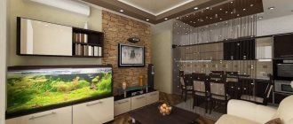
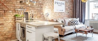
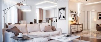
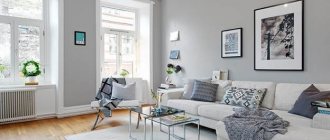
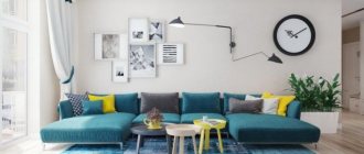
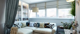
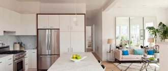
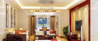
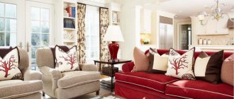
The 20-meter living room is not the largest room, but it is quite comfortable for receiving guests and evening relaxation. With proper planning of the space, you can arrange not only the relaxation and gathering area itself, but also an office, a greenhouse and/or a reading corner. We tell you what to consider when designing a living room of 20 square meters. m.: about the features of the layout, zoning options, choice of style and color schemes, lighting and other nuances.
Features of combining kitchen and living room
If the room initially has a large kitchen, organizing a combined space of several functional areas is quite easy. But even in small apartments, a similar design solution can be implemented by destroying the partition between the kitchen and the adjacent room. It is important to remember that in a residential building, the demolition of any wall must be coordinated with government services.
This need is due to the safety of other residents. If the owner does not approve the redevelopment, he may be subject to a fine and the obligation to return everything to its original form. In extreme cases, the apartment will be confiscated. This is due to the fact that some walls are load-bearing, which means their demolition can lead to the tilting of a multi-story building.
In addition, demolishing a wall and combining space is prohibited in houses where there is a gas stove.
When combining a kitchen with a living room, you should understand that it is better to leave some communications as is. For example, this applies to sewers, water pipes and ventilation shafts. But with electrics, you can fantasize without limits and adjust it to your needs.
Pros and cons of combination
Of course, such a serious decision as demolishing walls and combining space is always accompanied by advantages and disadvantages. Without a doubt, the main advantage is a new perception of large space and the ability to create almost any interior.
Pros:
- additional lighting , since now there will be two windows in one room, and the wall will not block the sunlight;
- convenience for the housewife to simultaneously cook and communicate with family or friends, or simply keep an eye on small children;
- the ability to organize holidays and parties in a large room;
- savings on technology - for example, there is no longer a need to buy two TVs.
But such redevelopment also has its drawbacks. For example, residents lose some of their personal space due to the combination of rooms. If previously the room could be organized as a bedroom, then in the kitchen-living room this is difficult to imagine for two reasons.
Minuses:
- odors - even the best hood cannot quickly eliminate odors after cooking. And if the dish was successful, then it has a pleasant smell, but if it is burnt, then the curtains, upholstery and other textile elements will have to be cleaned and washed;
- noise - when working in the kitchen, not the most pleasant sounds often appear, such as the refrigerator compressor turning on, water pouring, or the hood operating. Residents come to the kitchen to rest and relax, and noise can interfere with this.
The kitchen-living room also imposes certain obligations, for example, to more carefully maintain order, because the sight of dirty dishes that can be seen from the sofa is rather unattractive. Of course, there are disadvantages to such a combination of spaces, but, nevertheless, the kitchen turns out to be spacious, cozy and suitable for creative experiments.
Combine and separate
There are also disadvantages associated primarily with the impossibility of isolation if necessary, but they can be easily eliminated by the presence of partitions. According to their load, they are divided into real substitutes for doors and walls, and they can be more conventional, symbolic. But their choice directly depends on taking into account the wishes of family members.
Designers offer:
- Sliding glass doors are transparent, but save you from odors and noise. They will help to beat the remaining half-wall if it is impossible to completely dismantle the dividing wall.
- Sliding ones with stained glass design - they will demarcate for a more private environment. You can turn on bright lights in the kitchen if you need dim lights in the living room.
- Folding options, screens - division if necessary.
We tear down the wall
We must understand that not every wall can be demolished. All the more easy. If we are talking about a Khrushchev building made of brick, then there are no problems, since the load-bearing walls are only façade, and all internal walls can be demolished without problems.
But if the house is panel, then the situation is more difficult. Usually in such houses the wall between the living room and the kitchen is load-bearing and made of concrete. If you remove such a wall, the load will be distributed incorrectly, the building may tilt and even collapse.
The conclusion is the following: load-bearing walls cannot be demolished!
Moreover, demolishing this wall is not at all easy, unlike a brick one. Concrete can only be cut using diamond spraying - this is a very long, dusty and labor-intensive process. If you really want to demolish a load-bearing wall, you will have to install large metal fortifications in its place. And even in this case, you cannot completely get rid of the concrete - you must definitely leave a piece of it at the junction with the floor slab.
In addition, even this requires permission from government agencies, which is very difficult to obtain. You can do without it, but it will still come to light when selling an apartment or doing a major renovation. It's also unsafe.
Which wall is load-bearing?
The easiest and surest way to find out which wall is load-bearing is to look at the technical passport. There, load-bearing walls are highlighted with a thick line. If this document is lost, then you can look at the ceiling itself - the load-bearing wall always stands out. But this method can also fail, for example, if the apartment has been decorated.
Therefore, the most popular method is tapping. If there is a slight vibration and the sound is booming, you can bear it. If the wall is very hard, there are no vibrations, and the sound is dull, it is better not to experiment with it.
This rule, again, only applies to cases where there is no thick layer of finishing. If a load-bearing wall is covered with plasterboard or putty is applied poorly, vibration and a booming sound may occur.
What zones should be present in a studio kitchen?
After the wall is demolished, it turns out that 20 sq. m. - this is not at all small, and here you can even get confused. For this reason, it is advisable to think through the interior and layout before demolishing the walls. After all, there is a possibility that part of the wall can be left to place there, for example, a bar counter or to decorate an arch. There are three main zones that should be present in a kitchen-living room of 20 sq.m.
| Work area (kitchen) | Stove, sink, countertop, kitchen set |
| Dining area (dining room) | Table with chairs (armchairs, stools) |
| Recreation area (hall, living room) | Buffet with dishes, bookcase, TV, coffee table, armchairs and sofa |
It turns out that the kitchen-living room should have all the attributes that would be in two separate rooms. But if before the demolition of the wall it was possible not to pay much attention to the compatibility of these pieces of furniture, but now you cannot afford such luxury: everything must be done in the same style and harmonious color scheme.
Headset layout options
A kitchen combined with a living room, thanks to its large space, will accept almost any layout, but the following options are the most popular:
- parallel;
- letter P;
- letter G.
Each layout has its pros and cons, which must also be taken into account. In addition to the personal wishes of the owners, the design of a studio kitchen of 20 square meters also depends on the features of the room, for example, its geometric shape, the presence of a balcony or the number of doors and windows.
The main principle for arranging furniture is the working triangle. This principle requires that such important kitchen elements as the sink, stove and refrigerator be located next to each other, ideally forming a triangle.
At a minimum, there should be no obstacles between these items, such as a table or upholstered furniture. Otherwise, the housewife will waste time walking in this labyrinth while cooking.
Parallel layout
If the room has a rectangular shape, then the parallel layout seems to have been specially created for it, because there will still be enough free space in the center. With this layout, a set and similar accessories for the work area are usually placed along one wall, and upholstered furniture for guests is placed along a parallel wall. A table or island can be placed in the center to zone the room.
There is another, more familiar, option for parallel arrangement: with it, the set still remains along the wall, and the second part of the set plays the role of an island that separates the living room from the work area.
This layout is one of the most popular in kitchens and living rooms because it looks very cozy, but at the same time is very functional.
Letter P
A U-shape layout is a very convenient option, because while cooking, the housewife will only have to take a couple of steps to get to another functional area. The arrangement of such a kitchen is somewhat reminiscent of the previous layout:
- first option - there is a set along the first wall, upholstered furniture in parallel, and the dining group plays the role of a bridge between them;
- The second option is that there is a set along two adjacent walls, and the third part of it plays the role of a bar counter, and at the same time separates the recreation area from the work area.
Letter G
The L-shaped layout is often called the best because it is compact yet creates a perfect work triangle and also has plenty of storage space for kitchen utensils. This is ideal for square-shaped rooms.
For a more harmonious interior, it is better to place the furniture in the recreation area parallel to the main work area.
Examples of two-level apartments
Thanks to the second tier, several functional zones are created without losing excess apartment space. Basically, the upper level is equipped as a sleeping area. It is most often placed above the kitchen sector, bathroom or above a place with a sofa. In addition to its practical function, this structure gives the design special originality and uniqueness.
Zoning methods
The kitchen-living room must be at least visually divided into independent zones. There are several ways to do this, but first you need to decide where exactly the zoning object will be located.
Designers believe that 5 square meters will be enough for a working area. m, and the rest of the space can be left as a recreation area.
When choosing a zoning method, you need to ensure that it is combined with the overall style of the room.
Bar counter
One of the most popular ways to “divide” a room into functional zones. The design itself is simple, but at the same time it has many variations in sizes, colors, finishes and styles, which makes it possible to choose a rack that really suits any interior.
Dimensions are selected individually based on the functions assigned to the future furniture. If a bar counter needs to replace a table, then, of course, you need to look towards more massive and larger options.
But we must not forget that small children and older adults may find it difficult to reach a table or climb onto a high chair.
Island
The island is somewhat reminiscent of a bar counter, only it is not connected to anything and is most often made out of cabinets. You can even build appliances or a sink into it. But in this case, it is especially important to maintain the ideal frequency, since clutter on the island can make the entire room uncomfortable and untidy.
Instead of an island, you can also use a dining group, but this option is only available for really large rooms. A kitchen-living room of 20 meters is exactly one of these.
Different levels
You can delimit space by using different levels of the floor or ceiling. The easiest way is to make the plasterboard ceiling in the dining area slightly lower than in the rest. Spotlights can be built into the drywall, which will additionally illuminate the recreation area.
The same effect can be achieved if you place the dining group on a small podium. If desired, you can add one or two steps. The optimal lifting height is from 15 to 25 centimeters.
Arch
Zoning can also be done using more elegant tools, for example, wall-ceiling structures in the form of arches. They can be:
- square;
- semicircular;
- curly.
But choosing an arch for a room is not easy. It is very important to ensure that the material, shape and size fit harmoniously into the interior of the 20-square-meter kitchen-living room.
For example, for a room in a country or Provence style, it is best to use wooden structures with built-in shelves where you can place old books or a beautiful service. For a more modern kitchen, regular plasterboard is suitable - a budget solution.
Sofa
Another common method of planning zoning. All you need to do is simply place the sofa with its back facing the work area.
But there is one drawback - it’s not very convenient to communicate with guests or family, since their backs are also turned while the hostess is cooking. But the sofa can be called a full-fledged relaxation area, so there is no need to spend money on other entertainment.
It is important to ensure that the sofa does not clutter up the entire space, making the passage inconvenient. You should also avoid very large models, since they will optically make the room smaller. It’s a great idea to find upholstery to match the kitchen unit - the room will instantly become as harmonious as possible.
If the sofa is located with its back in the work area, then you can hang a TV on the opposite wall. Such upholstered furniture has several advantages:
- additional seating area;
- additional storage space;
- creates a cozy and harmonious atmosphere;
- if desired, it can be a bright accent in the interior;
- you can easily change the overall look of the room by choosing different pillows.
A sofa is what you need for a kitchen-living room of 20 m2.
Plasterboard partition
A rare, but very effective way of zoning is a plasterboard partition. Its advantage is that you can implement any ideas - from a blank openwork wall to a purely decorative partition with a large number of niches and decor in them.
There is a more difficult choice here - between functionality and beauty.
Mobile partition
A very practical way of zoning space can be called a mobile delimiter, or simply a movable partition. Sometimes it is also called a screen. Often they are used solely for decorative purposes, but they can also serve as zoning.
The variety of materials allows you to choose a partition to suit any interior. It can be stained glass, painted silk or trendy plastic.
Color
Color is another way to divide space into functional zones, and it is very simple to use: you need to decorate different zones in different, preferably contrasting, colors.
Not only the colors may differ, but also the materials used. For example, light tiles are used for the floor of the work area, and dark wood is used for the dining area. This approach can also be called practical, since ceramics have excellent performance properties.
Such contrasts can occur in color:
- ceilings;
- walls;
- curtains;
- and even the furniture - the set is light, and the dining area is dark.
Here you can show your imagination to the maximum, but it is important to ensure that the overall picture is still harmonious.
Bedroom-living room 20 sq. m
One solution for creating a functional bedroom-living room is to clearly separate the sleeping room from the active area. There are quite a few ways to do this. Depending on the layout of the room, you can use an unusual arrangement of walls, bedroom niches or a high ceiling. The bedroom area does not have to be large, but it can make use of the part of the room that has the worst access to daylight.
Bedroom in the living room behind a bookcase, curtain, screen
The bed, which fits into the niche of the room, can be further separated by a curtain that slides along tracks attached to the ceiling. You can do the same thing when the layout of the room does not promote separation. It may be a good idea to separate part of the bedroom with a shelf for electronics. You can talk about saving space by using a bookcase. In this situation, it will perform two important functions - a TV stand and a partition. By the way, a light bookcase without a back wall can visually enlarge the room. The bed can also be divided by a screen, a plasterboard partition or a lightweight screen on wheels, which can also be an excellent piece of furniture for storing small items.
Pull-out bed in the bedroom-living room 20 sq.m. m
An interesting solution could also be to create a platform in which a pull-out bed will be hidden. Meanwhile, a desk, sofa or wardrobe can be placed on the platform. The platform will include the bed itself, as you will then have plenty of space underneath which can be used for cabinets or drawers. An additional advantage of this solution is a clear visual separation of the living space from the bedroom.
If you want to have a separate sleeping and living area in one room, it is important that the bed is in the quietest place in the common room. It is better to place the bed as far as possible from the passage, so that the place of rest and sleep allows you to fully relax and calm down. This is possible even when you cannot organize a separate room for this purpose. It is also important to choose fairly light materials and fabrics when choosing accessories and decor. Thanks to this, the multifunctional room will gain lightness and become more spacious.
Idea for a bedroom in a small living room: a sofa bed and an armchair with a sleep function
The situation is somewhat different when, for various reasons (but most often due to very small space), it is impossible or not desirable to separate the day and night parts. The living room, which doubles as a bedroom at night, can be very comfortable, but requires careful arrangement and wise use of space. The most important task is to choose a piece of furniture that will give you a sweet night's sleep at night and a comfortable place to relax during the day.
It doesn't have to be a huge sofa. It is extremely important that unfolding and folding is quick and easy so that you can do it every day to accommodate your daily sleep routine. After all, sleep comfort is a major concern, and sofas or daybeds designed for occasional use as a bed may not perform well in everyday life. Therefore, it is best when the furniture is designed with special attention to the sleep function, is lightweight and equipped with a smart folding and unfolding mechanism, wheels or drawers for bedding.
A pull-out sofa can also be a good idea, which can act as a seating area during the day and then turns into a comfortable bed for one or two people at night. It is worth knowing that there are special mattresses that eliminate the bending that occurs after some sofas or couches are folded out. This proposal is for everyone who is afraid that even the most comfortable sofa will never match the bed in terms of comfort. You can sleep like a king on a quality sofa.
In turn, for single people living in small studios, a folding chair is an excellent solution. This is a piece of furniture that will add some flair to your device, while at the same time taking up very little space thanks to its lightweight design. When unfolded, it will be a comfortable bed.
Room 20 sq. m: living room and bedroom with modular furniture
An interesting solution could be modular furniture, which you can freely transform from a two- or three-seater sofa into a large bed. On such a sofa you can comfortably sit or lie in any position, and also arrange individual modules back to back so that members of the household can spend time together, but do completely different things, without getting in the way. Or maybe a comfortable sofa bed with a built-in desk would be a good idea? All solutions that make life easier and save space are most desirable!
A multifunctional living room should also include other multifunctional furniture and accessories. Smart storage systems and folding furniture will help. Thanks to them, the same space can be a quiet bedroom at night and a functional, spacious living room during the day. A small folding table with a removable tray can act as a bedside table, perfect for serving breakfast in your loved one's bed. By the way, it doesn’t take up much space and can hide small items.
Another smart solution would be a bedside table with wheels and a drawer - a mobile and compact piece of furniture will allow you to arrange a small space according to your personal needs. It will fit perfectly with the corner sofa.
Spacious dressing room and modular furniture
A large closet with sliding mirrored doors will allow you to hide clothes and shoes without overwhelming the room. In the end, every piece of space is 20 square meters. m is of great importance. Cabinets and shelves attached to the wall are also good because they can not only be a practical solution, but also add decoration to the room through bright colors or whimsical placement. You will also need decorative drawers, bags, organizers or hanging pockets, as they can help you maintain order even in a small space that has multiple functions.
Multifunctional table in the living room connected to the bedroom
The choice of folding and folding tables is really large. This type of furniture with a lowered tabletop can be easily adapted to personal taste and arrangement style. Among modern designs you will find both simple wooden furniture and more fashionable tables, retro-styled, round, low and high, equipped with additional drawers in light and dark colors. If you have very little space, purchasing two lightweight bamboo tables can also be a smart decision. When placed against a wall, they create two comfortable work stations, and can be combined when needed to create a table ideal for sharing with guests.
TV wall in the bedroom-living room
Don't want to give up the TV in your living room? Equip yourself with a combination of cabinets that will make wise use of not only the space next to the TV, but also above it. Shelves, cabinets and drawers will give you the opportunity to decorate the environment in a harmoniously organized room.
Choosing a style
It is best to choose the style of the room based on the interior of the apartment or room as a whole. A description and photo example of each option will help you decide on the final solution.
| High tech | A modern style that uses light and cool tones. The materials often used are plaster, glass, metal and other smooth surfaces. Lighting requires spotlights and floor lamps. |
| Classic style | This interior is suitable for people who value comfort and tradition. A fireplace is installed in the sitting area, and a chic chandelier with warm light hangs above the dining table. Classic means luxury, so furniture is chosen from wood decorated with gilding or patina, and porcelain vases, beautiful and large paintings, luxurious curtains, and so on are used as decor. |
| Loft | Urban style abandons a large number of decorative elements. The main thing is functionality and practicality. In the decoration you can often find decorative bricks and blackout curtains or their complete absence. |
| Minimalism | This design direction is characterized by monochrome and laconic furniture. The room must be spacious and bright. Light is the main character of the interior, so it is very important to think through the lighting system. |
| Scandinavian style | This style advocates complete unity with nature, which affects the colors and materials used in the interior. The furniture chosen is airy and laconic, and popular colors include blue, gray, brown, and green. Deep colors are especially relevant. The presence of wood and textiles in the room is a must. |
| Country | If you want some rustic simplicity and comfort, then this is country music. The furniture is a little aged, wicker decor is used, beautiful dishes are displayed on the shelves, and a lovely cotton tablecloth lies on the table. This interior is very comfortable, it seems to take you back to childhood. |
| Neoclassical | Neoclassicism is a classic style with a modern interpretation. Symmetry and orderliness are important here. The interior should be modern and look expensive. Popular colors include yellow, green, sand. |
| Provence | This is the style of the French countryside. The furniture is made of light wood. An arch can also be made from the same material. Much attention is paid to decor: these can be candlesticks, frames for photographs and posters, beautiful dishes, rugs or chair pads. Popular colors are lavender, peach, white, turquoise. |
There are many styles in which you can decorate a kitchen-living room, since due to the large space there are no restrictions. The variety of materials and furniture in stores will allow you to create the most daring image.
Technical equipment
How much of the budget is allocated to the technical equipment of the kitchen will determine how much effort and money will then be spent on maintaining the interior in its original “new” condition.
A kitchen hood is the main and mandatory attribute, especially since manufacturers offer many creative options for adapting this item to any style:
- innovative on the verge of futurism;
- powerful ceiling in silver metal for urban areas;
- hidden in the wall for laconic solutions;
- overlay camouflage cabinet for “non-industrial” styles, such as retro, vintage or authentic.
It is worth thinking carefully about the placement of the hood - its location is recommended in the location of the stove, although kitchen furniture manufacturers can claim the opposite.
Noise contacts between the two main zones, even with a partition, should be eliminated. If the ability to see and hear the TV from the kitchen area is only a plus of the connected interior, then this does not work in the opposite direction. Relevant: silent appliances, fittings that allow you to close the doors softly.
A kitchen is unthinkable without specific attributes such as a faucet or an oven; not everything can be disguised as much as possible when you want the room to give the impression of more of a living room than a kitchen. Noticeable, spectacular decor, furniture of a special type can attract attention to themselves: designer chairs, a fashionable armchair, paintings, lamps, and preferably a bright accent color.
Studio apartment - living room with kitchen
Color selection
As you can see, some styles themselves dictate the preferred color palette. However, this color scheme is very important because it can highlight the overall design of the kitchen.
Harmony in the kitchen is the most important thing, so it is better to use no more than three different colors in the interior: more color spots will visually fragment the room, making it uncomfortable.
It is also important to consider the location of the window. If it faces north, it is customary to stick to warm colors to smooth out this effect. Beige and peach tones are suitable.
If the windows face south, the kitchen will need a breath of freshness, which can be provided by bluish tones like turquoise, mint, light gray and others.
White
White tones will make a kitchen-living room of 20 square meters. m. even more spacious. Minimalism, country or Provence will fit perfectly in such an interior. If you add some bright accents, white will become an excellent background. Such accents can be brown furniture or contrasting bright decor. This solution is perfect for people who love practicality and comfort, while respecting tradition.
Yellow
For example, you can use bright yellow parts. They will look good in the form of textiles - for example, curtains, tablecloths or napkins. If the owners are bold enough to use yellow in decoration, then the furniture is selected either very light or light green. Such an interior must be diluted with fresh flowers.
Yellow not only refreshes the space, but makes it lighter and airier. But in this case, the main thing is not to overdo it.
Green
Mint tones have been on trend since 2022, and this fashion will not leave us soon. These colors look great combined with:
- white;
- peach;
- brown;
- sandy
It's a good idea to complement the green tones with accessories reminiscent of nature. For example, wicker or wooden figurines, pottery or photo wallpaper of a similar theme. This will create a fresh atmosphere of a forest house in a matter of seconds.
Grey
Gray color is also very popular in kitchens. It goes well with yellow and blue. At the same time, it is universal - it can be used both as accents and as decoration. Deep gray color will look great in a classic or, conversely, modern interior.
Red
If you want more emotions, you can add bright colors, for example, red. If you want a more delicate and calm design, you should take a closer look at crimson and burgundy tones in furniture and decor, and leave the finishing light.
In bright interiors, it is necessary to think carefully about light, since without a sufficient amount of it, the kitchen-dining room will seem gloomy.
Zoning studio 20 square meters
To zone a room, mobile partitions, folding screens or fabric curtains are used, which allow you to create a secluded atmosphere without affecting the surrounding design. Also, various furniture elements are preferred as a visual divider, for example, it could be a sofa, a wardrobe or a multifunctional shelving unit. An equally effective method is the option of delineating a room, due to color scheme, lighting or podium equipment.
Finishing materials
The style of the room also affects the choice of materials. For example, classic prefers wood, and high-tech prefers glossy glass and metal surfaces.
But we need to consider its practicality, because the kitchen is a room with a very complex atmosphere.
Floor
In the recreation area of the kitchen-living room, it is better to use a plain floor covering. It can be parquet or laminate. The original carpet is usually placed next to the sofa.
Multi-level ceiling and floor
Also a good option for separating zones. The ceiling in the kitchen area can be made of a different material and lowered slightly lower than the ceiling in the living room. Then the room will visually look divided.
The same goes for gender. If you make a step that leads to the kitchen, then the space will no longer look united. It’s even better if the flooring is of different colors and textures.
In the kitchen area there are tiles, for example, and in the living room there is laminate or also tiles, but of a different color.
Look at the photo, there are many options for zoning using levels:
Lighting
There are several tips that will help you avoid mistakes with lighting in a kitchen-living room of 20 sq.m:
- if the room seems too strict, then pendant lamps can be placed above the dining area;
- to save electricity and help nature, you should set up separate lighting - that is, the lamps in the work area work separately from the dining or living room;
- For the relaxation area, soft lighting will be enough, but for the work area it needs bright lighting;
- if you want to amaze all your friends and add some color to your life, you can make LED lighting with color control;
- It is better to choose matte lampshades so that the light is not too bright and does not dazzle.
Communications: how to arrange it correctly?
Since the kitchen and living room are combined, it is important to have good ventilation. Modern systems will allow you to maintain fresh and clean air in your apartment in any situation. The smell of fried cutlets will not permeate furniture and curtains.
Ventilation is thought through immediately after receiving documents for redevelopment. The issue of furniture placement is raised. Access to sockets should be free, and nothing should interfere with the sewer and water supply systems.
The kitchen should have good ventilation
Modern ventilation systems will prevent furniture and curtains from becoming saturated with unpleasant odors.
See alsoZoning a room into a bedroom and living room
Rectangular kitchen
For a rectangular kitchen-living room with an area of about 20 sq.m. An island or U-shaped layout is perfect. In the latter option, one of the sides can be replaced with a bar counter, which will be an excellent transition to the recreation area.
At the same time, the island layout will give more room for imagination. For example, in this case, you can move the sink or stove to the island - this will make it even more convenient to communicate with residents or guests while cooking. But you need to be prepared for the fact that this will require pipes or electricity.
If you want to leave the maximum amount of free space, then a corner layout will come in handy. A sink is built into the corner, and below and above it are cabinets with ample storage space.
If the rectangular kitchen seems too narrow after arranging the furniture, there are several options to fix it:
- Mirrors continue the interior, so the room visually appears larger. The greatest effect is achieved by tall specimens up to the ceiling or mirrors placed opposite each other.
- Photo wallpaper - high-quality photo wallpaper with perspective creates the illusion of depth, so again the room appears larger.
- Glossy surfaces - this primarily applies to facades, but other objects can also be used, for example, a table or a kettle.
- Light colors - the ability of light colors to expand space is no longer even discussed, it is an axiom.
If there are children, preference is often given to a sliding or movable partition. If necessary, adults can “close themselves” and talk while the younger generation watches TV or plays.
How to arrange furniture?
The design of the studio apartment is being prepared before the renovation begins. Everything in it is thought through to the smallest detail: from redevelopment, decoration, and ending with the arrangement of furniture. The author of modern projects is convinced that it is easier to furnish a small apartment than a large house with different rooms. Such repairs will require a little effort, the main thing is to properly plan each zone and how much area is allocated for it.
To enlarge the kitchen, it is necessary to reduce the number of square meters allocated to the hallway. The room is divided into two zones: reception and bedroom. If the studio apartment has a balcony, then it can be used to advantage. It will allow you to realize different design ideas.
Furniture arrangement must be taken seriously
If you place the furniture correctly, the room will become cozy and comfortable.
Zoning can be done using furniture or partitions
Interior design should begin with the arrangement of furniture. It can be done in different ways. Each of them will allow you to use space rationally.
| Zone delimitation option | Peculiarities |
| Partition installation | This option will allow you to get several areas separated by a special design. It will be a good border for the bedroom and living room |
| Glass door or bar counter | Mainly used to separate the rest area from the kitchen. The glass structure is transparent, so it will not block the penetration of light |
| Closet | It is mainly located in the corridor. Its built-in version is well suited, as it takes up few meters and is quite spacious |
There are several ways to arrange furniture
Each way of arranging furniture can use free space rationally
See alsoKitchen design with a balcony
Square kitchen
For a square kitchen, the best layout is a corner or U-shaped one. It is these options that will leave the center of the room free, where you can lay a soft carpet or even fit a dining group.
It is worth noting that the U-shaped layout of a square kitchen does not imply the presence of a balcony. But such a room allows you to experiment even with an island.
It’s better to make it square or even round - then its location becomes much more functional. The main thing is to make sure that there is at least a meter from the island to the headset. Another tip to keep your interior from looking cluttered is to use light colors.
Renovation and design tips
Only a competent approach will guarantee that the future premises will be comfortable and cozy. Combining two rooms always requires a special approach and adherence to certain design rules. If these rules are not followed, the perception of the interior will be disrupted, most often not for the better.
Before making a final decision, it is better to read the advice from designers and builders .
- Planning approval. And we are talking not only about government authorities (which is very important), but also about all residents of the apartment. Perhaps someone is a very light sleeper, and a demolished partition will significantly increase the noise level. It won’t hurt to find out the opinion of your neighbors, if you have any.
- Choosing a single style. Even though one large room unites many functional areas, it is still necessary to adhere to one interior concept. It is better to choose discreet interiors, since the abundant decor of styles such as Rococo, Art Deco, Baroque, along with large spaces, will make the kitchen more like a museum, and this will have a bad effect on the comfort of the room. It is better to opt for a classic, Scandinavian or ethnic style.
- Zoning of the premises. If you don’t think about dividing the kitchen-living room into functional zones, then it simply won’t be cozy. This can be done both by optical and physical means. There are many options - everyone will find something that fits perfectly into the interior.
- Choice of colors. Some designers even in such a large kitchen-living room of 20 sq.m. It is not recommended to use dark colors. This is due to the fact that the room is already too saturated in its functions and furniture, which visually reduces the space. It is for this reason that it is better to look towards light and neutral colors, for example, beige, blue, yellow, pink. At the same time, it is important to observe the principle of unity of the room - in different zones the tones should be repeated or at least combined with each other.
- Installation of the hood. The kitchen-living room is a spacious room through which odors will quickly spread. Therefore, installing a hood here is not a question, but simply a necessity. If the equipment cannot cope with a large room of 20 square meters, then you can additionally install an air conditioner or a water filter for the air.
- Correct lighting. To make cooking and evening meals comfortable, you should think about good lighting and the number of light sources. Ideally, each functional area has its own separate light sources. When planning your lighting scheme, it is important to consider future partitions, as they can trap and reflect light, changing the overall appearance of the room.
- Use light colors. This will visually expand the small kitchen-living room.
Layout ideas
Let's look at the drawing plans for several options on how you can furnish and arrange the same room, based on different lifestyles and interests.
Option 1. Classic.
The center of this interior was the dining group. On one side there is a work area with all the equipment, on the other there is a corner sofa. Additionally, zoning occurs using the console. A bookcase and electric fireplace add coziness to the space.
The balcony door is dismantled, and on the balcony itself another small area is created where you can have a snack, drink coffee or even work. Cabinets on the balcony will create a lot of storage space, because in the kitchen there is not much space left for this.
Option 2. For cooks.
If there is a need for a larger work area, then you can consider this layout option. In this case, the kitchen set grew and became U-shaped. Because of this, the dining group also moved, which in turn moved the sofa. The sofa is no longer a corner one, but it is worth noting the presence of a carpet - it serves as a zoning function here.
The door to the balcony is being demolished again, but this time it’s better to leave the wall under the window and extend the tabletop there - you’ll get an excellent work area. Or you can use it as a bar counter. On the balcony itself there is again a work area and a closet for storing rarely used utensils.
Option 3. Clear zoning
If it is important to separate the kitchen-living room from the rest of the room, then you can make a partition, as in the drawing above. In this case, there is a spacious storage system in the hall. The interior again features a corner sofa, from which it will be very comfortable to watch TV placed on the new wall.
The dining area is represented by an island with armchairs. The work area is very large, the refrigerator is located on the balcony. If there is no need for such a large work area, then the refrigerator can be returned. An additional seating area with armchairs and a coffee table is located on the balcony.
Option 4. Original.
If you want to create a kitchen-living room that is unlike any other, then you need to take drastic measures. For example, place an island in the center of the room, which will also serve as a work area and dining table. The stove and sink are also placed here. It is worth noting that this is a rather dangerous neighborhood that is best avoided.
There is a carpet on the floor again, which separates the work area from the living room. A large cabinet took the usual place of the kitchen unit. And the refrigerator is again moved to the balcony. All necessary additional equipment is transferred there.
This option cannot be called convenient and practical if cooking occurs daily. Rather, this layout is suitable for a country house.
Living room interior - 2022: 7 current trends
A room ready for change
One of the most current trends in modern design is the readiness of space for change, its ability to adapt to your needs. What will help with this:
- transformable, folding furniture (chair-bed, folding chairs, folding table);
- sliding partitions (including textile;
- furniture that performs several functions at once (ladder - footstool, pouf);
- wireless technology and lamps.
Photo: Instagram @decocury
Photo: Instagram @decocury
Environmental friendliness
The global trend is focus on nature, including:
- an abundance of indoor plants;
- plant prints and patterns;
- environmental friendliness of materials;
- natural textures;
- natural fabrics.
Interior photo: Ivan Sorokin. Author of the project: Oksana Lobanova, Svetlana Zhdanova (Kurochkina)
Interior photo: Ivan Sorokin. Author of the project: Oksana Lobanova, Svetlana Zhdanova (Kurochkina)
Photo: Ivan Sorokin. Author of the project: Denis Vasilov. Head of the design studio: Sergey Kamenshchikov
Photo: Ivan Sorokin. Author of the project: Denis Vasilov. Head of the design studio: Sergey Kamenshchikov
Photo: David Papazian
Photo: David Papazian
Photo: Hare Interiors
Photo: Hare Interiors
Elegant luxury
Status interiors are not “expensive and rich” at all; Modern luxury is all about elegance.
Author of the project: Olga Pospelova, Olga Churkina. Photo: Sergey Krasyuk
Author of the project: Olga Pospelova, Olga Churkina. Photo: Sergey Krasyuk
Author of the project: Ivan Pozdnyakov. Photo: ipozdnyakov.com
Author of the project: Ivan Pozdnyakov. Photo: ipozdnyakov.com
Photo: skeppsholmen.se
Photo: skeppsholmen.se
Author of the project: Natalya Dashkova. Photo: Evgeniy Kulibaba
Author of the project: Natalya Dashkova. Photo: Evgeniy Kulibaba
Photos of real design projects
Sometimes it can be difficult to imagine the interior of a room with any special features. The real photos below of different kitchen-living rooms with an area of 20 square meters will help spark your imagination and come up with something even better.
Square kitchen-living room.
Rectangular kitchen-living room.
In different styles.
Original solutions.
You can see a lot of original ideas in the video.
